Pink Abstract Wall Art: Colour, Form and Expression
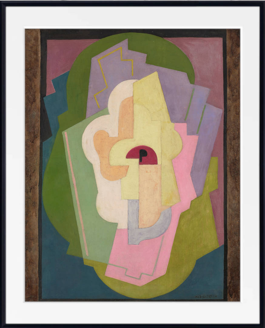
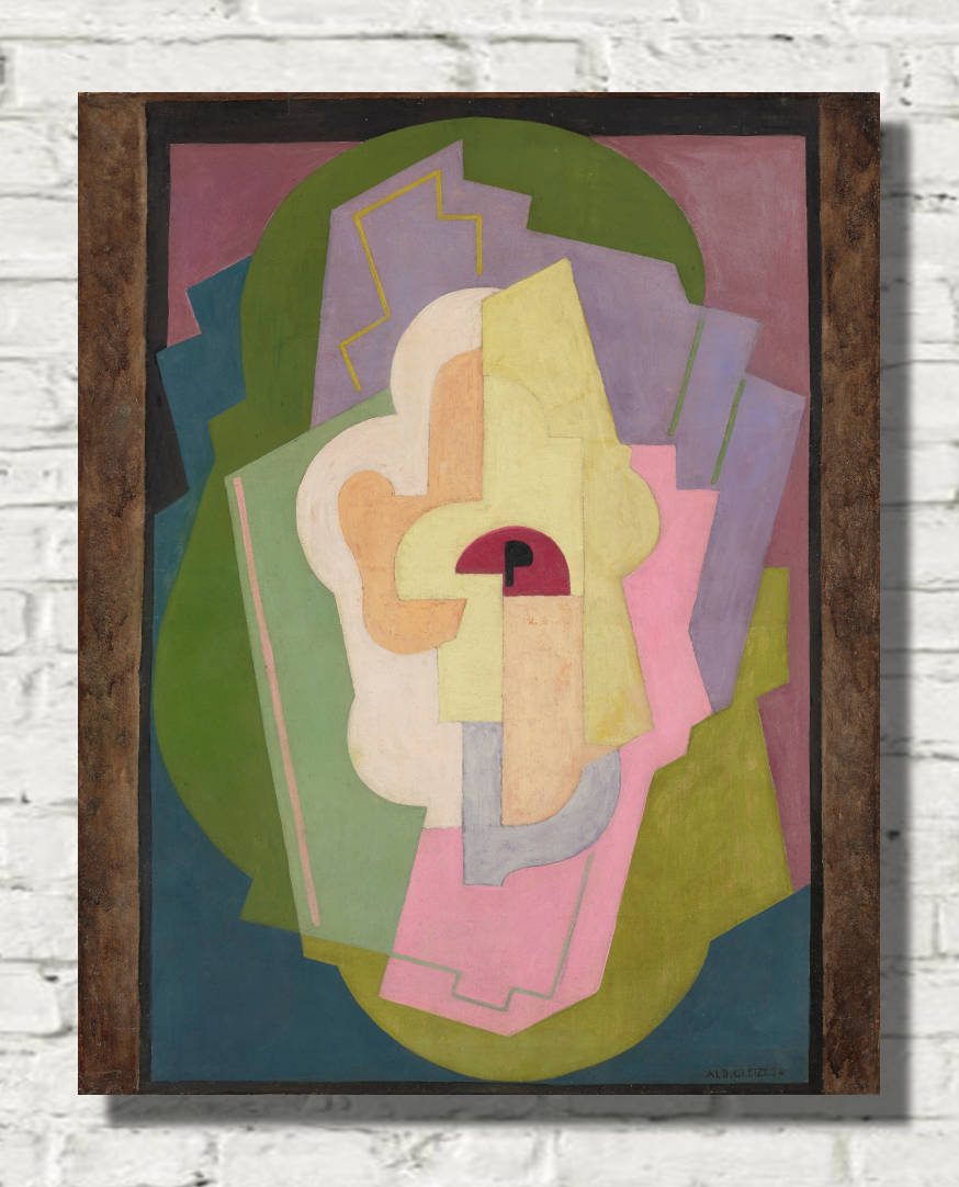
Pink has an extraordinary range within abstract art. Pale blush can feel calm and understated, dusty rose introduces warmth without excessive brightness, while magenta and fuchsia can create intense visual energy. Coral and peach sit closer to orange, bringing greater warmth, while mauve and raspberry move towards purple and red.
In abstract art, pink is liberated from the need to describe flowers, clothing, skin or any other recognisable subject. It can become pure colour: a geometric block, an atmospheric field, a circle, a line, an irregular shape or one part of a complex arrangement of contrasting hues.
This freedom makes pink abstract art especially versatile. A soft pastel composition can complement a calm neutral bedroom, while a large magenta or raspberry abstract print can become the dominant focal point of a contemporary living room.
Pink also changes dramatically according to the colours placed beside it. With green it creates lively contrast. With blue it can feel sophisticated and balanced. Beige and cream soften pink, while red and orange make it more energetic. Black can give even a pale pink composition stronger definition and graphic impact.
Hilma af Klint: Pink, Geometry and Spiritual Abstraction
Hilma af Klint created visionary abstract paintings filled with circles, spirals, botanical suggestions, geometric structures and symbolic colour.
Pink appears repeatedly in her paintings alongside blue, yellow, green, orange and violet. In some compositions it is soft and pastel-like, while in others it forms large areas of colour or interacts with bold geometric forms.
Her paintings often balance monumentality with delicacy. Large circles, spirals and symbolic shapes can create powerful structures, yet the use of pink and other soft colours gives many works a surprisingly gentle atmosphere.
Pink Hilma af Klint prints are particularly well suited to bedrooms, living rooms and contemplative spaces.
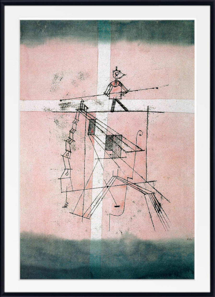
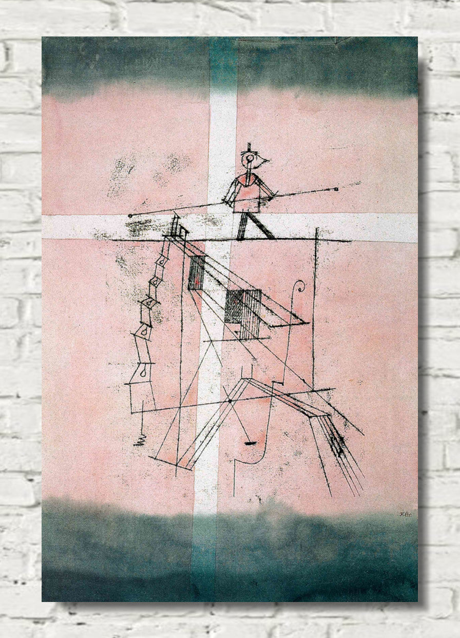
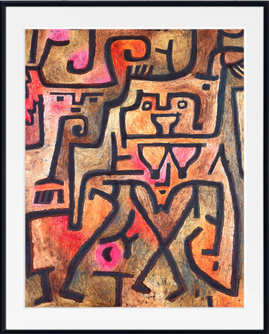
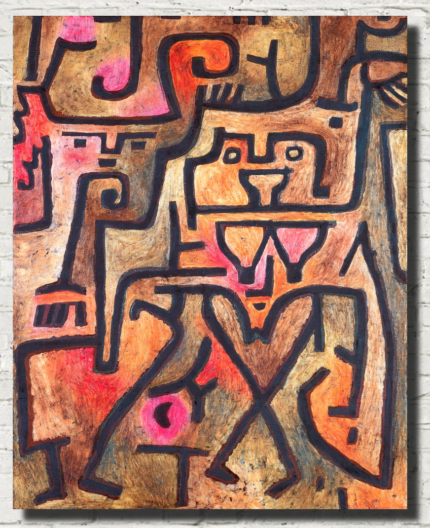
Paul Klee: Pink, Poetry and Playful Colour
Paul Klee developed one of the most distinctive visual languages of modern art.
His work combines abstraction, drawing, symbols, geometry, imagined landscapes and an extraordinary sensitivity to relationships between colours.
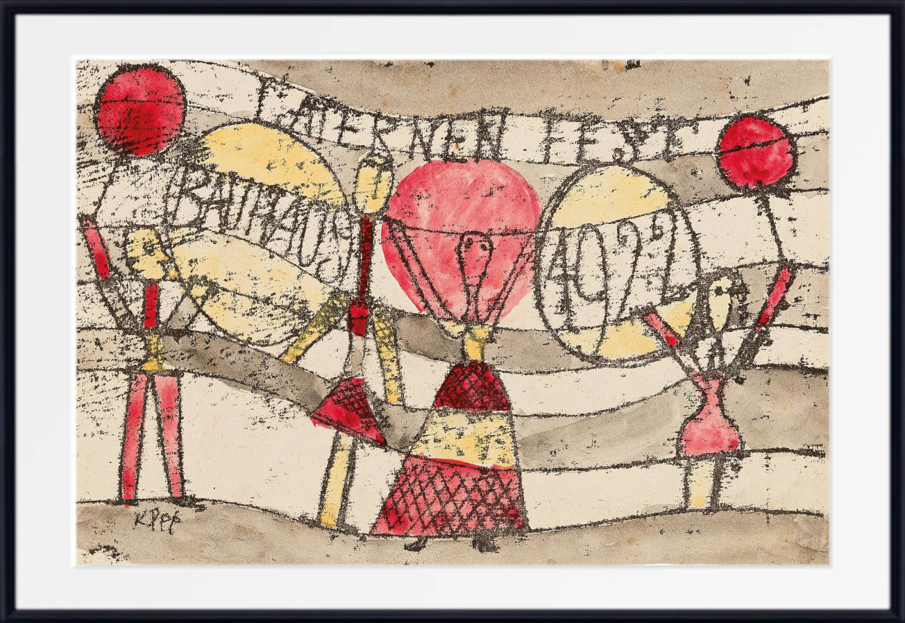
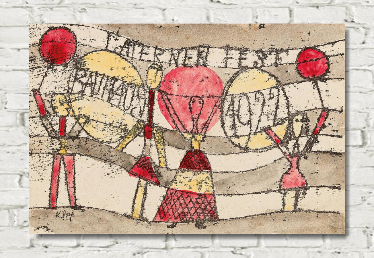
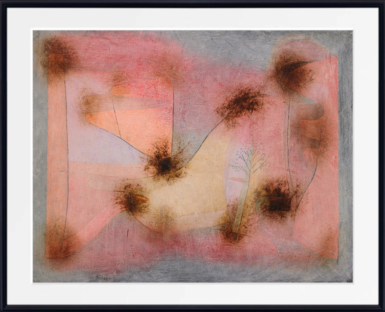
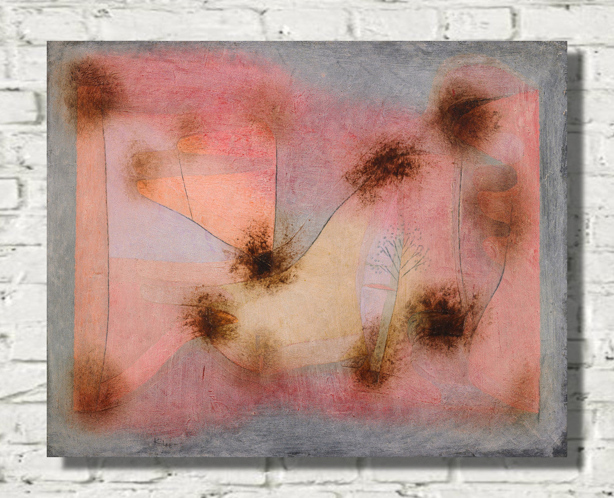
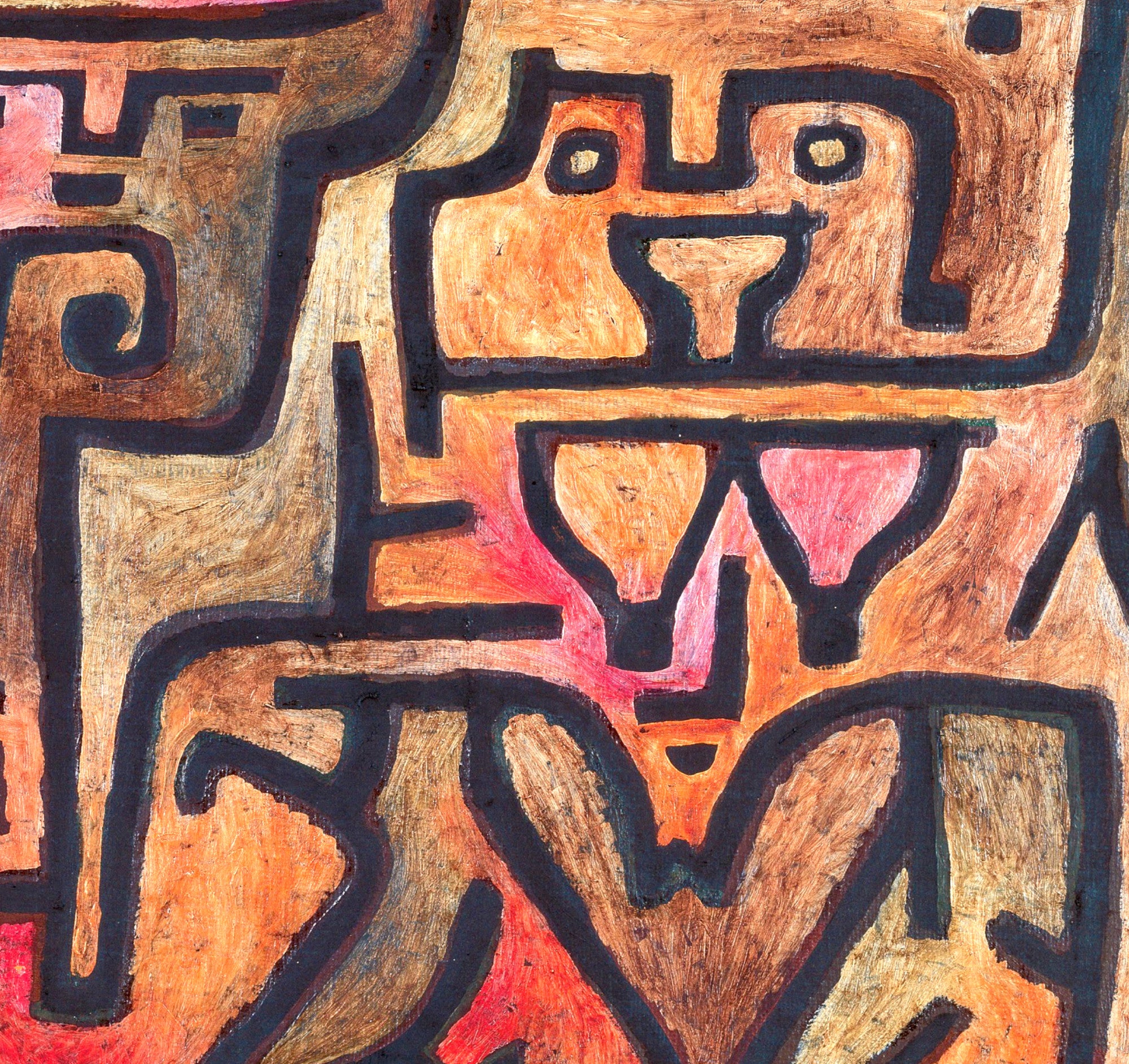
Pink can appear in Klee's compositions alongside ochre, blue, green, red, orange, beige and black. Sometimes it forms part of a grid of coloured shapes; elsewhere it appears in more delicate washes, lines and irregular forms.
Klee's use of colour can feel playful, mysterious or poetic, making his work particularly suitable for bedrooms, studies, reading areas and creative interiors.
Wassily Kandinsky and the Emotional Energy of Pink
Wassily Kandinsky was one of the central pioneers of abstraction.
He explored the expressive possibilities of colour, line, shape and rhythm, creating compositions that can feel almost musical.
Pink and rose tones appear within many of his multicoloured compositions, interacting with stronger red, blue, yellow, green, black and violet.
Kandinsky's paintings range from free-flowing early abstractions to more geometric later works filled with circles, lines, angles and carefully organised shapes.
Pink Kandinsky prints are especially effective in contemporary living rooms, dining rooms, offices and creative spaces.
Robert Delaunay: Pink within Rhythmic Colour
Robert Delaunay made colour central to his artistic practice.
His abstract compositions frequently use circles, arcs and repeated geometric forms to create optical movement and rhythm.
Pink, red and violet can interact with blue, green, orange and yellow in vivid combinations. Rather than treating colour as decoration, Delaunay allowed relationships between different hues to generate the structure and energy of the artwork itself.
Delaunay prints work particularly well in modern living rooms, dining rooms and home offices where strong geometry and confident colour can create a clear focal point.
František Kupka: Colour, Movement and Modern Abstraction
František Kupka was another important pioneer of abstract art.
He explored colour, movement, geometry and visual rhythm through circles, flowing forms, vertical bands and complex arrangements.
Some Kupka works use bold contrasting colours, while others are organised around more restrained palettes. Pink, red and violet tones can appear alongside blue, turquoise, green and yellow.
His work ranges from almost architectural compositions to more fluid, organic arrangements, making Kupka particularly suitable for modern interiors where abstraction and colour are desired without a literal subject.
Blush Pink Abstract Prints
Blush pink is one of the softest and most versatile forms of pink abstract art.
Its pale, slightly muted character makes it particularly suitable for calm bedrooms, living rooms, dressing areas and reading spaces.
Blush works naturally with cream, beige, pale grey, white, taupe and light wood. It can also be combined with sage green, dusty blue and muted terracotta for a more layered interior palette.
In abstract compositions, blush pink may appear as a broad colour field, a soft wash, a geometric shape or part of an organic arrangement.
Rose and Dusty Pink Abstract Art
Rose and dusty pink have greater depth than pale blush but remain softer than vivid magenta or fuchsia.
These muted tones can feel warm, sophisticated and easy to combine with both neutral and colourful interiors.
Dusty pink works especially well with sage, olive, navy, charcoal, cream and natural wood. Rose can be paired with deeper red and burgundy tones for a richer effect or balanced with pale blue and grey for a quieter palette.
Magenta and Fuchsia Abstract Wall Art
Magenta and fuchsia create a very different effect.
These highly saturated pinks can add energy, drama and strong contemporary colour, making them natural choices for statement art.
A large magenta abstract print can become the dominant focus above a sofa, fireplace or sideboard.
For richer interiors, magenta can be combined with navy, emerald green, black, orange or violet. Natural wood and warm metallic finishes can help balance the intensity.
Coral and Peach Abstract Prints
Coral and peach sit between pink and orange, bringing additional warmth to abstract compositions.
These shades can feel bright and summery or soft and understated depending on their saturation.
Pale peach works naturally with cream, beige and light wood, while stronger coral creates attractive contrast with teal, turquoise, blue and green.
Coral abstract art can be especially effective in living rooms and dining spaces where a warmer, sociable atmosphere is desired.
Pink Geometric Abstract Prints
Geometric abstraction uses circles, squares, grids, lines, arcs and other constructed forms to organise colour.
Pink can dominate the composition or appear as one element within a more varied arrangement.
Hilma af Klint, Kandinsky, Klee and Delaunay all explored relationships between geometry and colour in distinctive ways.
Pink geometric abstract prints are particularly effective in contemporary homes and offices because they combine strong visual structure with expressive colour.
For more structured modern abstraction, explore Geometric Abstract Prints.
Organic Pink Abstract Art
Not all pink abstract art is geometric.
Organic abstraction uses curving shapes, irregular forms, flowing lines and painterly colour that may suggest petals, cells, landscapes or natural growth without describing them literally.
Pink is particularly suited to organic abstraction because its associations with flowers, flesh and natural forms can remain present even when the artwork becomes completely non-representational.
These softer, flowing compositions work beautifully in bedrooms, living rooms and calm interiors.
Pink Abstract Prints for Living Rooms
Pink abstract wall art can bring warmth and personality into a living room.
For a neutral living room, pale blush, dusty rose and peach can introduce colour gently. A larger magenta, raspberry or fuchsia composition creates much stronger impact and can become the principal focal point above a sofa, fireplace or sideboard.
Pink abstract prints work naturally with cream upholstery, natural wood, green plants, brass and soft grey. Navy and dark green provide sophisticated contrast, while black creates a more graphic modern effect.
Pink Abstract Prints for Bedrooms
Bedrooms are especially well suited to softer pink abstract art.
Blush, dusty rose, pale peach and muted mauve can create warmth while maintaining a calm and restful atmosphere.
Choose abstract works with balanced forms, subtle colour and enough visual breathing space if you want a peaceful effect.
Pink abstract prints work beautifully with white bedding, cream, beige, sage green, pale grey, linen and natural wood.
Pink Abstract Prints for Dining Rooms and Offices
Dining rooms can accommodate stronger pink artwork particularly well.
Magenta, coral and multicoloured abstract compositions can add warmth, visual energy and conversation to a wall above a sideboard or opposite the dining table.
In home offices and creative workspaces, pink abstract art can introduce personality without the distraction of a literal narrative subject.
Geometric works by Kandinsky or Delaunay can add structure and energy, while quieter compositions by Klee or Hilma af Klint may create a more contemplative atmosphere.
What Colours Work with Pink Abstract Art?
Pink is extremely versatile because its many shades create different relationships with surrounding colours.
Blush works beautifully with cream, beige, grey and sage green. Dusty rose pairs naturally with navy, olive and natural wood, while bright magenta creates stronger contrast with emerald, teal, black and white.
Green is one of the most effective companion colours for pink. Pale sage produces a soft and natural palette, while deep emerald makes bright pink appear more vivid.
Blue can create a cooler, more sophisticated contrast. Navy gives pale pink greater depth, while turquoise and teal work especially well with coral and warmer pinks.
Beige, cream and warm neutral tones soften pink, while red, orange and purple create a more colourful and energetic effect.
Choosing the Right Size Pink Abstract Print
Large pink abstract prints work particularly well above sofas, beds, fireplaces and sideboards.
A substantial artwork allows colour and composition to become a defining feature of the room.
Medium-sized framed prints are useful above desks, consoles and smaller pieces of furniture.
Smaller pink abstract prints are ideal for gallery walls and can be combined with floral art, Impressionist prints, beige abstraction, green artwork or other pieces linked by a common palette.
Fine Art Prints, Framed Prints and Canvas Panels
GalleryThane pink abstract artwork is available across a range of formats and sizes.
Choose an unframed fine art paper print if you want the flexibility to select your own frame, a framed print for a complete gallery-style presentation, or a canvas panel for a clean, ready-to-hang finish.
Our prints, frames and canvas panels are handmade in our Nottinghamshire workshop using carefully selected fine art papers, UV-stabilised pigment inks and quality framing materials.
Explore Related Pink and Abstract Art
Continue exploring abstract art by colour:
Blue Abstract Prints
Green Abstract Prints
Beige Abstract Prints
Black Abstract Prints
Colourful Abstract Prints
For broader pink artwork, explore Pink Wall Art, Pink Impressionist Prints and Pink Floral Prints.
For the wider category, browse Abstract Art Prints.
Frequently Asked Questions
What is pink abstract art?
Pink abstract art uses shades of pink together with colour, shape, line, texture, geometry or gesture without necessarily representing the visible world realistically. Styles range from soft organic compositions to bold geometric abstraction.
What shades are included in pink abstract prints?
Pink abstract prints can include blush, dusty rose, coral, peach, raspberry, fuchsia, magenta, mauve and pale pastel pink. Some works are dominated by one shade, while others combine several pinks with contrasting colours.
Which artists are famous for pink abstract art?
Important abstract artists whose works explore pink and other strong colour relationships include Hilma af Klint, Paul Klee, Wassily Kandinsky, Robert Delaunay and František Kupka.
What colours go well with pink abstract prints?
Pink abstract prints work beautifully with white, cream, beige, grey, sage green, emerald, navy, pale blue, teal, black, warm metallic tones and natural wood.
Are pink abstract prints suitable for living rooms?
Yes. Pink abstract wall art can bring warmth and colour to a living room. Large blush, rose, magenta and multicoloured compositions work particularly well above sofas, fireplaces and sideboards.
Are pink abstract prints good for bedrooms?
Yes. Soft blush, dusty rose, pale peach and muted pink abstract prints can contribute to a calm bedroom atmosphere. They pair naturally with white, cream, beige, sage green, grey, linen and natural wood.
Does pink abstract art work in modern interiors?
Yes. Pink abstract art is especially effective in modern interiors because geometric shapes, organic forms and bold colour can create a contemporary focal point. Pale pink can look subtle and minimalist, while magenta and fuchsia create stronger visual impact.
Should I choose a framed pink abstract print or a canvas panel?
Choose a framed print for a structured, gallery-style presentation that clearly defines the artwork. Choose a canvas panel for a cleaner, frameless appearance that can work especially well with larger modern abstract compositions.
What size pink abstract print should I choose?
Large prints are ideal above sofas, beds and sideboards, while medium-sized works suit smaller walls and furniture. Smaller abstract prints can be displayed in pairs, rows or gallery wall arrangements.