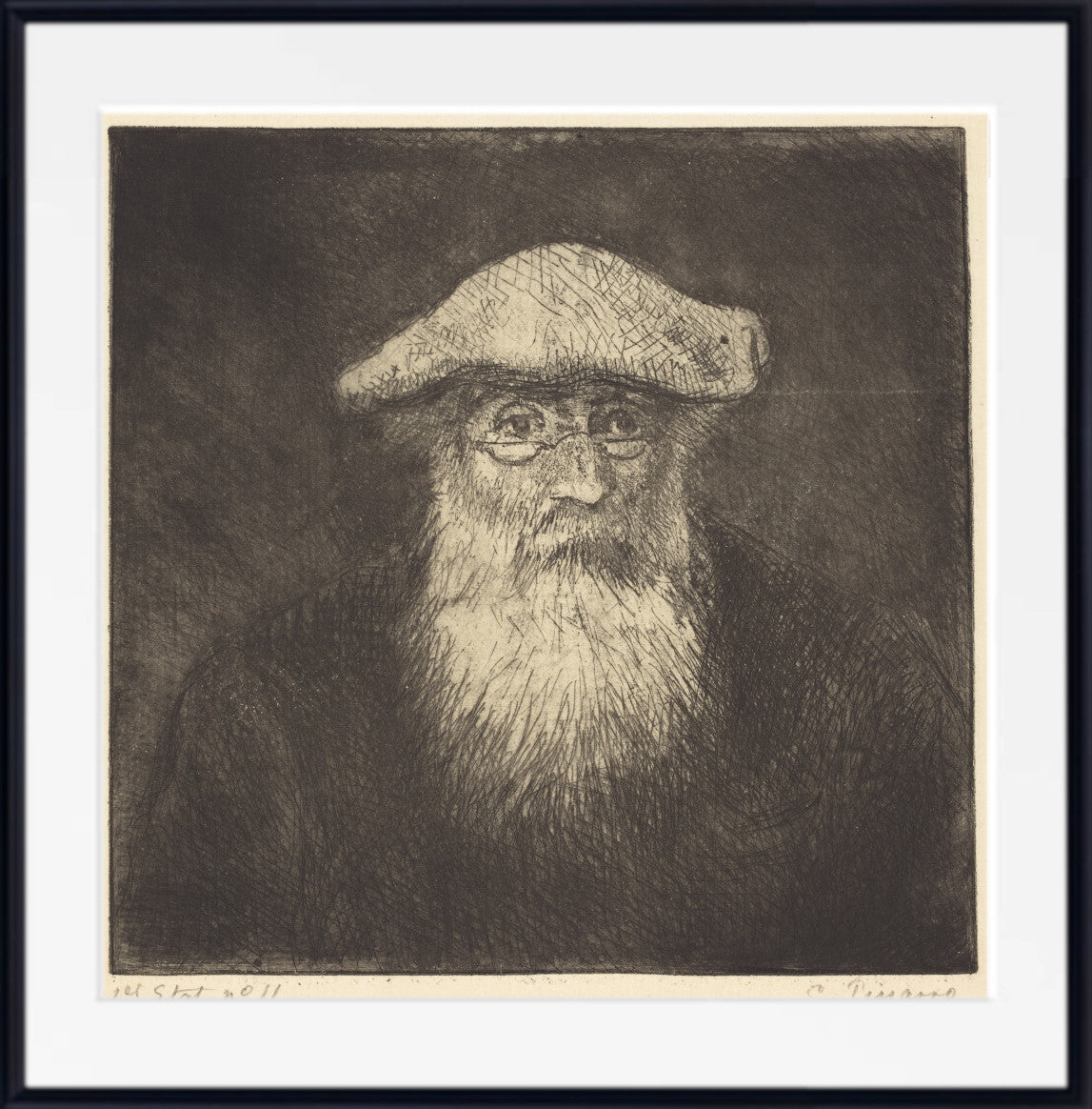
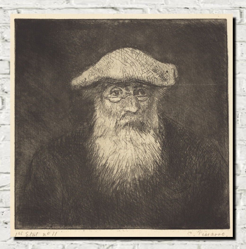
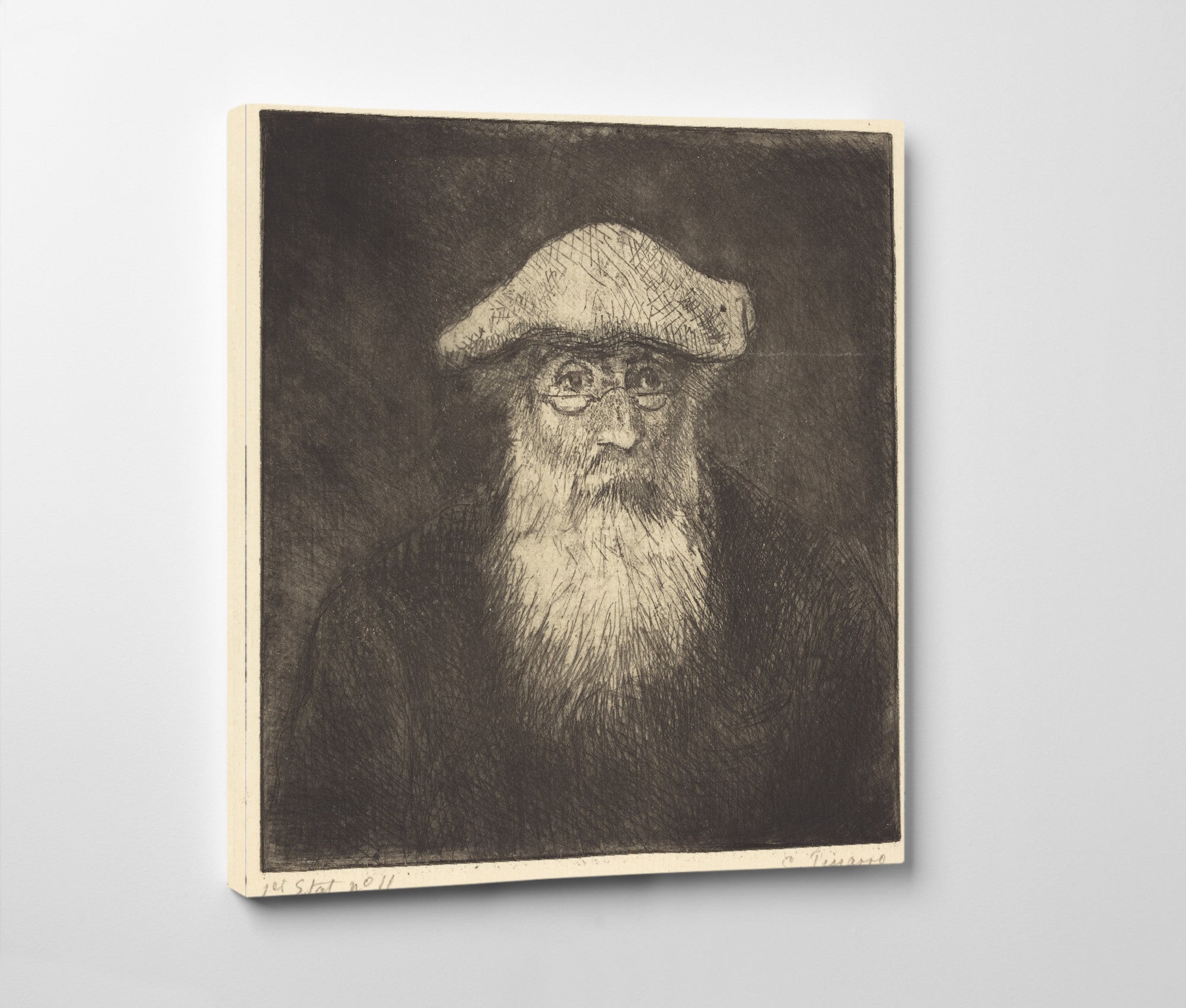
Grey Wall Art for Calm, Characterful Interiors
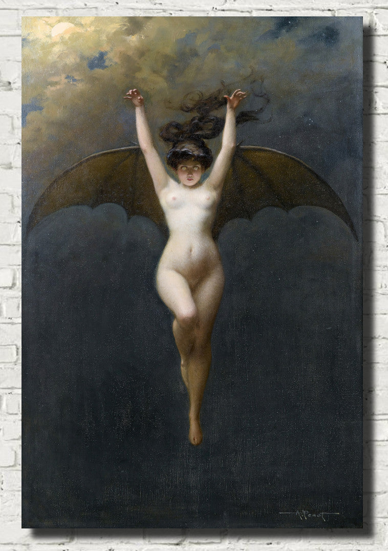
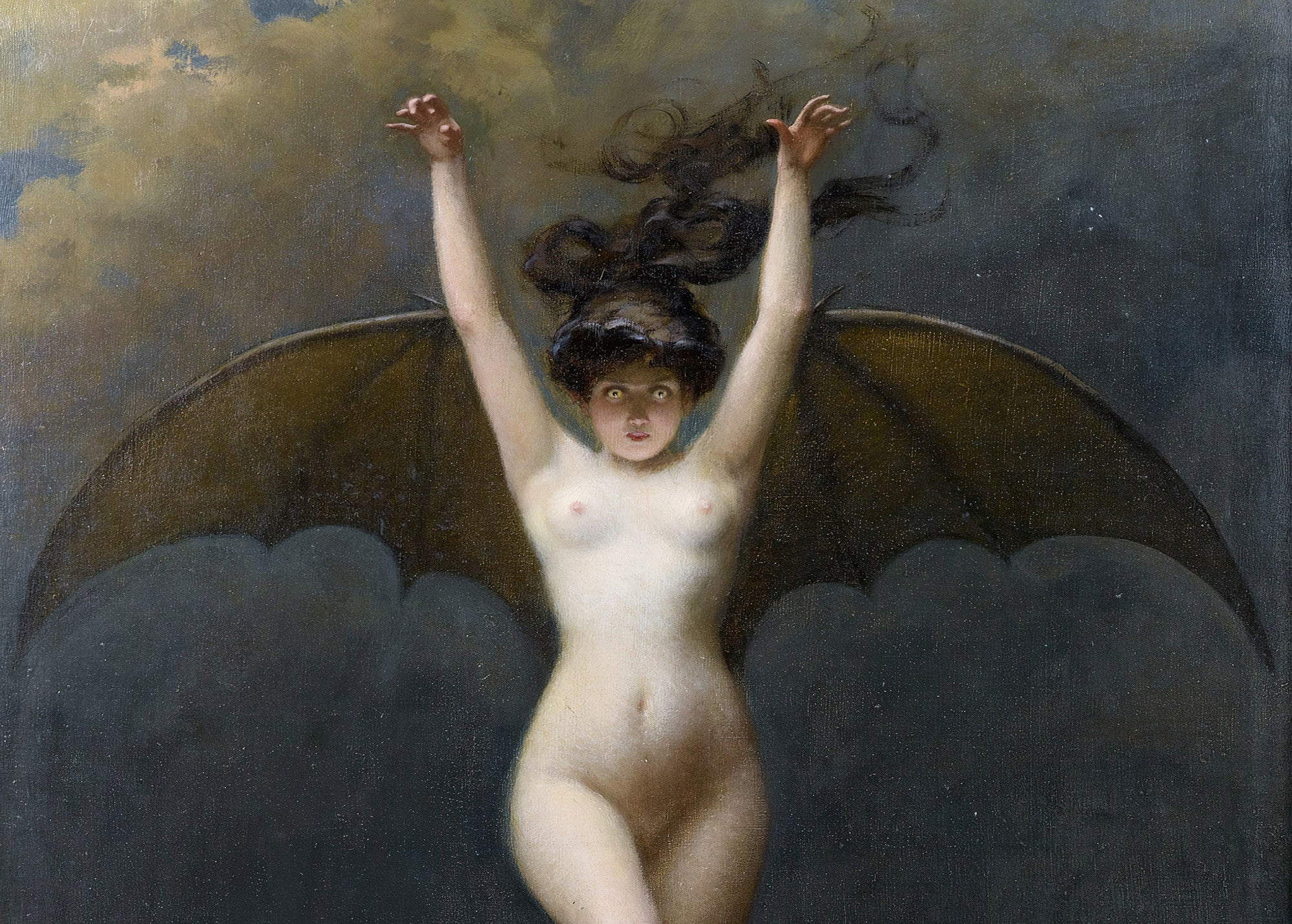
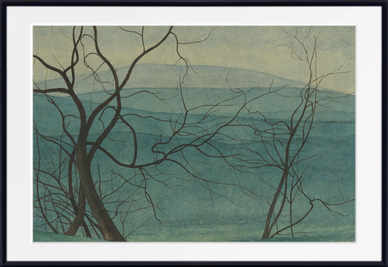
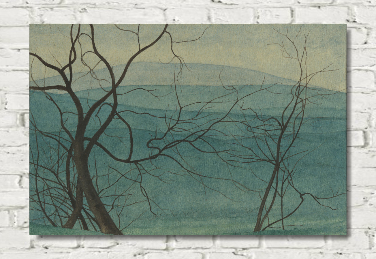
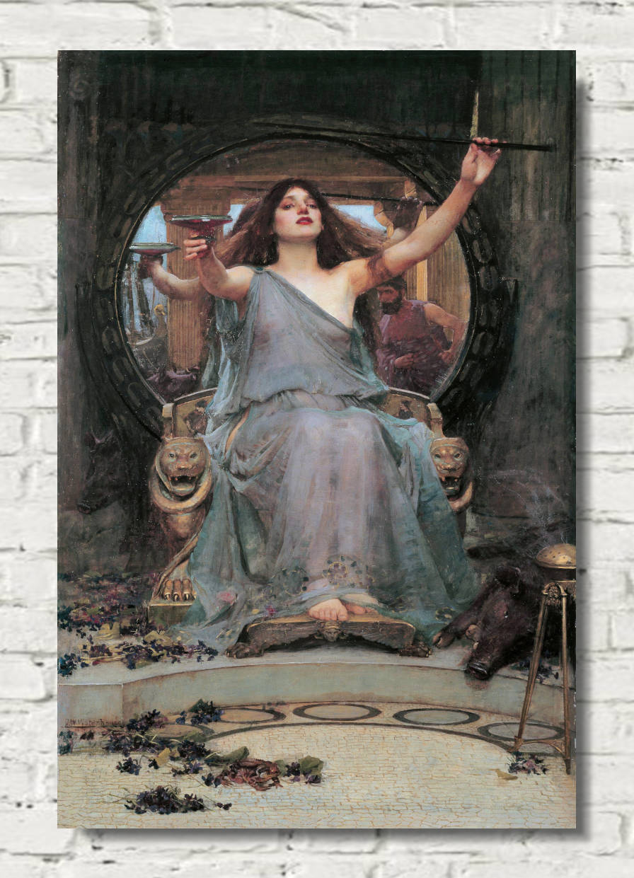
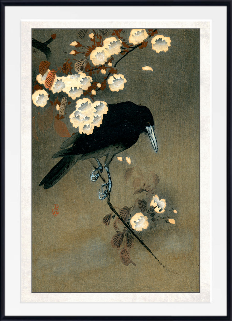
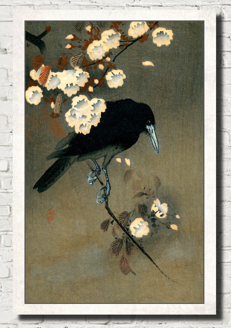
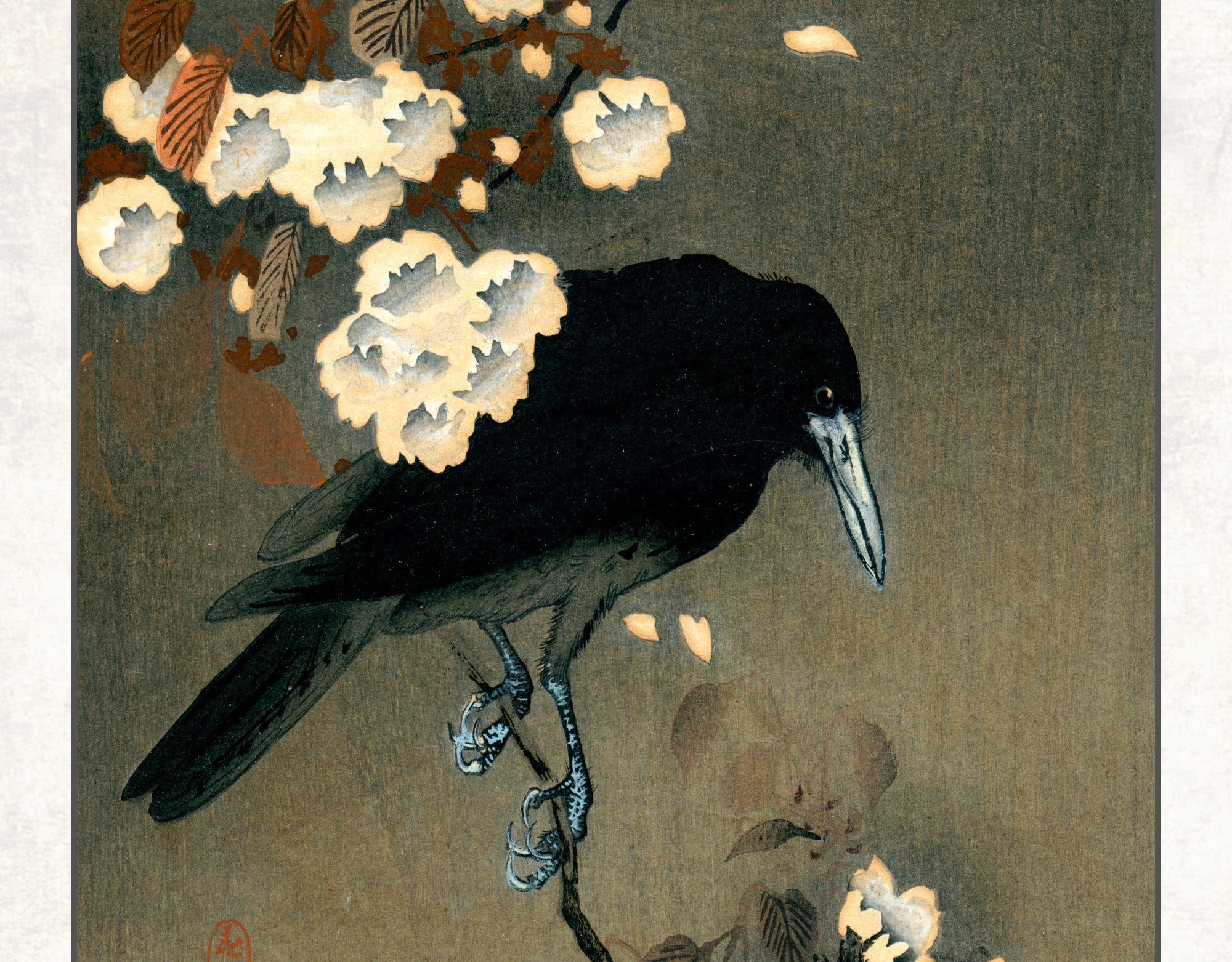
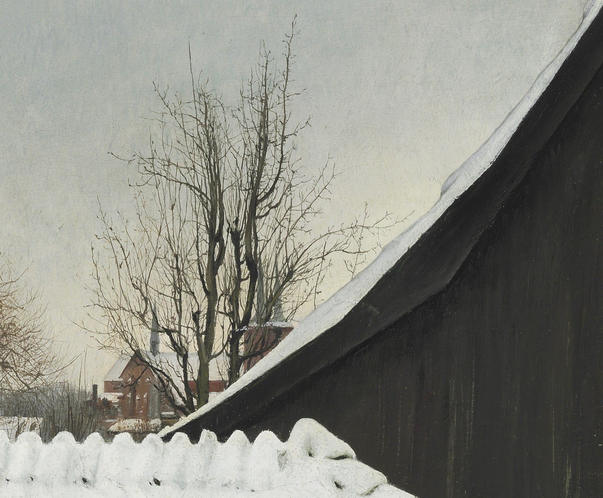
Grey is one of the most adaptable colours in interior design. It can appear soft, misty and peaceful or dark, dramatic and architectural. Grey wall art is particularly effective when you want artwork with atmosphere and depth without introducing a dominant bright colour.
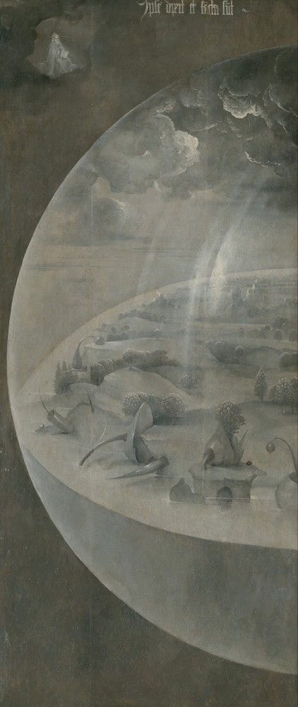
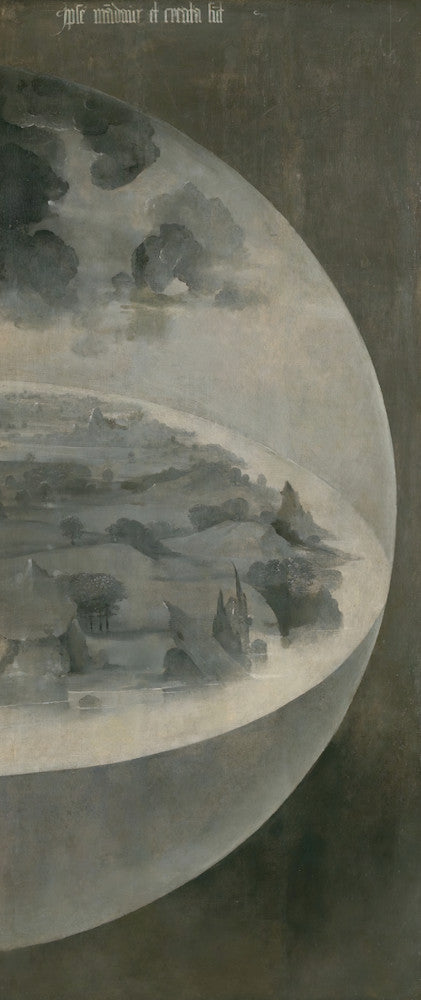
This collection includes fine art prints, framed prints and canvas panels across landscapes, seascapes, portraits, interiors, still life paintings, abstract compositions, religious subjects and city scenes. Grey artwork complements both traditional and contemporary rooms and works naturally with white, black, beige, brown, navy, green, natural wood, stone and metal finishes.
Grey Landscape Prints
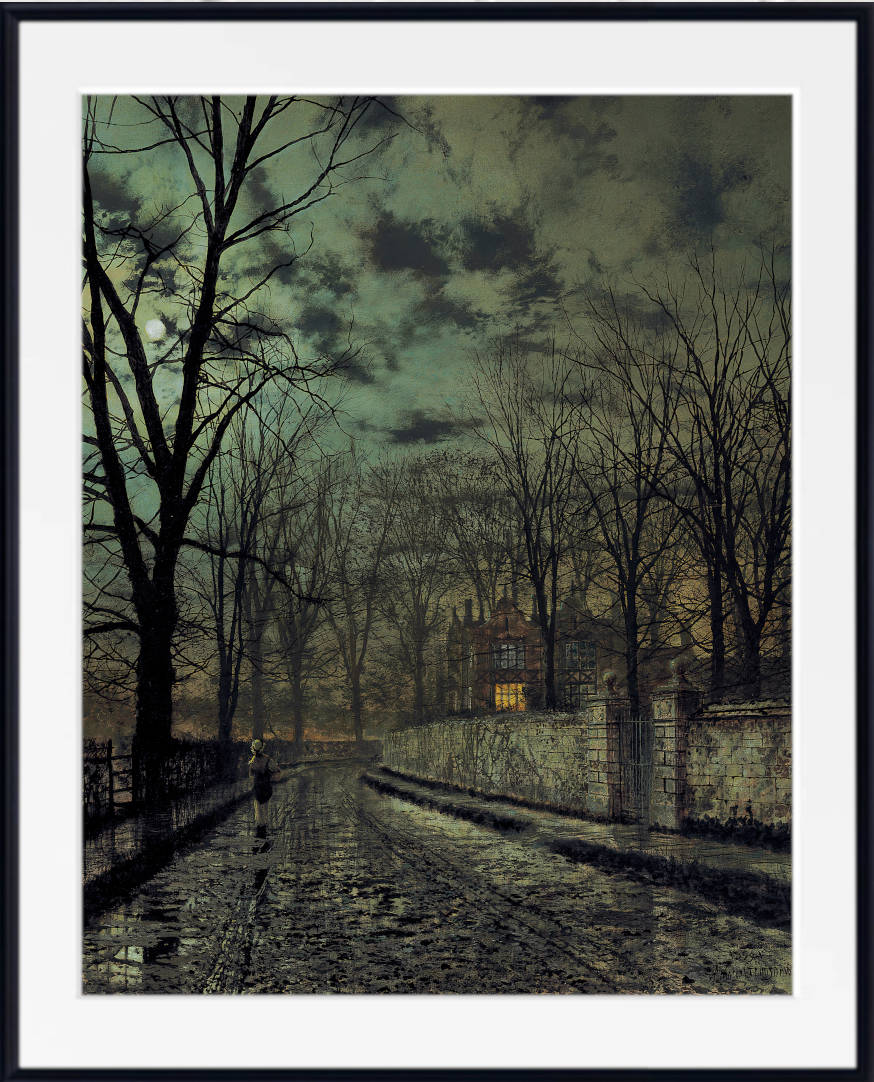
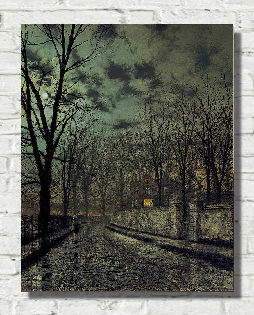
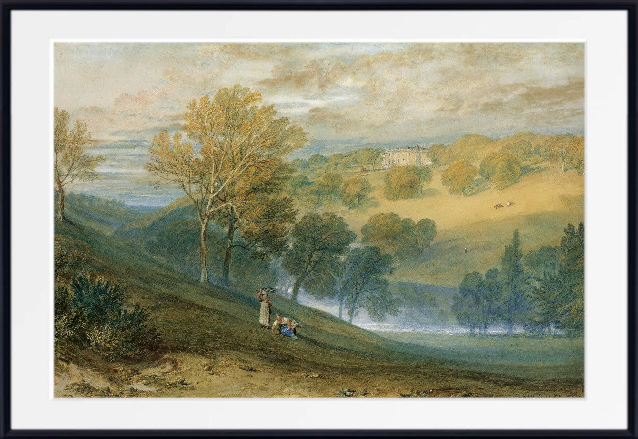
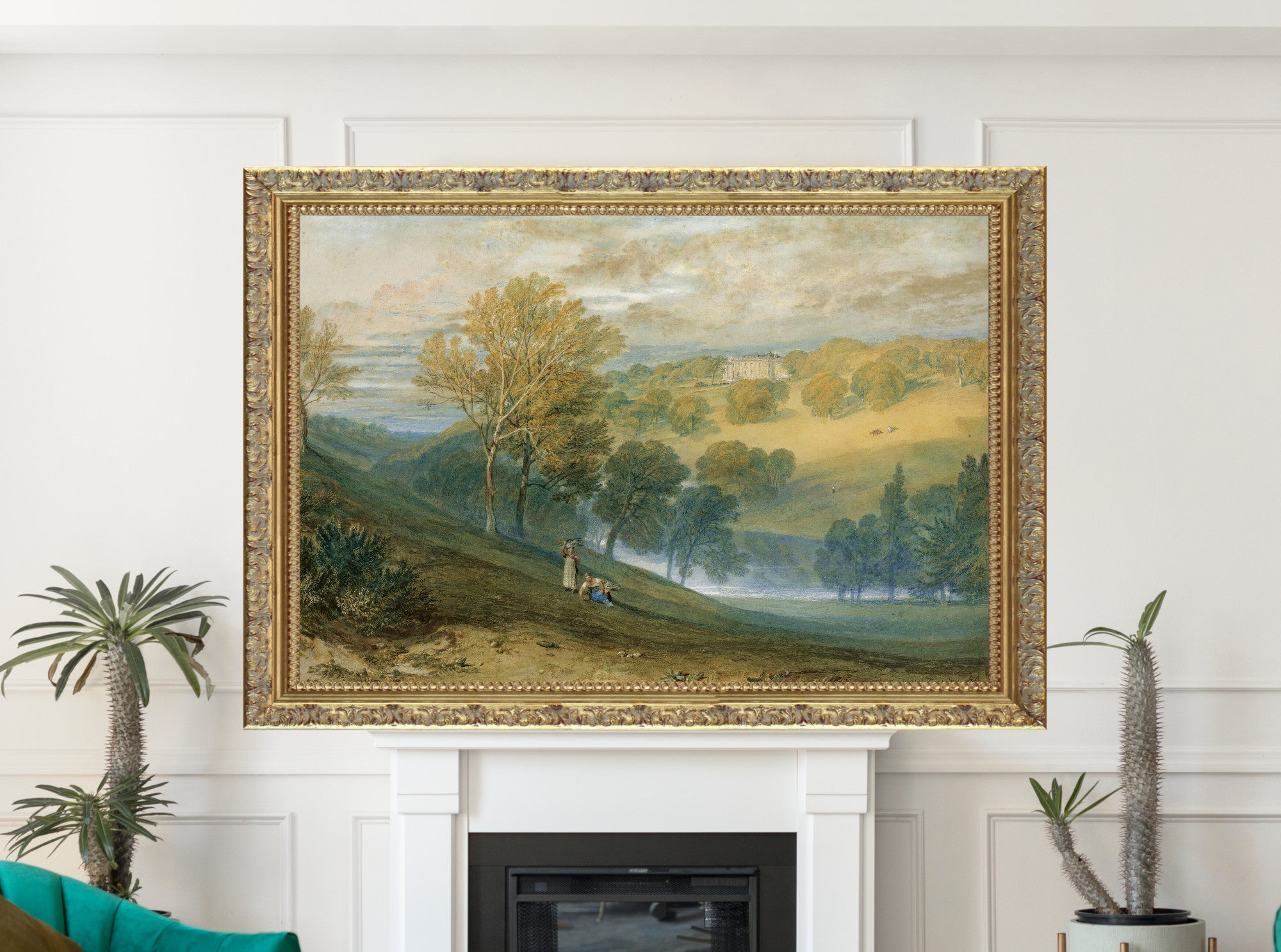
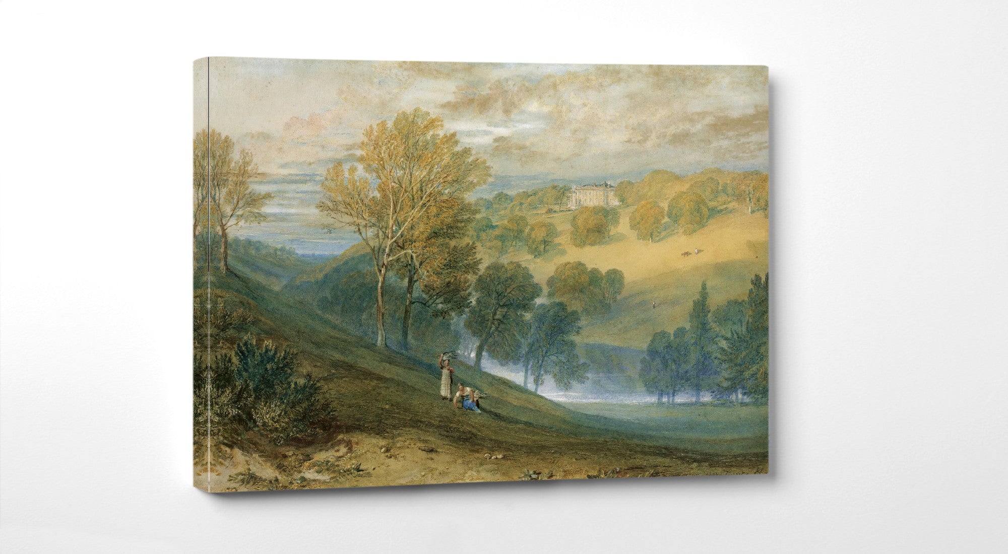
Grey landscape prints bring a sense of distance and atmosphere to a room. Mist, rain, winter skies, moonlight, stone buildings and quiet horizons all sit naturally within a cool neutral palette.
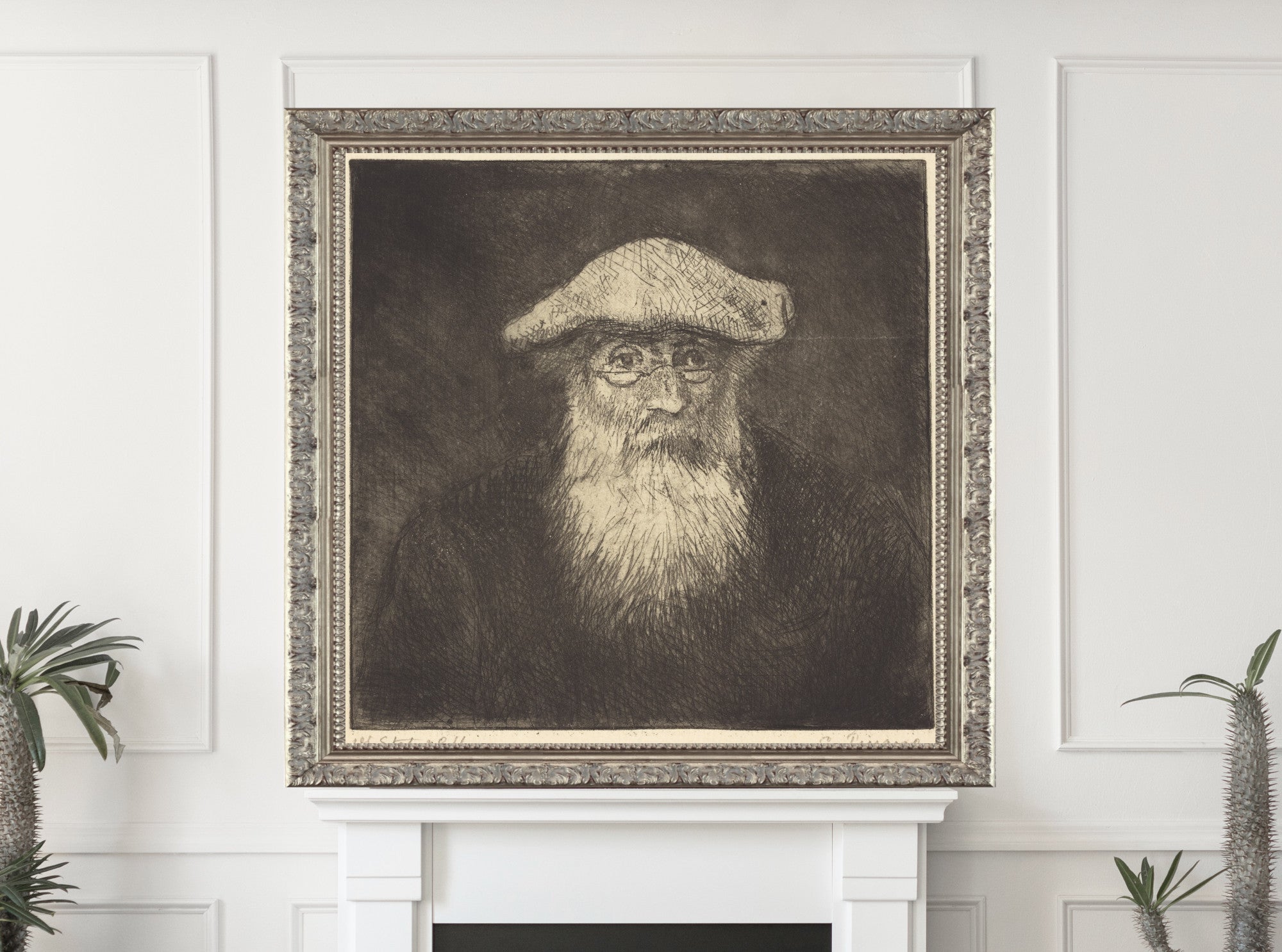
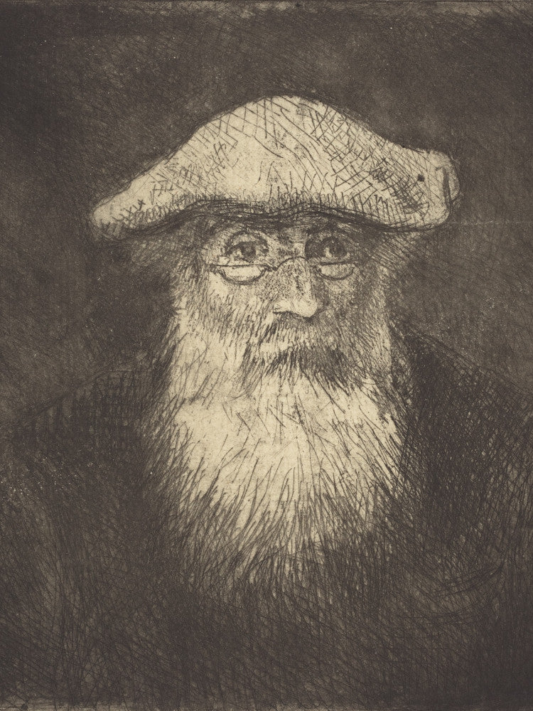
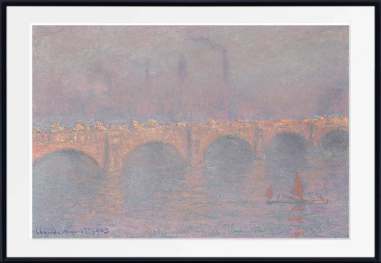
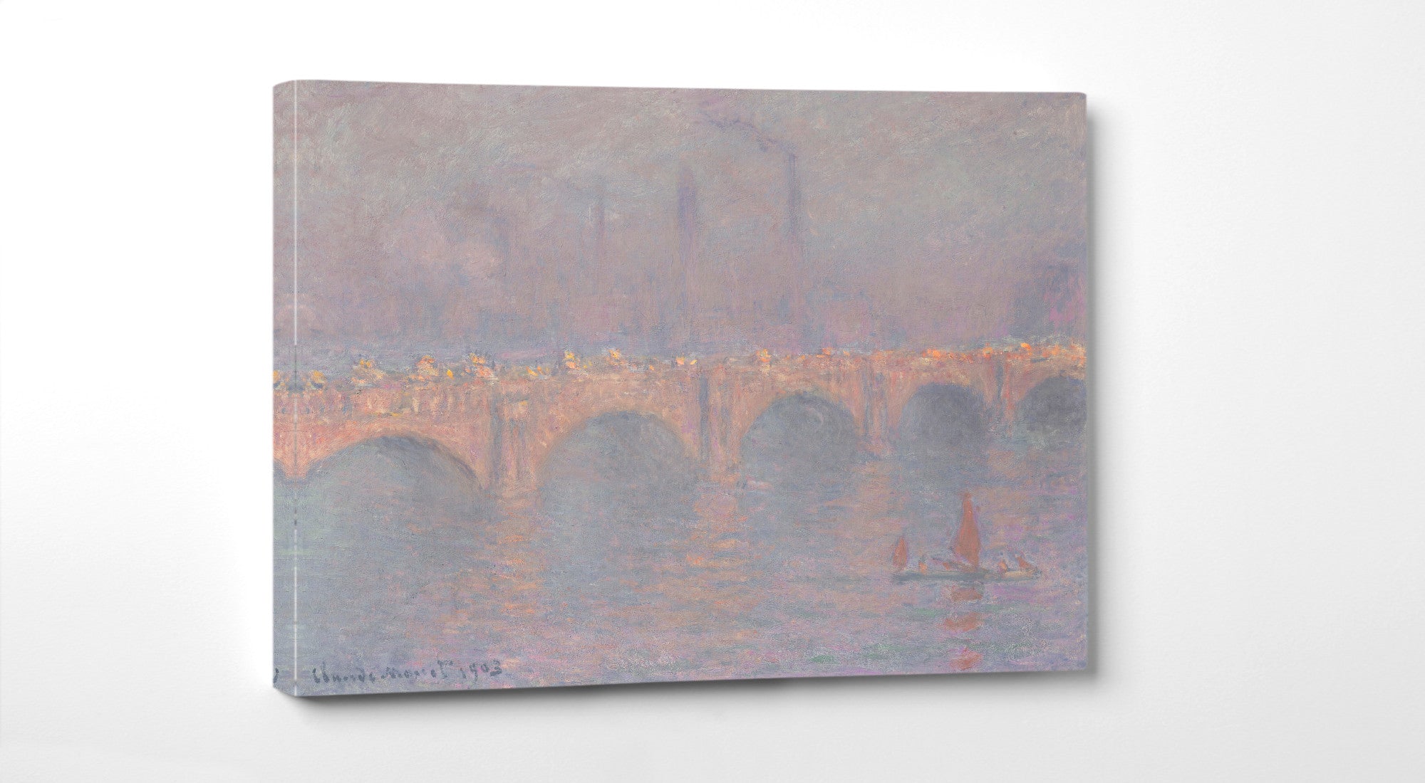
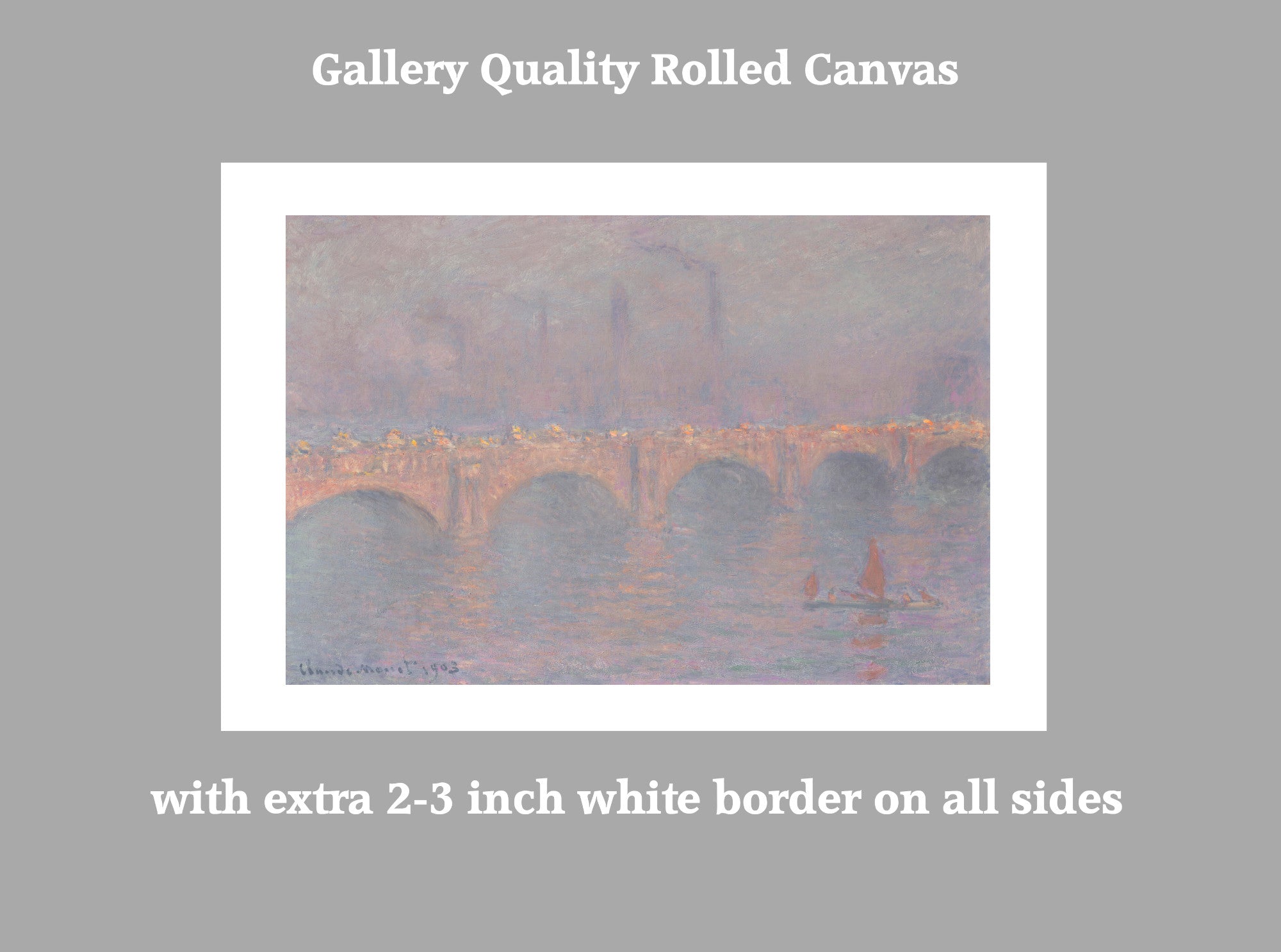
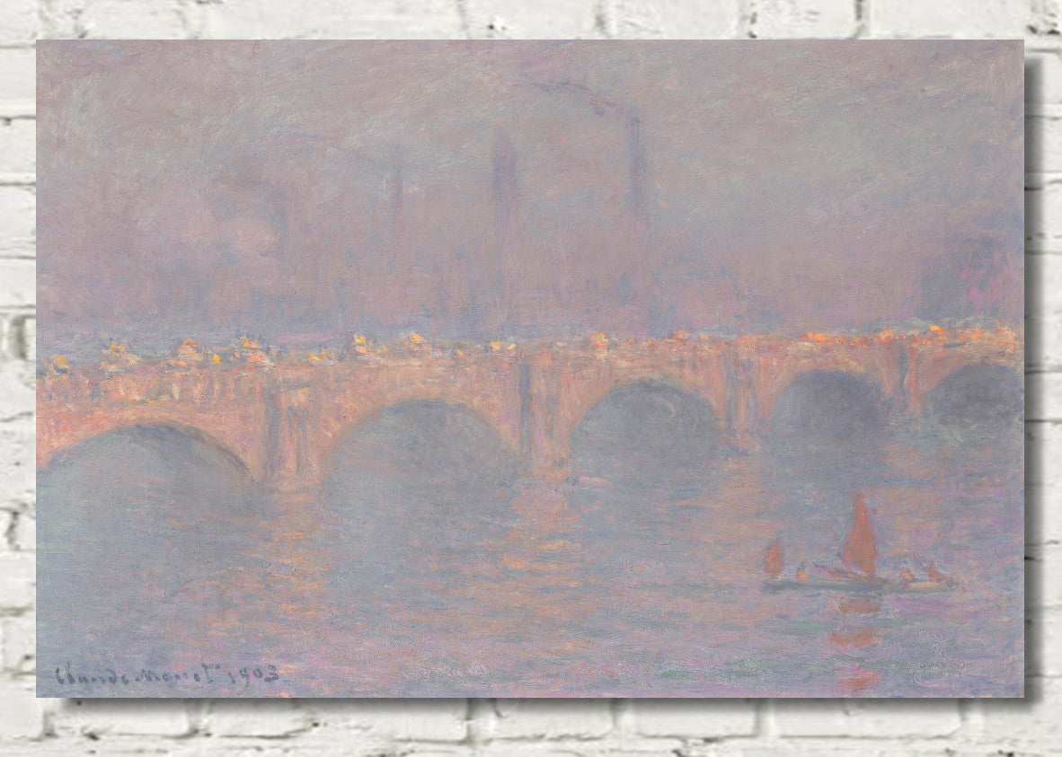
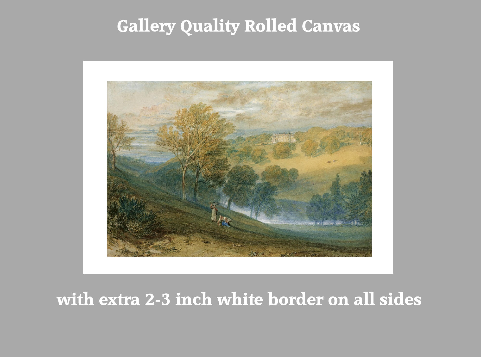
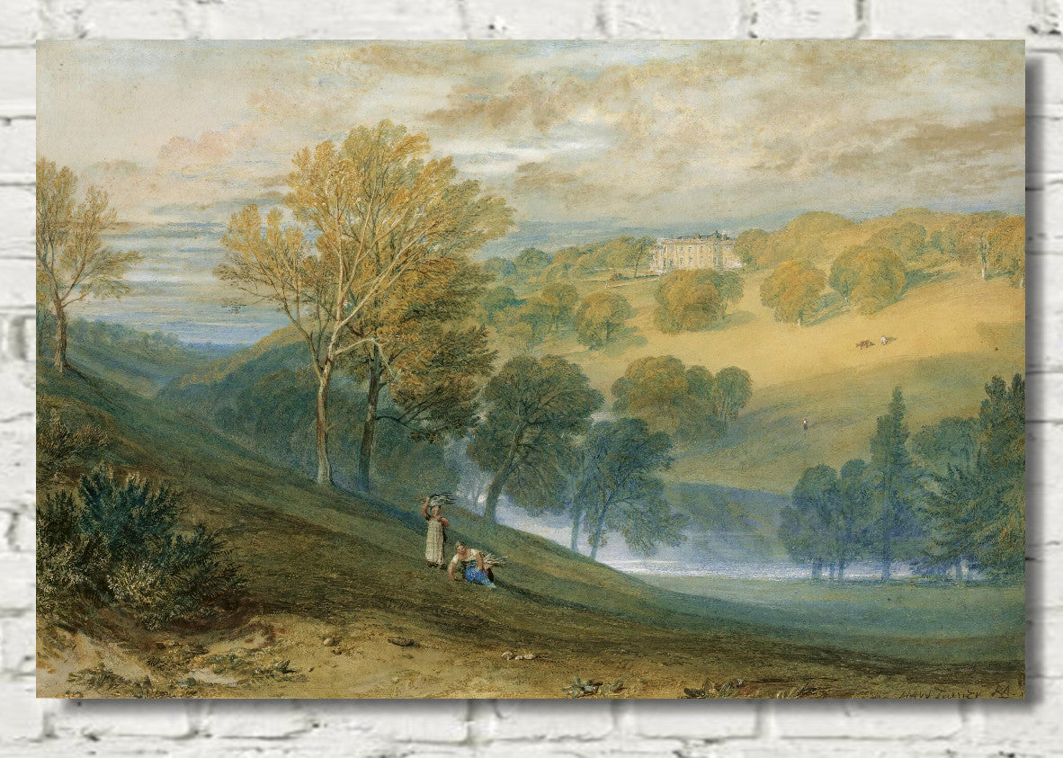
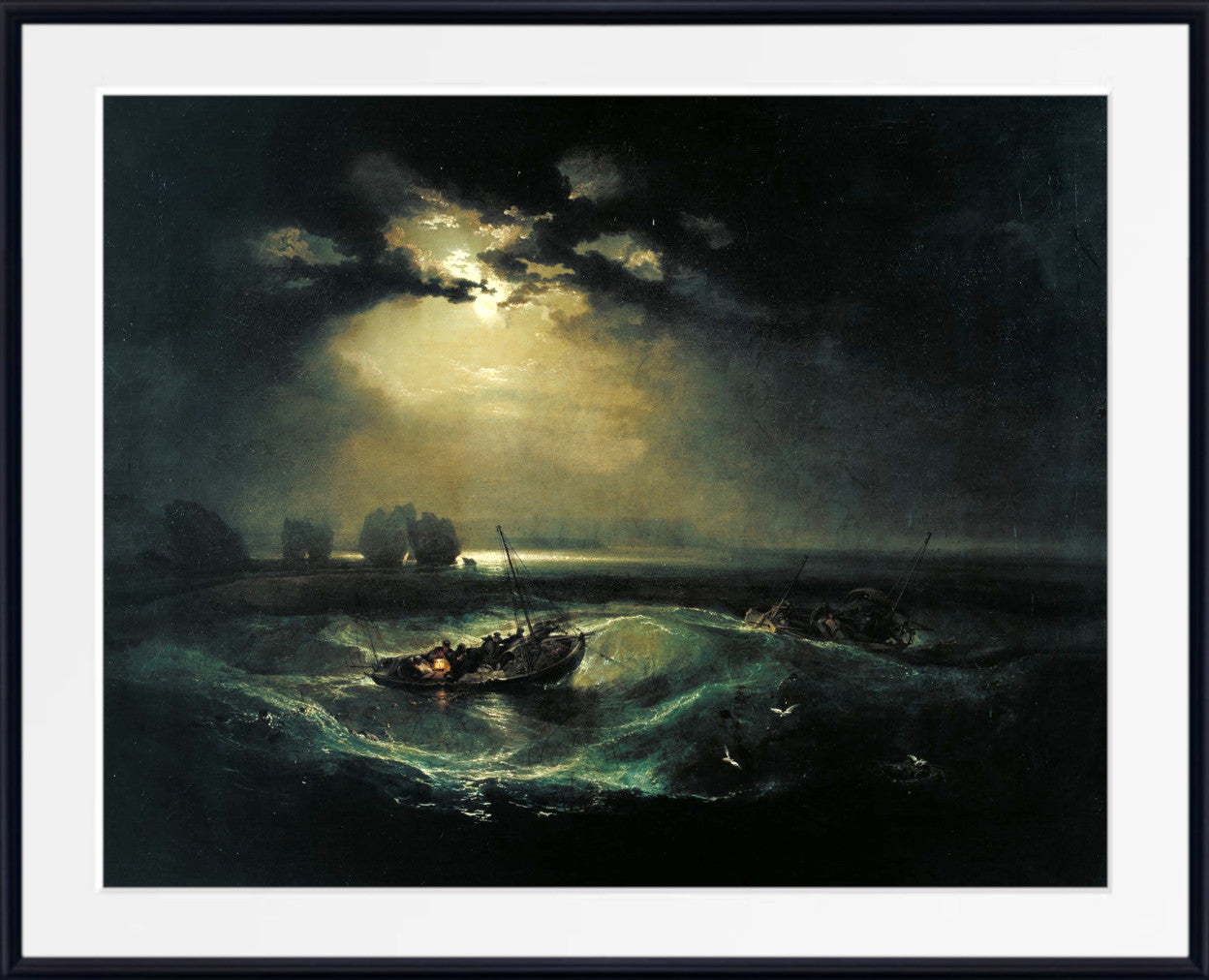
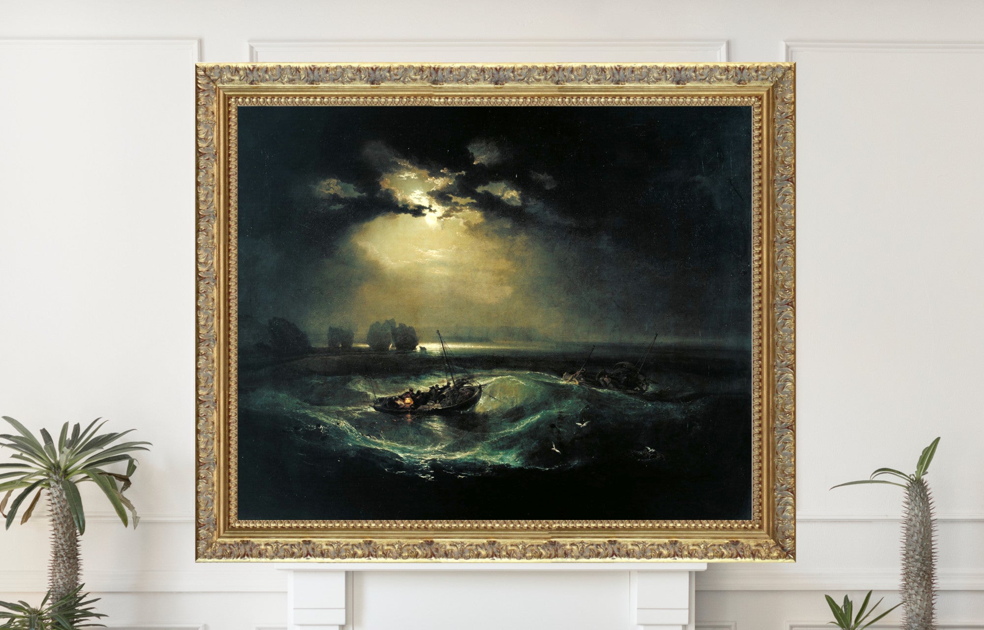
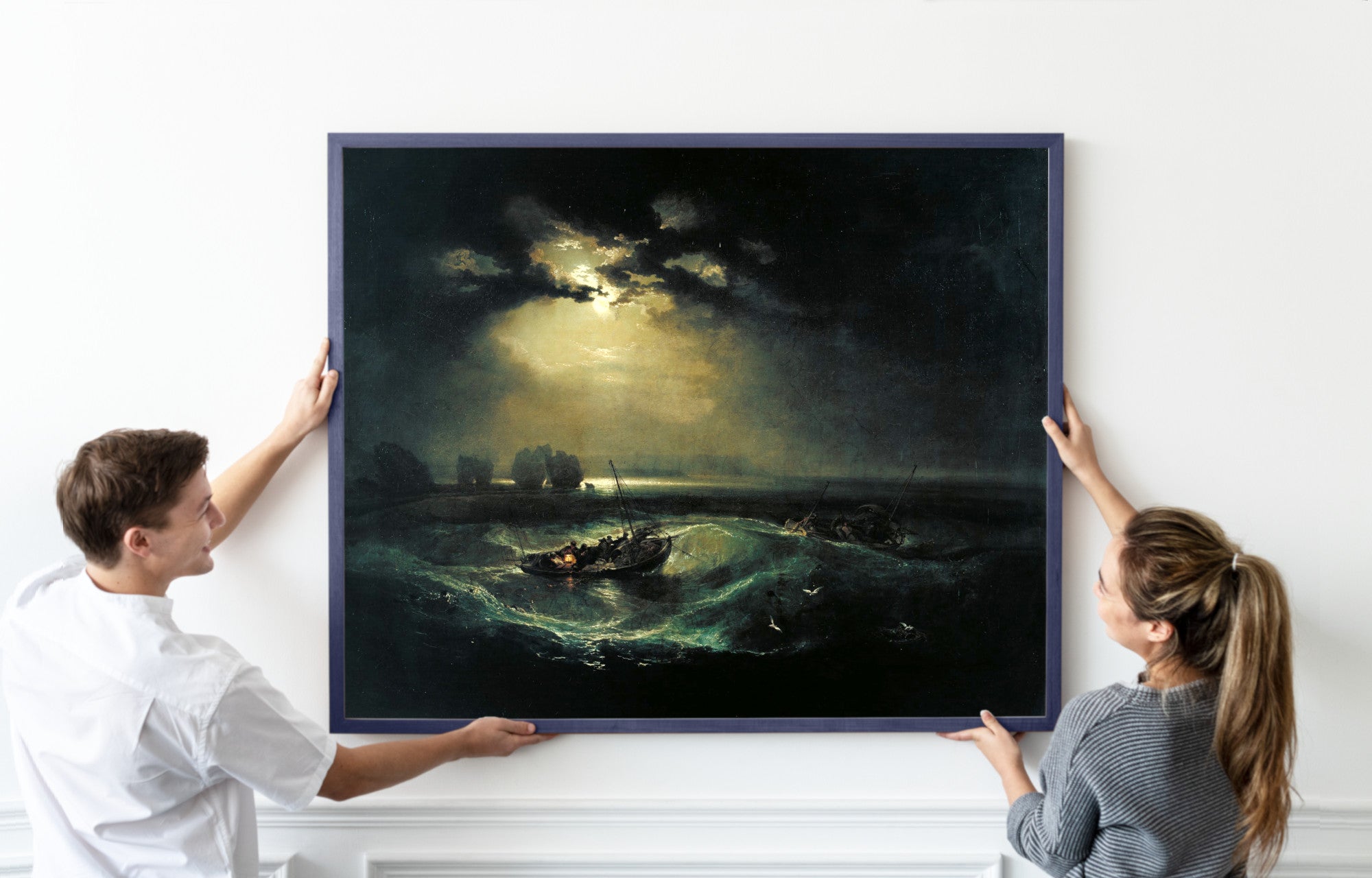
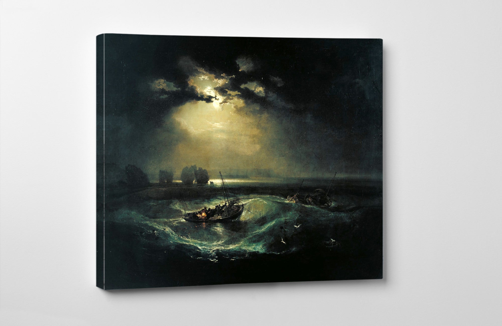
Claude Monet is a strong choice for misty rivers, bridges and softly diffused light. Camille Pissarro offers understated rural and urban scenes, while J. M. W. Turner uses cloud, fog, sea and sky to create movement and drama.
Explore more subjects in the Landscape and Scenery Prints collection.
Grey Cityscape and Architectural Prints
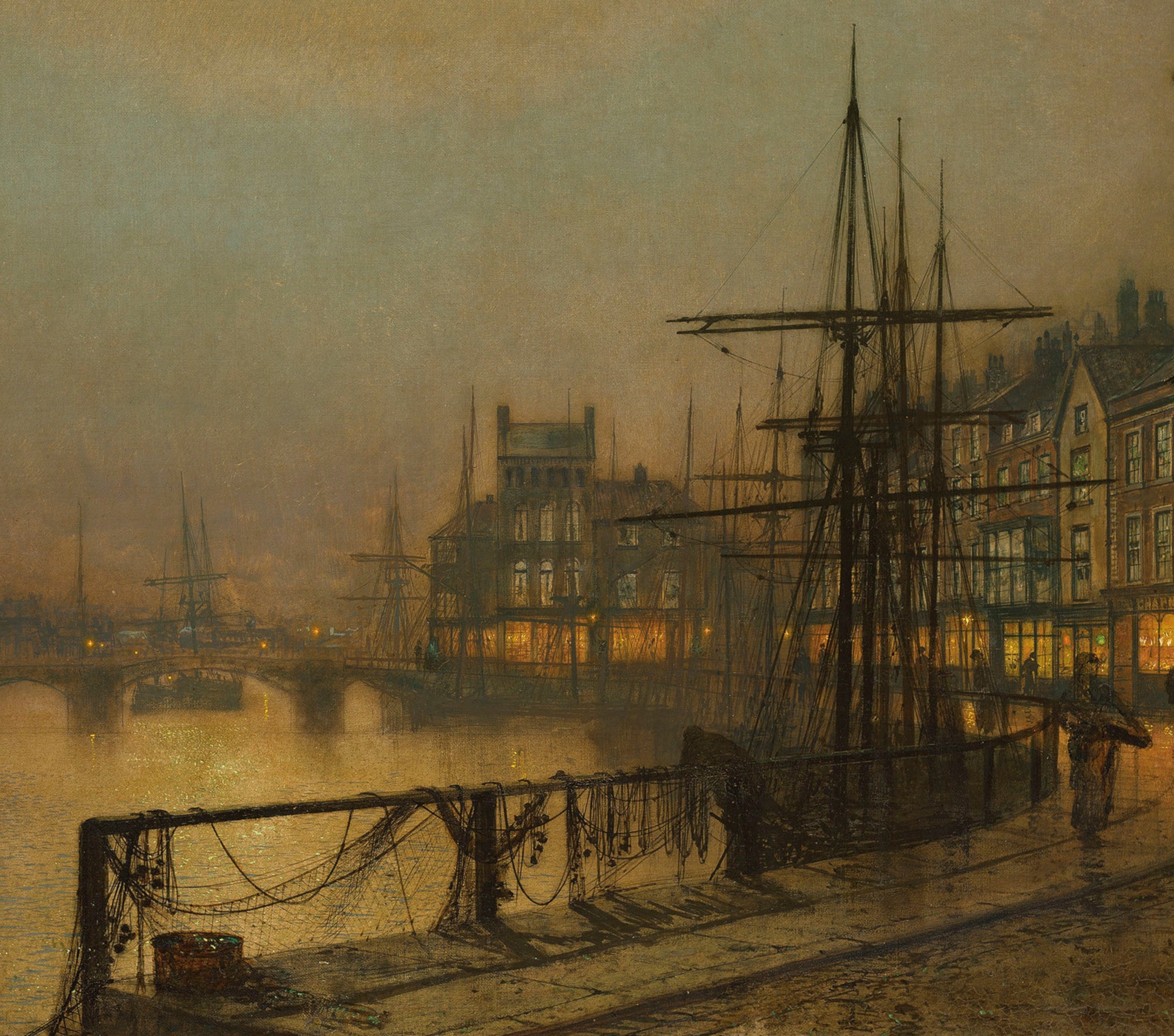
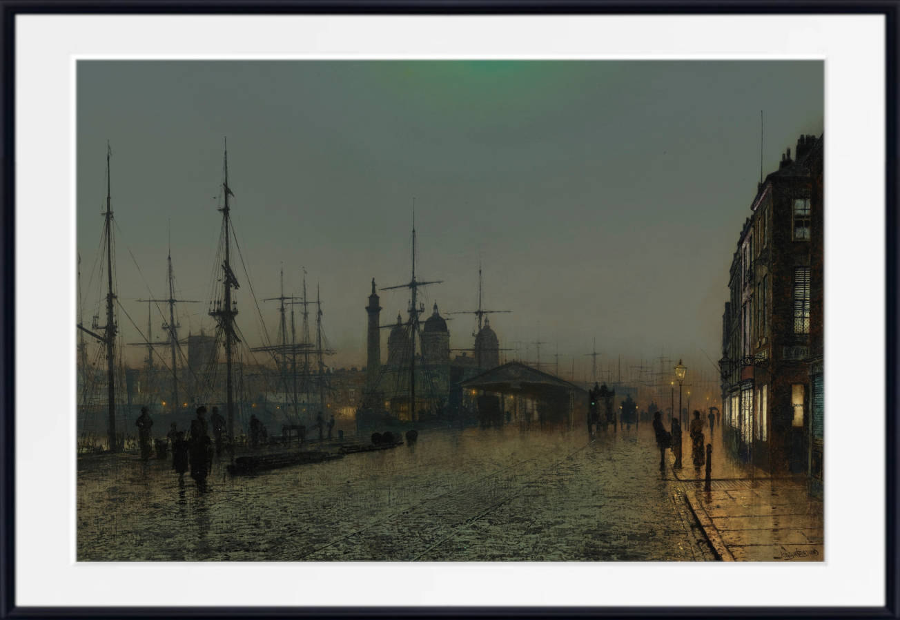
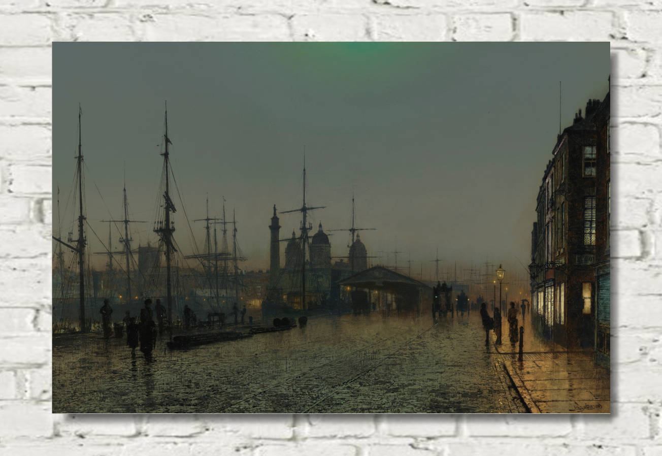
Grey cityscape prints suit hallways, offices, living rooms and contemporary apartments. Stone streets, bridges, docks, industrial buildings and evening views can add structure and atmosphere without making a room feel overly colourful.
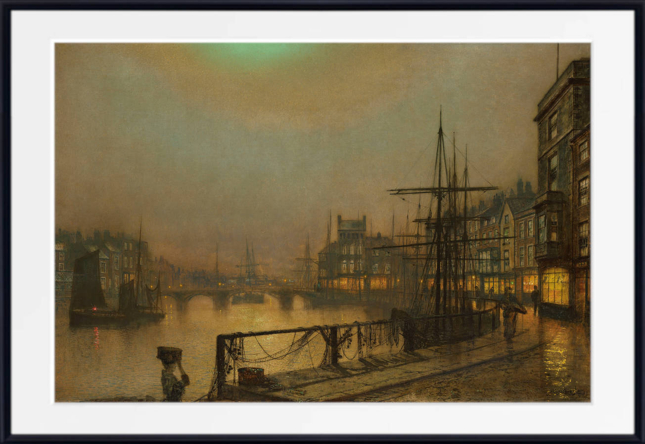
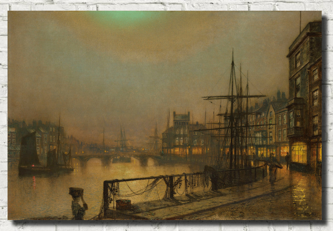
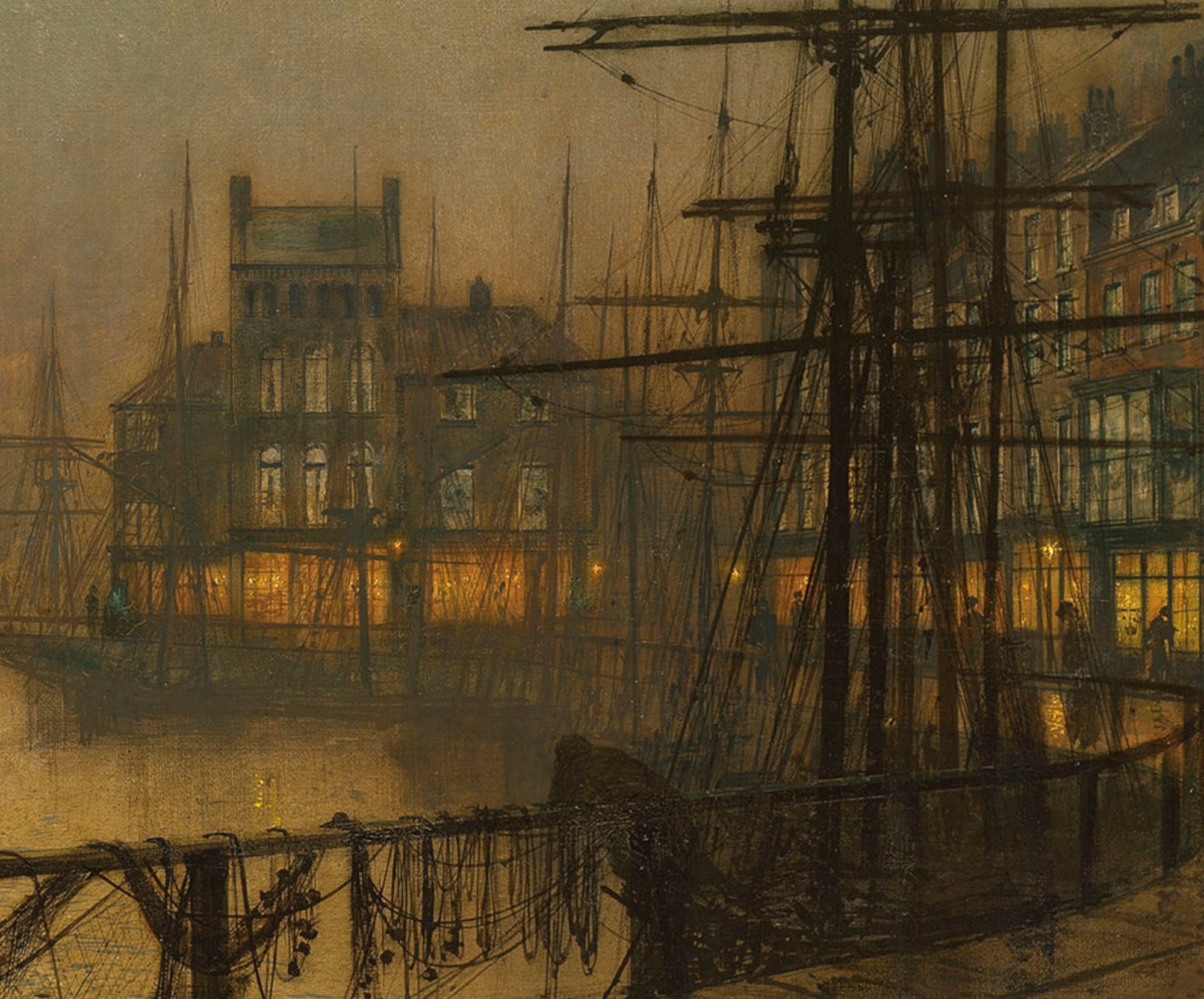
John Atkinson Grimshaw is particularly well suited to this palette. His moonlit roads, docks and Victorian streets combine architectural detail with mist, shadow and reflected light.
Browse the wider Architecture and Cityscape Prints collection for more urban subjects.
Grey Seascape and Coastal Wall Art
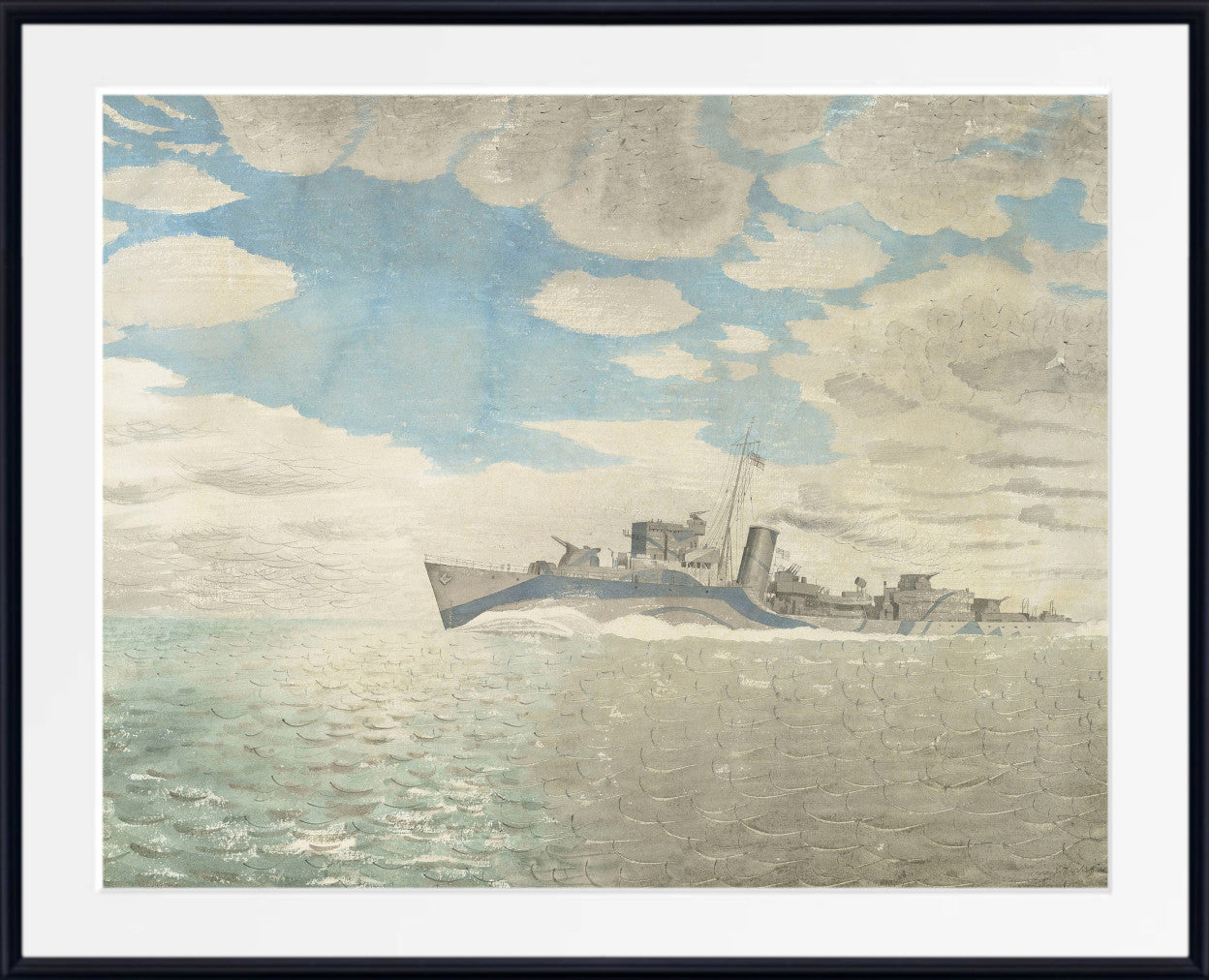
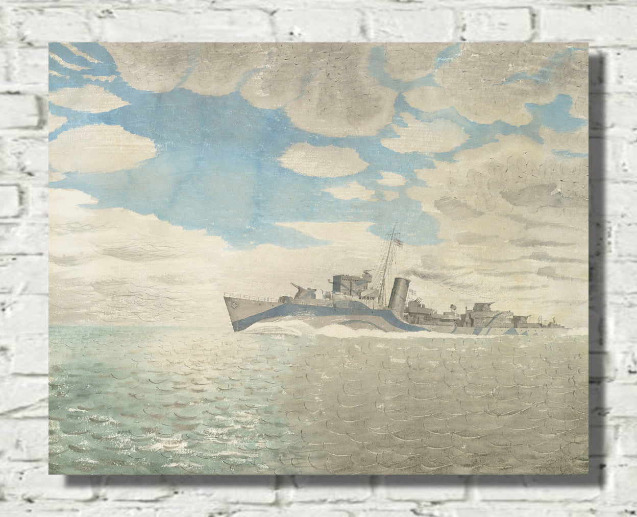
Grey seascape prints offer a restrained alternative to bright blue coastal artwork. Muted skies, calm water, weathered boats and distant horizons can make a room feel spacious, reflective and peaceful.
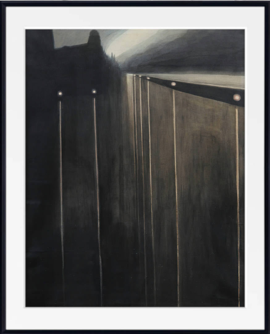
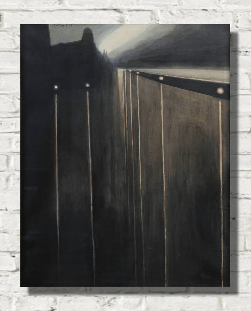
Léon Spilliaert is known for atmospheric coastlines, sea walls and introspective night scenes. Michael Ancher offers coastal and Skagen subjects in pale sand, cool light and muted maritime colours.
More coastal subjects can be found in the Seascape Art Prints collection.
Grey Abstract Wall Art
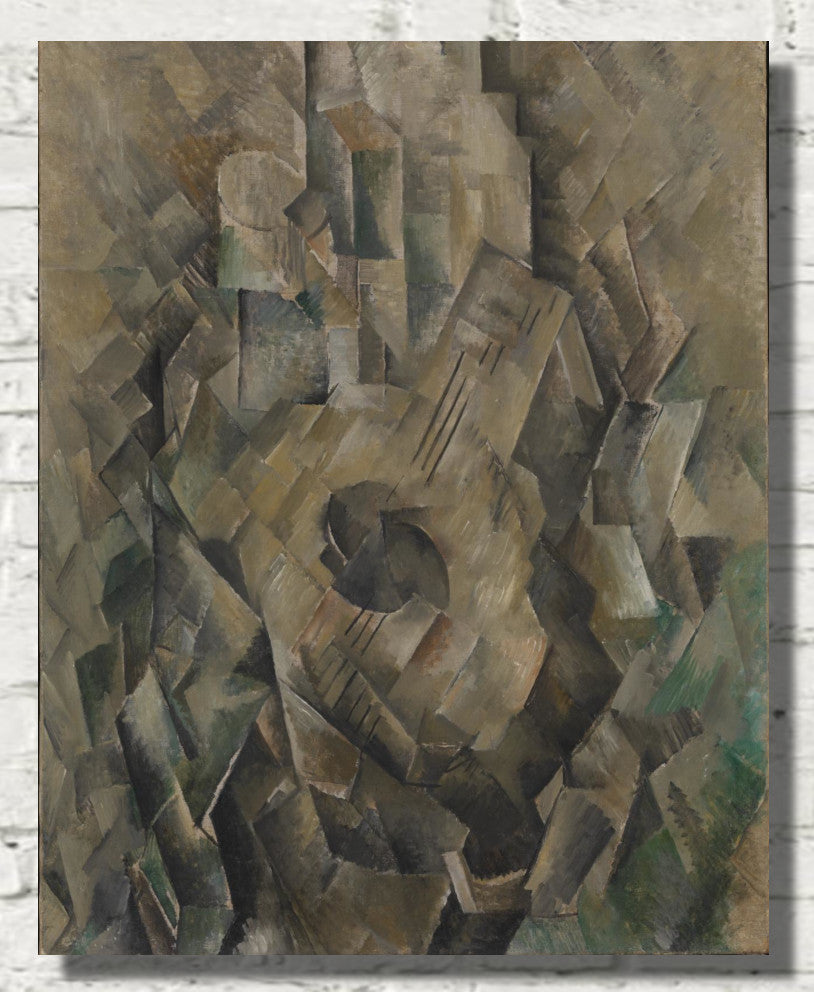
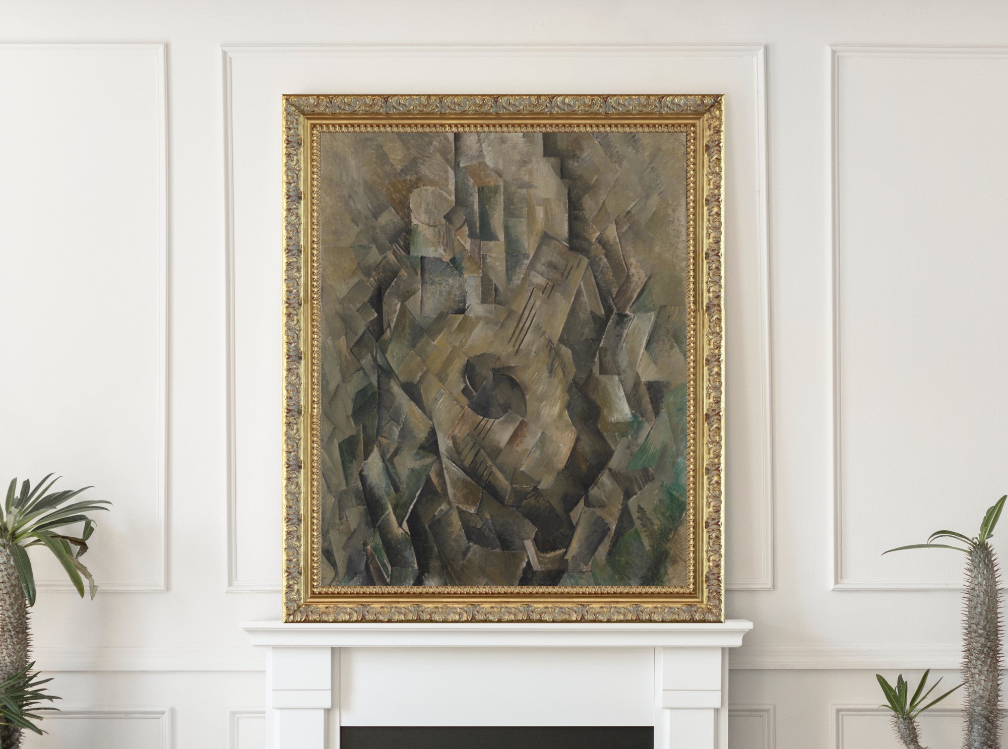
Grey abstract wall art adds shape, movement and visual interest without introducing a strong colour scheme. Pale grey compositions feel light and minimal, while charcoal and black-grey prints provide greater contrast.
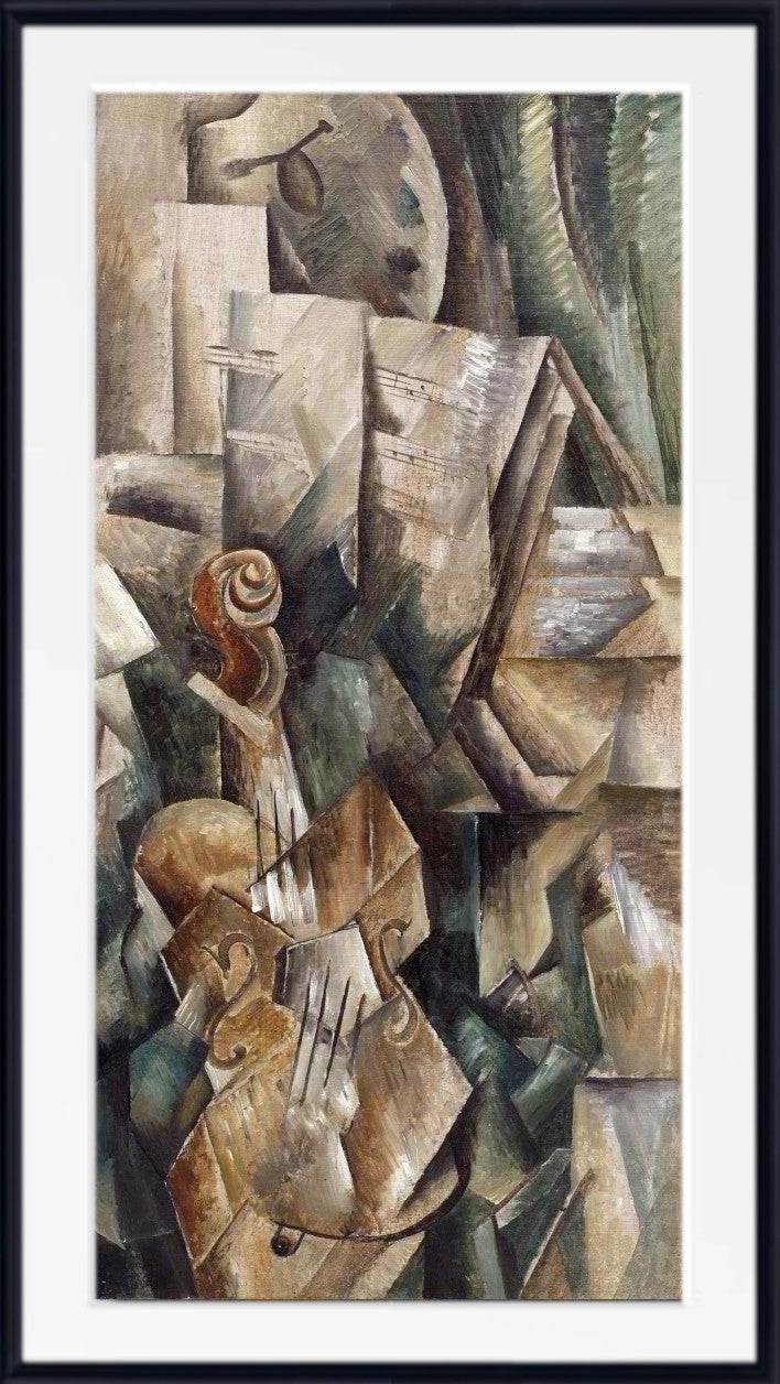
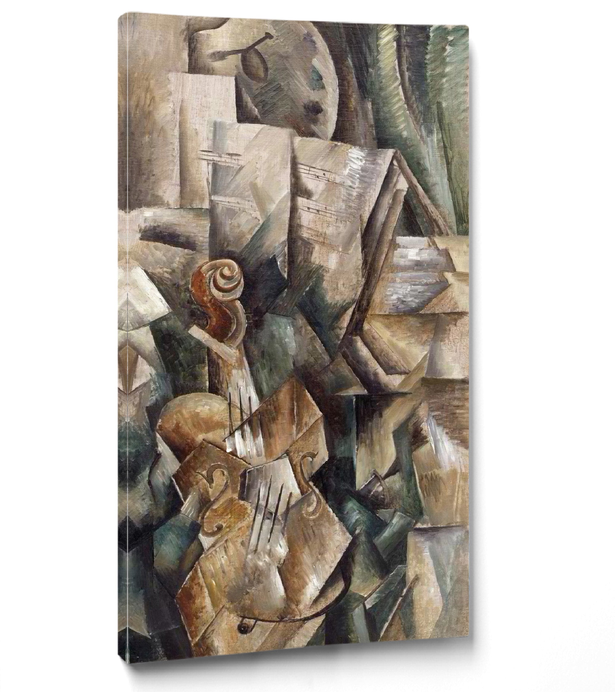
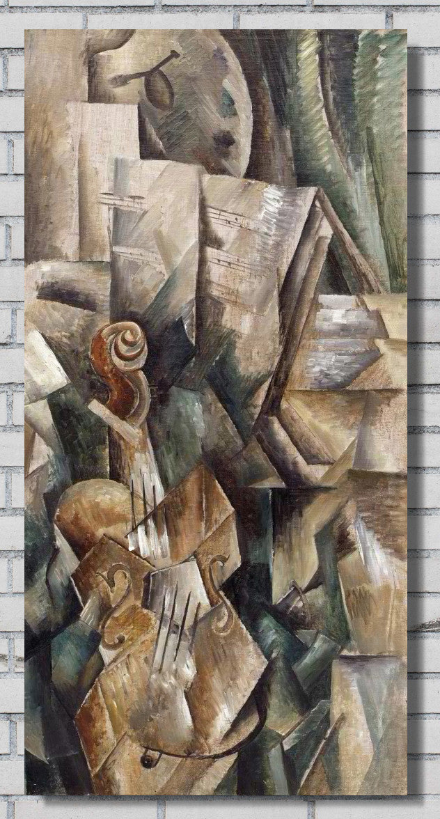
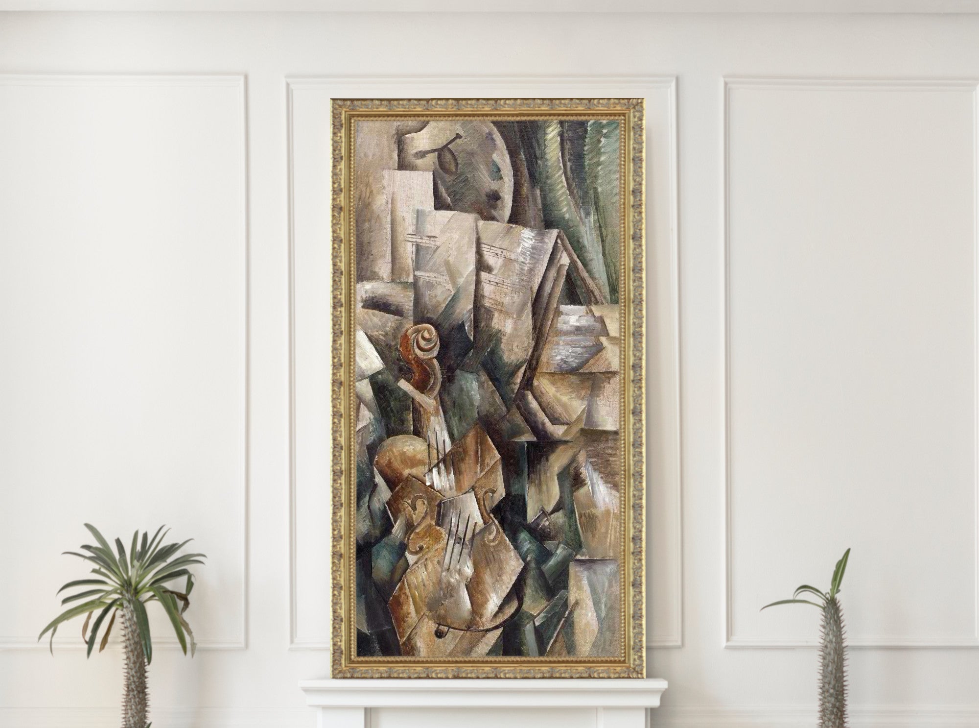
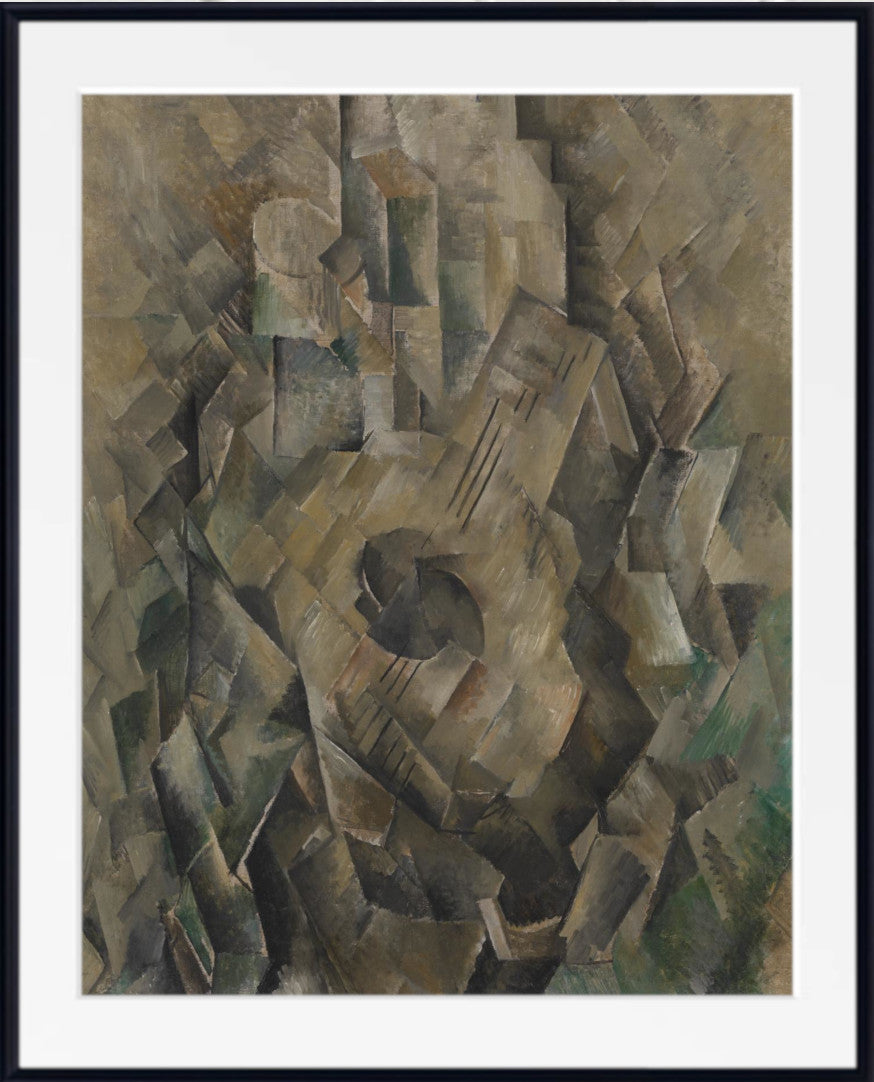
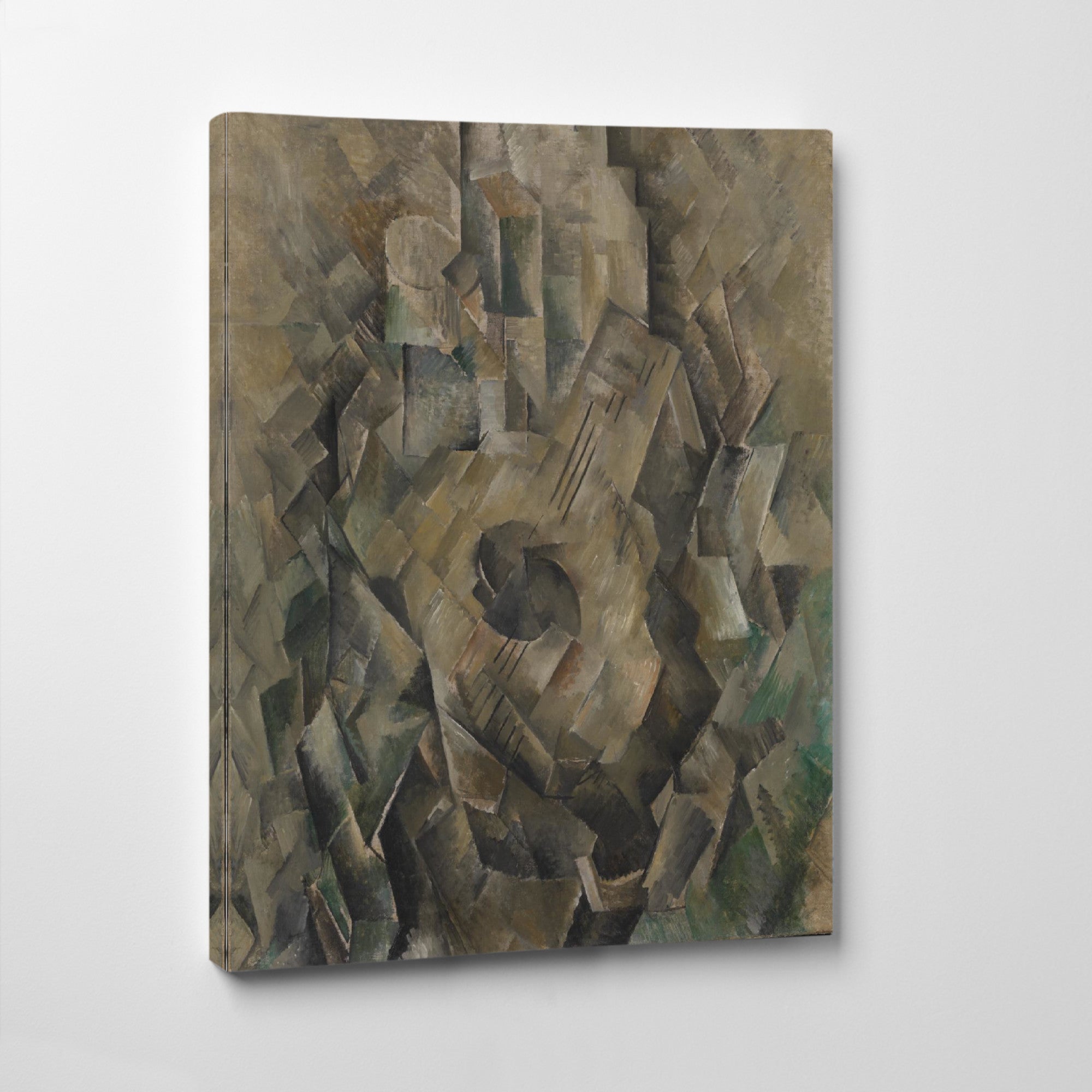
Georges Braque is a natural choice for Cubist and modernist work combining grey, brown, black and other muted tones. Abstract grey prints work especially well above sofas, beds, desks and sideboards.
Browse more modern compositions in the Abstract Art Prints collection.
Grey Portrait and Figure Prints
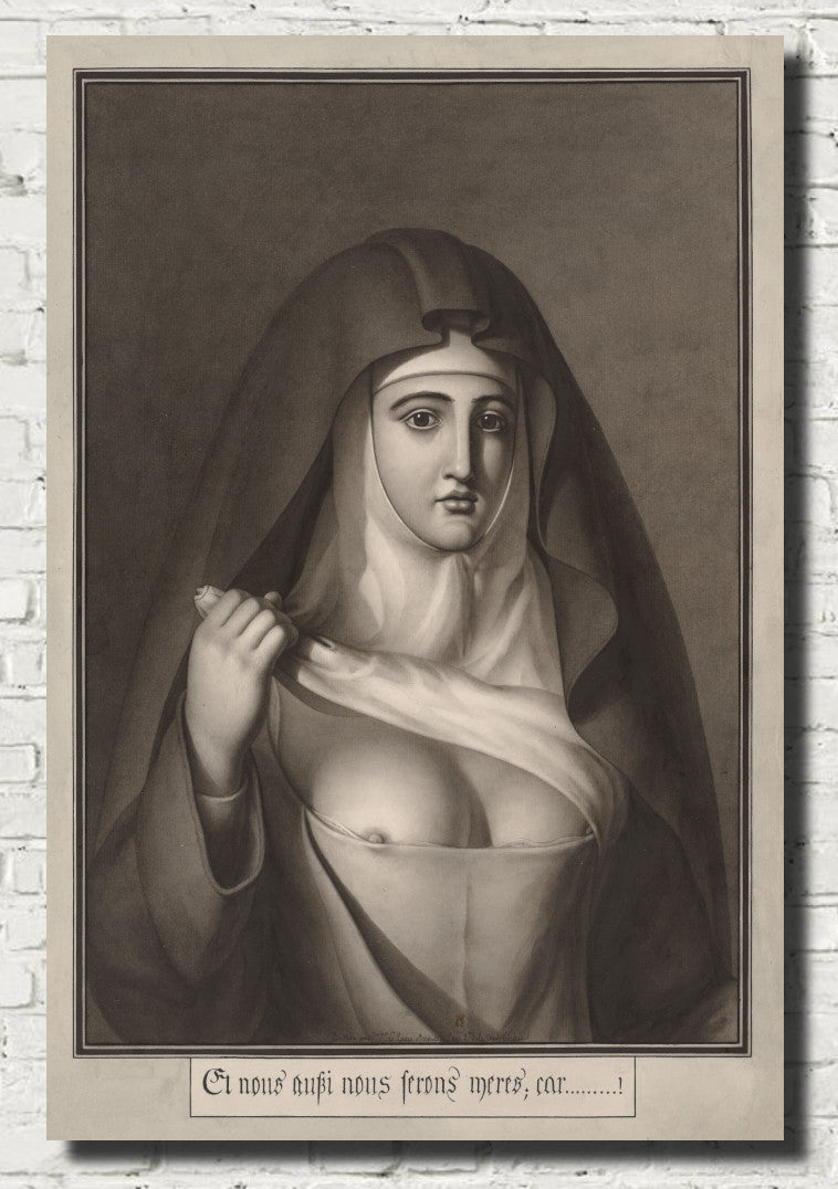
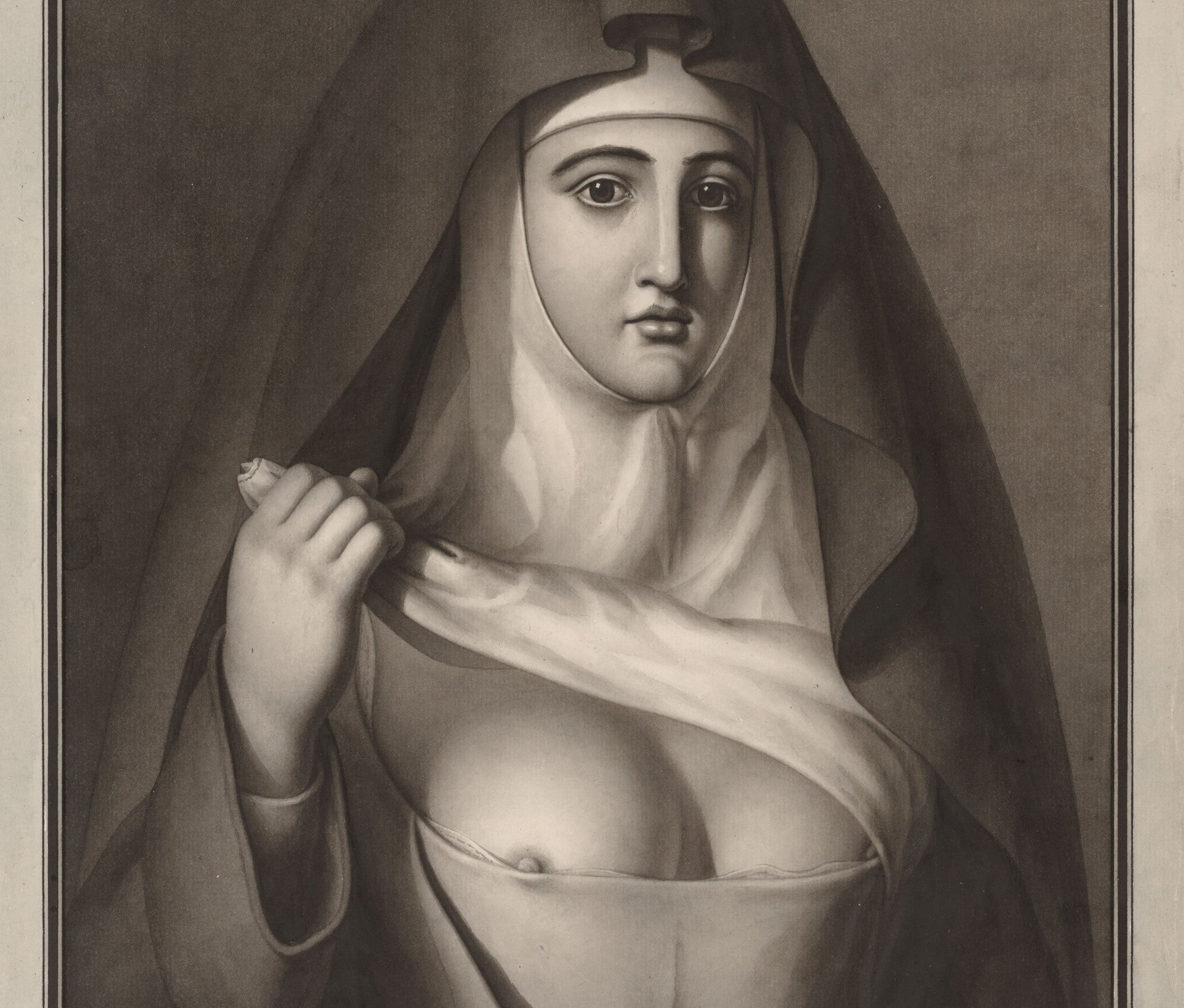
Grey portrait prints can feel elegant, serious and psychologically rich. They suit studies, bedrooms, hallways and traditional living rooms, particularly when presented in black, dark wood or antique-gold frames.
Egon Schiele offers expressive portraits and figure studies with spare backgrounds and muted colour. John Singer Sargent provides more refined portraiture in which grey, black and soft neutral tones create depth and elegance.
Explore the broader Portraits and People collection for additional figurative work.
Grey Still Life and Interior Prints
Grey still life and interior prints are suited to rooms where quiet detail matters more than bold colour. They work especially well in kitchens, dining rooms, studies, bedrooms and calm living spaces.
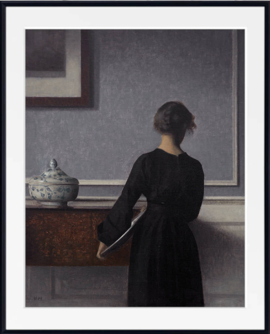
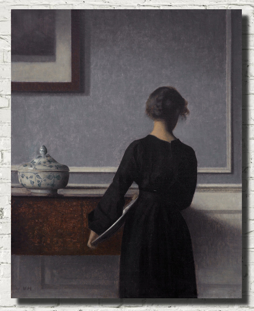
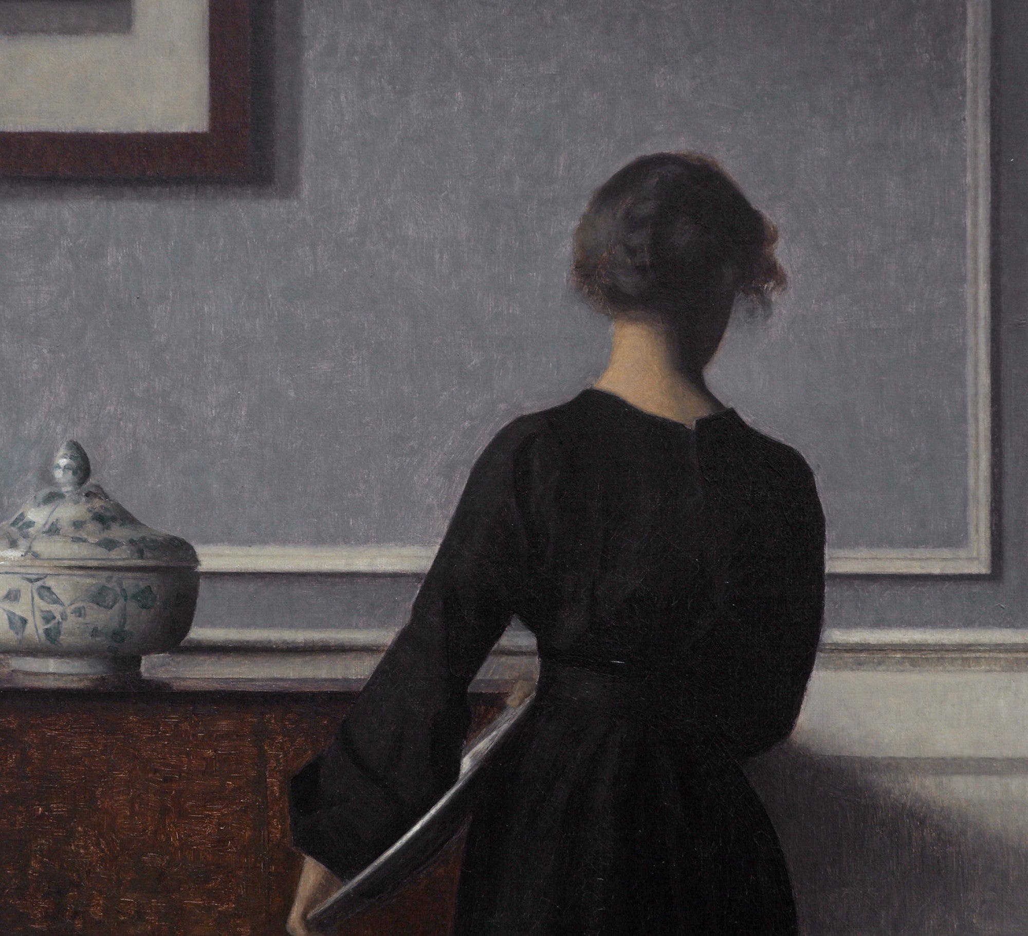
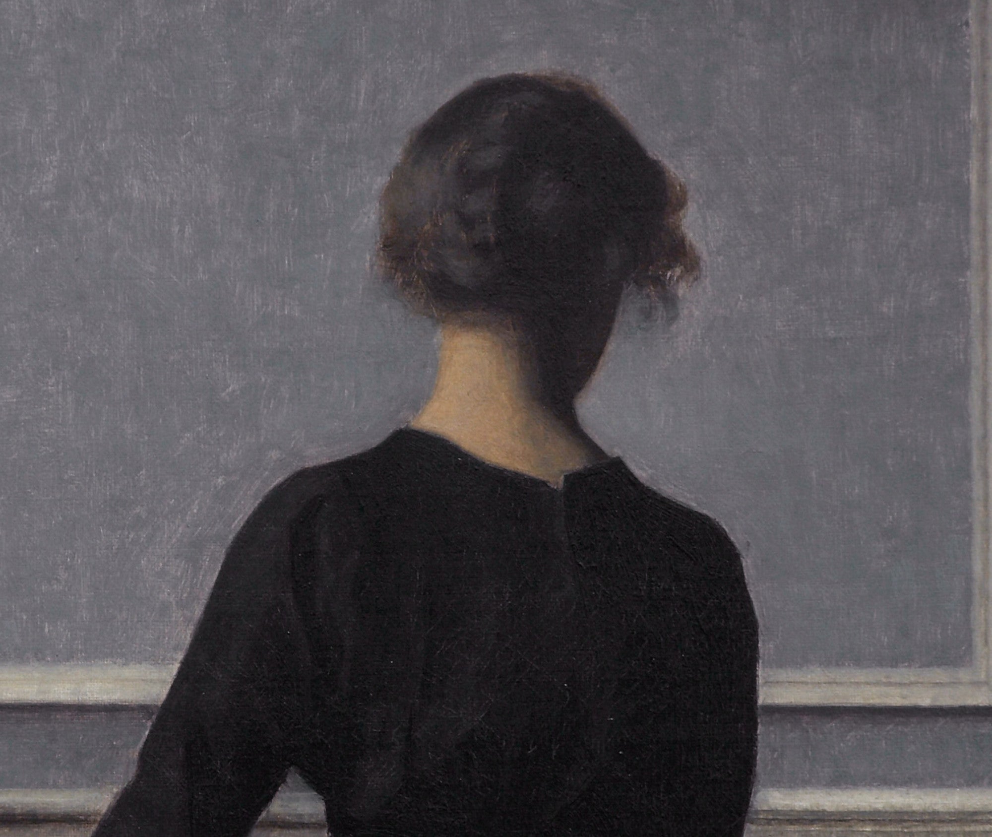
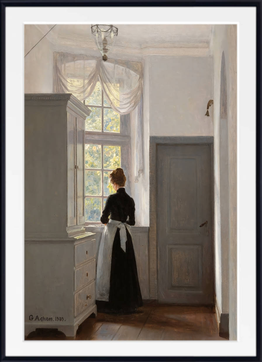
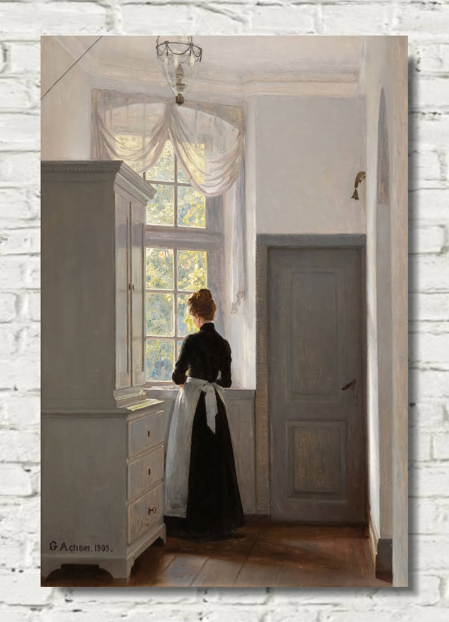
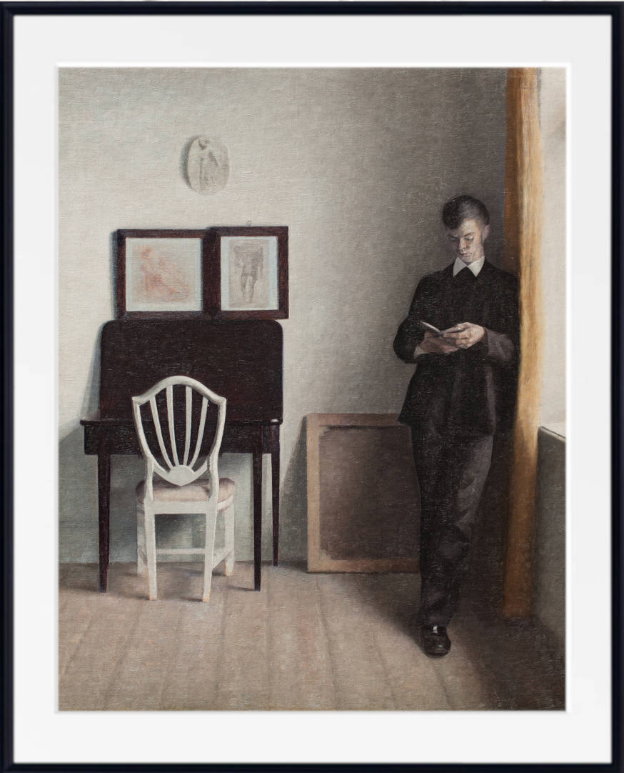
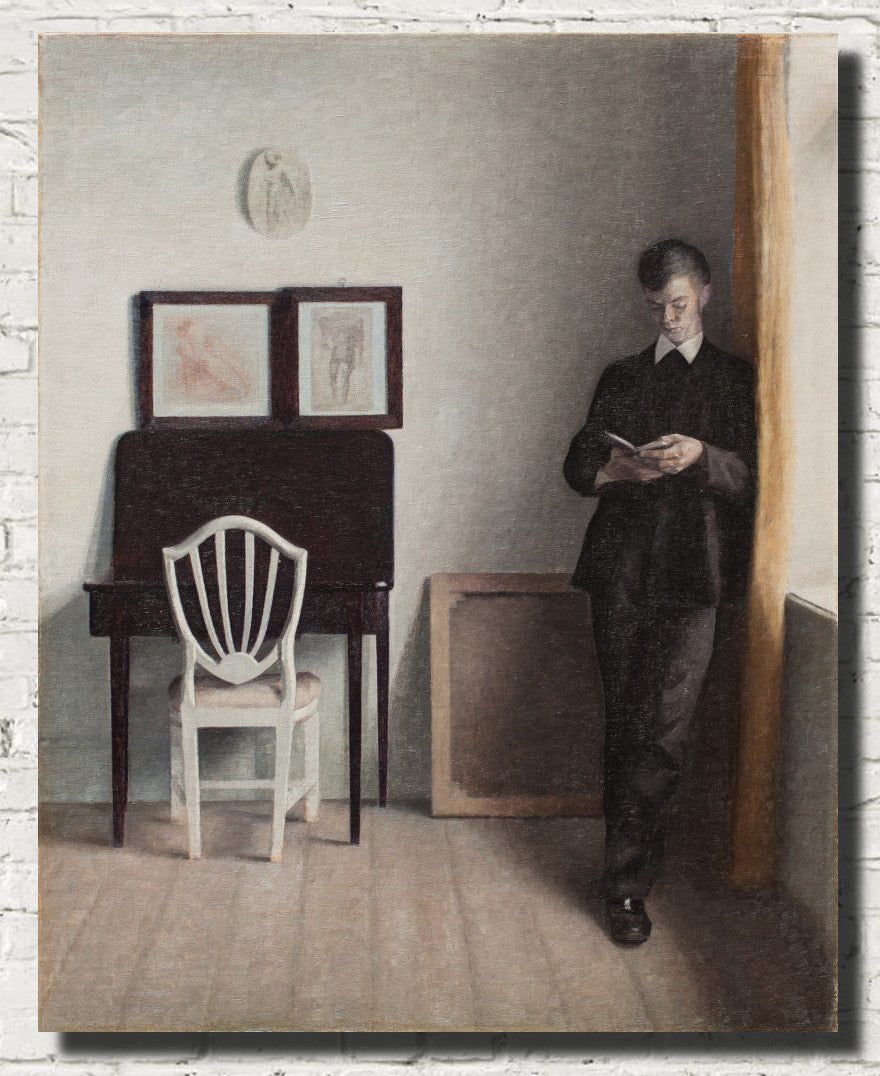
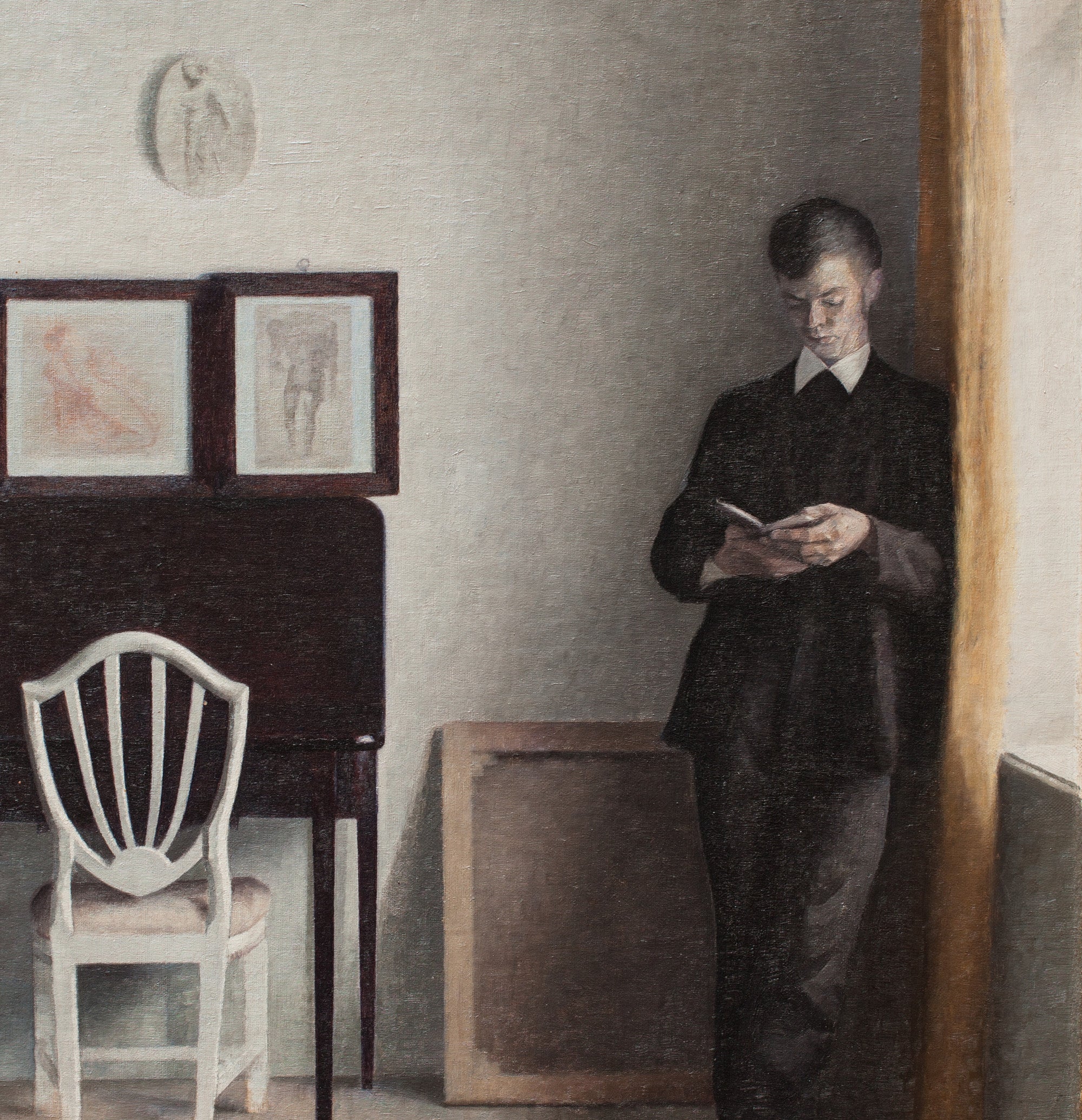
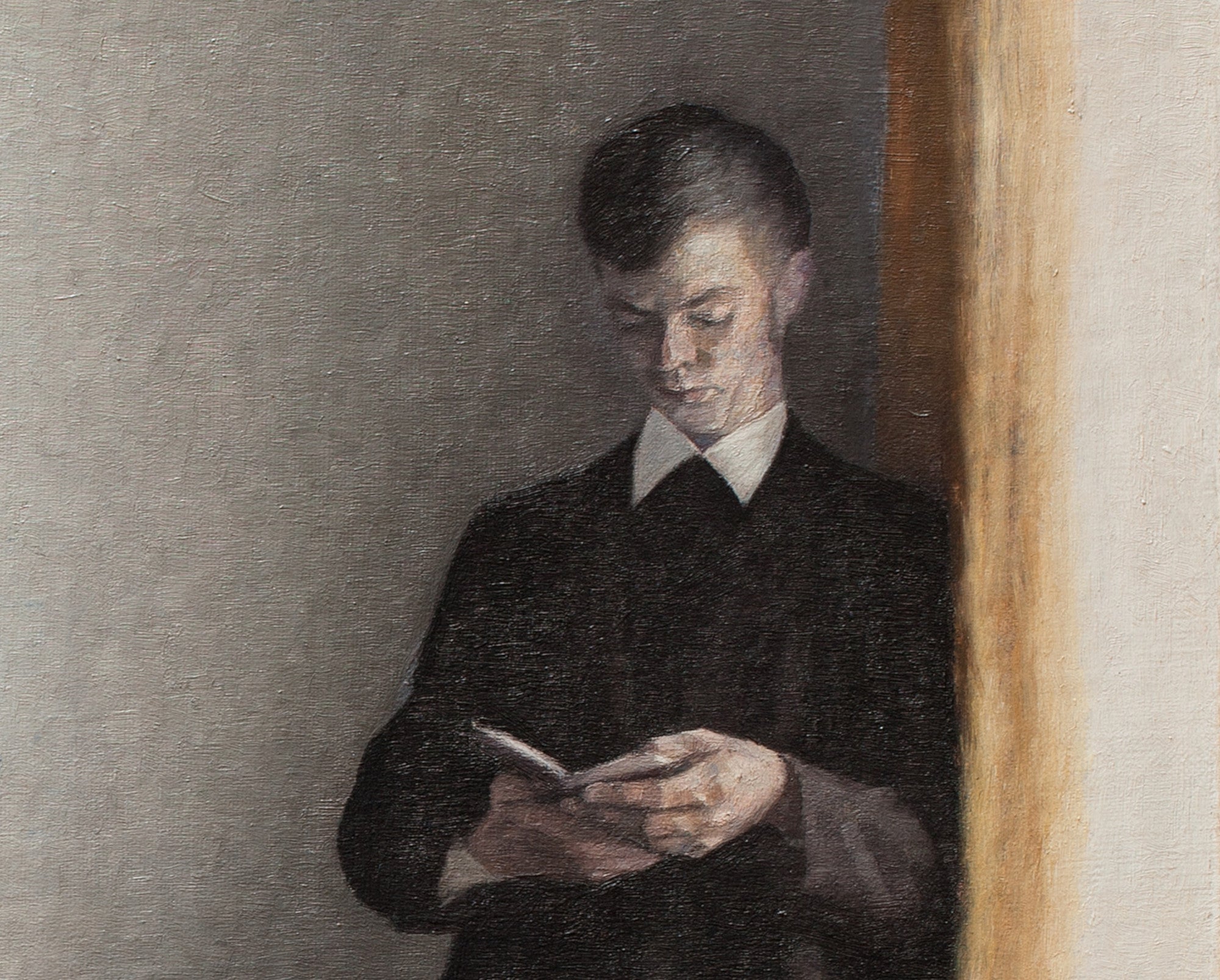
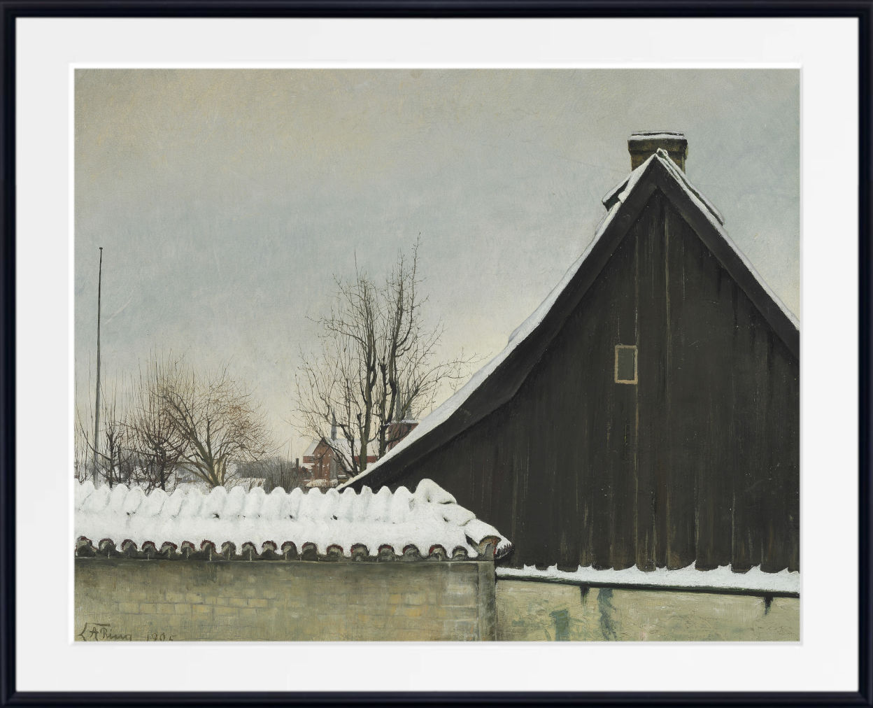
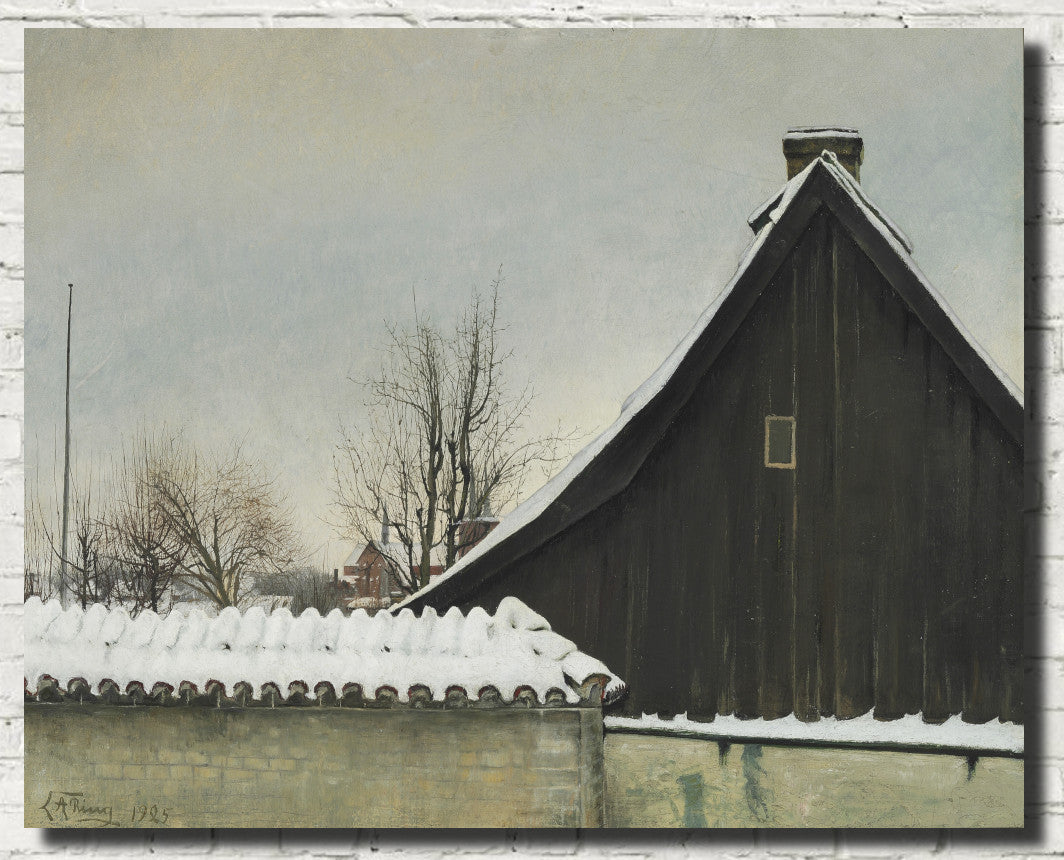
Scandinavian interiors often use subdued walls, natural light and a limited palette to create a feeling of stillness. Wilhelm Hammershøi is an especially important example, with restrained domestic scenes built around soft greys, pale walls and quiet human figures.
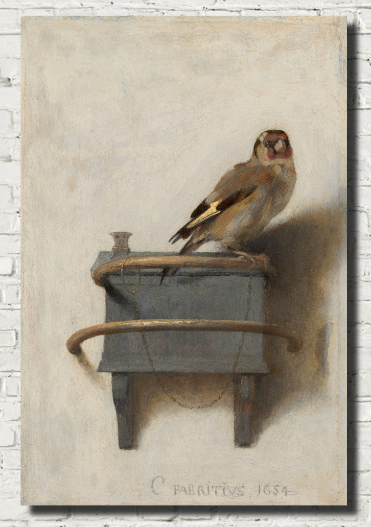
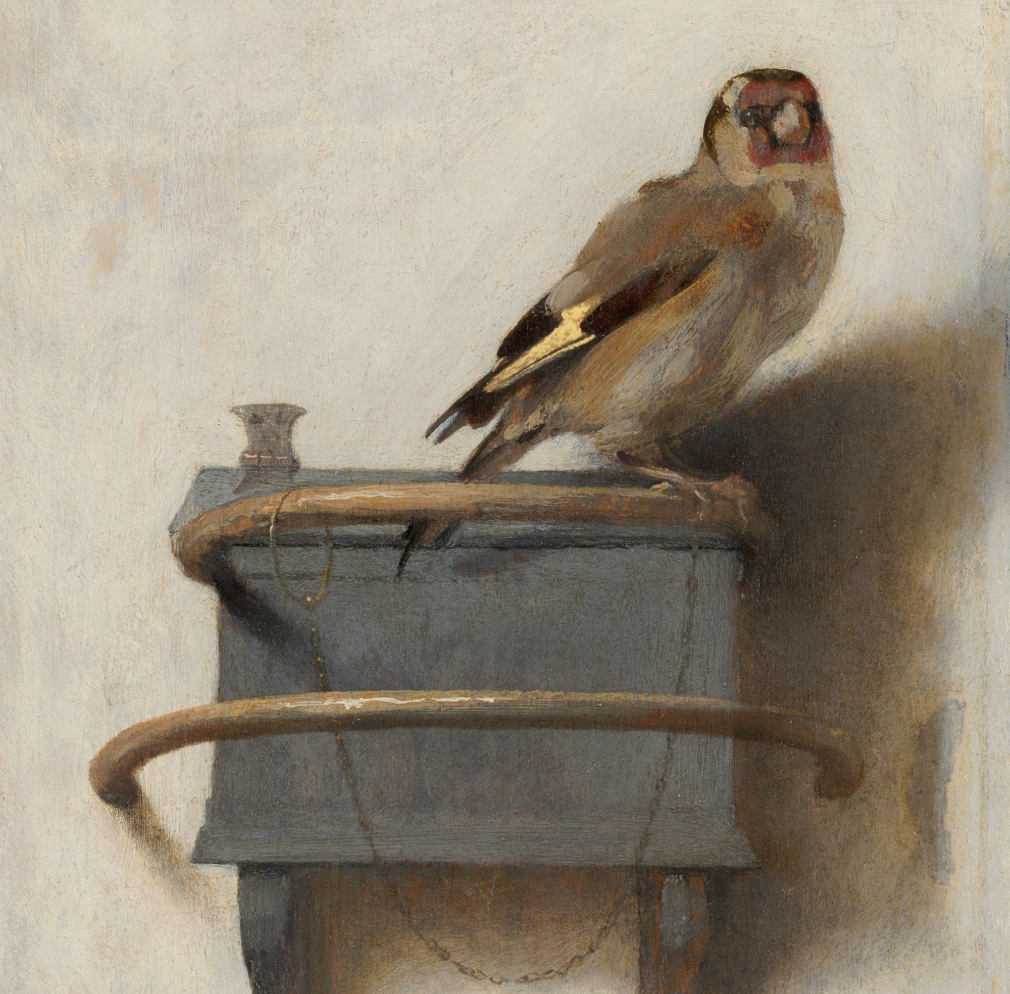
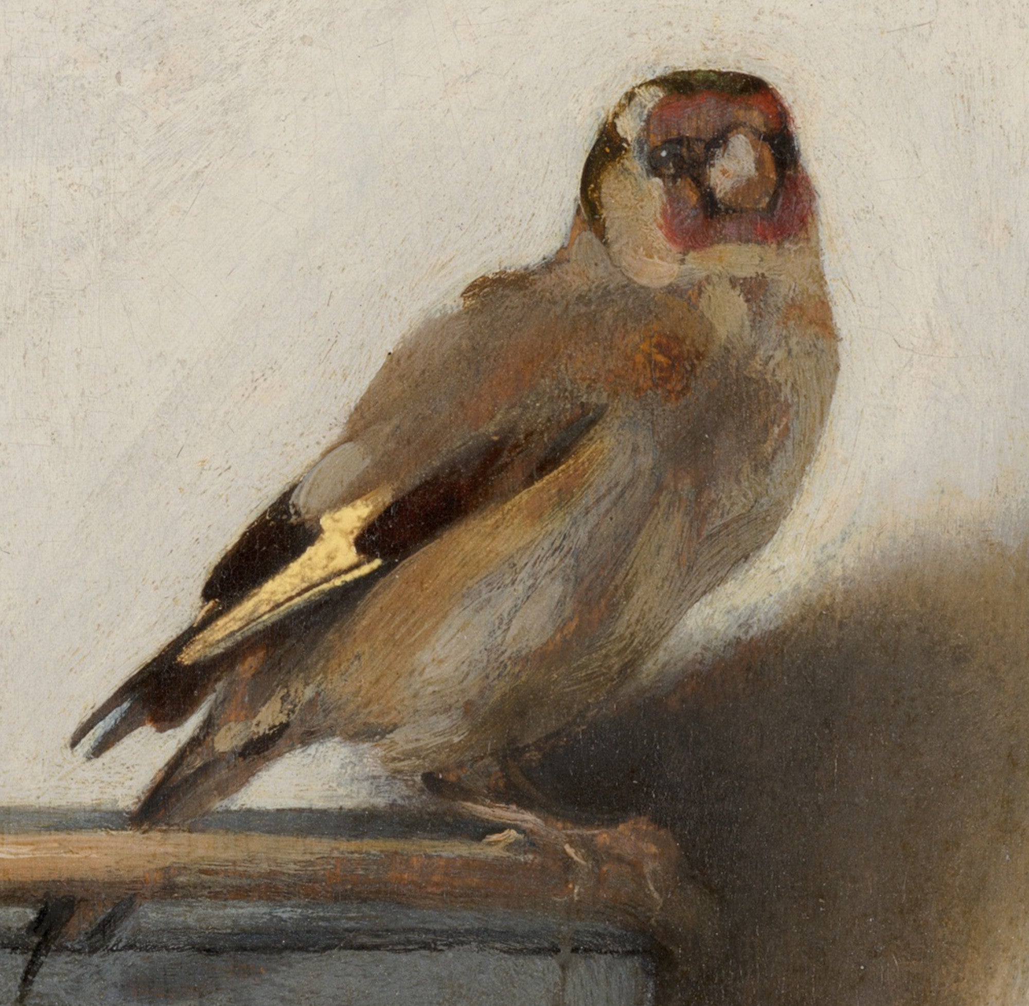
Carel Fabritius also offers understated works with pale neutral backgrounds and carefully controlled light.
Grey Wall Art for Living Rooms
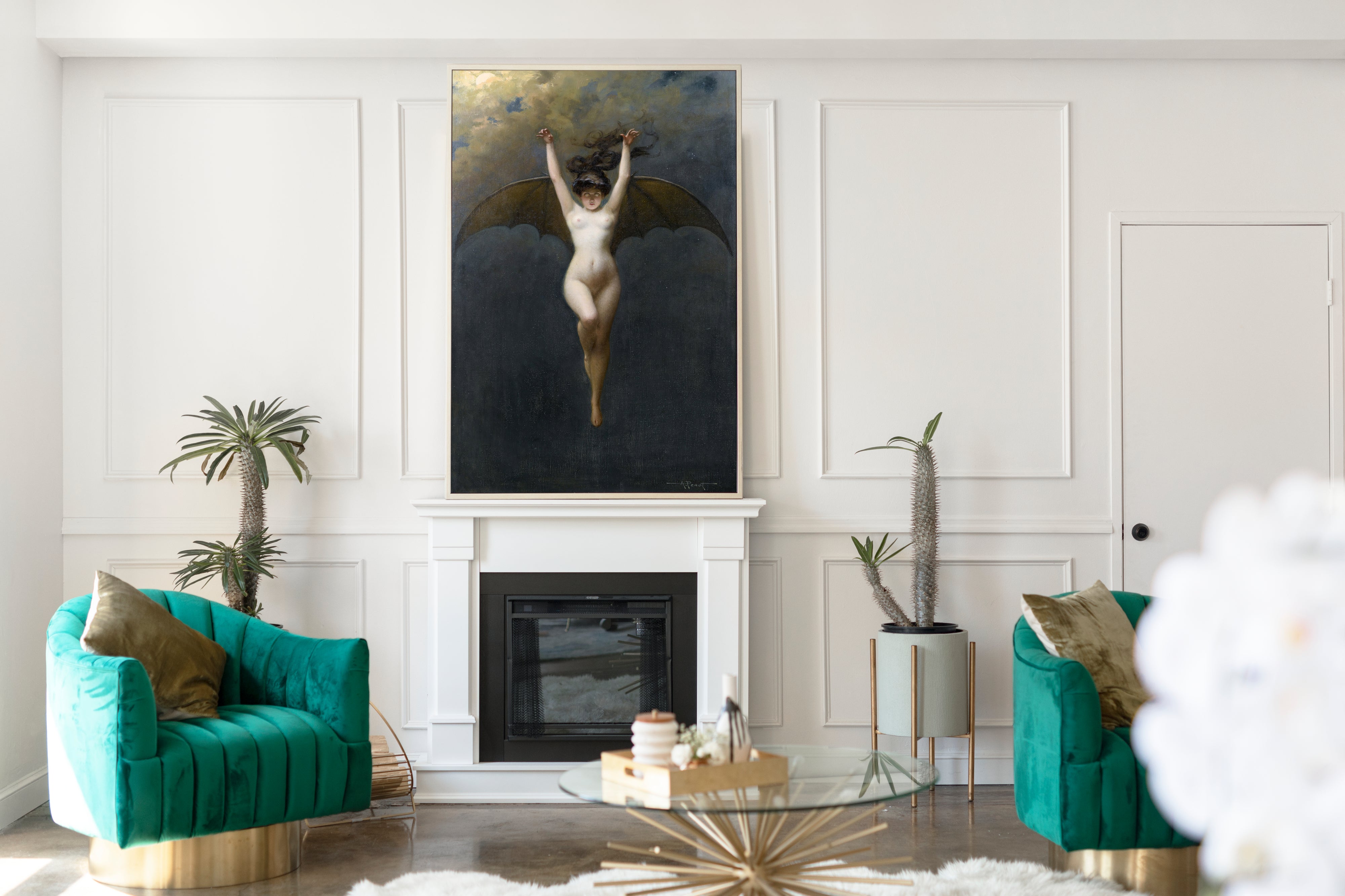
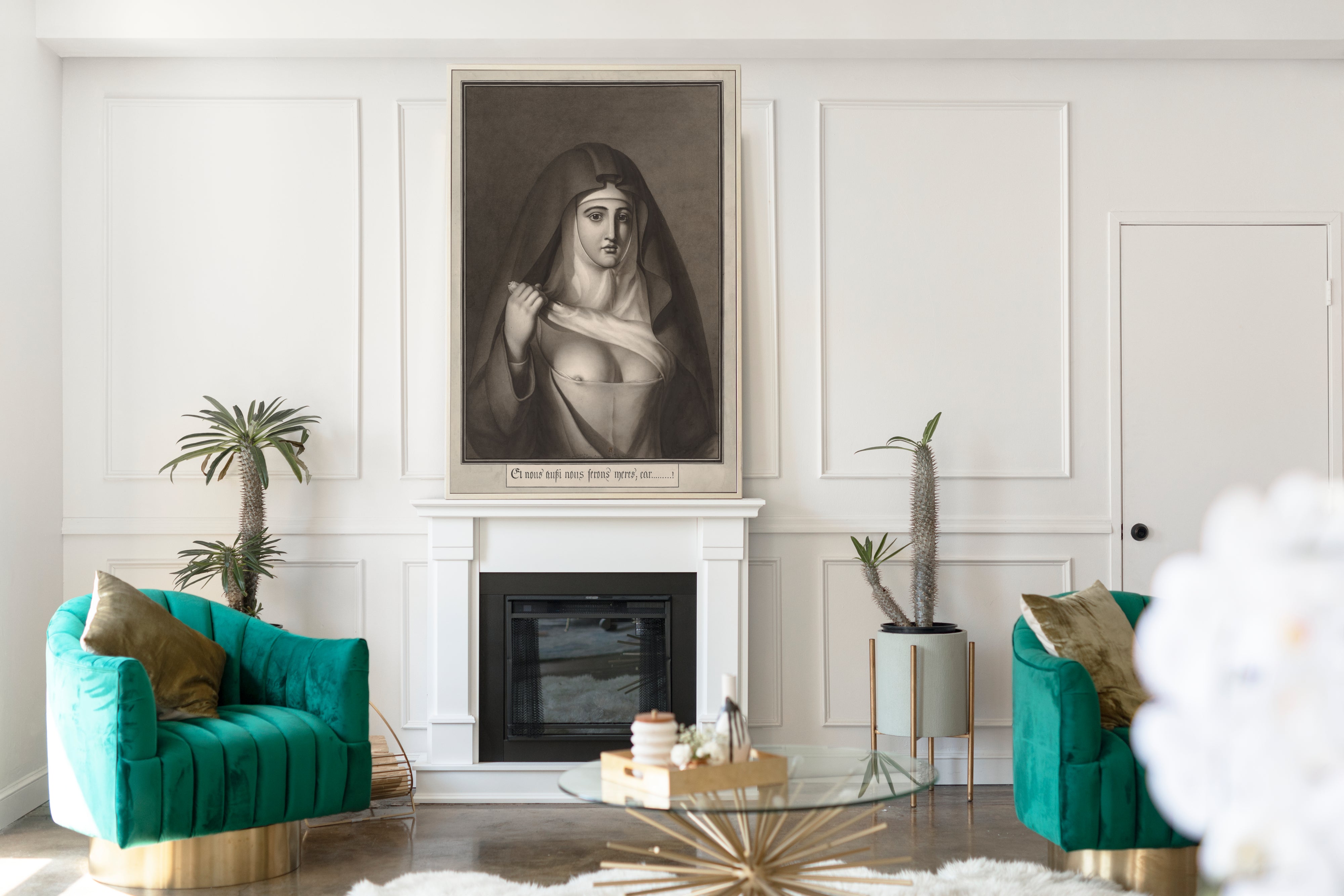
Grey living-room wall art can anchor a sofa wall without overwhelming the furniture below it. A large atmospheric landscape provides a calm focal point, while a darker charcoal composition can add definition to pale walls.
Grey artwork pairs naturally with cream upholstery, black frames, walnut furniture, oak floors, linen, stone, marble and brass. It can also balance stronger accents such as navy, green, rust or ochre.
Browse the dedicated Living Room Wall Art collection for more room-focused choices.
Grey Bedroom Wall Art
Soft grey landscapes, pale abstracts, misty seascapes and quiet figure studies can help create a restful bedroom. Silver, mist and blue-grey prints suit lighter rooms, while charcoal and slate tones provide stronger contrast in more dramatic interiors.
Consider the proportions of the wall before ordering. A wide landscape works naturally above a bed, while a pair or set of portrait-format prints may suit narrower spaces beside a wardrobe or dressing table.
Explore the Bedroom Wall Art collection for additional subjects and colours.
Grey Art for Hallways, Dining Rooms and Offices
Grey prints add interest to hallways and working spaces without making them feel busy. Architectural subjects, monochrome landscapes and restrained abstract compositions work particularly well in narrow or functional areas.
For commercial or home offices, grey wall art can appear focused and professional. In a hallway, a coordinated sequence of framed prints can create a calm route through the home.
Use the Hallway and Stairway Wall Art and Dining Room Wall Art collections to browse artwork selected for those spaces.
Artists Known for Grey and Muted Palettes
Artists whose work is especially relevant to grey-toned interiors include:
This is a selected group rather than a complete artist directory. The product filters provide the quickest way to explore the full collection by subject, orientation and proportions.
Choosing Grey Wall Art
Begin by deciding whether the artwork should feel soft or dramatic. Pale grey prints suit calm, airy rooms. Mid-grey works are versatile and easy to combine with most interiors. Charcoal and black-grey artwork creates stronger contrast and a more architectural appearance.
The subject also affects the mood:
- Landscapes and seascapes feel spacious and atmospheric.
- Abstract prints feel modern and structured.
- Portraits introduce character and human presence.
- Cityscapes feel urban and architectural.
- Still life and interior paintings create quiet detail.
Measure the available wall before choosing a size. One large print can create a clear focal point, while smaller prints usually work best in pairs, sets or carefully spaced gallery walls.
Colours That Complement Grey Artwork
Grey wall art works naturally with white, cream, beige, brown, black, navy, blue, sage green, olive, rust, ochre and blush pink. It also complements oak, walnut, stone, marble, brass, chrome and black metal.
For a soft neutral scheme, combine grey artwork with cream, beige and pale wood. For a stronger contemporary effect, use charcoal artwork, black frames and crisp white walls. Blue-grey prints can connect with navy furnishings, while warmer grey and taupe tones work well with brown, rust and natural timber.
Fine Art Prints, Framed Prints and Canvas Panels
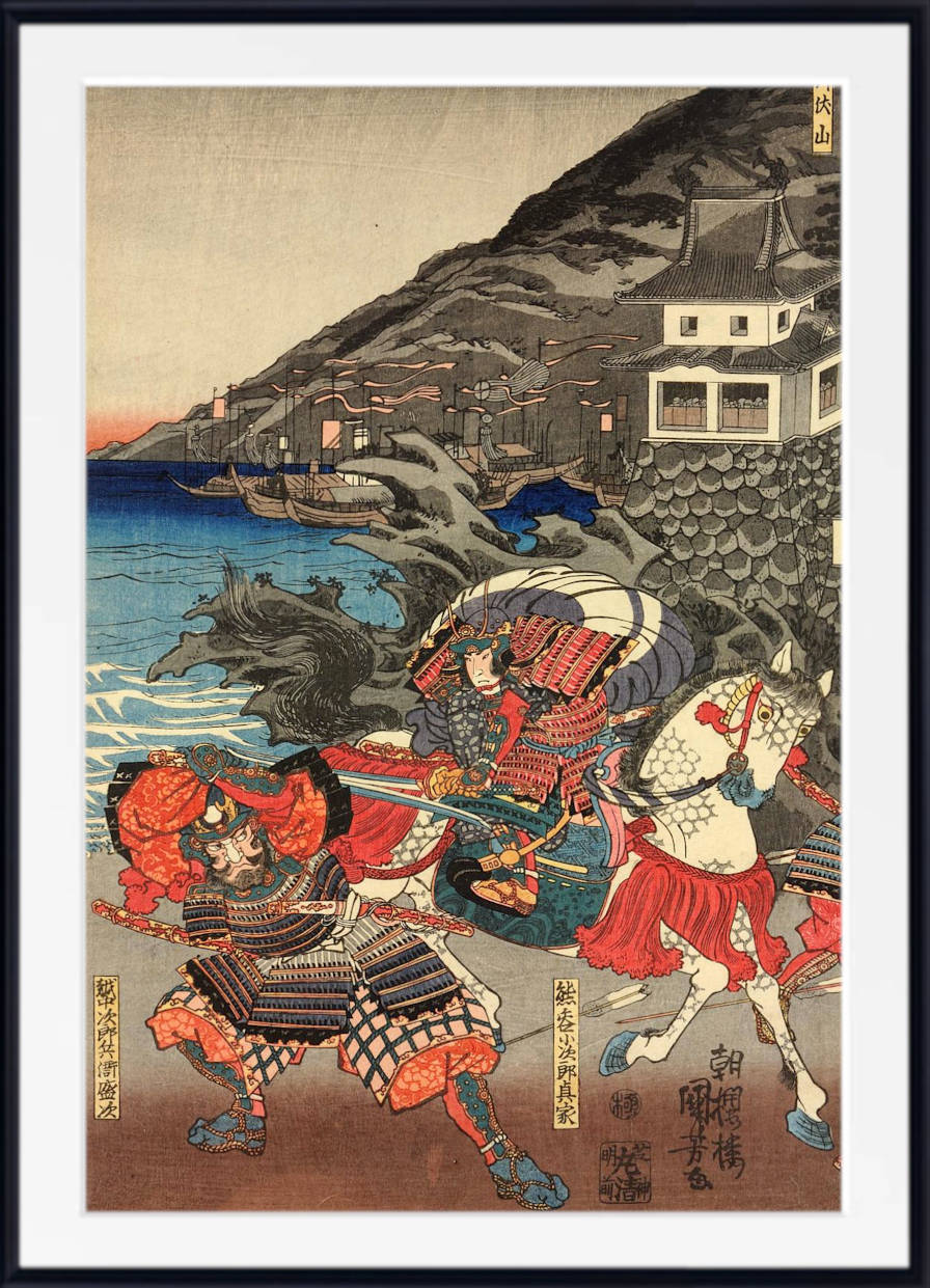
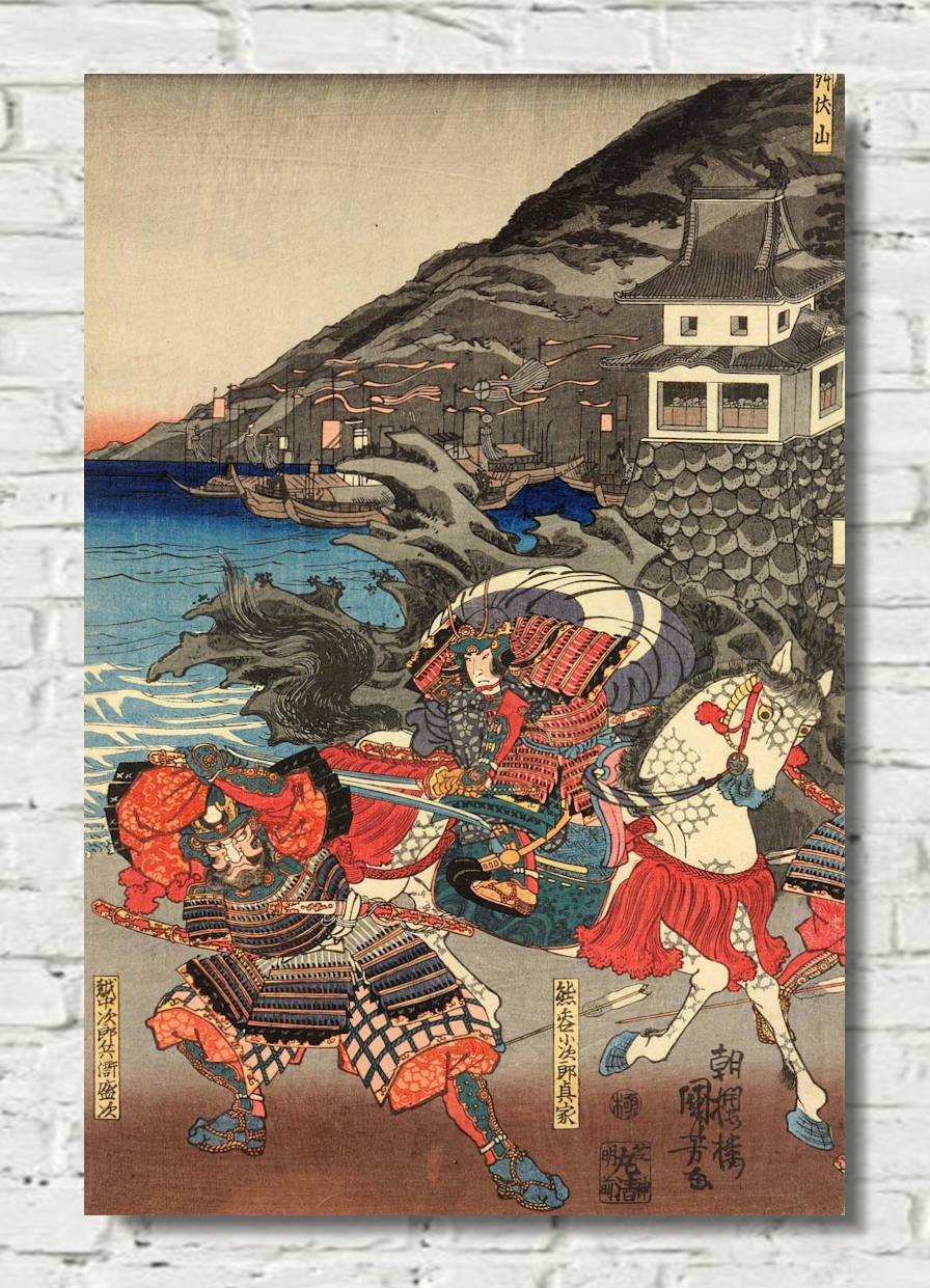
Grey artwork is available across GalleryThane’s fine art paper prints, framed prints and canvas panels. Choose an unframed print when you want to select your own frame, a framed print for a complete traditional presentation, or a canvas panel for a clean ready-to-hang finish.
Available formats and sizes vary by artwork, so review the options on the individual product page before ordering.
Frequently Asked Questions
What colours work well with grey wall art?
Grey wall art works with white, cream, beige, black, brown, navy, blue, green, rust, ochre and blush pink. It also complements natural wood, stone, brass, chrome and black metal.
Is grey wall art suitable for living rooms?
Yes. Grey artwork is versatile enough for both contemporary and traditional living rooms. It can add atmosphere without overwhelming the room and works particularly well above sofas, fireplaces and sideboards.
What type of grey art is best for bedrooms?
Soft landscapes, pale abstracts, misty seascapes and quiet interior paintings are strong bedroom choices. They create visual interest while maintaining a restful atmosphere.
Does grey wall art work in modern interiors?
Grey abstract prints, monochrome landscapes and architectural subjects work especially well in modern interiors. Their restrained palettes complement clean lines, pale walls, stone, metal and simple furniture.
What is the difference between grey, black and beige wall art?
Grey is generally cooler and softer than black but less warm than beige. Black creates stronger contrast, beige contributes warmth, and grey provides a flexible neutral position between them.
Are “grey” and “gray” the same colour?
Yes. “Grey” is the standard British spelling and “gray” is the standard American spelling. Both refer to the same colour.