Yellow Impressionist Prints
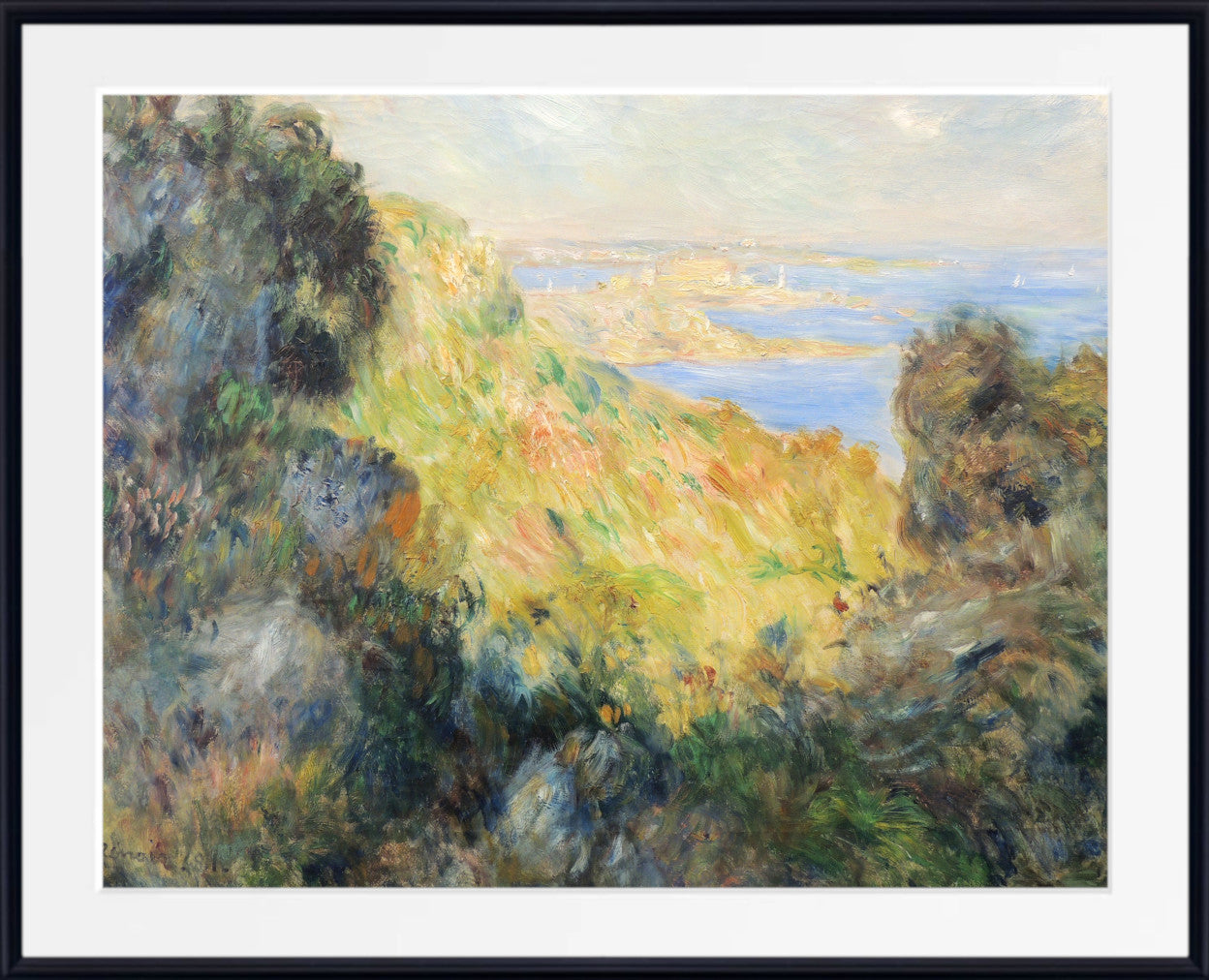
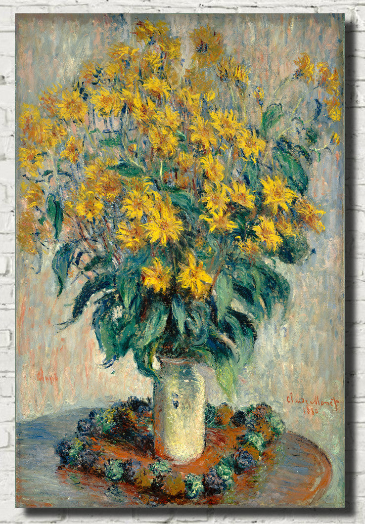
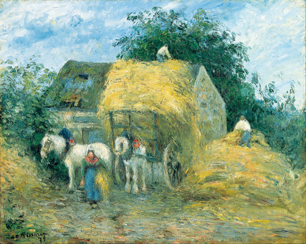
Explore our collection of yellow Impressionist prints, featuring sunlit gardens, golden fields, glowing haystacks, warm interiors, sandy beaches, flowers and luminous landscapes in shades of butter yellow, ochre, amber, mustard, gold and bright sunflower tones. From Claude Monet's changing sunlight and golden haystacks to Pierre-Auguste Renoir's radiant figures, Childe Hassam's bright gardens and Frederick Carl Frieseke's sun-filled interiors, yellow appears throughout Impressionist art as a colour of light, warmth and atmosphere.
Yellow Impressionist wall art can bring warmth, optimism and painterly colour into living rooms, bedrooms, dining rooms, hallways and home offices. Choose a soft golden landscape for a calm interior, a bright garden scene for greater energy or a warm yellow interior for a more intimate atmosphere. GalleryThane yellow Impressionist artwork is available in a wide range of sizes as fine art paper prints, framed prints and canvas panels.
Explore Yellow Impressionist Prints
Browse Impressionist art by colour, discover related yellow wall art and explore painters whose landscapes, gardens, interiors and figures reveal the expressive possibilities of yellow and gold.
Yellow in Impressionist Painting
Yellow is closely connected with the Impressionist fascination with light. The movement's painters wanted to capture the immediate appearance of a scene under particular conditions of weather, season and time of day, and yellow became one of the most effective colours for suggesting sunshine, warmth and reflected illumination.
Impressionist yellow is rarely limited to one pure hue. Pale lemon can suggest cool morning light, while ochre and mustard create earthier warmth. Gold and amber appear in late-afternoon sunlight, autumn foliage and harvested fields, while brighter yellow can illuminate flowers, dresses, parasols and sunlit walls.
Yellow also becomes more expressive through its relationship with neighbouring colours. Against blue it creates vivid contrast. Beside green it can suggest fresh vegetation and sunlight. Combined with pink, orange and red, it creates warmer, more radiant compositions.
This sensitivity to colour relationships allowed the Impressionists to make ordinary subjects feel alive with changing light. A haystack, garden path, beach or domestic interior could become a complex arrangement of warm and cool colour depending on the moment in which it was observed.
Claude Monet: Golden Haystacks, Sunlight and Gardens
Claude Monet repeatedly explored the effect of changing light on familiar subjects. Rather than painting a place only once, he often returned to it under different weather conditions and at different times of day, revealing how dramatically colour could change.
His famous Haystacks series is among the clearest examples. The same stacks could appear pale gold beneath strong sunlight, orange and amber towards sunset, blue-violet in shadow or almost enveloped by winter frost. Yellow and gold frequently dominate the warmer versions, transforming an ordinary agricultural subject into an extraordinary study of light.
Yellow also appears throughout Monet's gardens and landscapes. Sunlight catches flowers, paths, fields and buildings, while yellow-green foliage creates a luminous bridge between pure yellow and the deeper greens of vegetation.
At Giverny, Monet's garden offered endless combinations of flowers and natural colour. Yellow blooms could stand against pink, purple and blue flowers, while sunlight moved across leaves, paths and water. These works are especially well suited to interiors where warmth and natural colour are desired.
Pierre-Auguste Renoir: Warm Light and Radiant Colour
Pierre-Auguste Renoir was one of Impressionism's great painters of people, leisure and luminous colour. His paintings frequently contain warm yellows, creams, golds and ochres in clothing, interiors, sunlight and skin tones.
Renoir's outdoor scenes often show light filtering through trees and falling across figures, tables and clothing. Warm yellow highlights can flicker across the composition, combining with blue, pink, green and red to suggest the movement of natural light.
In portraits and interiors, yellow may appear in dresses, upholstery, wallpaper or surrounding decorative details. These warmer colours can create intimacy and richness without the heaviness associated with darker academic painting.
Yellow-toned Renoir prints are particularly effective in living rooms and dining rooms, where their combination of warmth, figures and social atmosphere can make a room feel welcoming and lively.
Childe Hassam: Yellow Gardens and American Sunlight
Childe Hassam brought Impressionist approaches to American subjects, painting city streets, gardens, coastal landscapes and country scenes with broken colour and luminous light.
Yellow appears throughout Hassam's work in flowers, autumn leaves, sunlight, sand, buildings and decorative interiors. His garden paintings can be particularly rich in yellow, combining golden blooms with green foliage, blue sky and flashes of white and pink.
In urban scenes, sunlight can warm façades and streets, while autumn paintings introduce ochre, amber and gold. These works demonstrate how yellow can move between bright decorative colour and subtler atmospheric warmth.
Hassam prints are particularly useful for living rooms, bedrooms and home offices where you want colour that feels lively but still rooted in landscape, architecture or garden subjects.
Frederick Carl Frieseke: Yellow Rooms and Sunlit Gardens
Frederick Carl Frieseke became known for paintings of women, gardens and domestic interiors filled with luminous colour and decorative pattern. His years at Giverny placed him within the international artistic community that developed around Claude Monet's famous garden village.
Yellow is particularly important in many Frieseke paintings. It appears in wallpaper, dresses, furniture, sunlight and flowers, often combined with pink, green, blue and violet. His interiors can glow with warm colour, while his garden scenes dissolve figures and vegetation into shifting patterns of light.
Afternoon – Yellow Room is a particularly striking example of his use of yellow within a domestic setting. Rather than acting merely as a background colour, yellow helps establish the entire warmth and atmosphere of the room.
Frieseke's yellow-toned prints are especially effective in bedrooms, living rooms and reading areas where warmth, elegance and a more intimate sense of colour are desired.
Gustave Caillebotte: Sunlit Gardens and Modern Landscapes
Gustave Caillebotte is famous for his striking views of modern Paris, but he was also an enthusiastic painter of gardens, riverbanks, orchards and cultivated landscapes.
In his outdoor paintings, yellow can appear in sunlit lawns, flowers, autumn foliage, paths and reflected light. His compositions often have strong perspective and carefully structured spaces, giving his landscapes a distinctive clarity.
This makes Caillebotte particularly suitable for interiors that combine an appreciation of historic art with cleaner, more contemporary design. His garden and landscape scenes can bring natural warmth without appearing excessively soft or decorative.
Eugène Boudin: Golden Beaches and Coastal Light
Eugène Boudin was an important precursor of Impressionism and a major influence on the young Claude Monet. He became celebrated for coastal scenes, harbours, beaches and expansive skies painted directly from observation.
Yellow appears in sand, sunlight, buildings, sails and reflections, often set against cooler blue and grey skies. This contrast between warm shore and cool atmosphere gives many of Boudin's beach scenes their distinctive freshness.
Boudin's paintings are excellent choices for rooms where you want both warmth and a sense of openness. Golden sand and light can brighten an interior, while sea and sky prevent the palette from feeling overly warm.
Featured Yellow Impressionist Artists
Explore painters whose landscapes, gardens, figures, beaches and interiors reveal the warmth and variety of yellow, ochre and gold within and around Impressionism.
Yellow Impressionist Landscape Prints
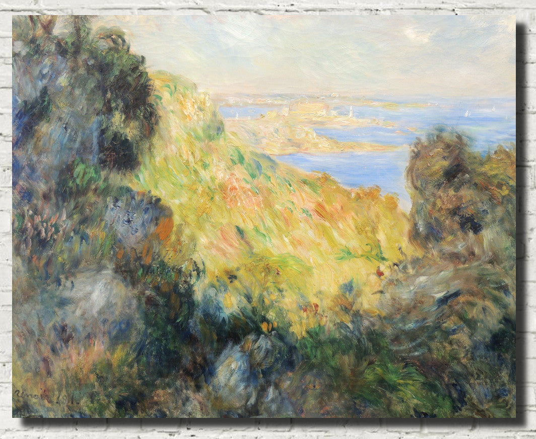
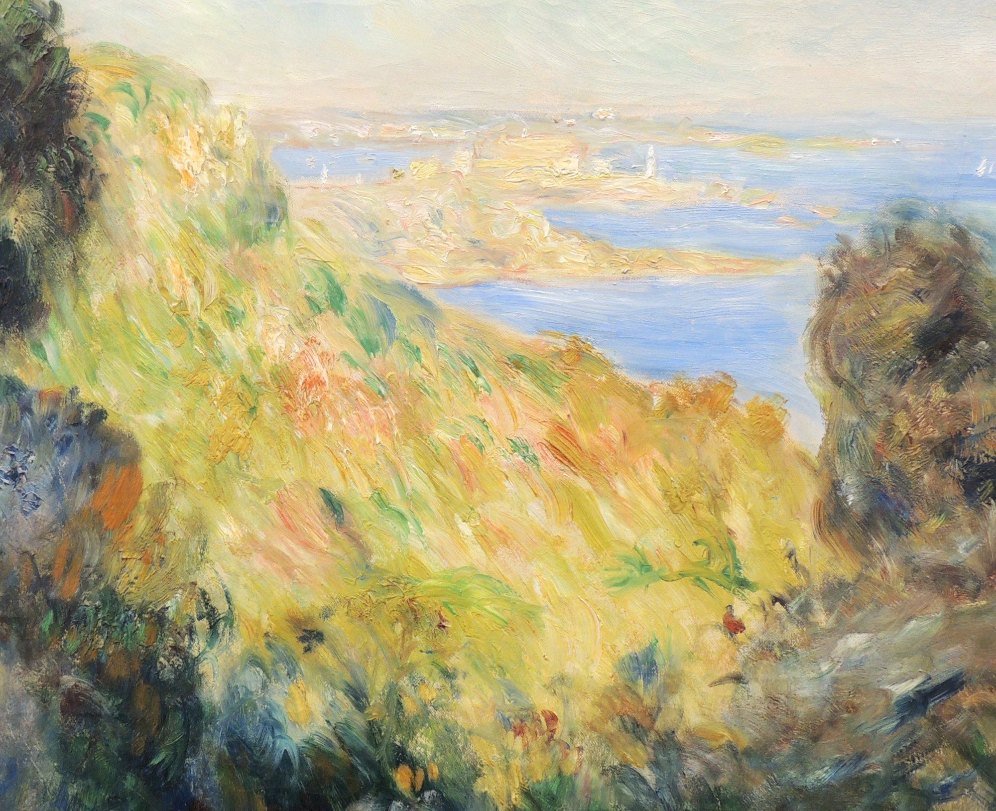
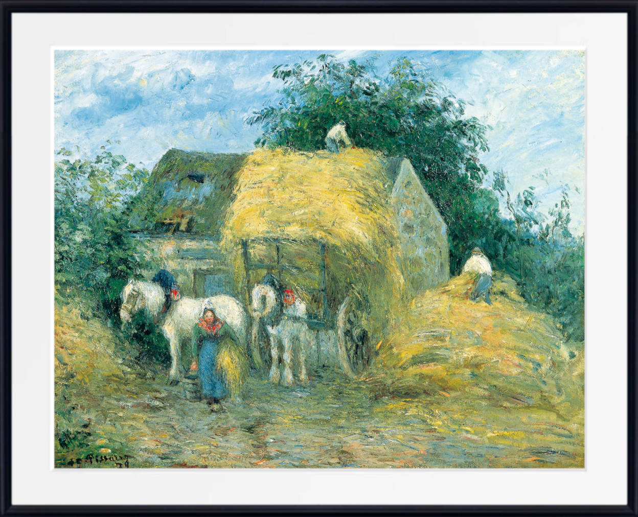
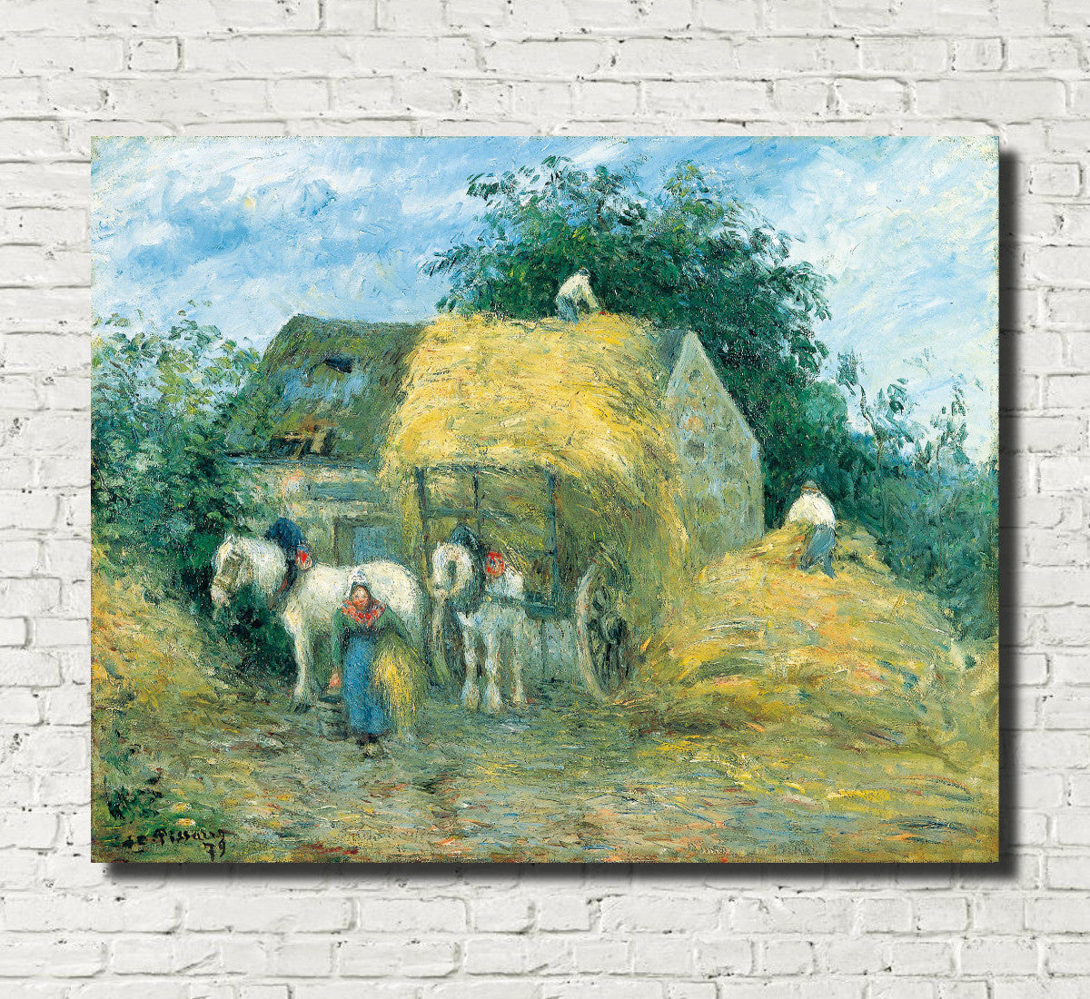
Landscape gave Impressionist painters endless opportunities to study yellow in nature. Harvested fields, dry grass, sandy roads, autumn foliage, sunlight and flowers could all introduce warm tones into a composition.
Yellow landscapes can range from soft and muted to intensely radiant. Pale ochre and beige create an understated effect, while golden fields and bright sunlight can become the dominant features of an artwork.
Monet's haystacks are among the most famous examples, but warm yellow landscapes appear throughout Impressionist and American Impressionist painting. Fields, gardens and rural roads can all take on yellow and gold tones under strong sunlight or as the seasons change.
For a wider selection of fields, countryside, mountains, rivers and scenic paintings, explore the Landscape and Scenery Fine Art Prints collection.
Yellow Impressionist Garden and Floral Prints
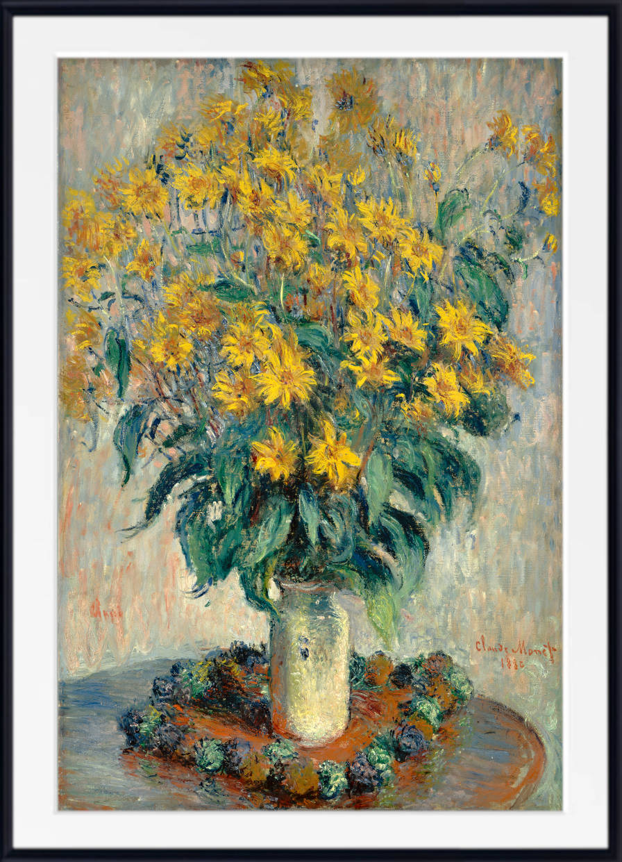
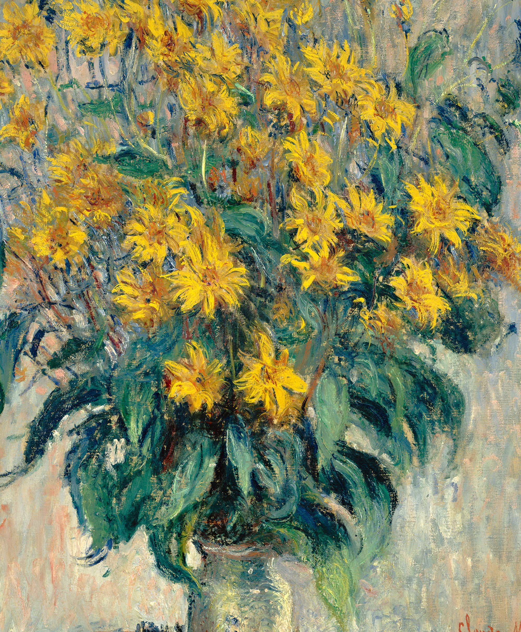
Flowers offered Impressionist painters brilliant opportunities to use yellow. Sunflowers, chrysanthemums, roses, irises and mixed garden borders could introduce flashes of lemon, gold and amber among green foliage and other flower colours.
In a garden painting, yellow often becomes even more vivid when placed beside violet, blue or purple. Against green foliage it feels natural and fresh, while combinations with pink and orange create greater warmth.
Monet and Hassam are particularly strong choices for luminous garden scenes, while Frieseke often combined flowers with figures and decorative surroundings.
For more flower paintings, garden scenes and botanical artwork, explore the Floral Wall Art collection.
Golden Fields and Haystack Prints
Fields and haystacks became powerful subjects for Impressionist painters because their appearance could change dramatically with weather and light. A field that appeared pale yellow beneath midday sun might become orange, gold or rose at sunset.
Monet's Haystacks series transformed a simple rural motif into an extended investigation of perception. By painting similar subjects repeatedly, he demonstrated that colour is never fixed: it changes according to atmosphere, season and the position of the sun.
Golden landscape prints are particularly effective in living rooms and dining rooms because they create warmth without depending on a strongly decorative subject. They pair naturally with cream, beige, blue, green, brown and natural wood.
Yellow Impressionist Interiors
Yellow can transform the atmosphere of an interior painting. Warm walls, curtains, lamps, upholstery and sunlight can make a room feel inviting and intimate, while cooler shadows prevent the composition from becoming visually flat.
Frieseke is especially important for richly coloured interiors in which yellow interacts with patterned fabric, women's clothing, flowers and domestic furnishings. The colour can fill an entire room or appear as a warm element within a more varied palette.
Yellow interior prints work particularly well in bedrooms, reading areas and living rooms where a warmer and more intimate atmosphere is desired.
Yellow Impressionist Beach and Coastal Prints
Beaches provide a natural meeting point between warm and cool colour. Golden sand, yellow sunlight and sunlit buildings contrast with blue water, grey clouds and changing coastal skies.
Boudin's beach paintings often exploit these relationships, creating scenes that feel open, airy and full of changing weather. The warmth of the beach is balanced by cooler sea and sky, making the overall composition versatile in many interiors.
For more coastal scenes, sunlit beaches and seaside paintings, explore the Beach Scenes collection.
Yellow Impressionist Prints for Living Rooms
Yellow Impressionist wall art can make a living room feel warmer, brighter and more inviting. Large golden landscapes, garden paintings and figure scenes can create strong focal points above sofas, fireplaces and sideboards.
Soft yellow and ochre prints work naturally with cream, beige, grey and light wood. Stronger golden tones can create contrast against navy, charcoal or deep green walls, while white backgrounds allow brighter yellow artwork to stand out clearly.
Monet's golden landscapes can bring natural atmosphere, Renoir adds warmth and human presence, while Hassam and Frieseke are excellent choices for more decorative colour.
For larger walls, consider one substantial framed print or canvas panel. Several smaller works can also be grouped through a shared palette of yellow, gold, ochre and warm green.
Yellow Impressionist Prints for Bedrooms
Softer yellow Impressionist art can work beautifully in bedrooms. Pale gold, butter yellow, muted ochre and warm cream bring light and warmth without needing the visual intensity of brighter primary yellow.
Gentle landscapes, gardens and interiors are particularly good choices. A soft Monet landscape can create a calm focal point, while a Frieseke interior may bring greater warmth and decorative character.
Yellow Impressionist prints pair naturally with white bedding, cream, beige, sage green, pale blue, grey and natural wood. For a more dramatic scheme, deeper ochre and gold also work beautifully with navy and dark green.
Yellow Impressionist Prints for Dining Rooms and Hallways
Dining rooms are particularly well suited to warm yellow and golden art. These colours can make a space feel welcoming, especially when paired with natural wood, brass, ceramics and warm lighting.
A large Renoir, Monet or Hassam print above a sideboard can give the room a strong visual focus, while smaller landscapes and garden scenes can be grouped into a more varied display.
Hallways and stairways also benefit from yellow artwork because warm colour can brighten spaces with limited natural light. Smaller framed landscapes, beach scenes and gardens can create an attractive sequence along a corridor or staircase.
How to Style Yellow Impressionist Wall Art
Start by considering the particular shade of yellow within the artwork. Pale yellow and butter tones work naturally with white, cream and light grey. Ochre and mustard pair beautifully with brown, beige, navy and dark green, while gold and amber complement warm woods and brass.
Blue is one of the strongest contrasts for yellow. Many Impressionist paintings naturally combine warm sunlight or sand with blue sky and water, creating balanced colour relationships that are easy to translate into an interior.
Green also works naturally with yellow, particularly in garden and landscape paintings. Terracotta and rust can create a warmer, earthier palette, while black and charcoal provide stronger contemporary contrast.
You do not need to match the yellow in the painting exactly to furnishings. Instead, choose one or two secondary colours from the artwork and repeat them subtly through cushions, textiles, ceramics or other decorative details.
Choosing the Right Size Yellow Impressionist Print
Large yellow Impressionist prints work particularly well above sofas, beds, fireplaces and sideboards. A substantial landscape or garden painting allows the warmth of the colour and the movement of the brushwork to make a stronger visual impact.
Medium-sized framed prints are useful above desks, consoles and smaller pieces of furniture. They can also be displayed in pairs where two paintings share a related artist, subject or colour palette.
Smaller Impressionist prints are ideal for gallery walls. You might combine golden landscapes, gardens and interiors, using yellow and ochre as the visual thread that connects works by different artists.
Consistent frame styles can help create unity, especially when combining paintings from different periods or artistic traditions.
Fine Art Prints, Framed Prints and Canvas Panels
GalleryThane yellow Impressionist artwork is available across a range of formats and sizes. Choose an unframed fine art paper print if you want the flexibility to select your own frame, a framed print for a complete gallery-style presentation, or a canvas panel for a clean, ready-to-hang finish.
Our prints, frames and canvas panels are handmade in our Nottinghamshire workshop using carefully selected fine art papers, UV-stabilised pigment inks and quality framing materials. Free UK delivery is available on all orders, with fast, tracked international shipping also available.
Frequently Asked Questions
What are yellow Impressionist prints?
Yellow Impressionist prints reproduce paintings in which yellow, gold, ochre or amber plays an important visual role. Subjects can include gardens, landscapes, fields, haystacks, figures, interiors, beaches and flowers.
Which Impressionist artists are famous for yellow paintings?
Claude Monet, Pierre-Auguste Renoir and Childe Hassam all used yellow extensively in different ways. Frederick Carl Frieseke is especially notable for luminous yellow interiors and sunlit garden scenes, while Eugène Boudin used warm sand and coastal light in many beach paintings.
What are the best yellow Monet prints?
Monet's Haystacks series contains some of his most famous yellow and golden compositions. His garden scenes, fields, poplars and many landscapes also use yellow, ochre and warm sunlight prominently.
Are yellow Impressionist prints suitable for living rooms?
Yes. Yellow Impressionist landscapes, gardens and figure paintings can make a living room feel warmer and more welcoming. Large Monet, Renoir and Hassam prints work particularly well above sofas, fireplaces and sideboards.
Are yellow Impressionist prints good for bedrooms?
Yes. Softer butter yellow, pale gold and muted ochre paintings can create a warm but restful bedroom atmosphere. Gentle landscapes, gardens and interiors are particularly suitable.
What colours go well with yellow Impressionist art?
Yellow Impressionist prints work beautifully with white, cream, beige, grey, navy, blue, green, brown, terracotta, rust and natural wood. The best pairing depends on whether the artwork uses pale yellow, mustard, ochre or richer golden tones.
Should I choose a framed yellow Impressionist print or a canvas panel?
Choose a framed print for a structured, gallery-style presentation that emphasises detail and gives the artwork a finished appearance. Choose a canvas panel for a cleaner, frameless look that can work especially well with larger, painterly landscapes and garden compositions.
What size yellow Impressionist print should I choose?
Large prints are ideal above sofas, beds and sideboards, while medium-sized works suit smaller walls and furniture. Smaller Impressionist prints can be displayed in pairs, rows or gallery wall arrangements.