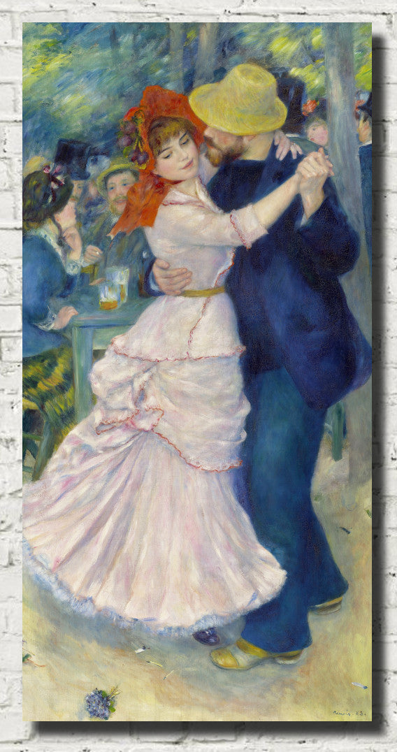
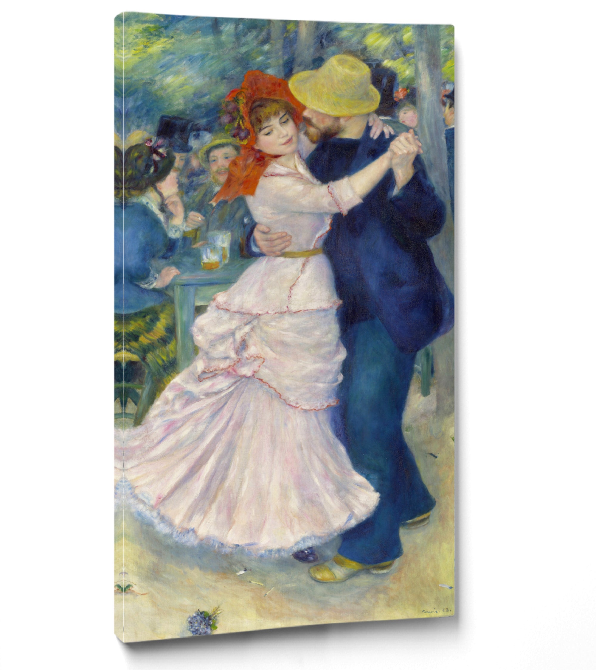
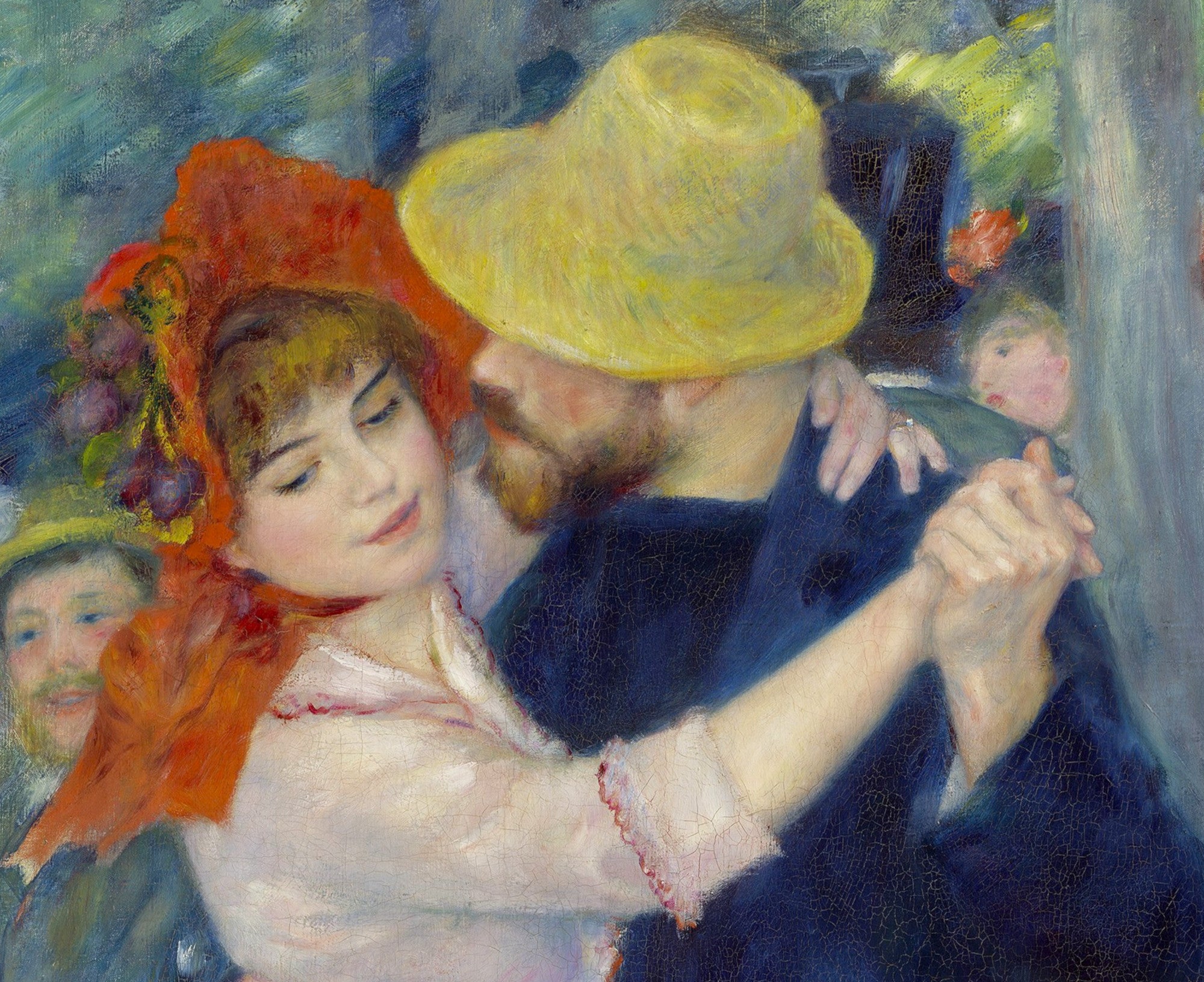
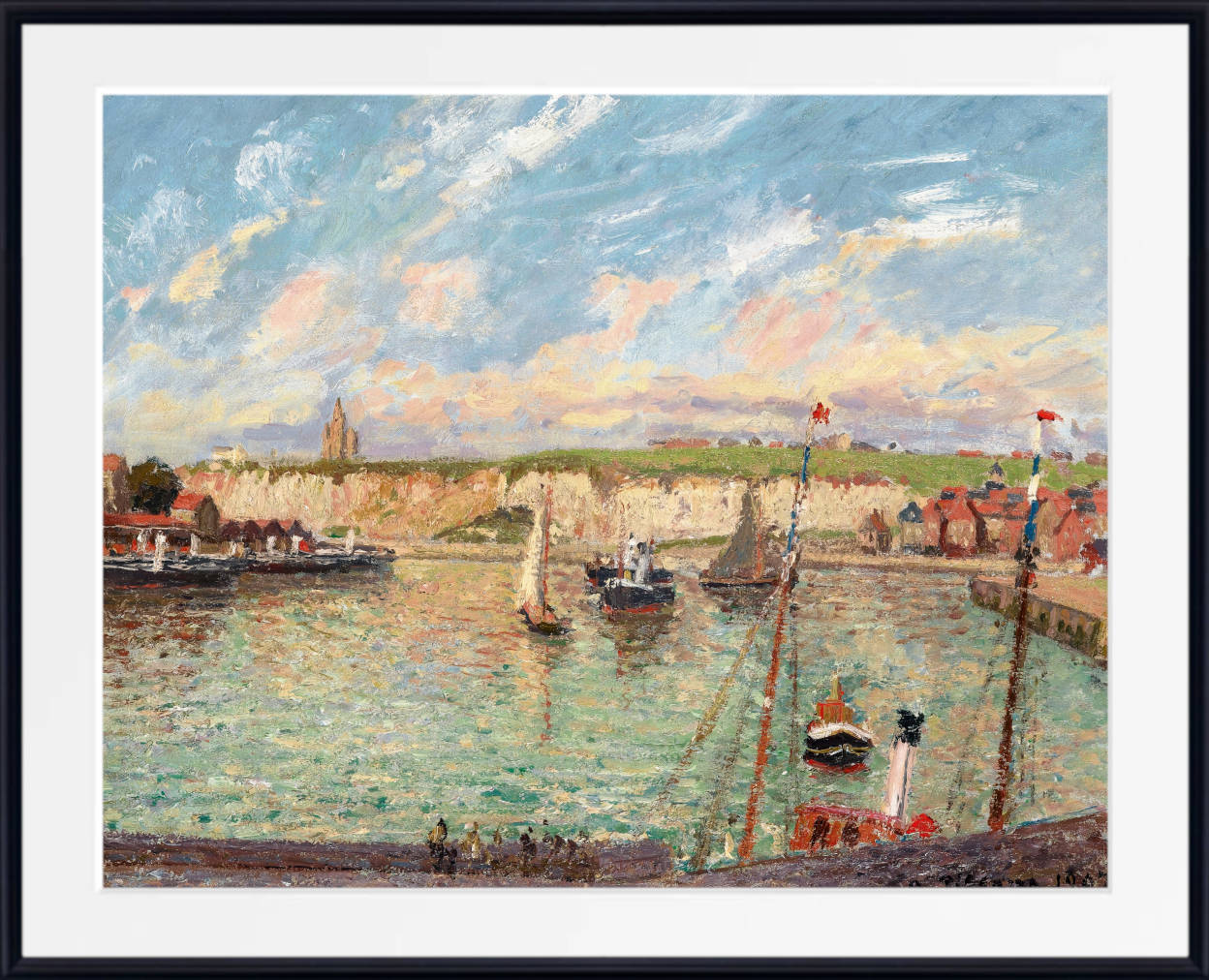
Blue Impressionist Prints
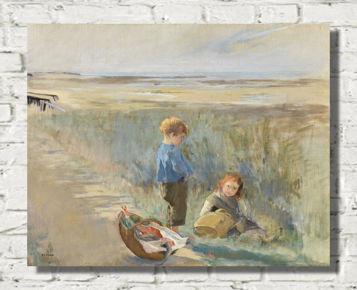
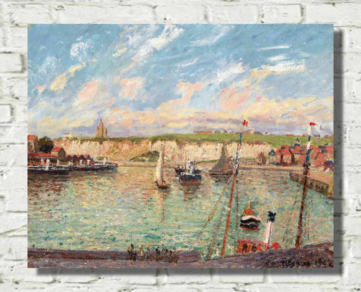
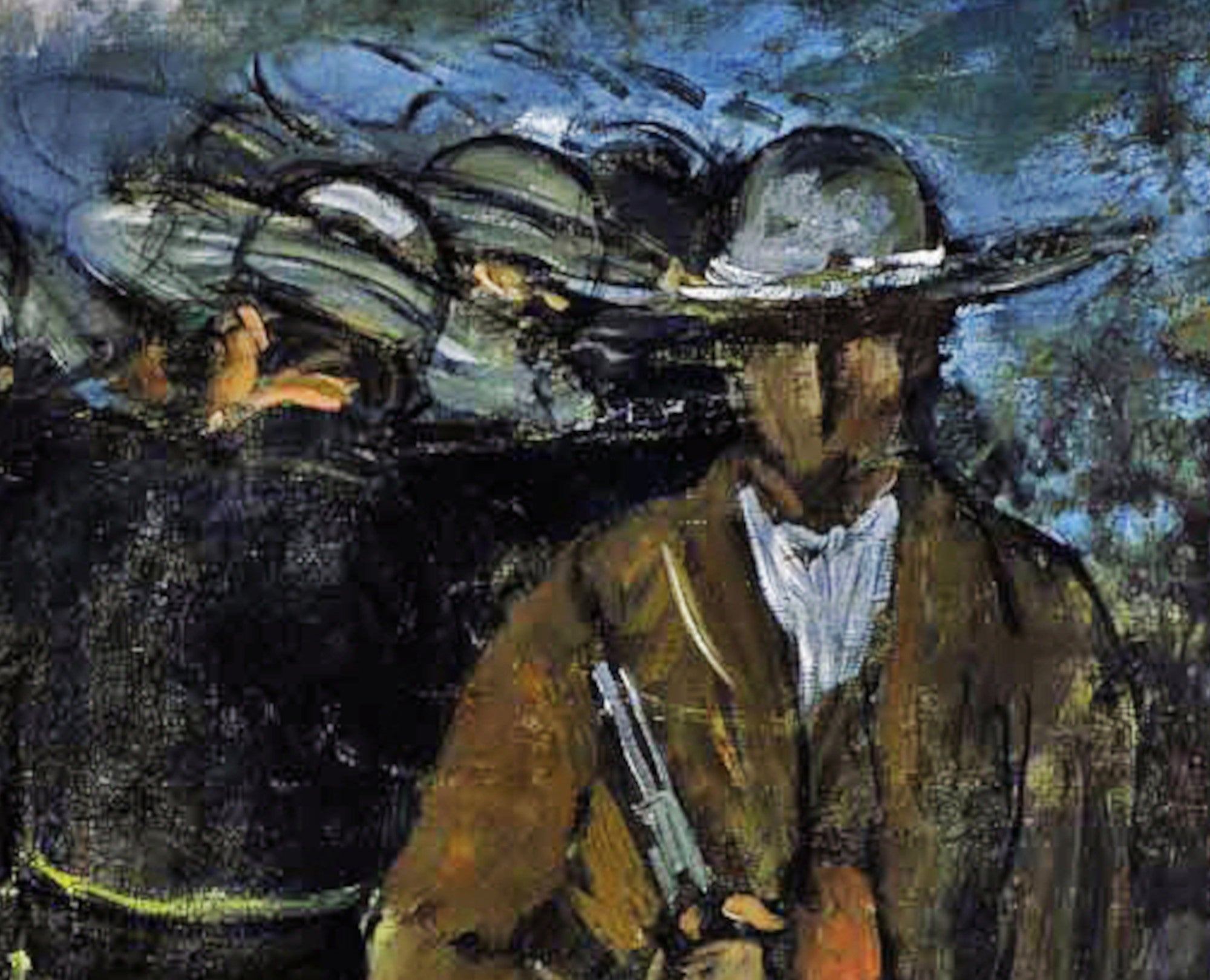
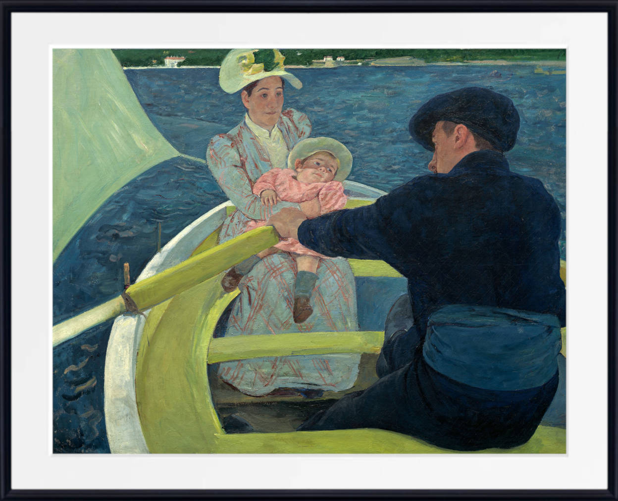
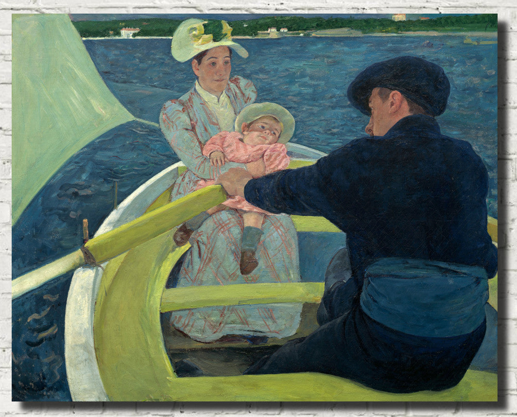
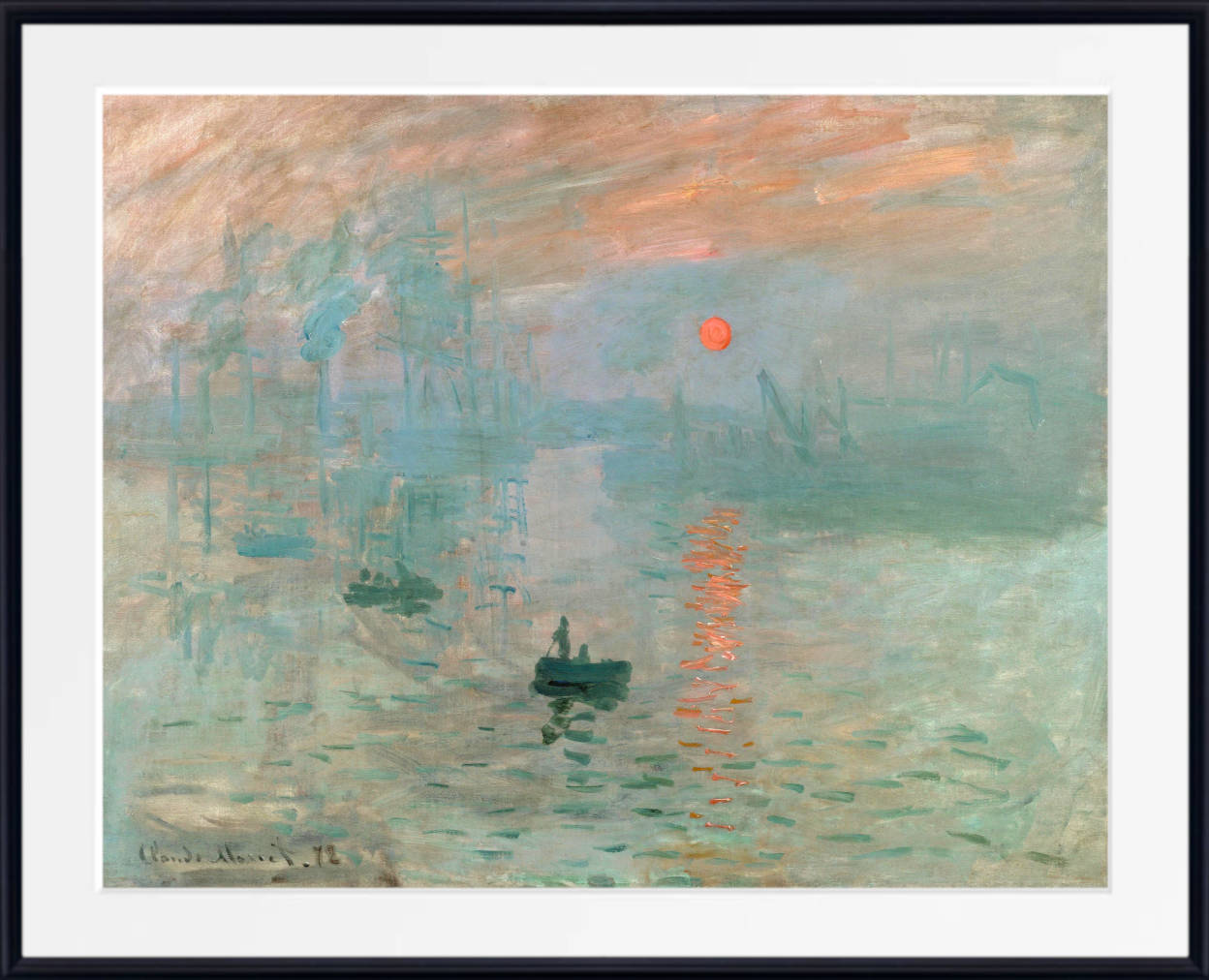
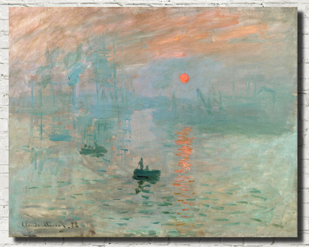
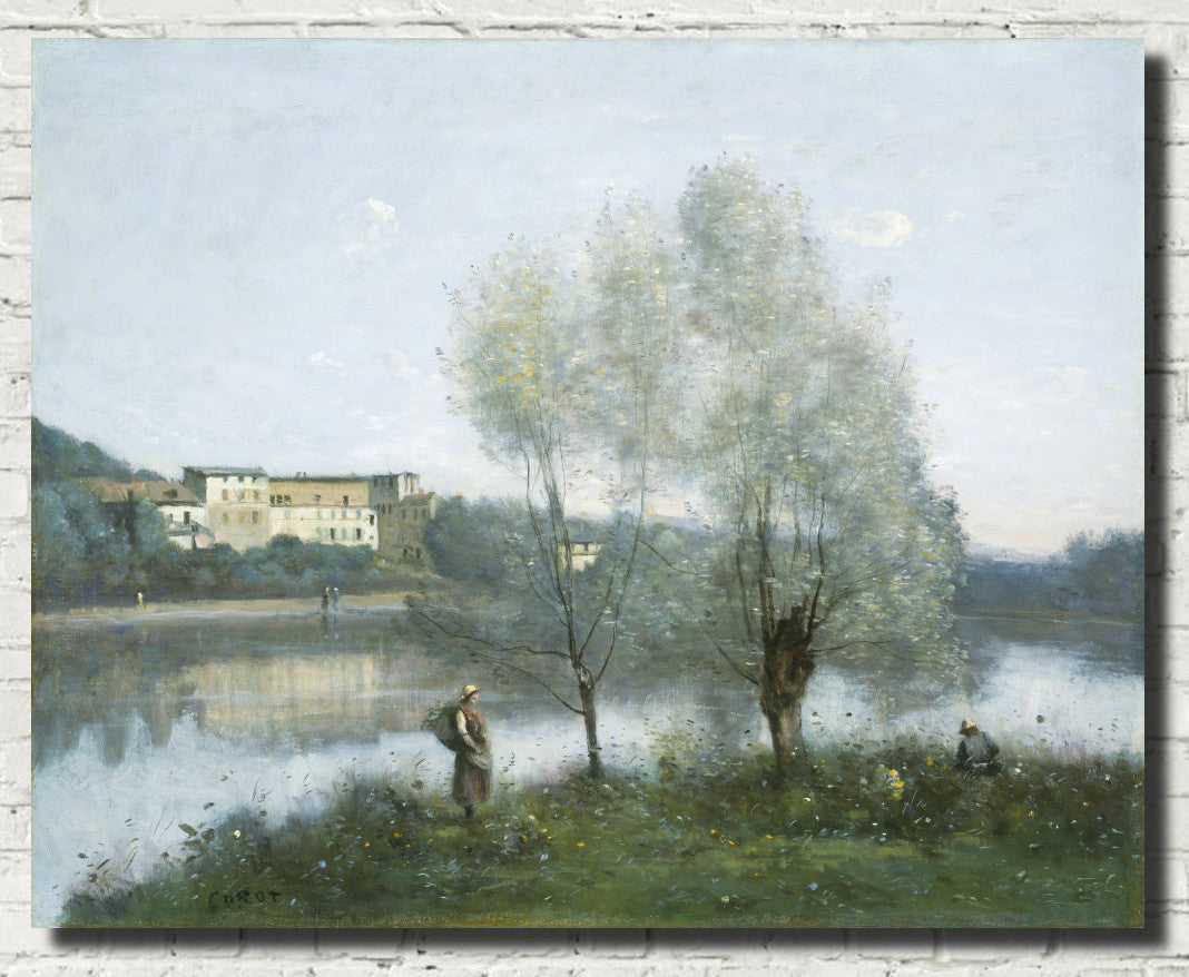
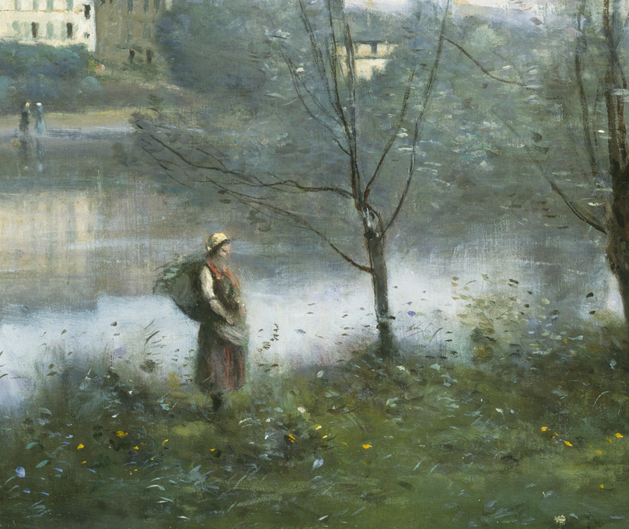
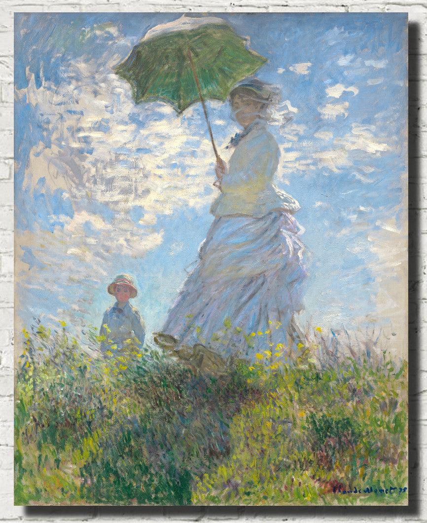
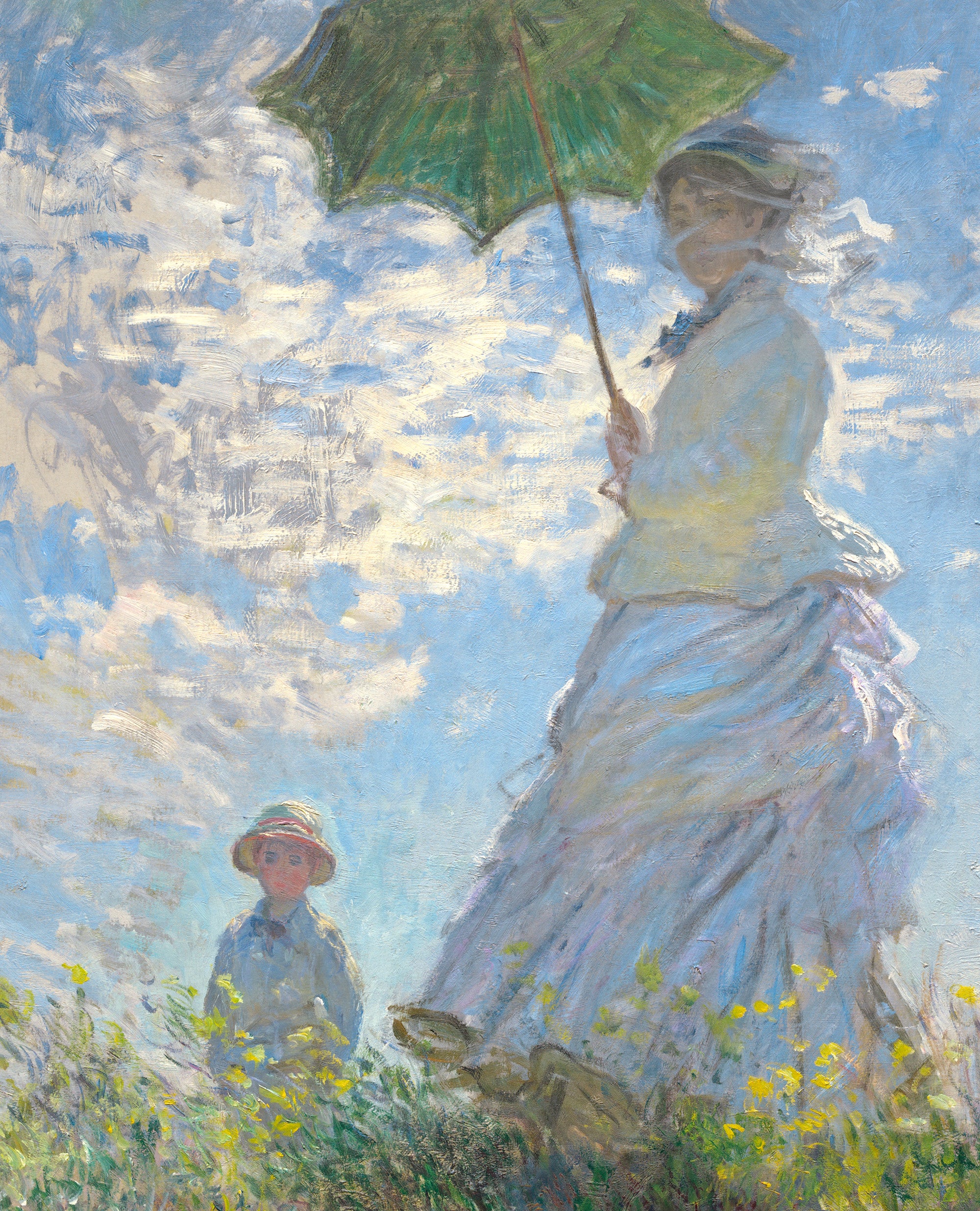
Explore our collection of blue Impressionist prints, featuring luminous rivers, seascapes, gardens, skies, snow scenes, harbours and atmospheric landscapes in shades of cobalt, indigo, turquoise, powder blue, blue-grey and deep navy. From Claude Monet's shimmering water and misty London views to Alfred Sisley's expansive skies and Camille Pissarro's atmospheric landscapes, blue played a remarkable role in the development of Impressionist painting.
Blue Impressionist wall art combines expressive brushwork, changing light and natural colour with subjects that work beautifully in living rooms, bedrooms, dining rooms, hallways and offices. Choose a tranquil pale-blue landscape for a restful interior, a rich cobalt seascape for stronger impact or a misty blue-grey city view for a more understated atmosphere. GalleryThane blue Impressionist artwork is available in a wide range of sizes as fine art paper prints, framed prints and canvas panels.
Explore Blue Impressionist Prints
Browse Impressionist art by colour, discover other styles of blue wall art and explore major painters associated with blue landscapes, water, skies and atmospheric effects.
Blue in Impressionist Painting
Blue was one of the defining colours of Impressionism. The movement's painters worked increasingly outdoors and became fascinated by the way natural light altered the appearance of water, sky, snow, buildings and shadows. Rather than treating shadows simply as black or grey, they frequently discovered blues, violets and other colours within them.
Rivers, coastlines and harbours gave Impressionist painters endless opportunities to explore blue. Water might reflect a bright summer sky, break into short strokes of cobalt and turquoise, or become almost silver-grey beneath mist and cloud. The same scene could change dramatically according to weather, season and time of day.
Blue also helped artists create atmospheric distance. Stronger colour could appear in the foreground, while softer blue-grey tones suggested distant hills, buildings or horizons. This sensitivity to changing colour and light became one of the characteristics that distinguished Impressionism from more traditional academic painting.
Claude Monet and the Changing Colours of Water and Sky
Claude Monet is perhaps the artist most closely associated with the Impressionist exploration of water, atmosphere and changing light. Across his long career, he painted rivers, seas, harbours, gardens, bridges, snow, mist and reflections, frequently returning to the same subject under different conditions.
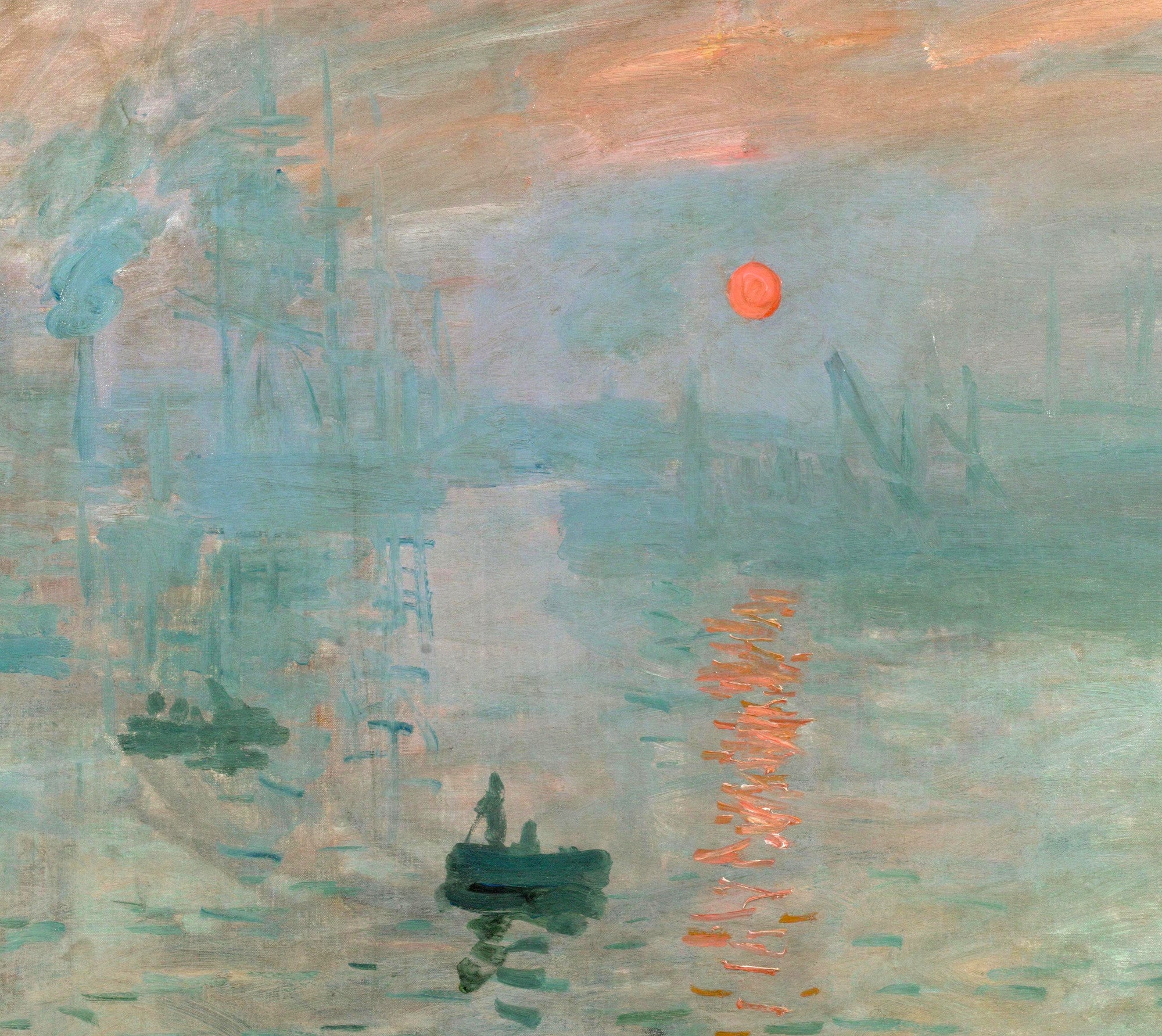
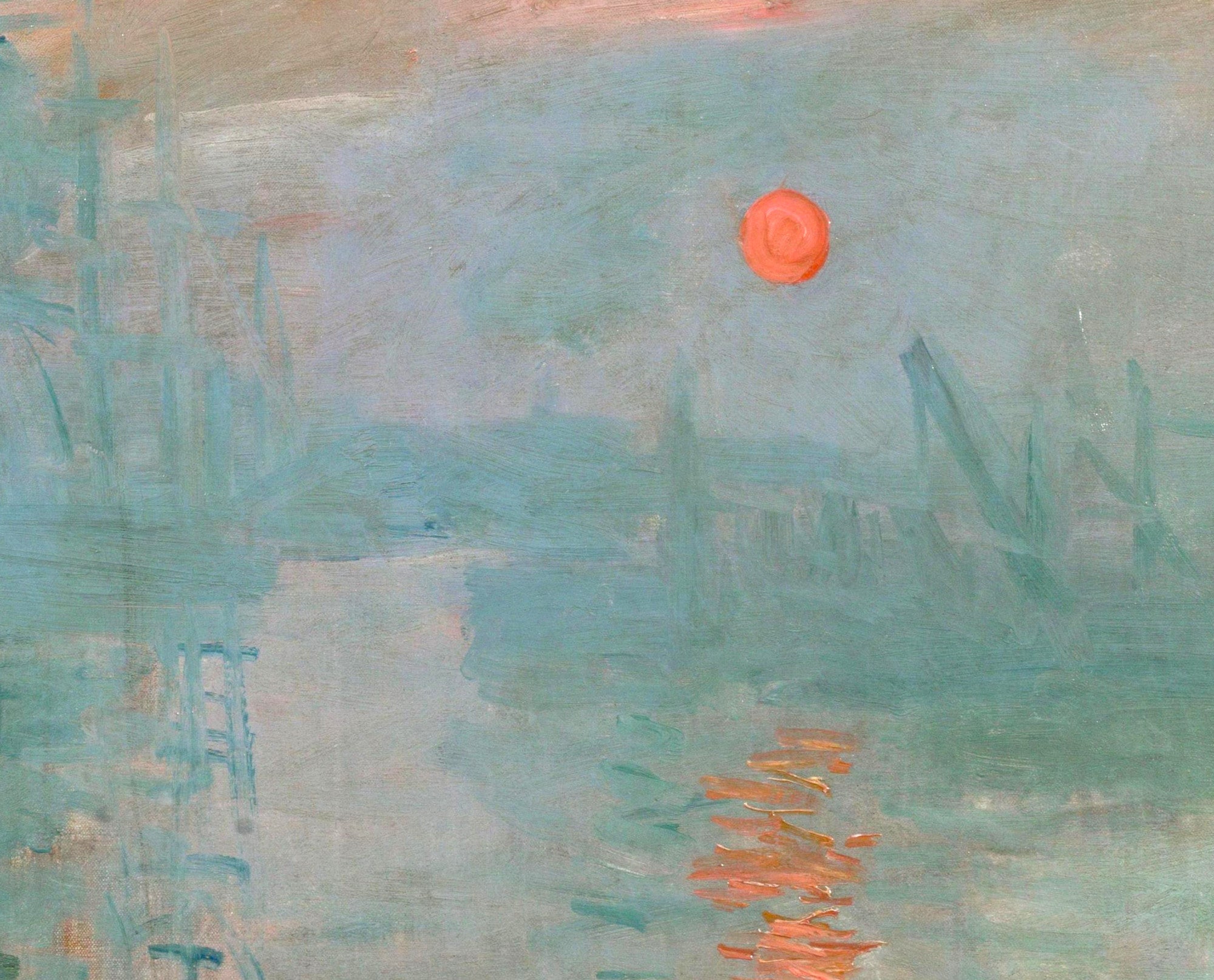
Blue appears throughout Monet's work in an extraordinary variety of forms. It can be pale and silvery in mist, rich and saturated in water, violet-blue in shadows or almost turquoise in reflected light. His paintings demonstrate that blue is not one fixed colour but a whole family of tones capable of changing according to weather and atmosphere.
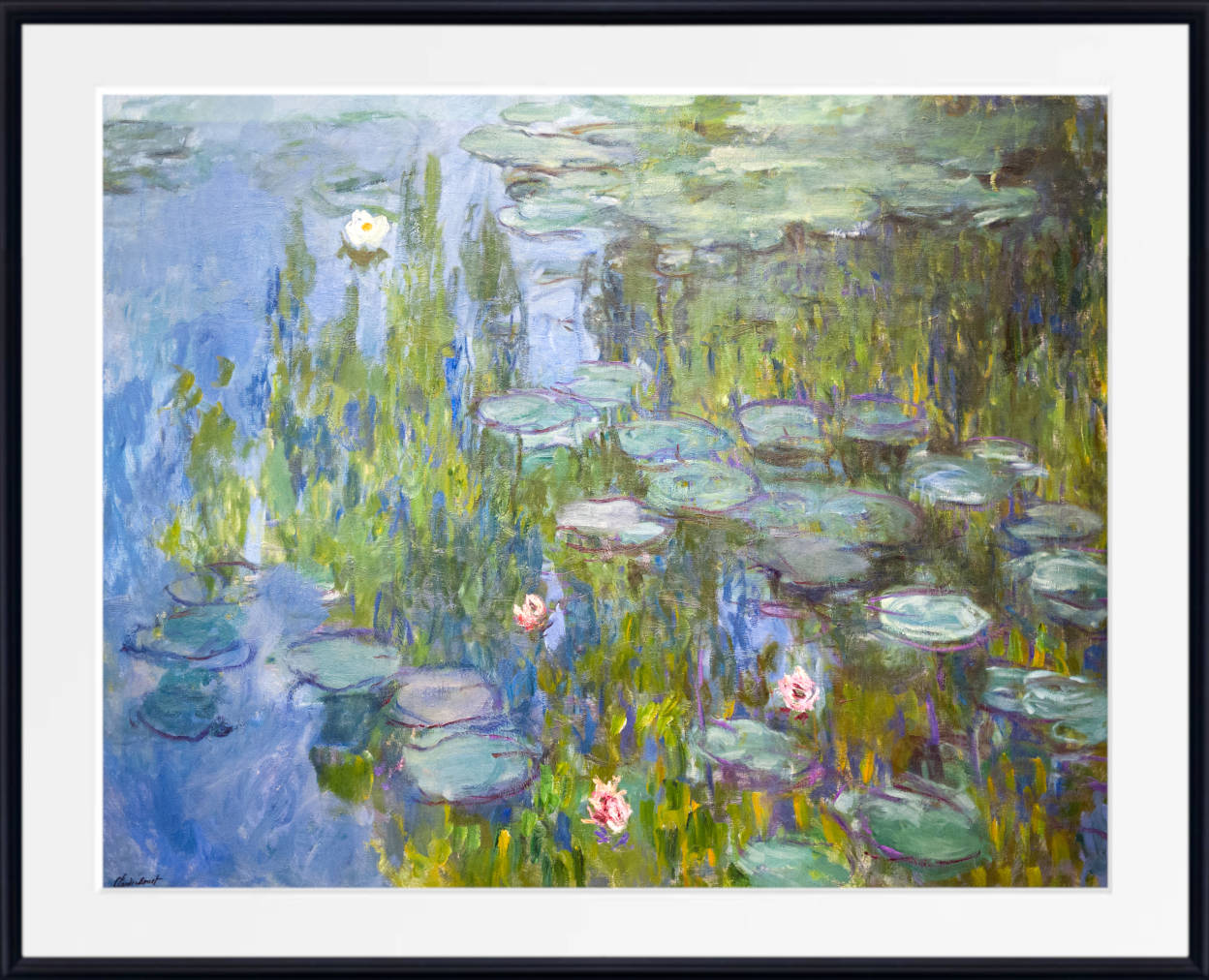
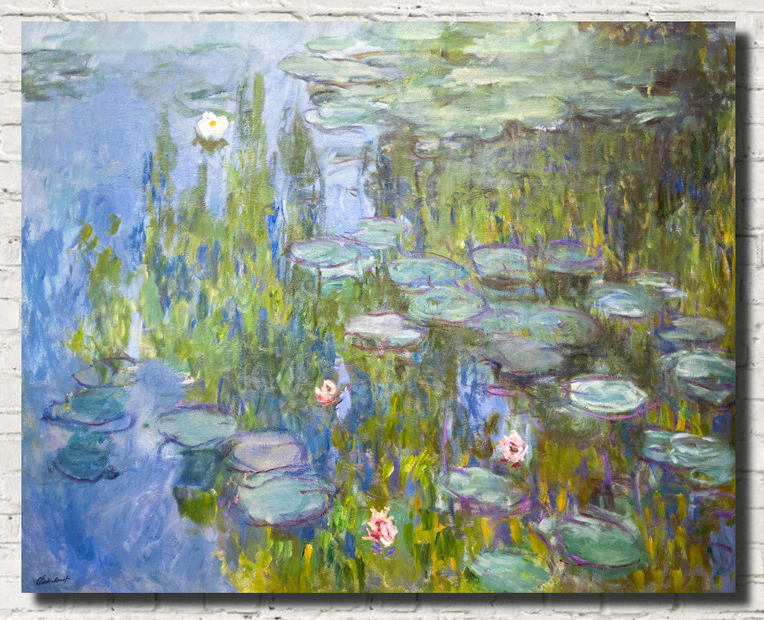
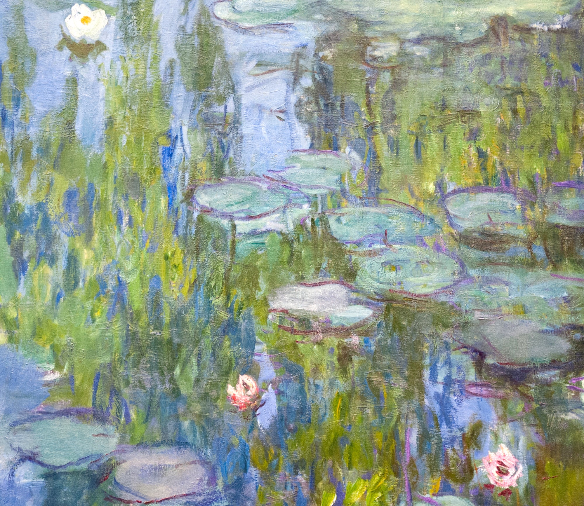
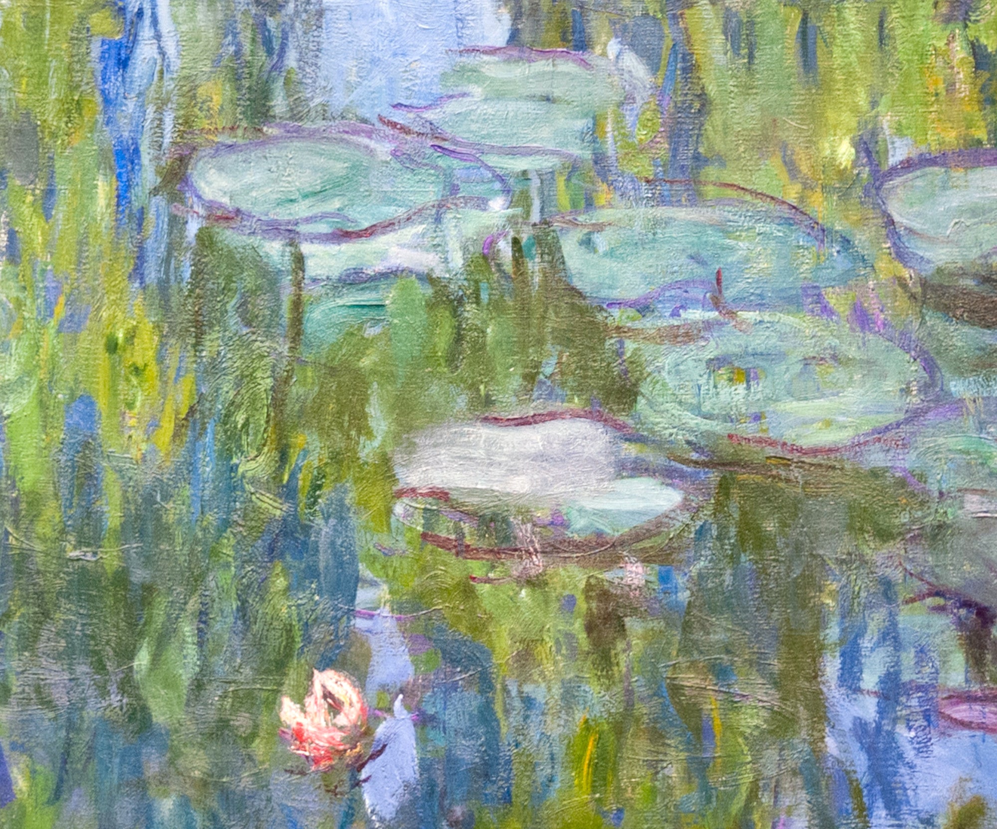
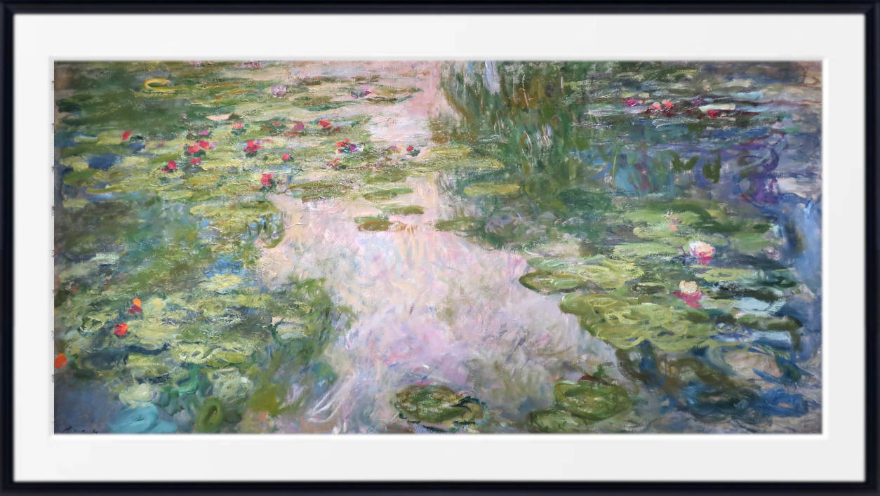
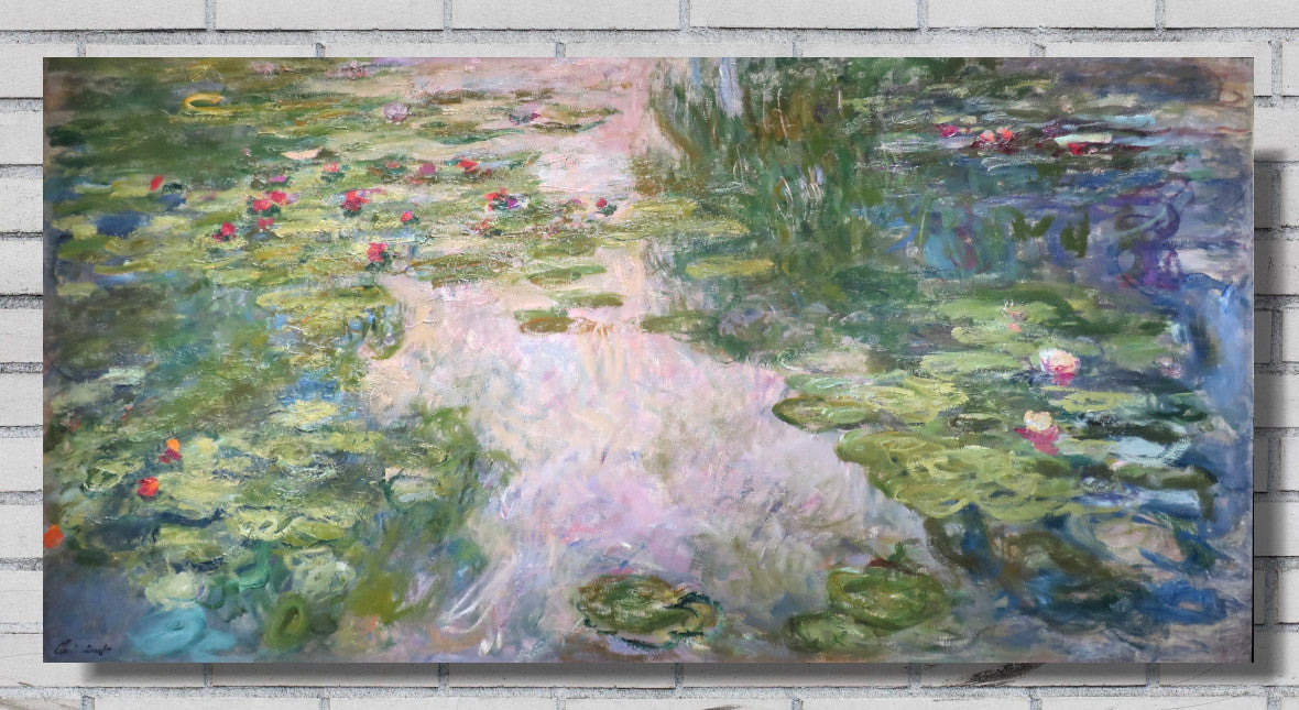
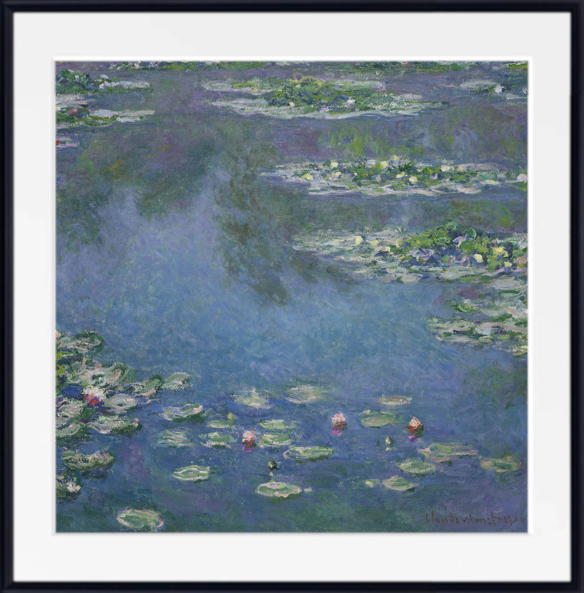
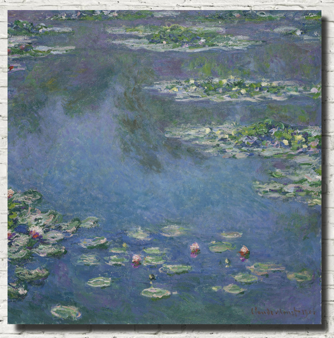
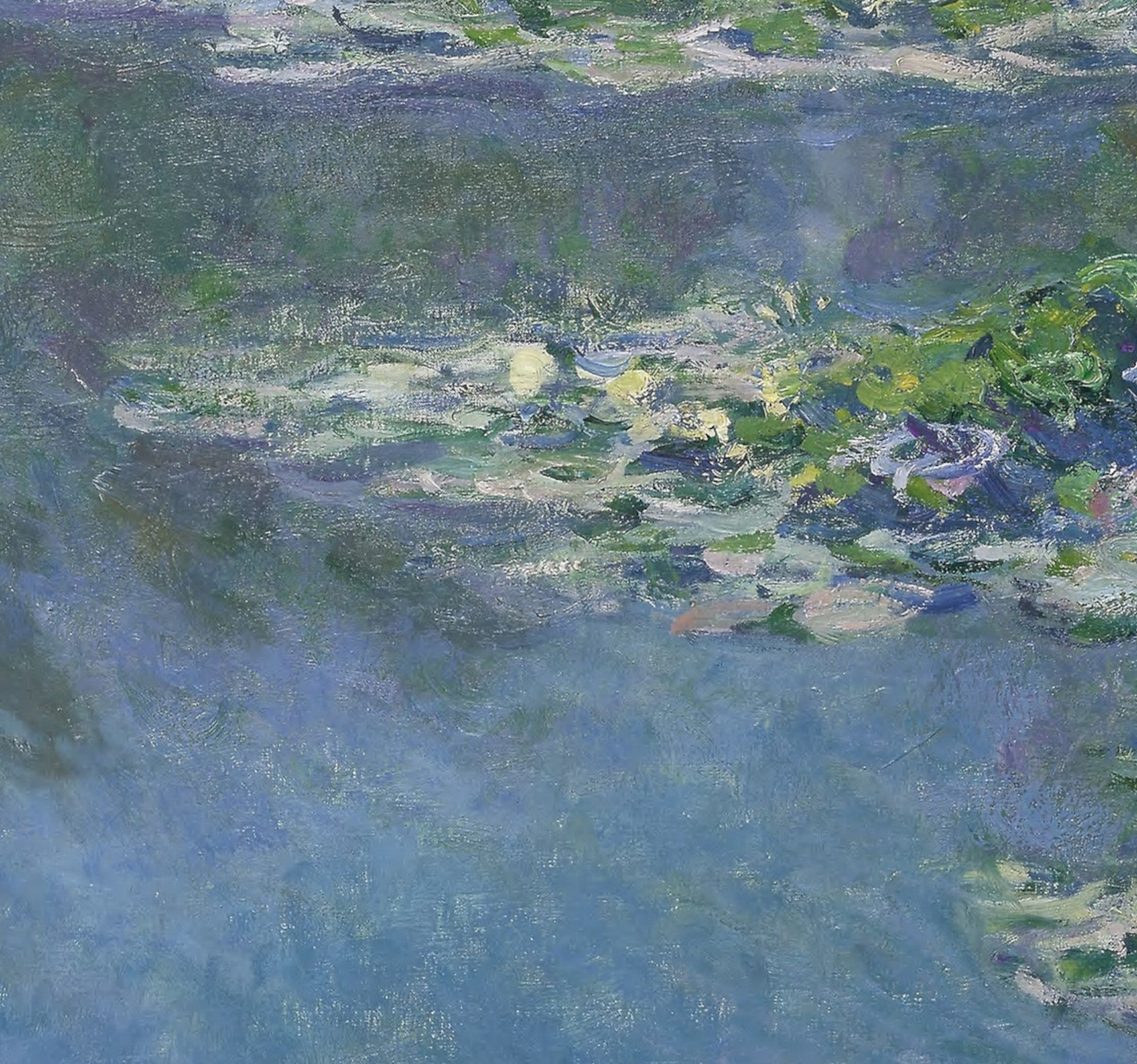
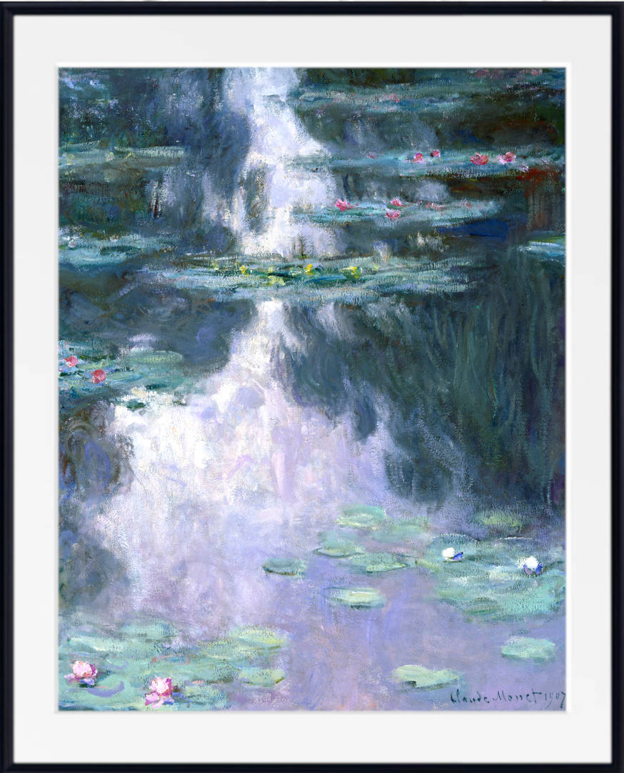
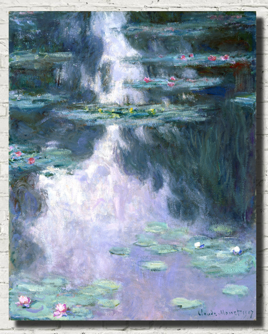
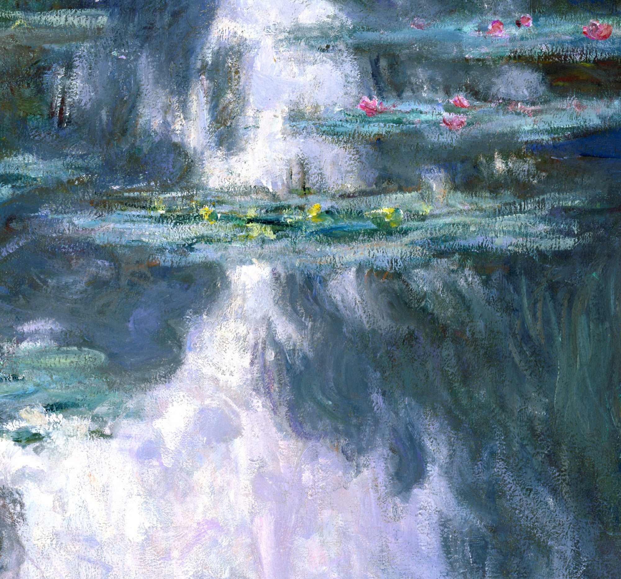
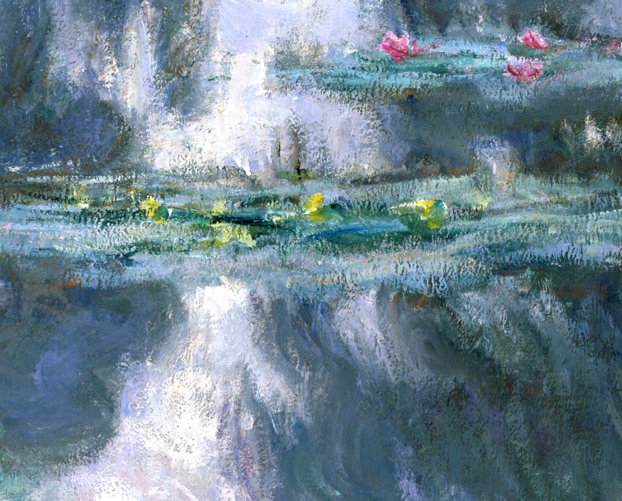
Monet's Water Lilies paintings are among the most celebrated examples. By concentrating on the surface of his pond at Giverny, he brought together water, reflected sky, floating vegetation and changing light. Blues, greens, purples and pinks merge across the surface, often making it difficult to distinguish between water itself and the reflections upon it.
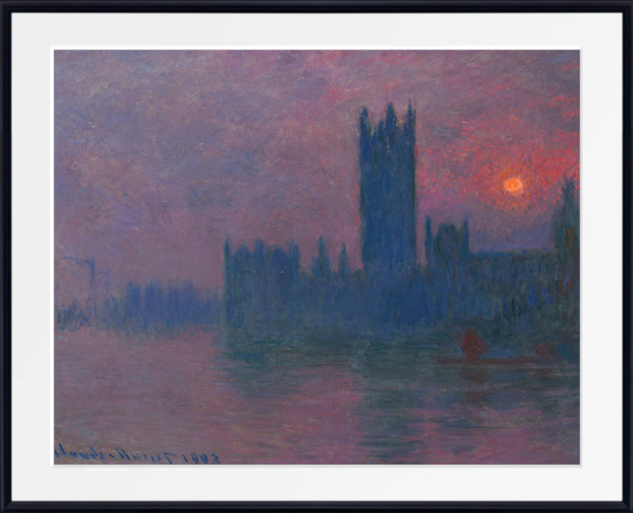
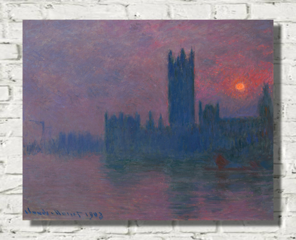
Monet's London paintings also offer remarkable blue and blue-grey atmospheric effects. In his views of Waterloo Bridge and the Houses of Parliament, architecture can appear almost dissolved within fog, smoke, mist and coloured light. These works are particularly effective in interiors where a softer, more atmospheric form of blue wall art is desired.
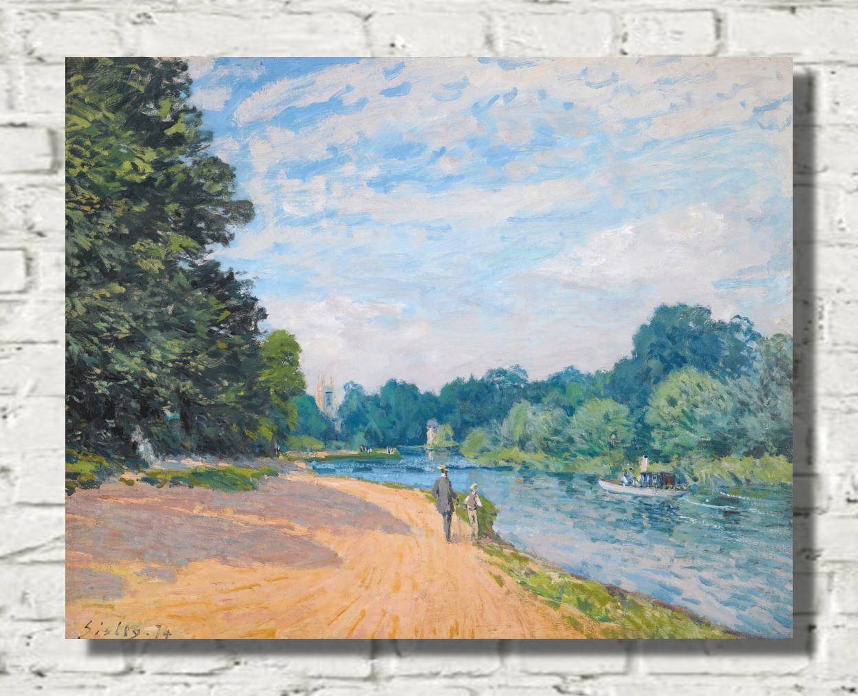
Alfred Sisley: Blue Skies, Rivers and Snow
Alfred Sisley devoted much of his career to landscape painting and became one of Impressionism's most consistent observers of weather, rivers and changing seasons. His paintings frequently give substantial space to the sky, allowing clouds and atmospheric conditions to shape the mood of the entire composition.
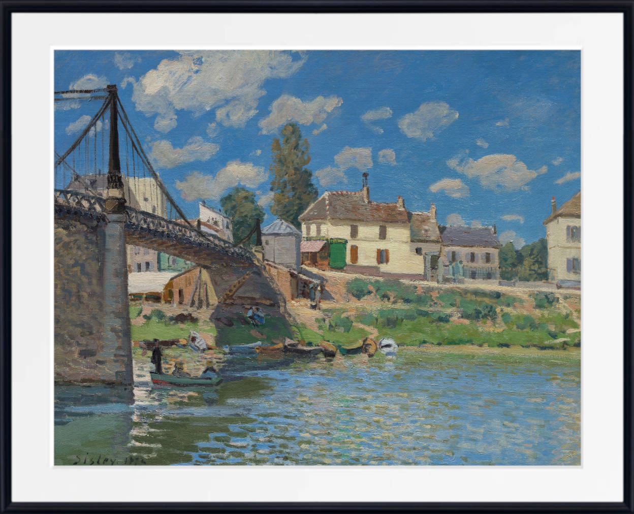
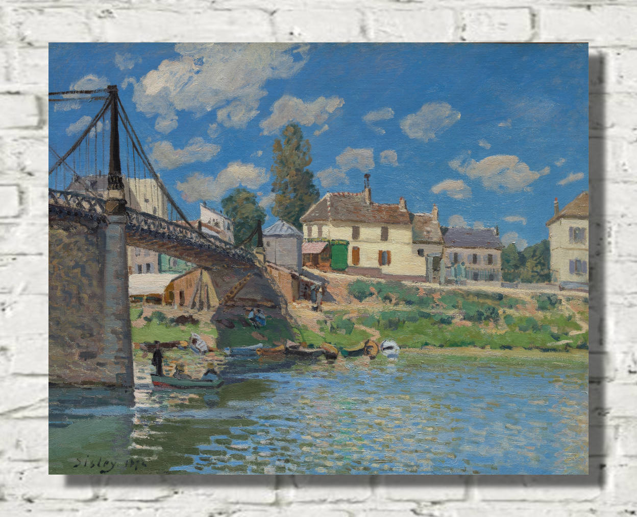
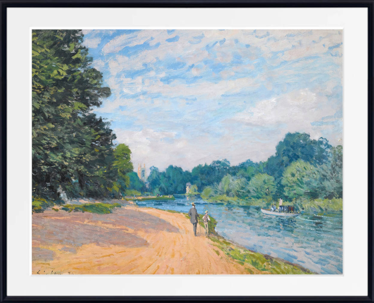
Blue is especially important in Sisley's river landscapes. Water reflects the sky in broken passages of blue, green, white and grey, while bridges, trees and riverbanks provide structure and contrast. His paintings often feel spacious and natural, making them particularly suitable for calm living rooms, bedrooms and studies.
Sisley also painted snow with great sensitivity. Instead of representing snow as pure white, he observed blue and violet shadows, warmer highlights and subtle reflections from the surrounding landscape. These winter scenes can have a quiet, restrained beauty that works especially well in pale, neutral interiors.
Camille Pissarro and Atmospheric Blue Landscapes
Camille Pissarro painted rural landscapes, roads, fields, villages, gardens and city views throughout a long and influential career. His art often explores the changing appearance of familiar places under different weather and light conditions.
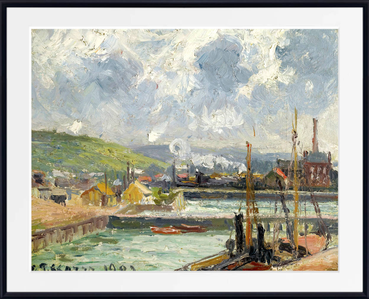
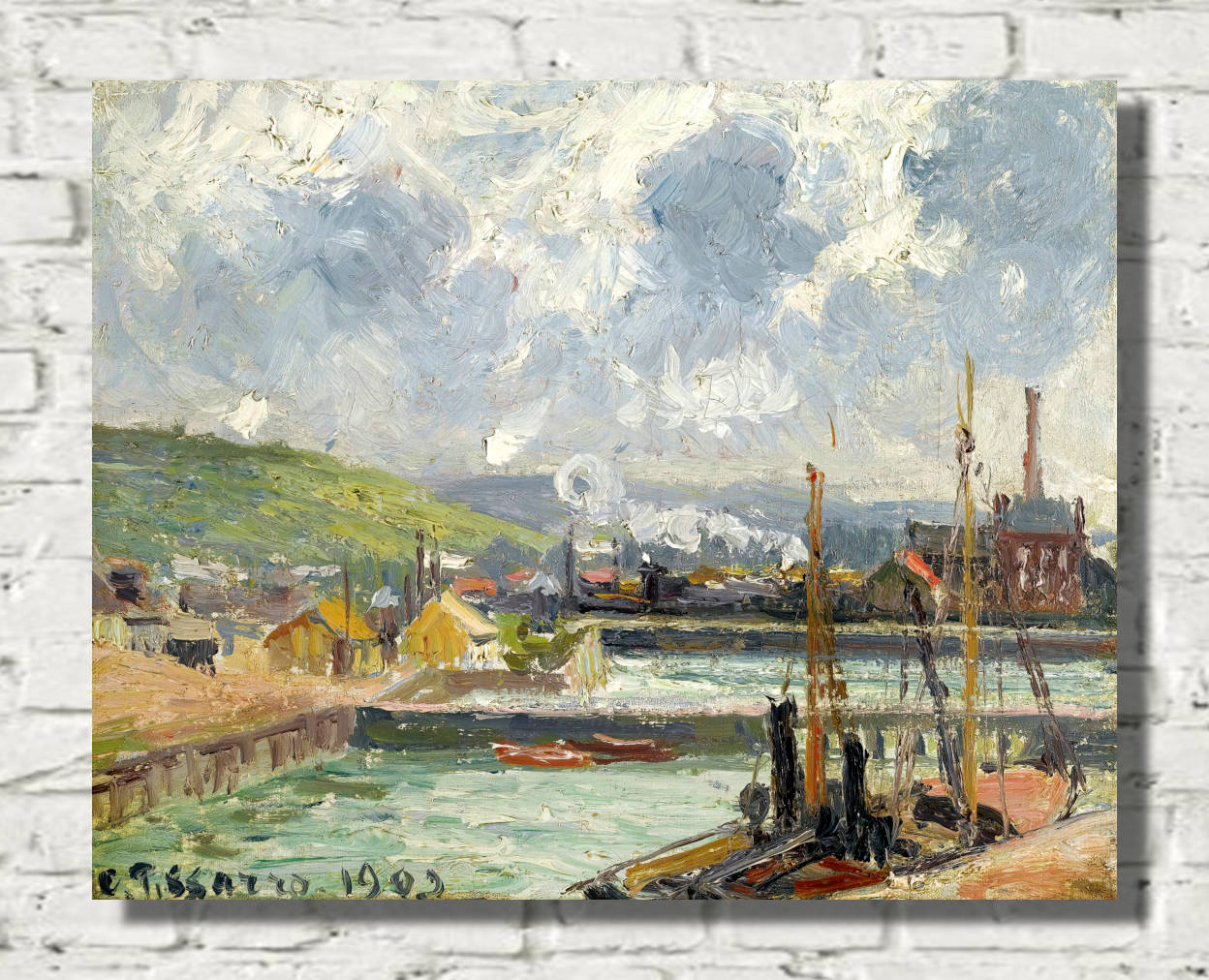
In Pissarro's landscapes, blue may appear in distant hills, open skies, shaded roads, rivers and winter scenes. His colour is often closely integrated with surrounding greens, ochres, greys and earth tones, producing landscapes that feel natural and balanced rather than dominated by a single hue.
Later in his career, Pissarro painted elevated views of Paris, Rouen and other cities. Mist, rain, smoke and changing daylight allowed buildings and streets to dissolve into complex arrangements of cool blue-grey, warm stone and reflected colour.
Berthe Morisot: Blue in Figures, Interiors and Landscapes
Berthe Morisot brought a distinctive lightness and immediacy to Impressionist painting. Her subjects included women, children, domestic interiors, gardens and landscapes, often painted with loose, rapid brushwork and delicate relationships between colour and light.
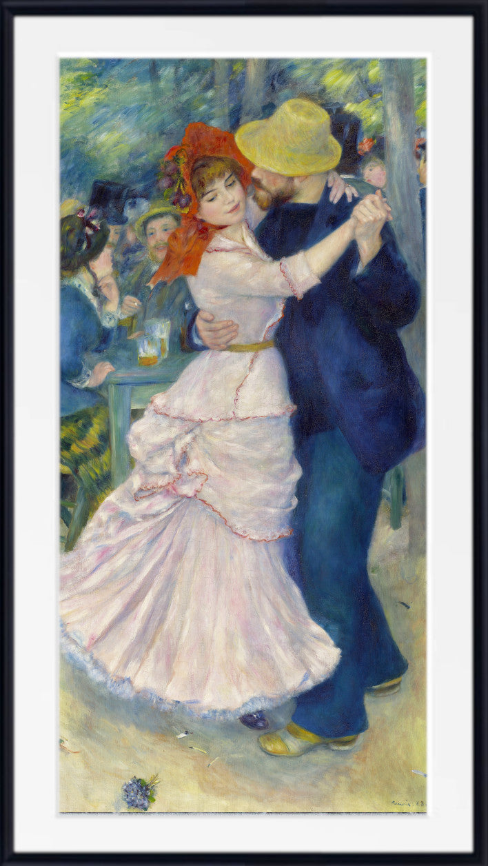
Blue appears in dresses, ribbons, furniture, water, skies and shadows throughout Morisot's work. Her lighter blues can feel fresh and airy, particularly when combined with white, cream, green and soft grey. These qualities make her paintings especially suitable for bedrooms, dressing areas, reading spaces and elegant living rooms.
Unlike the broad river landscapes of Sisley or the monumental late works of Monet, Morisot often used blue within intimate scenes of everyday life. The result is a different form of blue Impressionist art: personal, luminous and closely connected with figures and interiors.
Eugène Boudin: Blue Skies, Beaches and Coastal Light
Eugène Boudin was an important precursor of Impressionism and a major painter of beaches, harbours and expansive skies. His close observation of coastal weather had an important influence on the young Claude Monet.
Boudin's skies can occupy much of the canvas, filled with rapidly changing clouds, patches of clear blue and shifting coastal light. Beneath them, beaches, boats and figures are often painted on a smaller scale, emphasising the openness of the landscape.
His blue coastal prints work especially well in living rooms, bedrooms and relaxed interiors where a sense of space and fresh air is desired. They also provide a natural bridge between Impressionist art and traditional seascape painting.
Featured Blue Impressionist Artists
Explore painters whose landscapes, water scenes, coastlines, gardens and atmospheric studies reveal the remarkable variety of blue within and around Impressionism.
Blue Impressionist Seascapes and Coastal Prints
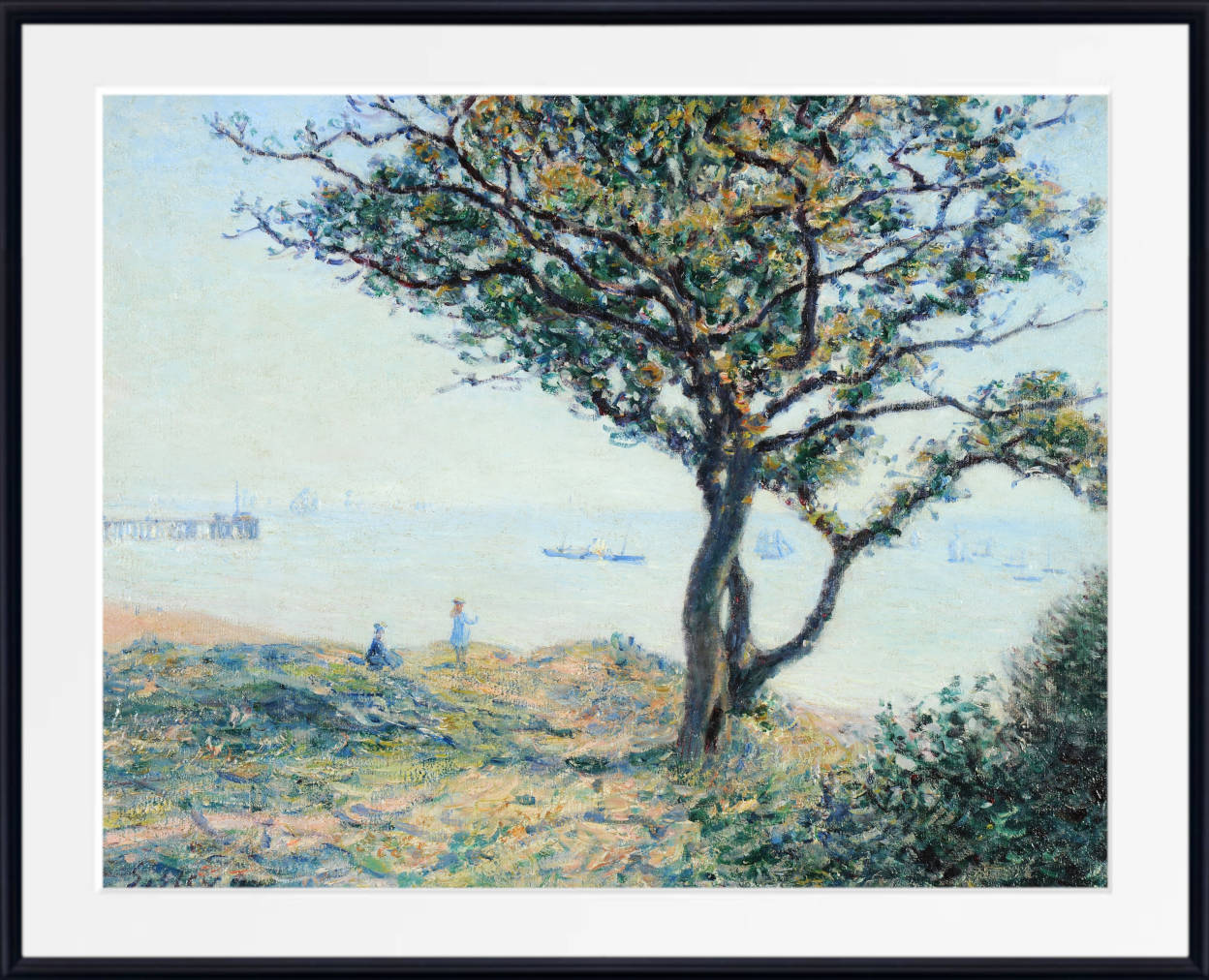
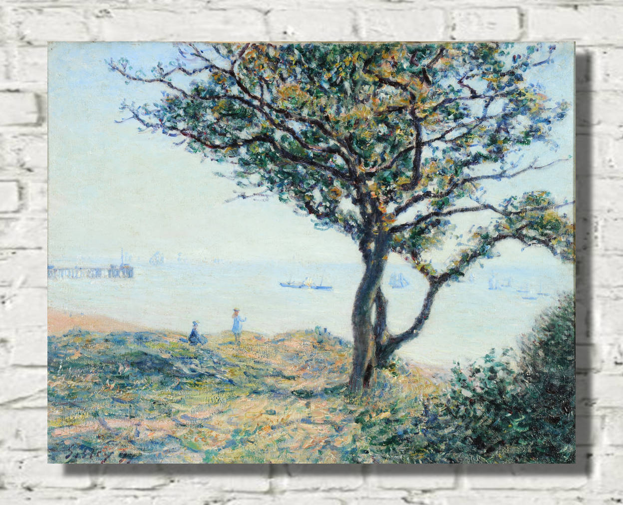
The coast was one of the great subjects of nineteenth-century French painting. Beaches, harbours, sailing boats, cliffs and open seas gave artists the opportunity to study changing weather and the interaction between water and sky.
In blue Impressionist seascapes, the sea rarely appears as a flat, uniform colour. It may contain cobalt, turquoise, grey, violet, green and white, broken into short touches that suggest movement and reflected light. Clouds can transform the entire colour of a scene within minutes.
Coastal prints are particularly effective in rooms where you want a feeling of space and openness. They work naturally in bedrooms and living rooms, but can also bring freshness to dining rooms, hallways and home offices.
For a broader selection of oceans, boats, harbours and maritime paintings, explore the Seascape Art Prints collection.
Blue Impressionist Landscapes
Blue appears throughout Impressionist landscape painting, even when water is absent. Distant hills can become blue through atmospheric perspective, shadows may contain violet-blue colour, and winter skies can shift between pale grey, turquoise and deep cobalt.
Monet, Sisley and Pissarro all painted landscapes in which blue interacts closely with green fields, autumnal ochres, white snow and dark trees. This makes blue Impressionist landscapes especially adaptable in interiors because they often contain a balanced natural palette rather than one dominant colour alone.
A blue landscape can make a room feel more spacious by suggesting distance, sky and an open horizon. For more rural, mountain, garden and scenic artwork, browse the Landscape and Scenery Fine Art Prints collection.
Blue Water Lily Prints by Claude Monet
Monet's Water Lilies series offers some of the most celebrated blue Impressionist paintings in art history. After developing his garden and water garden at Giverny, Monet repeatedly painted the pond, water lilies, reflections, willow trees and Japanese bridge.
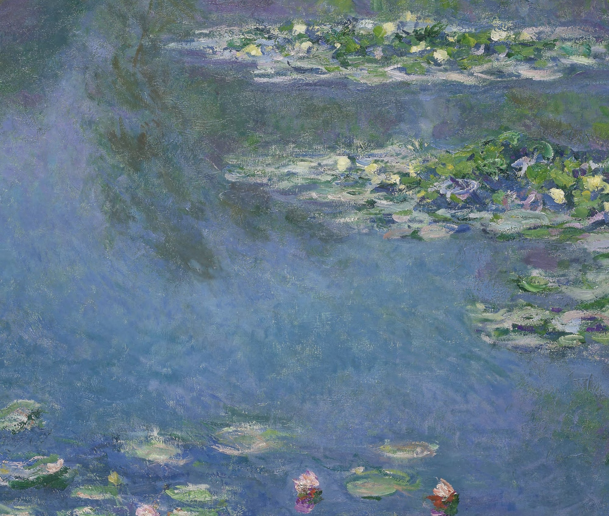
In many of these works, conventional perspective gives way to the surface of the water. Reflections of blue sky mingle with green vegetation, purple shadows and floating flowers. The paintings can feel simultaneously like landscapes and abstract arrangements of colour.
Blue Water Lilies prints are particularly effective in bedrooms and living rooms because they combine a recognisable natural subject with an immersive, tranquil palette. Larger formats can create a strong focal point, while smaller square prints work well in pairs or grouped arrangements.
Blue Impressionist Prints for Living Rooms
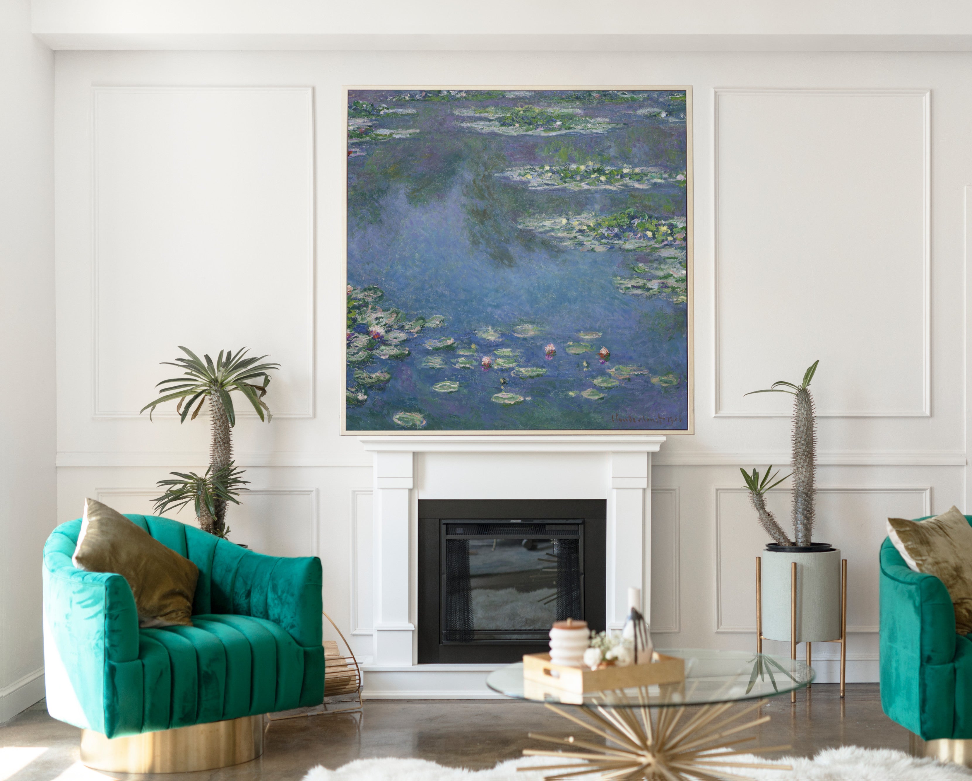
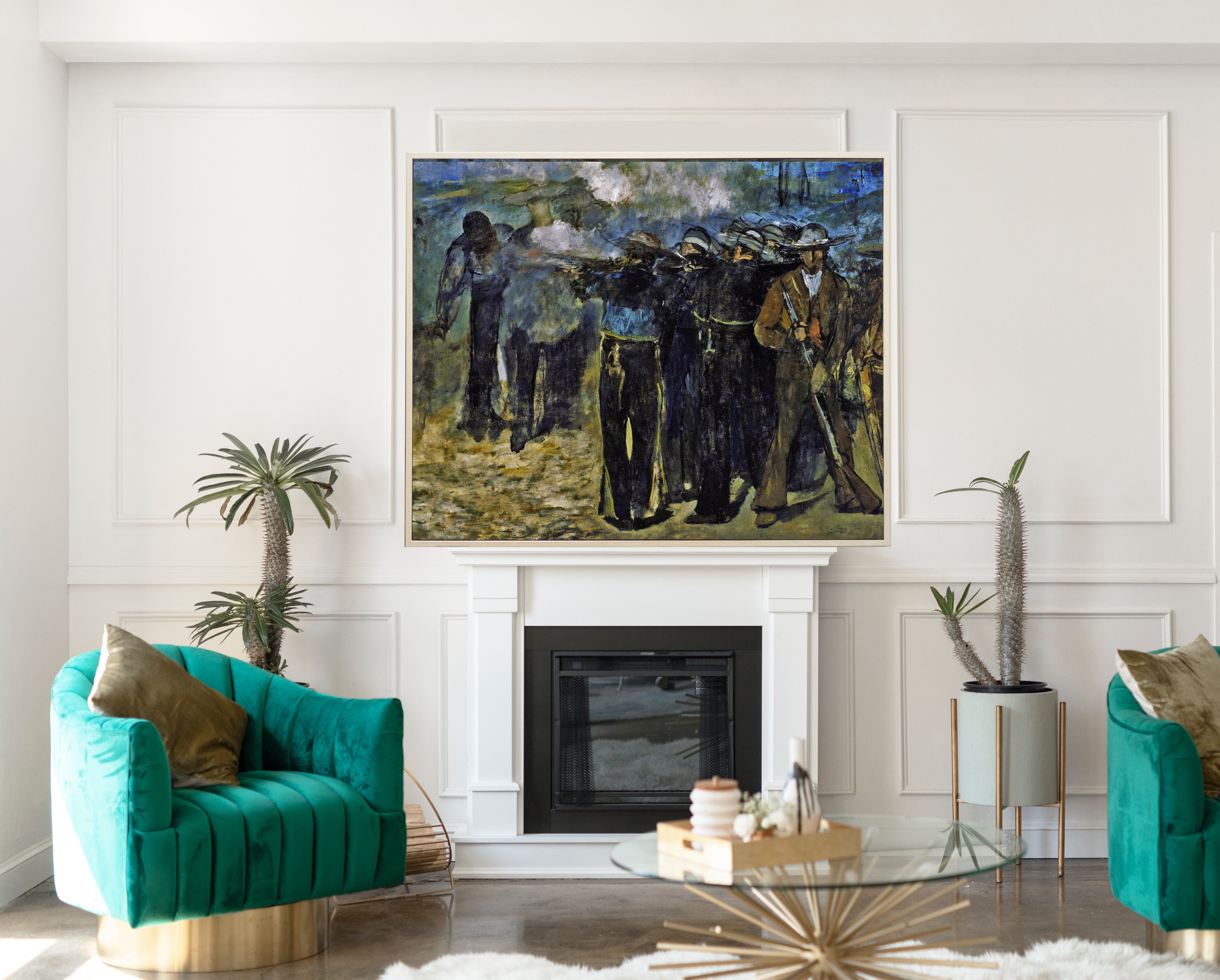
A living room is an ideal setting for blue Impressionist wall art because landscapes, seascapes and water scenes can establish atmosphere without overwhelming the interior. A large Monet print above a sofa can create a strong focal point, while a Sisley river landscape or Boudin coastal scene can introduce a greater sense of openness.
Pale blue and blue-grey prints work naturally with cream, white, beige, light grey and natural wood. Stronger cobalt and navy tones can provide greater contrast against pale walls, while warmer furniture in oak, walnut, tan leather or brass can balance cooler blues.
For larger walls, choose one substantial artwork or arrange two or three related paintings together. Works by the same artist, or landscapes connected by colour and subject, can create a more coherent display.
Blue Impressionist Prints for Bedrooms
Blue Impressionist prints are especially well suited to bedrooms because many combine restful colour with natural subjects such as rivers, gardens, water lilies, snow and distant landscapes.
Soft powder blue, misty blue-grey and muted turquoise can help create a calm atmosphere. Monet's water scenes, Sisley's river landscapes and Morisot's lighter compositions are particularly useful where you want artwork that introduces colour without feeling heavy or visually crowded.
A large framed print above the bed creates a clear focal point, while pairs of smaller landscapes can form a balanced arrangement. Blue Impressionist art also works naturally with white bedding, linen, pale wood, cream, sage green and soft grey.
Blue Impressionist Prints for Dining Rooms and Hallways
Dining rooms can accommodate stronger blue landscapes and atmospheric city scenes particularly well. A substantial Monet or Pissarro print above a sideboard can give the room colour and historical character while remaining versatile enough to complement changing table settings and decorative accessories.
Hallways and stairways are excellent spaces for smaller Impressionist landscapes. A sequence of river views, gardens or coastal scenes can create a natural sense of progression, while consistent frames help connect works by different artists.
How to Style Blue Impressionist Wall Art
Begin by looking at the dominant shade of blue within the artwork. Pale blue and blue-grey pair naturally with white, cream, beige and light wood. Navy and cobalt create stronger contrast and work particularly well with warm neutrals, brass, walnut, tan and ochre.
Green is another natural companion because many Impressionist landscapes combine blue sky or water with trees, gardens and vegetation. Soft pink, lavender and warm yellow can also complement blue by repeating secondary colours found within flowers, sunlight and reflections.
You do not need to match the artwork precisely to your furniture. Instead, look for one or two colours within the painting that connect naturally with the wider room. Impressionist art is particularly useful in this respect because individual paintings often contain many subtle variations of colour.
Choosing the Right Size Blue Impressionist Print
Large blue Impressionist prints work particularly well above sofas, beds, fireplaces and sideboards. A substantial landscape can create a window-like effect, drawing the eye towards water, sky or a distant horizon.
Medium-sized framed prints suit smaller pieces of furniture, reading areas, desks and narrower walls. Smaller Impressionist prints can be combined into gallery walls, especially when they share a common artist, colour palette or subject.
When displaying several works together, consider using consistent frame styles to create visual unity. Alternatively, select paintings from one series or artist to establish a stronger historical and artistic connection between the pieces.
Fine Art Prints, Framed Prints and Canvas Panels
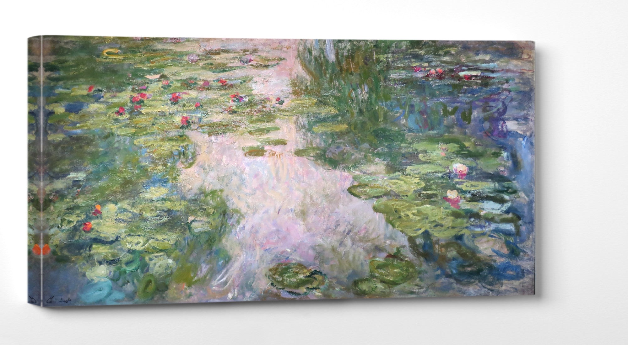
GalleryThane blue Impressionist artwork is available across a range of formats and sizes. Choose an unframed fine art paper print if you want the flexibility to select your own frame, a framed print for a complete gallery-style presentation, or a canvas panel for a clean, ready-to-hang finish.
Our prints, frames and canvas panels are handmade in our Nottinghamshire workshop using carefully selected fine art papers, UV-stabilised pigment inks and quality framing materials. Free UK delivery is available on all orders, with fast, tracked international shipping also available.
Frequently Asked Questions
What are blue Impressionist prints?
Blue Impressionist prints reproduce paintings in which blue plays an important visual role, including landscapes, seascapes, rivers, gardens, snow scenes, city views and water paintings. Shades can range from pale blue and blue-grey to turquoise, cobalt, indigo and navy.
Which Impressionist artists are famous for blue paintings?
Claude Monet, Alfred Sisley, Camille Pissarro and Berthe Morisot all used blue extensively in different ways. Eugène Boudin, an important precursor of Impressionism, was also celebrated for coastal scenes and expansive skies.
What are the best blue Monet prints?
Monet's Water Lilies paintings are among his most famous blue works, but his views of Waterloo Bridge, the Houses of Parliament, the Seine and coastal landscapes also feature beautiful blue, violet and blue-grey atmospheric effects.
Are blue Impressionist prints suitable for living rooms?
Yes. Blue Impressionist landscapes, seascapes and water scenes are excellent choices for living rooms because they can create a focal point while maintaining a calm and versatile atmosphere. Large Monet and Sisley prints work particularly well above sofas, fireplaces and sideboards.
Are blue Impressionist prints good for bedrooms?
Yes. Soft blue landscapes, water lilies, gardens and river scenes can create a restful bedroom atmosphere. Pale blue, turquoise and blue-grey artwork works naturally with white, cream, beige, sage green and natural wood.
What colours go well with blue Impressionist art?
Blue Impressionist prints pair beautifully with white, cream, beige, grey, green, tan, natural wood and brass. Warmer contrasting colours such as ochre, soft yellow, rust and muted pink can also complement blue artwork.
Should I choose a framed blue Impressionist print or a canvas panel?
Choose a framed print for a structured, gallery-style presentation that emphasises detail and gives the artwork a finished appearance. Choose a canvas panel for a cleaner, frameless look that can work particularly well with larger, painterly landscapes and water scenes.
What size blue Impressionist print should I choose?
Large prints are ideal above sofas, beds and sideboards, while medium-sized works suit smaller walls and furniture. Smaller Impressionist landscapes can be displayed in pairs, rows or gallery wall arrangements.