
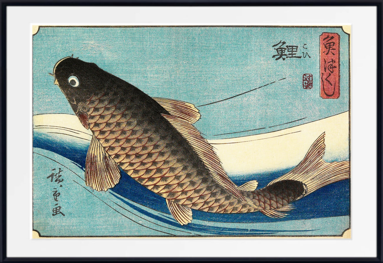
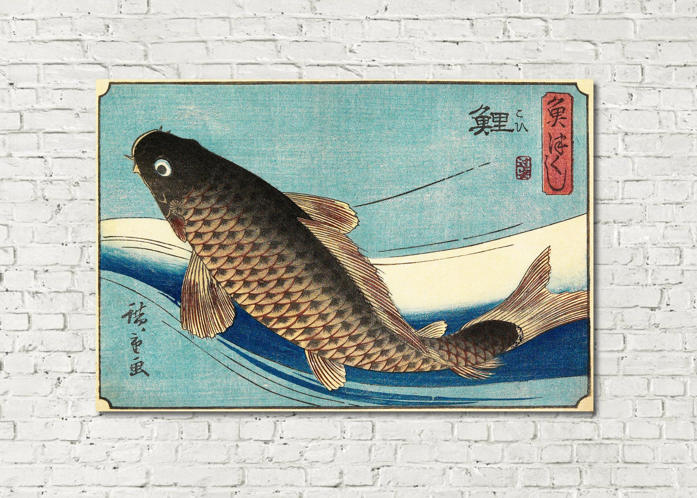
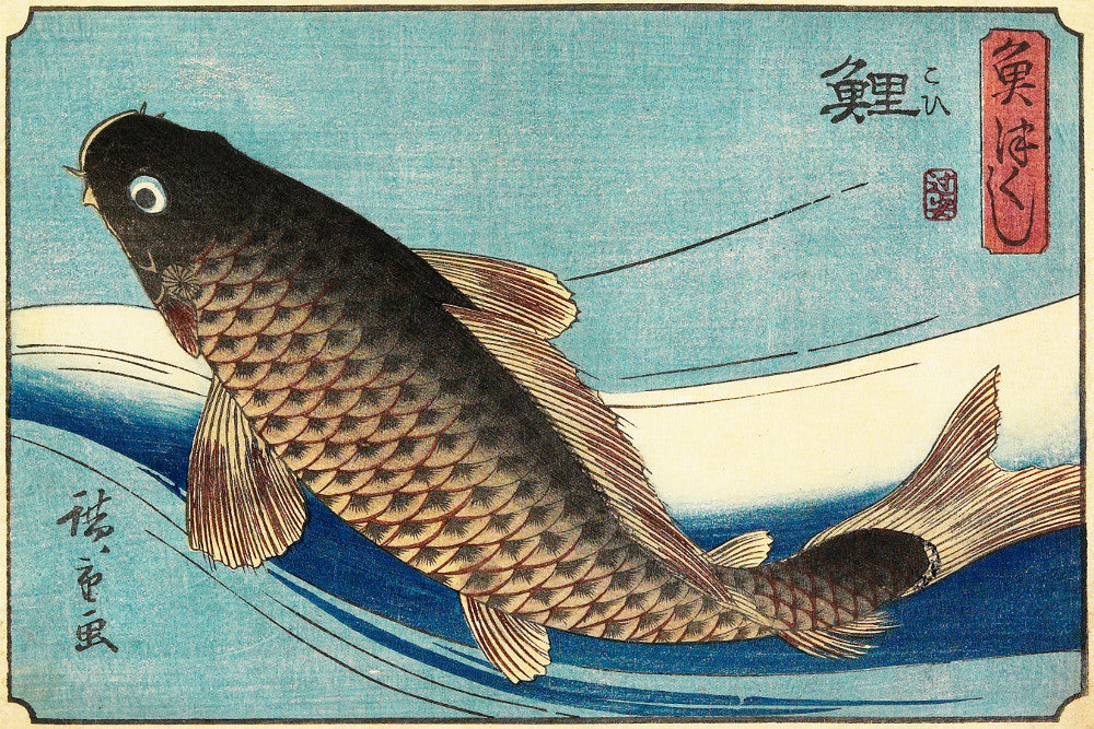
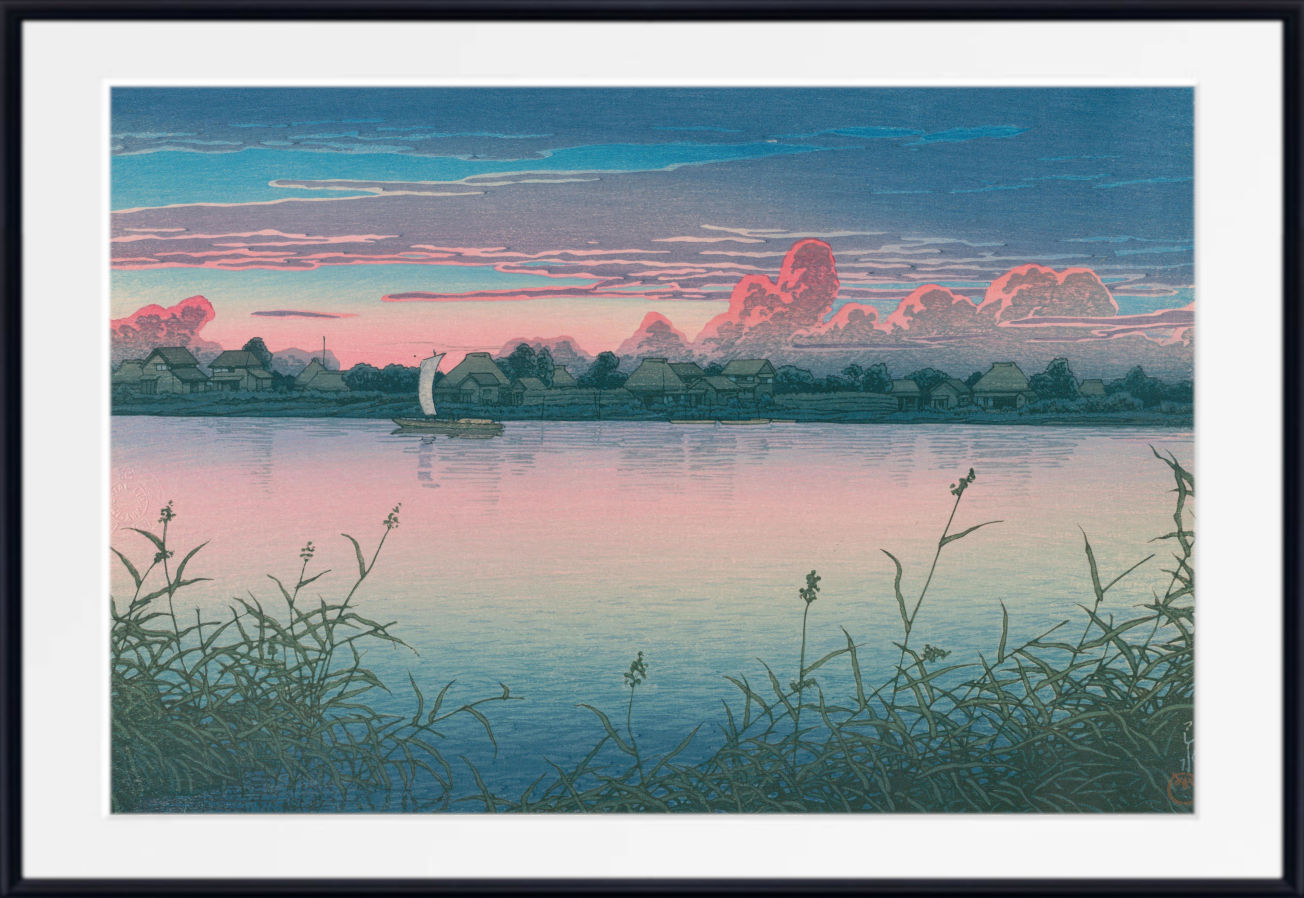
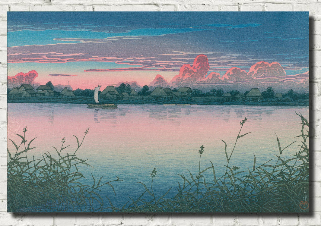
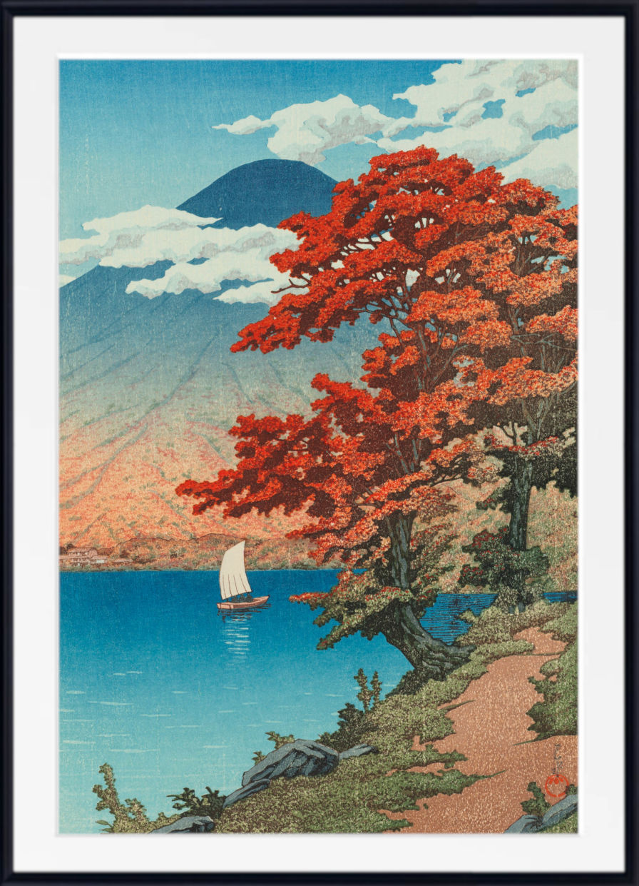
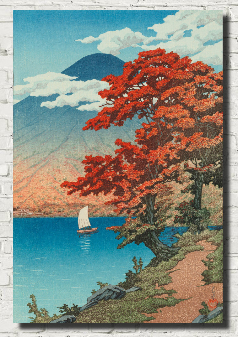
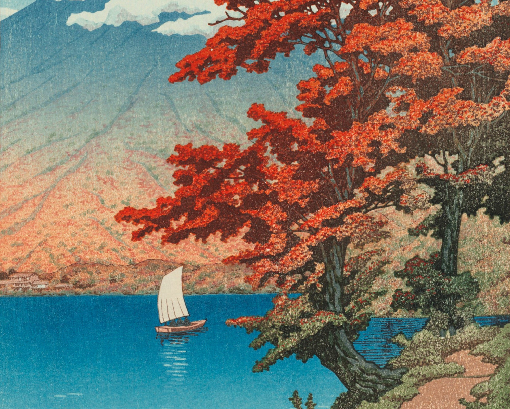
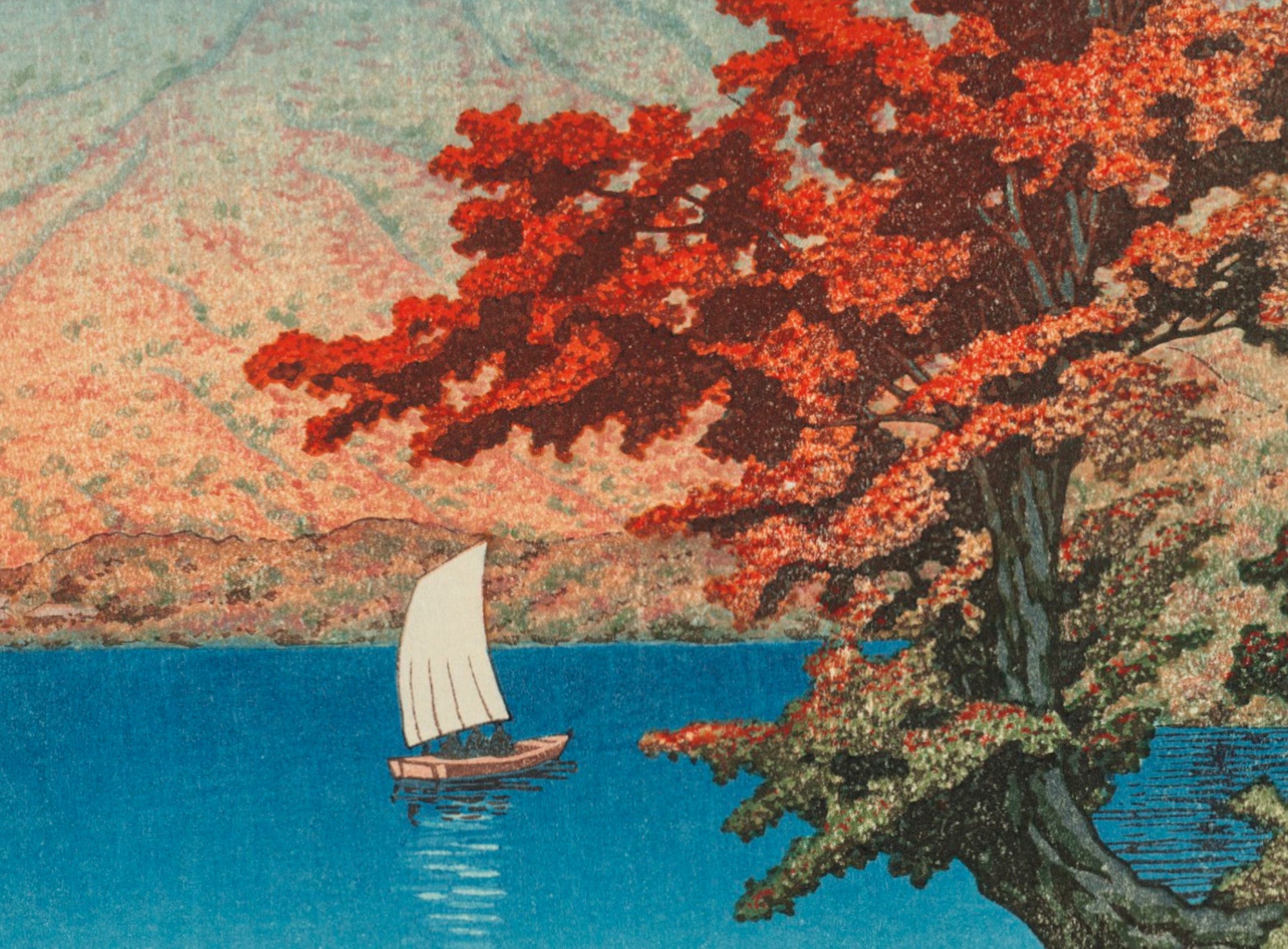
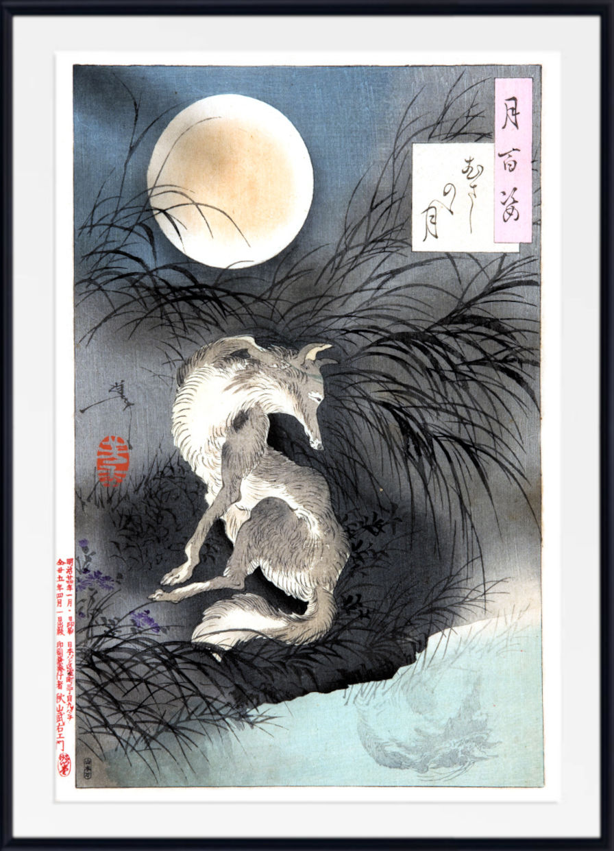
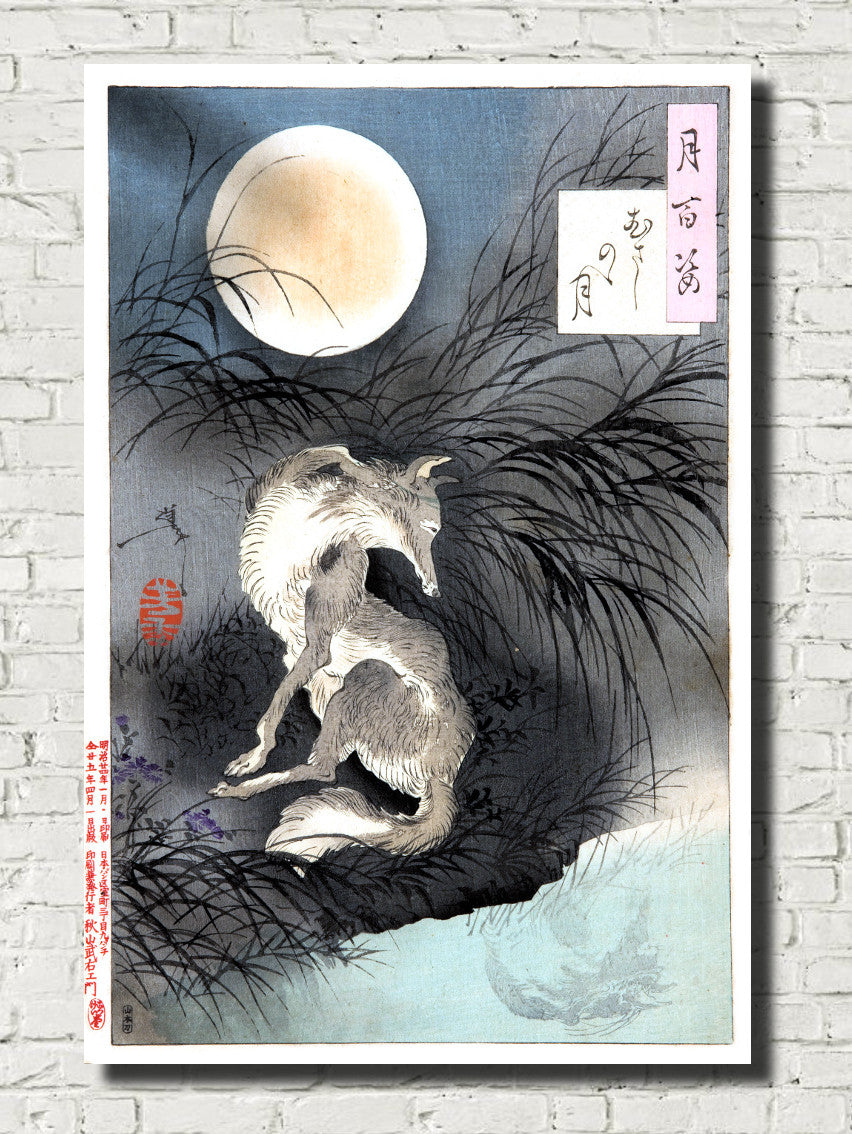
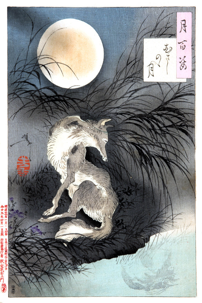
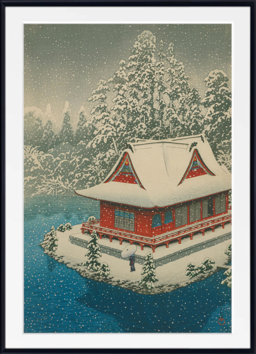
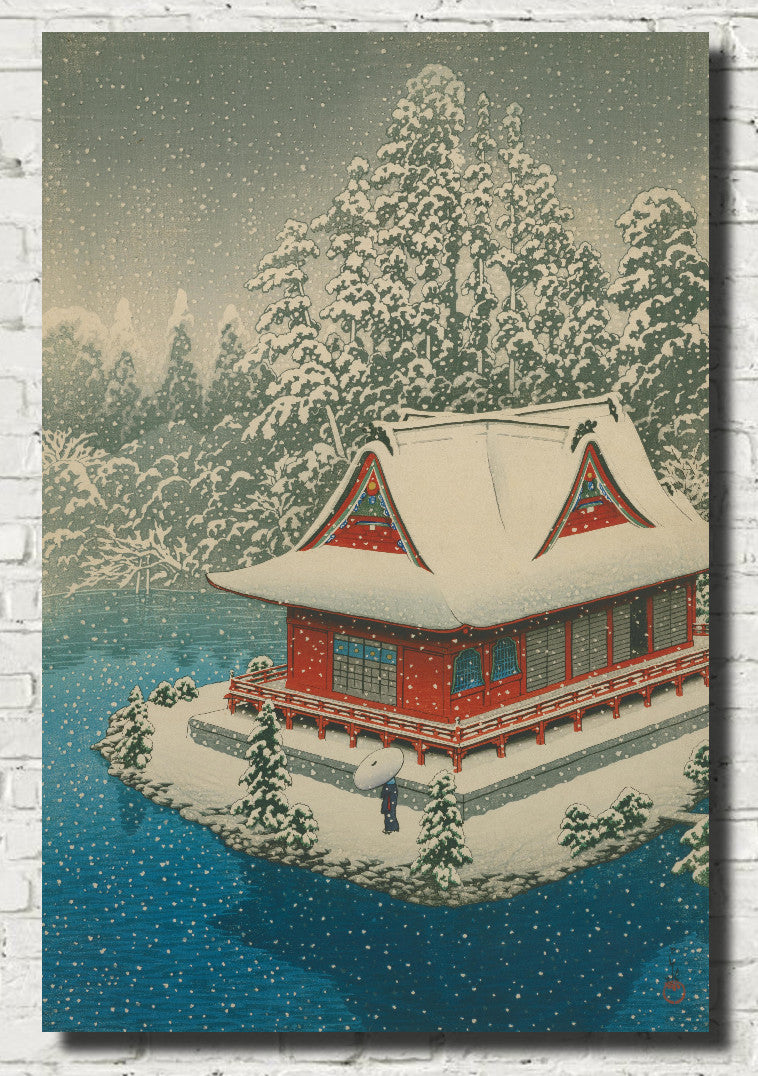
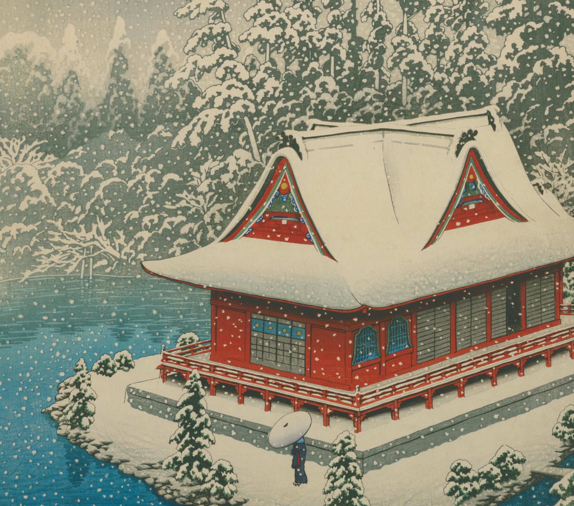
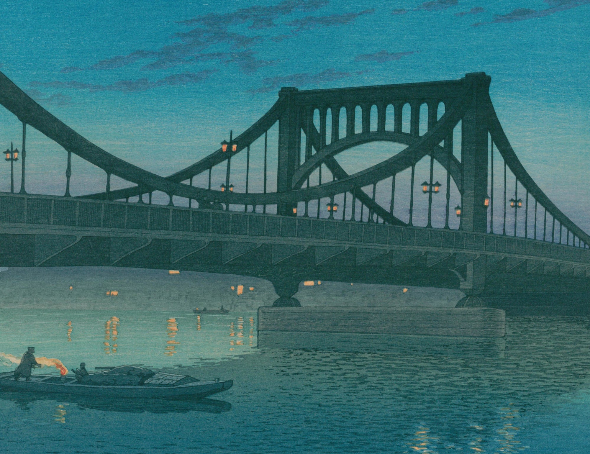
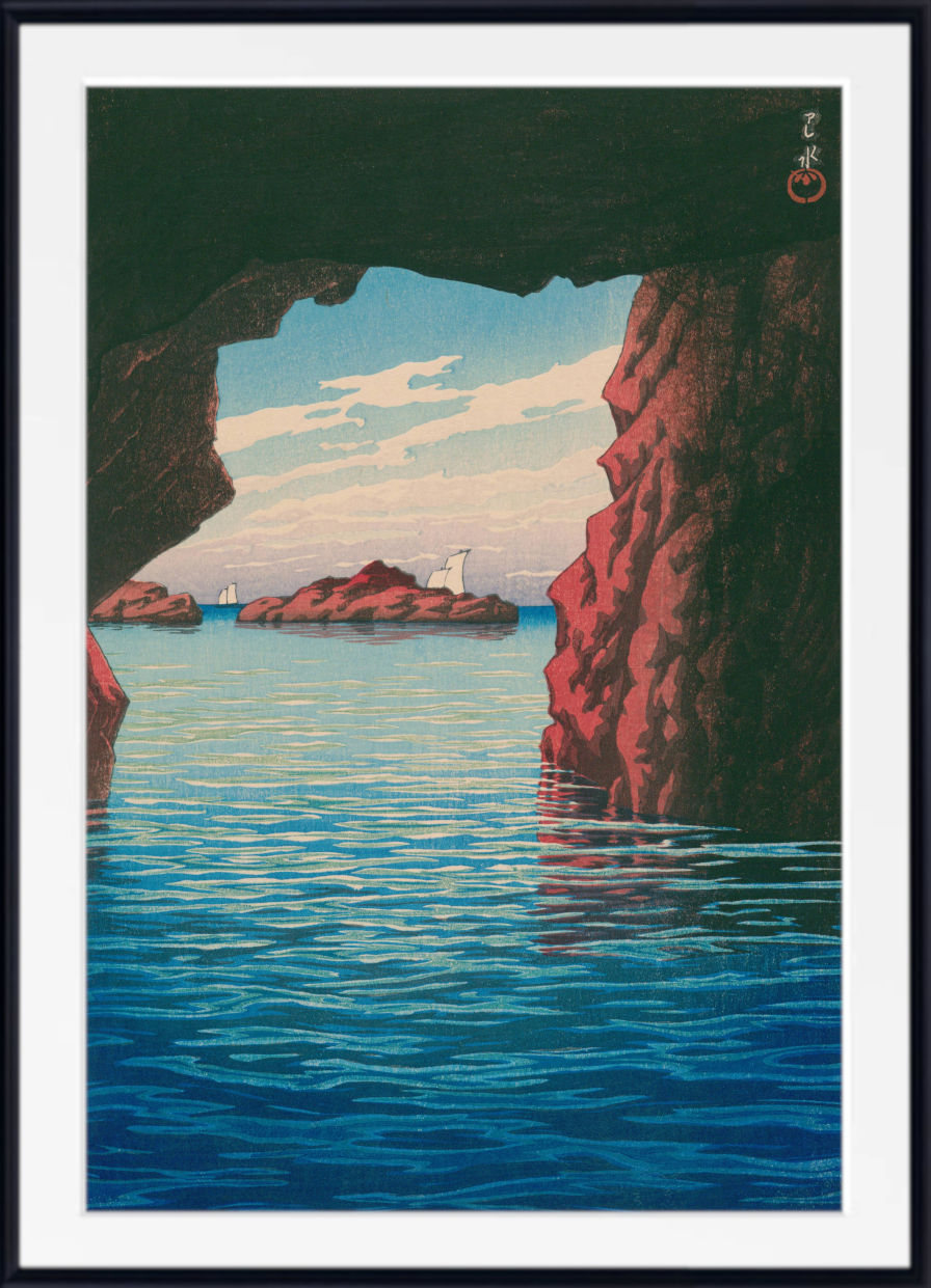
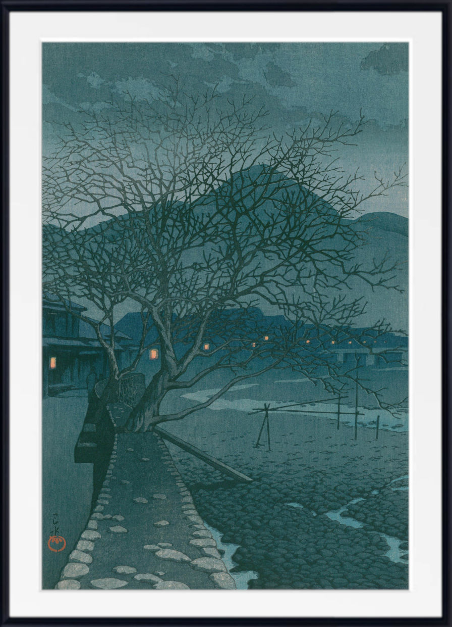
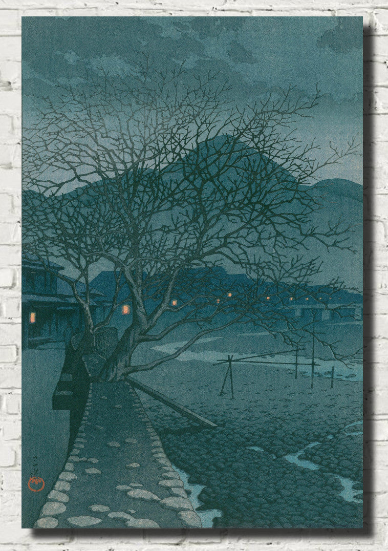
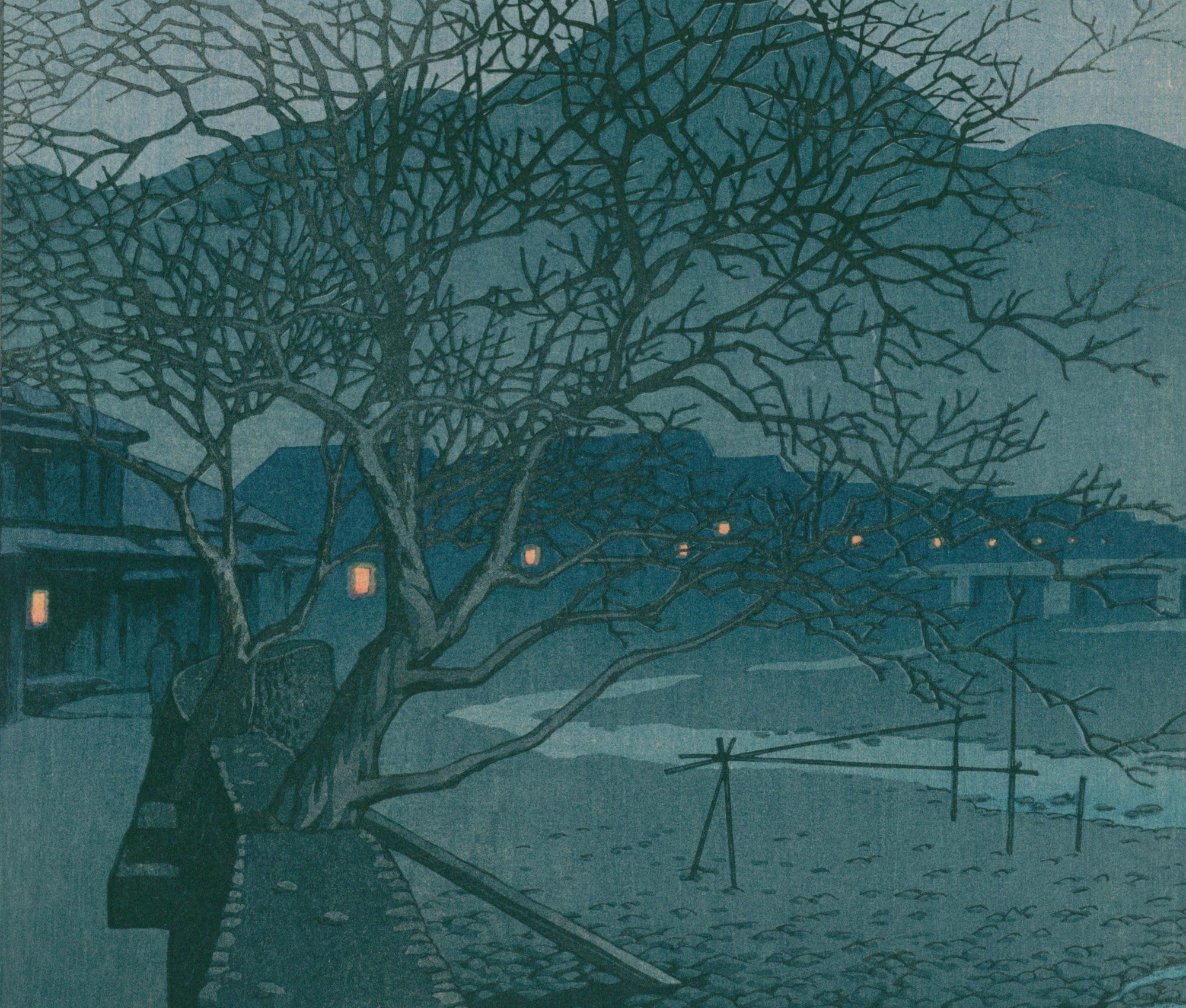
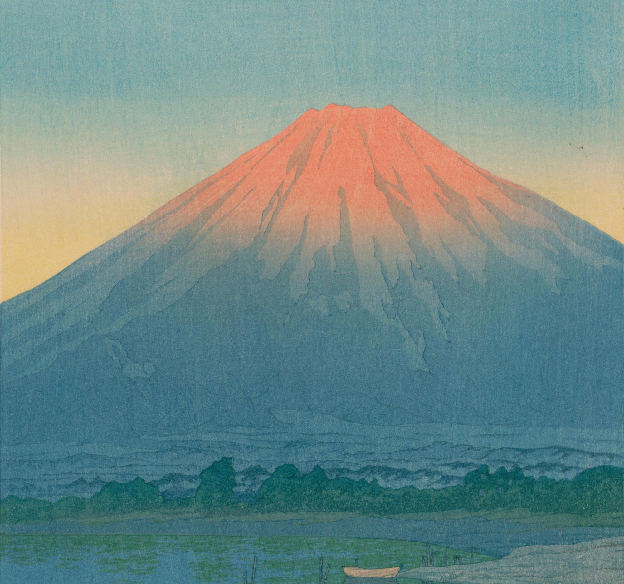
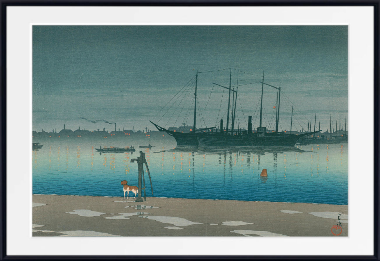
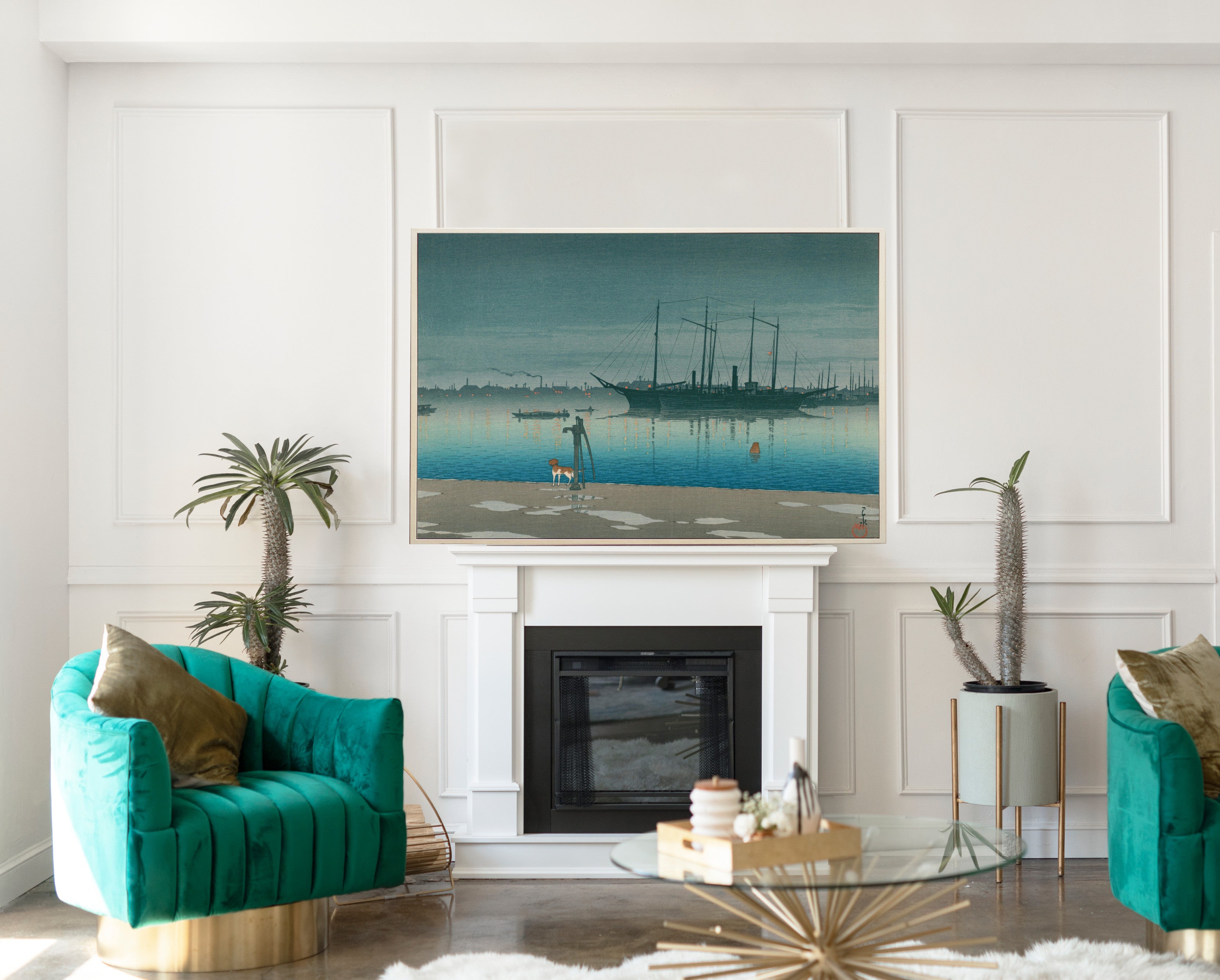
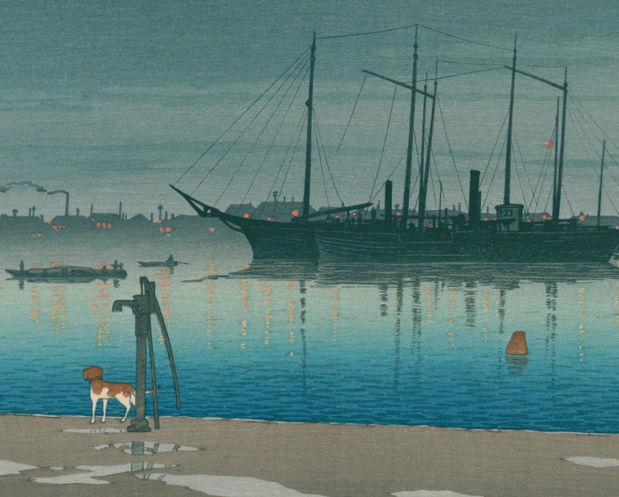
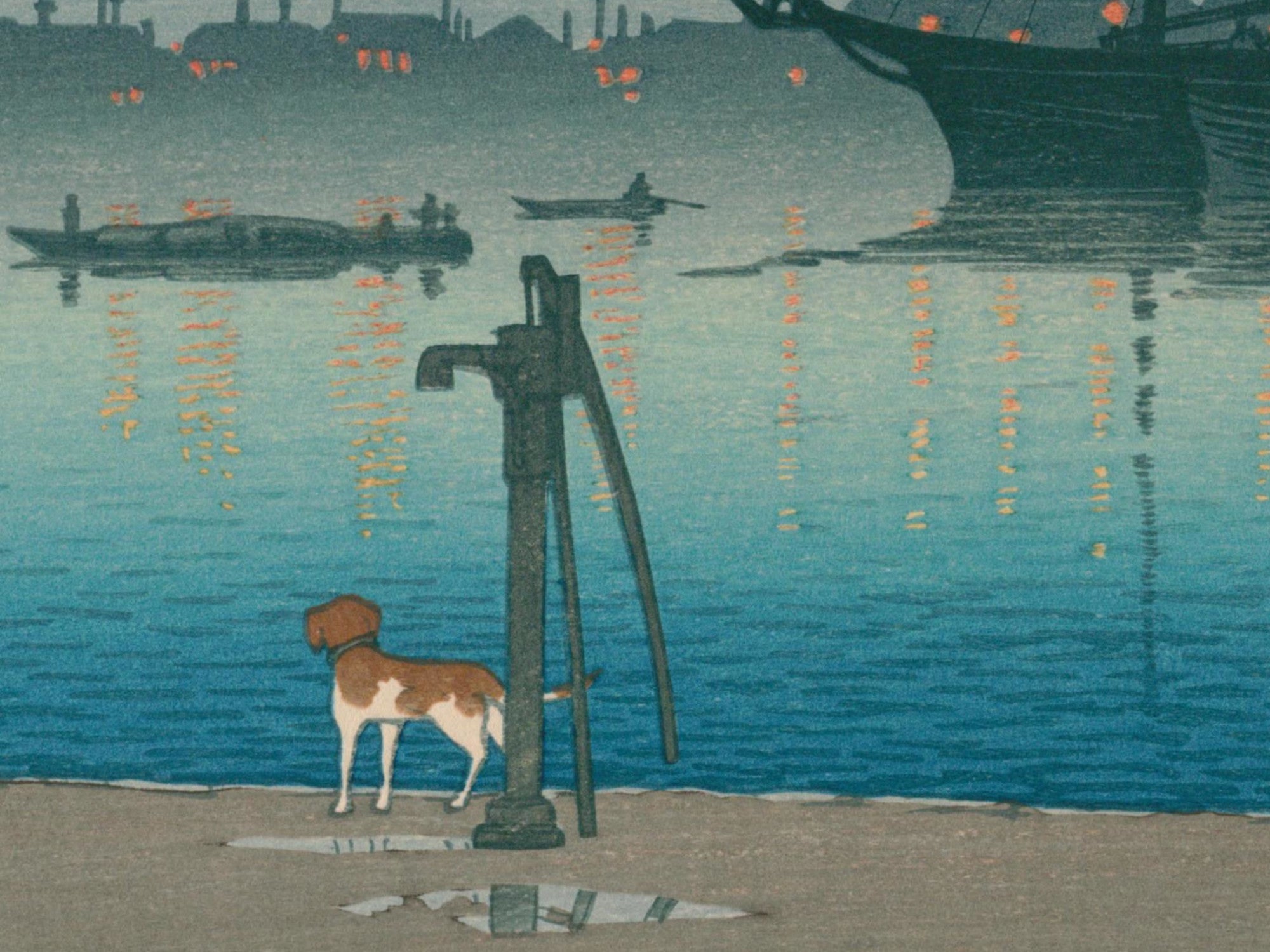
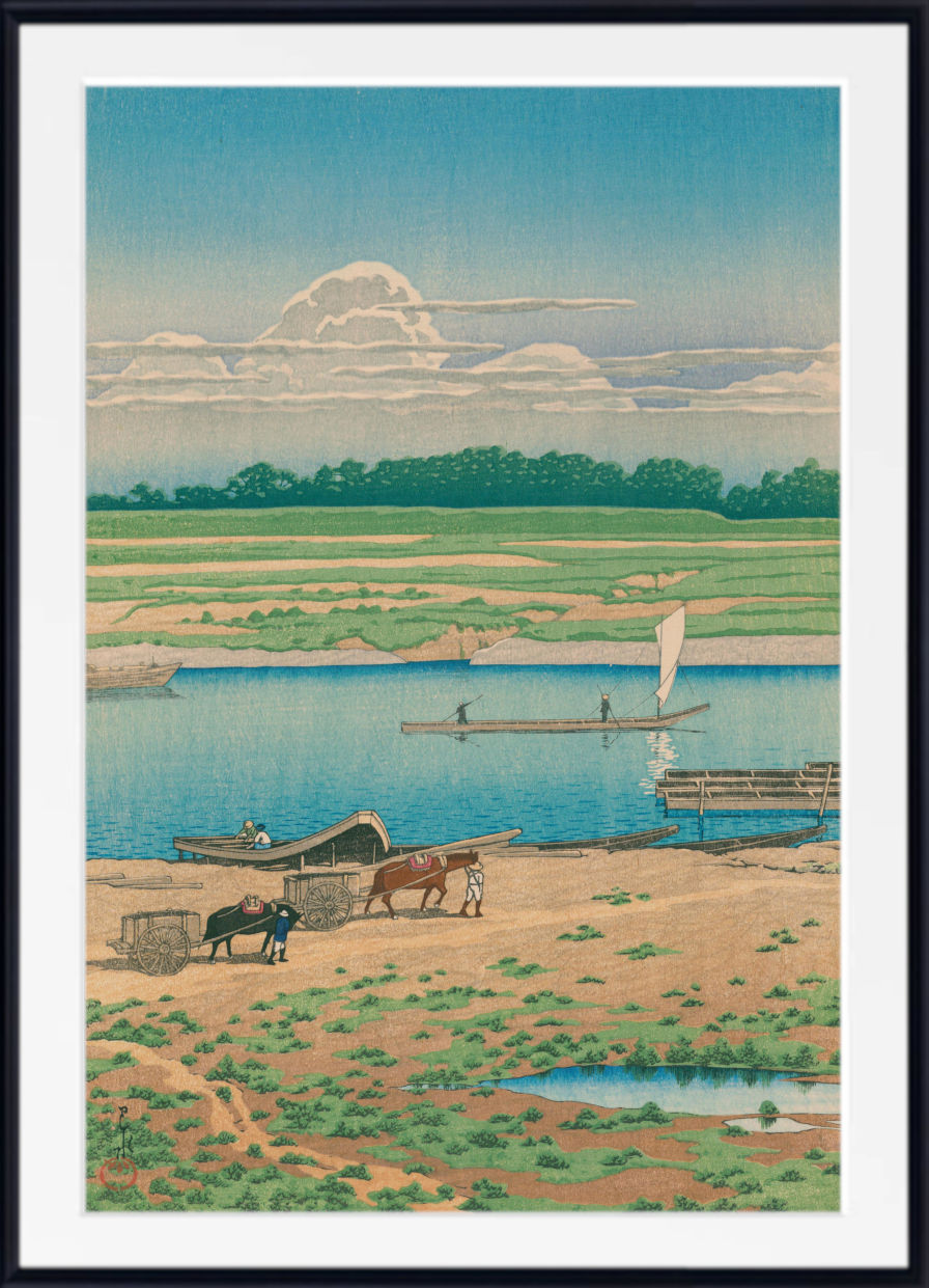
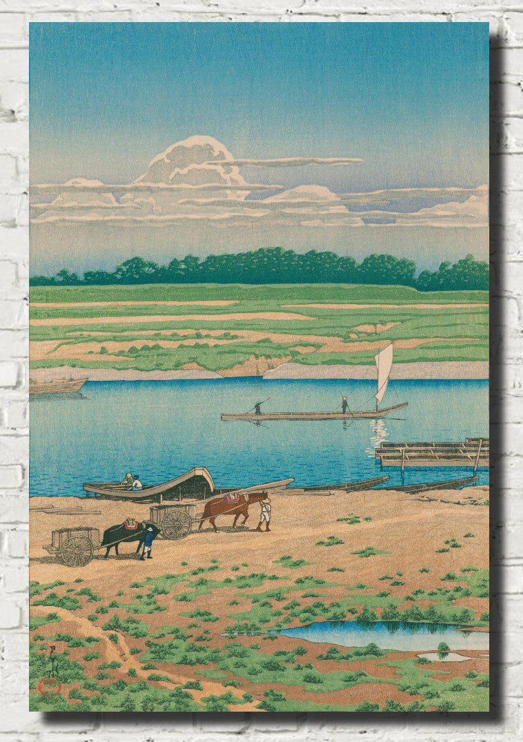
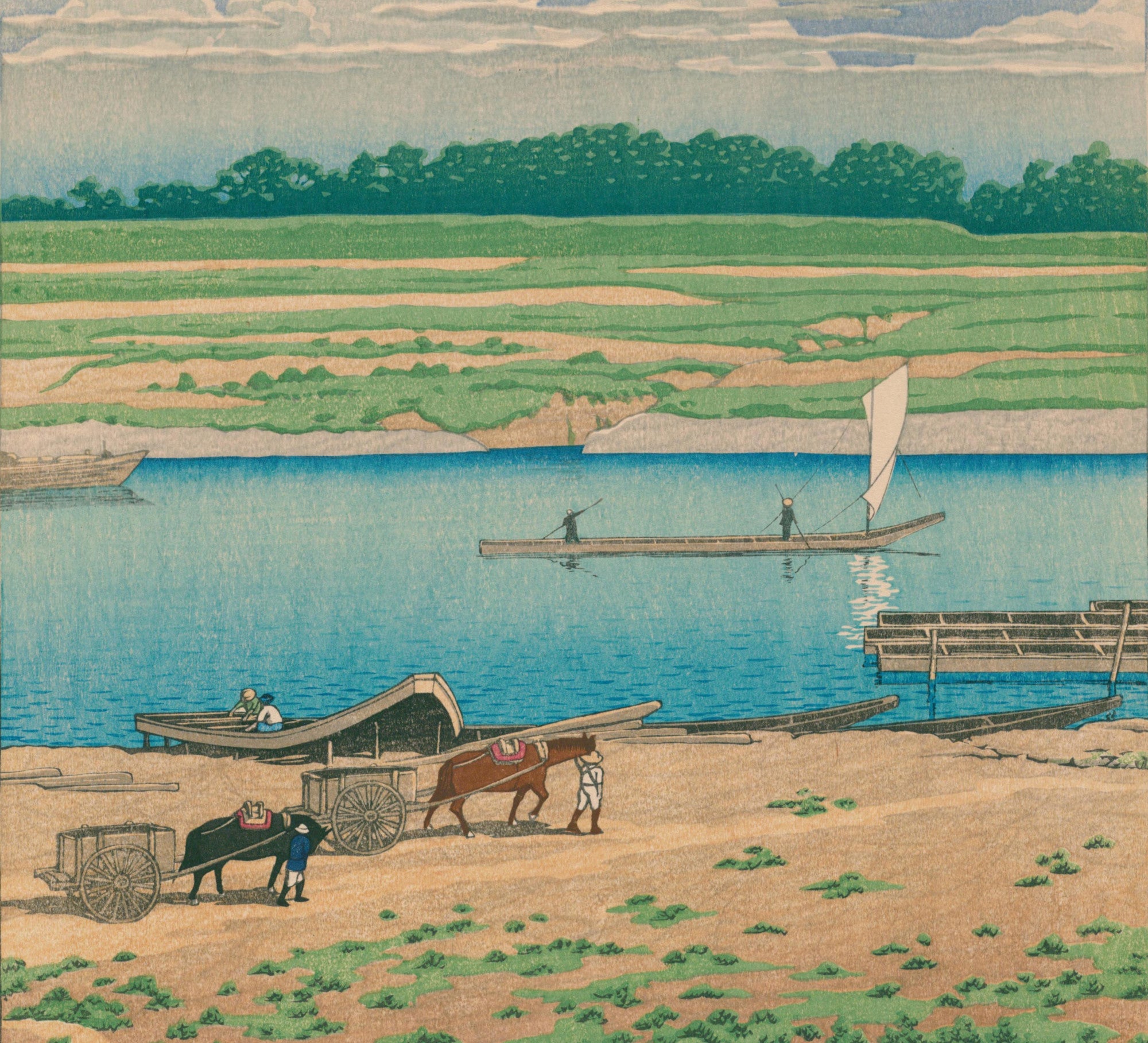
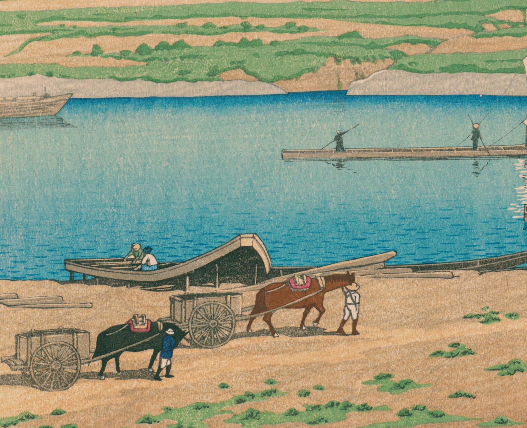
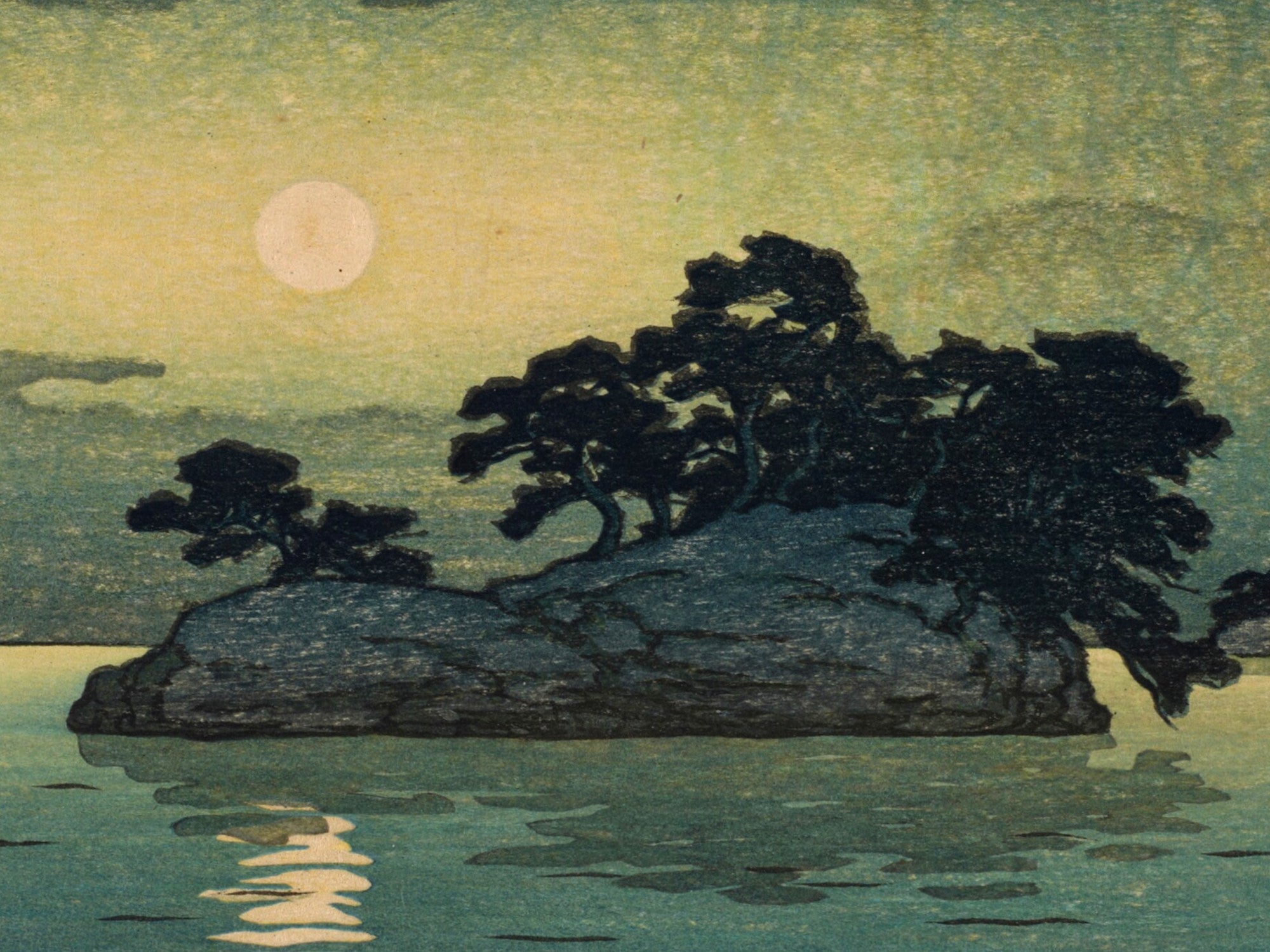
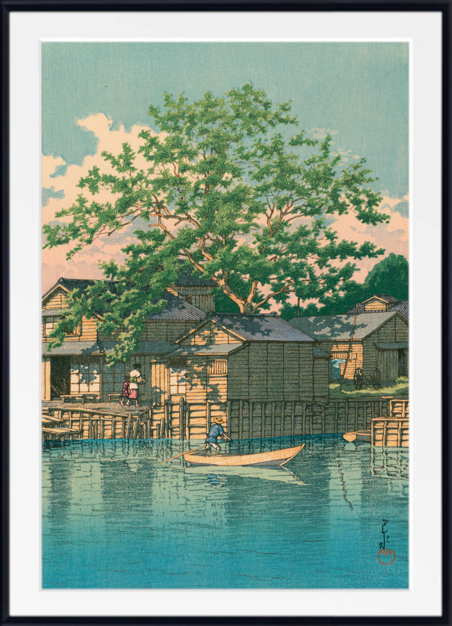
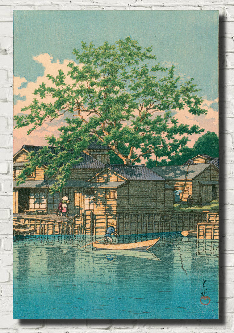
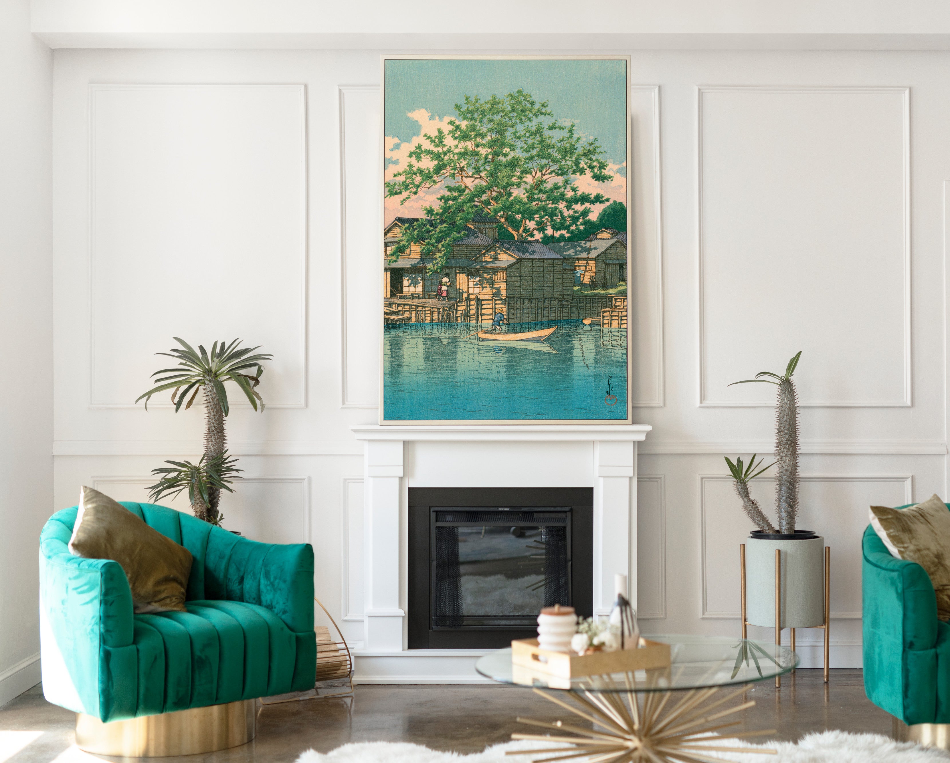
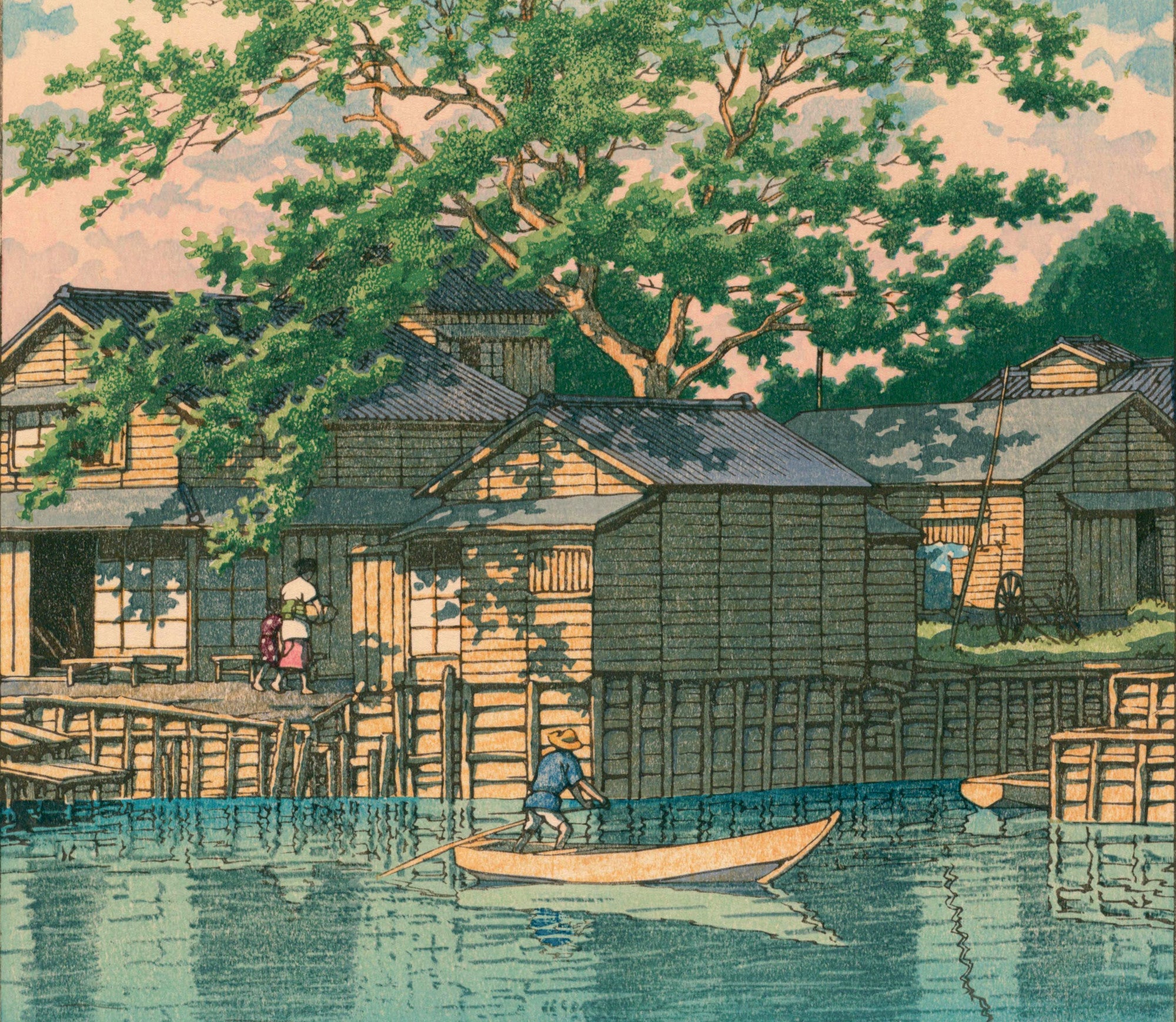
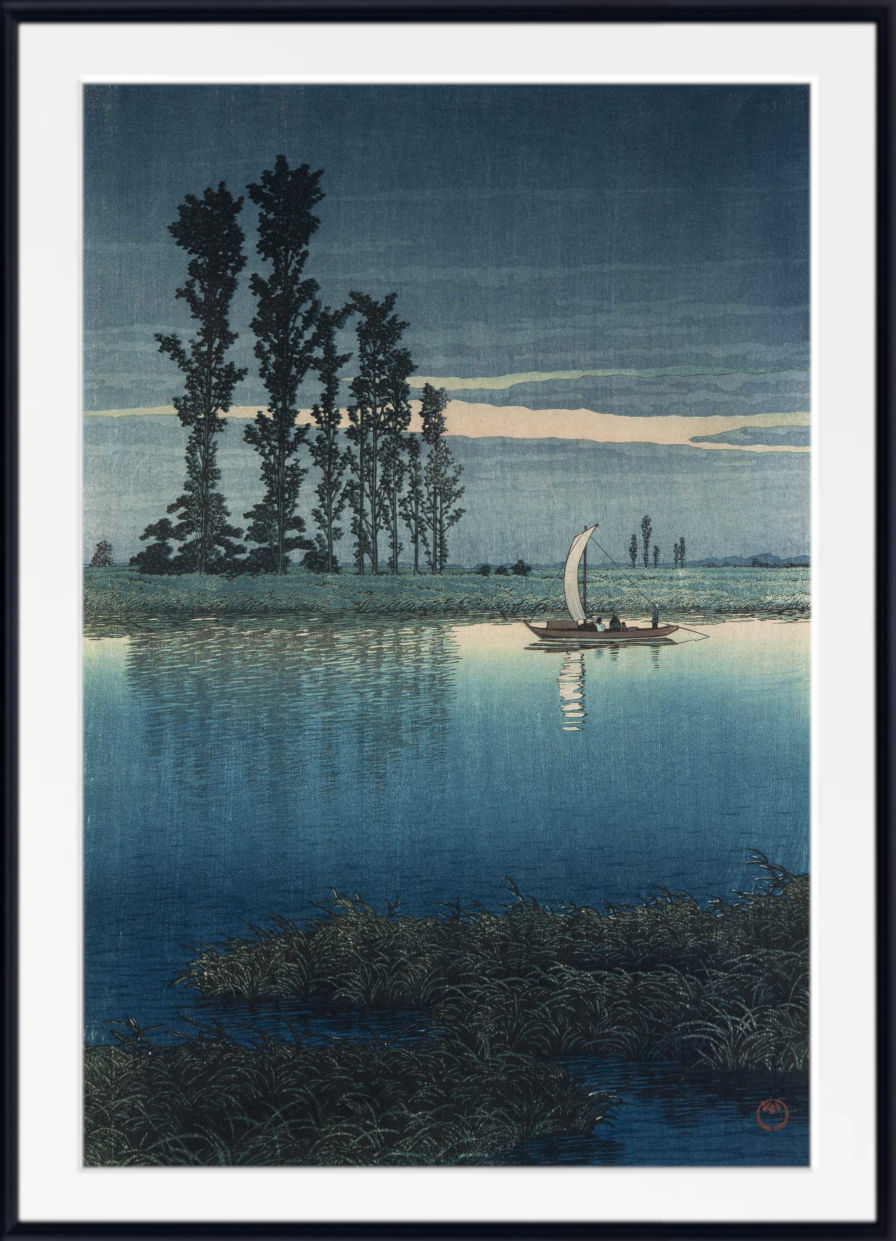
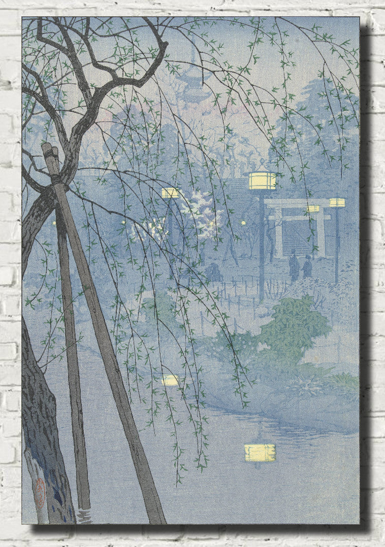
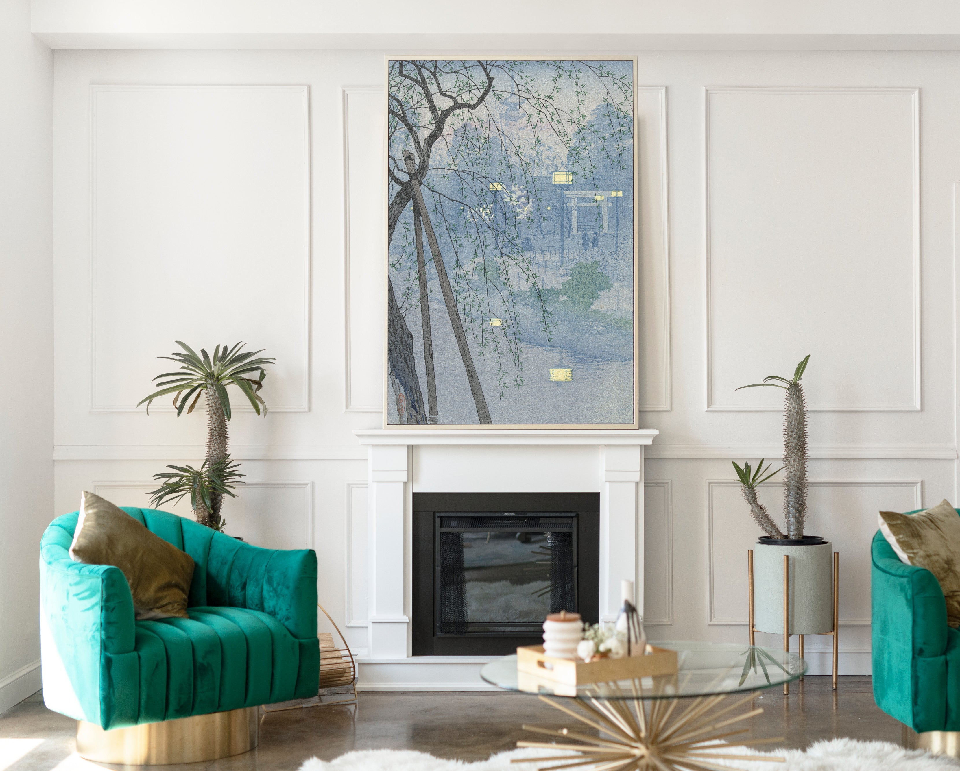
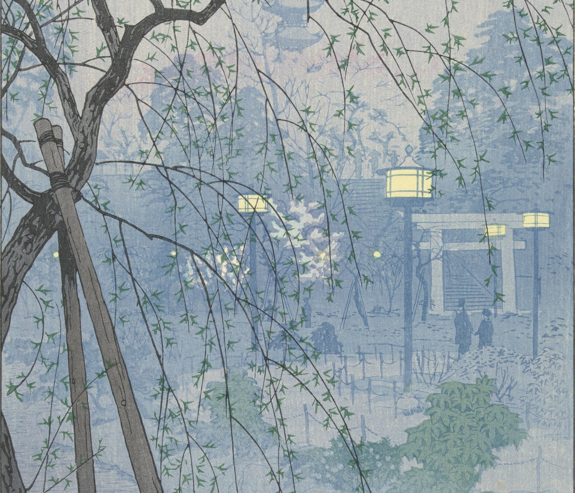
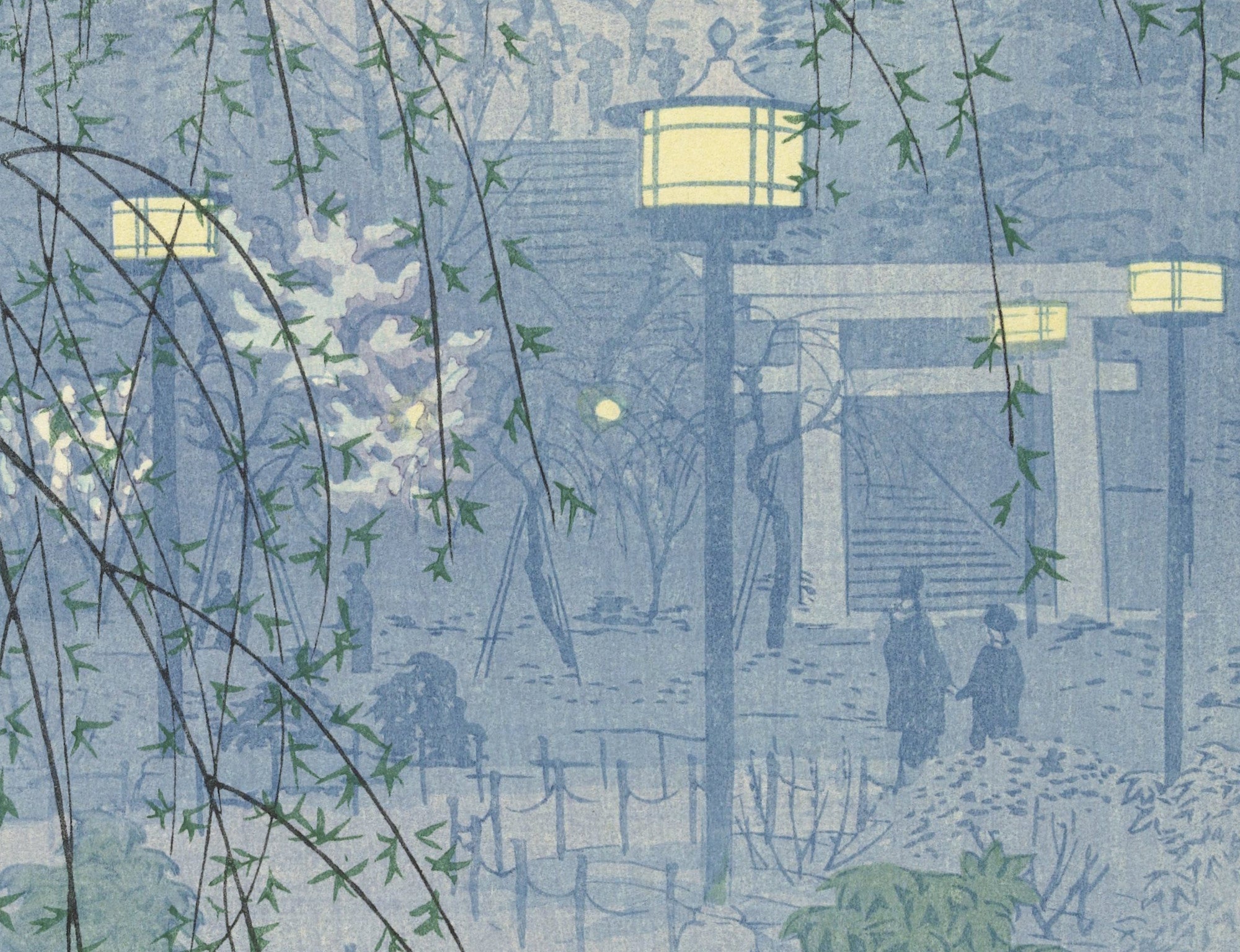
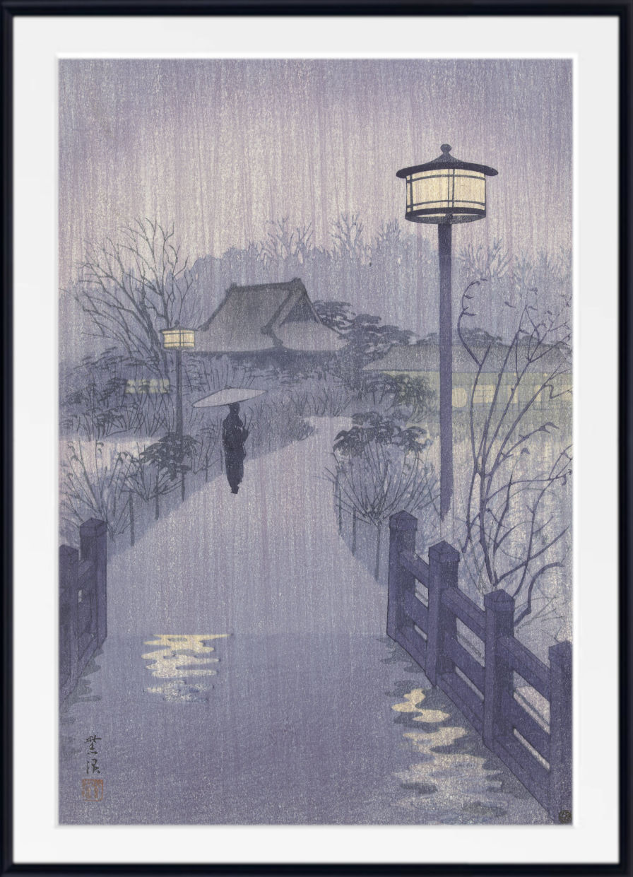
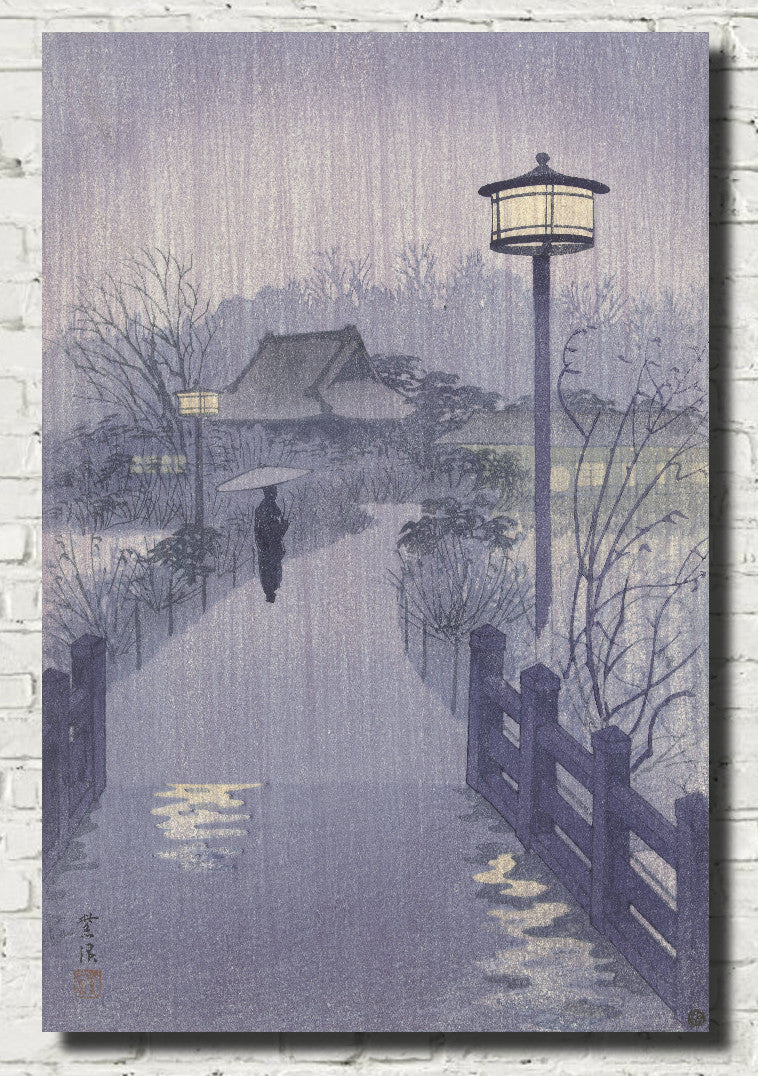
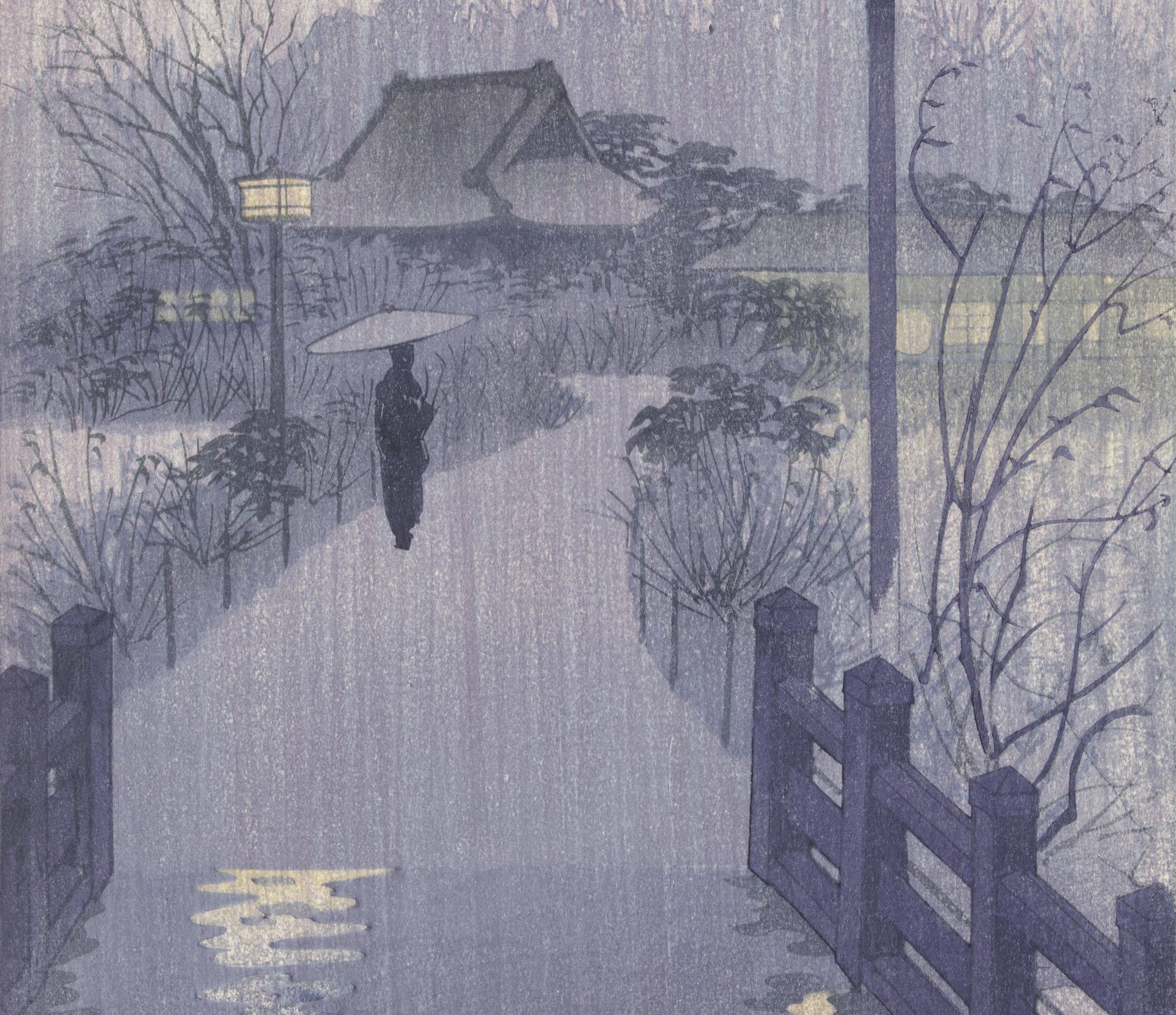
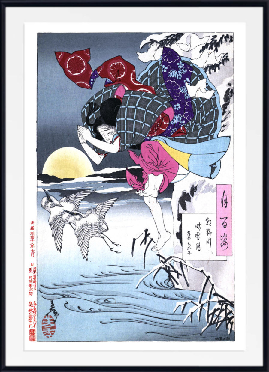
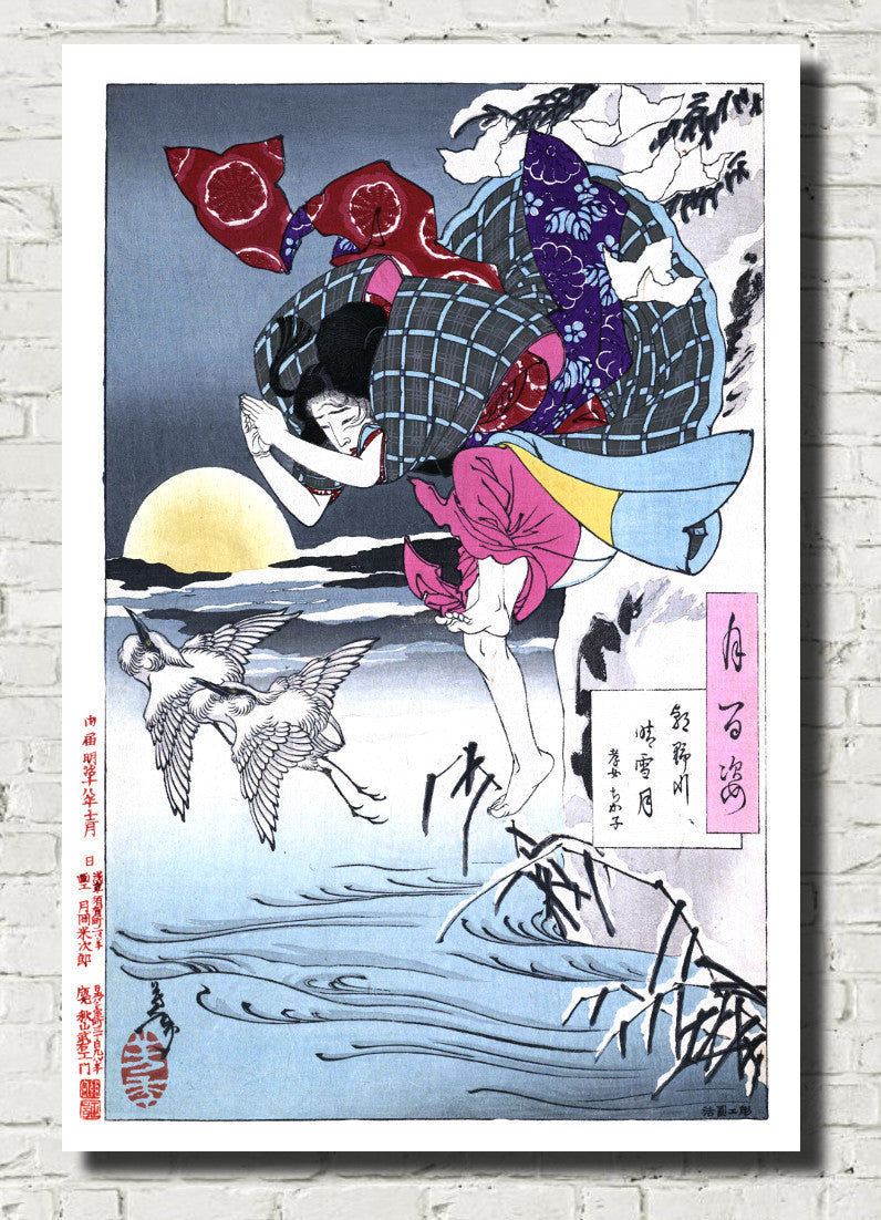
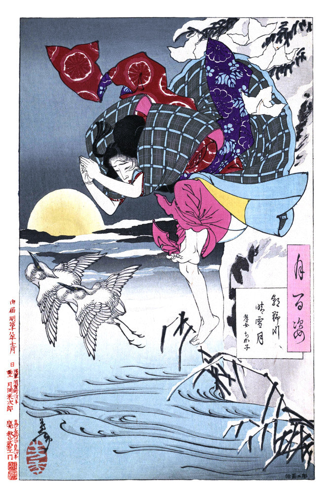
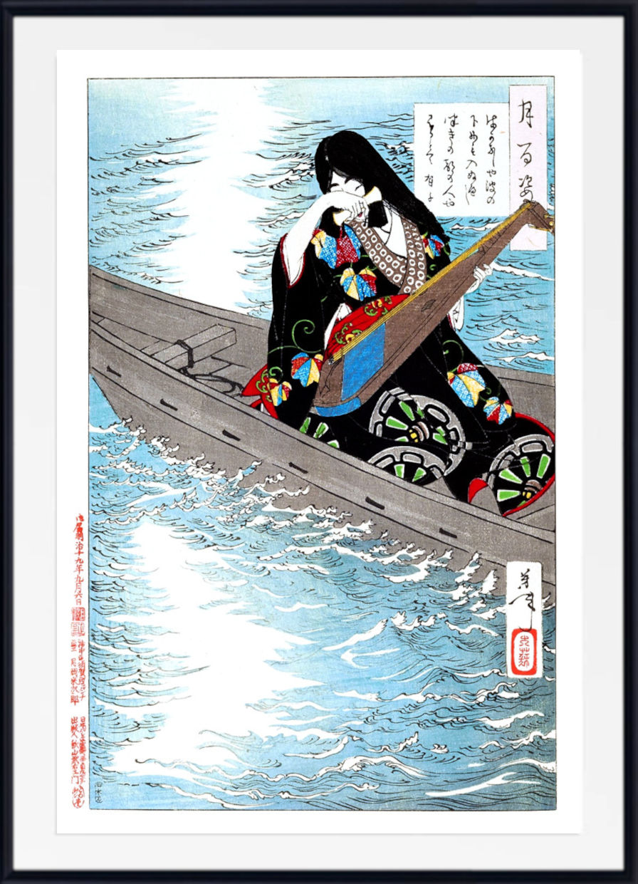
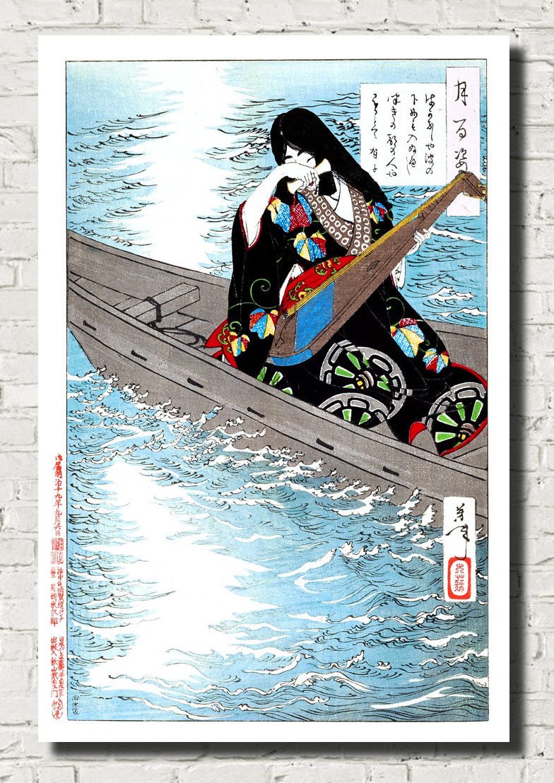
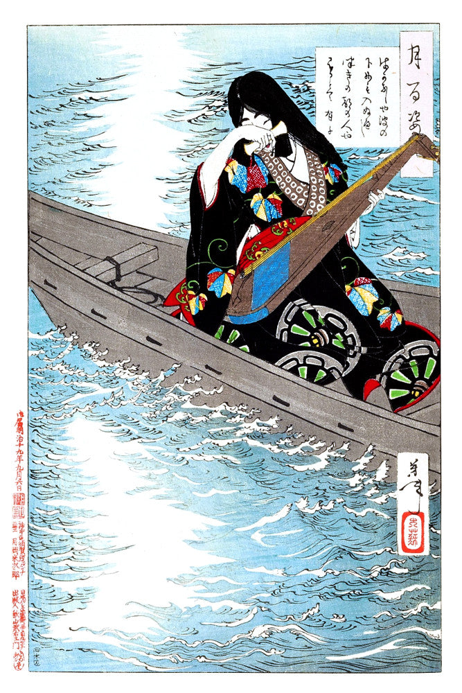
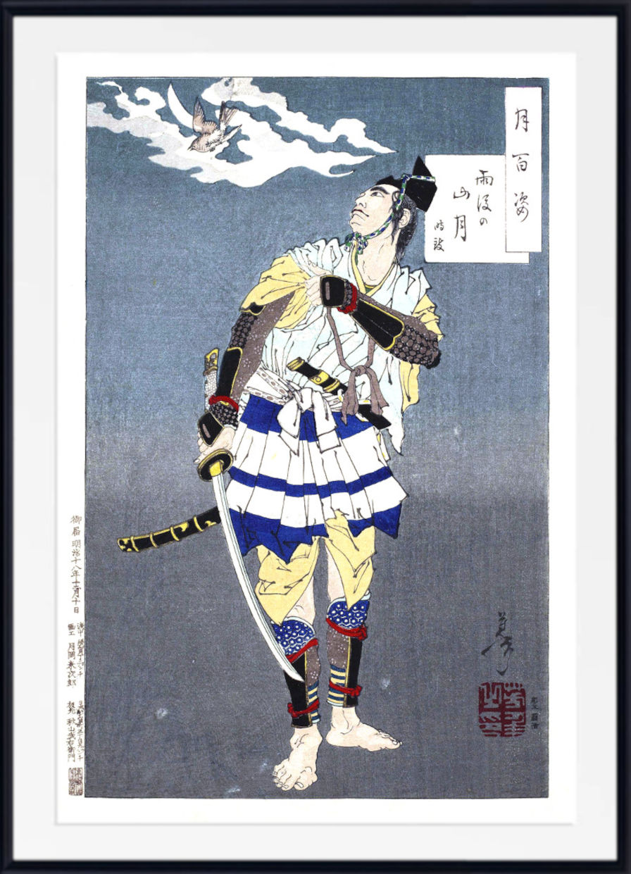
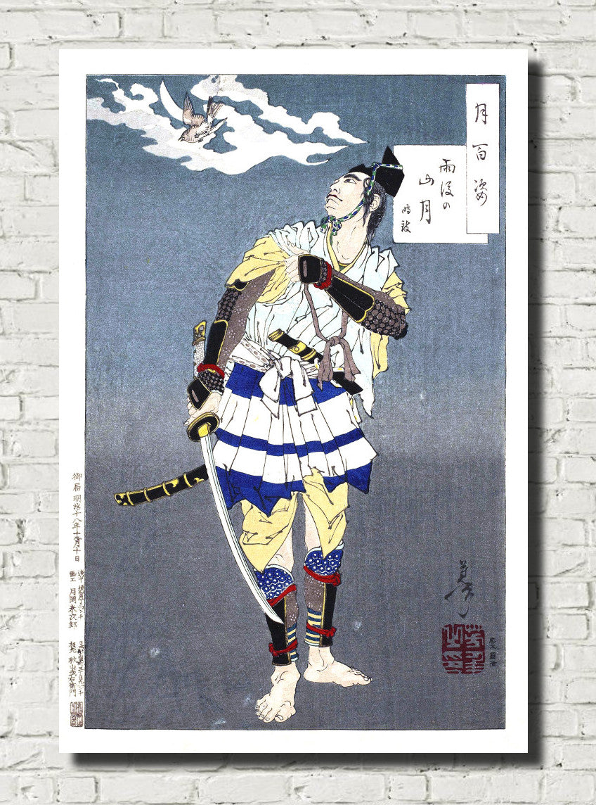
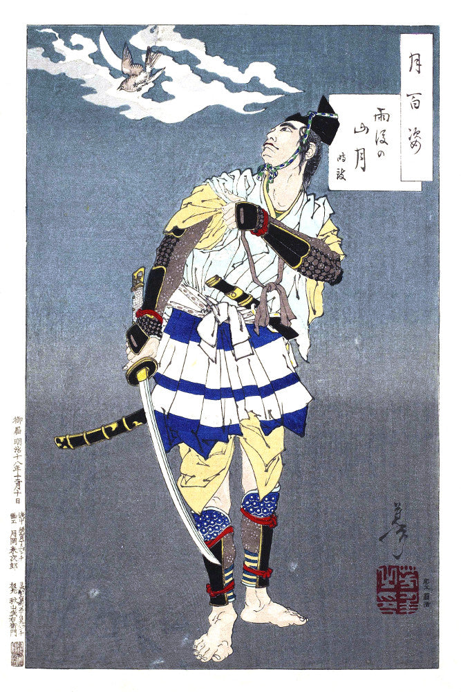
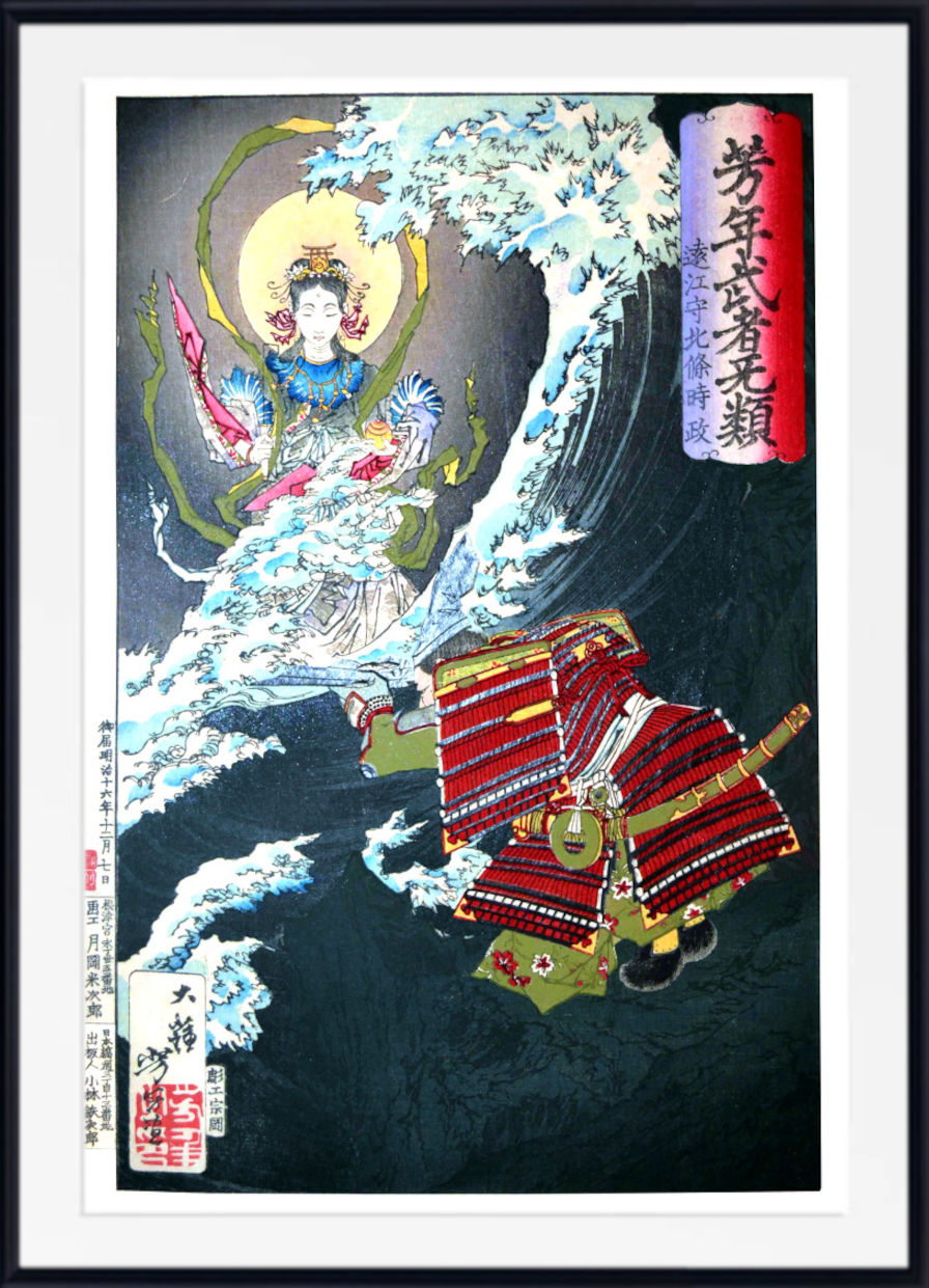
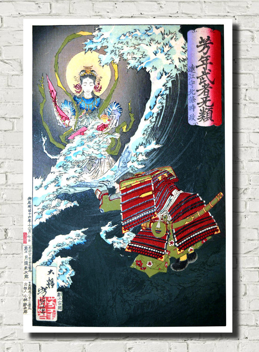
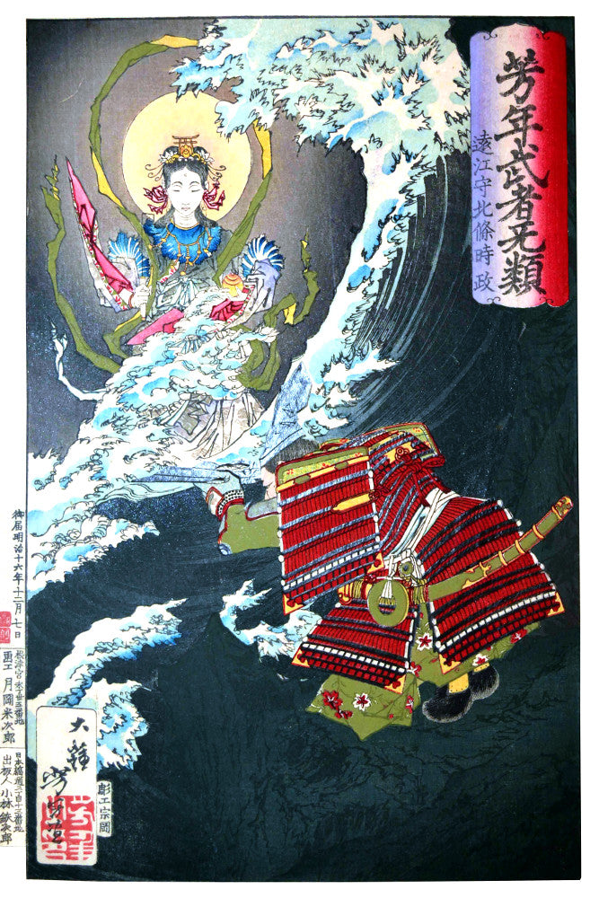
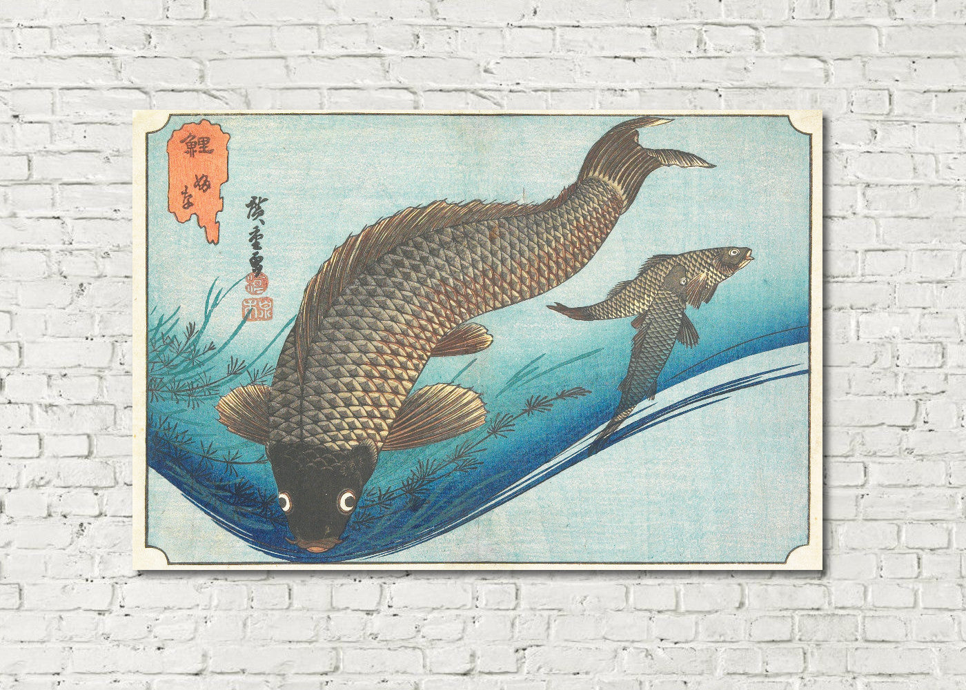
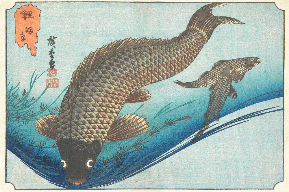
Explore our collection of blue Japanese prints, featuring dramatic ocean waves, Mount Fuji landscapes, rivers, rain, moonlit scenes, snowy landscapes, coastal views and atmospheric woodblock prints in shades of indigo, Prussian blue, cobalt, turquoise and softer blue-grey. From iconic ukiyo-e designs by Katsushika Hokusai and Andō Hiroshige to the tranquil landscapes of Hasui Kawase, blue has played an exceptional role in the history of Japanese printmaking.
Blue Japanese wall art combines elegant composition, strong line and distinctive colour with subjects drawn from nature, travel and everyday life. These artworks work beautifully in living rooms, bedrooms, hallways, dining rooms, offices and calm contemporary interiors. Choose from fine art paper prints, framed prints and canvas panels in a wide range of sizes.
Explore Blue Japanese Prints
Browse blue Japanese wall art alongside related blue collections, Japanese printmakers and major art movements.
Blue in Japanese Art and Woodblock Printing
Blue has an extraordinary presence in Japanese art. It appears in seas, rivers, waterfalls, rainstorms, distant mountains, evening skies and patterned textiles, but its importance extends far beyond the simple depiction of nature. In the hands of Japanese printmakers, blue could create depth, movement, atmosphere and dramatic contrast.
The widespread use of imported Prussian blue during the nineteenth century transformed Japanese printmaking. Its deep, stable colour allowed artists to create richer seas and skies than had previously been possible. The popularity of predominantly blue prints, often known as aizuri-e, helped make blue one of the defining colours of nineteenth-century ukiyo-e.
Today, blue Japanese prints remain especially appealing because they combine historic artistry with a colour palette that works naturally in modern homes. Indigo, navy and deep Prussian blue can create drama, while pale blue and blue-grey bring a quieter, more contemplative quality.
Hokusai and the Power of Prussian Blue
Katsushika Hokusai is among the most famous artists in Japanese history, and some of his best-known works are inseparable from the colour blue. His celebrated landscapes combine bold outlines, unusual viewpoints and powerful natural forms with extensive areas of water and sky.
The Great Wave off Kanagawa is perhaps the world's most recognisable Japanese woodblock print. Its enormous curling wave, deep blue water and distant view of Mount Fuji demonstrate how Hokusai could transform a landscape scene into an image of extraordinary rhythm and visual power.
Other works from Hokusai's famous Mount Fuji series use blue to describe rivers, lakes, coastlines, distant mountains and atmospheric space. His use of colour helped give these landscapes clarity and depth while maintaining the strong decorative character that makes Japanese prints so distinctive.
Hiroshige: Rain, Rivers and Blue Landscapes
Andō Hiroshige was a master of landscape and atmosphere. His woodblock prints frequently feature blue rivers, mist-covered mountains, waterfalls, coastlines, rain and expansive evening skies. Rather than relying on dramatic spectacle alone, Hiroshige often created a quieter sense of place and changing weather.
In series such as The Fifty-Three Stations of the Tōkaidō, travellers move through rain, snow, rivers and mountain passes. Blue becomes a way of expressing distance, weather and mood, giving many of his landscapes their characteristic poetic atmosphere.
Hiroshige's blue landscapes work especially well in bedrooms, hallways and living rooms where a sense of calm and visual openness is desired. His compositions often balance strong foreground forms with distant horizons, making them effective both as individual statement prints and as part of a coordinated gallery wall.
Featured Japanese Artists
Discover influential Japanese printmakers whose landscapes, coastal scenes and atmospheric compositions feature striking uses of blue.
Blue Shin-Hanga Prints by Hasui Kawase
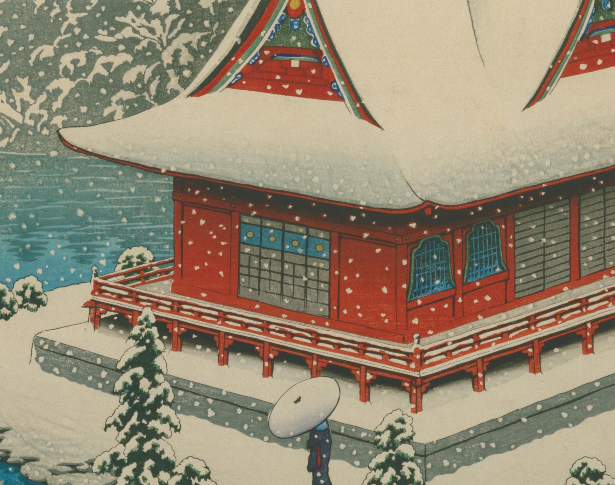
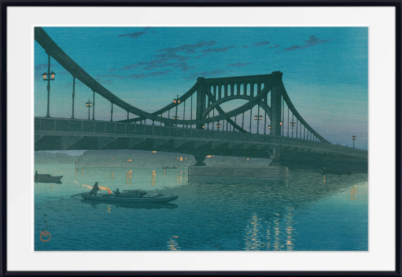
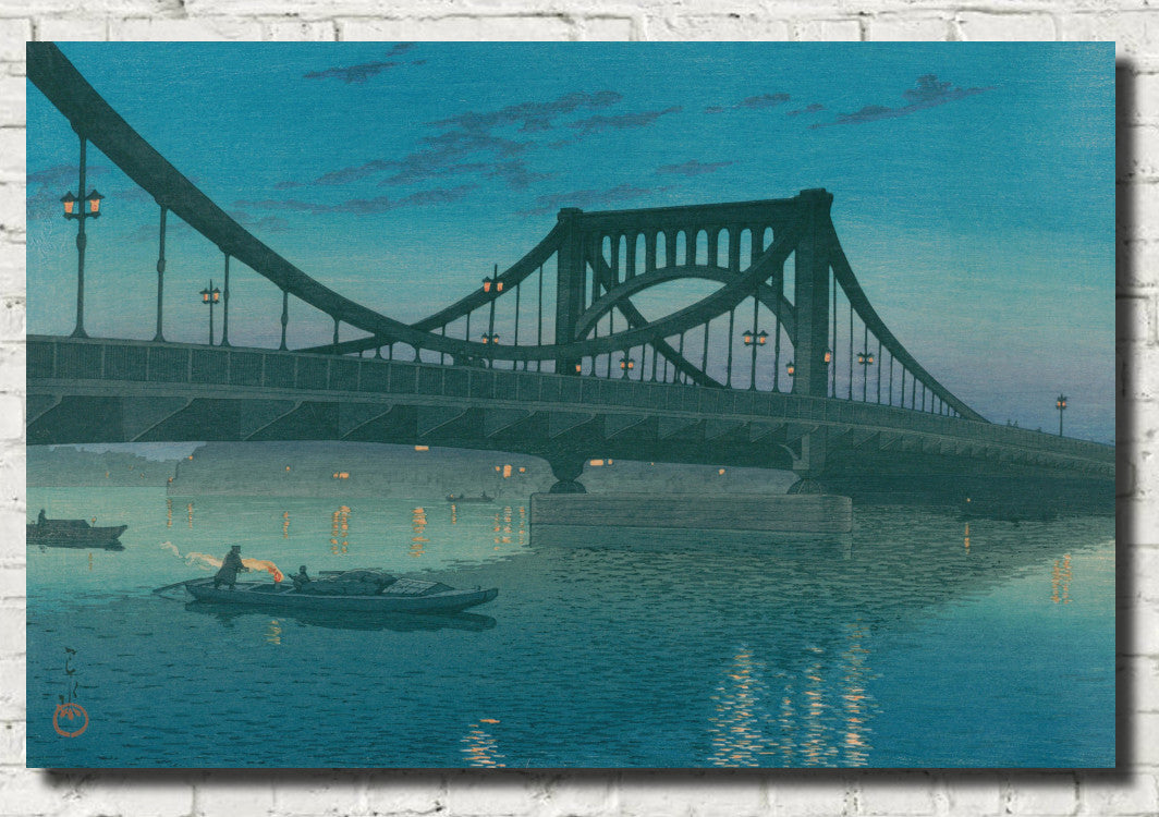
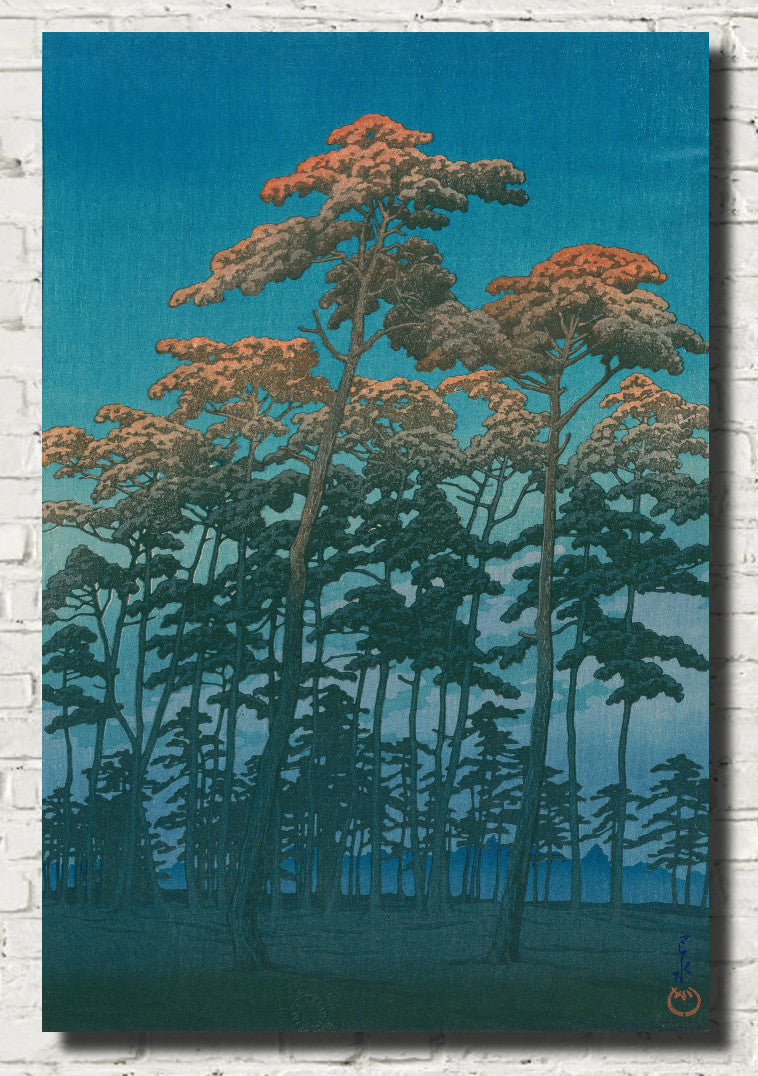
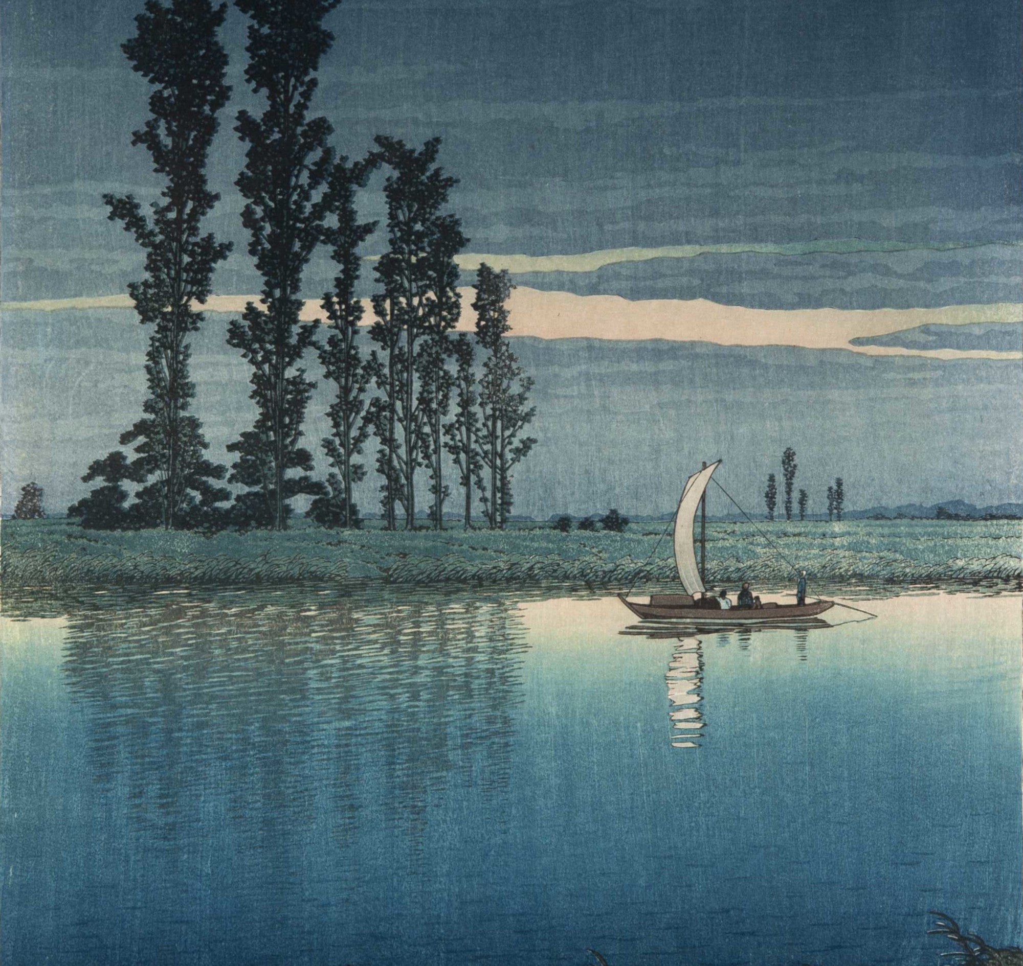
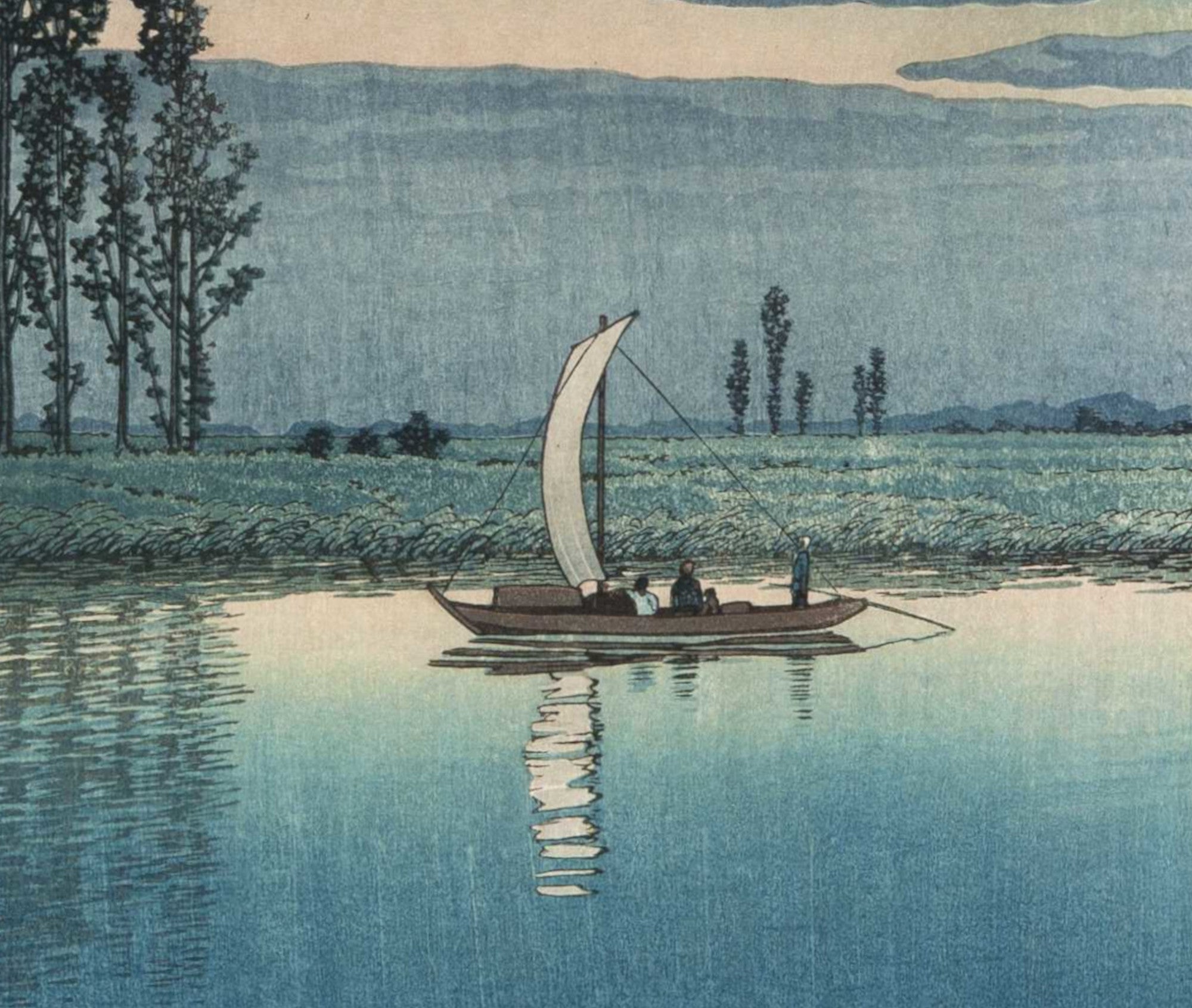
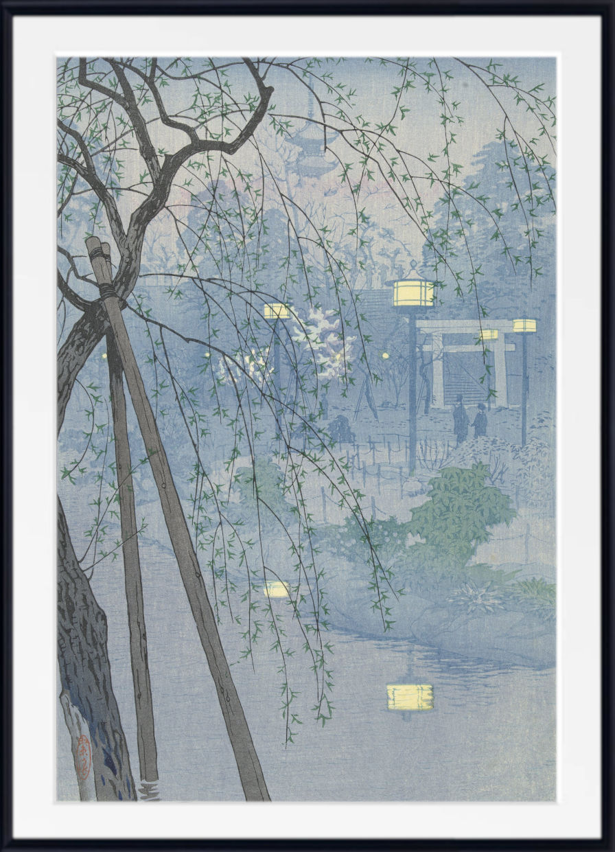
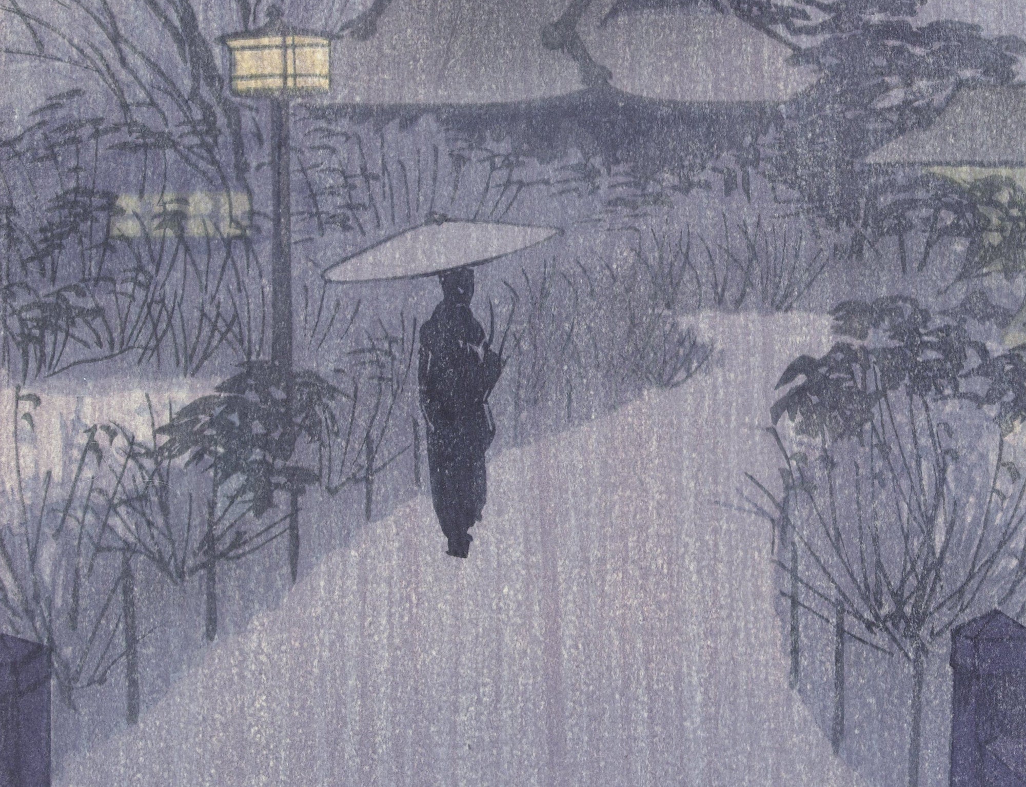
The Japanese tradition of atmospheric landscape printing continued into the twentieth century through the shin-hanga movement. Hasui Kawase became one of its most celebrated landscape artists, creating tranquil scenes of temples, streets, rivers, snow, moonlight and rain.
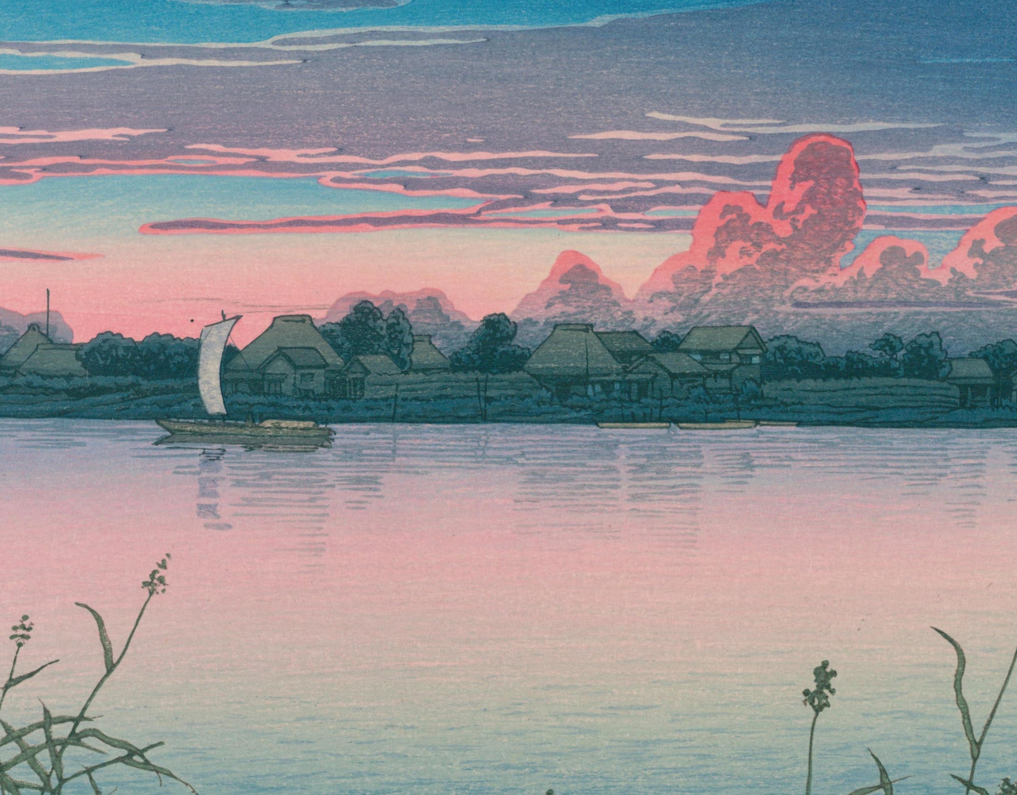
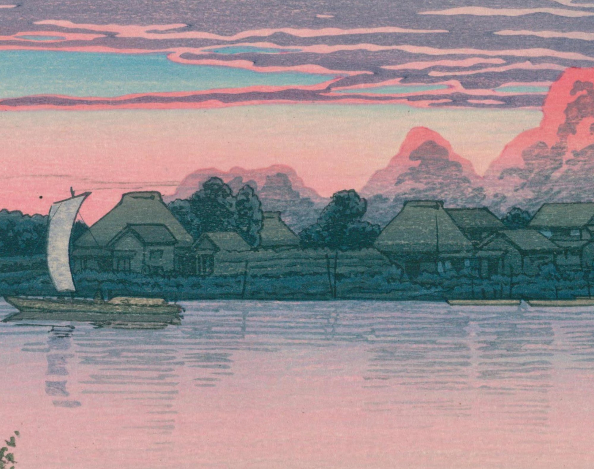
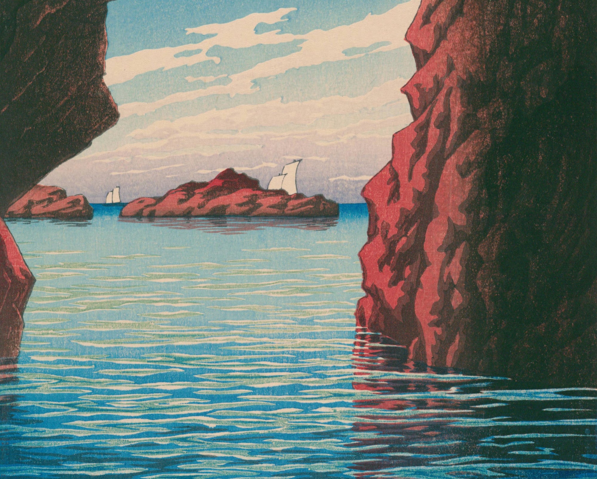
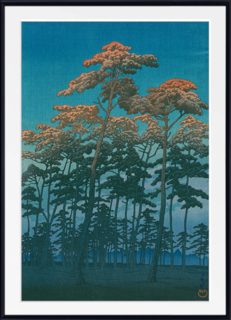
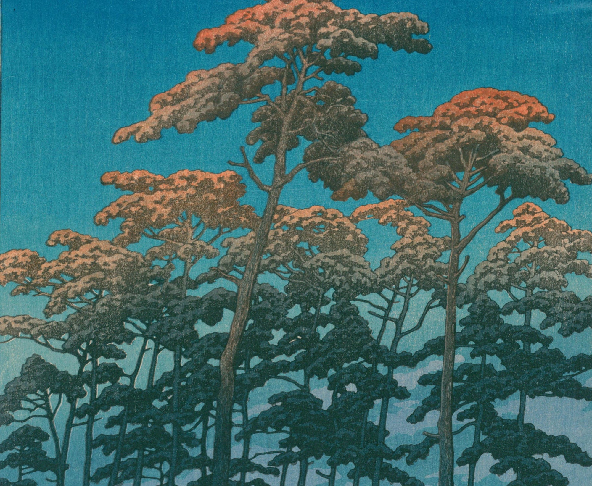
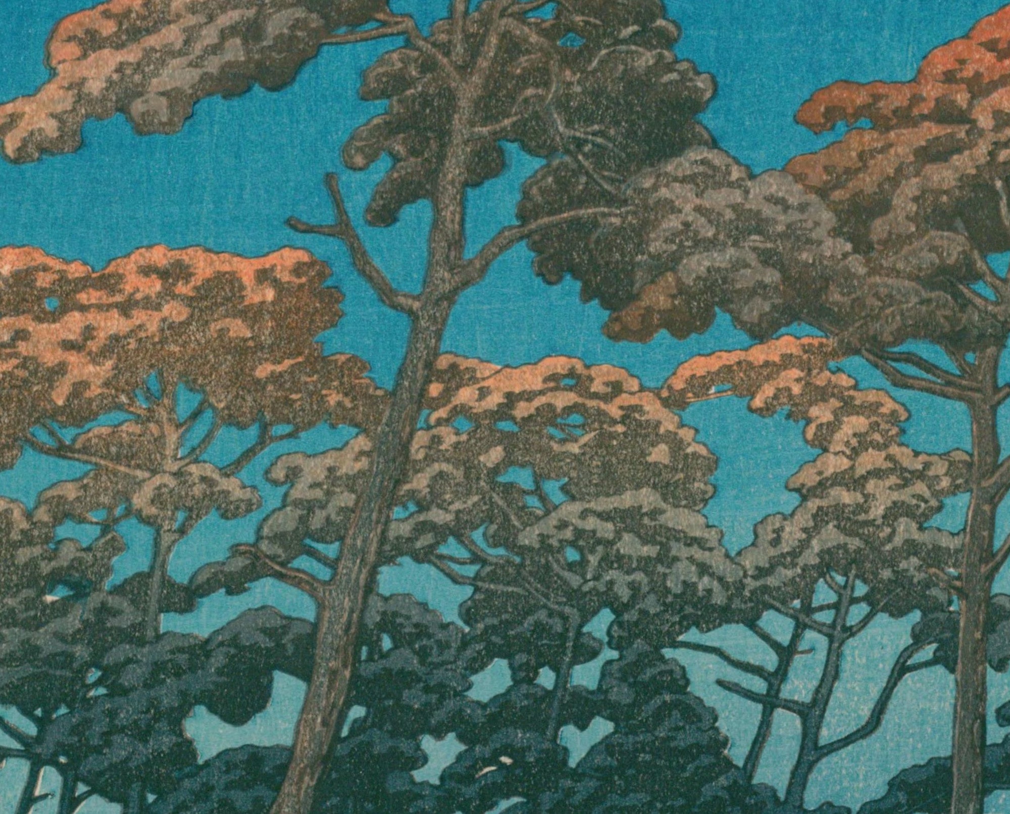
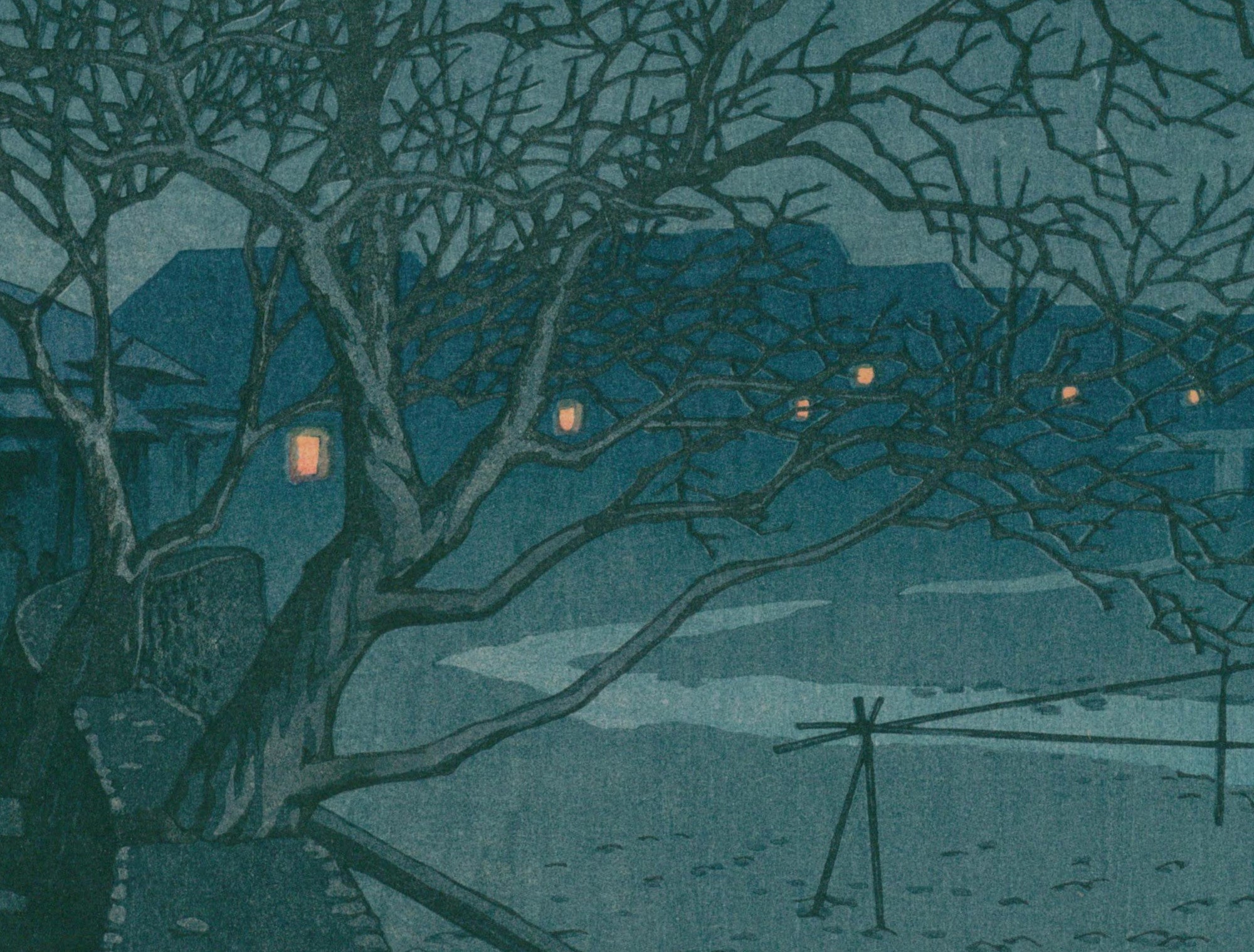
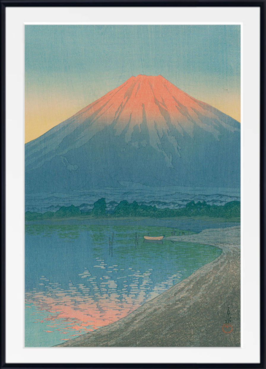
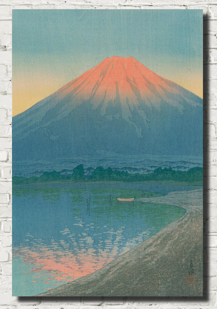
Many Hasui prints use blue with remarkable subtlety. Deep navy can evoke a quiet night, muted blue-grey can suggest snowfall or mist, and luminous blues can give water and sky a peaceful clarity. These prints are especially well suited to calm bedrooms, studies and minimalist interiors.
Where Hokusai often used strong design and dramatic natural forms, and Hiroshige explored travel and changing weather, Hasui frequently created an atmosphere of solitude and stillness. Together, their works demonstrate the extraordinary range of blue within Japanese landscape art.
Blue Japanese Seascape and Wave Prints
Water is one of the most important subjects in Japanese printmaking. Oceans, rivers, waterfalls and lakes offered artists opportunities to explore movement, rhythm and changing light. Blue was naturally central to these scenes, but Japanese printmakers rarely used it in a purely descriptive way.
Waves may be stylised into powerful curling forms, rivers can lead the eye deep into a landscape, and bands of graduated blue can suggest immense areas of sea or sky. This combination of observation and design is one reason Japanese prints have had such a lasting influence on art and visual culture around the world.
Blue Japanese seascape prints are particularly effective in bathrooms, bedrooms and living rooms, where their combination of water, movement and blue colour can create a fresh and spacious atmosphere.
Blue Japanese Landscape Prints
Japanese landscape prints often present mountains, rivers, coastlines and villages through carefully balanced compositions. Mount Fuji appears repeatedly in the work of Hokusai and other artists, sometimes dominating the scene and sometimes appearing as a small distant landmark.
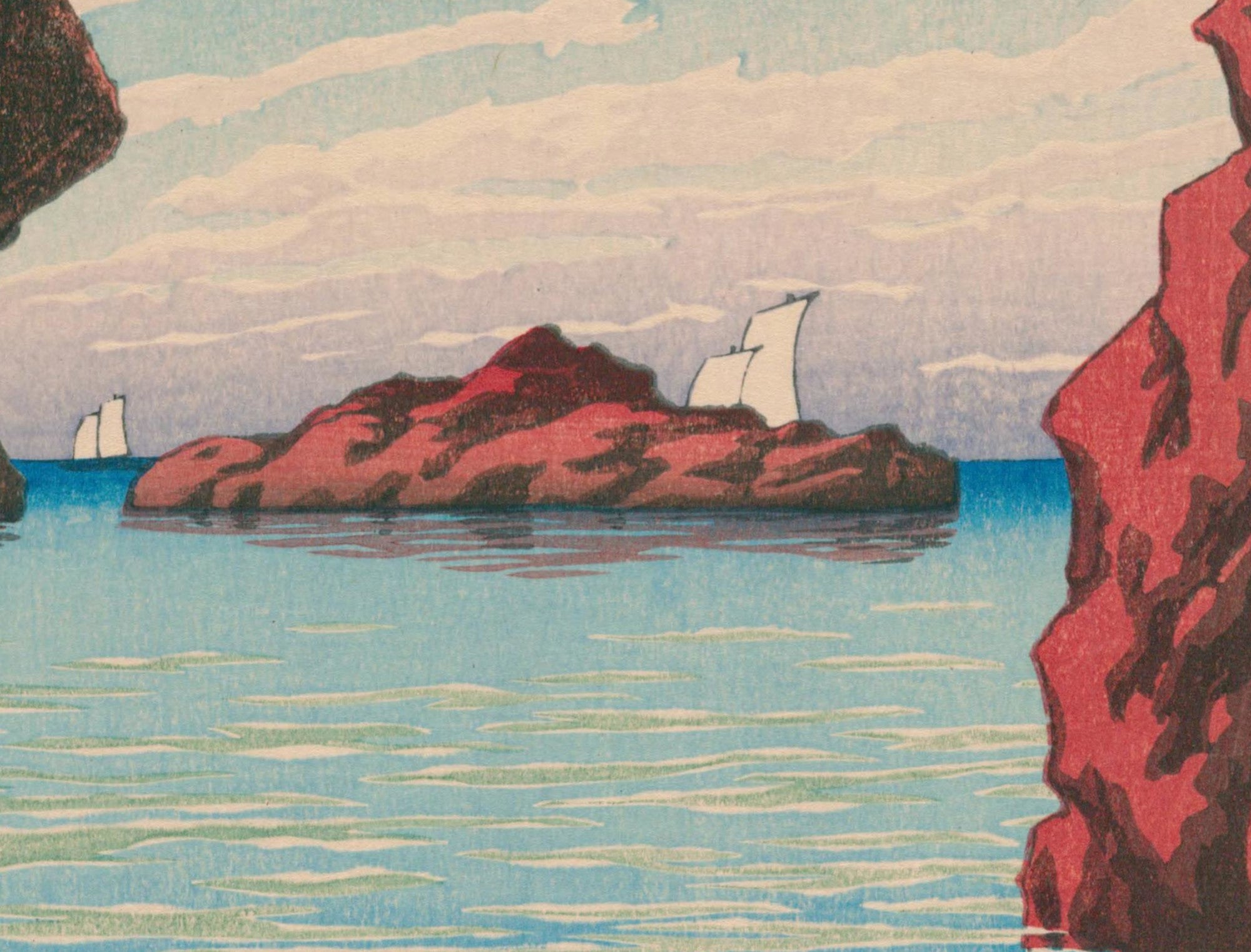
Blue can create a convincing sense of depth by separating foreground, middle distance and horizon. Pale blue suggests atmospheric distance, while deep indigo creates contrast and anchors the composition. These colour relationships make blue Japanese landscape prints especially easy to combine with white, cream, grey, natural wood and other neutral interior palettes.
Blue Japanese Prints for Living Rooms
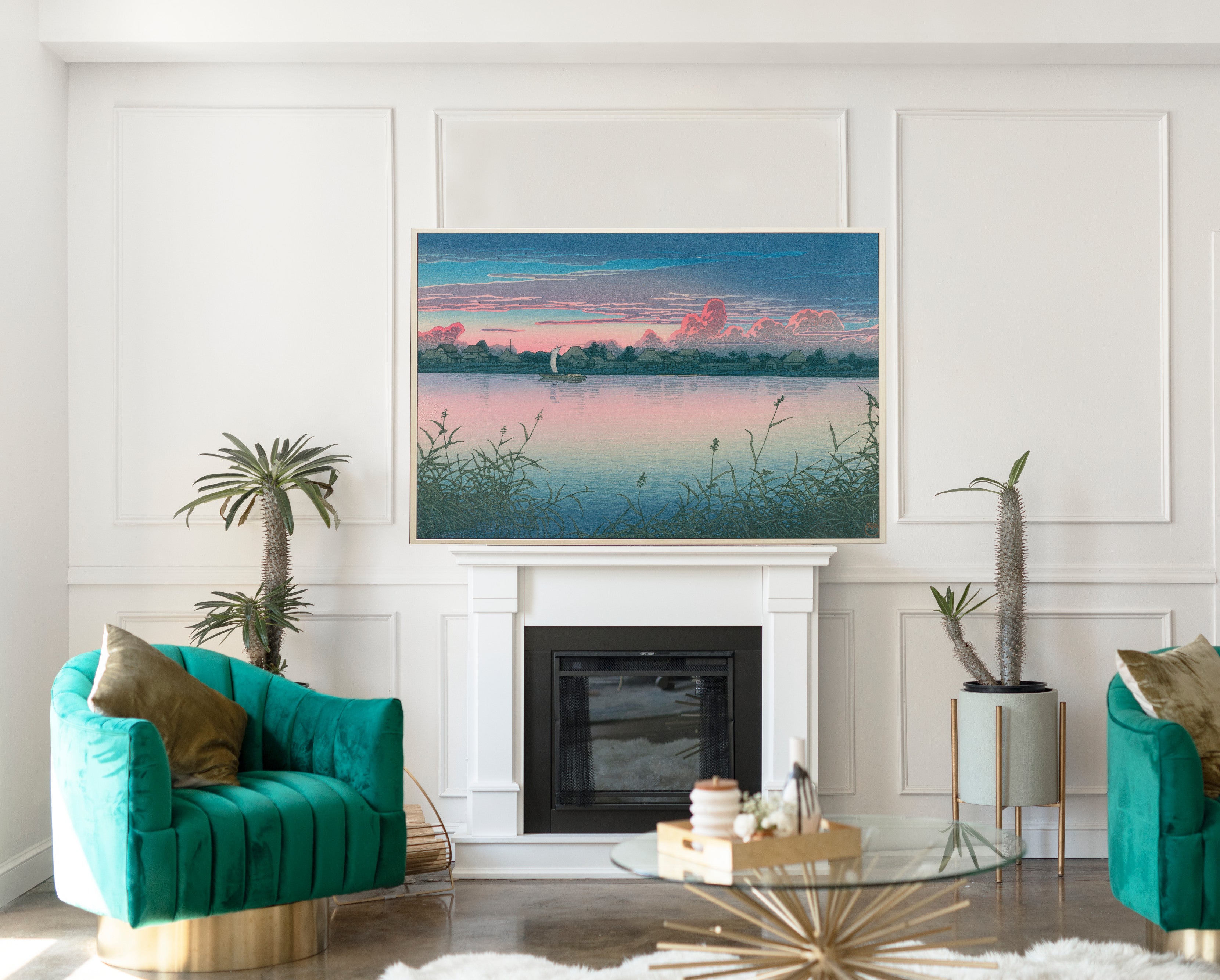
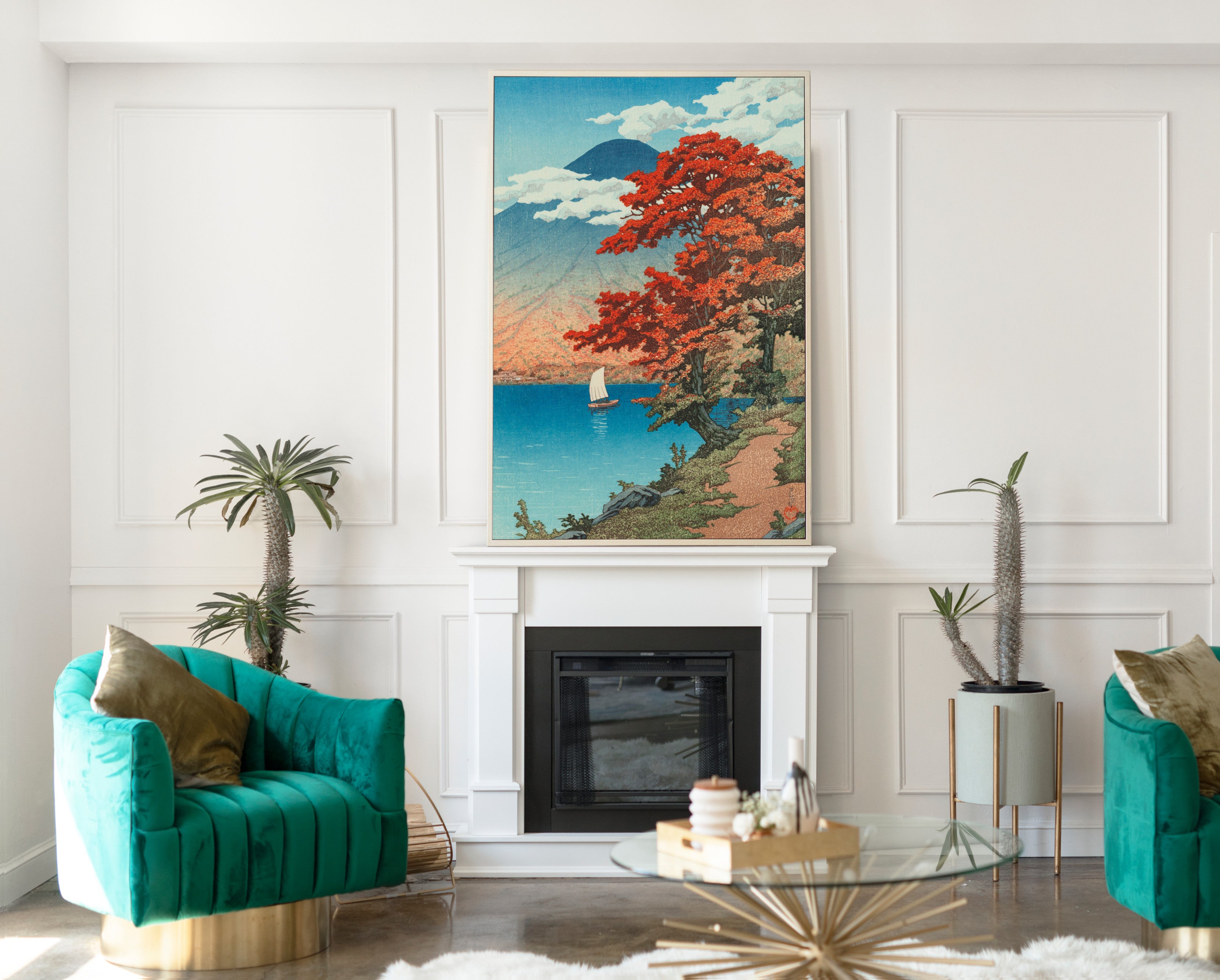
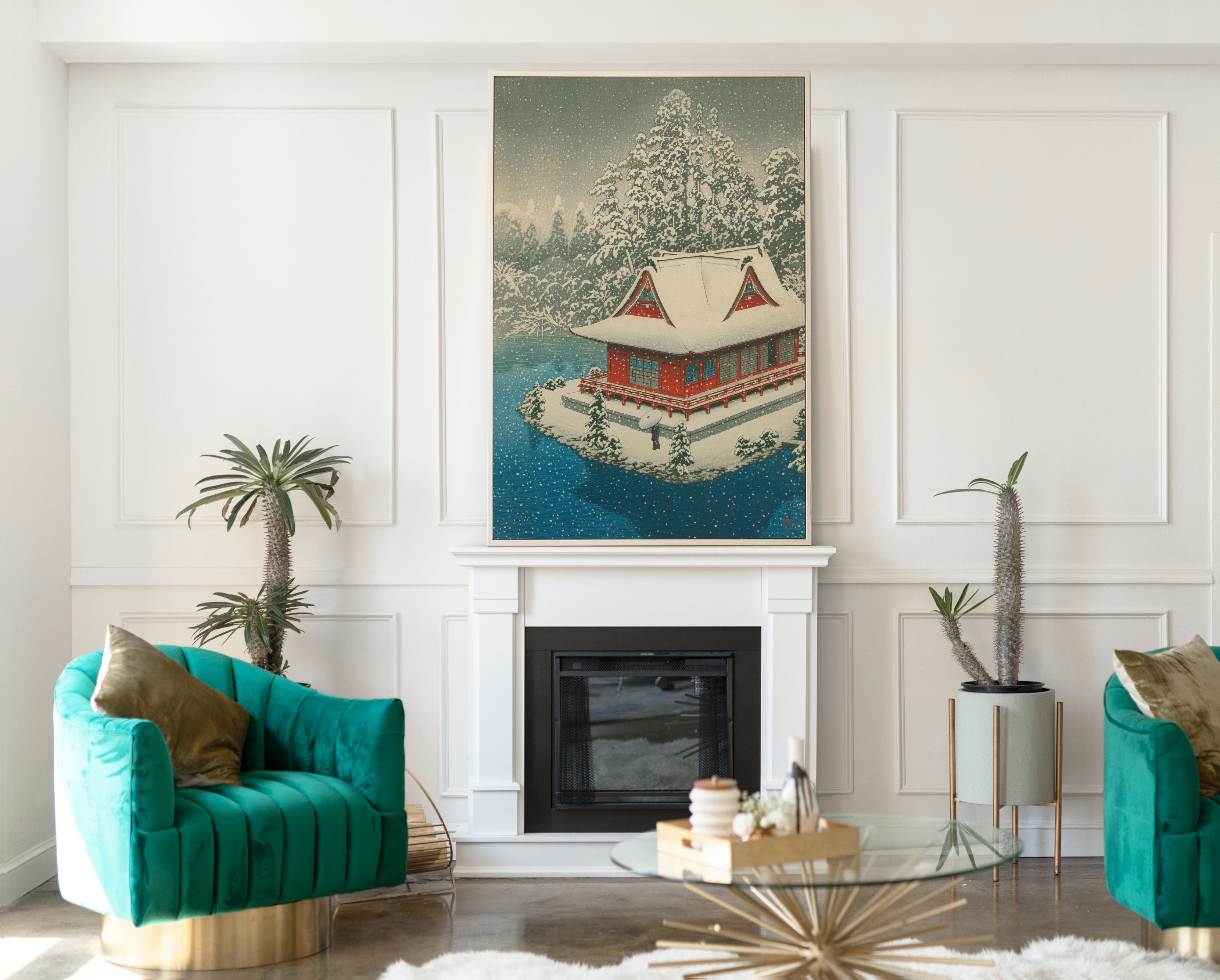
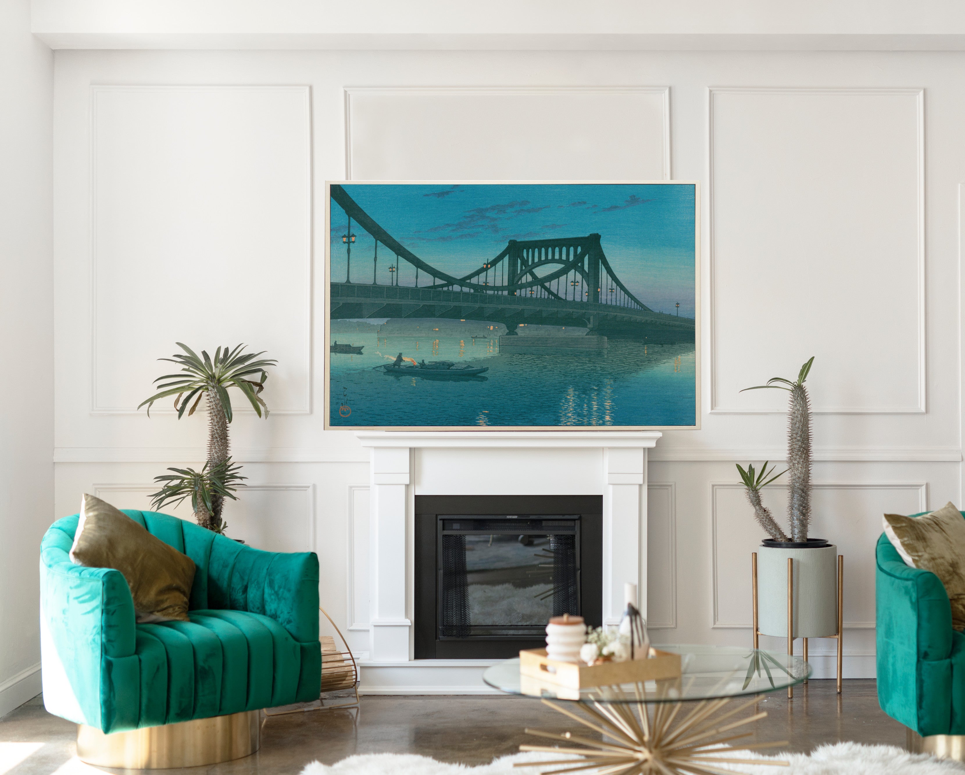
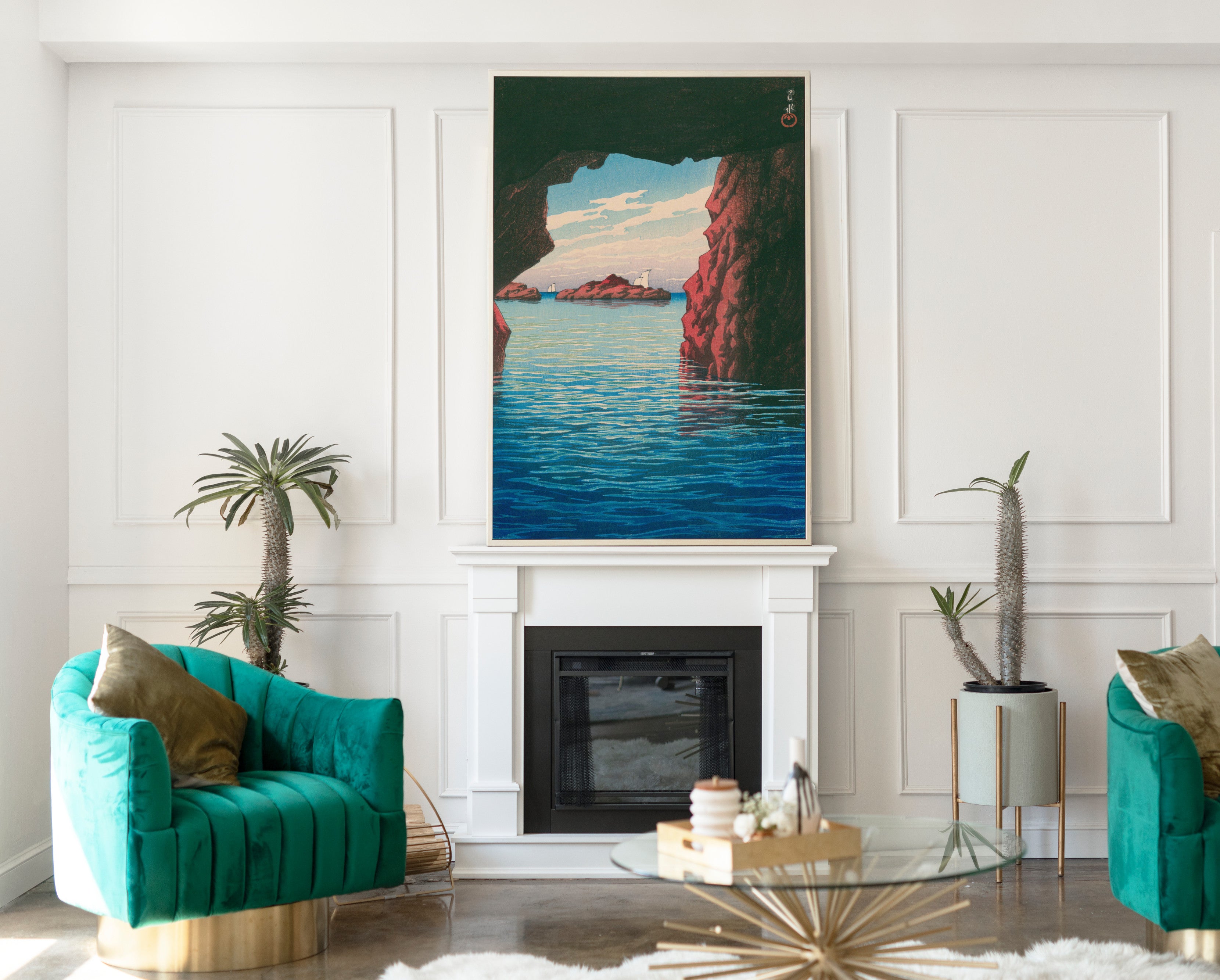
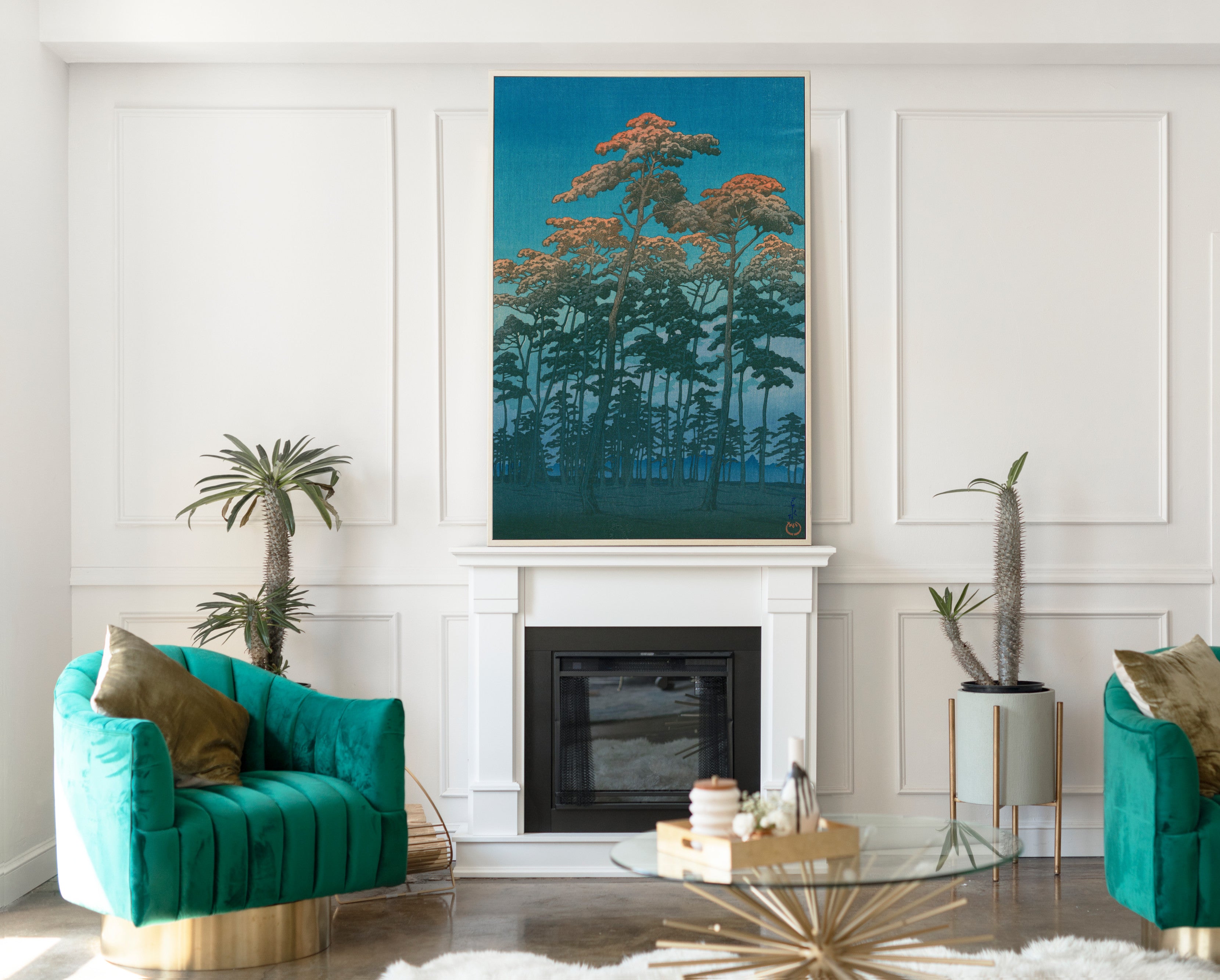
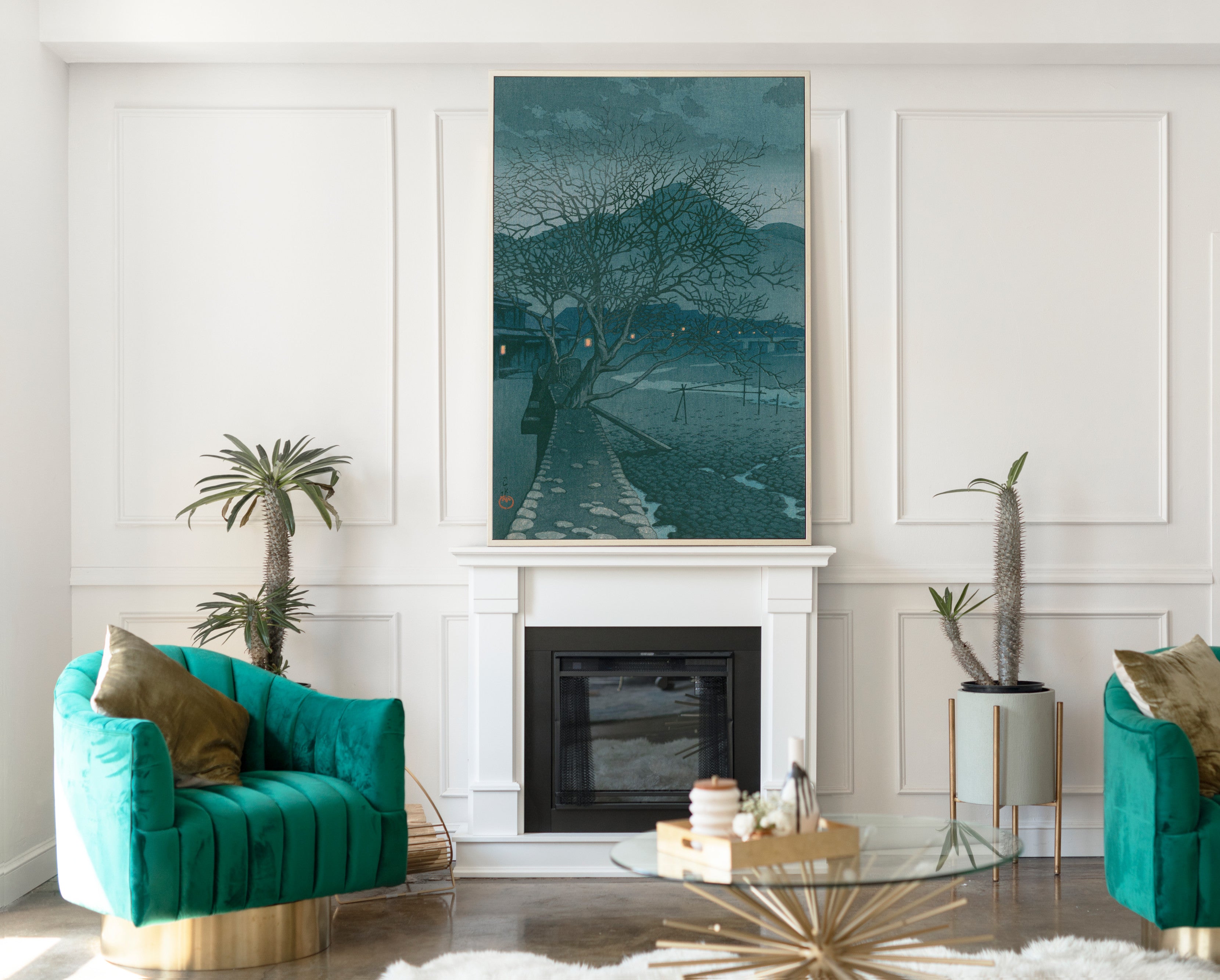
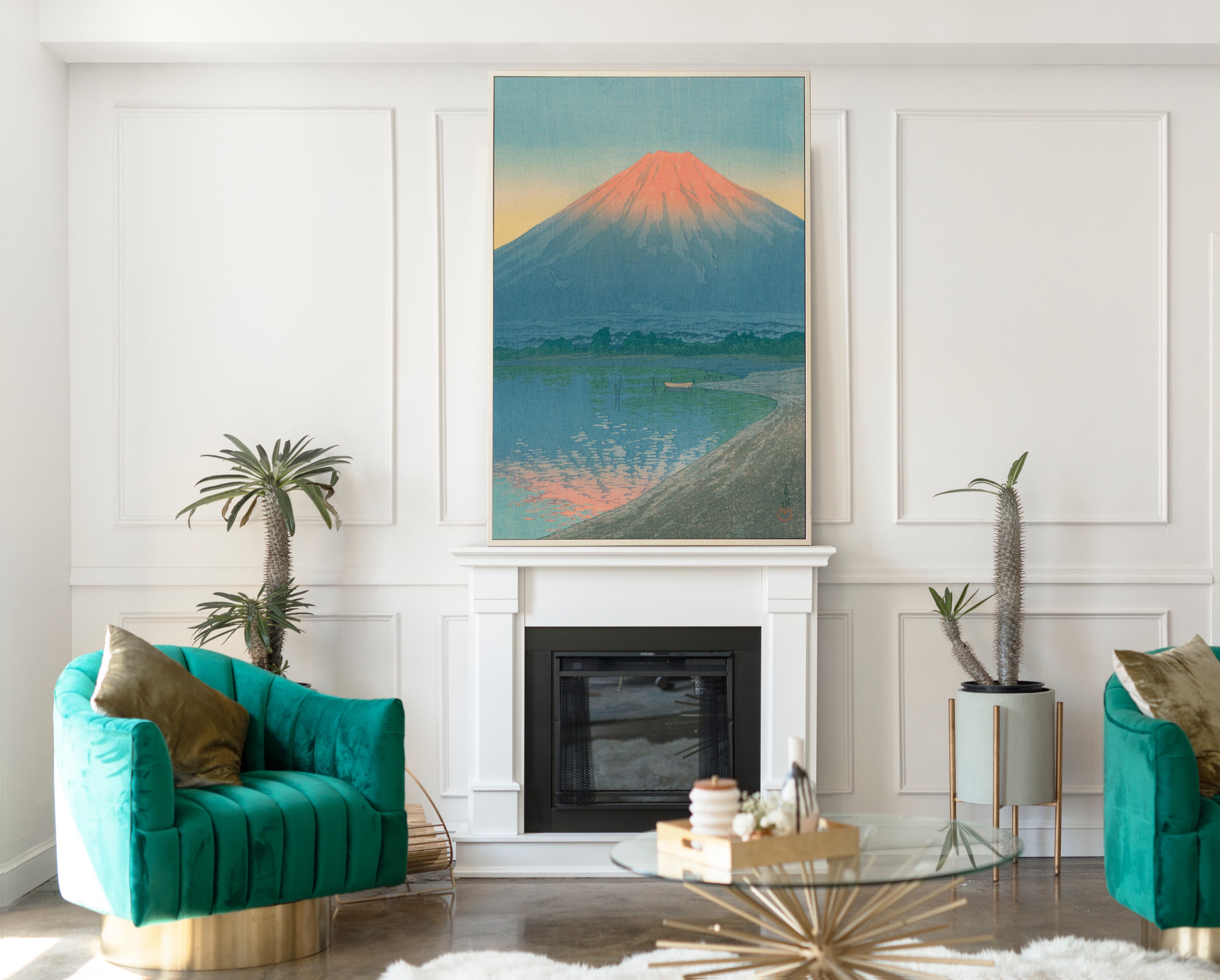
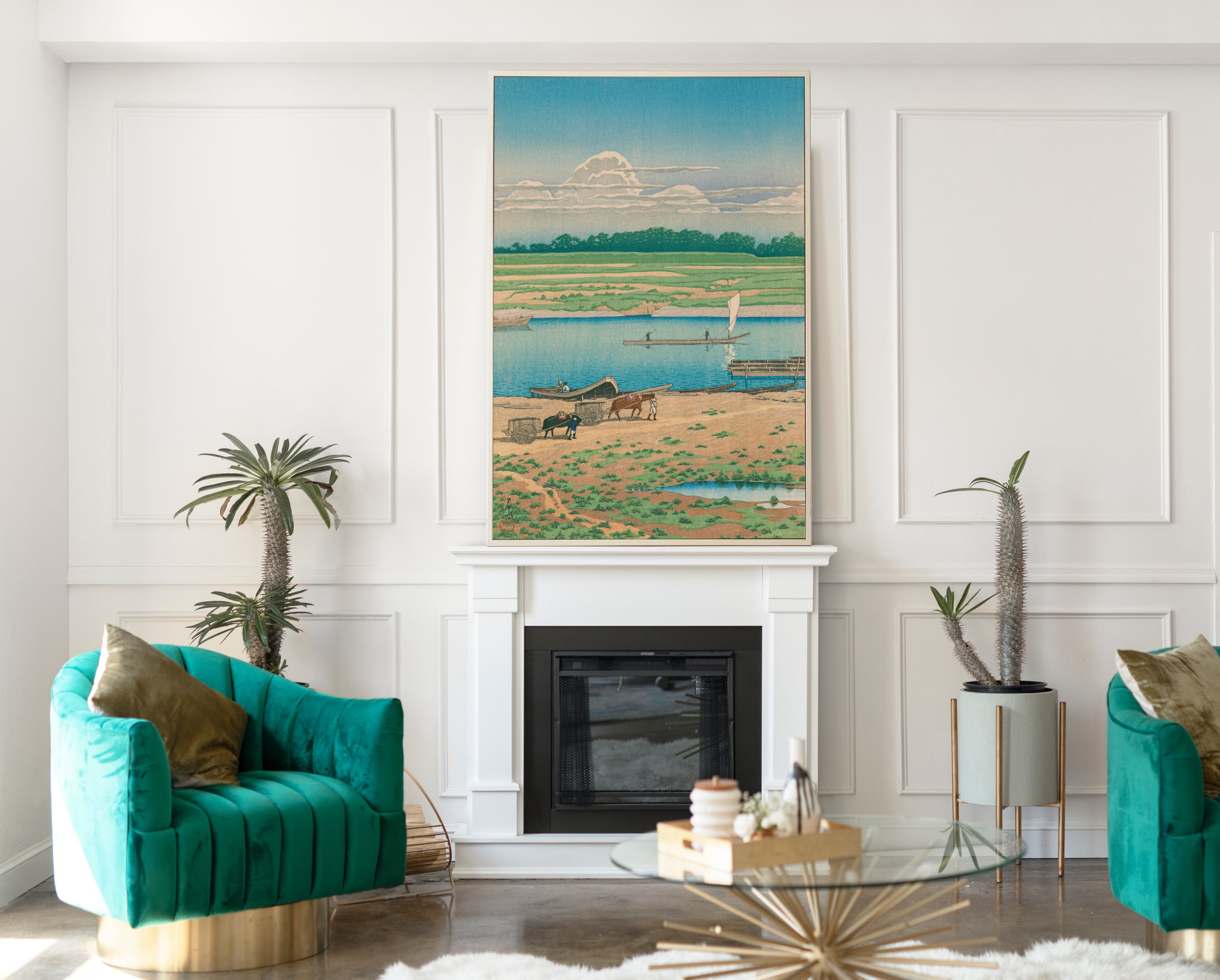
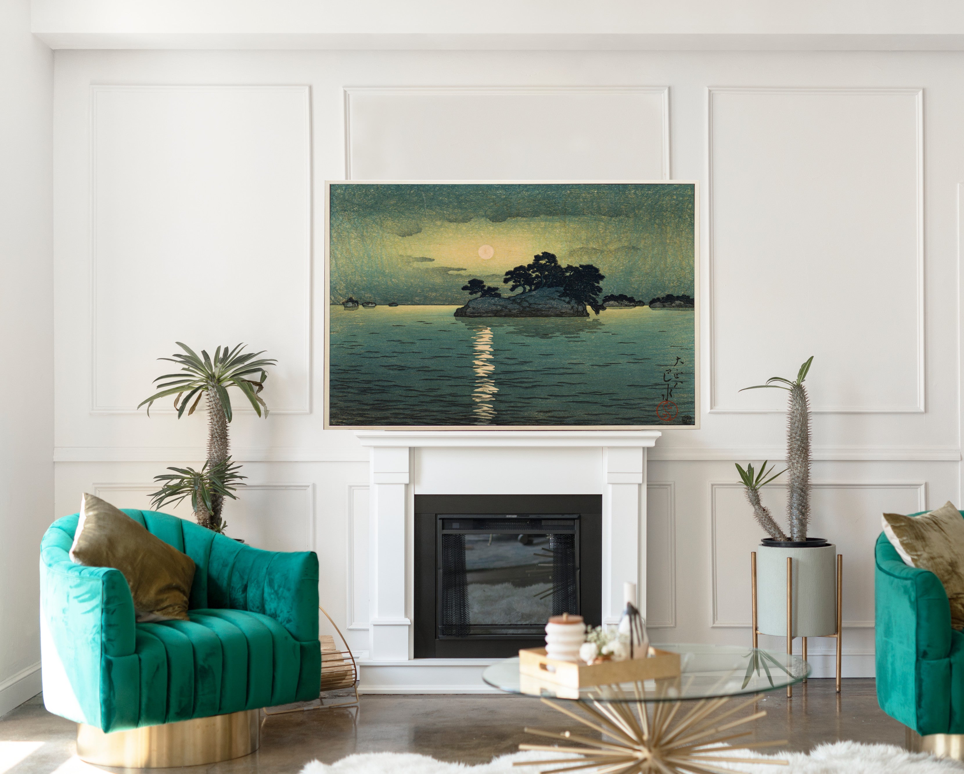
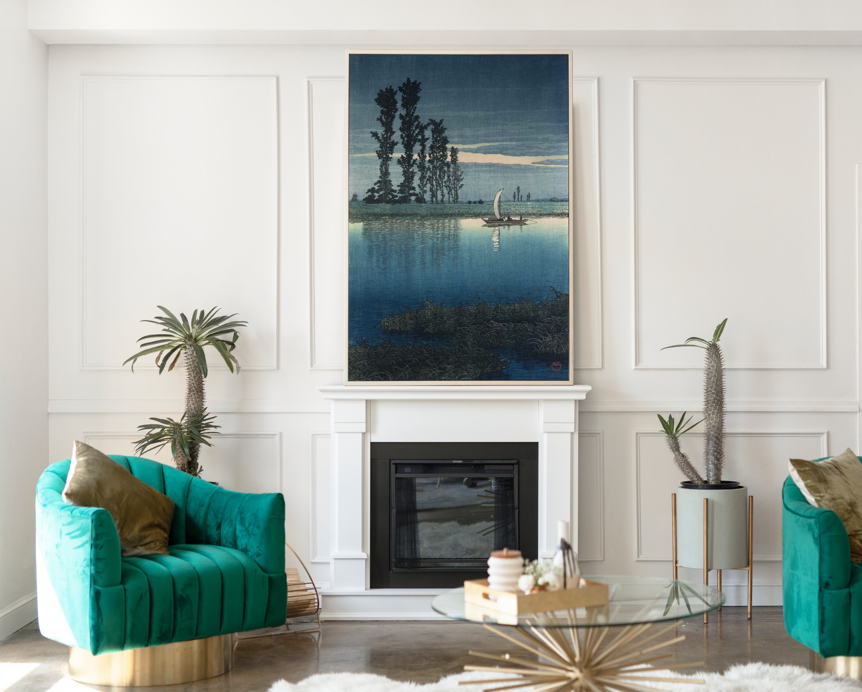
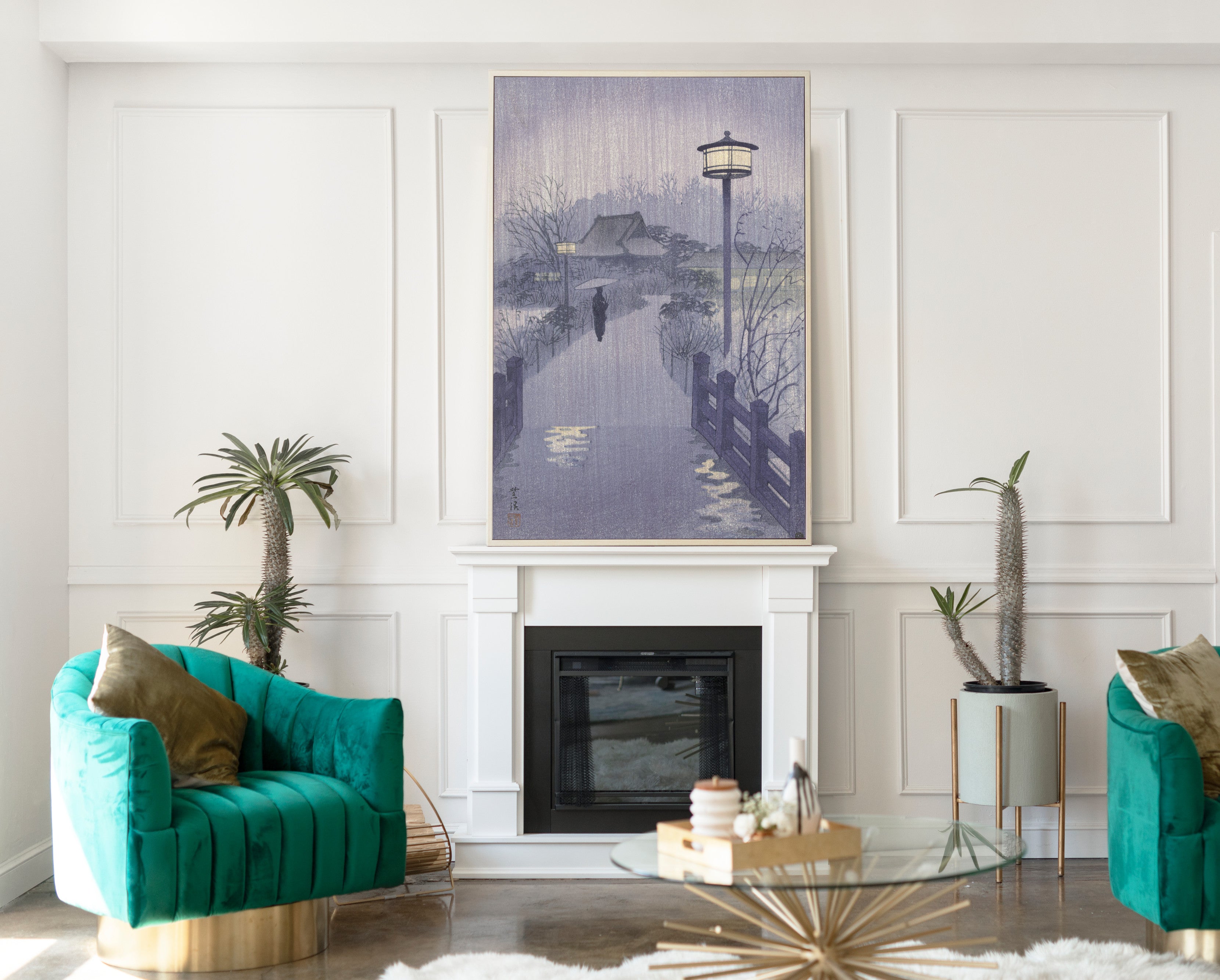
Blue Japanese wall art can create an elegant focal point in a living room without overwhelming the space. Hokusai's bolder compositions work well above sofas, fireplaces and sideboards, while Hiroshige landscapes can introduce a gentler sense of atmosphere and visual distance.
For a larger wall, consider one substantial framed print or a coordinated group of Japanese landscapes. Blue works naturally with white, off-white, beige, grey, black frames, oak furniture and other natural materials.
Blue Japanese Prints for Bedrooms
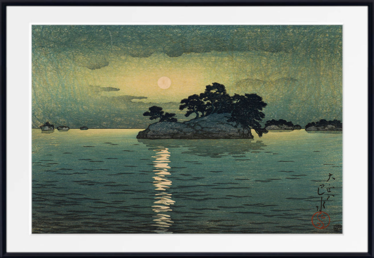
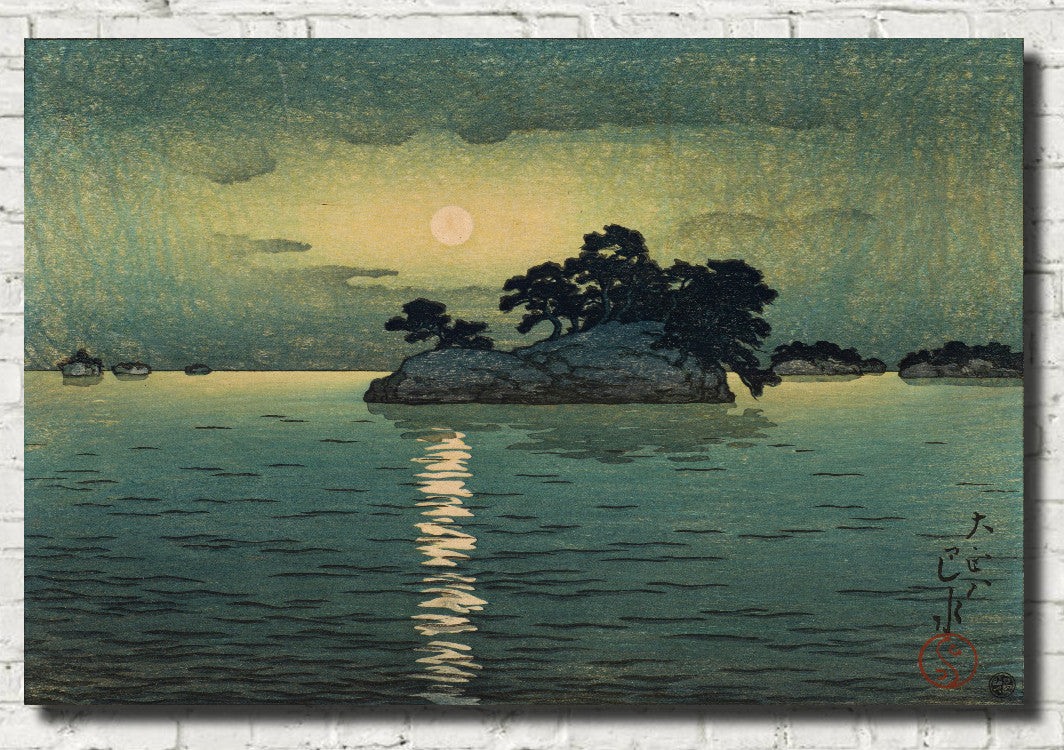
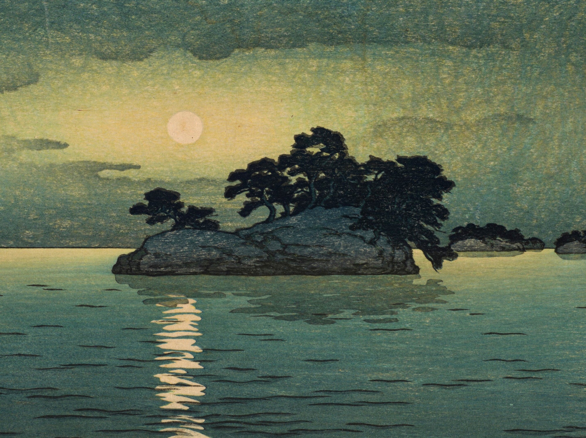
Bedrooms are particularly well suited to Japanese landscapes in softer blues, blue-grey and indigo. Moonlit scenes, snow-covered temples, quiet rivers and distant mountains can contribute to a calm, restful atmosphere.
A single framed Japanese print above a bed can create a clear focal point, while two or three related landscapes can form a balanced arrangement. For a quieter interior, choose works with generous areas of sky, water or open space.
How to Style Blue Japanese Wall Art
Blue Japanese prints are extremely versatile. In contemporary interiors, their strong lines and clear compositions work well with simple furniture and restrained colour palettes. In more traditional rooms, woodblock landscapes can add history, craftsmanship and decorative character.
White, cream, beige and pale grey walls allow indigo and navy prints to stand out clearly. Natural oak and walnut bring warmth to cooler blue tones, while black frames can emphasise the graphic quality of ukiyo-e. For a richer colour scheme, blue Japanese art also works beautifully with rust, terracotta, ochre, soft pink and muted green.
Consider scale as well as colour. A large blue Japanese print can become the main visual focus of a room, while smaller prints can be arranged as pairs, triptychs or gallery walls. Series by Hokusai and Hiroshige are especially suitable for grouped displays because individual works share artistic and historical connections.
Fine Art Prints, Framed Prints and Canvas Panels
GalleryThane's blue Japanese artwork is available across a range of formats and sizes. Choose an unframed fine art paper print if you want to select your own frame, a framed print for a complete gallery-style presentation, or a canvas panel for a clean, ready-to-hang finish.
Our prints, frames and canvas panels are handmade in our Nottinghamshire workshop using carefully selected fine art papers, UV-stabilised pigment inks and quality framing materials. Free UK delivery is available on all orders, with fast, tracked international shipping also available.
Frequently Asked Questions
Why is blue so important in Japanese prints?
Blue became especially important in Japanese woodblock printing during the nineteenth century, when artists gained access to Prussian blue. Its rich, stable colour allowed printmakers to create dramatic seas, skies, rivers and landscapes with greater depth and intensity.
What are blue Japanese prints called?
Japanese woodblock prints produced predominantly in shades of blue are often known as aizuri-e. These works became particularly popular during the nineteenth century and were created by leading artists including Hokusai and Hiroshige.
Which Japanese artists are famous for blue prints?
Katsushika Hokusai and Andō Hiroshige are especially famous for their use of blue in ukiyo-e landscapes. In the twentieth century, Hasui Kawase also created many atmospheric landscapes featuring indigo, navy, blue-grey and other cool tones.
What is the most famous blue Japanese print?
Hokusai's The Great Wave off Kanagawa is probably the most famous Japanese print in the world. Its powerful wave, deep blue water and distant Mount Fuji have made it an enduring icon of Japanese art.
Are blue Japanese prints suitable for living rooms?
Yes. Blue Japanese prints work particularly well in living rooms because they combine strong visual design with a versatile colour palette. Large Hokusai prints can create a dramatic focal point, while quieter Hiroshige or Hasui landscapes can introduce calm and atmosphere.
Are Japanese prints suitable for bedrooms?
Yes. Moonlit scenes, rivers, snowy landscapes and quiet blue-toned prints can be particularly effective in bedrooms. Their clear compositions and often restful colour palettes work well in calm interiors.
What colours go well with blue Japanese wall art?
Blue Japanese prints pair well with white, cream, beige, grey, black and natural wood. Warm contrasting tones such as terracotta, rust, ochre and muted pink can also complement indigo and navy beautifully.
Should I choose a framed Japanese print or a canvas panel?
Choose a framed print for a classic gallery-style presentation that emphasises the line and detail of the original artwork. Choose a canvas panel for a cleaner, frameless appearance that can work particularly well with larger landscape compositions.