


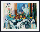
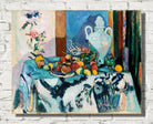


Henri Matisse Print, Blue Still Life (Nature morte bleue) (1907)
Couldn't load pickup availability
BUY WITH CONFIDENCE
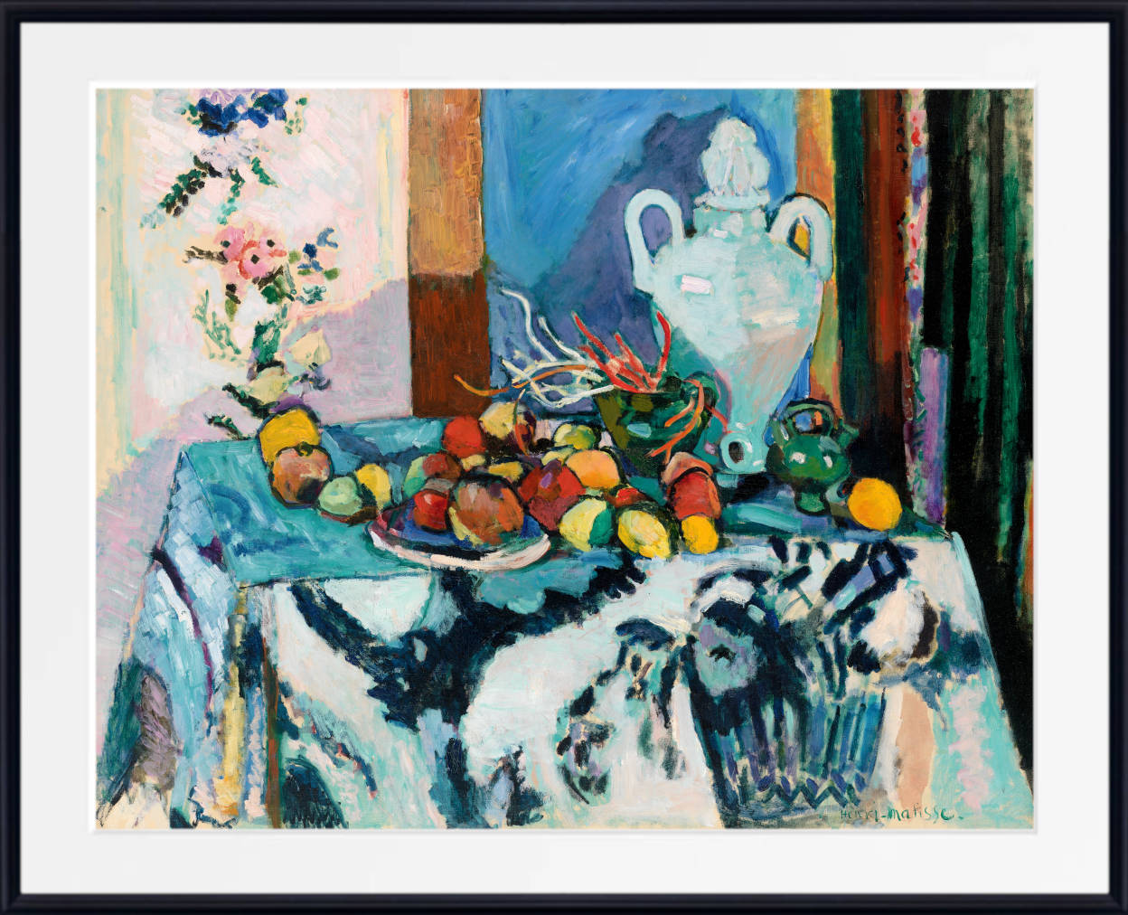
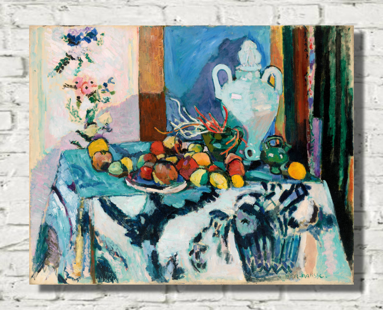
Blue Still Life (Nature morte bleue) (1907) by Henri Matisse is a richly patterned still life from one of the most experimental periods of the artist's career. Fruit, jugs and other domestic objects are arranged across a table covered with a blue-and-white patterned cloth, while an equally animated screen and curtain rise behind them. Deep blue unifies the composition, but brilliant oranges, yellows, greens, pinks and whites continually interrupt the dominant colour and send the viewer's eye moving around the canvas.
This Henri Matisse Blue Still Life print demonstrates how far Matisse had moved beyond conventional still-life painting by 1907. Objects remain recognisable, yet pattern competes with volume, foreground merges with background and the distinction between three-dimensional space and flat decoration becomes deliberately unstable. Available as a fine art print, framed print or canvas panel, Nature morte bleue is an exceptional choice for admirers of Matisse, Fauvist colour, modern still life and decorative twentieth-century art.
Blue Still Life – Matisse Reinvents the Still Life
Still-life painting had traditionally depended upon a clear distinction between objects and their surroundings.
Fruit, vessels and other objects would normally be arranged on a table and modelled carefully so that they appeared convincingly three-dimensional.
Matisse disrupts that tradition in Blue Still Life.
The objects remain visible, but they must compete with the patterns surrounding them.
A blue-and-white toile de Jouy cloth falls from the front edge of the table. Its elaborate decoration is given almost as much visual emphasis as the fruit and vessels resting above it.
Behind the table, a patterned folding screen and curtain continue this decorative activity.
Instead of creating a quiet backdrop against which the objects can be clearly read, the surrounding patterns become active participants in the composition.
The result is a still life in which there is no obvious division between subject and decoration.
Why Blue Dominates the Painting
The title Nature morte bleue reflects the strong blue tonality that binds together much of the composition.
Blue appears across the cloth, patterned background and surrounding forms, repeatedly connecting areas that would otherwise seem spatially separate.
This use of colour is particularly important because it helps flatten the picture.
Instead of relying upon different colours to separate foreground, middle ground and background, Matisse allows related blues to move across all three.
The eye therefore travels freely from the hanging tablecloth to the tabletop and into the screen behind it.
Against this dominant blue, warmer colours become especially intense.
Oranges, yellows and other warm tones within the fruit immediately attract attention because of their contrast with the cooler surrounding palette.
Colour is consequently doing much more than describing objects. It is organising the entire painting.
A Table Filled with Fruit and Domestic Objects
The still life contains a collection of familiar domestic objects, yet Matisse refuses to give any one of them overwhelming importance.
Fruit is scattered across the tabletop alongside vessels including a pitcher, jug and large two-handled jar.
Round fruit forms appear repeatedly through the composition, creating a rhythm of circles and curves among the stronger horizontal and vertical structures of the table and screen.
The large vessel towards the right has considerable physical presence, but even this substantial object remains integrated into the surrounding decorative pattern.
The objects therefore perform two roles simultaneously.
They are recognisable pieces of everyday life, but they are also shapes, colours and repetitions within the overall visual design.
This transformation of ordinary objects into components of a decorative whole would become increasingly important throughout Matisse's career.
The Blue-and-White Toile de Jouy
One of the most striking features of Blue Still Life is the patterned textile falling down the front of the table.
The fabric is a form of toile de Jouy, traditionally decorated with repeated figurative or pastoral motifs.
Matisse uses its blue-and-white pattern not merely as a realistic description of a table covering but as a major structural component of the painting.
The cloth hangs vertically towards the viewer, creating the nearest plane in the composition.
Yet because its pattern is presented so strongly, the surface also emphasises the flatness of the canvas.
The viewer therefore experiences an intriguing contradiction.
We understand that the cloth hangs downward in three-dimensional space, but its repeated blue pattern continually draws our attention back to the two-dimensional surface of the painting.
Pattern from Foreground to Background
Matisse extends this decorative complexity throughout the entire image.
The pattern does not stop at the tablecloth.
Behind the table, the folding screen carries further floral and curving forms. These background motifs visually connect with those on the textile below.
This creates what the Barnes Foundation describes as an all-over animated surface.
Foreground and background cease to function as completely separate zones.
Patterns echo one another, colours repeat and curving shapes migrate from one part of the painting to another.
The eye is continually encouraged to move rather than settle on a single focal object.
This rejection of conventional hierarchy is one of the most modern aspects of the painting.
Matisse and the Arabesque
Blue Still Life belongs to an important group of still lifes painted by Matisse between approximately 1906 and 1908 in which he explored the arabesque.
An arabesque is a flowing ornamental line or pattern that moves rhythmically through a design.
In Matisse's hands, the arabesque became much more than decorative embellishment.
Curving lines could connect objects, textiles and background patterns, carrying the viewer's eye across the painting.
In Nature morte bleue, these rhythms can be followed through the toile de Jouy, the fruit, vessels and decorative screen.
The composition therefore functions less like a collection of isolated objects and more like one continuous visual organism.
This interest in flowing decorative rhythm would become one of the defining characteristics of Matisse's mature art.
A Painting Between Flatness and Depth
One of the most fascinating qualities of Blue Still Life is its deliberate tension between two-dimensional pattern and three-dimensional space.
The objects have sufficient modelling to suggest physical volume.
The tabletop recedes away from the viewer, and shadows establish the position of several vessels and pieces of fruit.
Yet the powerful surrounding patterns repeatedly flatten that space.
The foreground textile seems almost parallel with the surface of the painting. The decorative screen behind the table can appear visually as close as the fruit in front of it.
Matisse consequently allows the painting to move backwards and forwards between depth and flatness.
The viewer can read it as a believable interior while simultaneously experiencing it as an arrangement of coloured shapes across a flat rectangle.
Space Arranged Like a Staircase
The Barnes Foundation identifies an especially ingenious spatial structure within the painting.
Matisse establishes a sequence of horizontal and vertical planes that unfold into depth almost like the steps of a staircase.
First comes the vertical plane of the tablecloth hanging towards the floor.
Above it, the tabletop turns approximately ninety degrees and recedes horizontally.
Behind the table rises another vertical plane formed by the screen and curtain.
These successive changes of direction create sufficient depth for the still life to remain spatially convincing.
At the same time, the repeated patterns and blue tonality visually press those separate planes back together.
Matisse therefore creates depth and destroys it almost simultaneously.
The Influence of Paul Cézanne
Paul Cézanne was a crucial influence upon Matisse's development as a still-life painter.
Cézanne had repeatedly challenged conventional perspective, allowing tables to tilt, objects to be viewed from slightly different angles and pictorial space to remain deliberately unstable.
His still lifes demonstrated that a painting did not need to behave like a perfectly consistent window onto reality.
Matisse studied Cézanne closely, and that influence is strongly evident in Blue Still Life.
The relationship between tabletop, objects and background is not governed by one rigid viewpoint.
Instead, Matisse adjusts space according to the needs of the composition.
Cézanne had died in 1906, only a year before Nature morte bleue was painted, and his example was becoming increasingly important to the younger generation of modern artists.
Moving Beyond Cézanne
Matisse did not simply imitate Cézanne.
Where Cézanne often used colour and brushwork to reinforce the physical solidity of apples, bottles and tables, Matisse increasingly allowed decoration to challenge that solidity.
Pattern spreads across surfaces and begins to compete with the objects themselves.
The entire painting consequently becomes more unified and less hierarchical.
A patterned cloth can carry as much visual importance as a jug.
A section of screen can command as much attention as a piece of fruit.
This was a decisive development.
It helped Matisse move towards the idea that the whole canvas should function as a balanced decorative field rather than merely serving as a convincing depiction of individual objects.
Light in Blue Still Life
Despite the painting's strong decorative flatness, Matisse has not completely abandoned natural light.
A coherent source of illumination enters the scene and creates bright highlights on vessels and other objects.
Shadows extend across the tabletop and against the screen behind it.
This naturalistic lighting helps preserve a sense of three-dimensional space.
Yet once again Matisse creates a contradiction.
The shadows suggest depth, but the surrounding patterns flatten it.
Bright white highlights make the vessels appear solid, while the dominant blue links them to the surrounding decorative surface.
The tension between these two ways of seeing gives the painting much of its visual complexity.
Still Life During Matisse's Fauvist Period
Matisse painted Blue Still Life in the summer of 1907, during the period immediately following the most explosive years of Fauvism.
Fauvism had emerged publicly at the Salon d'Automne in 1905, where the intense colours used by Matisse, André Derain and related artists provoked the famous description les fauves — “the wild beasts”.
The movement encouraged an unprecedented freedom in the use of colour.
By 1907, however, Matisse was no longer simply interested in brilliant non-naturalistic colour.
He was increasingly investigating how colour, pattern and structure could operate together across an entire composition.
Blue Still Life demonstrates this evolution particularly clearly.
The painting retains Fauvism's freedom of colour but turns that freedom towards the more complex problem of organising an interior filled with objects and decorative surfaces.
From Fauvist Colour to Decorative Harmony
The importance of Nature morte bleue becomes especially clear when compared with Matisse's later interiors.
Over the following years he increasingly allowed wallpaper, textiles, rugs and furniture to dissolve the conventional boundaries between objects and surroundings.
Pattern would eventually become one of the great organising principles of his art.
Instead of seeing decoration as secondary to the main subject, Matisse allowed decorative elements to become the subject.
Blue Still Life stands near the beginning of that development.
Its competing patterns, saturated blue tonality and flowing arabesques point directly towards paintings in which the whole surface becomes an integrated field of colour and ornament.
Blue Still Life and Harmony in Red
A particularly revealing comparison can be made with Matisse's later Harmony in Red of 1908.
Both paintings contain tables covered with patterned textiles, fruit, vessels and strongly decorative surroundings.
In Blue Still Life, Matisse still preserves a considerable degree of conventional modelling and spatial depth.
By Harmony in Red, however, the distinction between table and wall becomes dramatically weaker as a single red field and repeated blue pattern spread across both surfaces.
The development between the two works reveals how rapidly Matisse was moving towards increasingly radical decorative unity.
Blue Still Life therefore occupies an important position in that progression.
The Importance of Repetition
Matisse repeatedly echoes shapes from one object to another.
The Barnes Foundation notes, for example, that the form of a large basket of flowers represented within the toile de Jouy finds an echo in the two-handled jar positioned above it.
Round pieces of fruit repeat similar circular forms across the tabletop.
Colours recur at different points throughout the image.
These repetitions help tie together areas that occupy different apparent depths.
A shape in the foreground textile can therefore connect visually with an actual three-dimensional object sitting farther back.
Pattern and reality begin to overlap.
This is precisely the kind of visual relationship that fascinated Matisse.
Why Blue Still Life Matters
Blue Still Life brings together several characteristics that became fundamental to Matisse's mature art:
- a dominant blue tonality unifying the composition
- strong contrasts between blue and warmer fruit colours
- pattern given equal importance to represented objects
- blue-and-white toile de Jouy used as a major visual element
- arabesques directing the eye through the composition
- repeated shapes and colours connecting different areas
- a deliberate tension between flat pattern and three-dimensional depth
- Cézanne-inspired experimentation with pictorial space
- natural light retained alongside increasingly decorative organisation
- the entire surface treated as an interconnected visual field
The painting therefore represents far more than a colourful arrangement of fruit and vessels.
It shows Matisse developing the decorative language that would transform his interiors and still lifes during the following decades.
Henri Matisse's Painting Style in 1907
By 1907, Matisse had already passed through an extraordinary sequence of artistic experiments.
His early work had absorbed lessons from Impressionism and Post-Impressionism.
He subsequently explored Divisionist colour through his relationship with Paul Signac before working intensively with André Derain at Collioure during the breakthrough Fauvist summer of 1905.
Fauvism liberated his colour from strict naturalistic description.
Yet Matisse continued searching.
Rather than treating Fauvism as a fixed style, he developed its discoveries into a broader artistic language based on colour relationships, simplification, rhythmic line and decorative balance.
Blue Still Life captures that process in motion.
The intense palette remains Fauvist in spirit, while the growing concern with arabesque and pictorial structure points towards Matisse's mature decorative art.
About Henri Matisse
Henri Matisse (1869–1954) was a French painter, draughtsman, sculptor and printmaker and one of the most influential artists of the twentieth century.
Born at Le Cateau-Cambrésis in northern France, Matisse originally trained in law before turning towards art.
His early development included encounters with Impressionism, Post-Impressionism, Cézanne and Neo-Impressionist colour theory.
During the summer of 1905, his work alongside André Derain at Collioure helped establish the radical colour language associated with Fauvism.
Matisse became the movement's leading figure but rapidly moved beyond its relatively brief historical phase.
Throughout the following decades he explored the relationship between colour, line, pattern, interior space and the human figure.
Textiles, decorative screens, rugs, patterned walls and ornamental objects became recurring elements within his paintings.
During his later years he developed his celebrated paper cut-outs, extending his lifelong search for clarity, rhythm and expressive colour into an entirely new medium.
The Original Blue Still Life
The original Blue Still Life (Nature morte bleue) was painted by Henri Matisse in the summer of 1907.
It was created in oil on canvas and measures approximately 89.7 × 116.7 cm.
The original is held by the Barnes Foundation in Philadelphia, where it is recorded under accession number BF185.
The painting forms part of Matisse's important group of still lifes from approximately 1906–08 exploring arabesques, decorative pattern and the tension between two-dimensional and three-dimensional space.
Its early provenance is particularly significant.
Michael and Sarah Stein, important early supporters of Matisse and members of the remarkable Stein family circle in Paris, probably acquired the painting directly from the artist in 1907 or early 1908.
The work was shown at the Salon d'Automne in Paris in 1908 under the title Nature morte au camaïeu bleu, where the catalogue recorded it as belonging to Michael Stein.
It subsequently appeared in Matisse's exhibition at Bernheim-Jeune in Paris in 1910 and in several important European exhibitions.
The painting later entered the collection of Danish collector Christian Tetzen-Lund.
Albert C. Barnes acquired it in January 1925 through the Parisian dealer Paul Guillaume.
It remains part of the Barnes Foundation collection and is displayed within the distinctive ensemble arrangement created for the collection.
A Henri Matisse Blue Still Life Print for Your Interior
A Henri Matisse Blue Still Life print combines bold colour with intricate pattern, making it particularly effective as a focal point within an interior.
The dominant blue creates a strong visual identity, while orange and yellow fruit, white vessels and warmer decorative accents prevent the composition from becoming monochromatic.
The painting works especially well against white, cream, putty and pale neutral walls, where its saturated colours can remain prominent.
It can also complement interiors containing navy, teal or softer blue furnishings, while natural timber provides an effective contrast with the cooler palette.
The textile patterns make the work especially suitable for contemporary, Scandinavian-inspired, mid-century and eclectic interiors where colour and surface design play an important role.
Its broad horizontal format makes it well suited to display above sofas, sideboards, beds and console tables.
It can work particularly effectively in living rooms, dining rooms, bedrooms and home offices, while its still-life subject also makes it a natural choice for sophisticated kitchen and dining spaces.
For admirers of Matisse, however, Nature morte bleue has significance beyond its decorative appeal. It captures the artist at a pivotal point between the explosive colour of Fauvism and the richly patterned interiors that would become one of the defining achievements of his mature work.
Frequently Asked Questions
When did Henri Matisse paint Blue Still Life?
Matisse painted Blue Still Life in the summer of 1907.
What is the French title of Blue Still Life?
The French title is Nature morte bleue. The painting was also exhibited historically under the title Nature morte au camaïeu bleu.
What does Blue Still Life depict?
The painting depicts fruit, pitchers, a large two-handled vessel and other domestic objects arranged on a table covered with a blue-and-white patterned cloth. A decorative folding screen and curtain occupy the background.
Why is the painting called Blue Still Life?
Blue dominates much of the composition and visually connects the foreground textile, tabletop objects and patterned background. The recurring blue also helps flatten the apparent depth of the scene.
What is toile de Jouy?
Toile de Jouy is a patterned textile traditionally decorated with repeated figurative or pastoral designs. A blue-and-white example covers the table in Matisse's painting and becomes one of its most important decorative elements.
What is an arabesque in Matisse's art?
An arabesque is a flowing, curving ornamental line or pattern. Matisse used arabesques to carry the viewer's eye across a composition and connect objects, textiles and background decoration into a unified visual rhythm.
Was Blue Still Life painted during Matisse's Fauvist period?
Yes. The work dates from 1907 and retains the liberated colour associated with Fauvism, although it also demonstrates Matisse moving towards the increasingly decorative and structurally complex style of his subsequent interiors.
How did Cézanne influence Blue Still Life?
Matisse had studied Cézanne's still lifes closely. Cézanne's willingness to destabilise conventional perspective and organise objects through colour and structure helped encourage Matisse's own experiments with the relationship between two-dimensional pattern and three-dimensional space.
Why does the space in Blue Still Life look unusual?
Matisse deliberately creates competing spatial effects. The hanging tablecloth, receding tabletop and upright screen suggest depth like successive steps, while repeated blue patterns visually flatten those planes back towards the surface of the canvas.
What medium did Henri Matisse use?
The original Blue Still Life was painted in oil on canvas.
What size is the original Blue Still Life?
The Barnes Foundation records the original as measuring approximately 89.7 × 116.7 cm.
Where is the original Blue Still Life by Henri Matisse?
The original is held by the Barnes Foundation in Philadelphia.
What is the Barnes Foundation accession number?
The painting is recorded by the Barnes Foundation under accession number BF185.
Who originally owned Blue Still Life?
Michael and Sarah Stein, important early collectors and supporters of Matisse in Paris, probably purchased the painting directly from the artist in 1907 or early 1908.
Was Blue Still Life exhibited at the Salon d'Automne?
Yes. The painting was exhibited at the Salon d'Automne in Paris in 1908 under the title Nature morte au camaïeu bleu.
When did Albert Barnes acquire Blue Still Life?
Albert C. Barnes acquired the painting in January 1925 from the collection of Christian Tetzen-Lund through the dealer Paul Guillaume.
How does Blue Still Life relate to Harmony in Red?
Both paintings explore tables, fruit, vessels and extensive decorative pattern. In Blue Still Life, conventional depth remains relatively strong, while in the later Harmony in Red Matisse flattens table and surrounding interior much more radically into a unified decorative field.
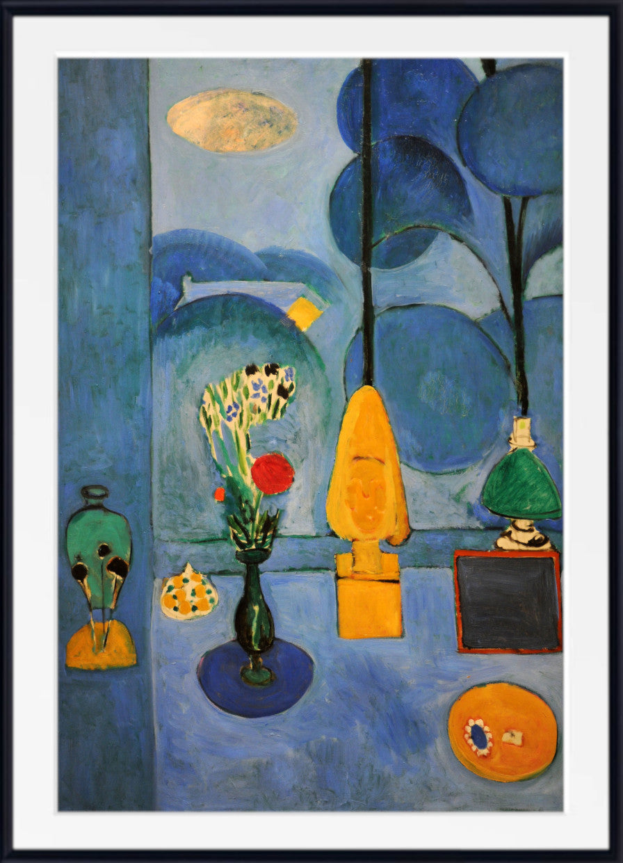
Is Blue Still Life available as a framed Henri Matisse print?
Yes. GalleryThane offers Blue Still Life (Nature morte bleue) in a choice of sizes and formats, including fine art paper prints, framed prints and canvas options.
Where would a Matisse Blue Still Life print work well?
Its horizontal format, dominant blue palette and richly decorative surface make it particularly suitable for living rooms, dining rooms, bedrooms, kitchens and home offices. It works especially well with contemporary, Scandinavian-inspired, mid-century and eclectic interiors.
All orders for unframed fine art prints and original paintings are dispatched within 2 working days of receipt of payment.
Orders for custom framed prints are dispatched within 4 working days.
All orders are fully tracked from dispatch to delivery at your home or business.
All print and original painting orders are fully insured against loss or damage in transit. We refund or replace any damaged or lost orders.
Buy with confidence - read what our satisfied customers have to say - Reviews
Fine art papers are printed without any additional white border Please let us know at the time of ordering if you would like a small additional white border.
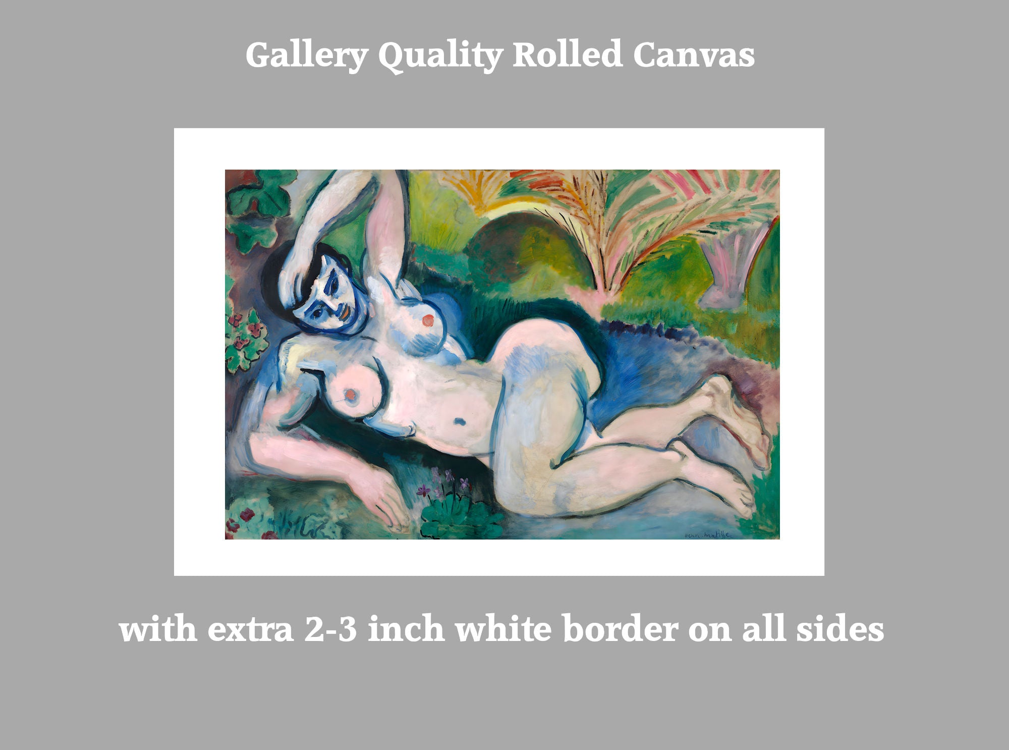
Rolled canvas options have an additional white border of approximately 2.5 inches (7cm) on all 4 sides to aid stretching.
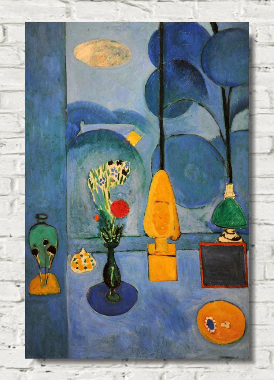
Ready to hang canvas panels are stretched on 1.5 inch deep solid pine frames from sustainable forestry sources. The image is mirrored on all 4 sides to give an aesthetically pleasing finish.
Why not have us gift wrap your order and attach a personalised message to the recipient. Available for all orders. Each order is hand wrapped in high quality gift wrap with meatllic ribbon and bow. Your personalised message is printed on a card which is included with your order.
Have your hand wrapped gift delivered directly to the recipient.
Full tracking and insurance included with every order.
Please note design may vary depending upon availability
Just purchase the gift wrap option HERE
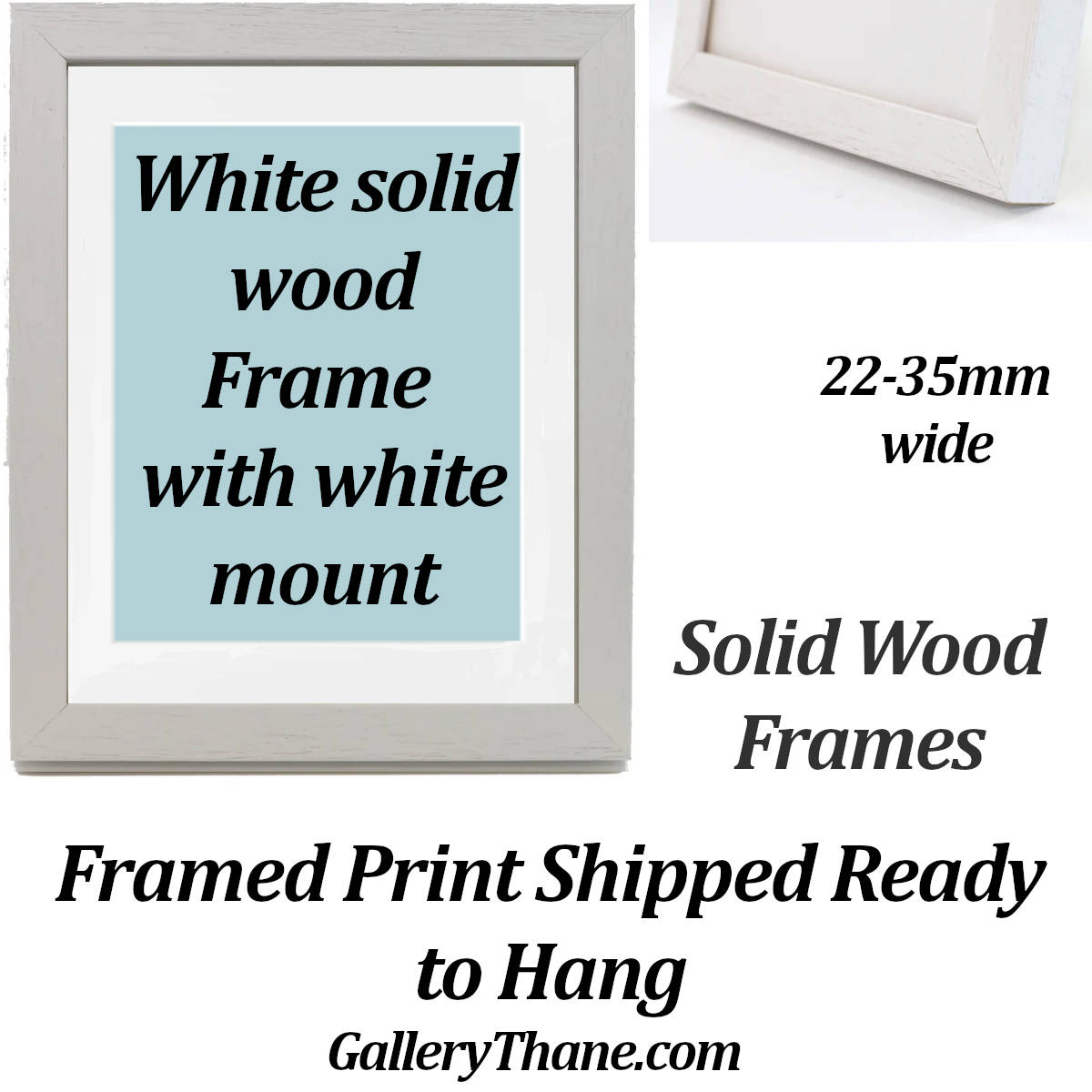
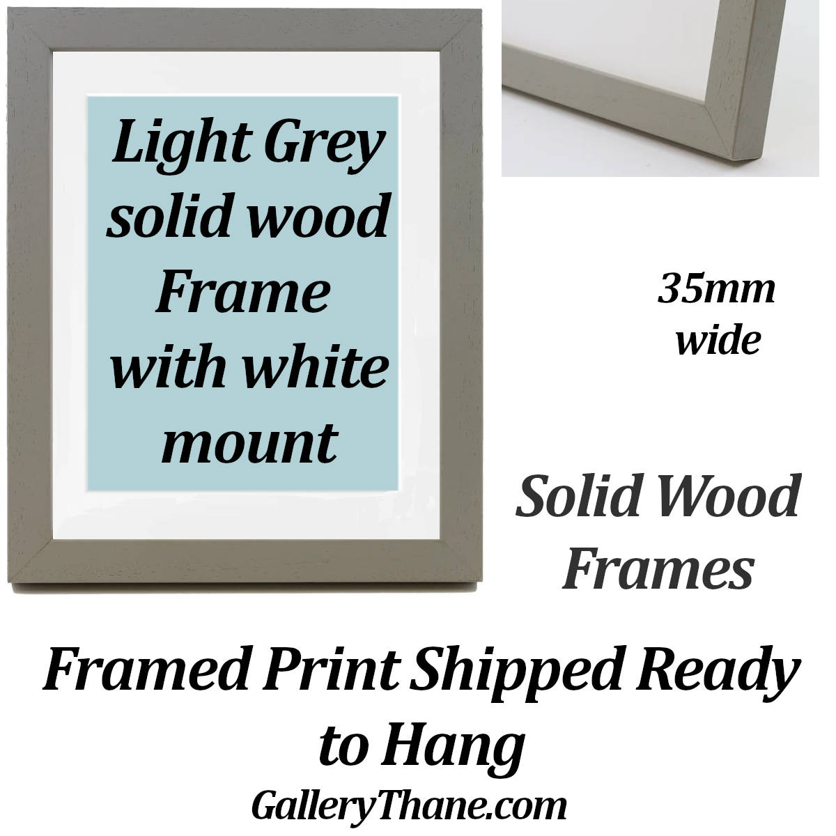
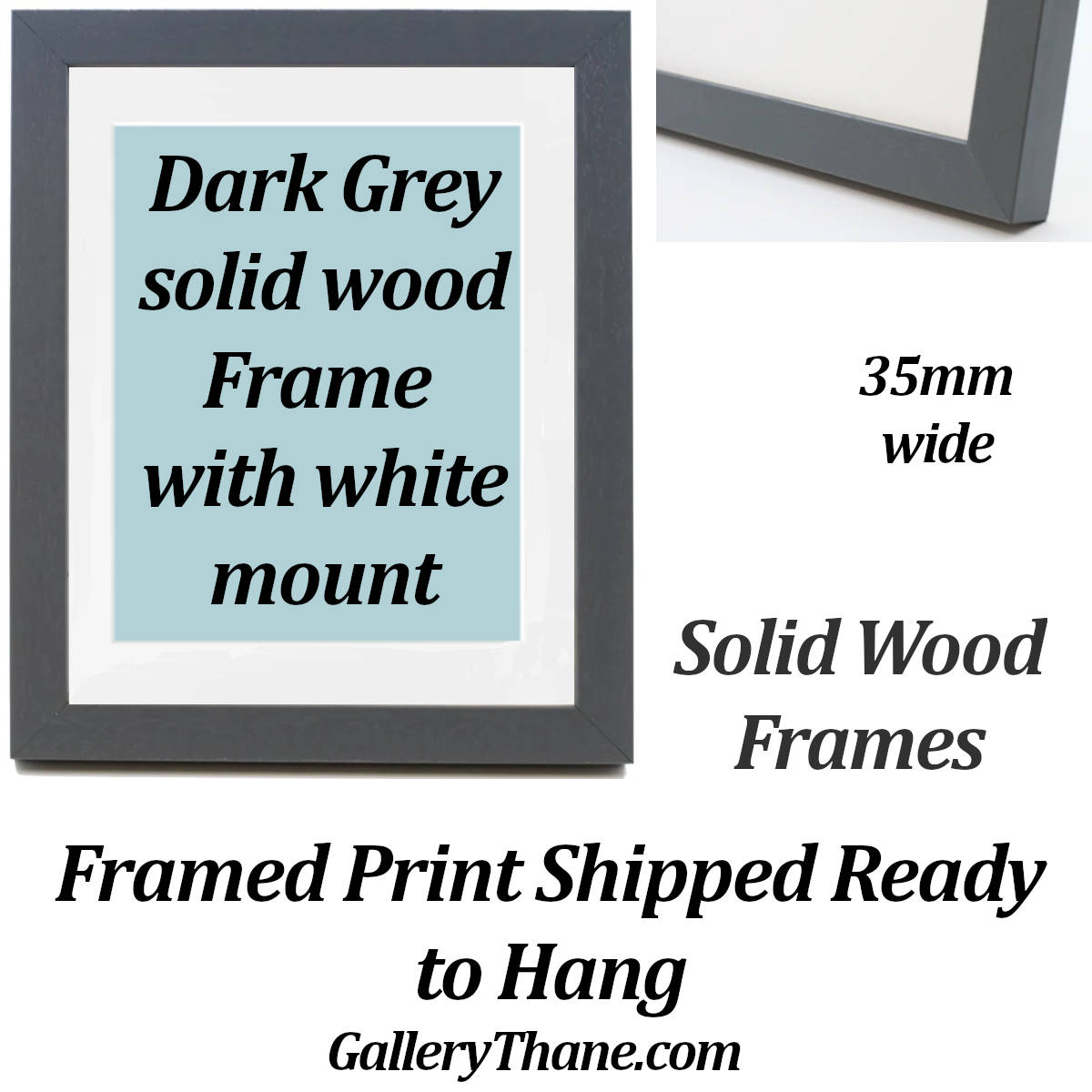
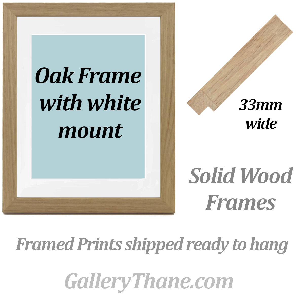
We have a wide range of frames in standard sizes and we also make custom size frames.
To order a framed print:
1. select the print size you would like along with the print materials (matte paper, fine art paper).
2. Add your print choice to the basket.
3. Choose from our range of frames
4. Select the same size as the print you have added to your basket. If the frame size you want is not listed please contact us
5. Choose from the mount or no-mount option
6. Add your frame choice to the basket
7. Proceed to checkout.
Why Choose GalleryThane?
- Printed and framed in-house
- Free UK delivery
- Free EU and USA delivery on orders over £200
- Tracking and insurance included in every order
- Fast 1-3 day dispatch
- Gift wrapping service available
- Gallery quality materials
- Sustainable, eco-friendly packaging
- Great customer support
Explore related collections

What makes our Prints and Canvas Panels so special

Latest Giclee Printing Technology
We have invested in the latest wide format print technology to produce museum quality giclee prints utilising the highest quality pigment inks to give outstanding colour reproduction.

Museum Quality Archival Fine Art Papers
We print on the finest quality fine art papers with textured, smooth and lustre finishes for prints which last a lifetime.
From aceo miniatures to 40x80 inch large format, every print has our lifetime quality guaranteee.

Solid Wood Frames, Cotton Canvas
All of the wood for our canvas panels and frames is responsibly sourced from manages forests. Our cotton canvas is completely seedless for the highest quality reproduction possible.

Have Your Gift Wrapped


Choose a Custom Frame
Popular Collections


EU Representative
Manufacturer
LucasAbstract t/a GalleryThane
15 Campion Way, Bingham NG13 8TR UK
sales@gallerythane.com
EU Authorised Representative
Westwood Sourcing
Fellenoordstraat 52, Unit 2.38
4811 TJ Breda, Netherlands
info@westwoodsourcing.com