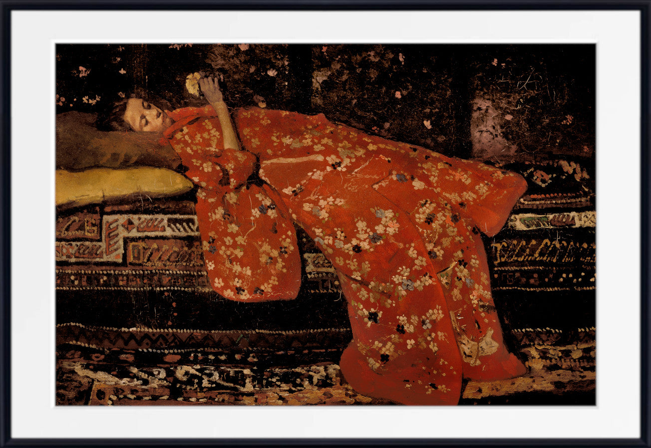
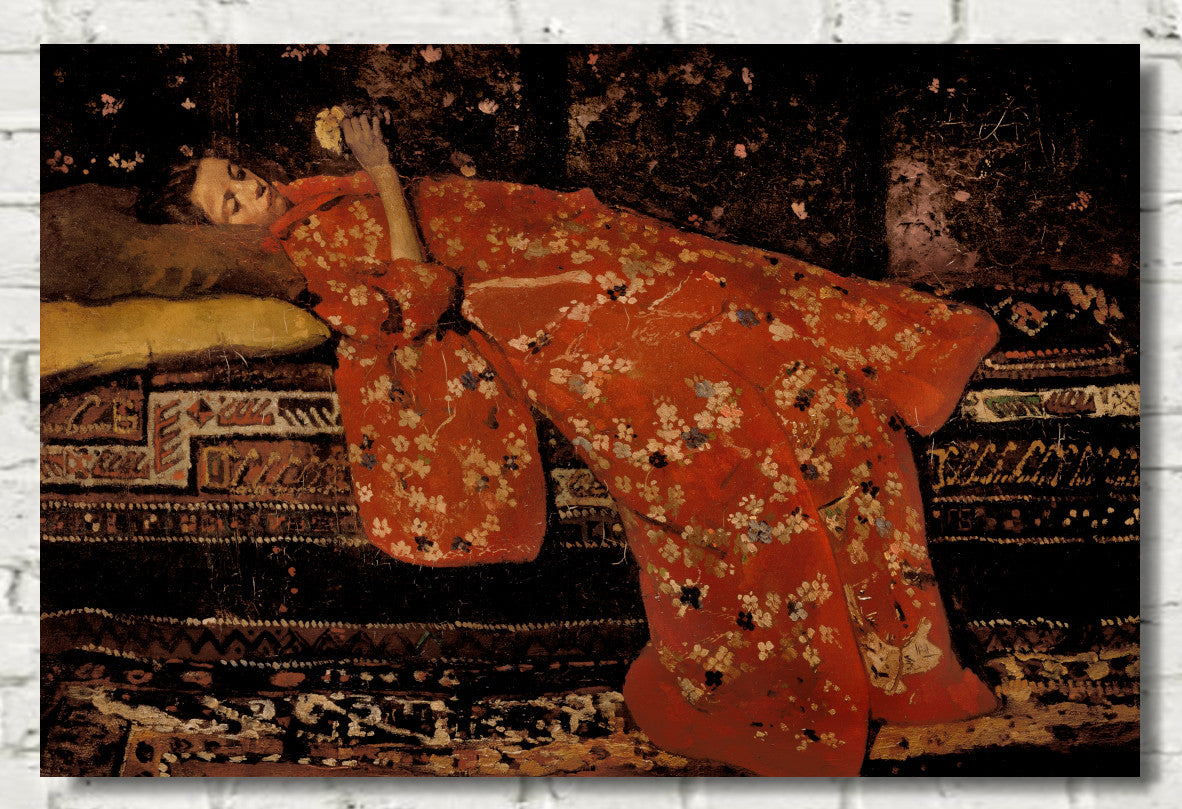
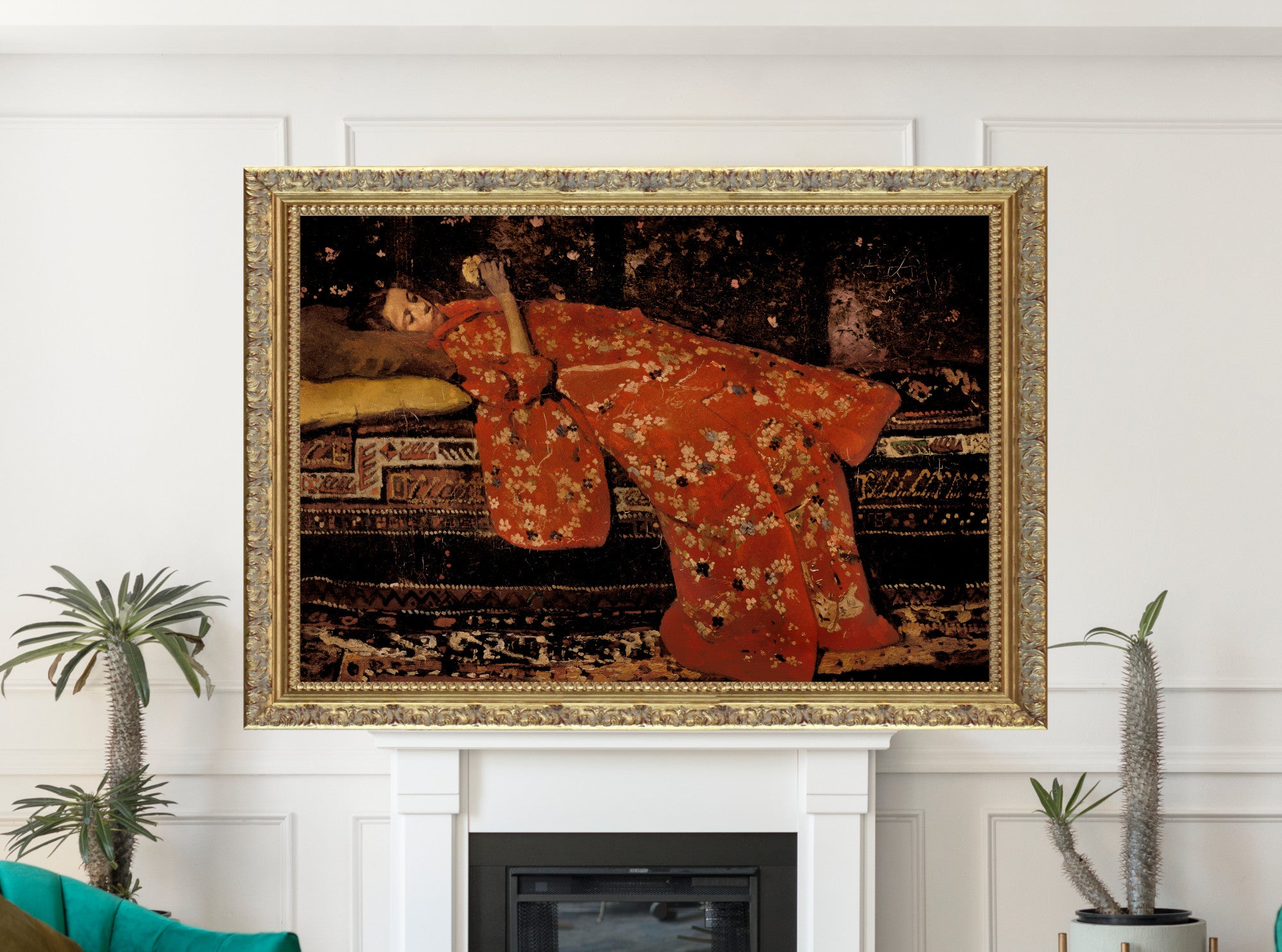
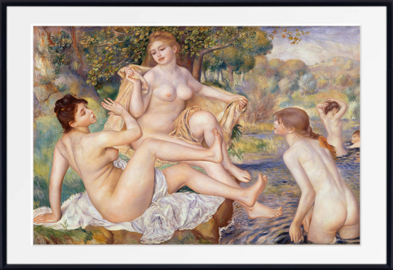
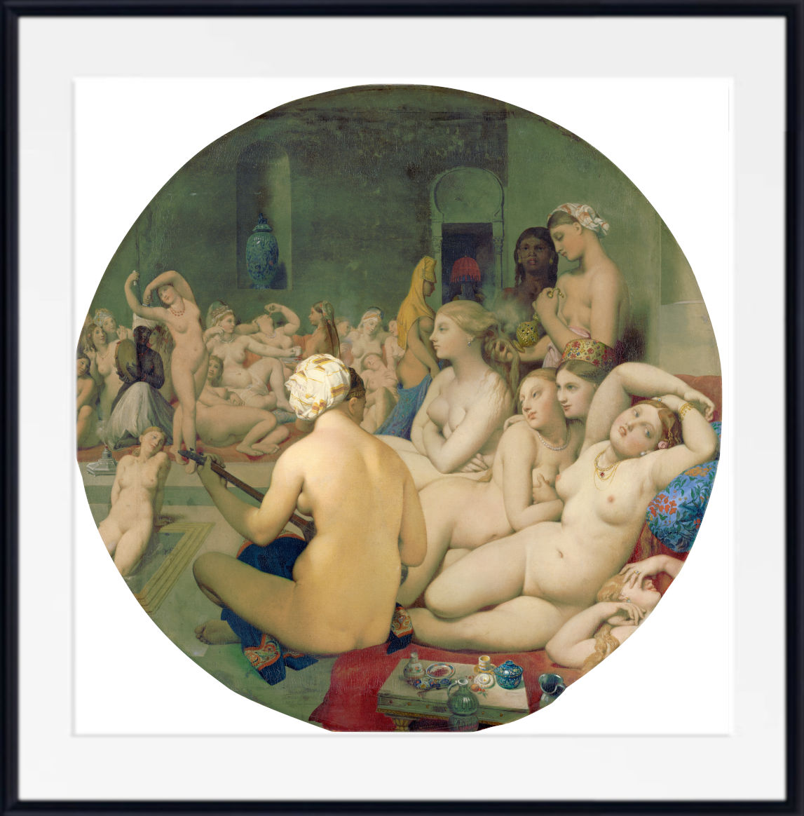
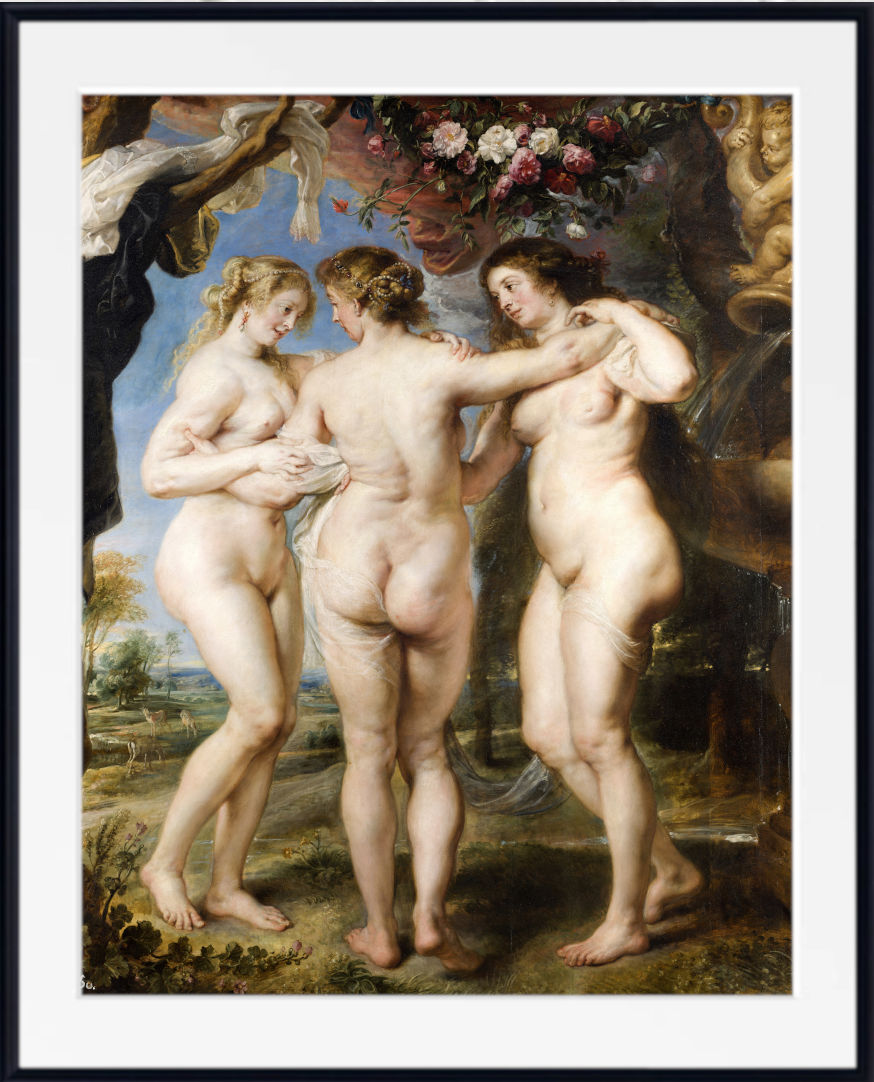
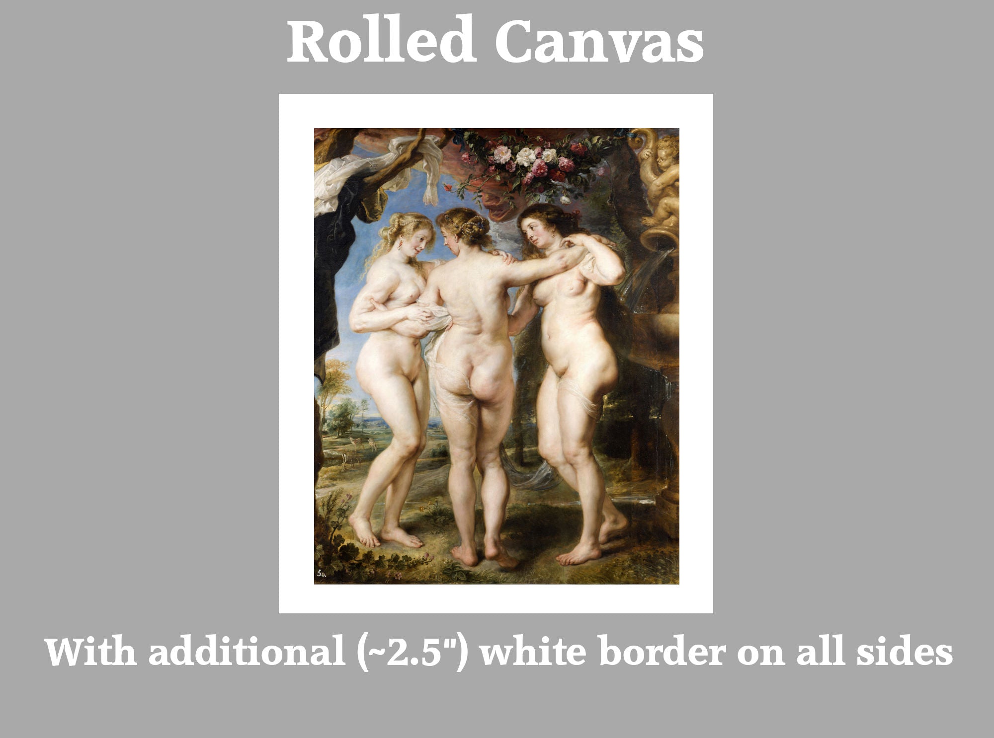
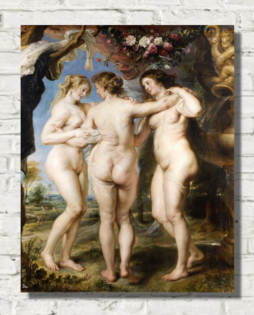
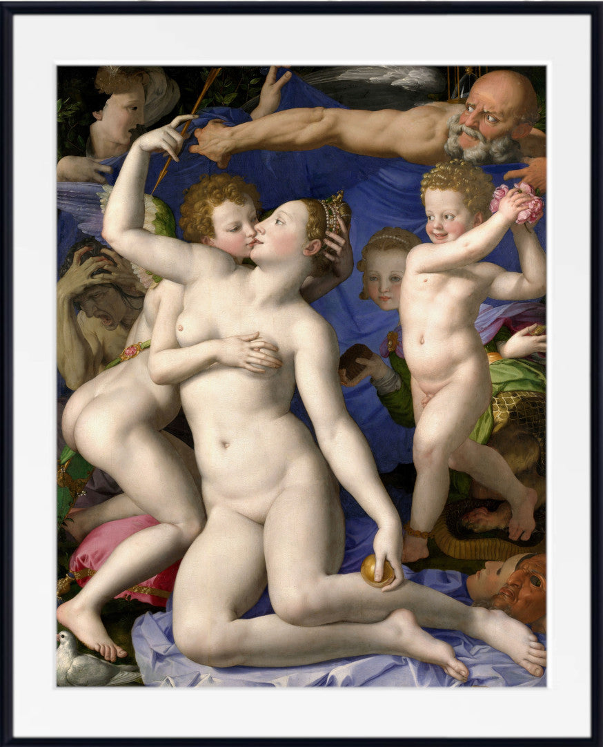
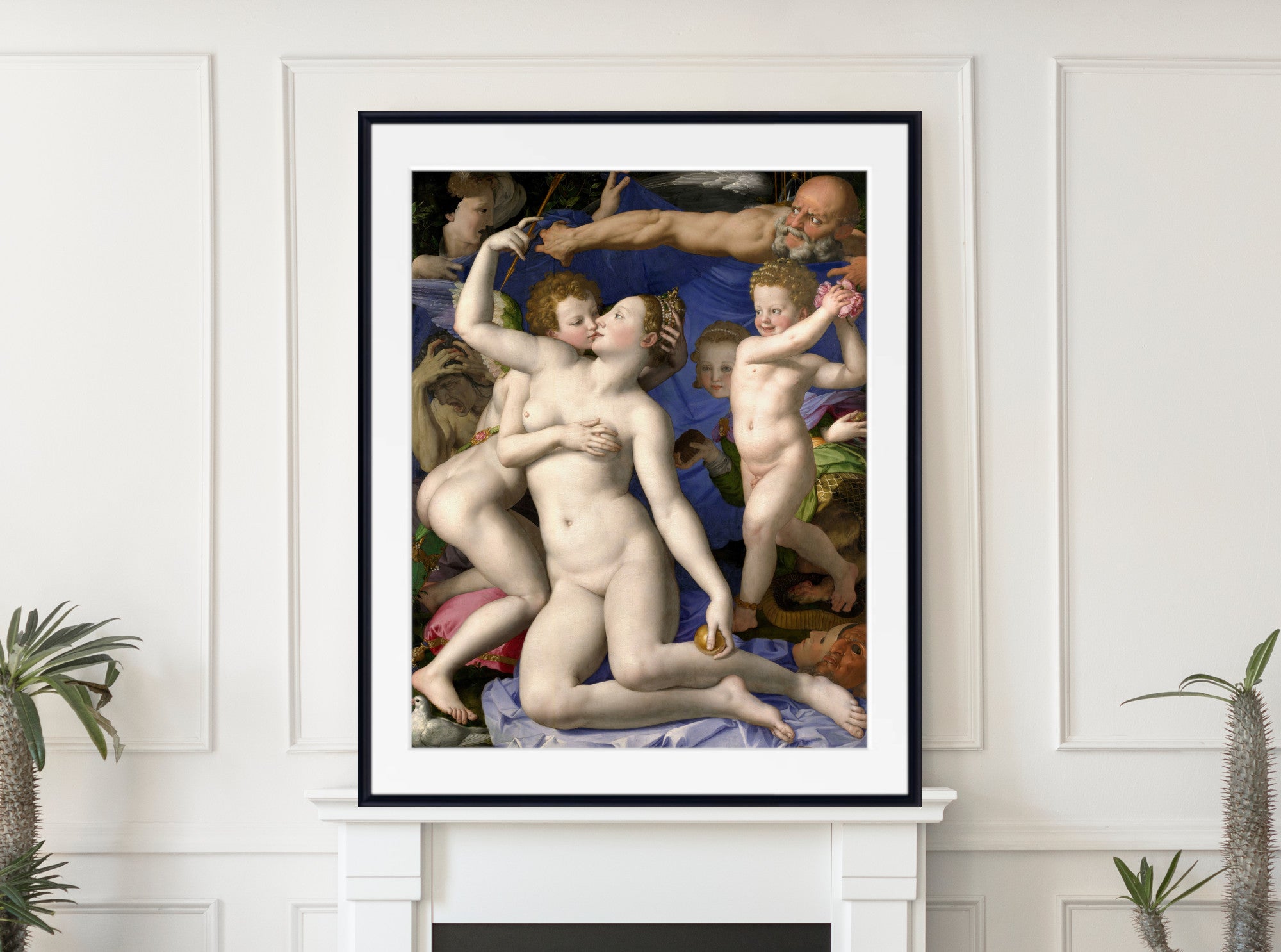
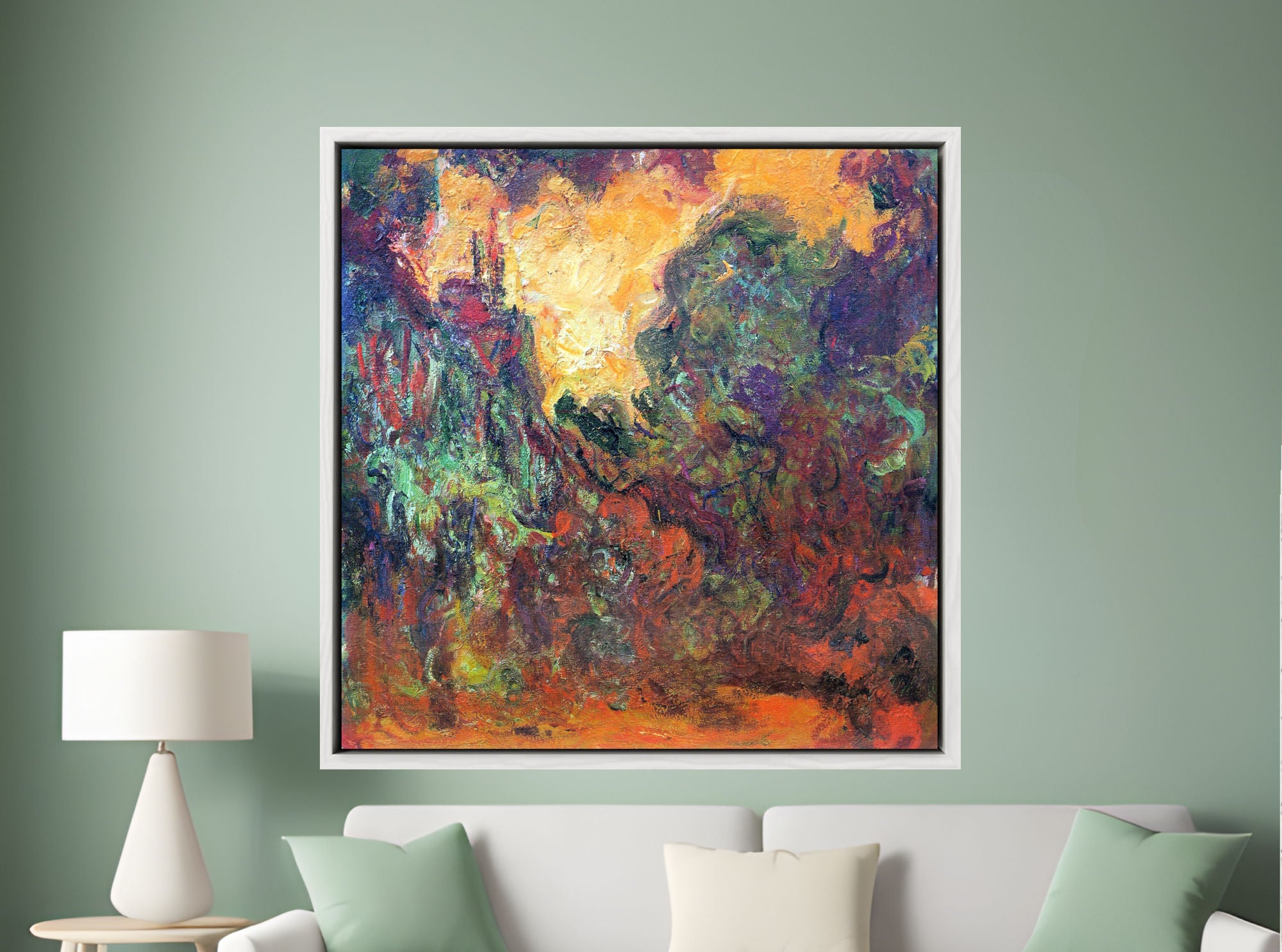
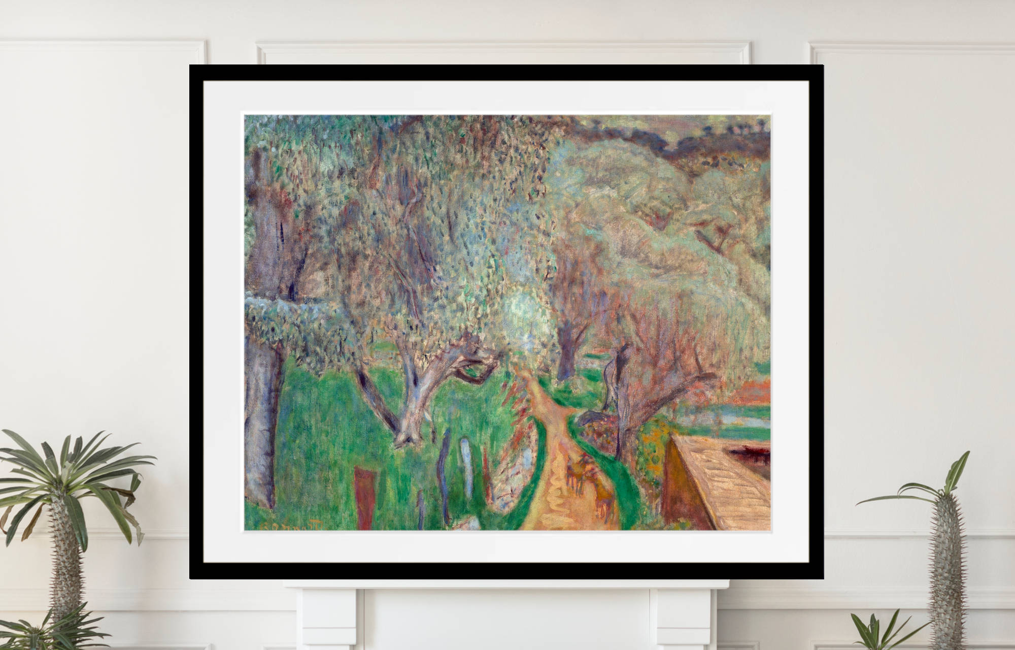
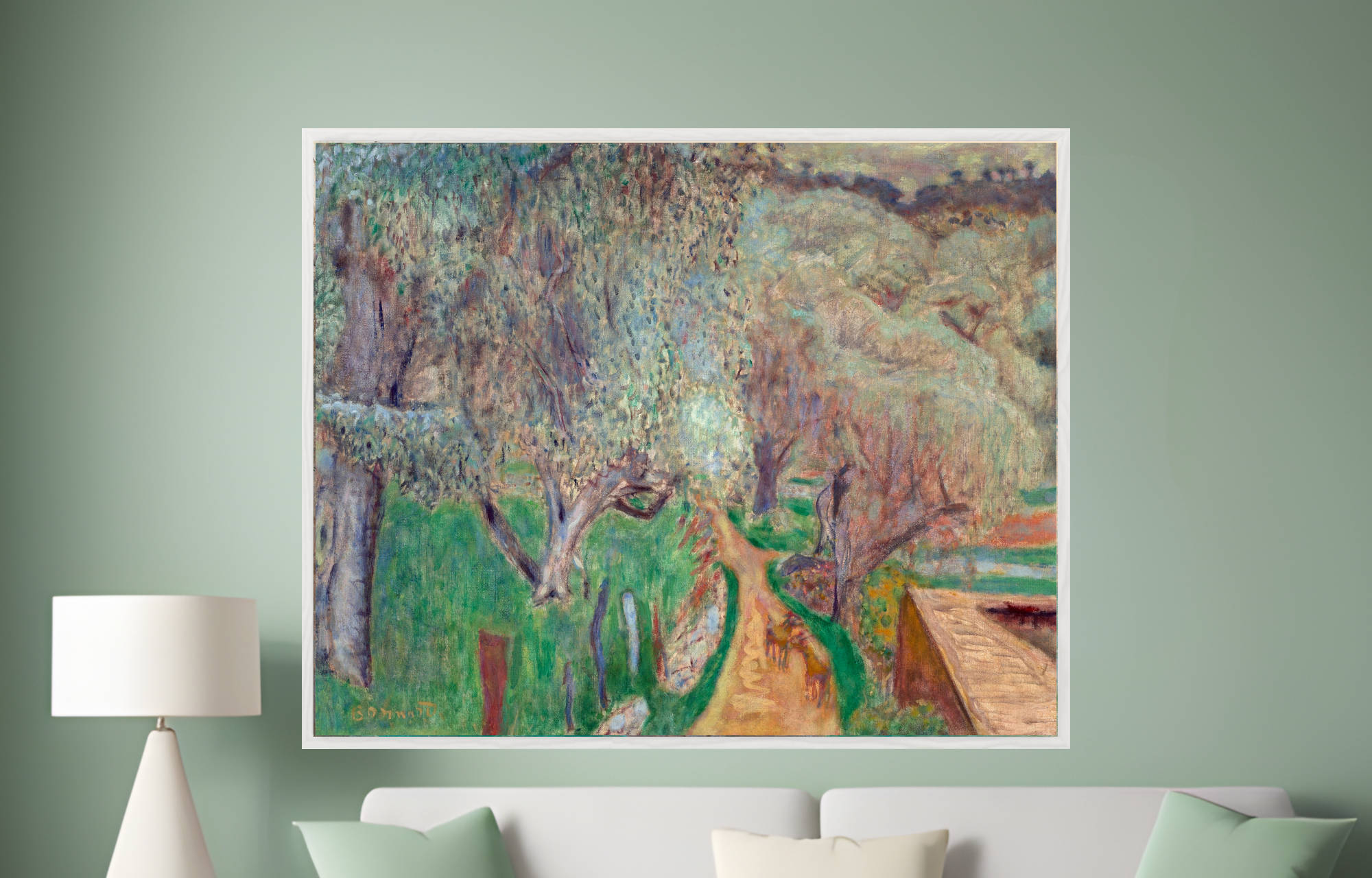
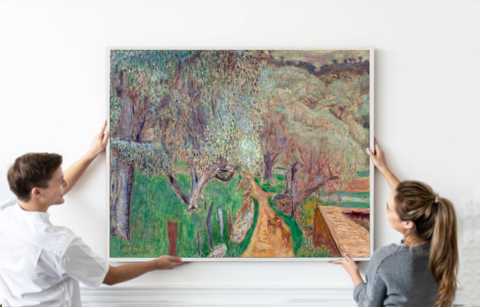
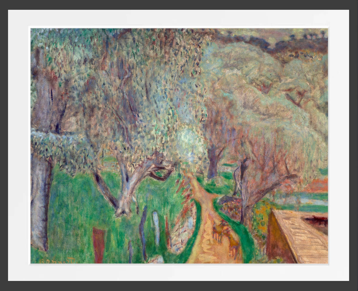
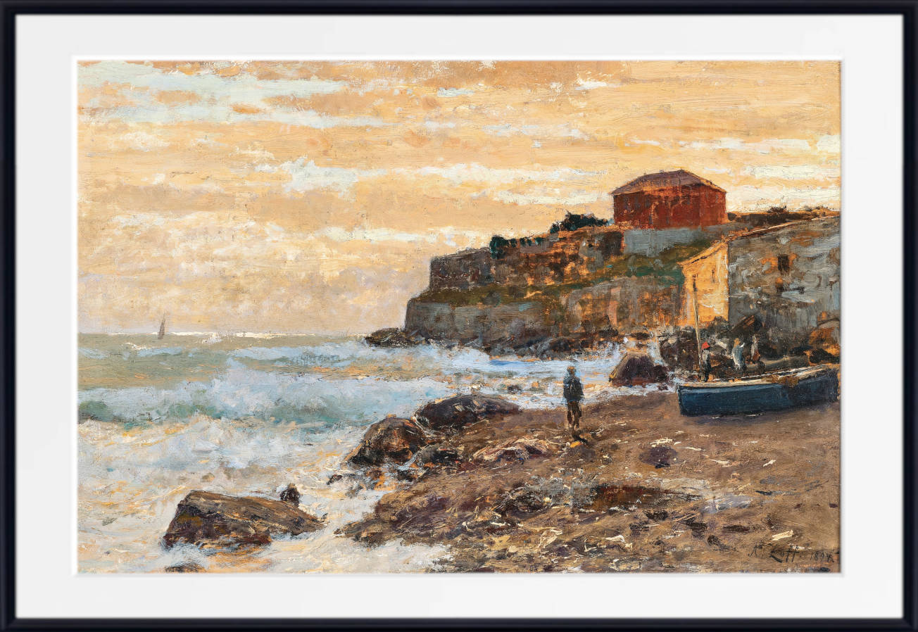
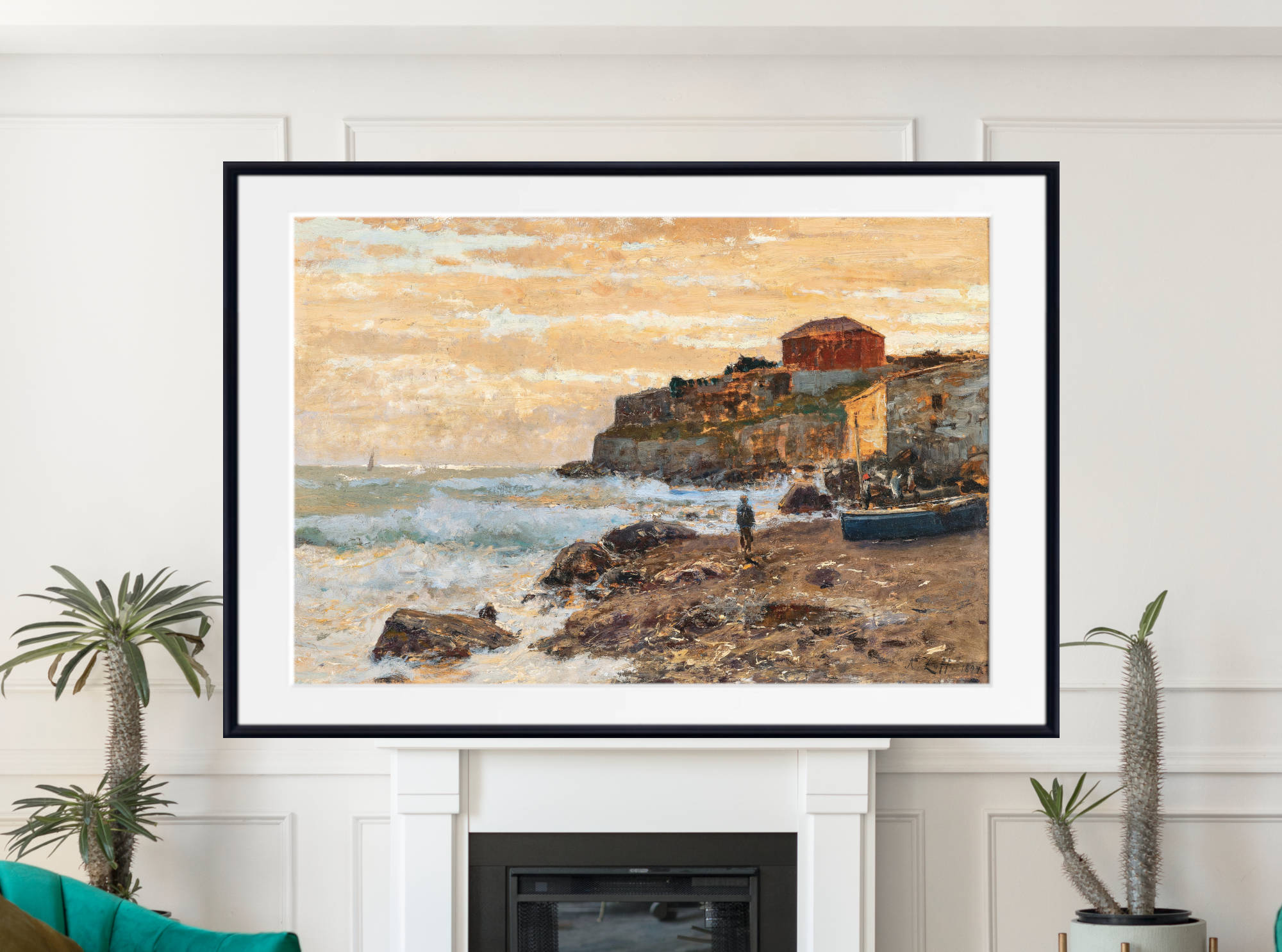
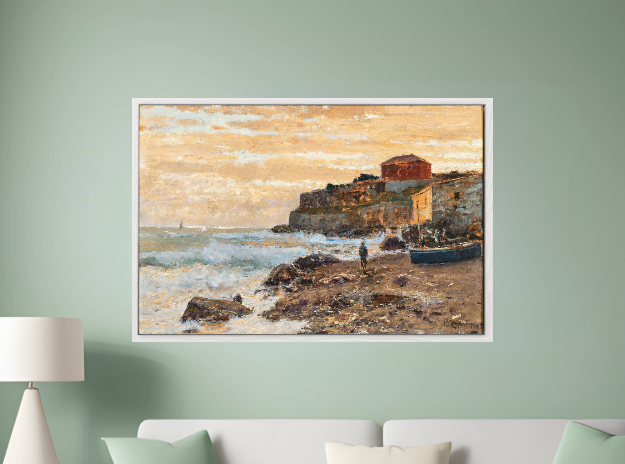
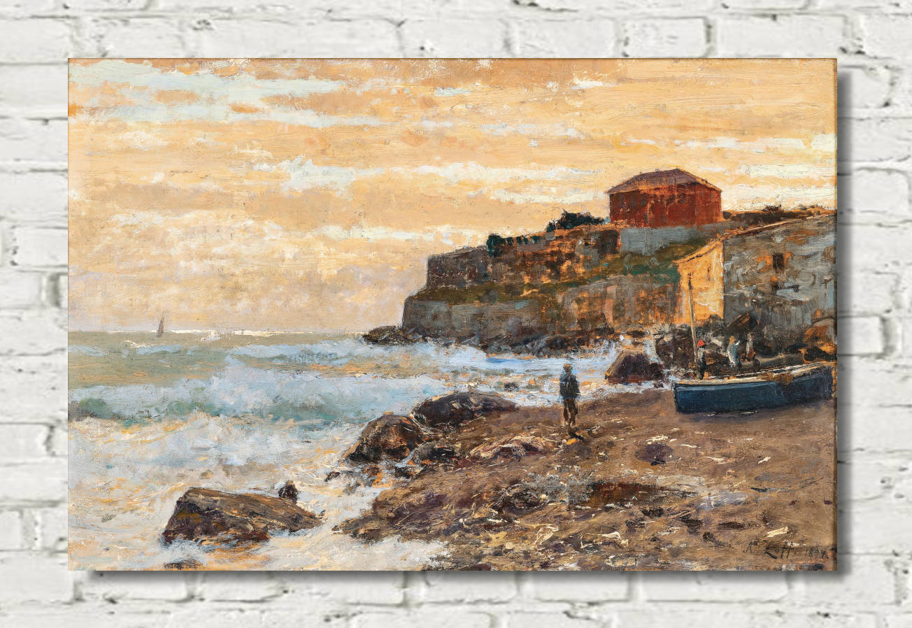
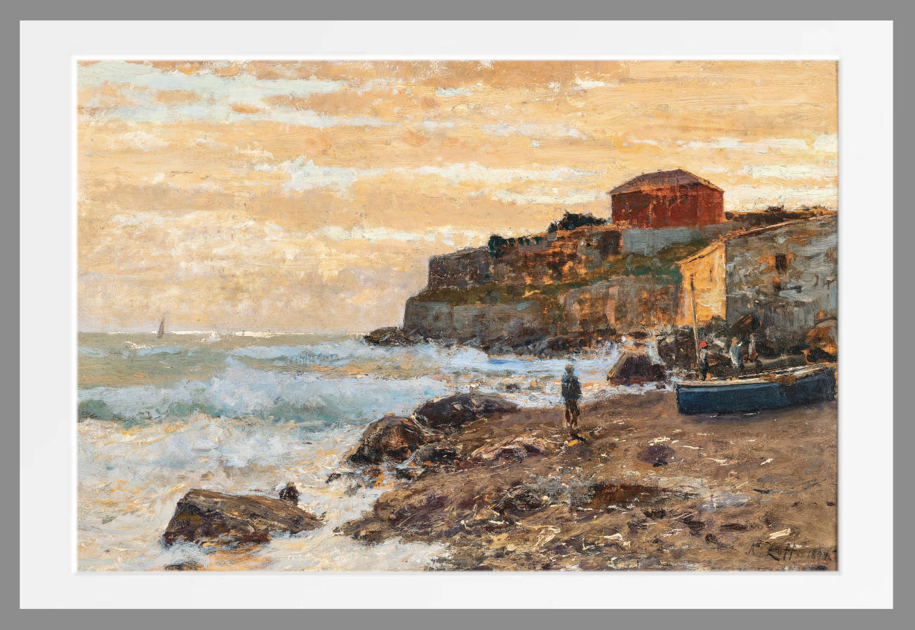
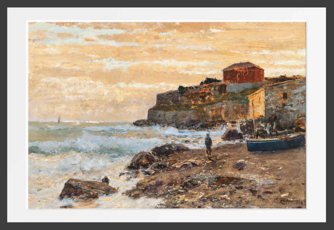
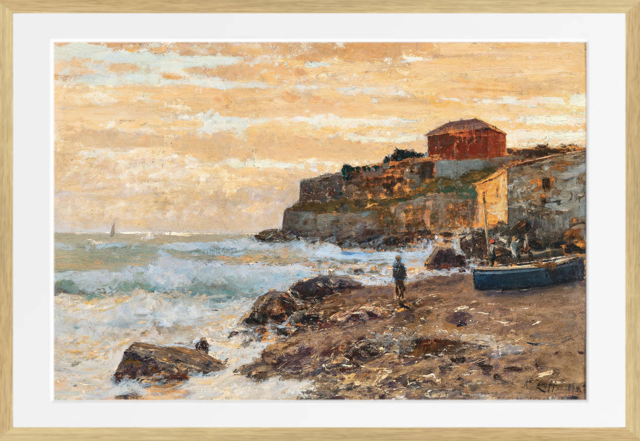
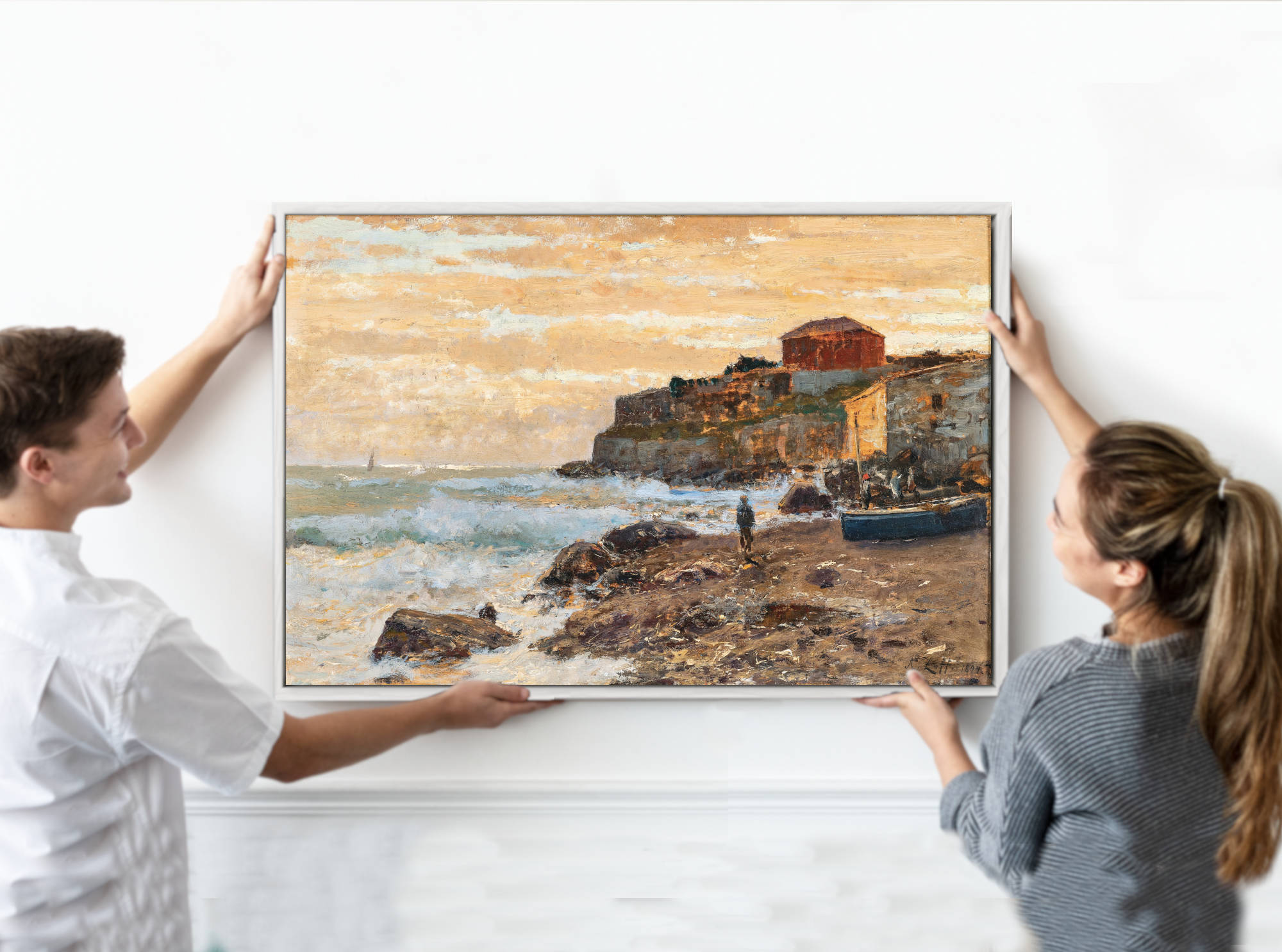
Red Wall Art
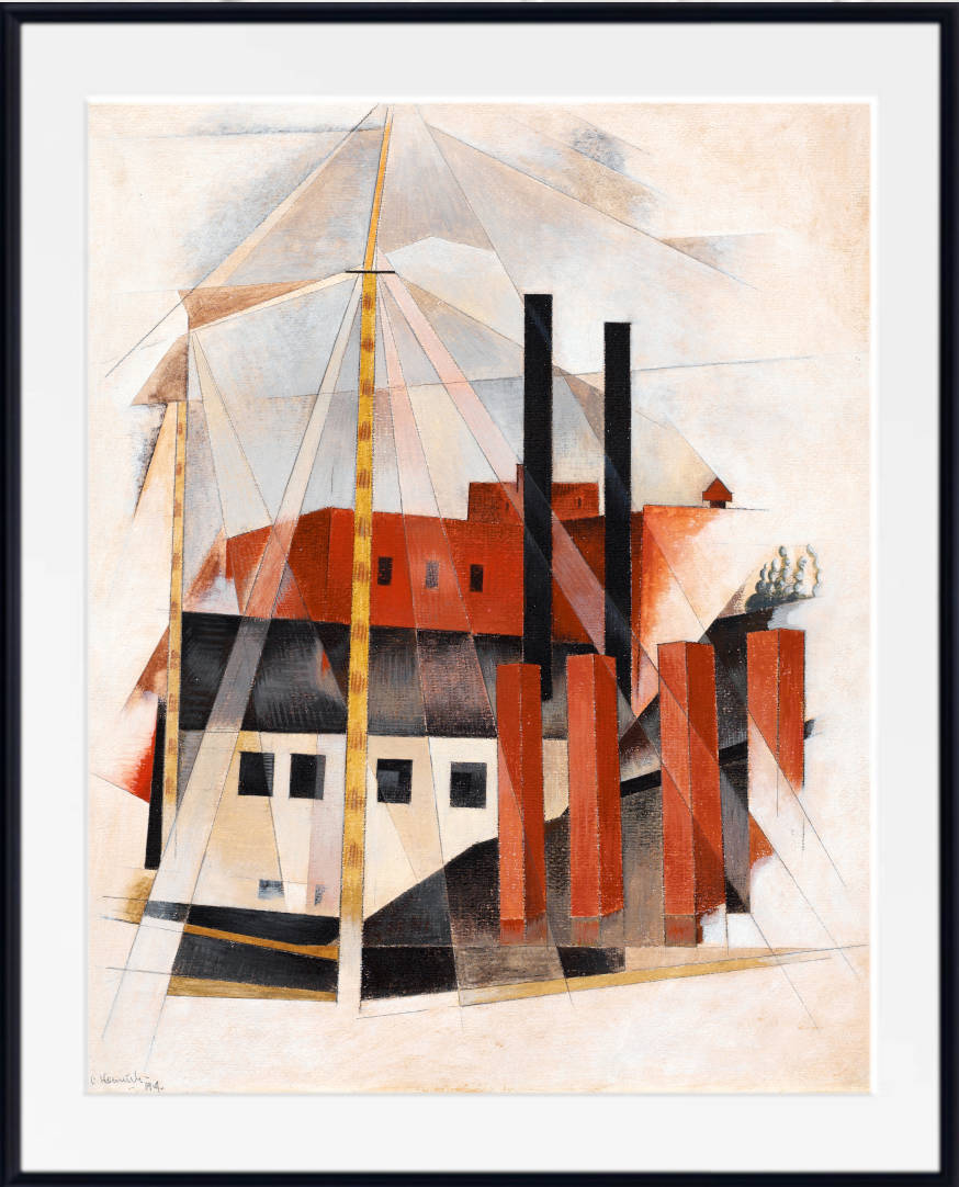
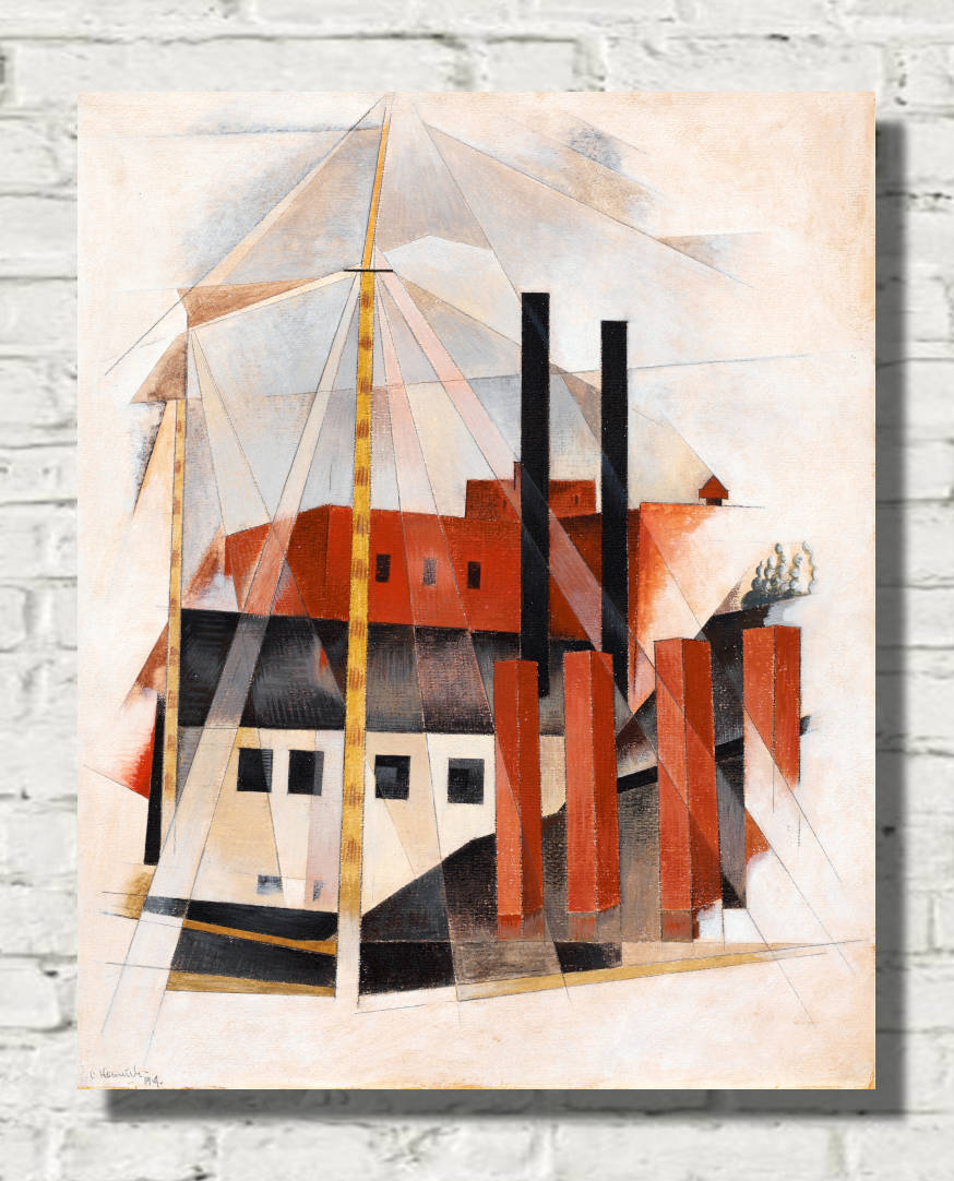
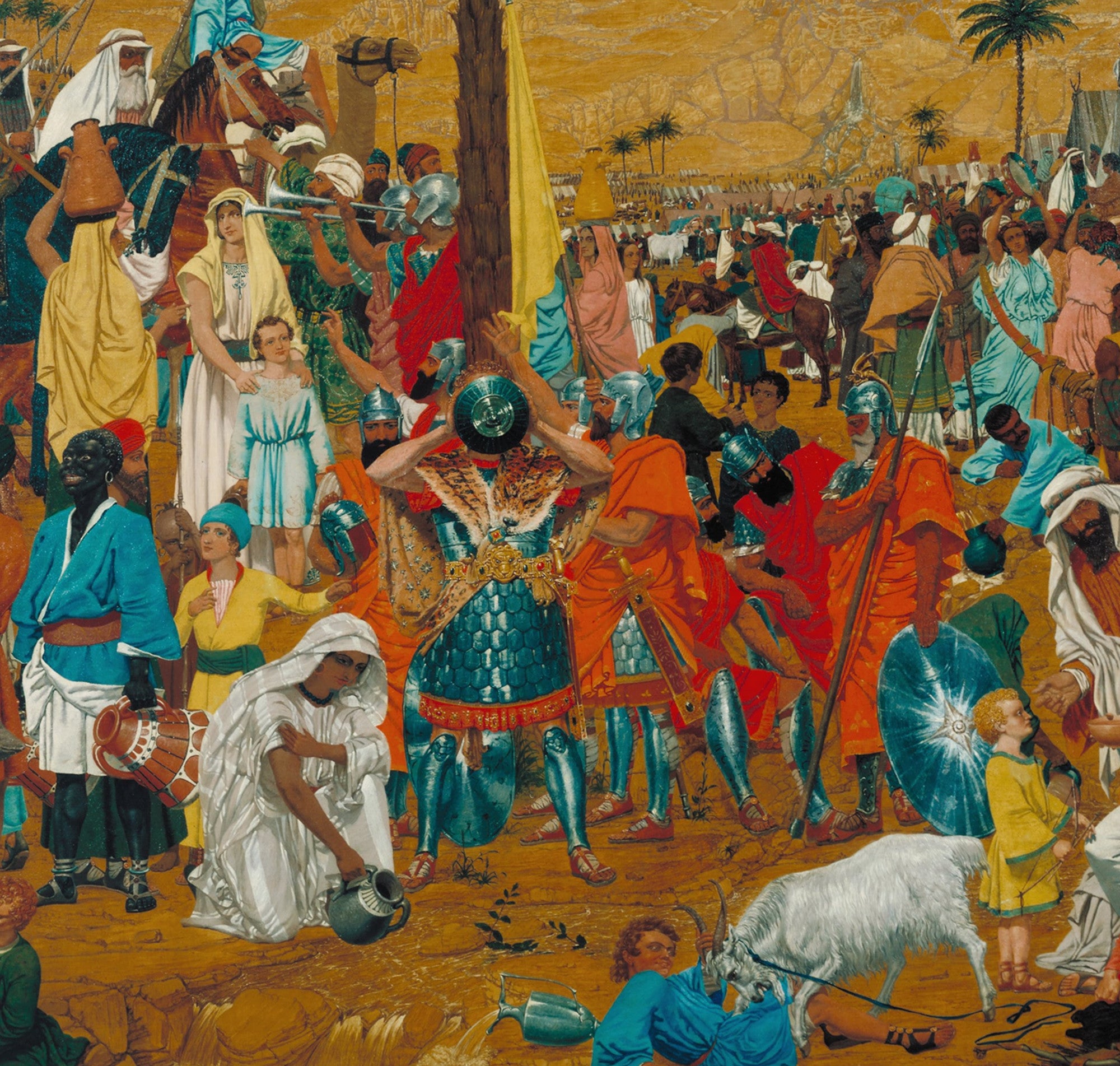
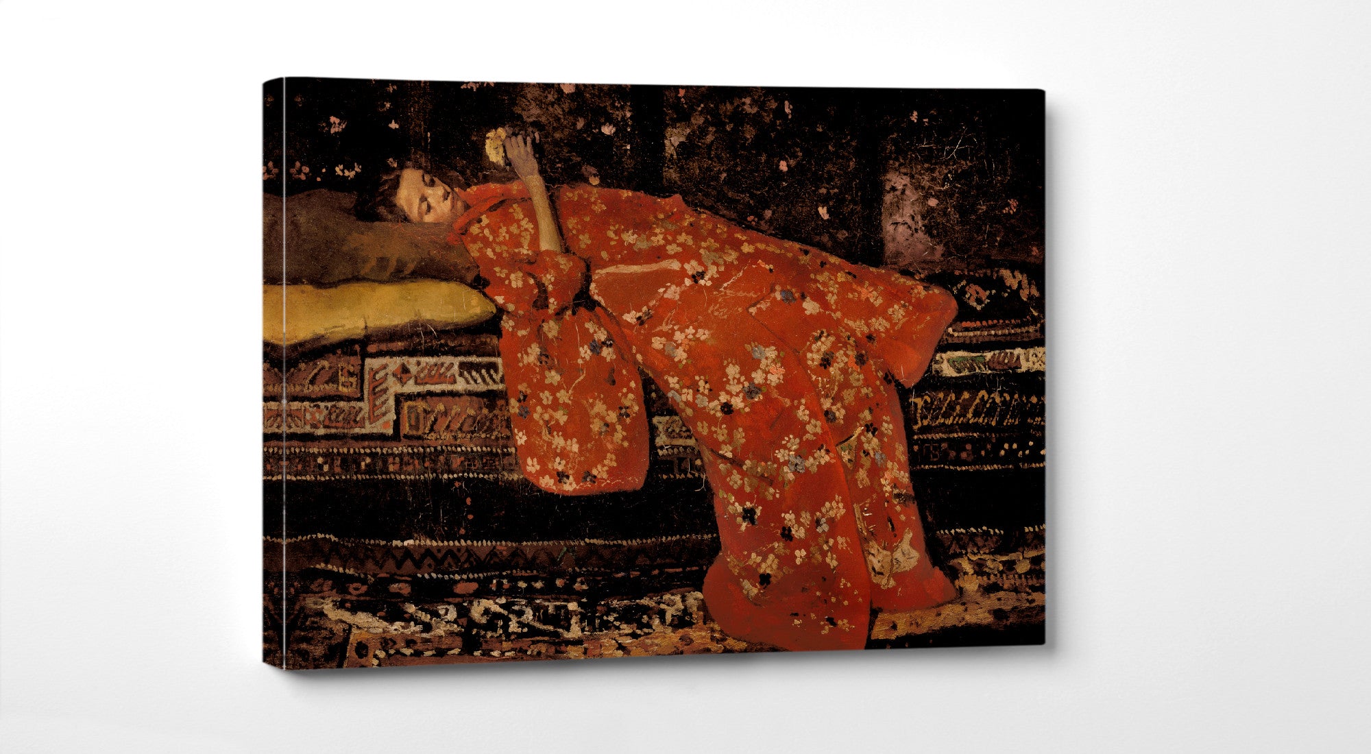
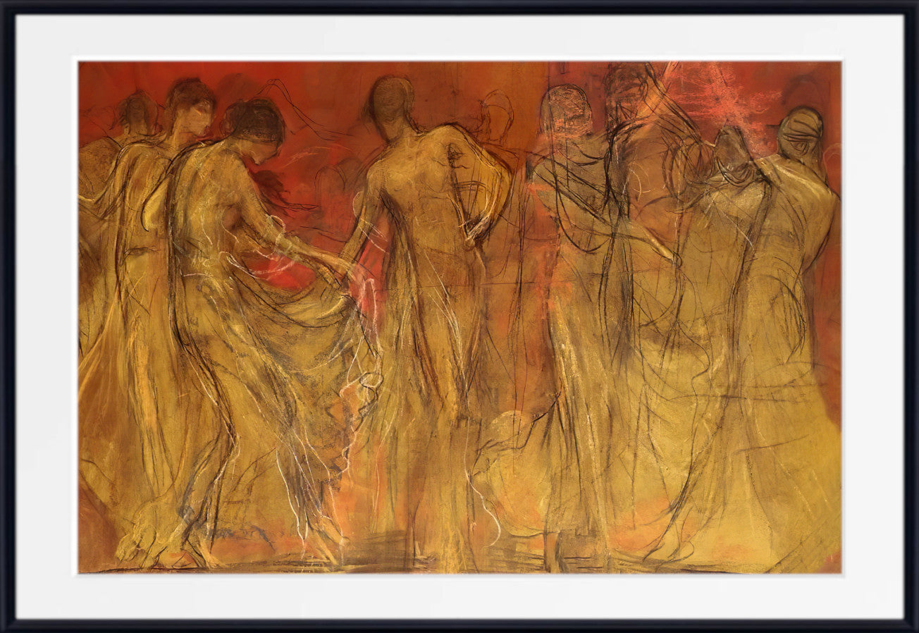
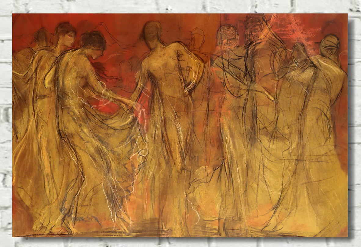
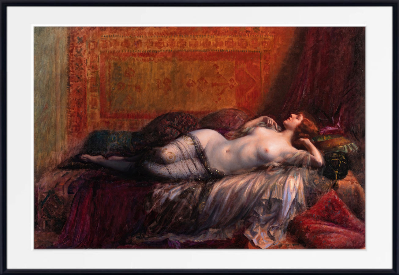
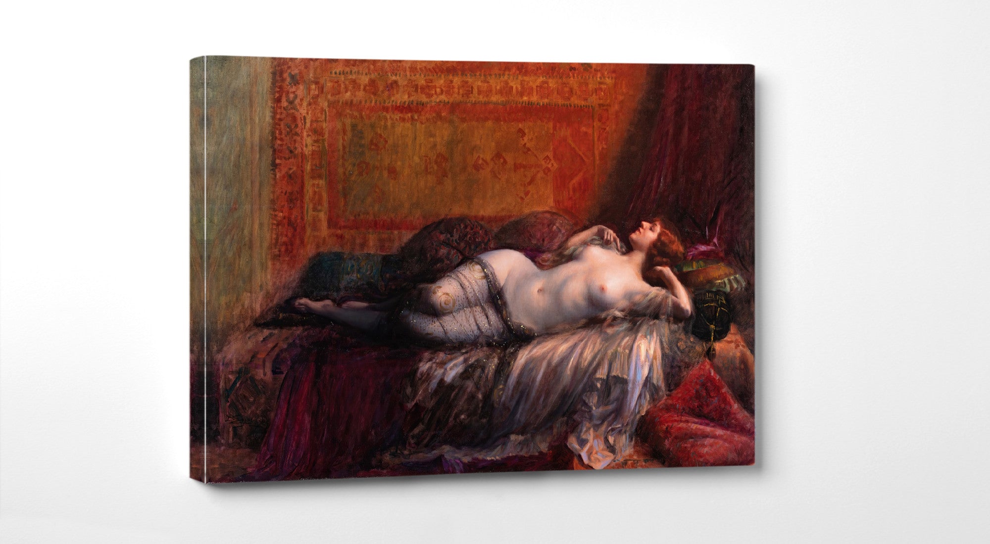
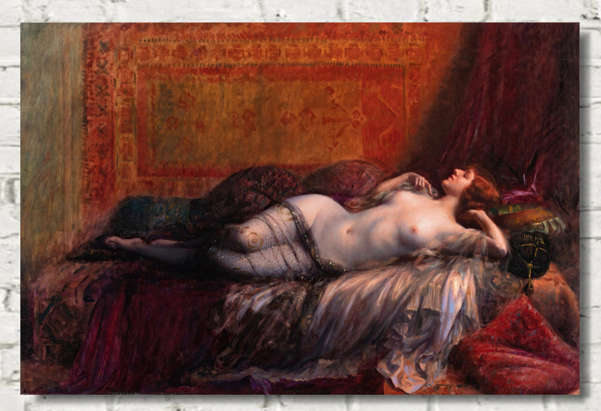
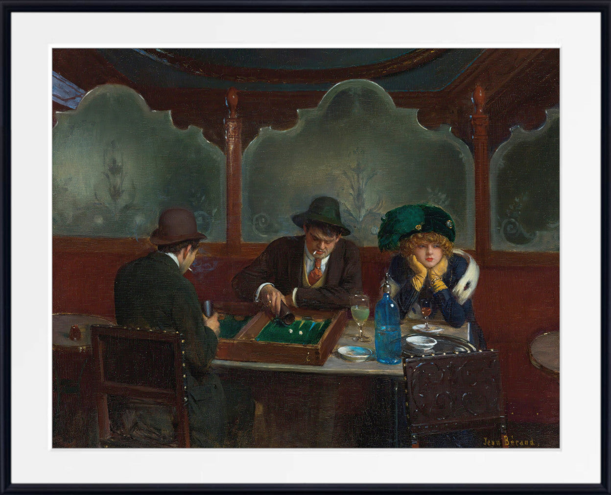
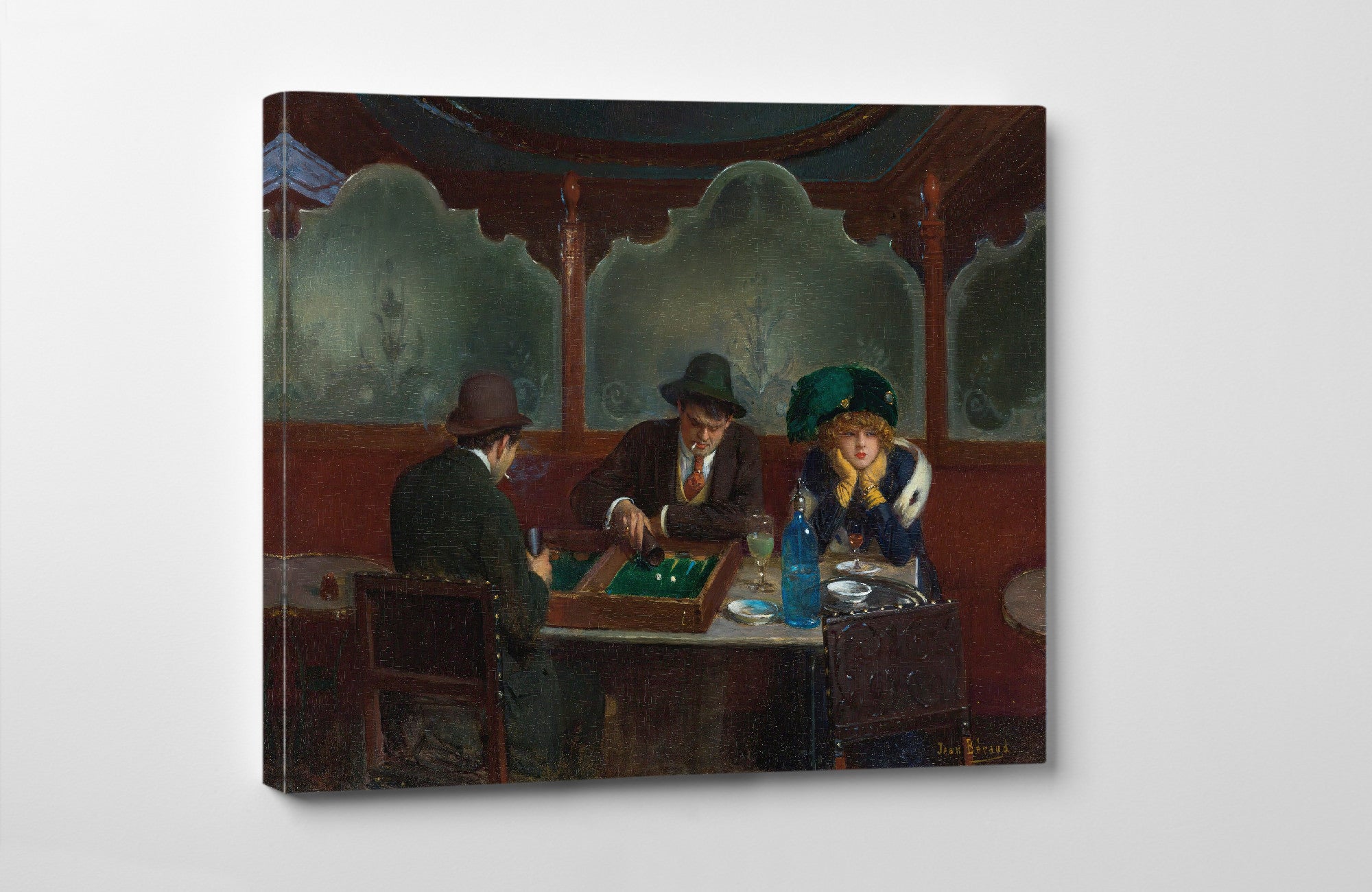
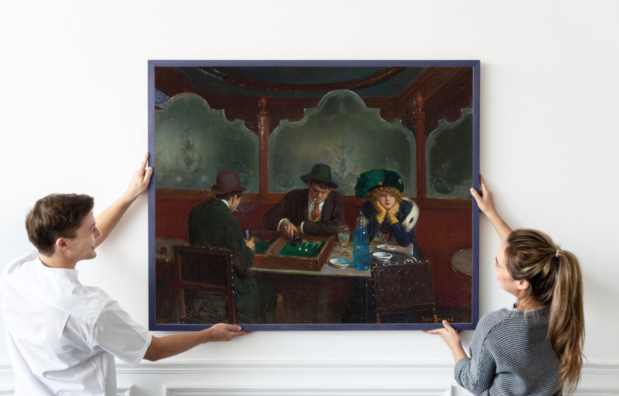
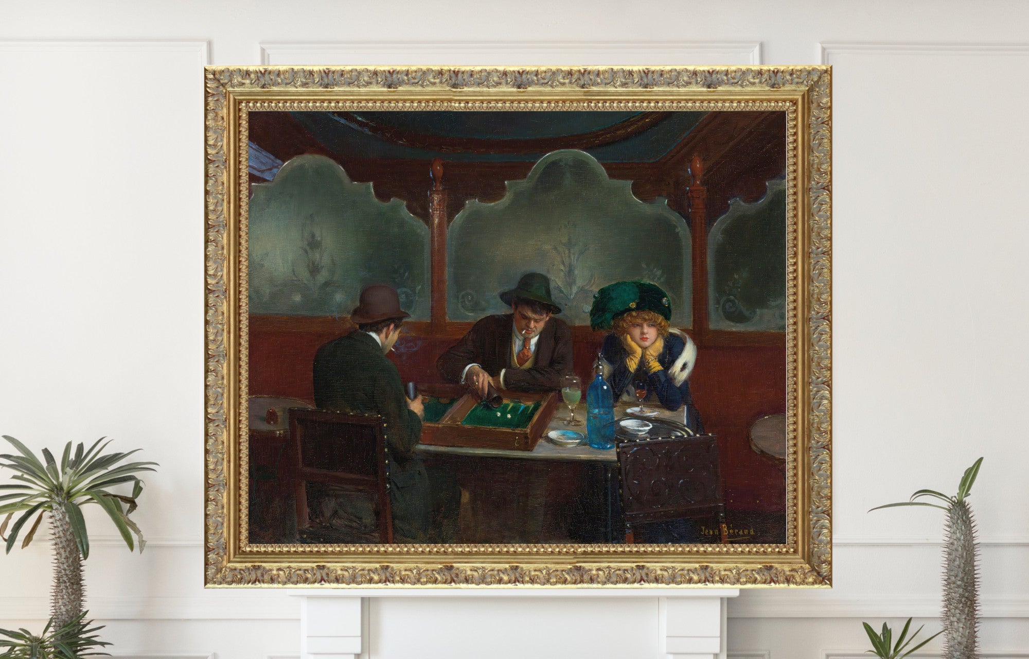
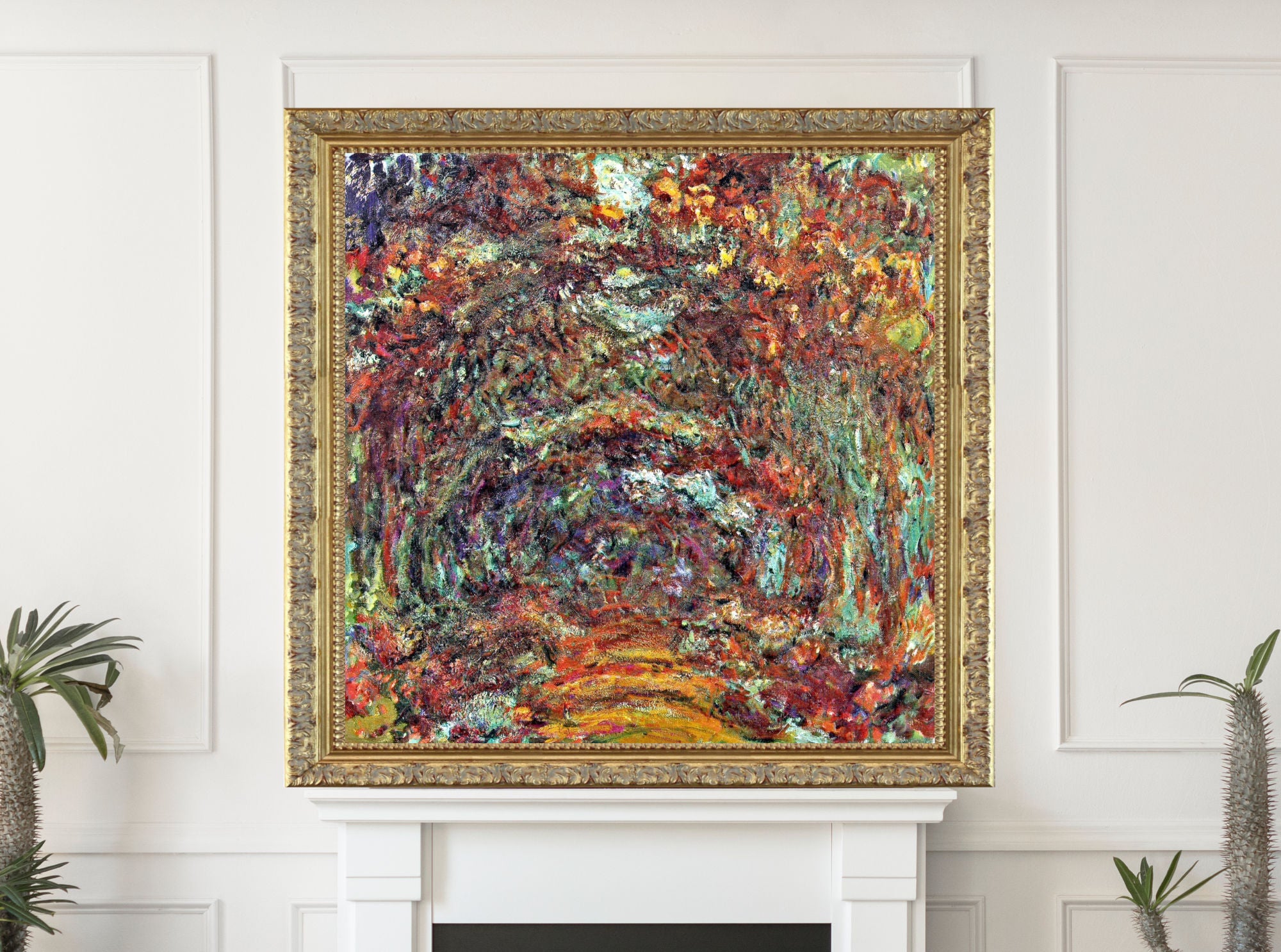
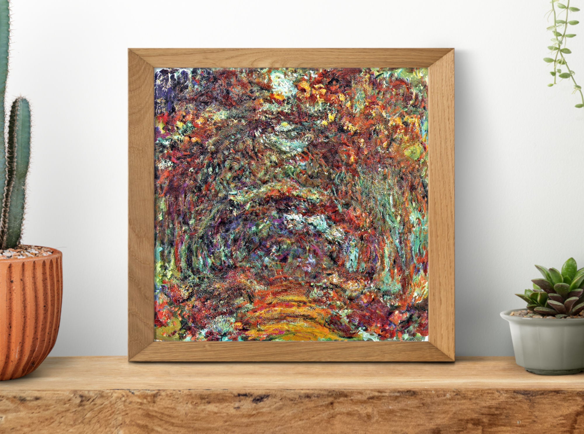
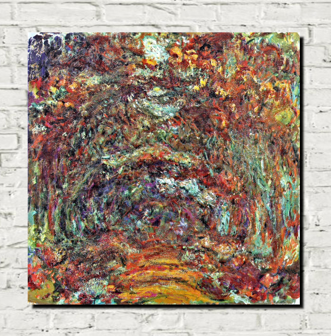
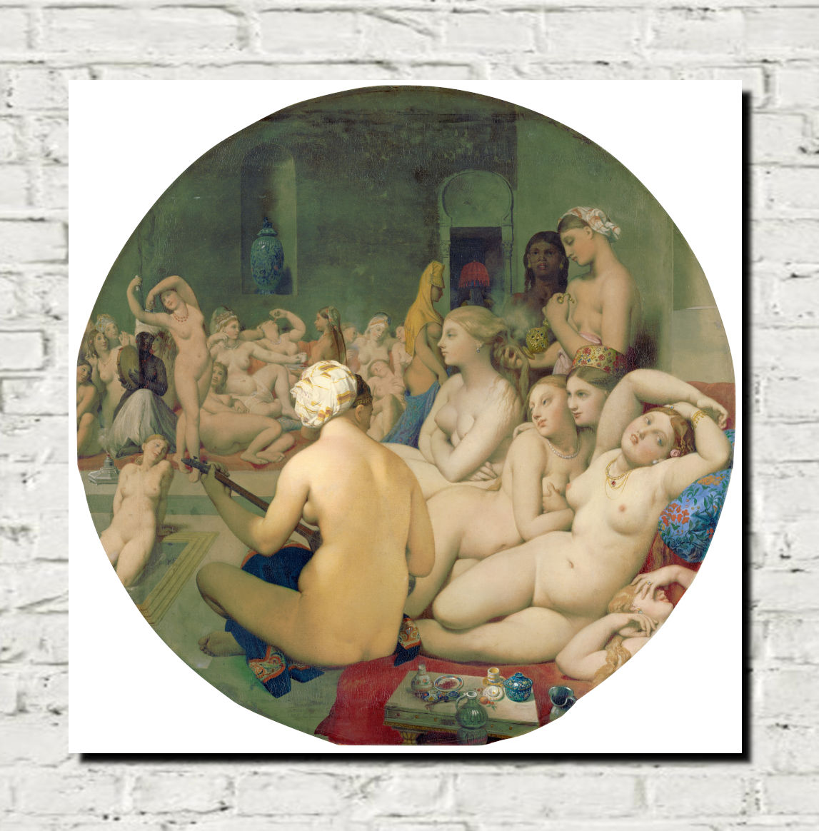
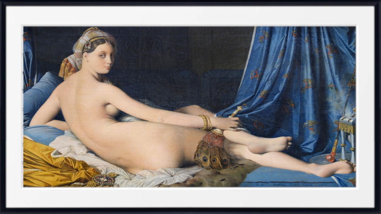
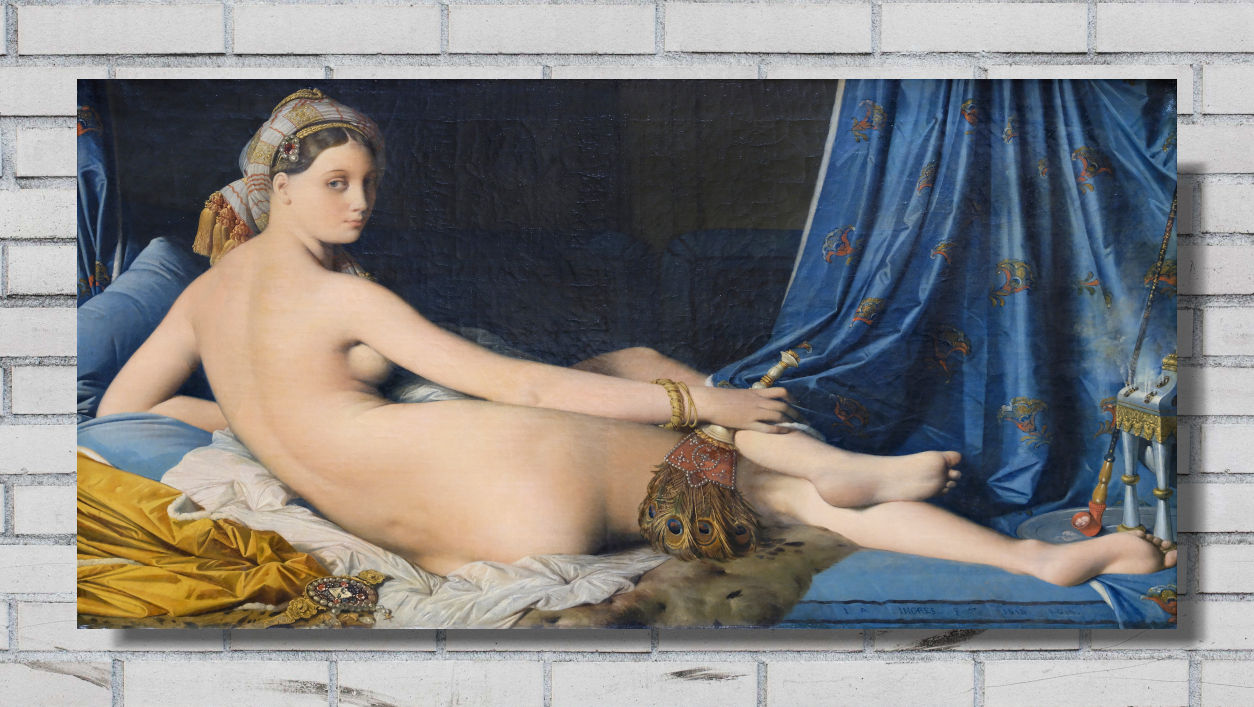
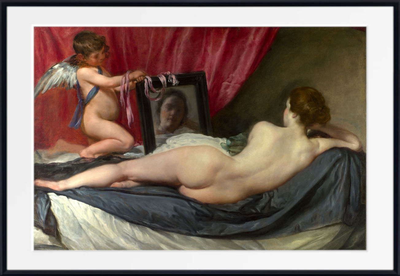
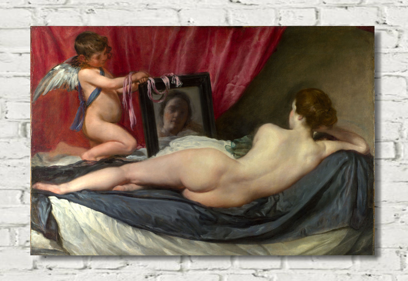
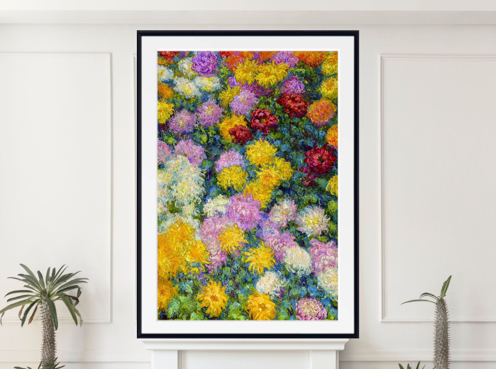
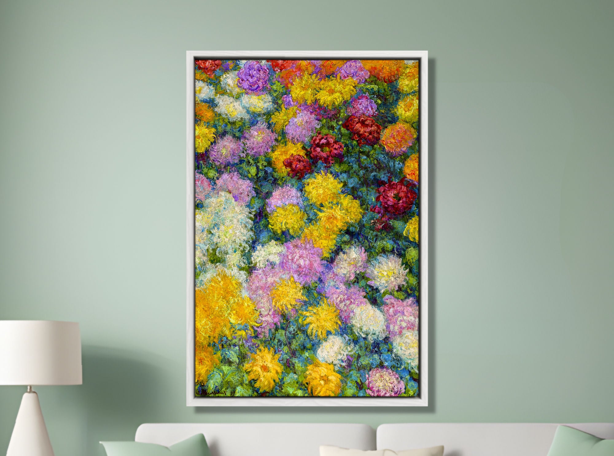
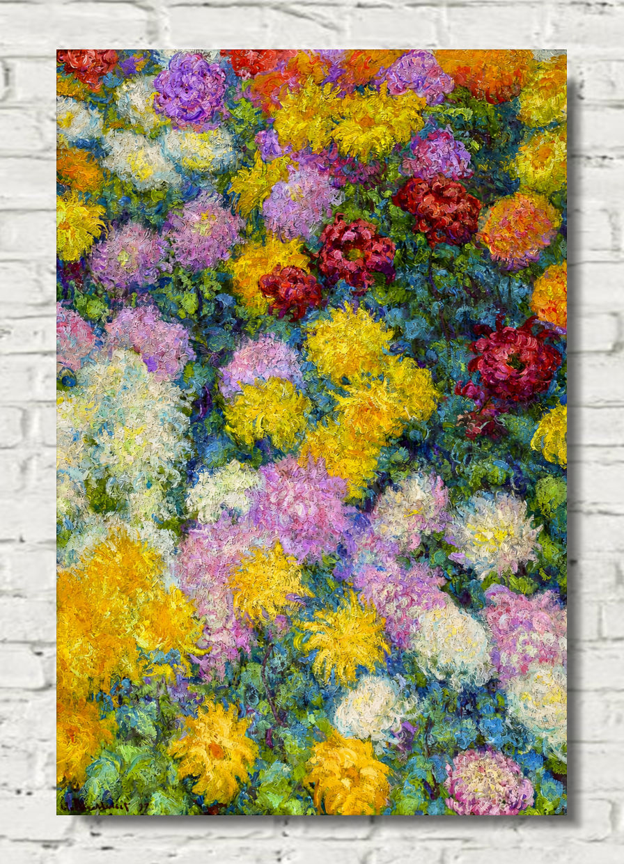
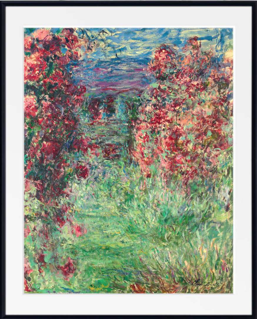
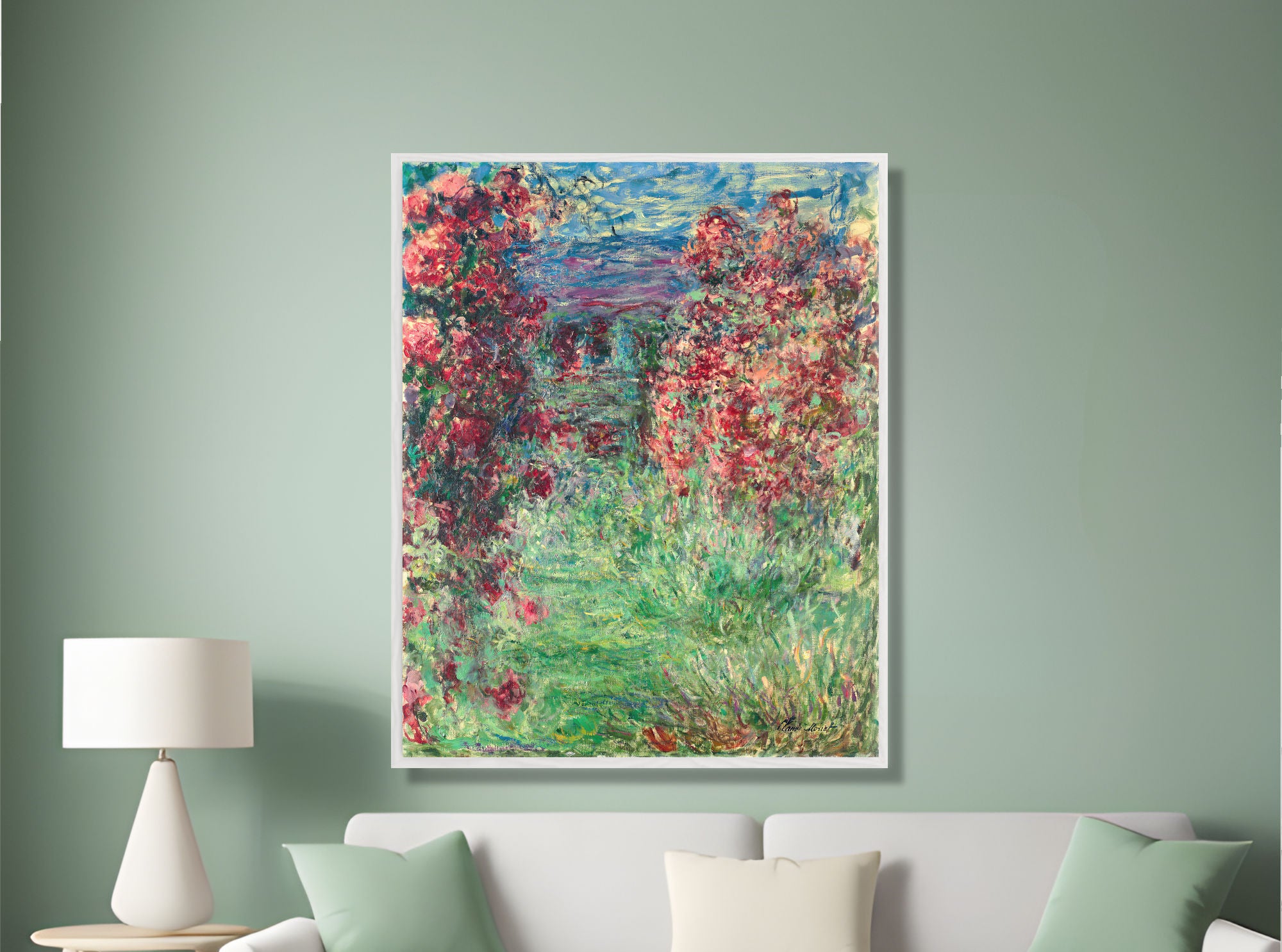
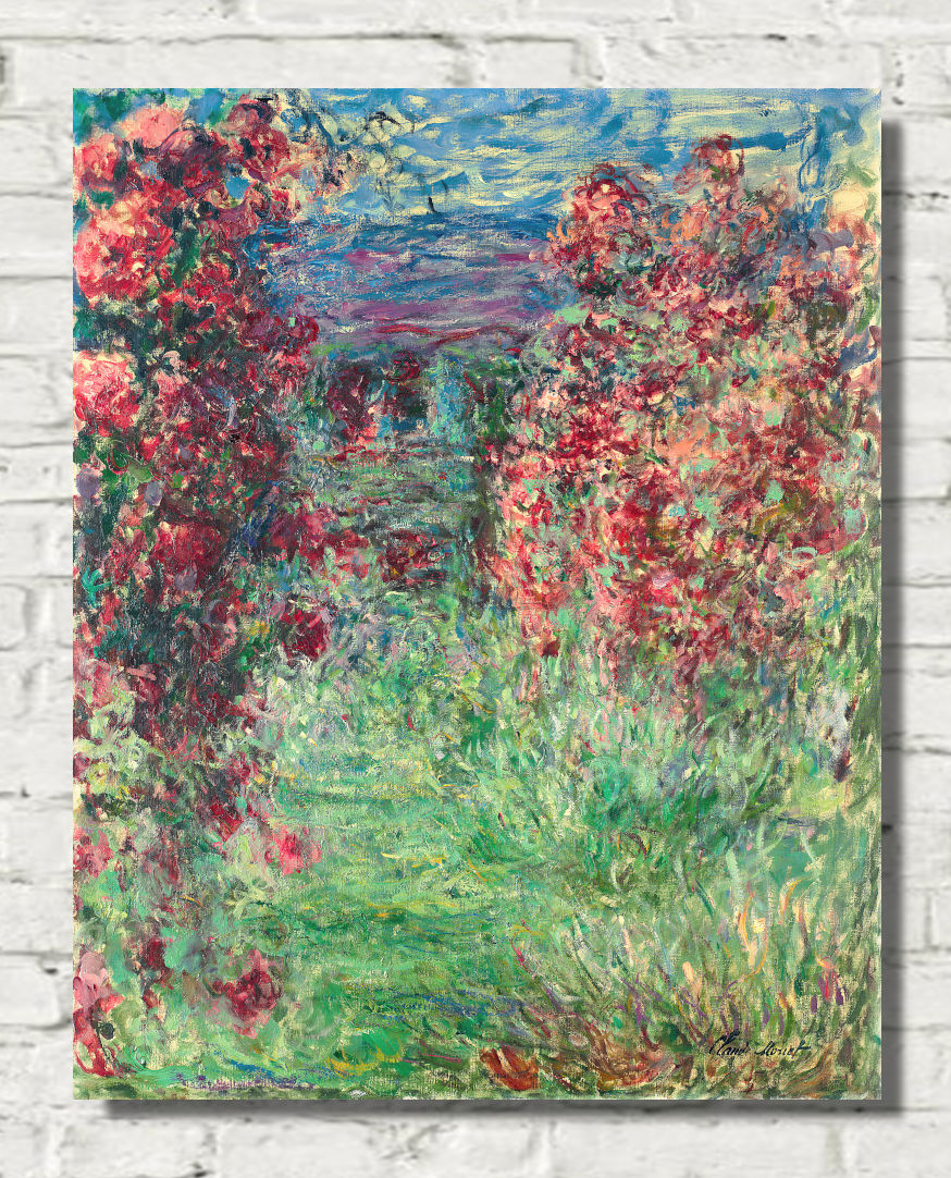
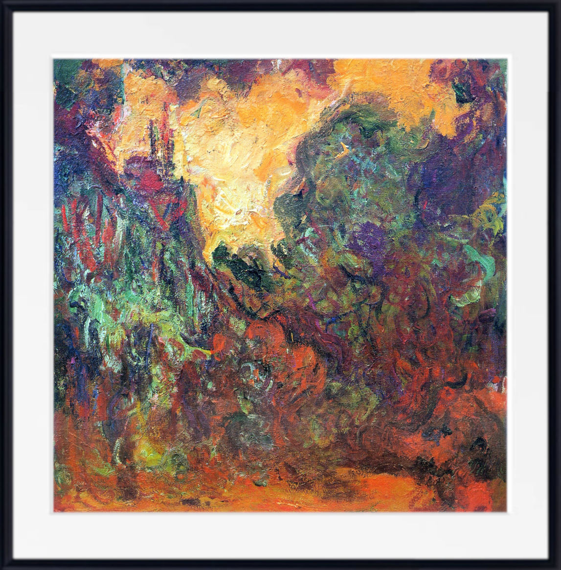
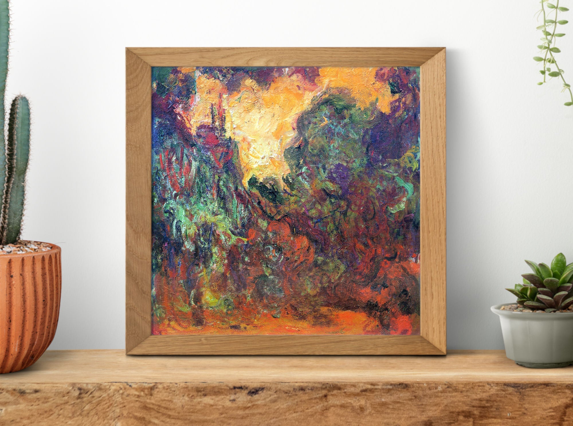
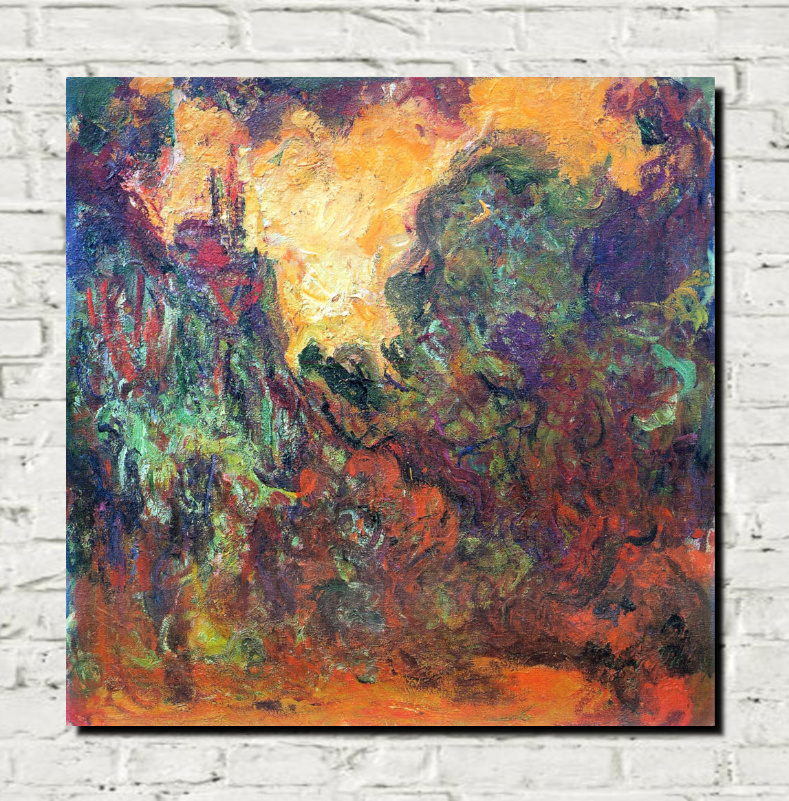
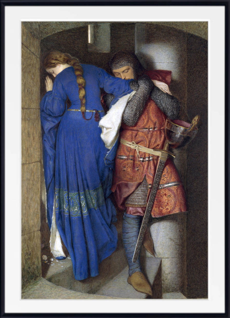
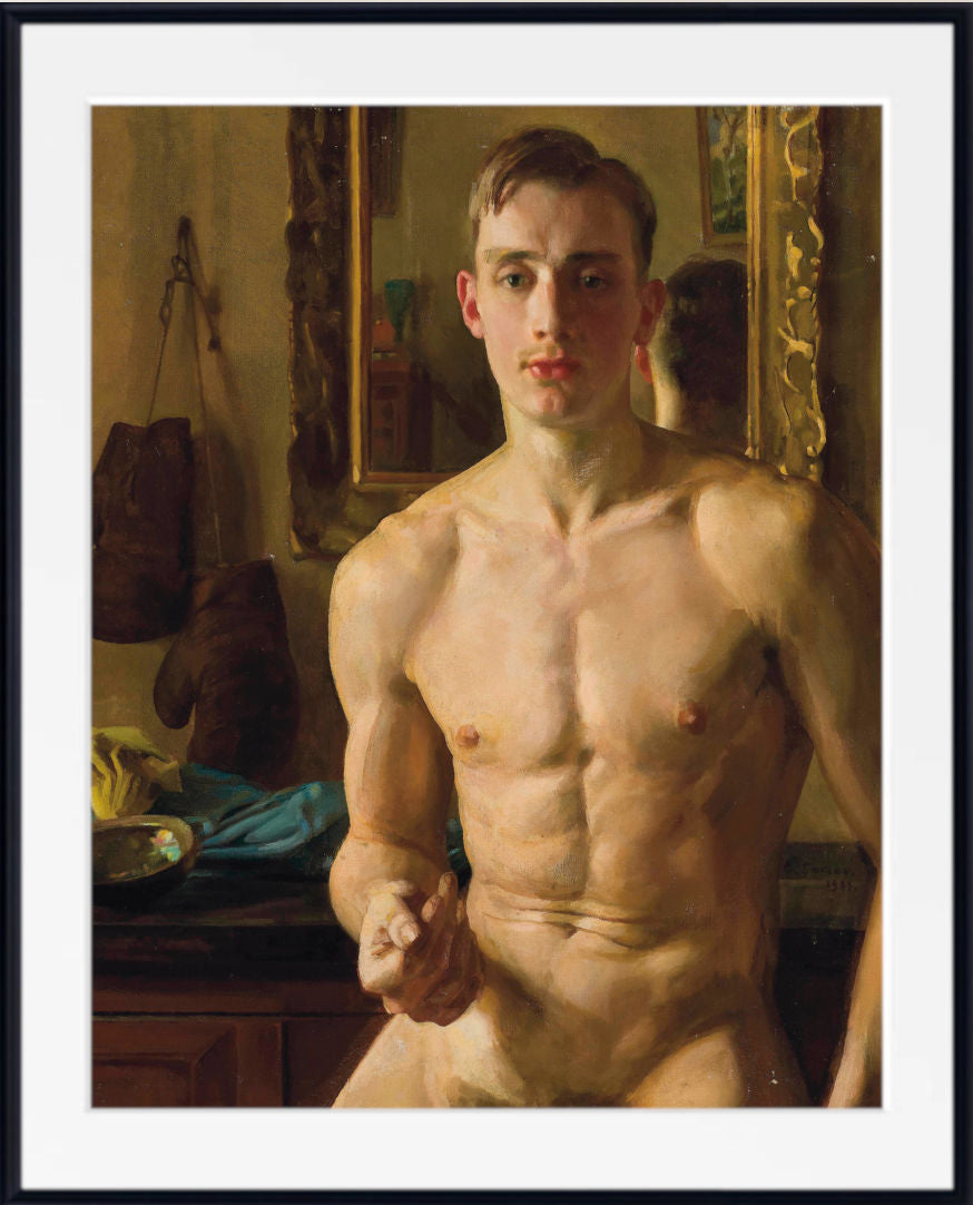
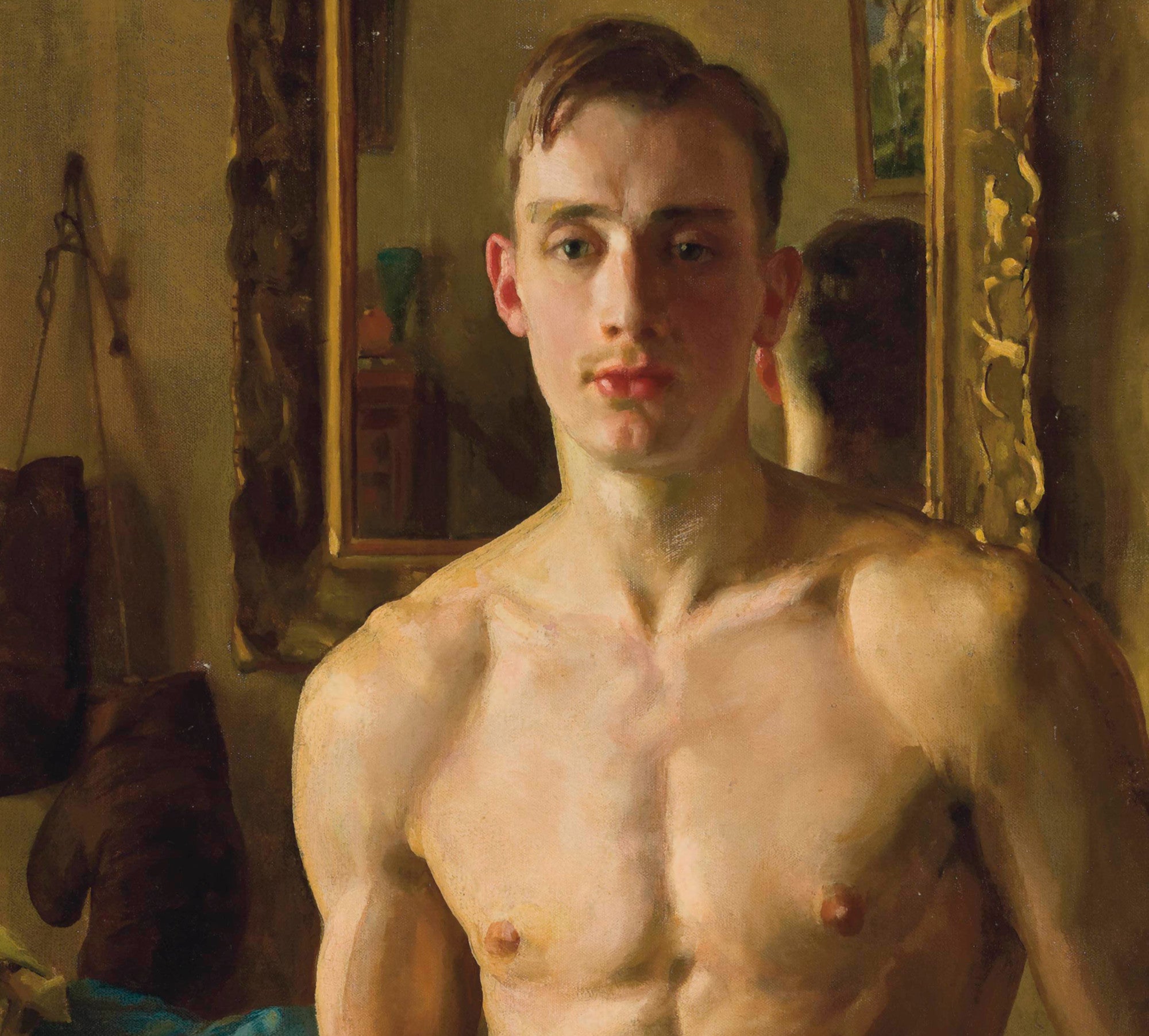
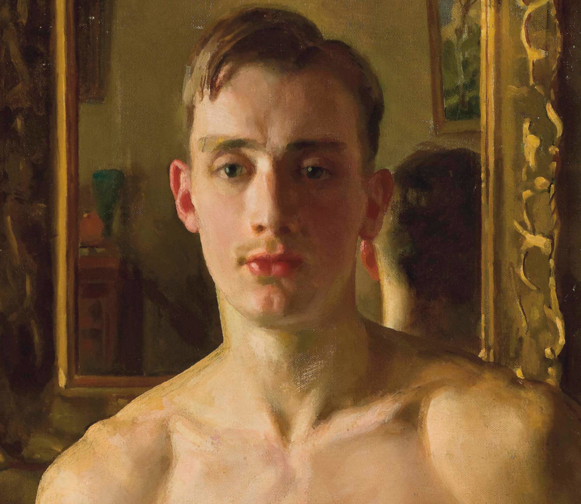
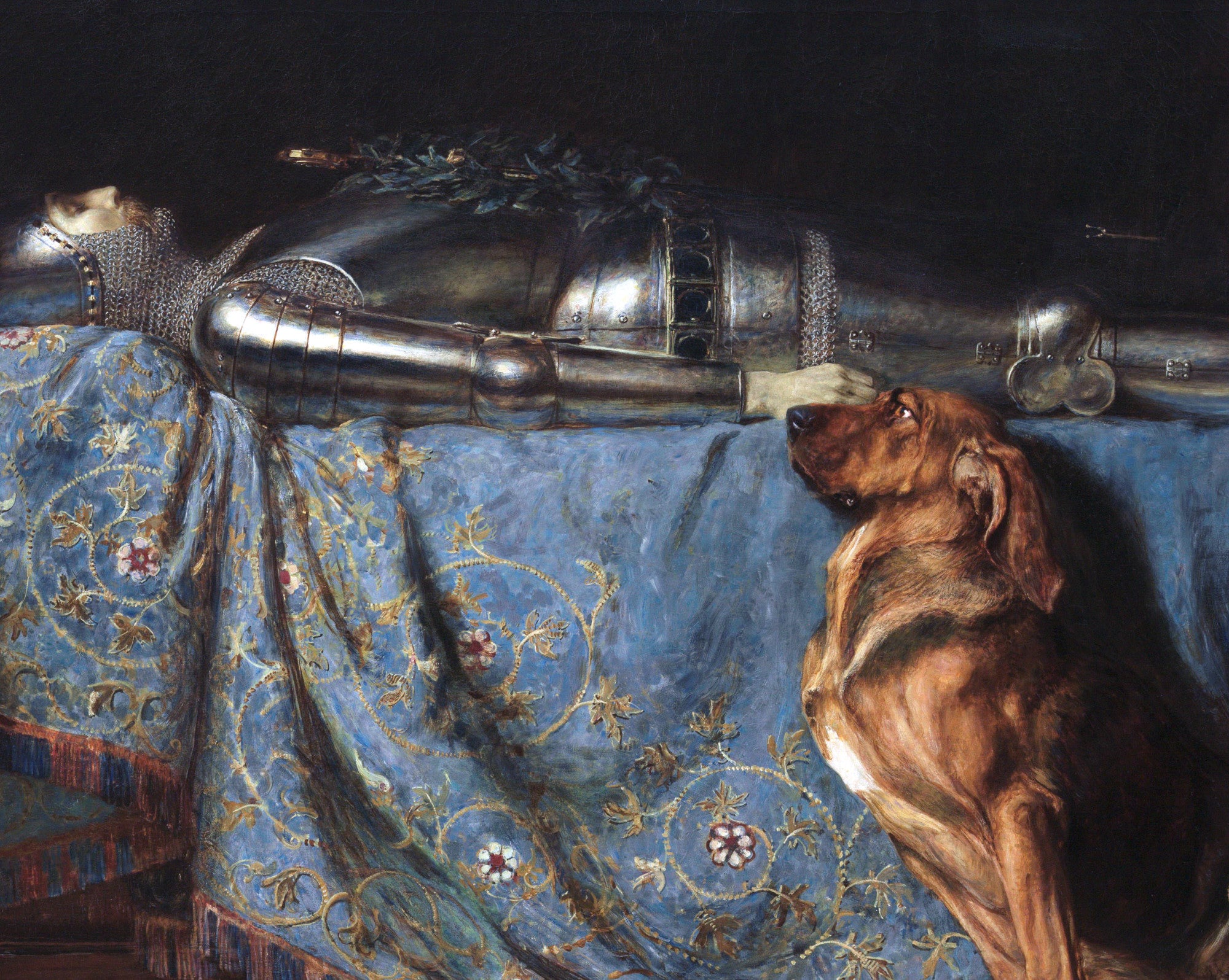
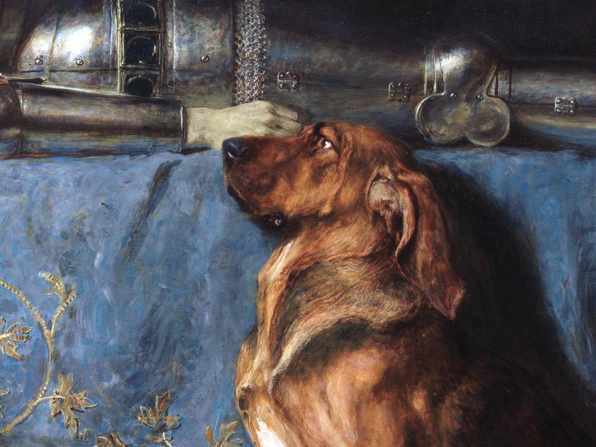
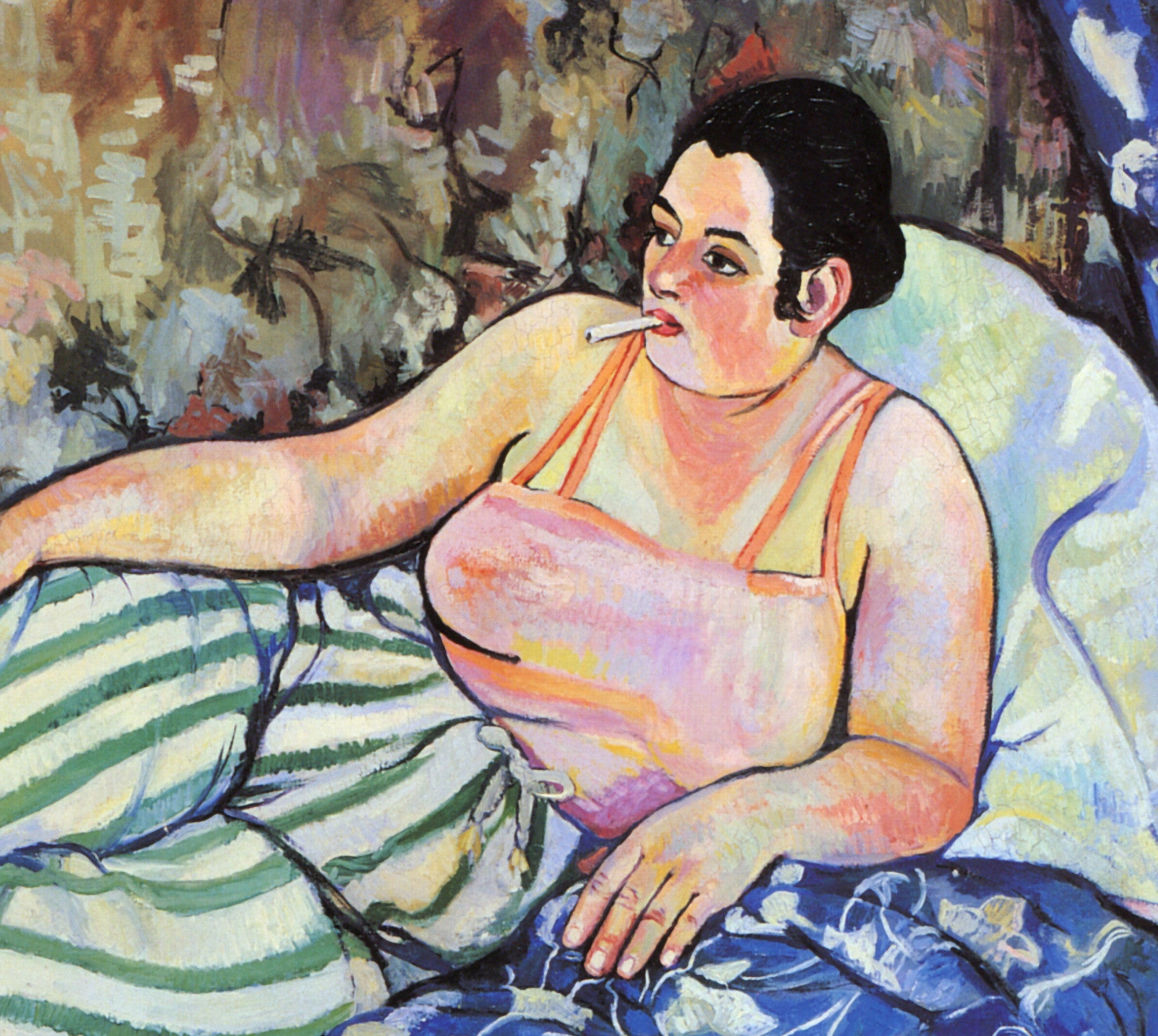
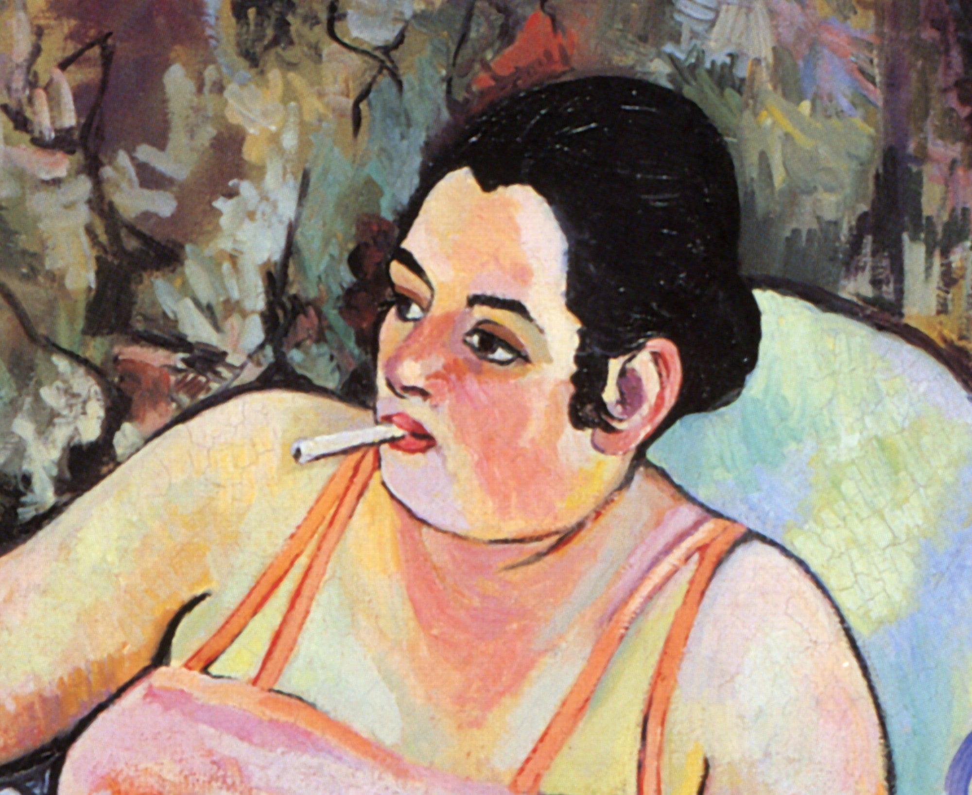
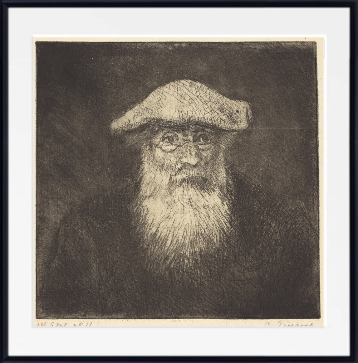
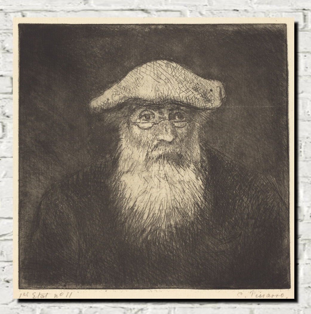
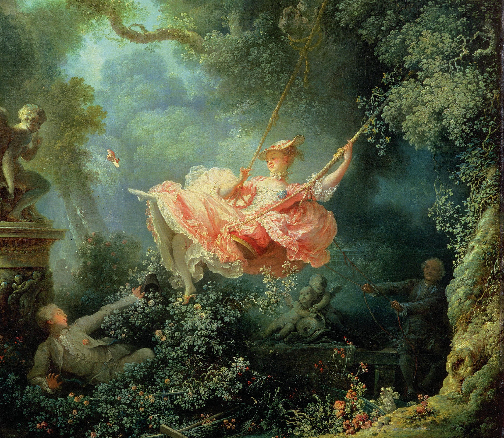
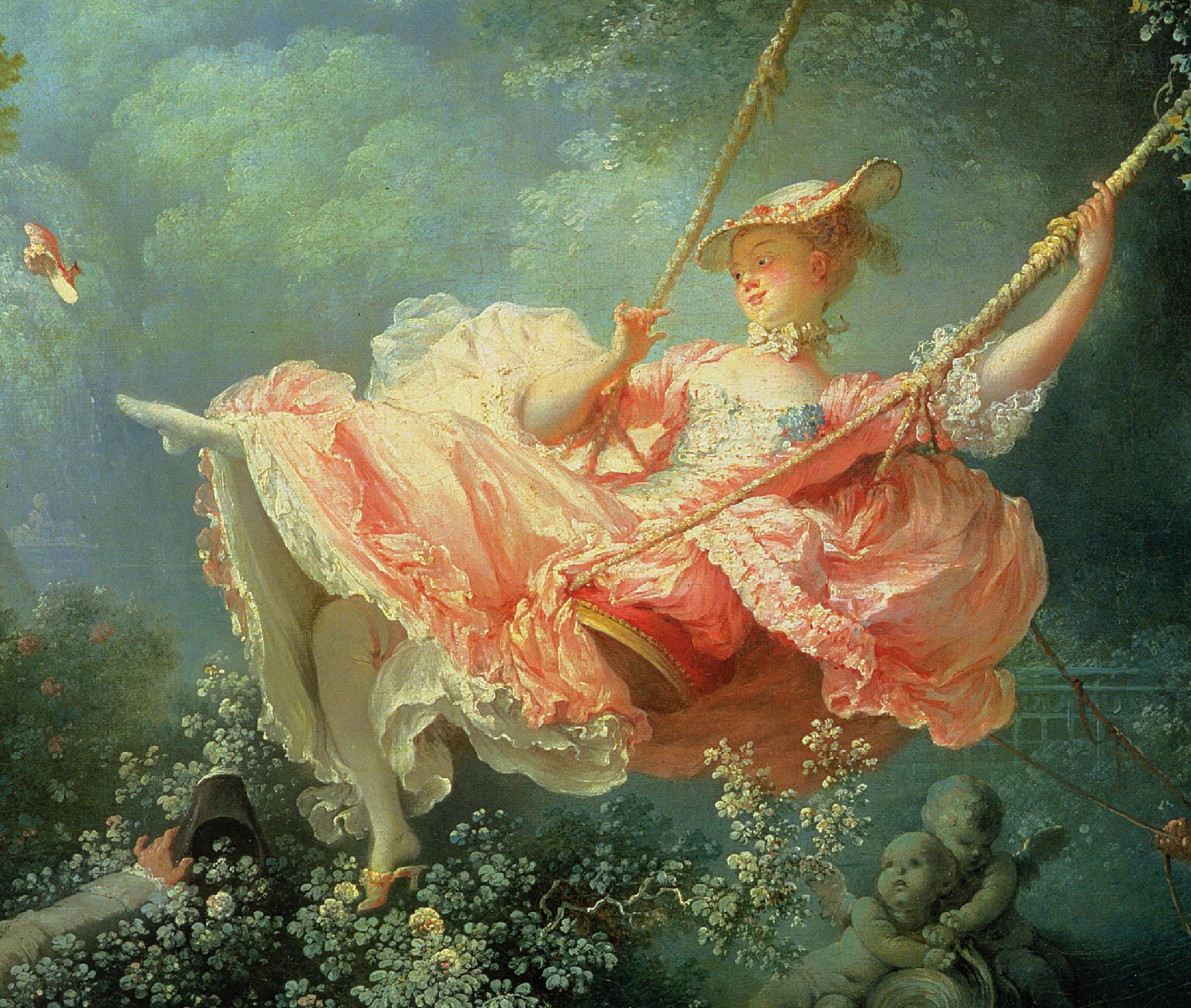
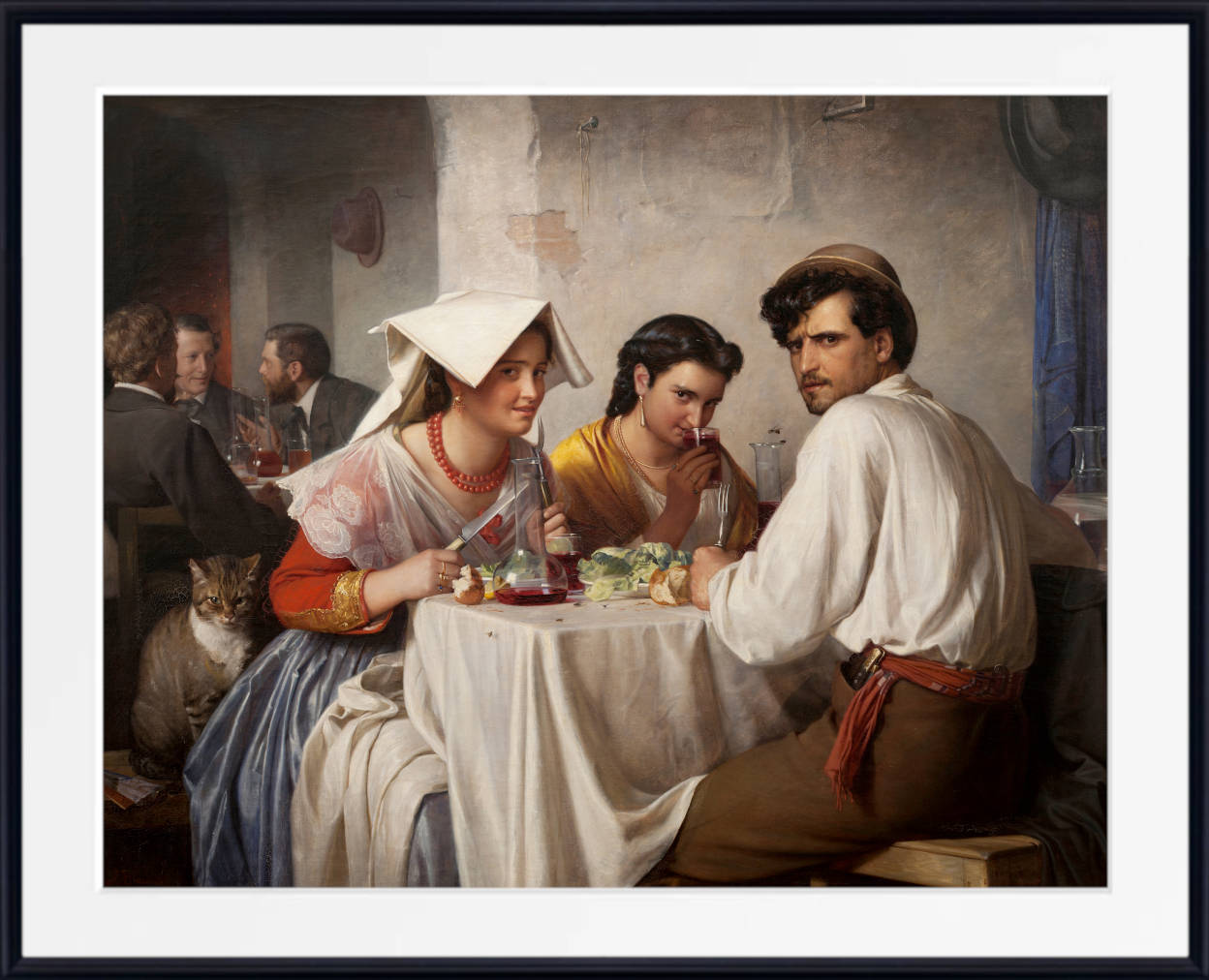
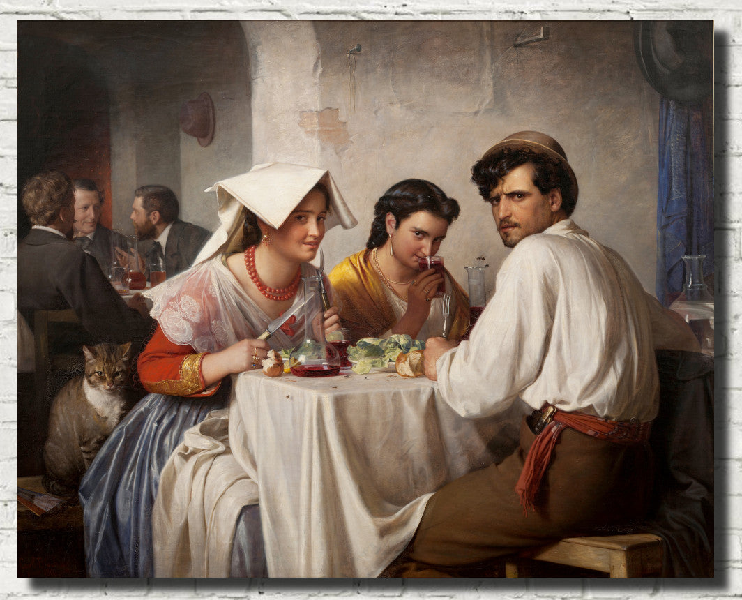
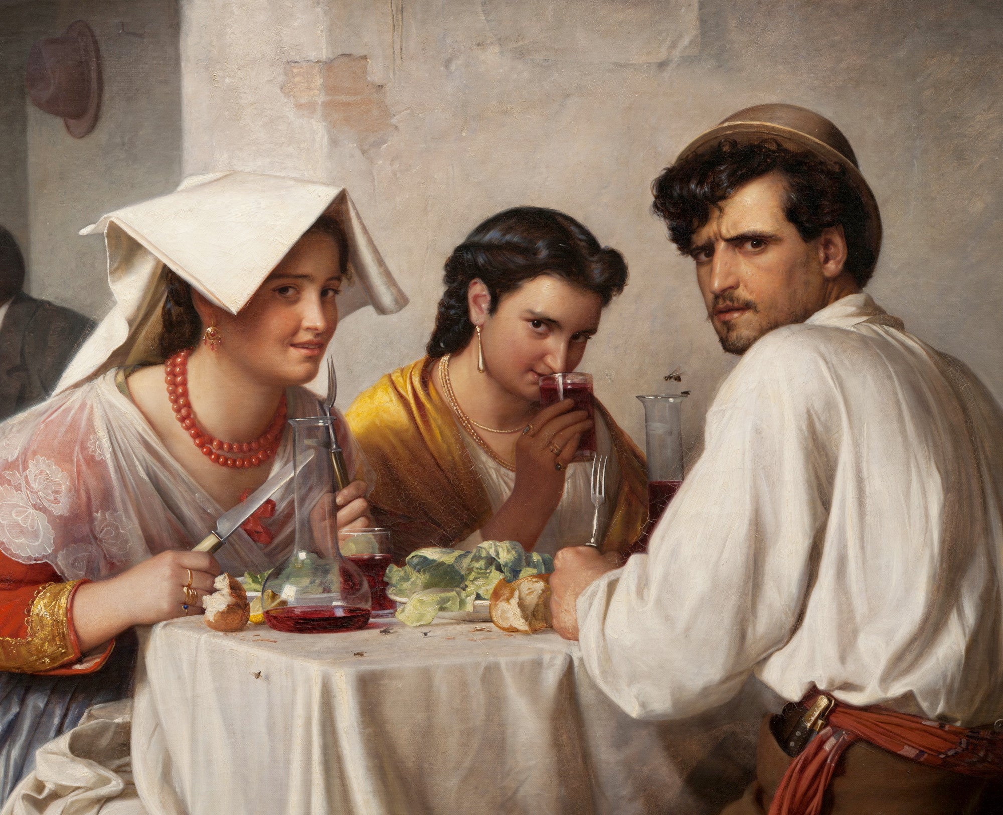
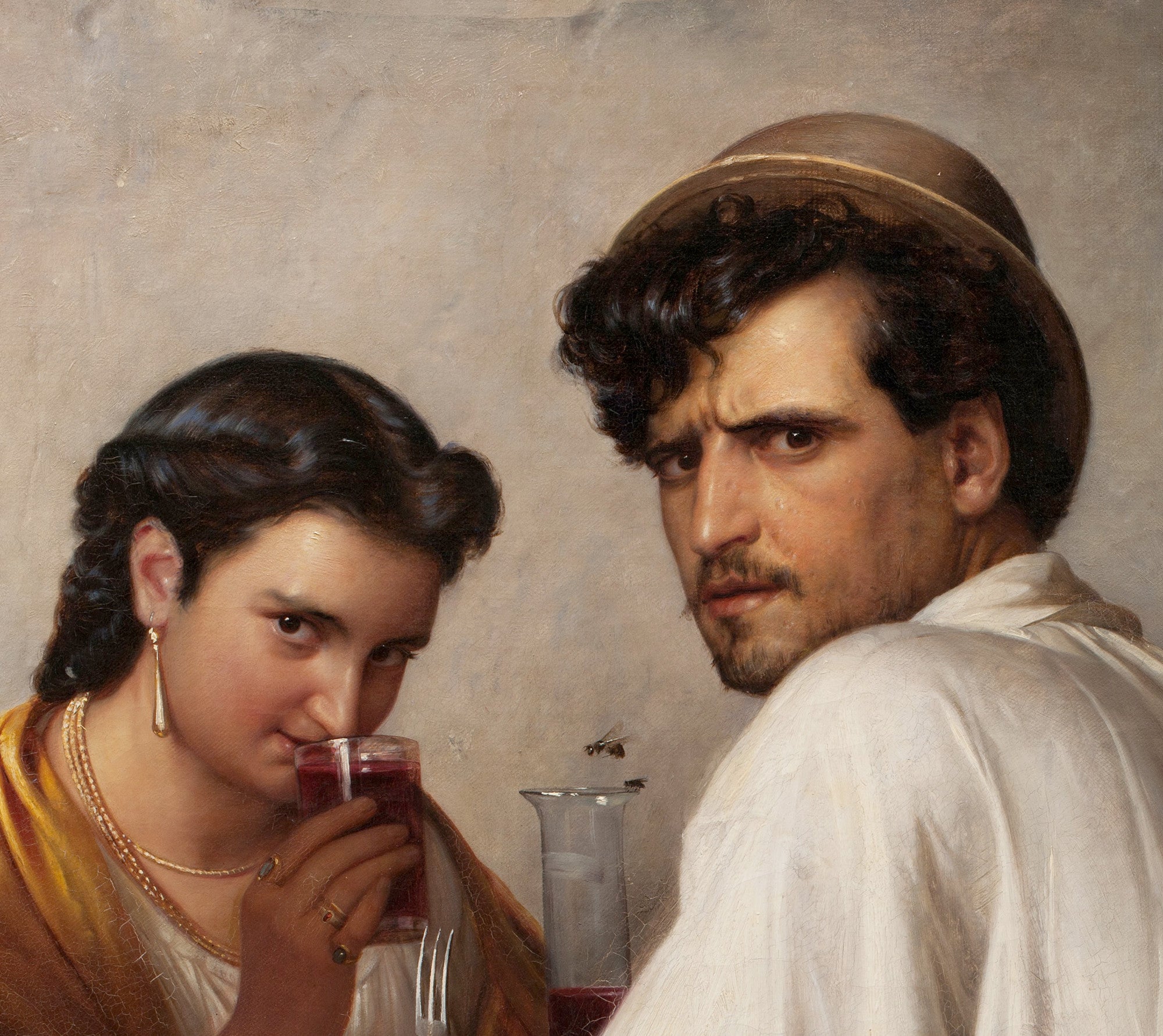
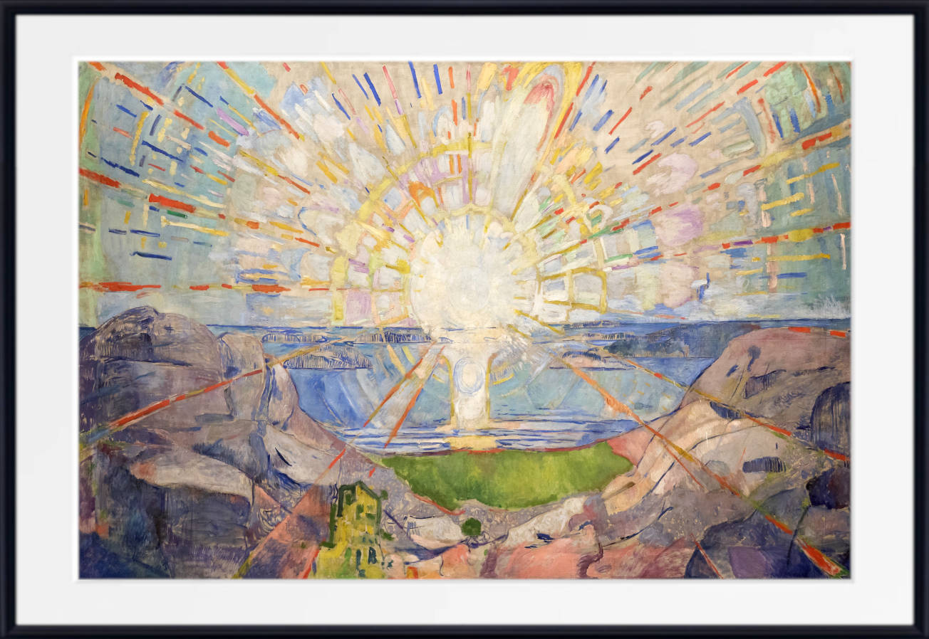
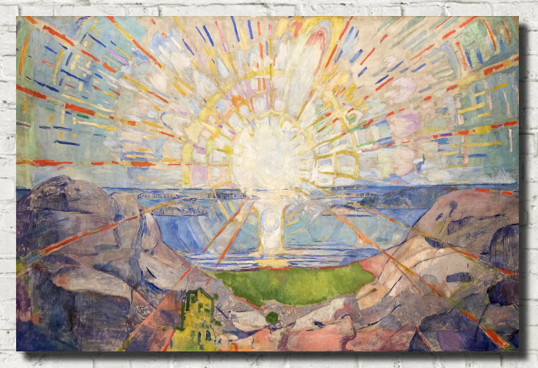
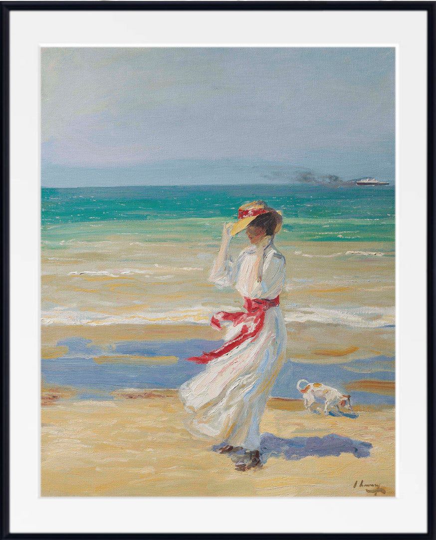
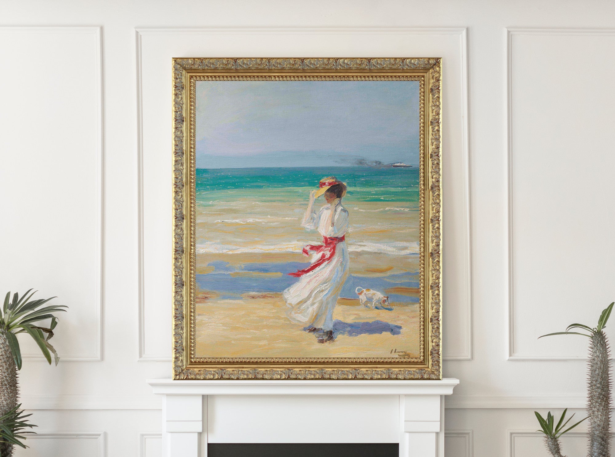
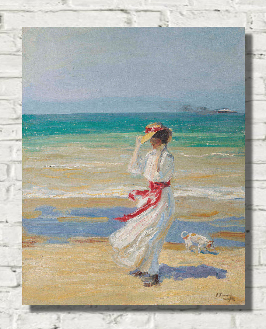
Explore our collection of red wall art, featuring bold abstract prints, dramatic portraits, red still life paintings, floral art, mythology prints, city scenes, interiors and expressive fine art prints. From deep crimson and burgundy to bright scarlet, warm terracotta, rose red and rich wine tones, red artwork can bring energy, warmth and visual drama to a room.
Red art prints work especially well in living rooms, dining rooms, hallways, studies and statement interiors. Choose deep red wall art for a rich, elegant look, red abstract art for a modern focal point, or softer rose and terracotta prints for a warmer and more relaxed scheme.
Explore Red Wall Art
Browse red prints by style, room and featured artist without creating an oversized artist directory.
Red Wall Art for Bold, Warm Interiors
Red is one of the most powerful colours in interior design. It can make a room feel warmer, richer and more dramatic, whether used as a single statement artwork or as part of a wider colour scheme. Red wall art is especially effective when you want a strong focal point, a sense of warmth, or a confident decorative accent.
This collection includes red fine art prints, framed red prints and red canvas panels across many subjects, including portraits, abstract art, still life paintings, flowers, interiors, mythology, city scenes, landscapes and Japanese prints. Red artwork pairs beautifully with cream, black, grey, beige, navy, gold, green, brown, walnut, brass and warm white interiors.
Red Abstract Wall Art
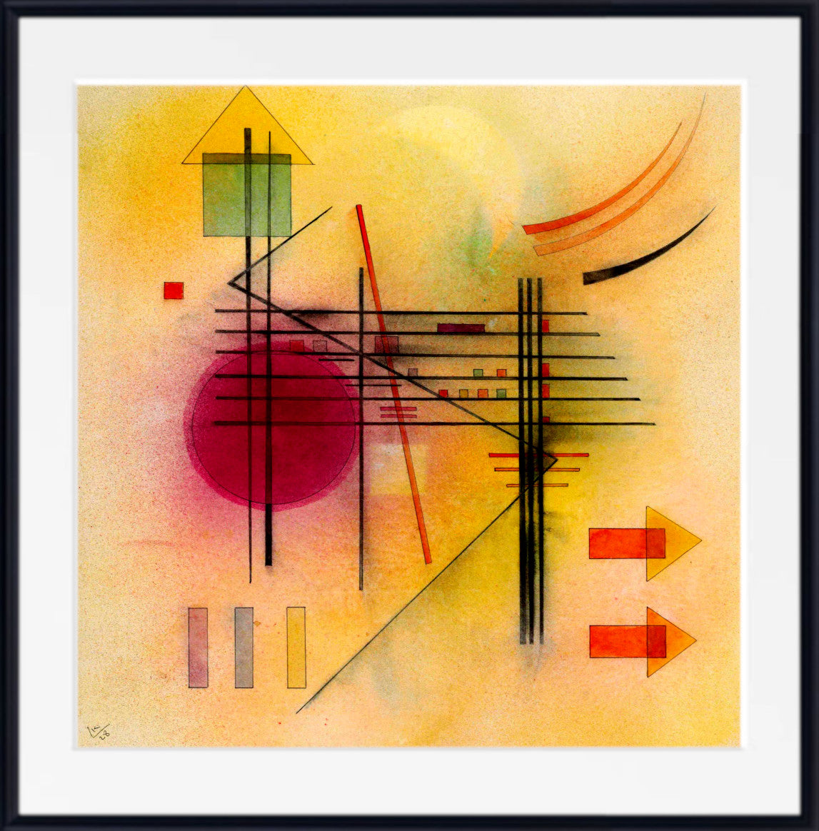
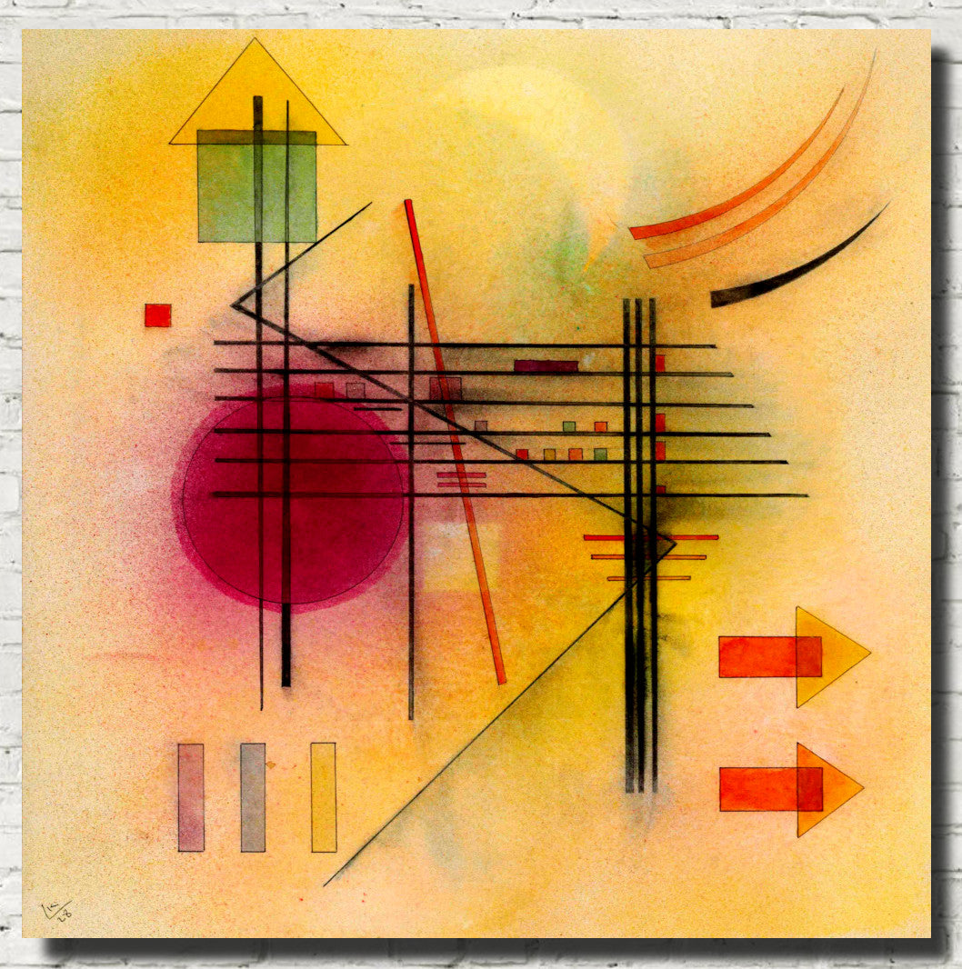
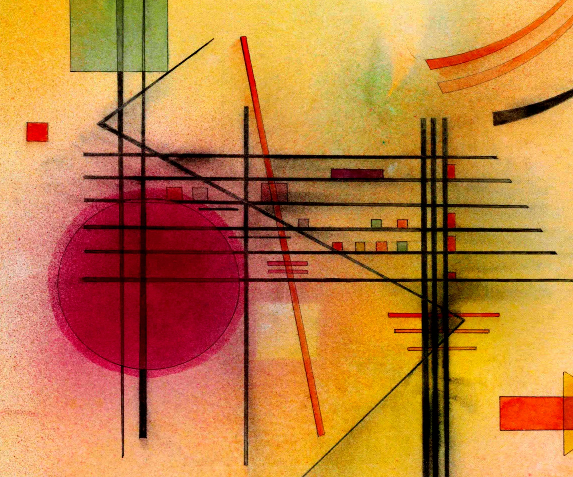
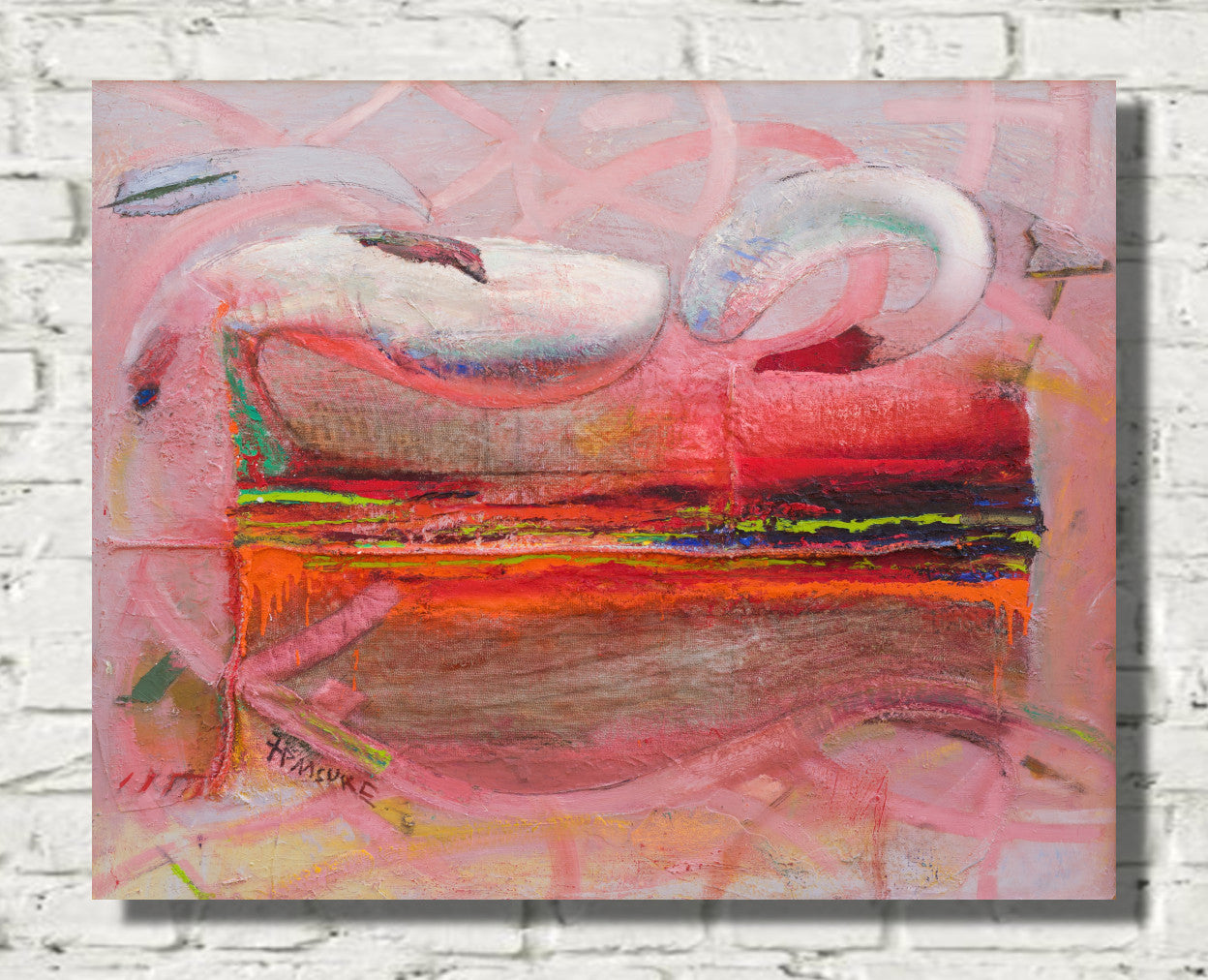
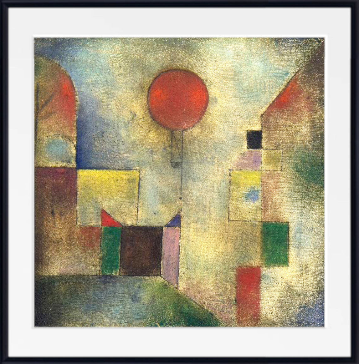
Red abstract wall art is ideal for modern interiors where you want energy, colour and impact without choosing a literal subject. Bright red abstract prints can feel lively and contemporary, while darker burgundy or wine-red abstracts create a more refined, atmospheric look.
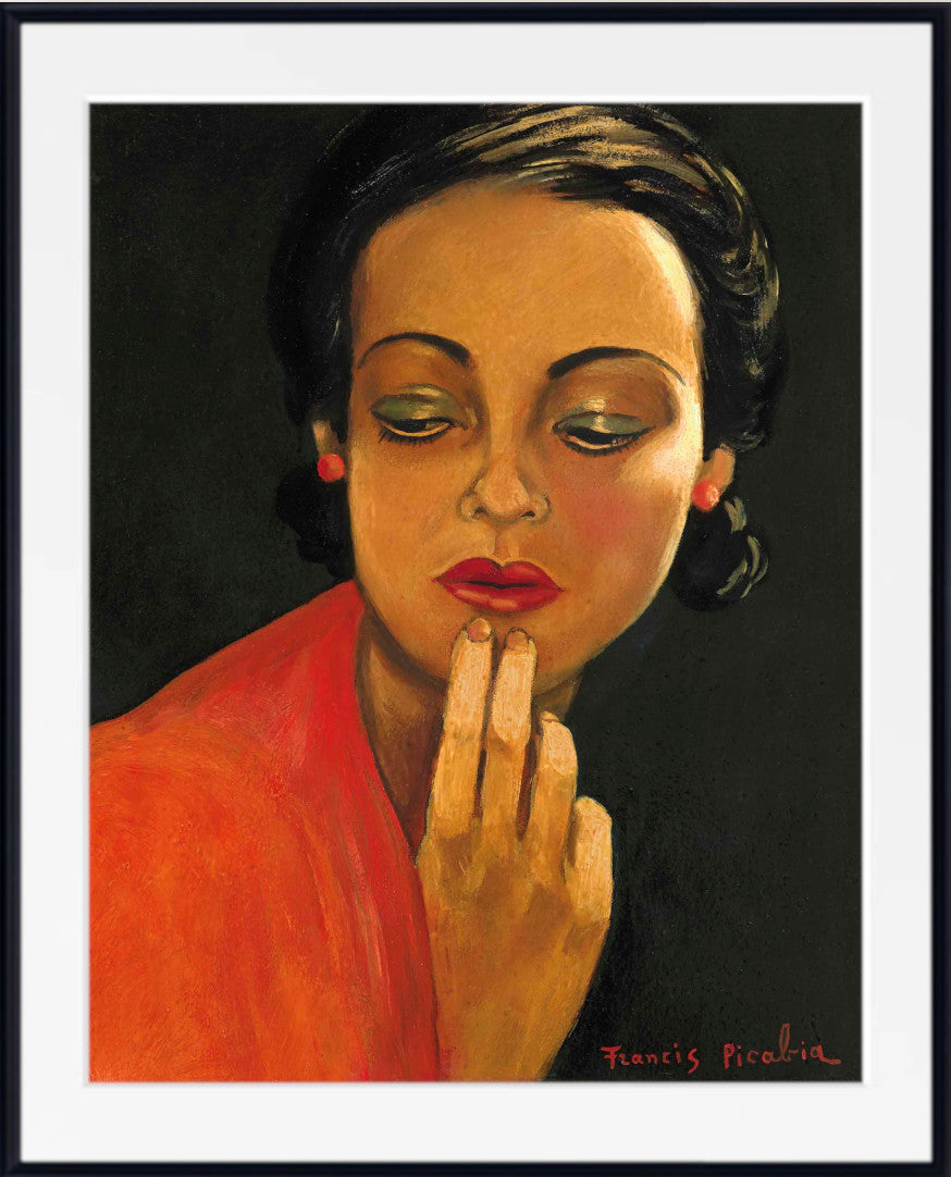
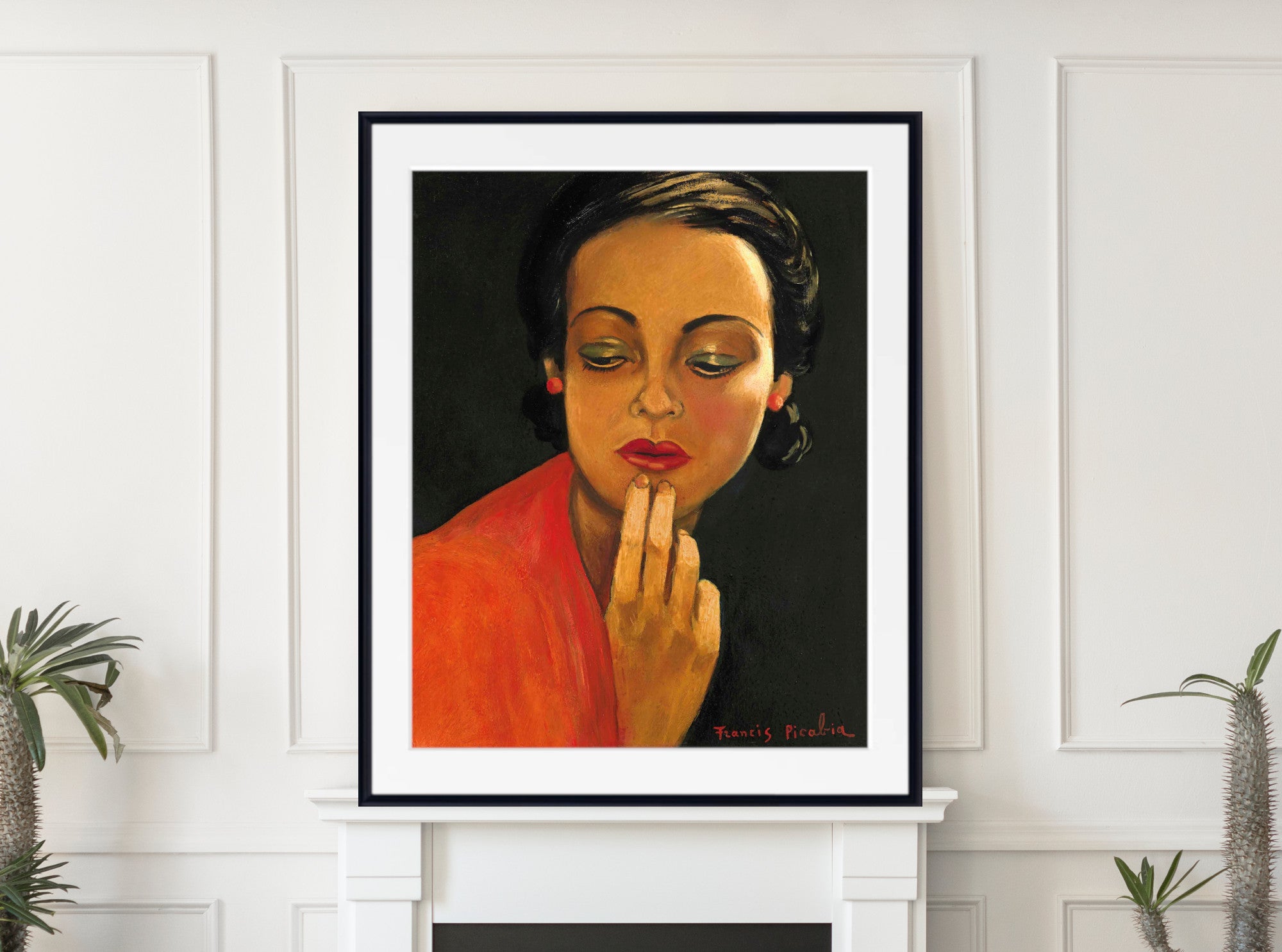
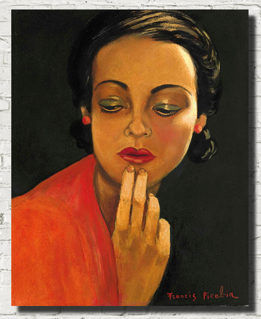
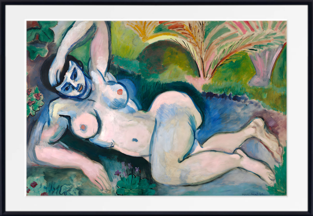
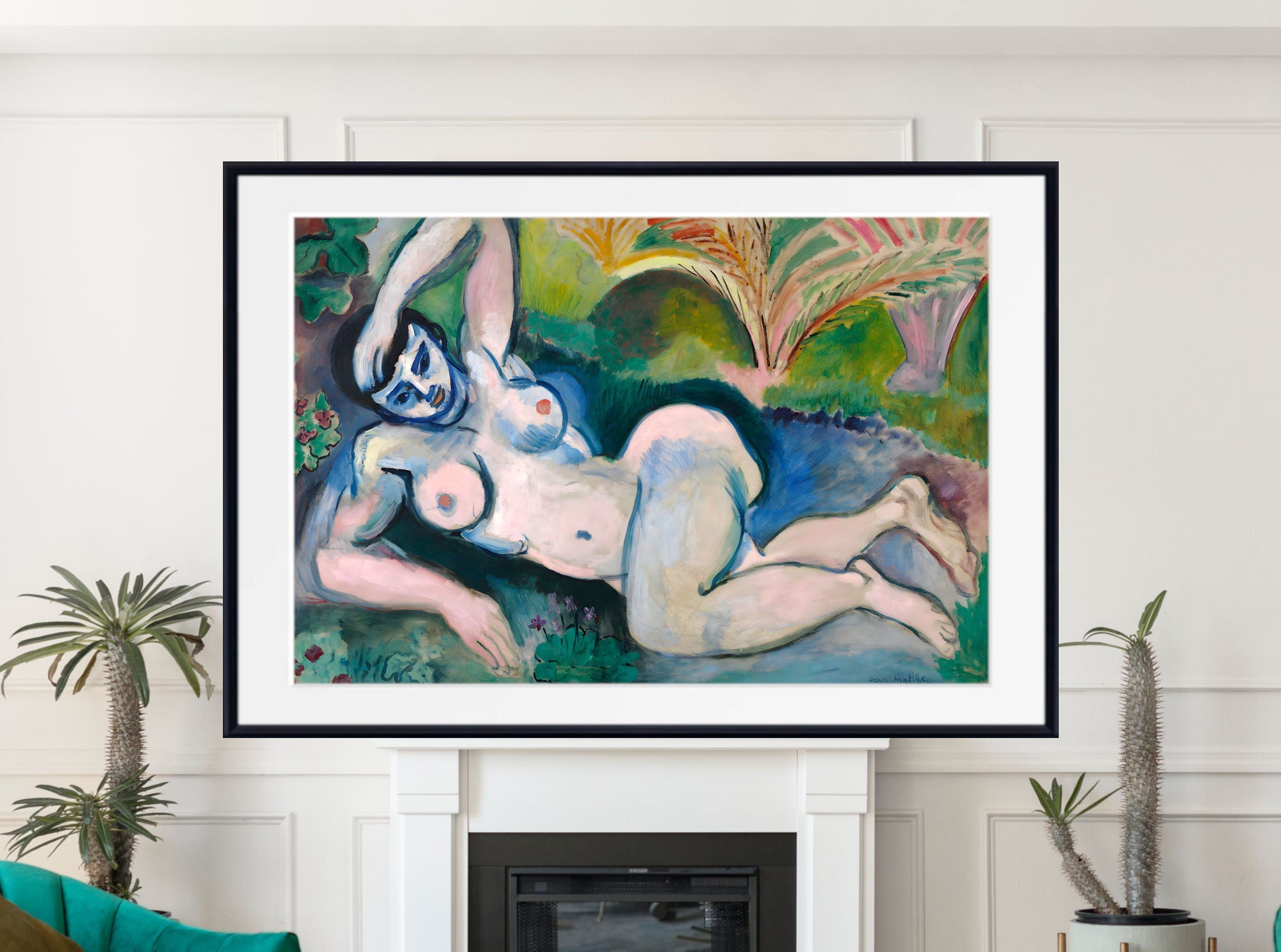
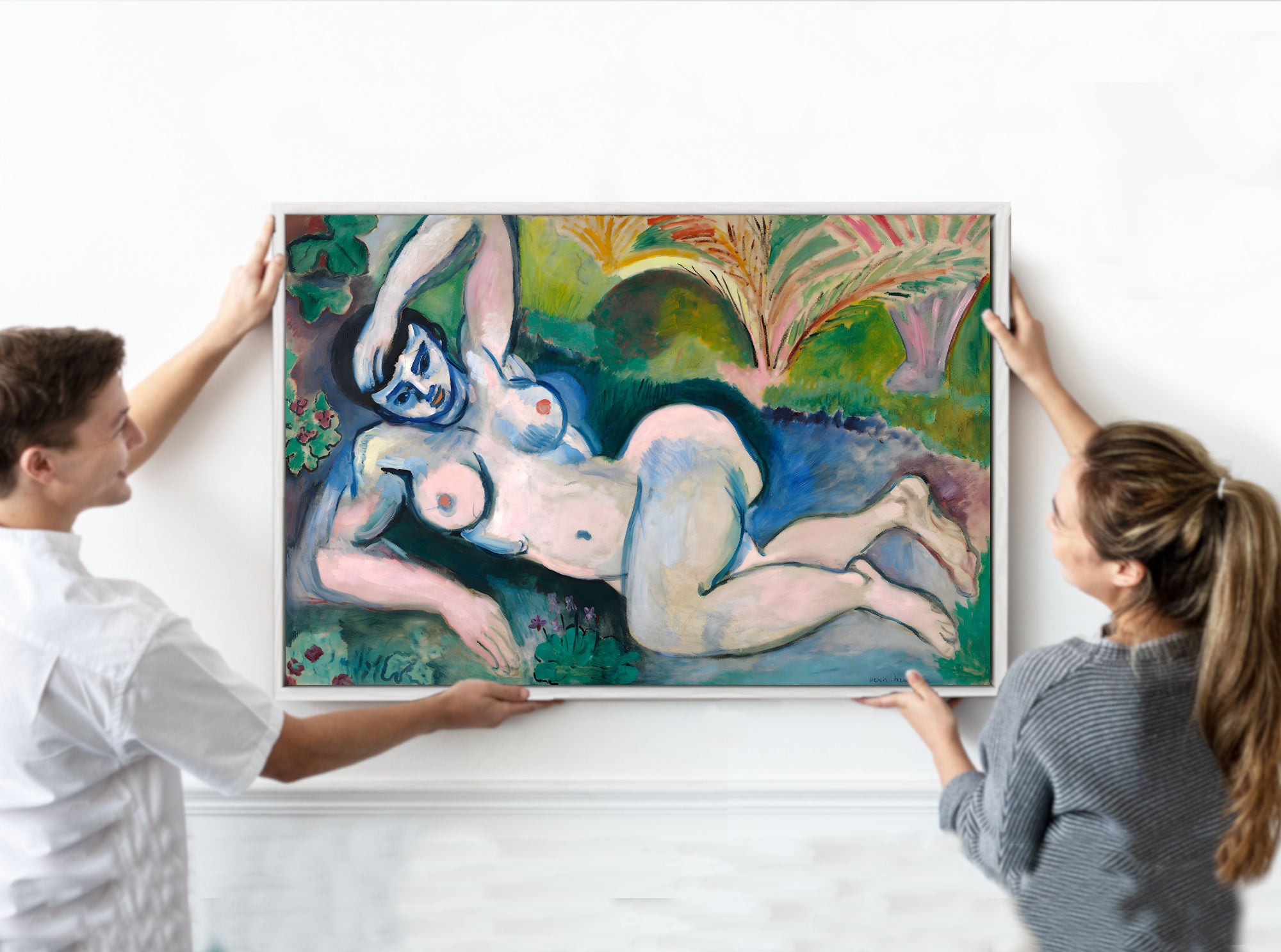
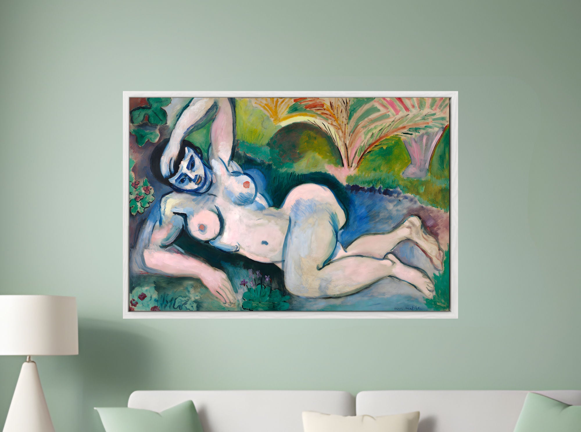
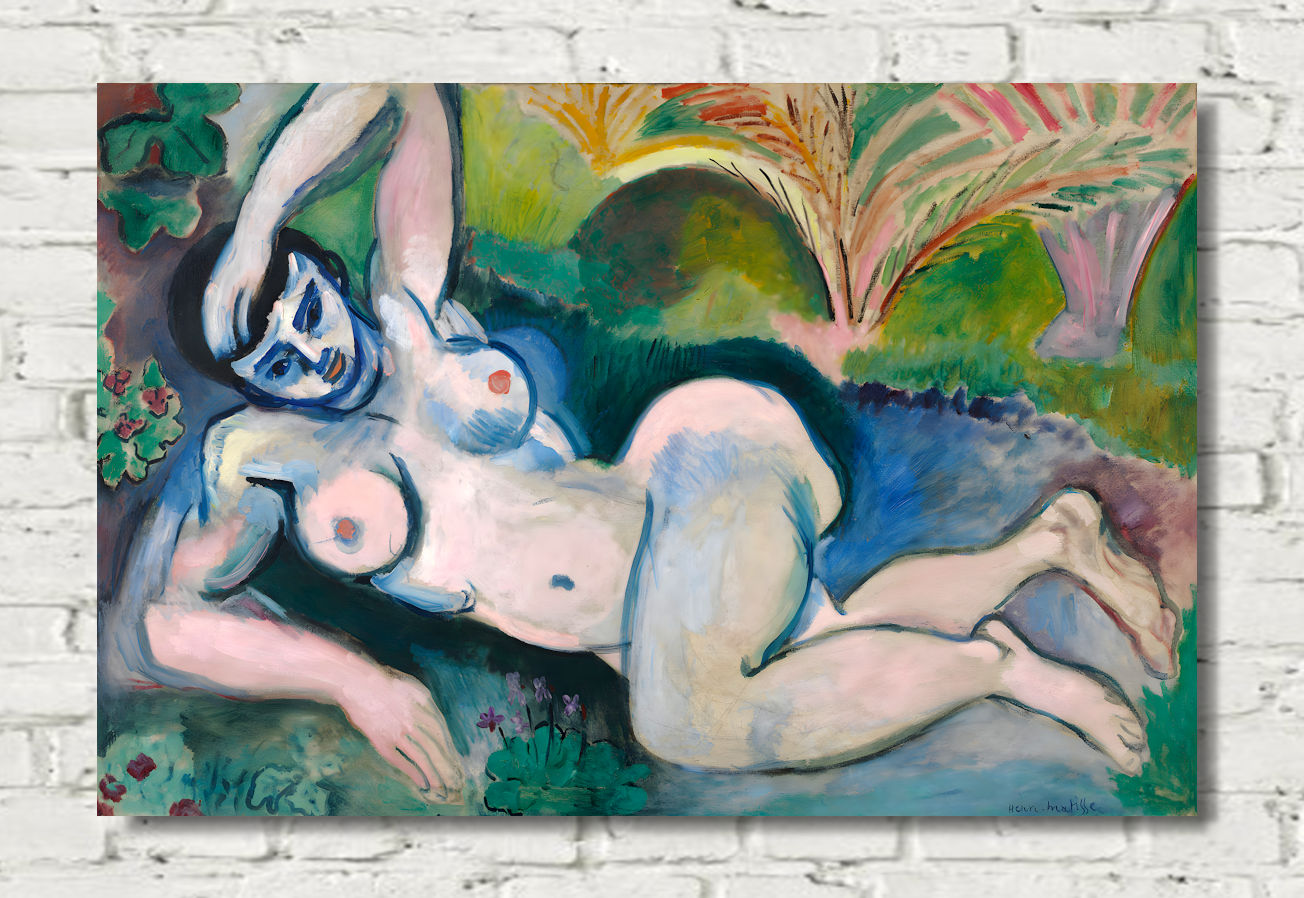
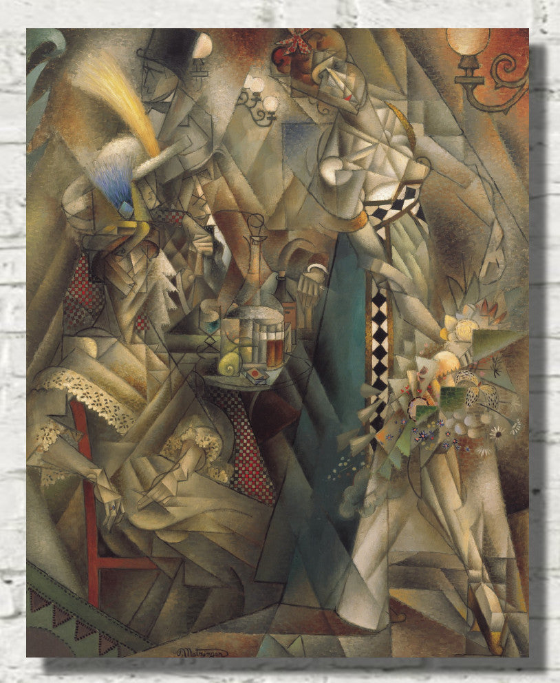
Francis Picabia, Paul Klee, Henri Matisse and Andre Derain are strong choices for red, modernist and colour-led prints. Red abstract art works especially well above sofas, sideboards, desks and dining room furniture.
Red Portrait and Figure Prints
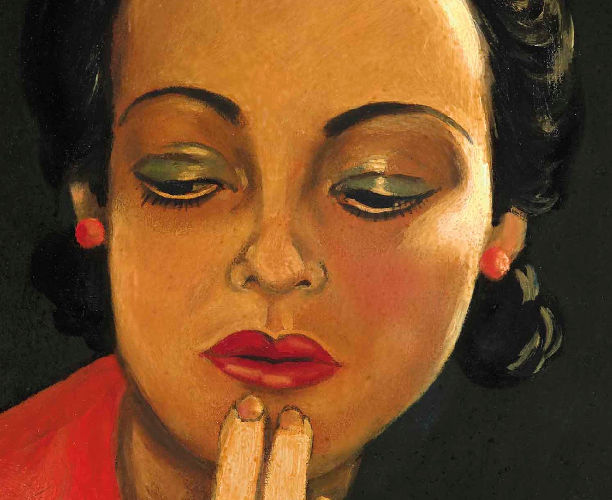
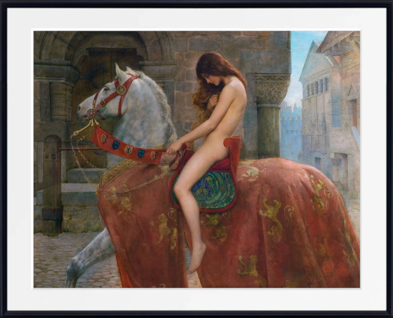
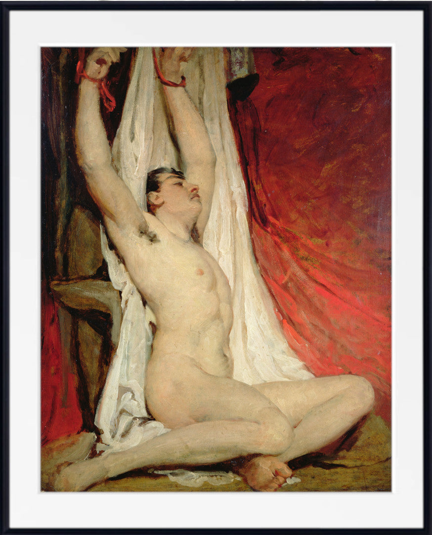
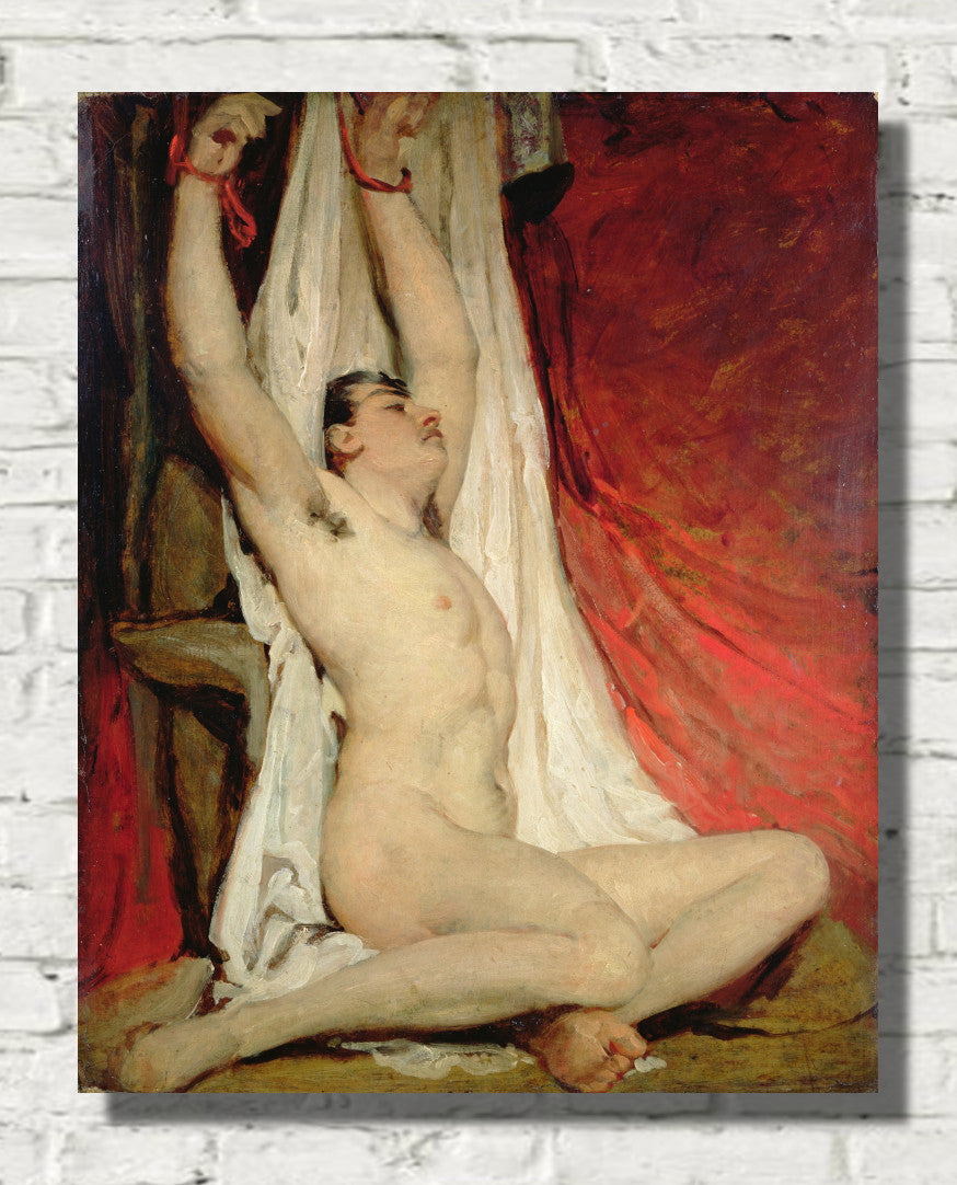
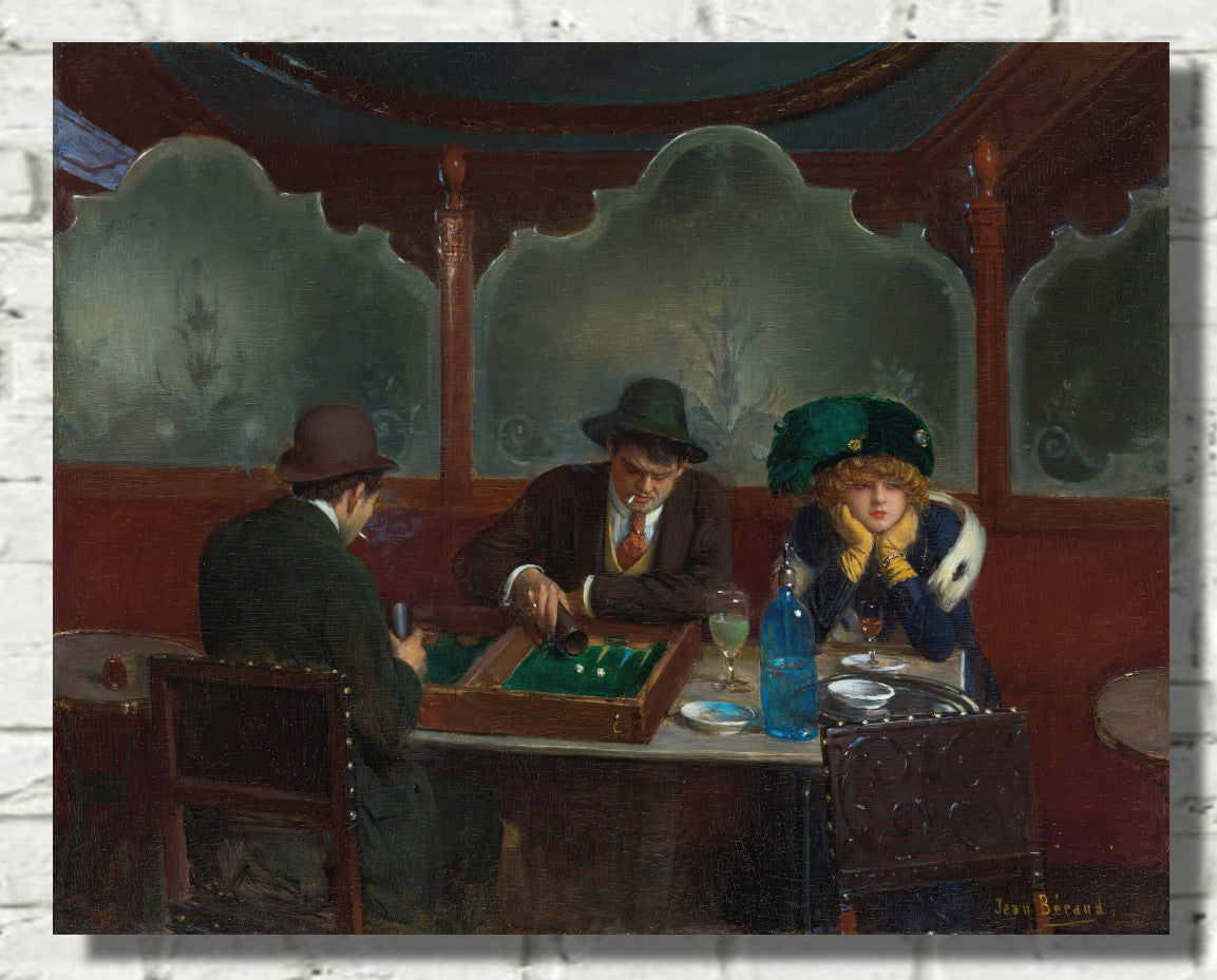
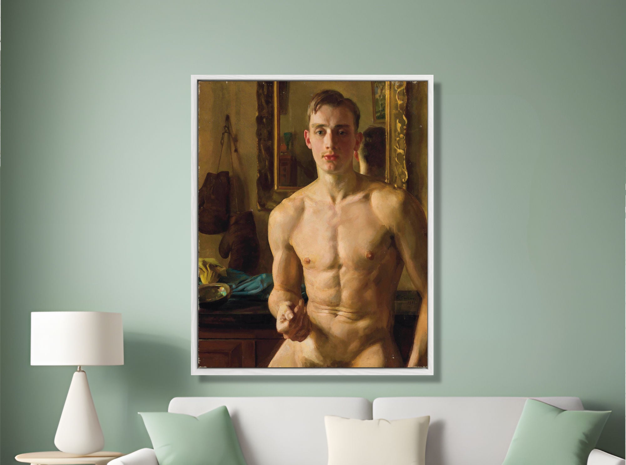
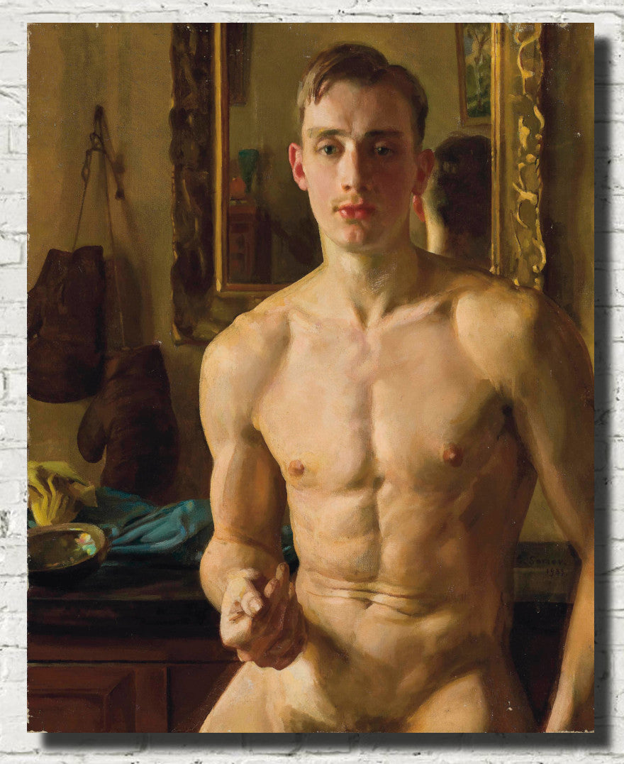
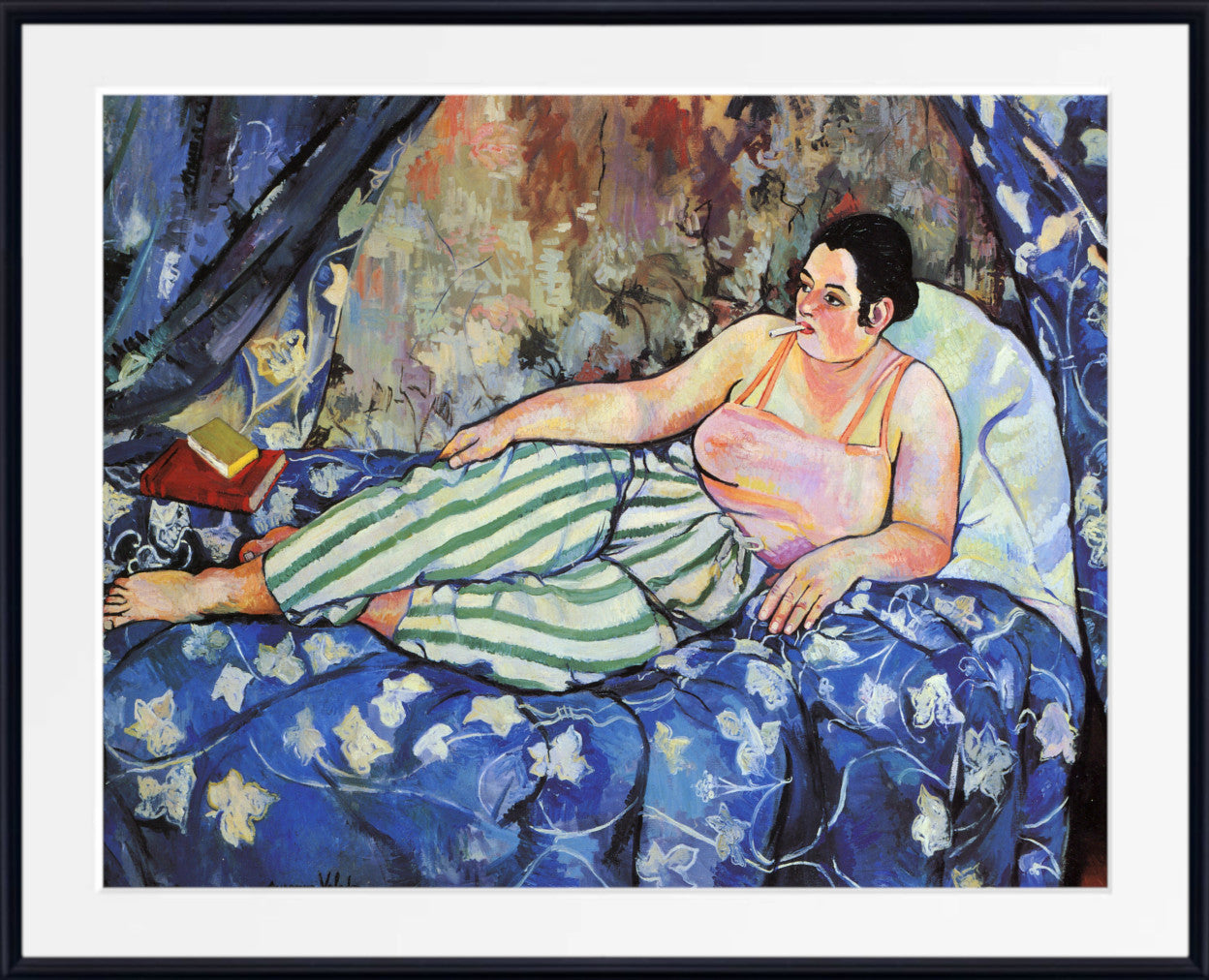
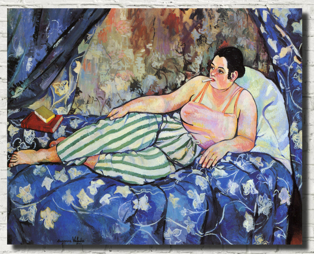
Red is naturally suited to portrait and figure painting because it brings warmth, drama and psychological intensity. A red coat, red room, red sofa or crimson background can make a portrait feel instantly memorable.
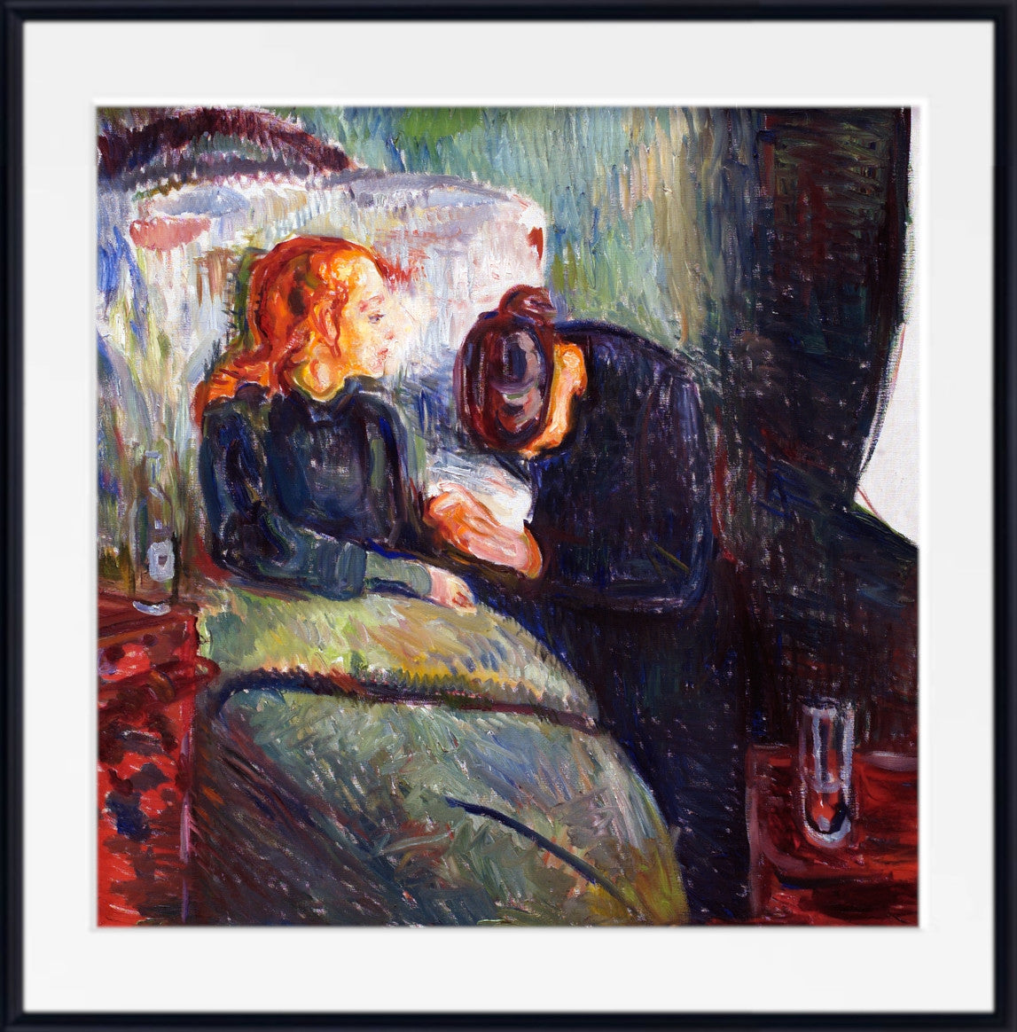
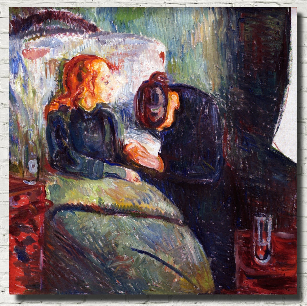
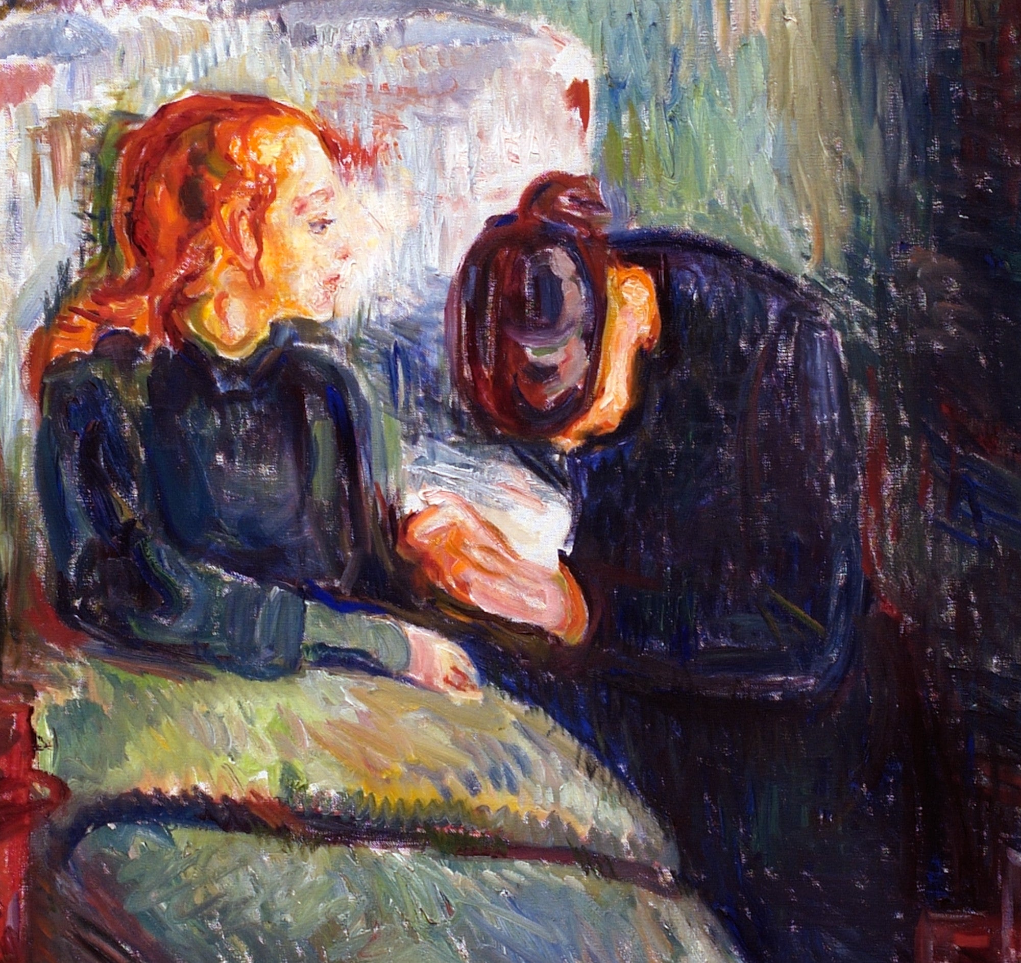
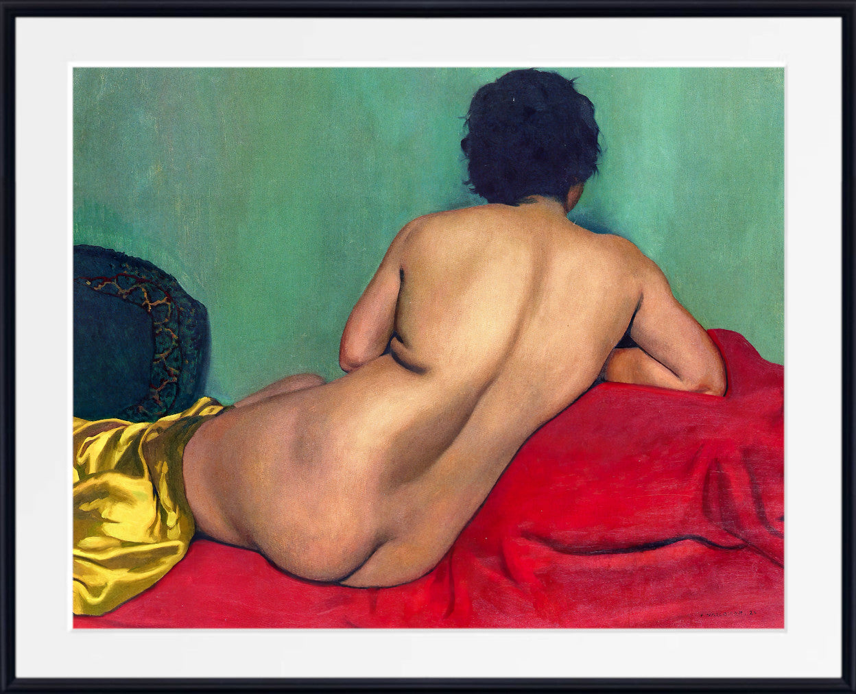
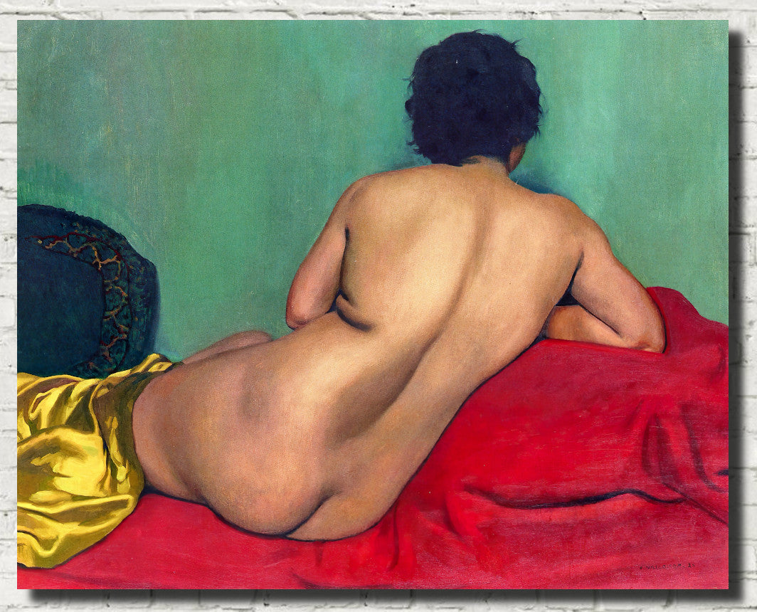
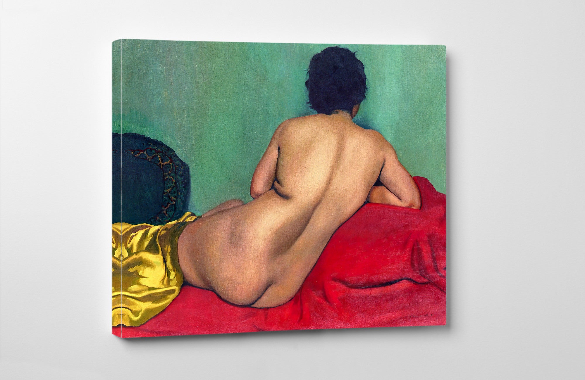
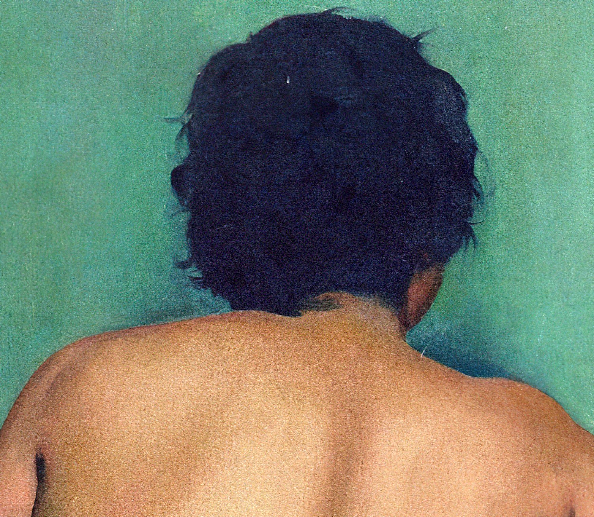
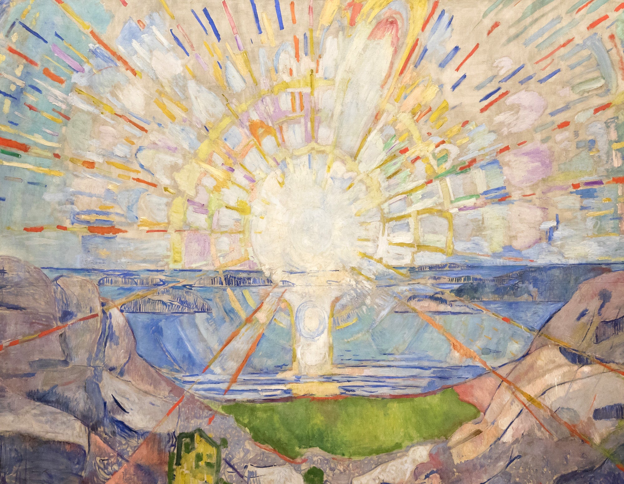
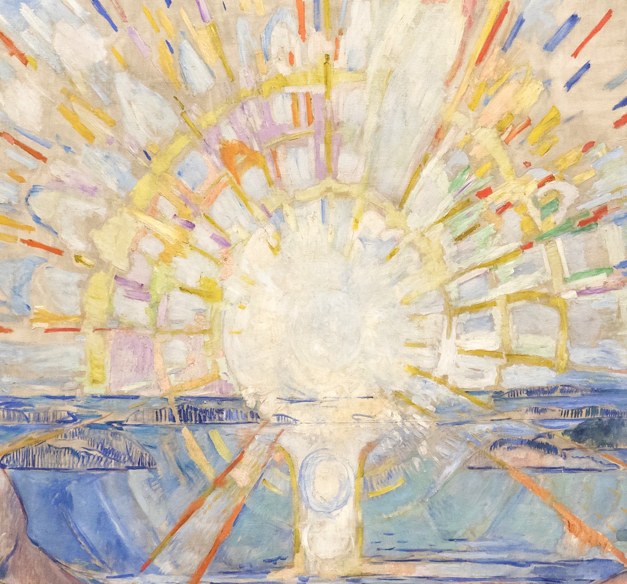
John Singer Sargent is a superb choice for elegant red portraiture, including richly dressed sitters and theatrical interiors. Edvard Munch offers more emotional and expressive works, while Felix Vallotton uses red interiors and figure subjects with a distinctive modern edge.
Red Still Life and Floral Prints
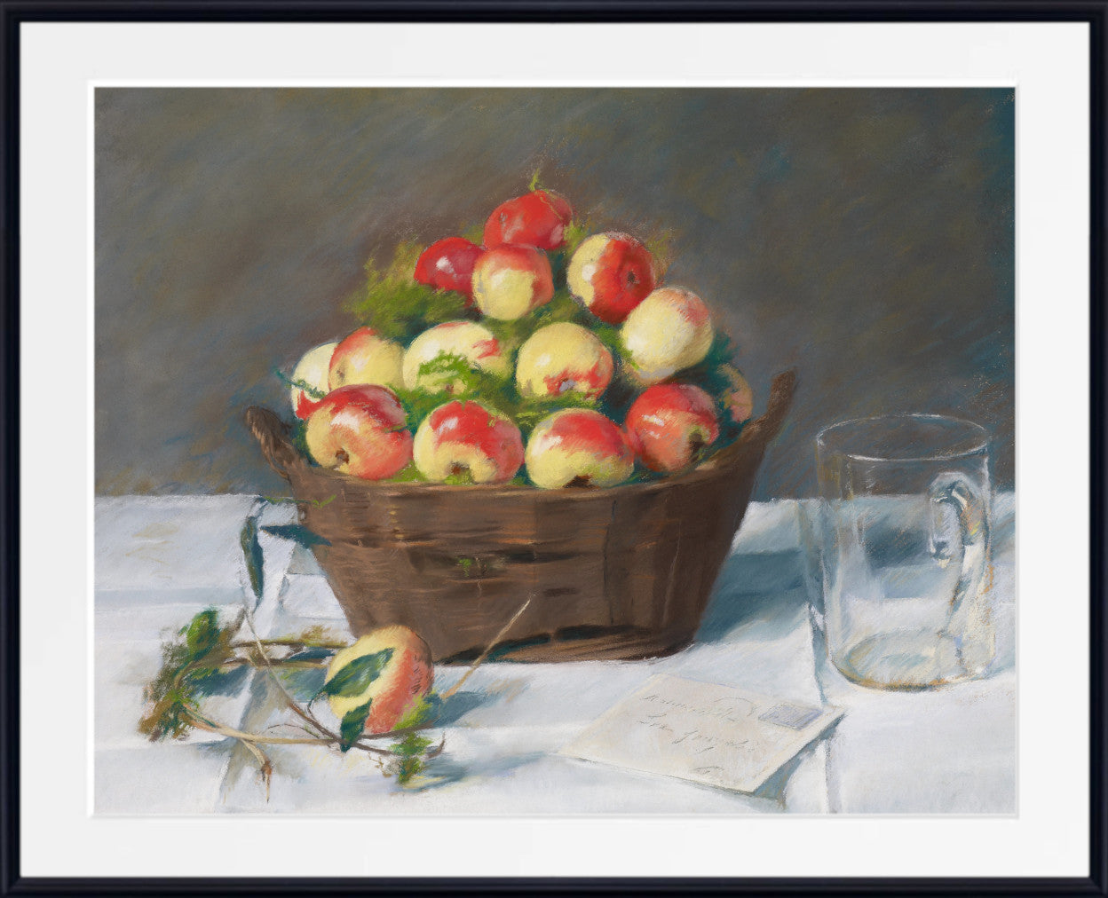
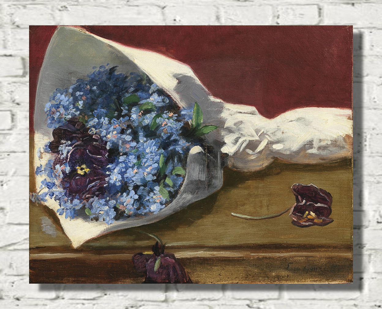
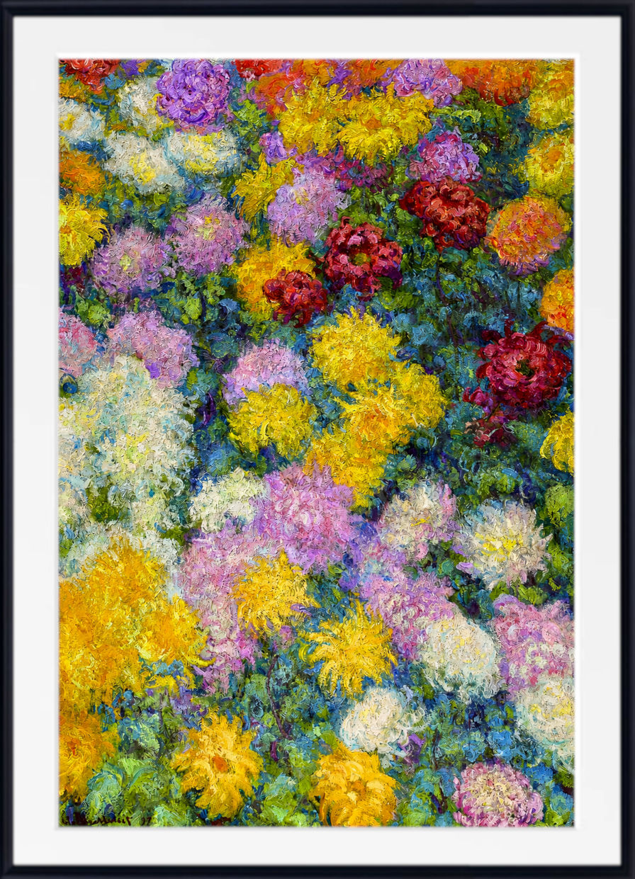
Red still life prints are a natural fit for kitchens, dining rooms and warm living spaces. Poppies, azaleas, fruit, vases, textiles and table settings can introduce red in a way that feels decorative and easy to live with.
Vincent van Gogh brings expressive floral and colour-rich still life subjects, while Marie Egner offers floral works and landscapes with natural warmth. Red still life art pairs well with wood, ceramic, linen, brass and darker dining room schemes.
Red Mythology and Religious Art
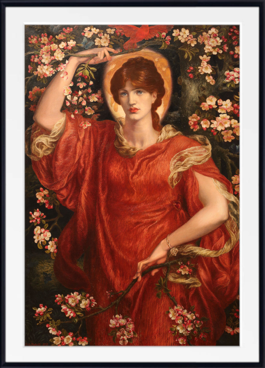
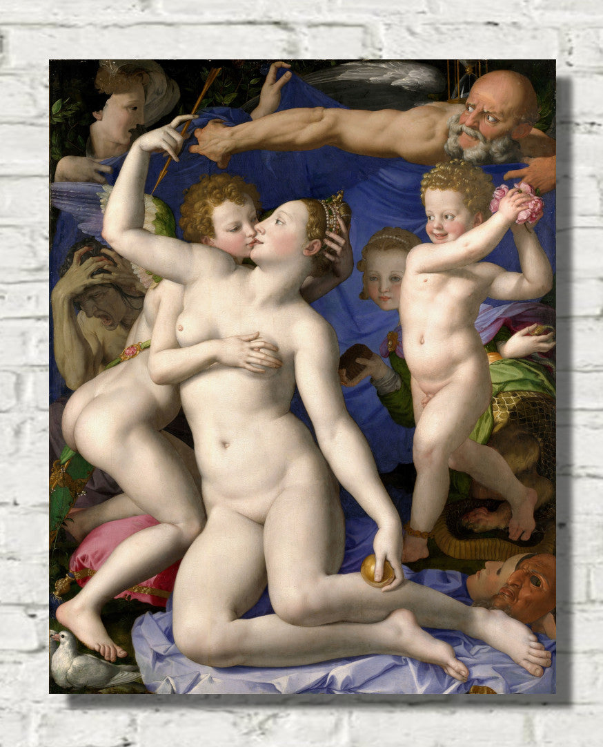
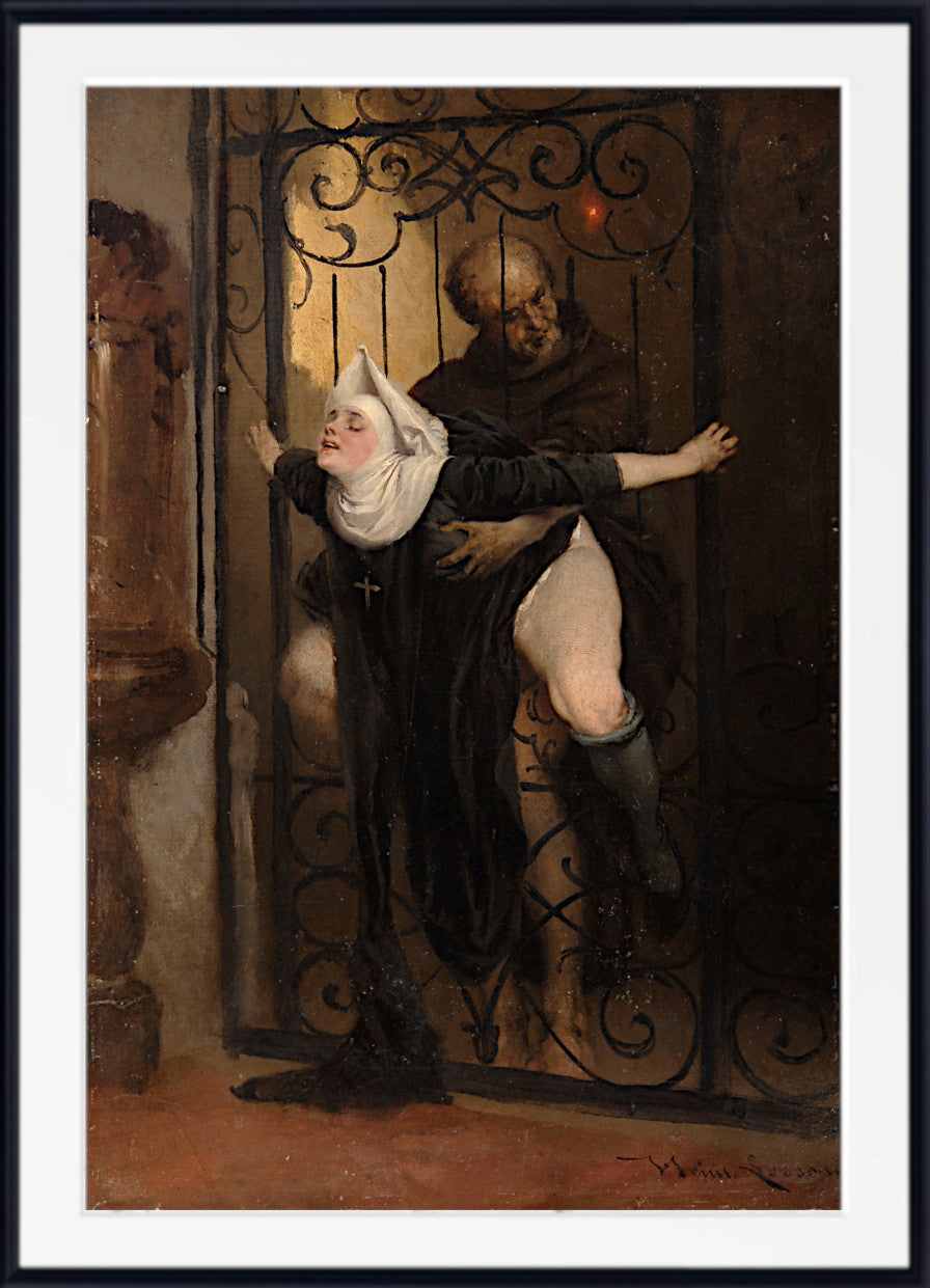
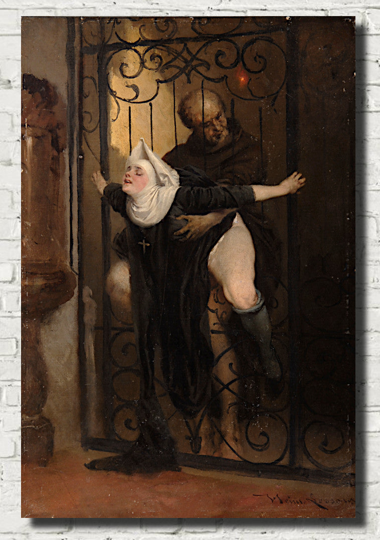
Red is often used in historical, mythological and religious painting to suggest intensity, sacrifice, grandeur or emotion. These works can be very effective in rooms where you want art with narrative power and visual weight.
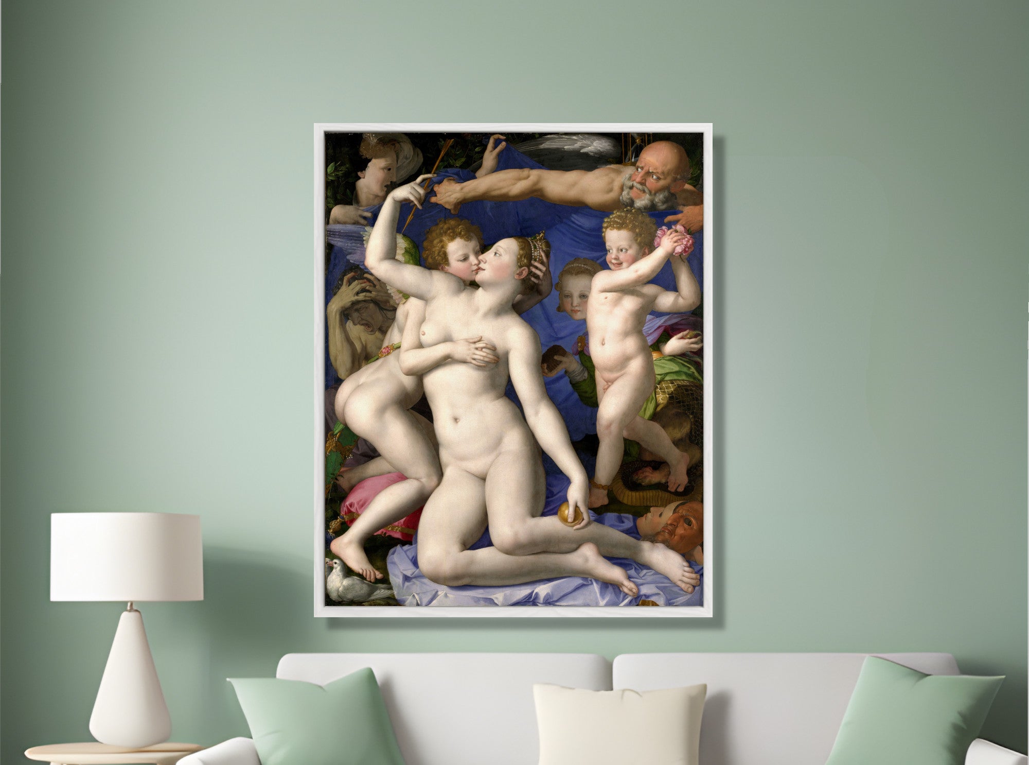
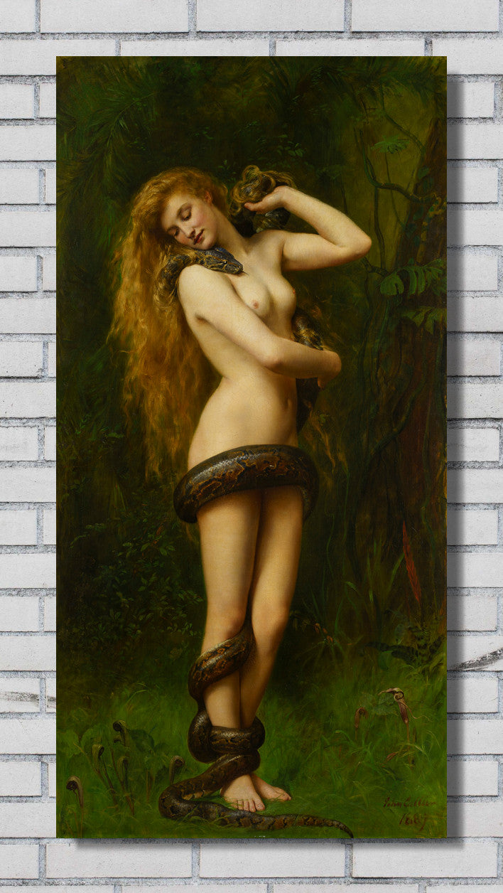
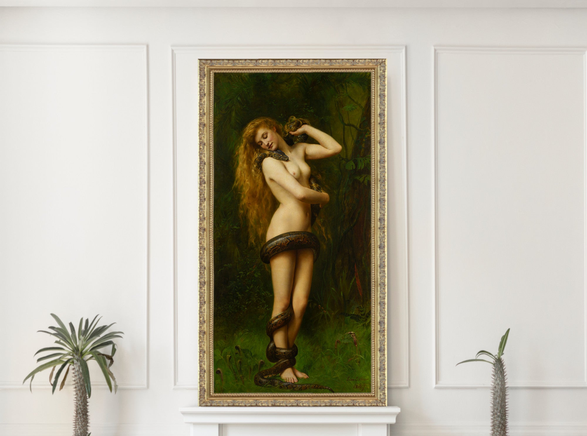
John William Waterhouse, Gustave Moreau and William-Adolphe Bouguereau are good choices for classical, mythological and symbolic subjects. Their works can suit dining rooms, studies, hallways and more traditional interiors.
Red Landscape and Cityscape Prints
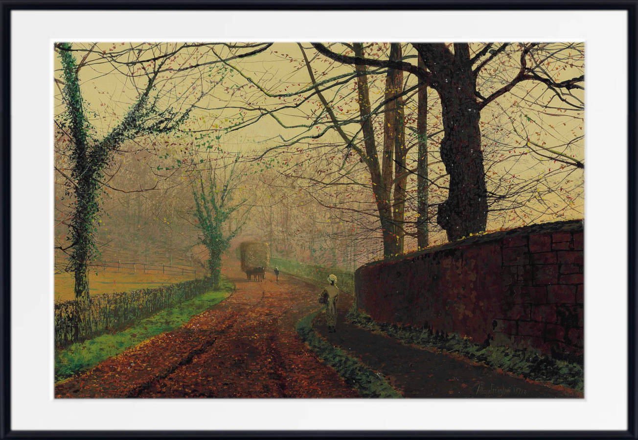
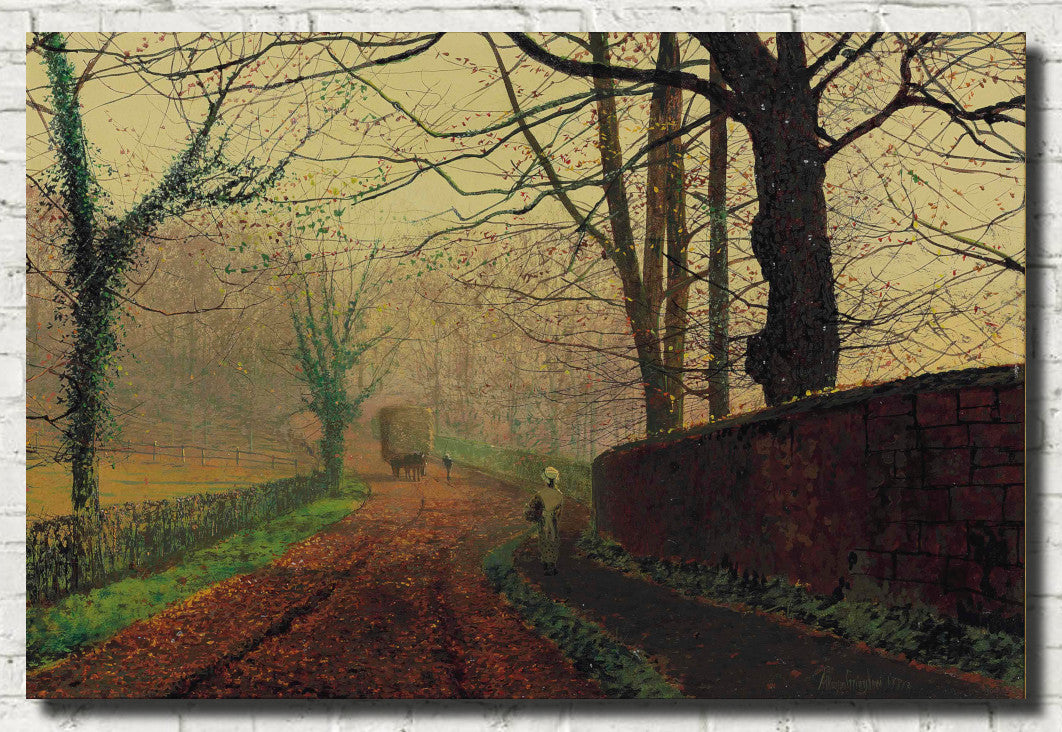
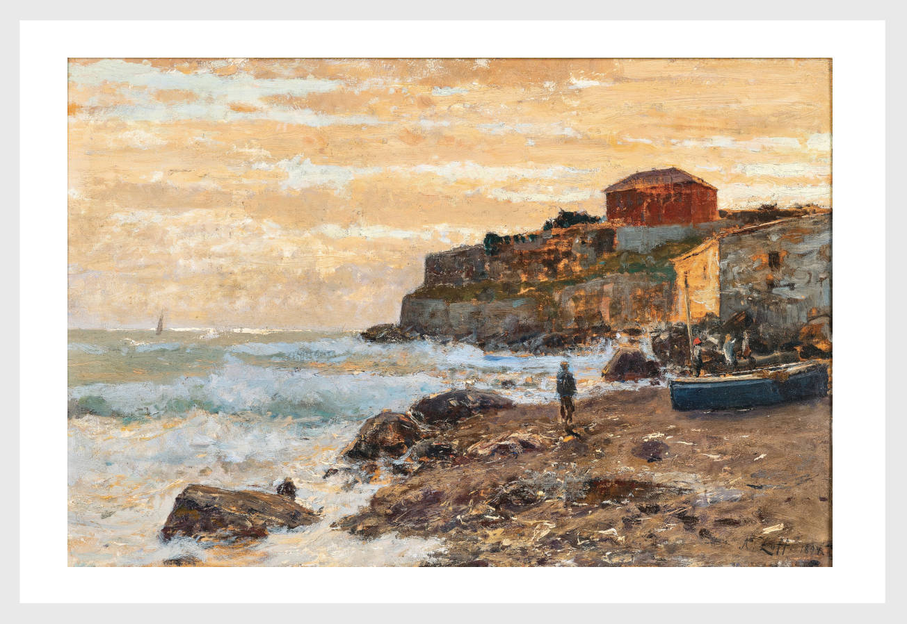
Red landscape prints often use sunset, autumn, firelight or dramatic skies to create warmth and atmosphere. City scenes can also use red through glowing windows, illuminated streets, interiors and night-time colour.
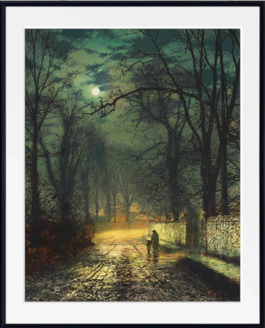
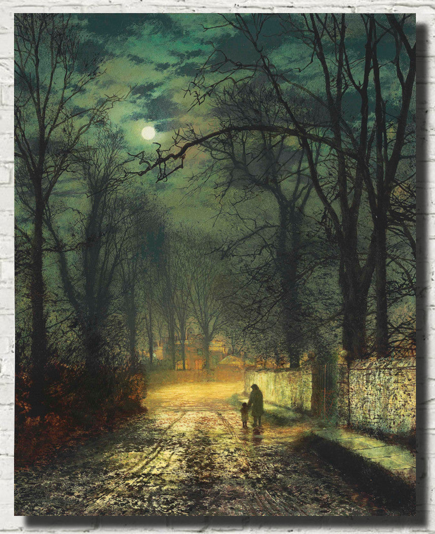
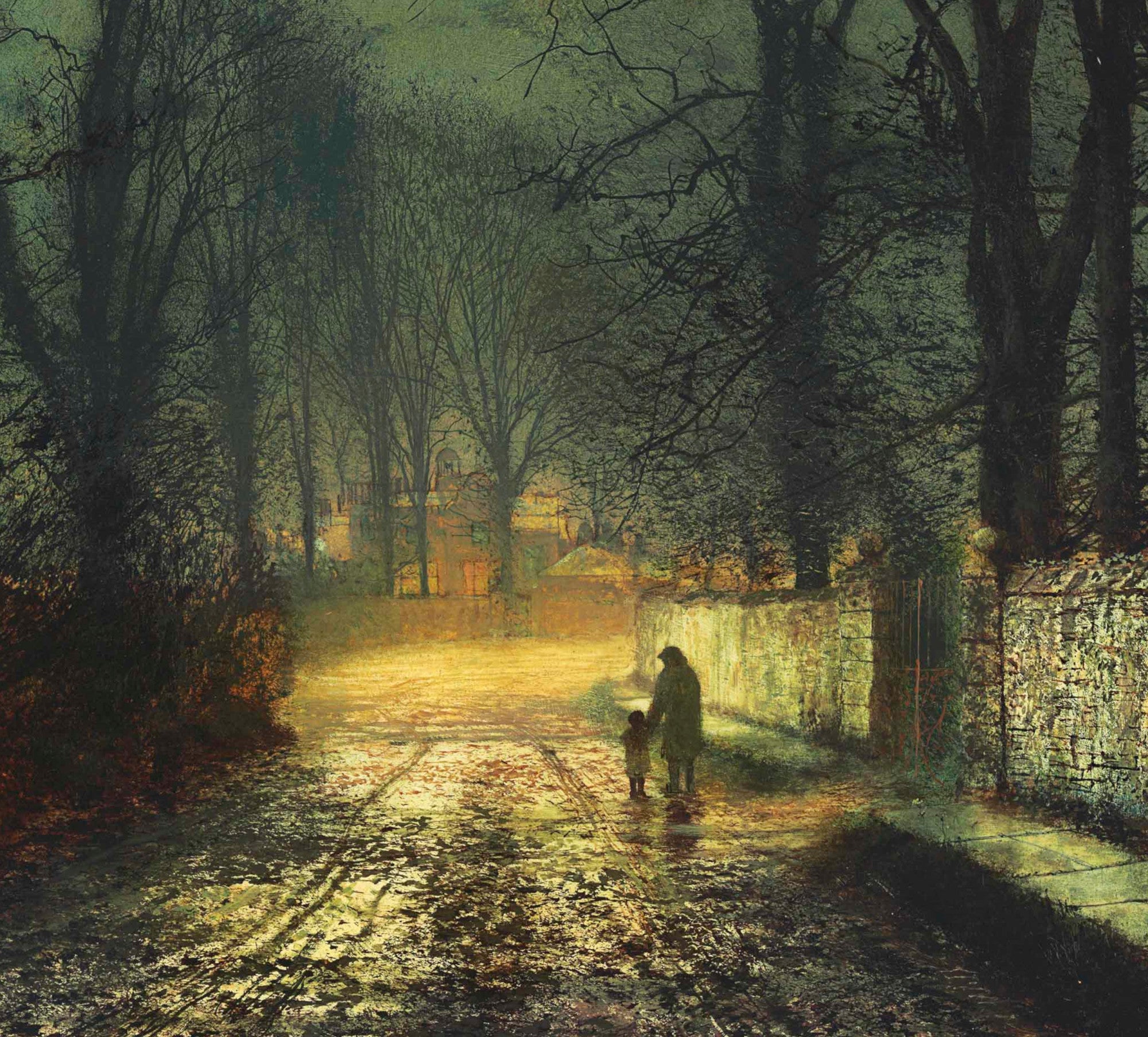
Edward Hopper is a strong choice for modern interiors and urban atmosphere, particularly where red appears in windows, signs and artificial light. Frederic Edwin Church and John Atkinson Grimshaw are useful for richer evening effects and dramatic landscape or city moods.
Red Japanese Prints
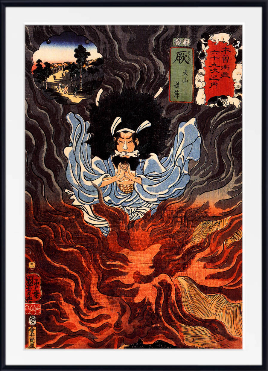
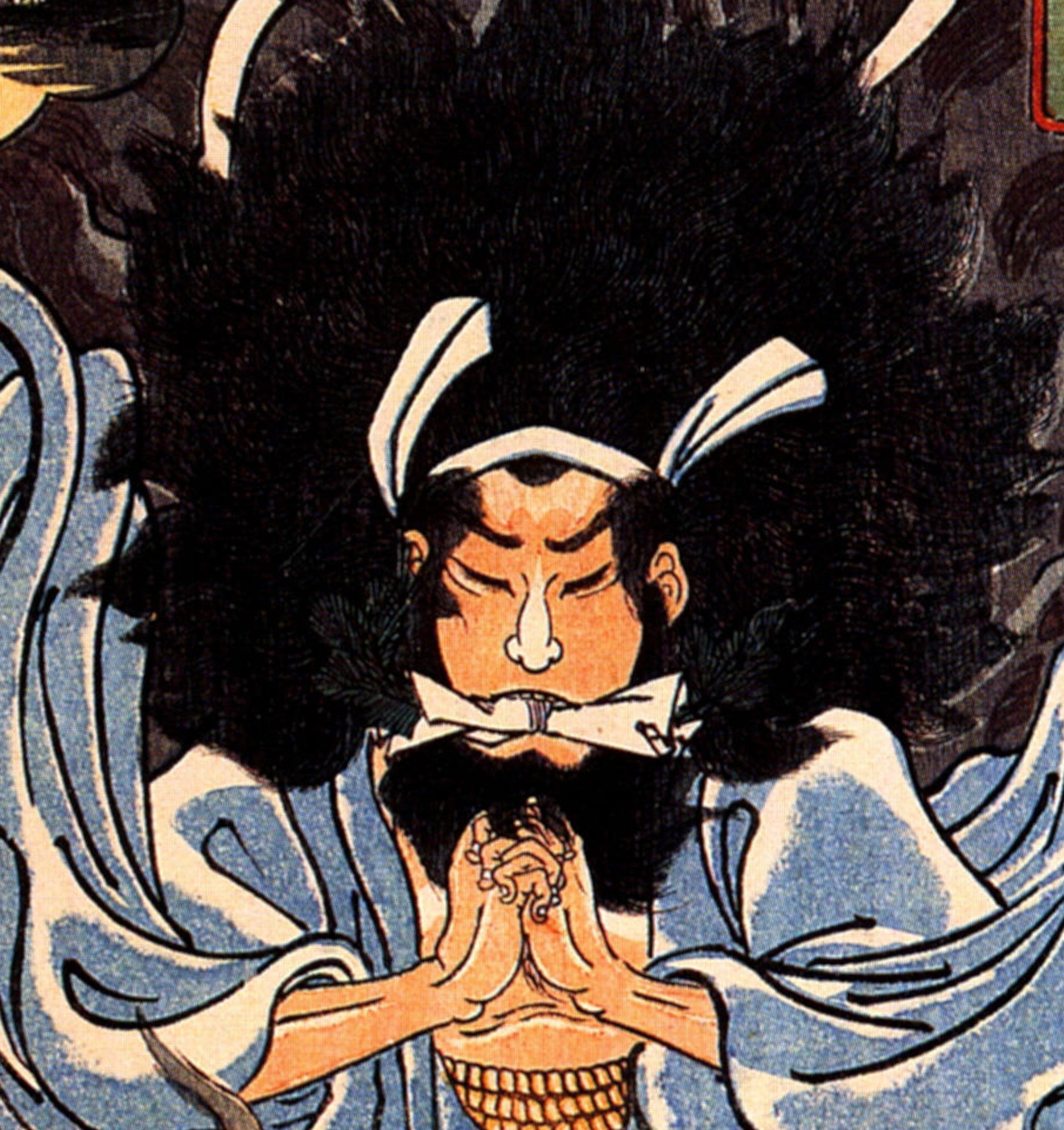
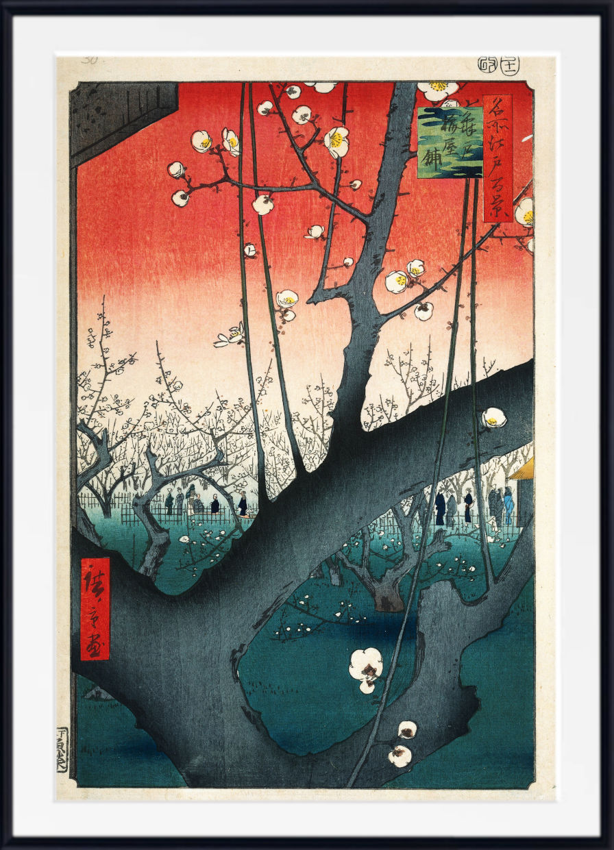
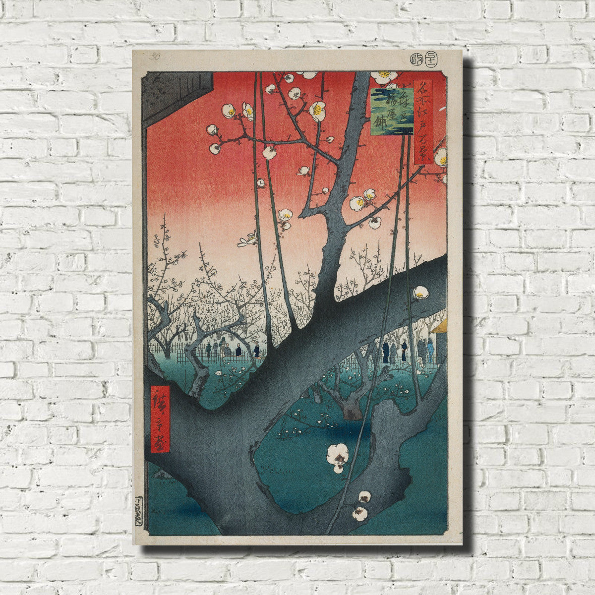
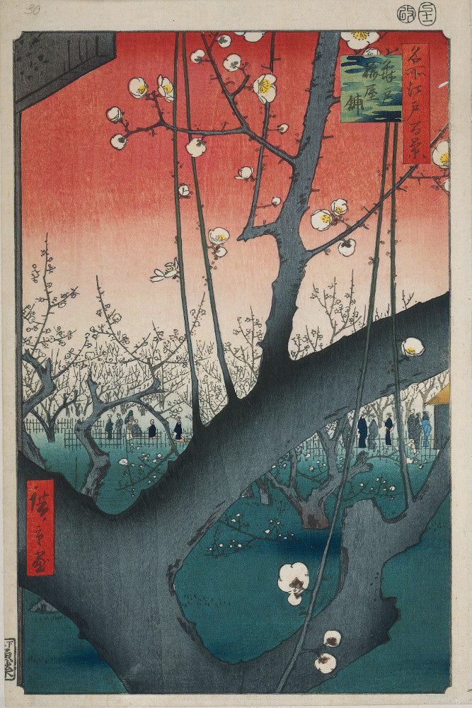
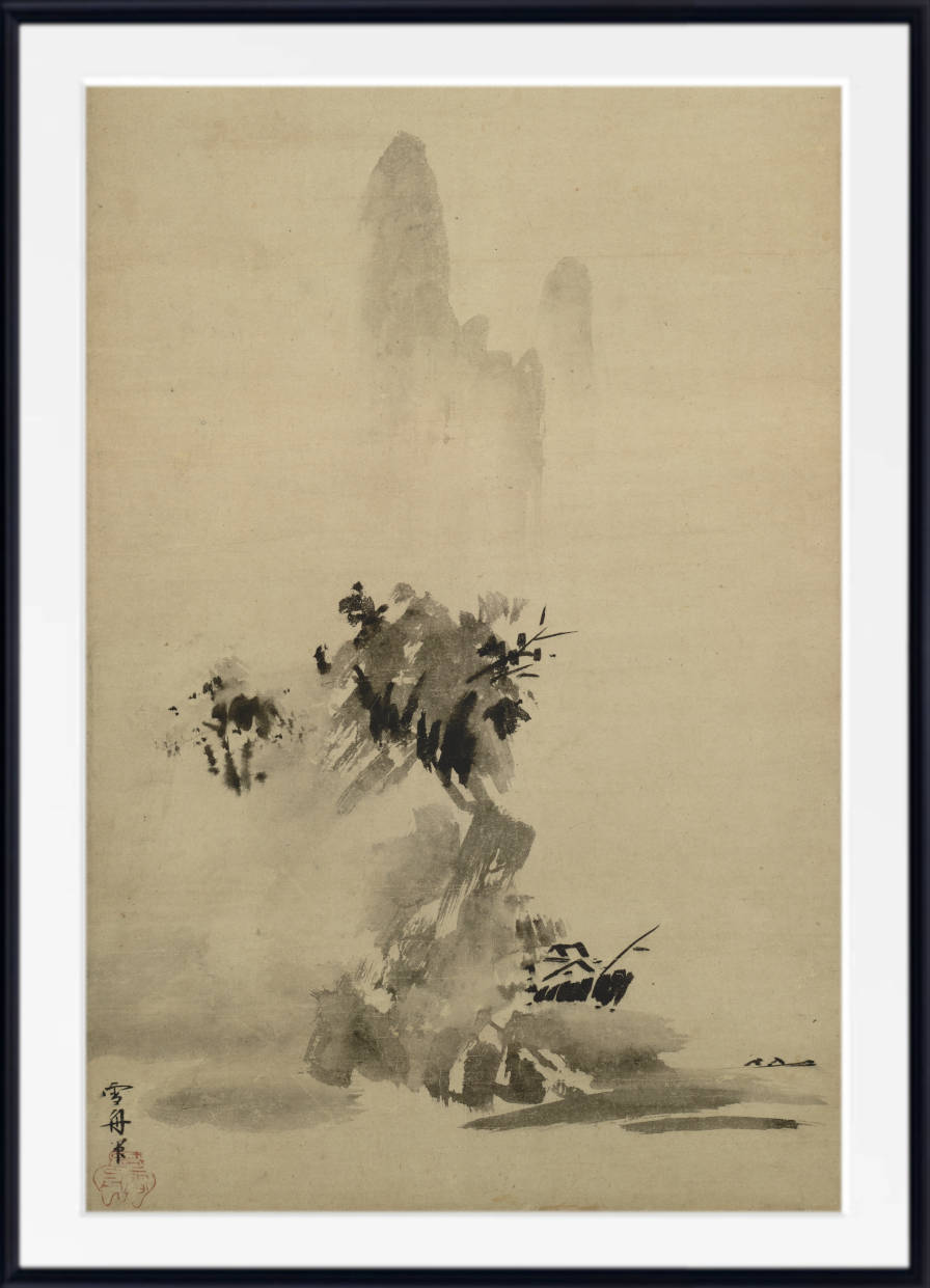
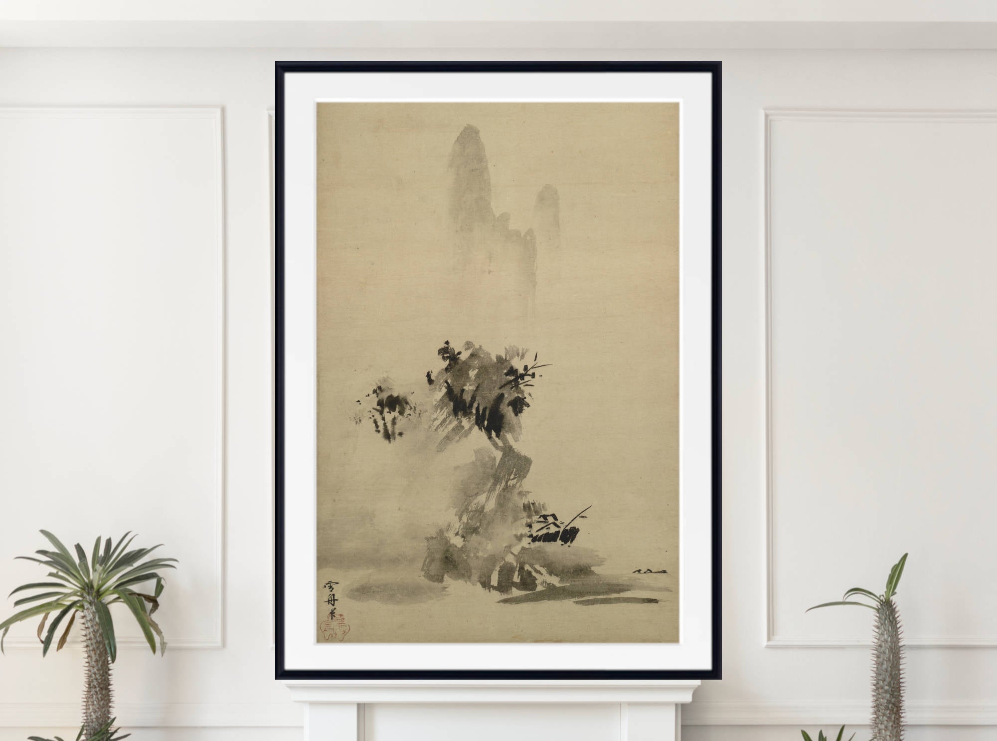
Japanese prints often use red with striking decorative clarity, especially in clothing, theatre scenes, warriors, banners and dramatic compositions. Red Japanese prints can bring pattern, rhythm and strong design to a room.
Browse our Japanese art prints for red-toned ukiyo-e works, warrior prints, theatre imagery and decorative compositions. These prints are especially effective in hallways, studies and gallery walls.
Red Wall Art for Living Rooms
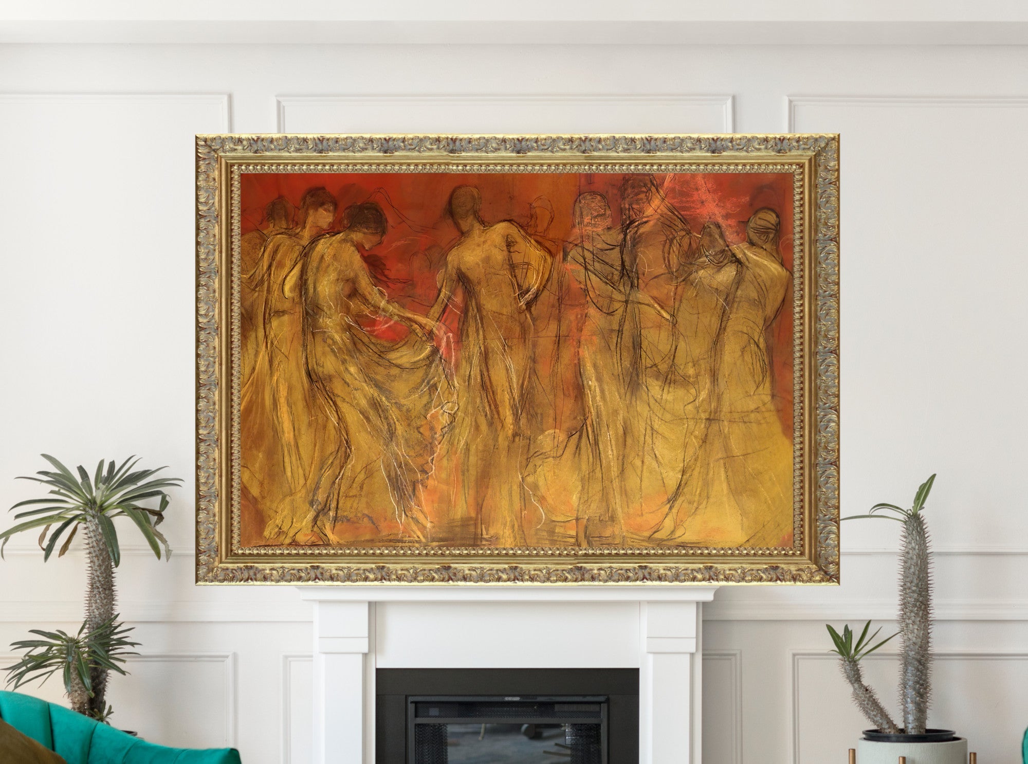
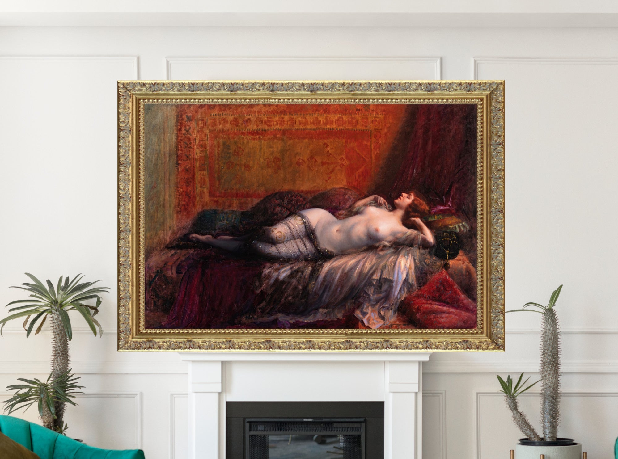
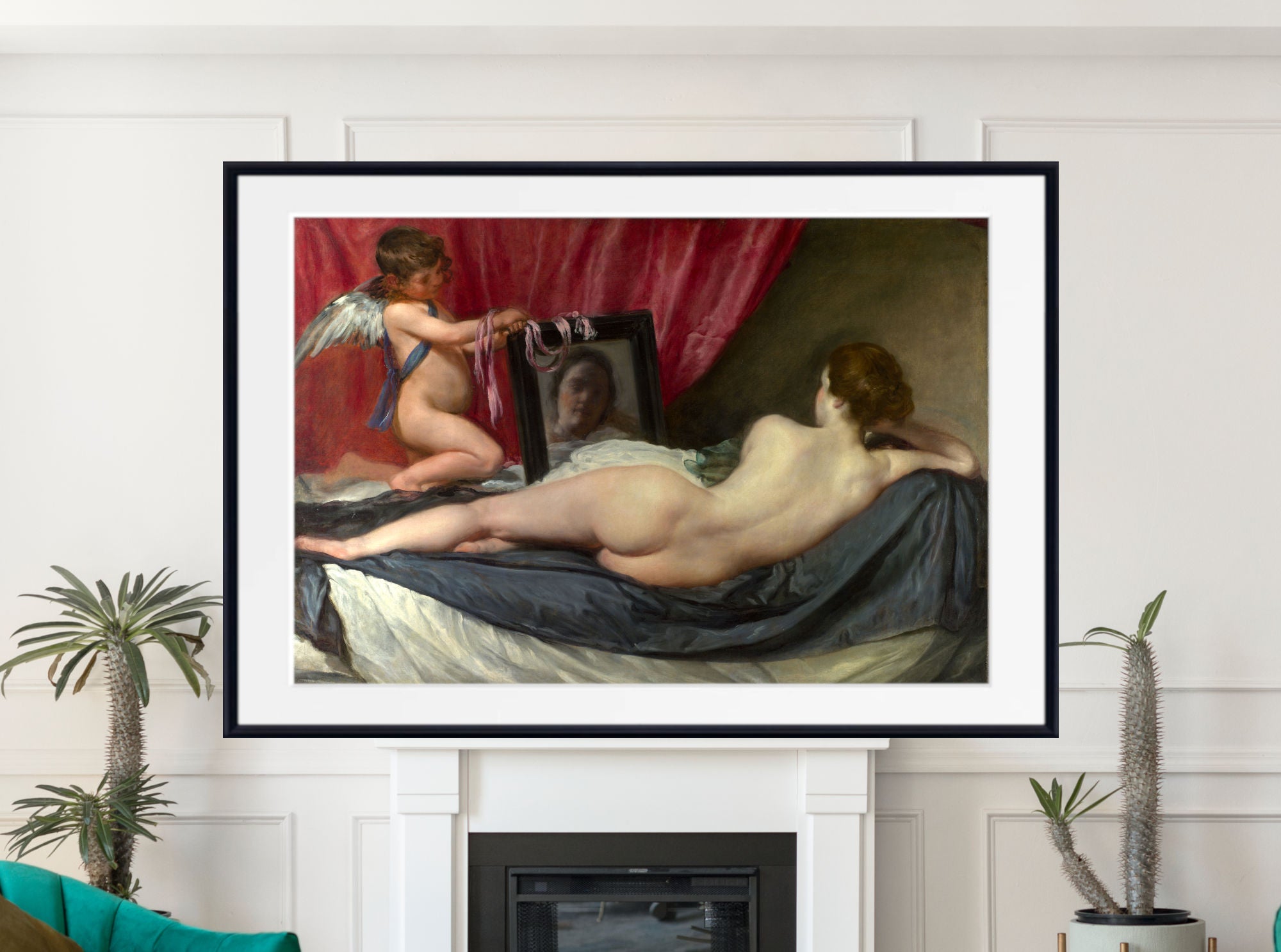
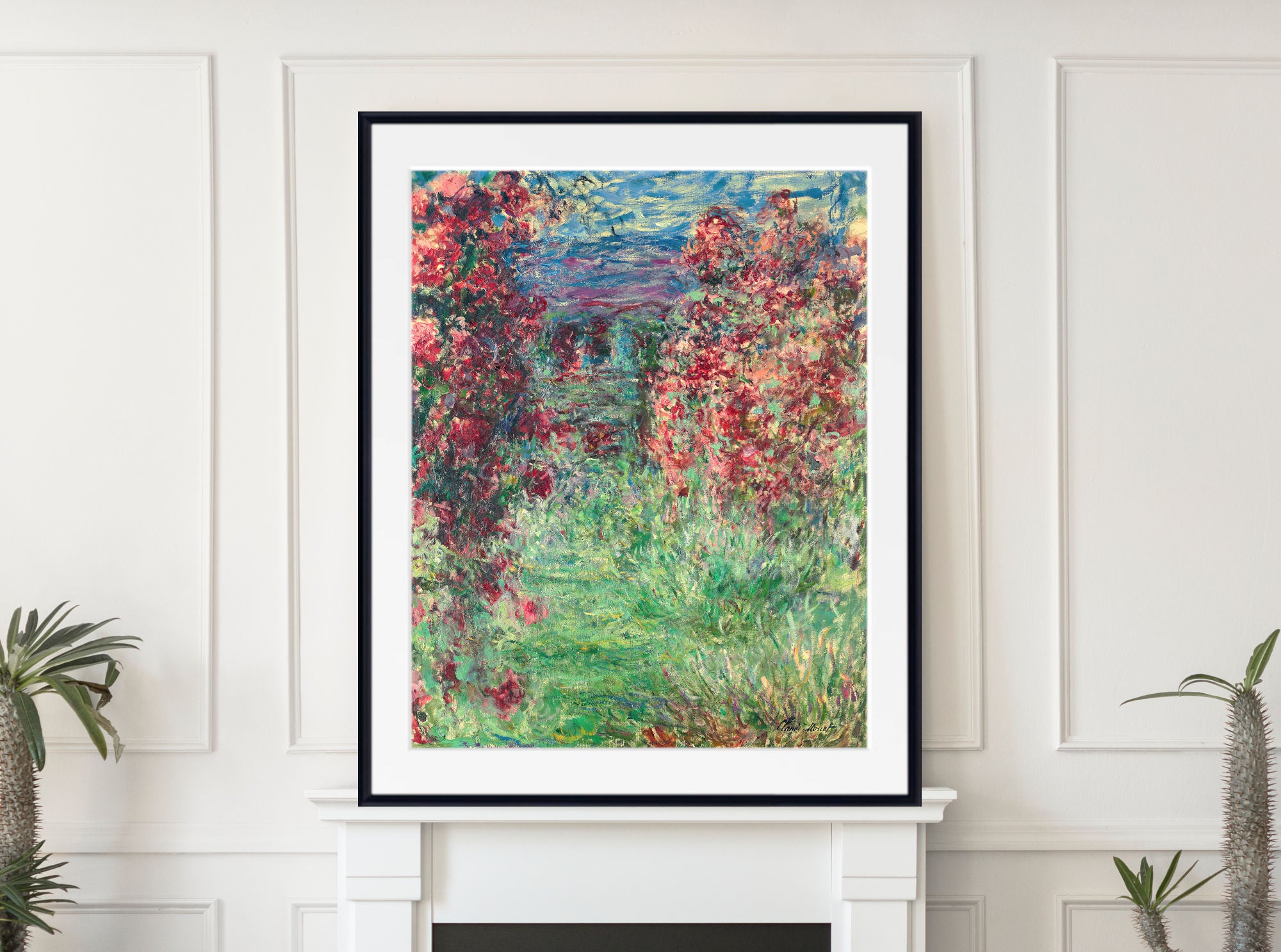
Red living room wall art can create a confident focal point. A large red abstract print can anchor a sofa wall, while a red portrait, still life or city scene can bring warmth and character to the room.
Red artwork pairs well with cream sofas, grey walls, black frames, walnut furniture, navy accents, olive green, brass lighting and warm neutral rugs. For a subtle look, choose terracotta, rust or burgundy prints. For more impact, choose scarlet, crimson or bright red artwork.
Red Dining Room Wall Art
Red is especially effective in dining rooms because it feels warm, sociable and dramatic. Red still life prints, portraits, classical art and rich interiors can all work beautifully around a dining table.
For a classic dining room, choose framed red portraits, mythological scenes or still life paintings. For a modern dining room, choose red abstract art or a strong colour-led composition.
Red Bedroom Wall Art
Red bedroom wall art works best when used carefully. Deep burgundy, wine red, rose red and terracotta prints can feel warm and intimate, while very bright red is usually better as a smaller accent.
For bedrooms, consider red floral prints, softer figure studies, warm interiors, muted landscapes or dark red abstract prints. Pair them with cream bedding, grey walls, walnut furniture, black frames or brass lamps for balance.
How to Choose Red Wall Art
Start by choosing the type of red that suits your room. Scarlet and bright red feel energetic and bold. Crimson feels dramatic and classic. Burgundy and wine red feel deeper and more sophisticated. Terracotta and rust feel warmer, softer and easier to use in relaxed interiors.
Also consider the subject. Red abstract prints feel modern, red portraits feel dramatic, red still lifes feel decorative, red landscapes feel warm and atmospheric, and red mythology prints feel rich and theatrical.
Colours That Work Well With Red Art
Red wall art pairs well with cream, white, beige, grey, black, navy, brown, gold, brass, olive green, sage, charcoal, terracotta and natural wood. It can be used as a strong contrast in neutral rooms or as part of a richer warm colour scheme.
For a balanced look, pair red prints with black or dark wood frames. For a softer interior, choose red artwork with cream, beige, rust or warm brown tones.
Fine Art Prints, Framed Prints and Canvas Panels
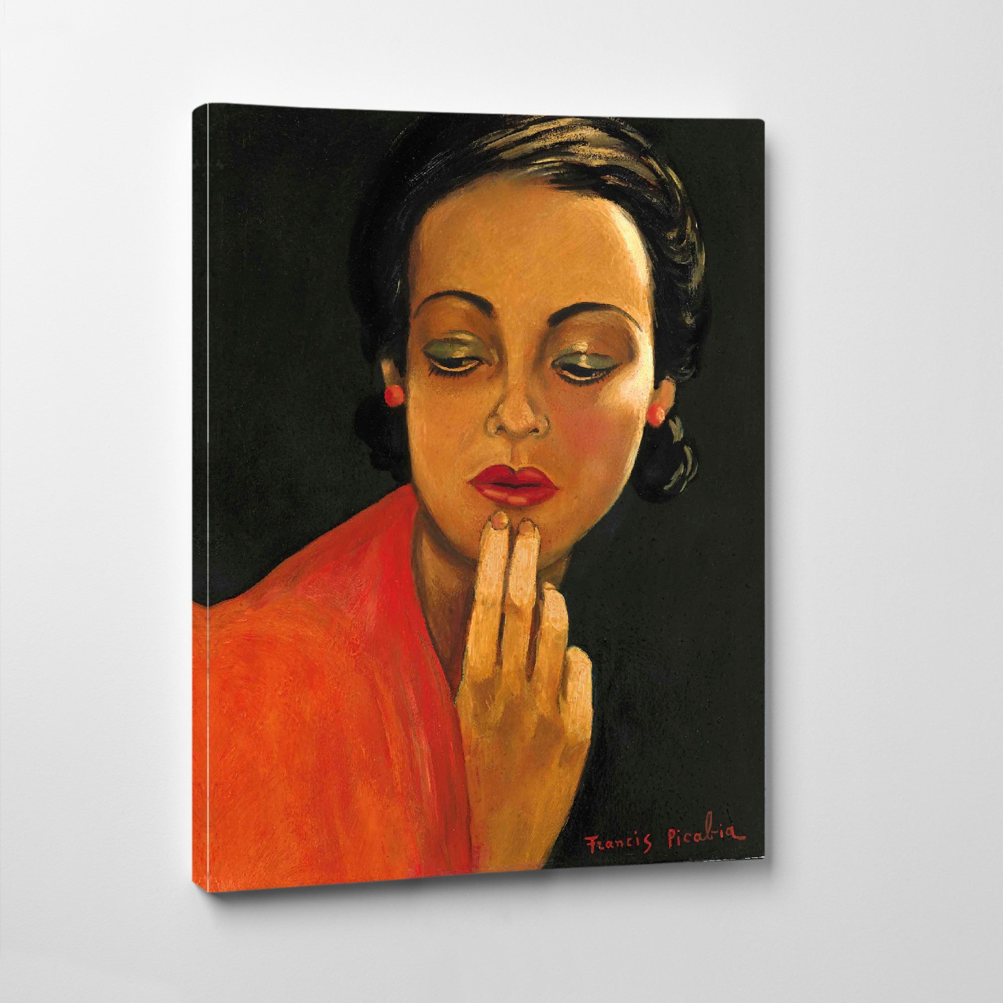
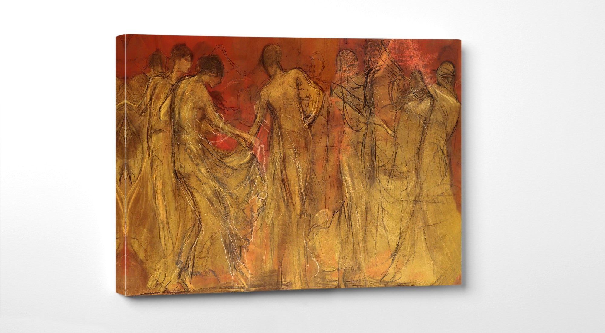
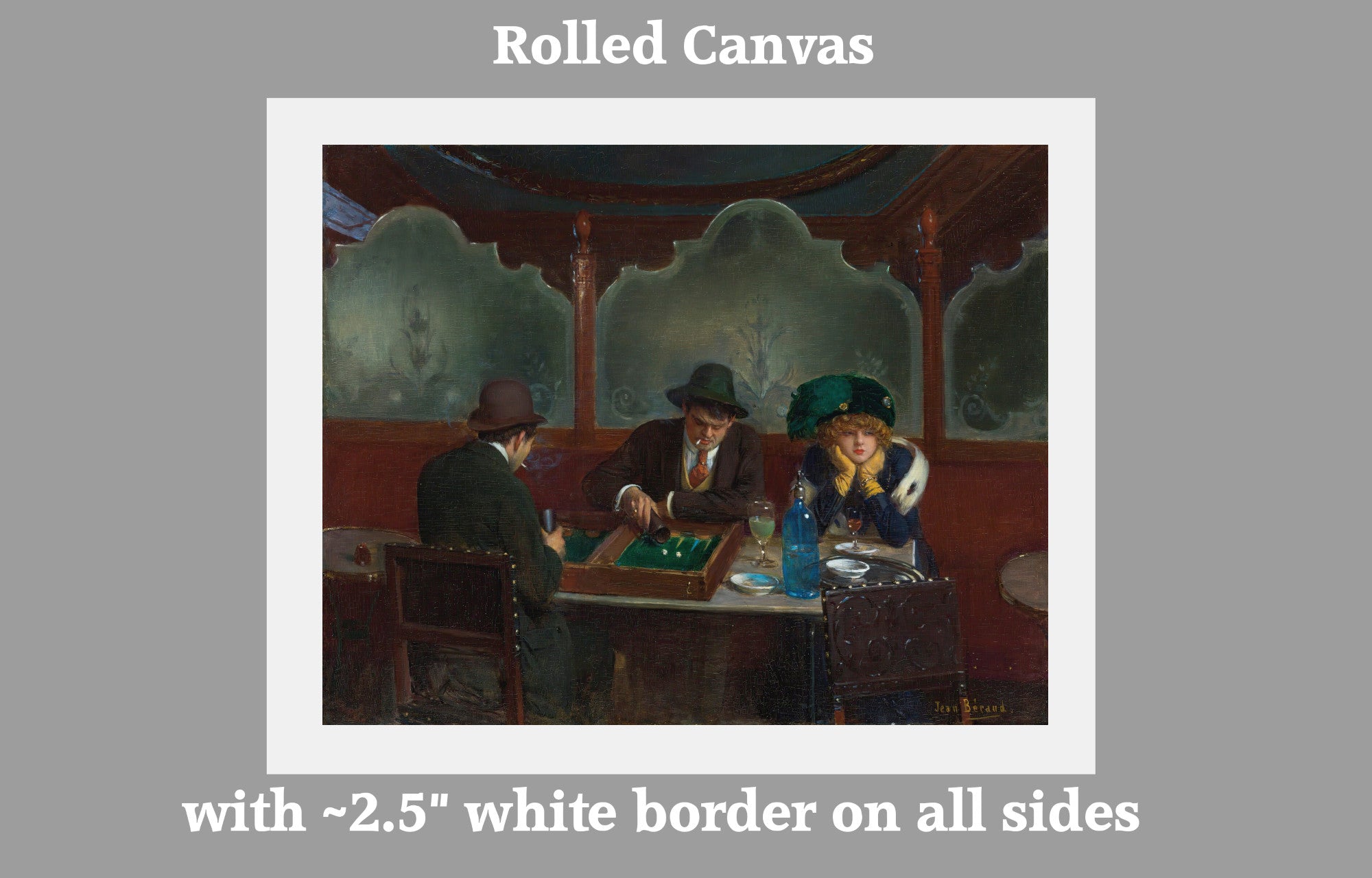
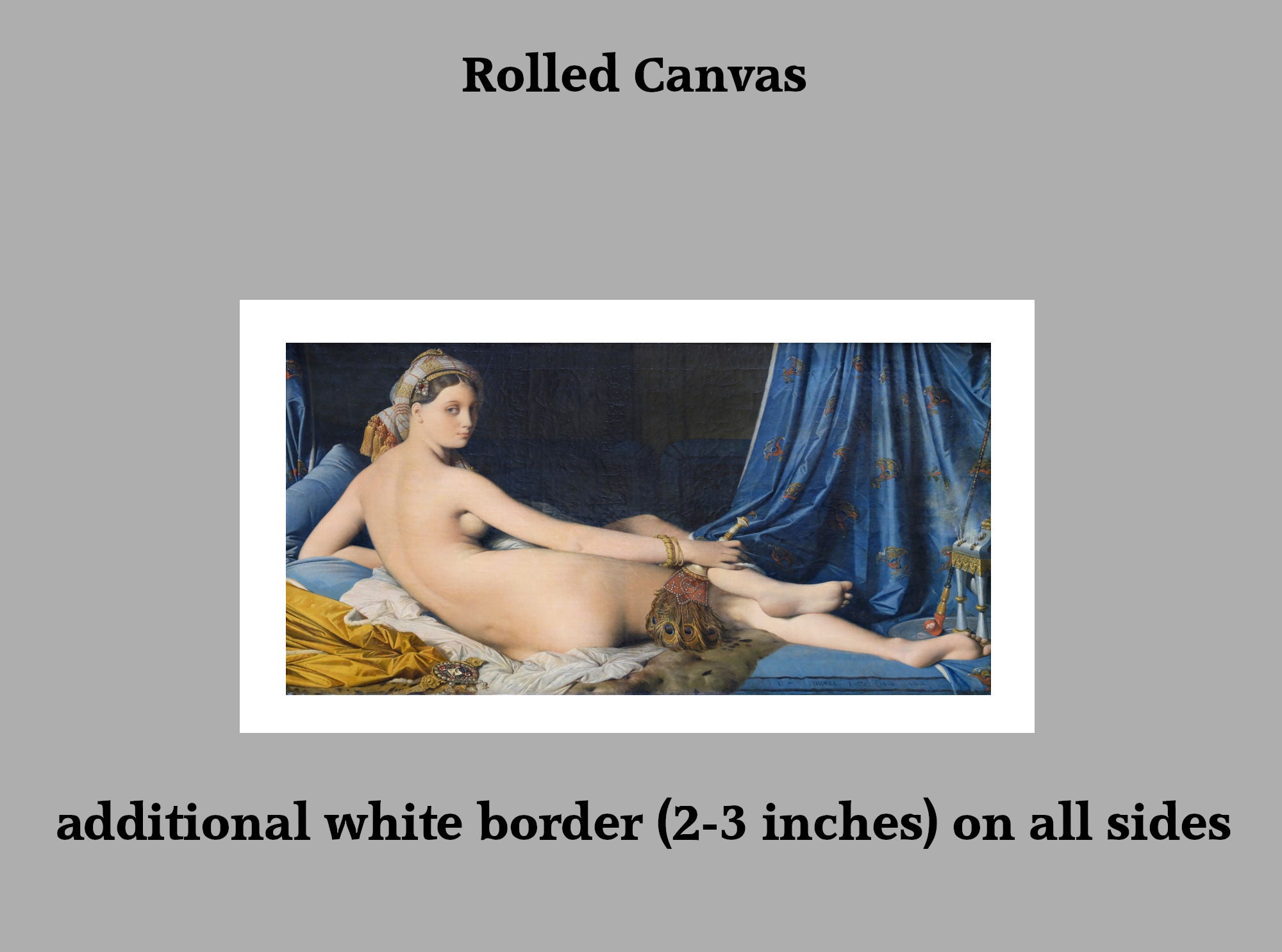
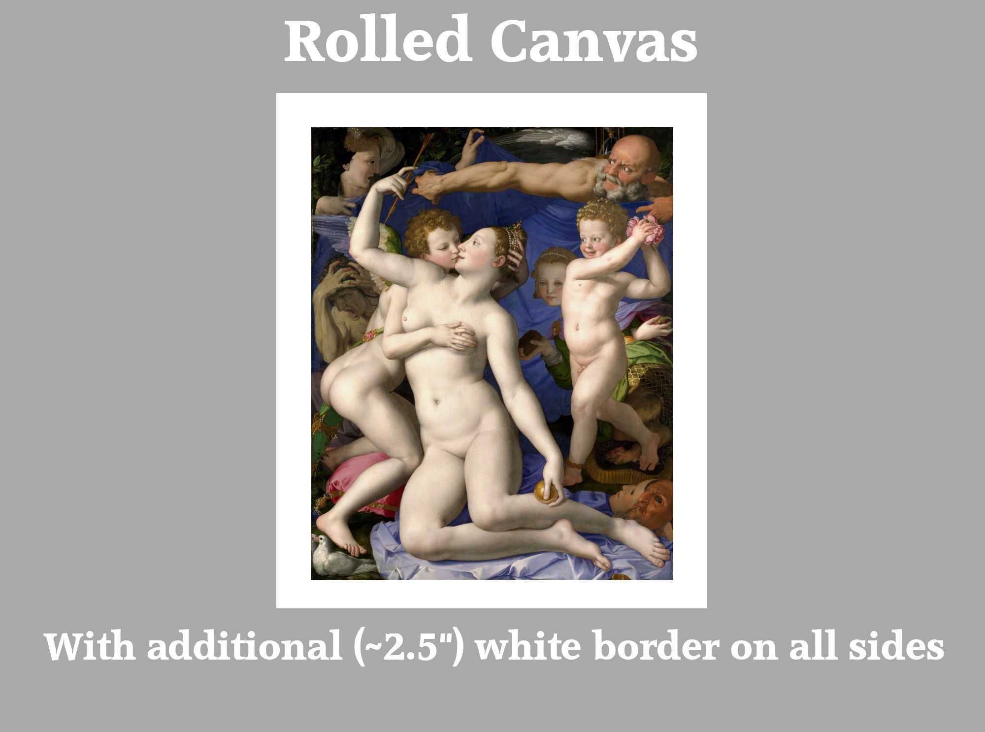
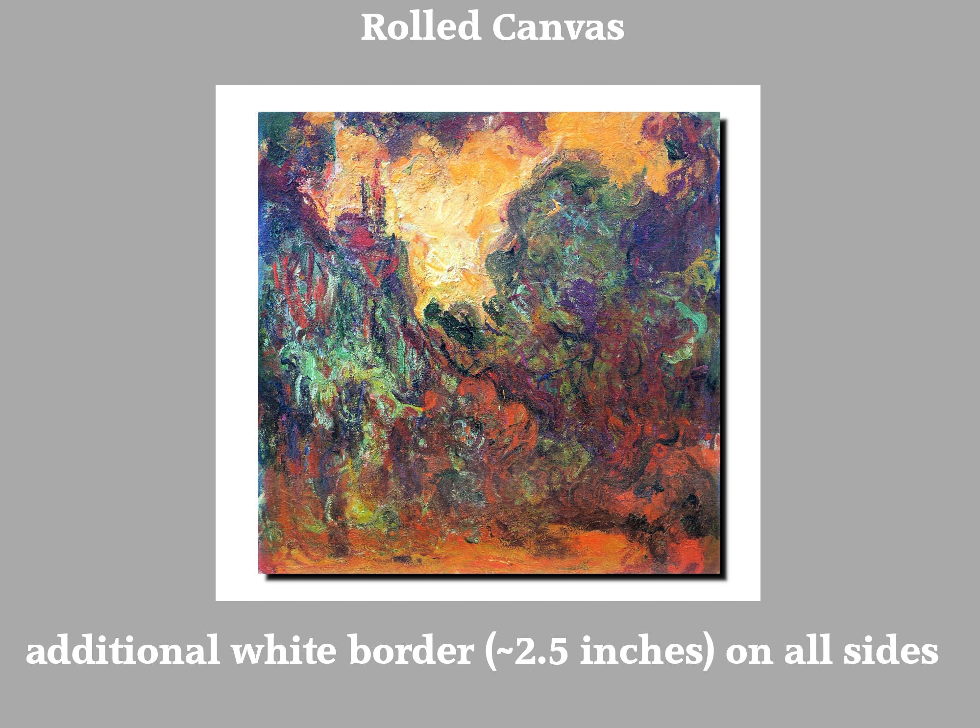
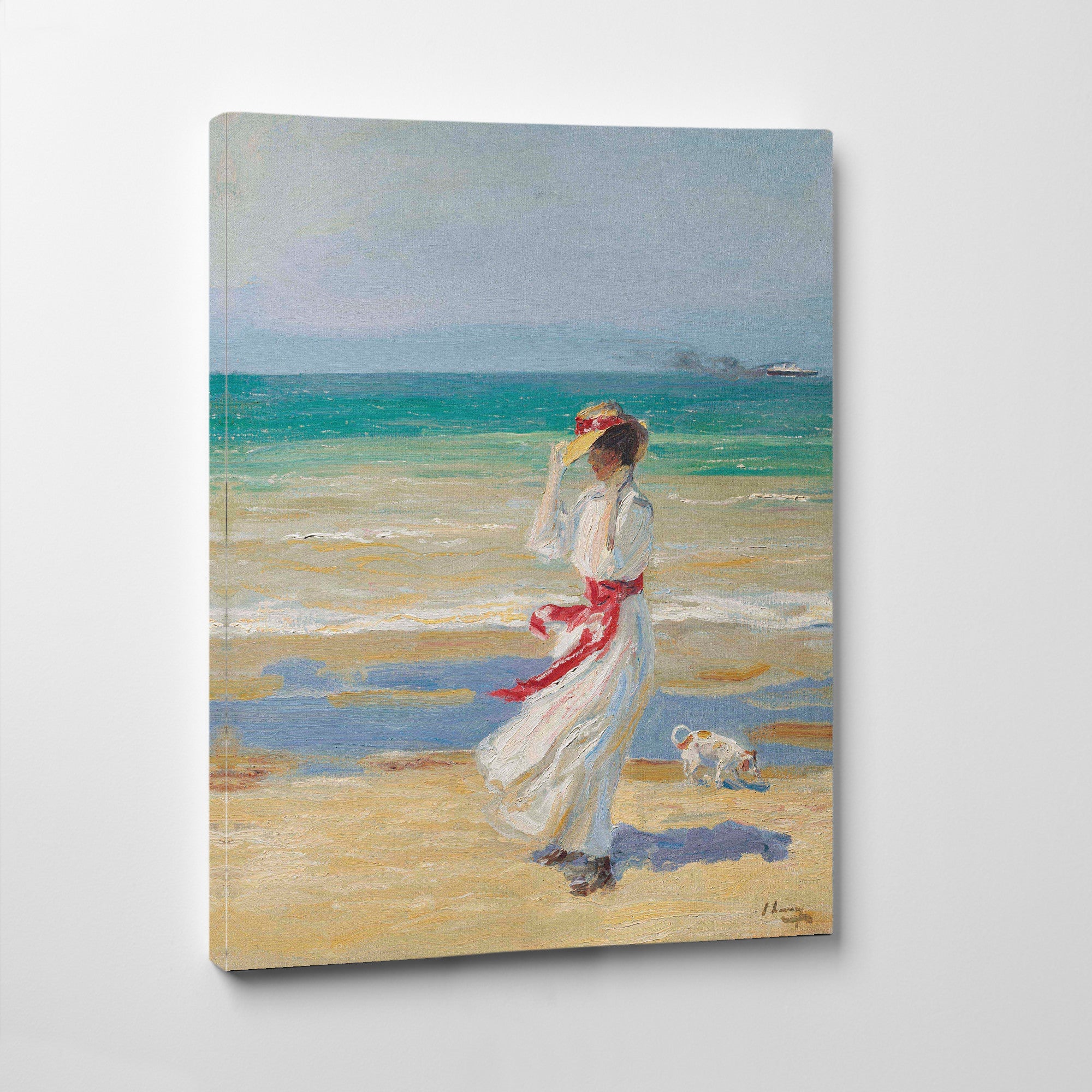
Our red wall art collection includes fine art prints, framed prints and canvas panels in a wide range of sizes. Choose an unframed print if you want flexibility, a framed print for a classic finished look, or a canvas panel for a clean, ready-to-hang option.
Whether you are looking for red living room wall art, red dining room prints, red abstract art, crimson portraits, red floral prints, burgundy wall art or framed red fine art prints, this collection offers bold and versatile artwork for many different interiors.
Frequently Asked Questions
What colours go well with red wall art?
Red wall art works well with cream, white, beige, grey, black, navy, brown, gold, brass, olive green, sage, charcoal and natural wood. Burgundy and terracotta reds are easier to pair with warm neutral interiors.
Is red wall art good for living rooms?
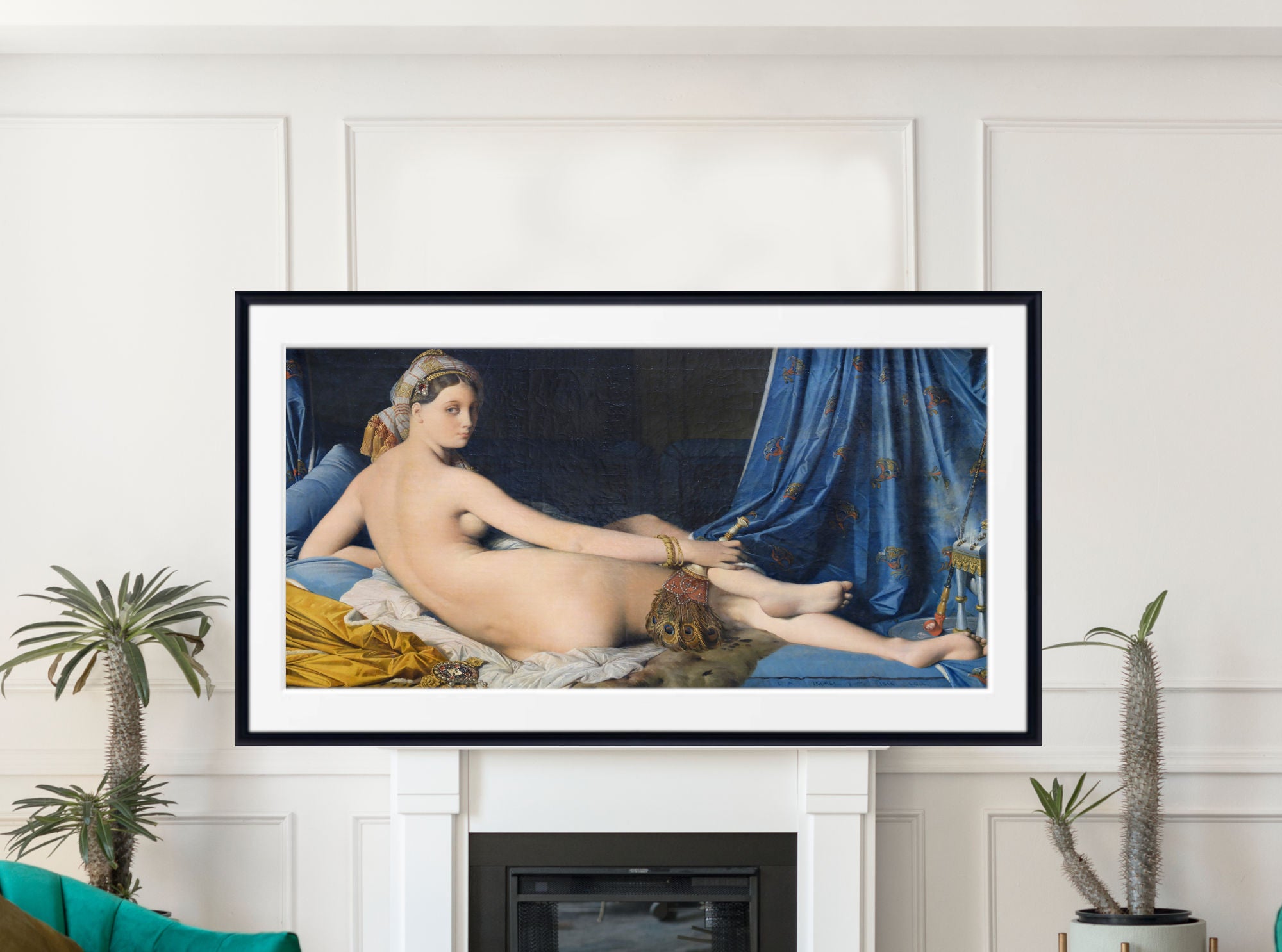
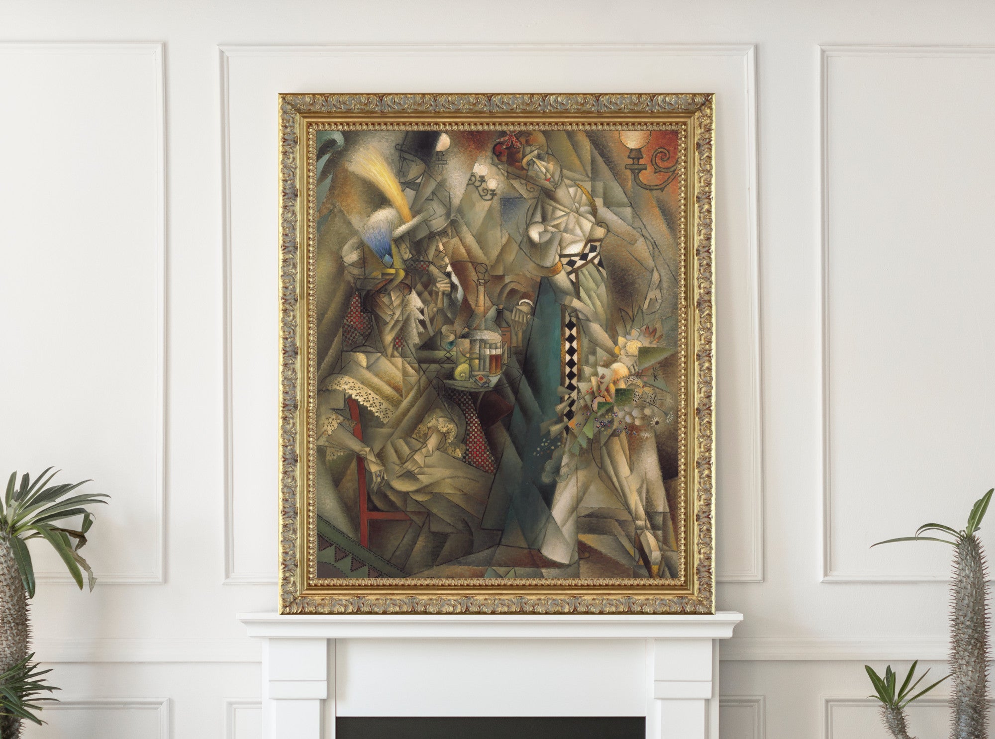
Yes. Red wall art can create a strong focal point in a living room. Red abstract prints, portraits, floral prints and city scenes all work well above sofas, fireplaces and sideboards.
What type of red wall art is best for dining rooms?
Red still life prints, portraits, classical art, mythological works and abstract prints are all good choices for dining rooms. Red can make the space feel warm, sociable and visually rich.
Can red wall art work in bedrooms?
Yes, but softer or deeper reds usually work best. Burgundy, wine red, rose, rust and terracotta prints can feel warm and restful, while very bright red is better used as a smaller accent.
What is the difference between red, burgundy, crimson and terracotta wall art?
Red is the broad colour family, crimson is rich and dramatic, burgundy is darker and more wine-toned, and terracotta is warmer, earthier and easier to use in relaxed interiors.