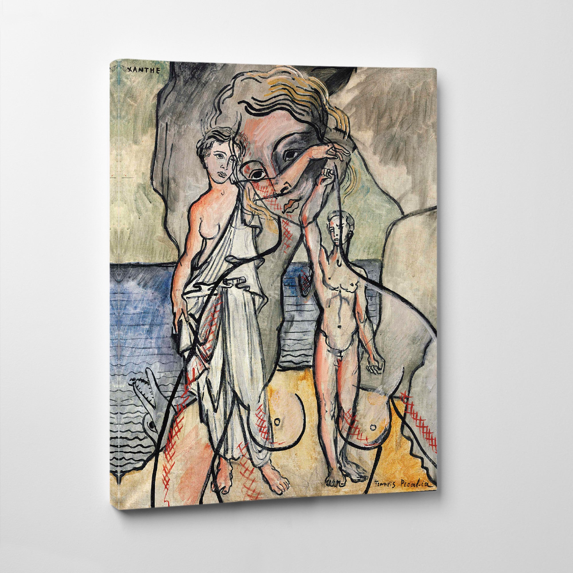
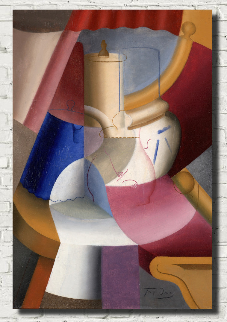
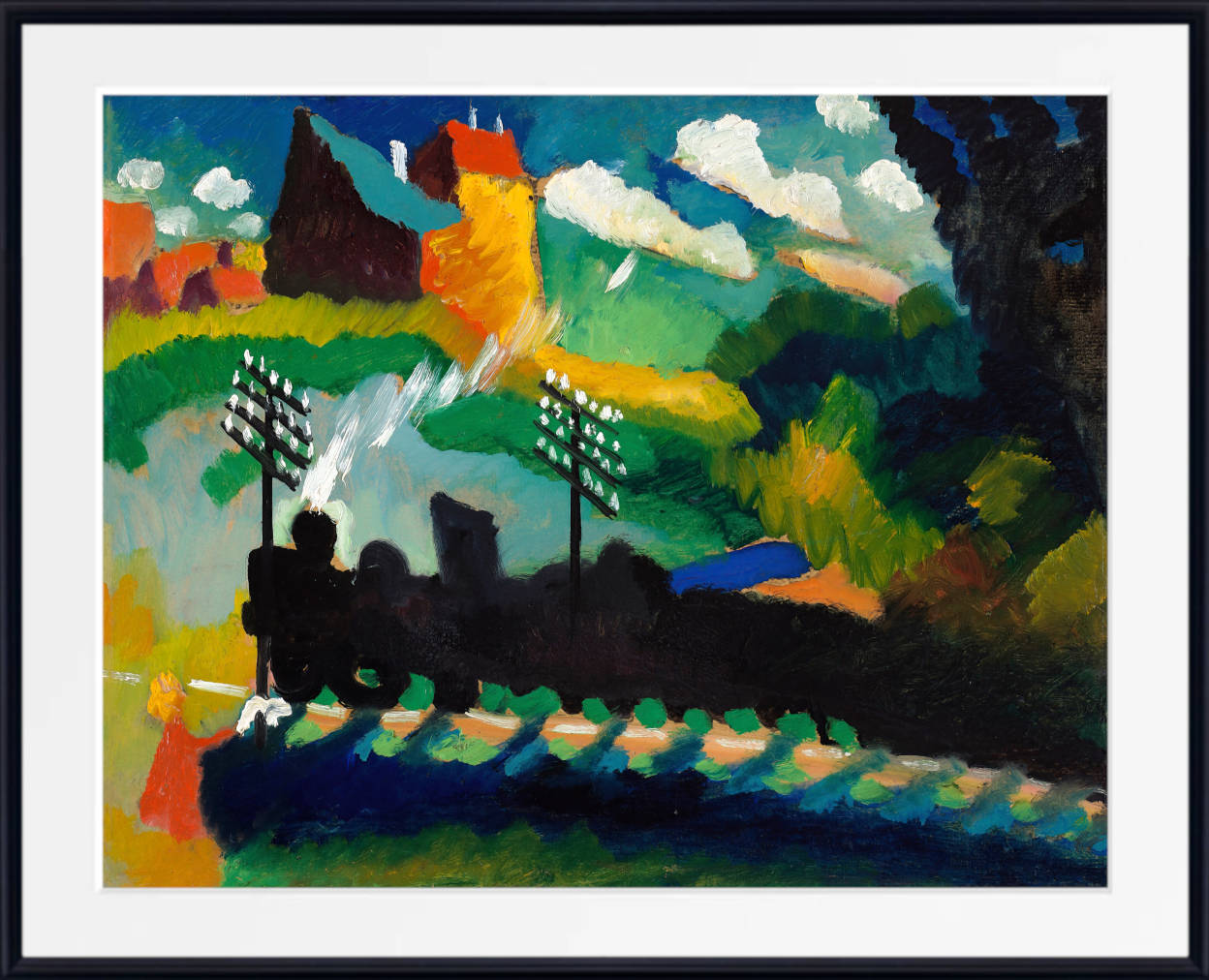
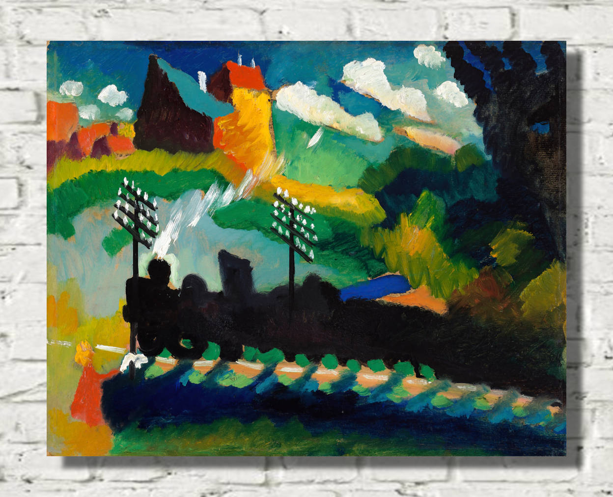
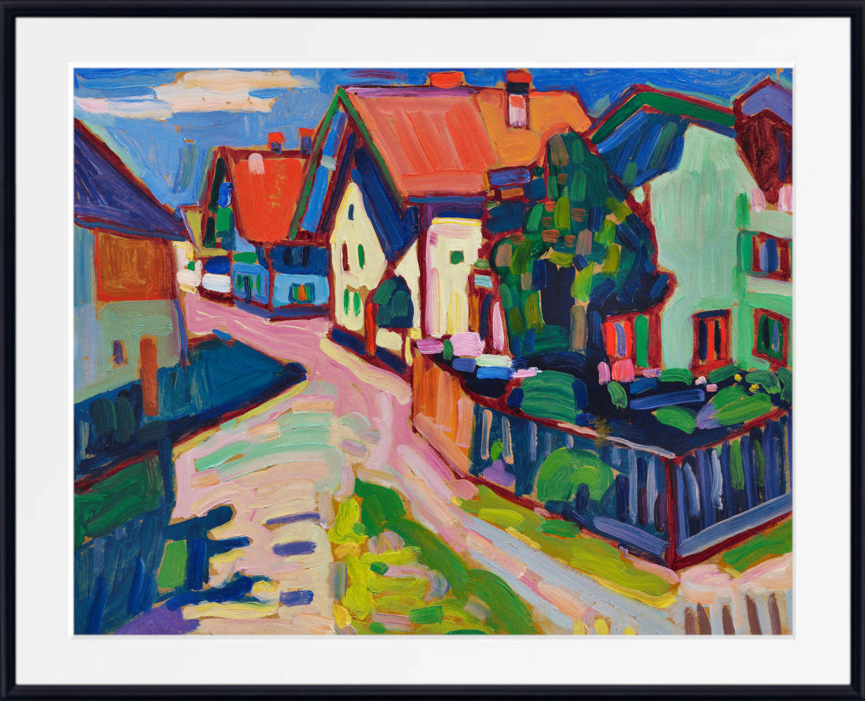
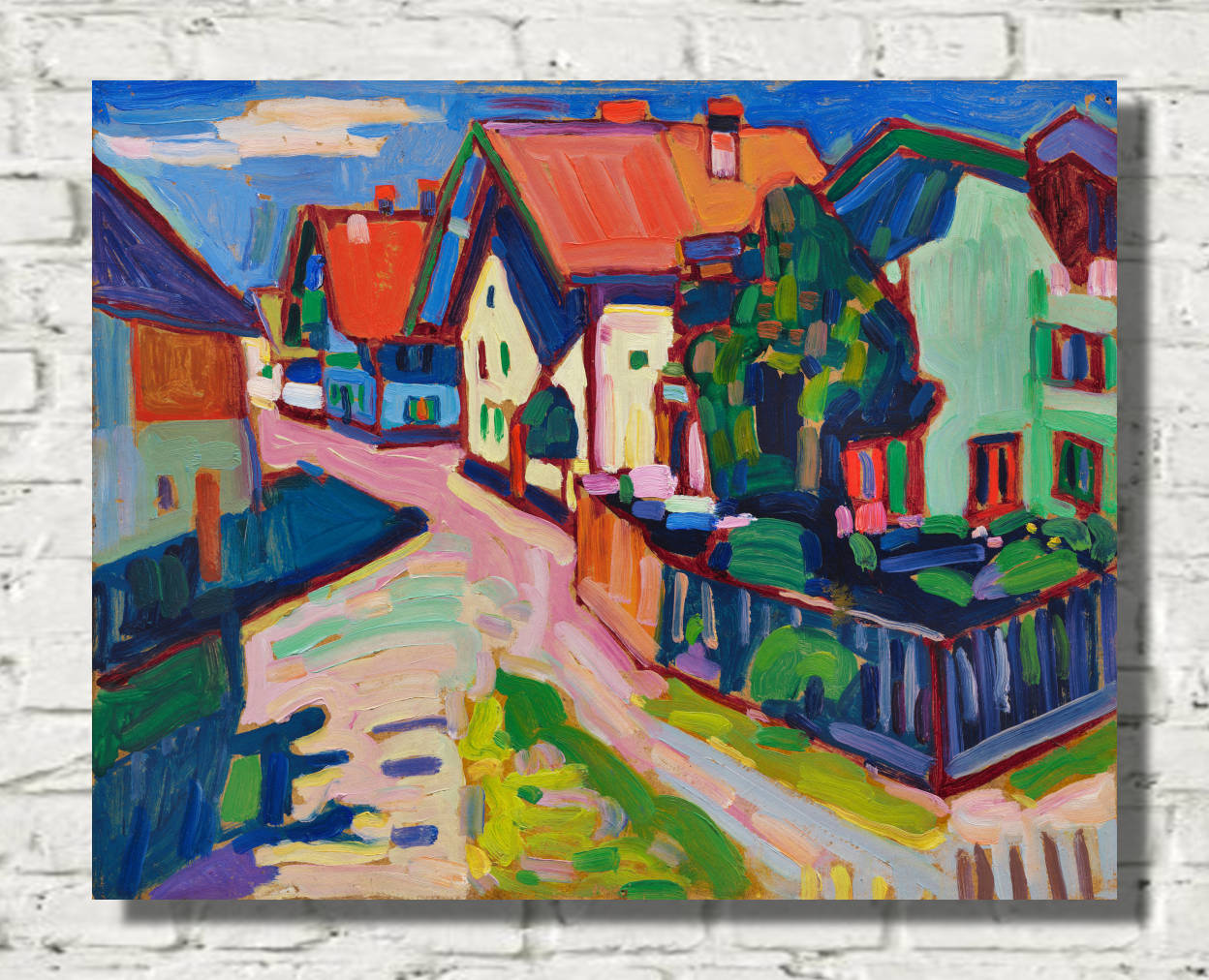
Colourful Abstract Art: Colour as the Subject
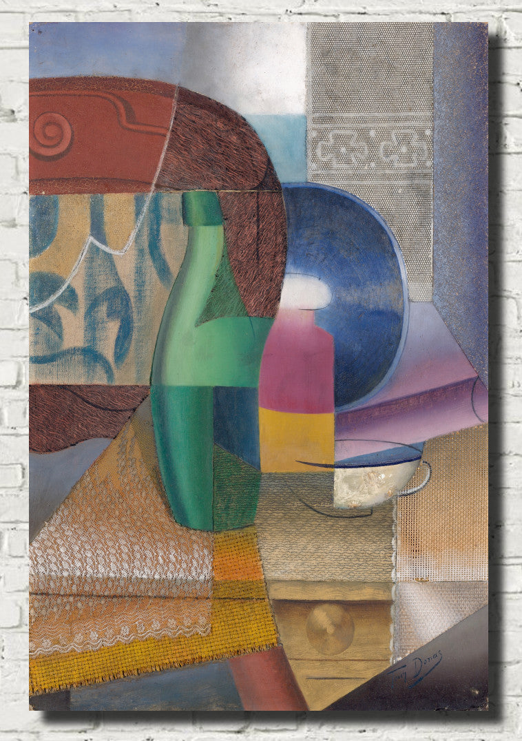
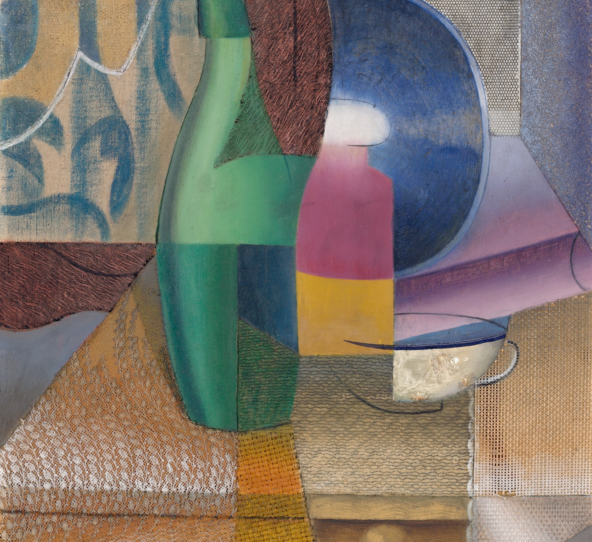
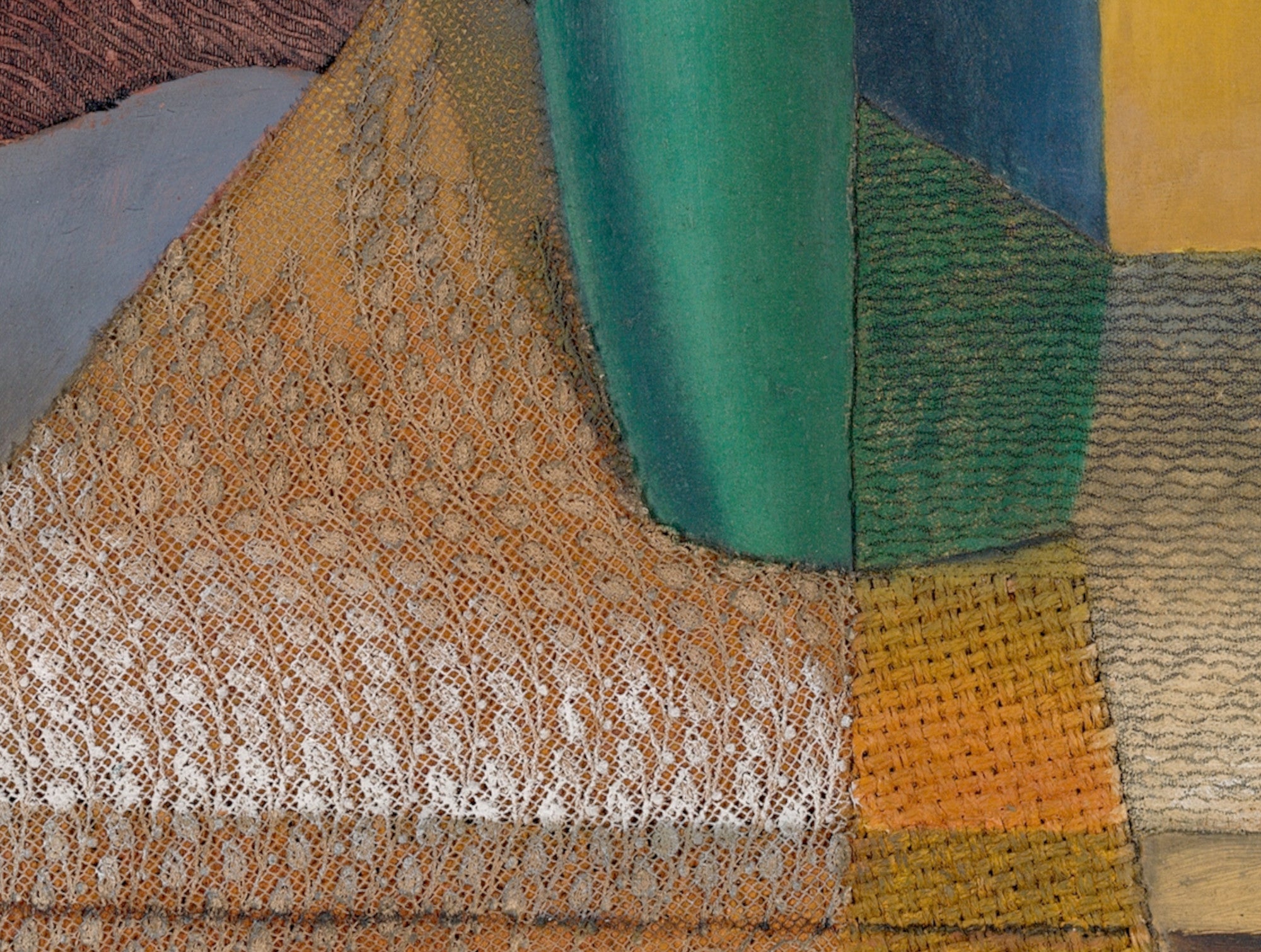
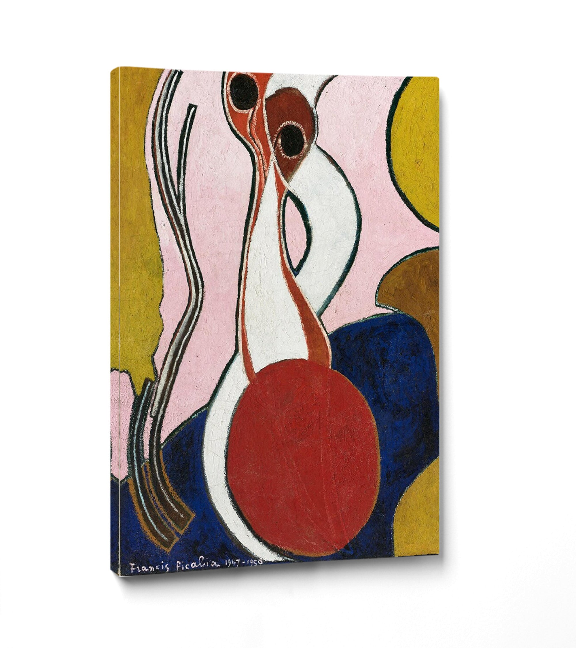
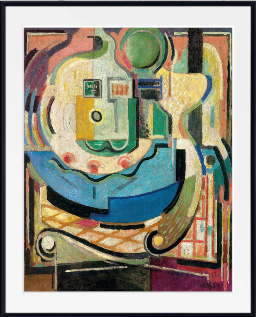
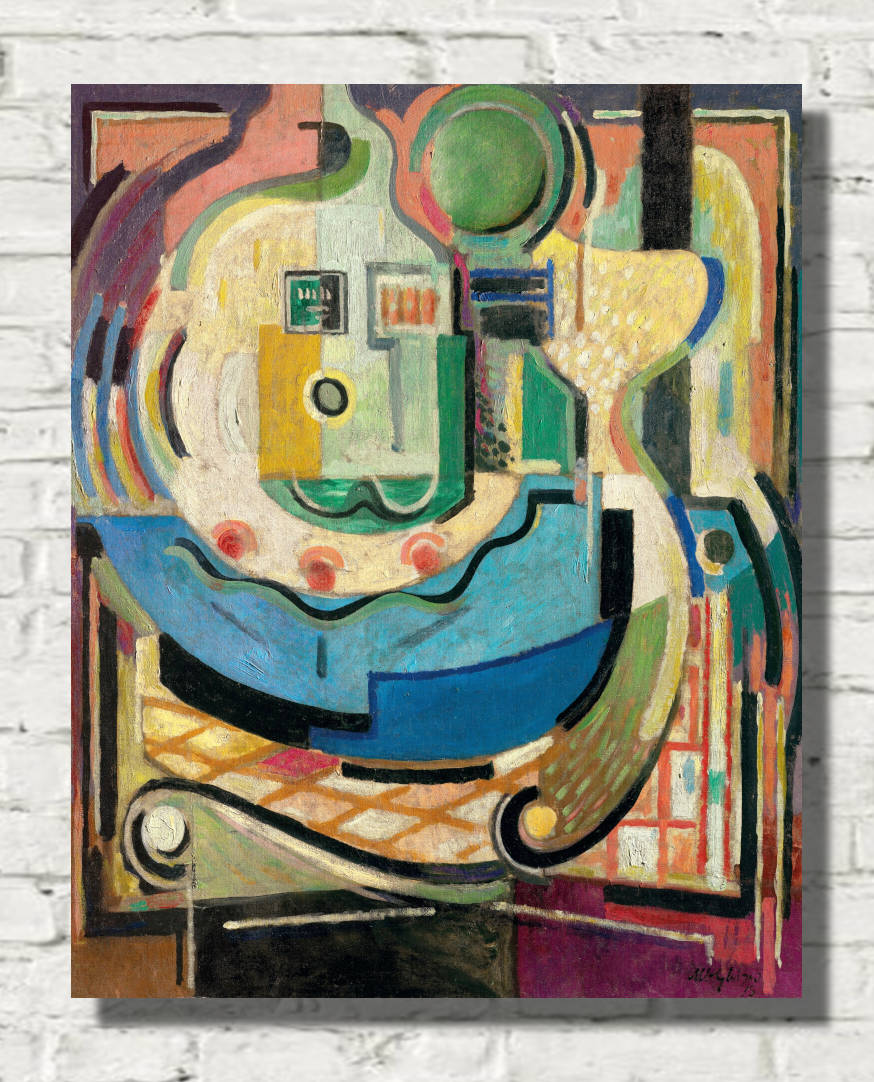
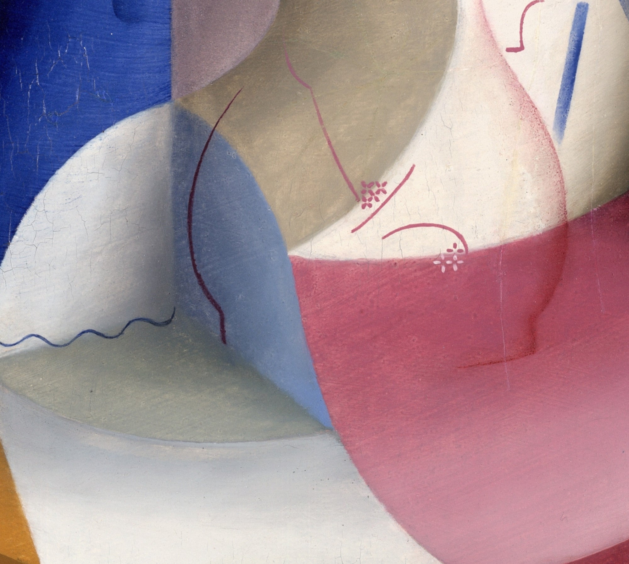
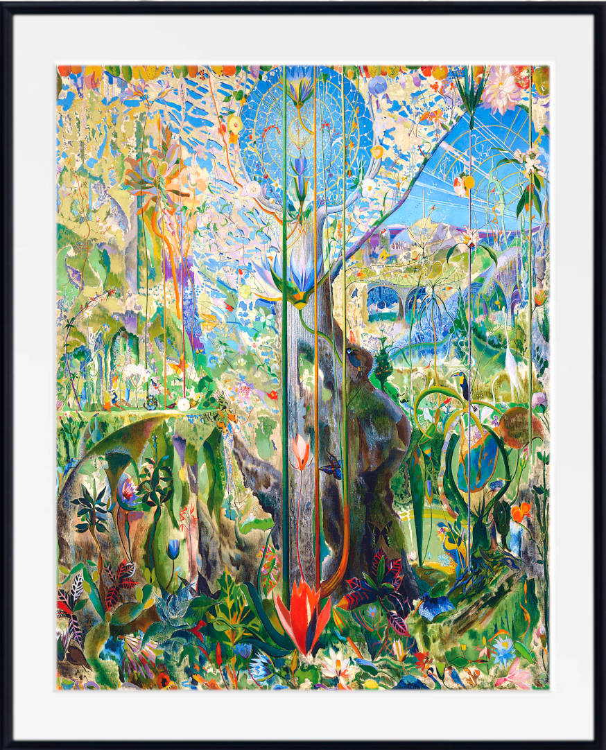
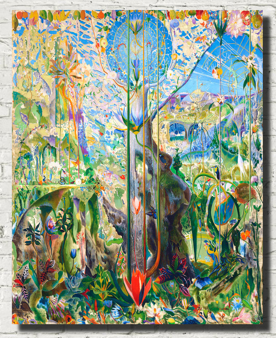
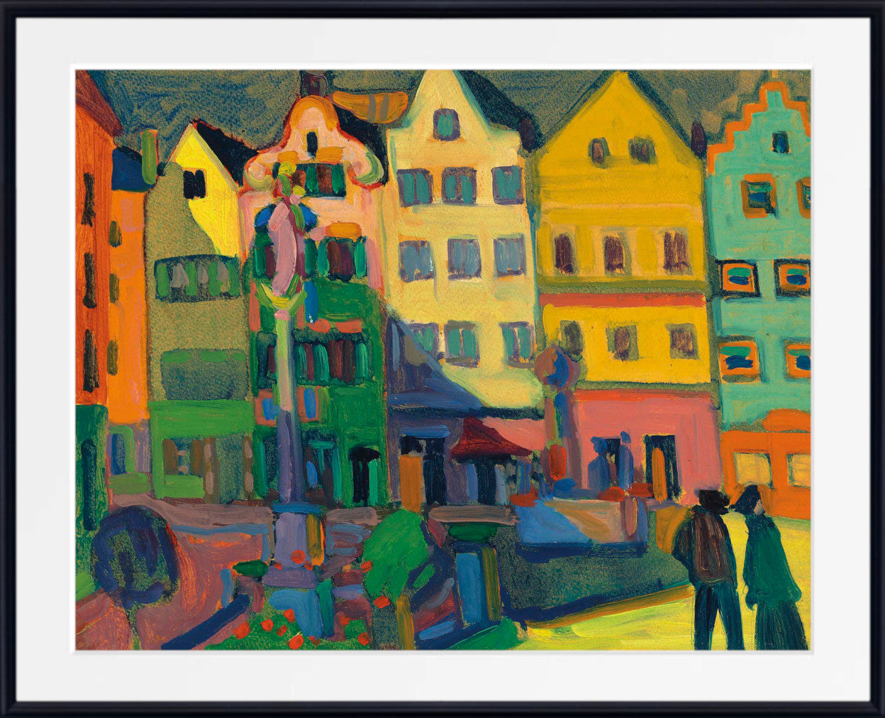
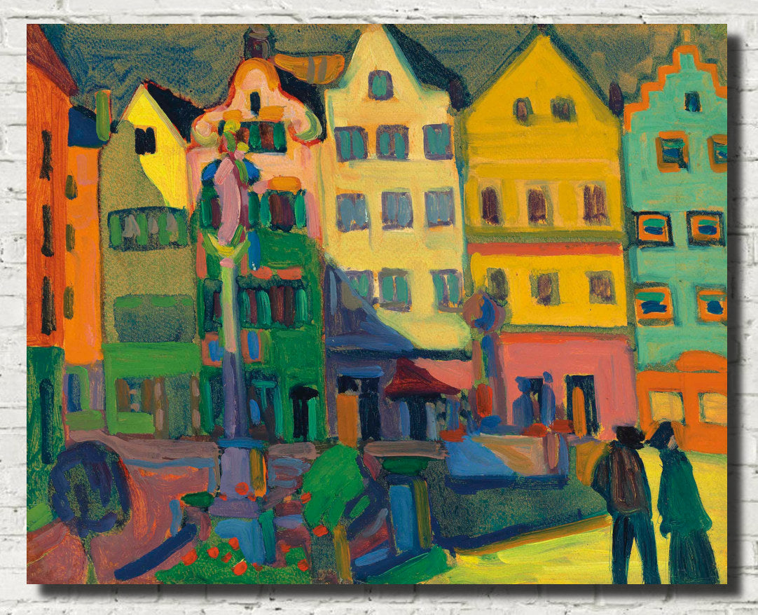
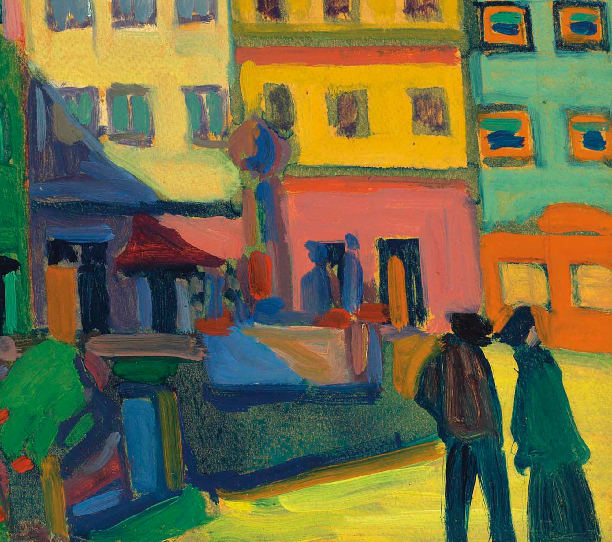
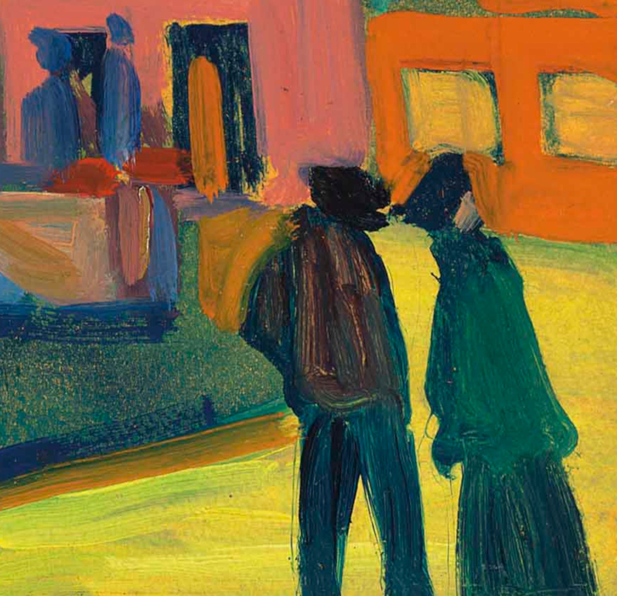
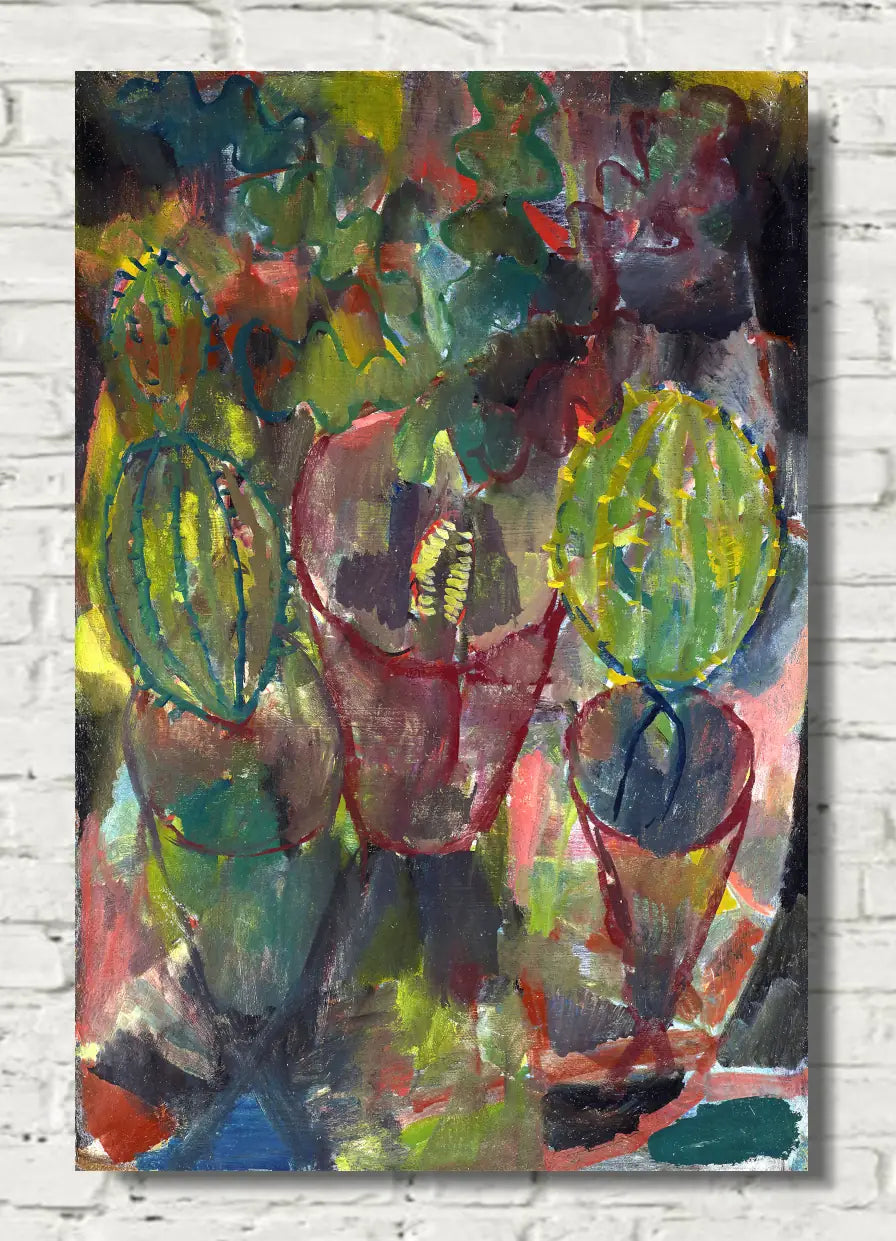
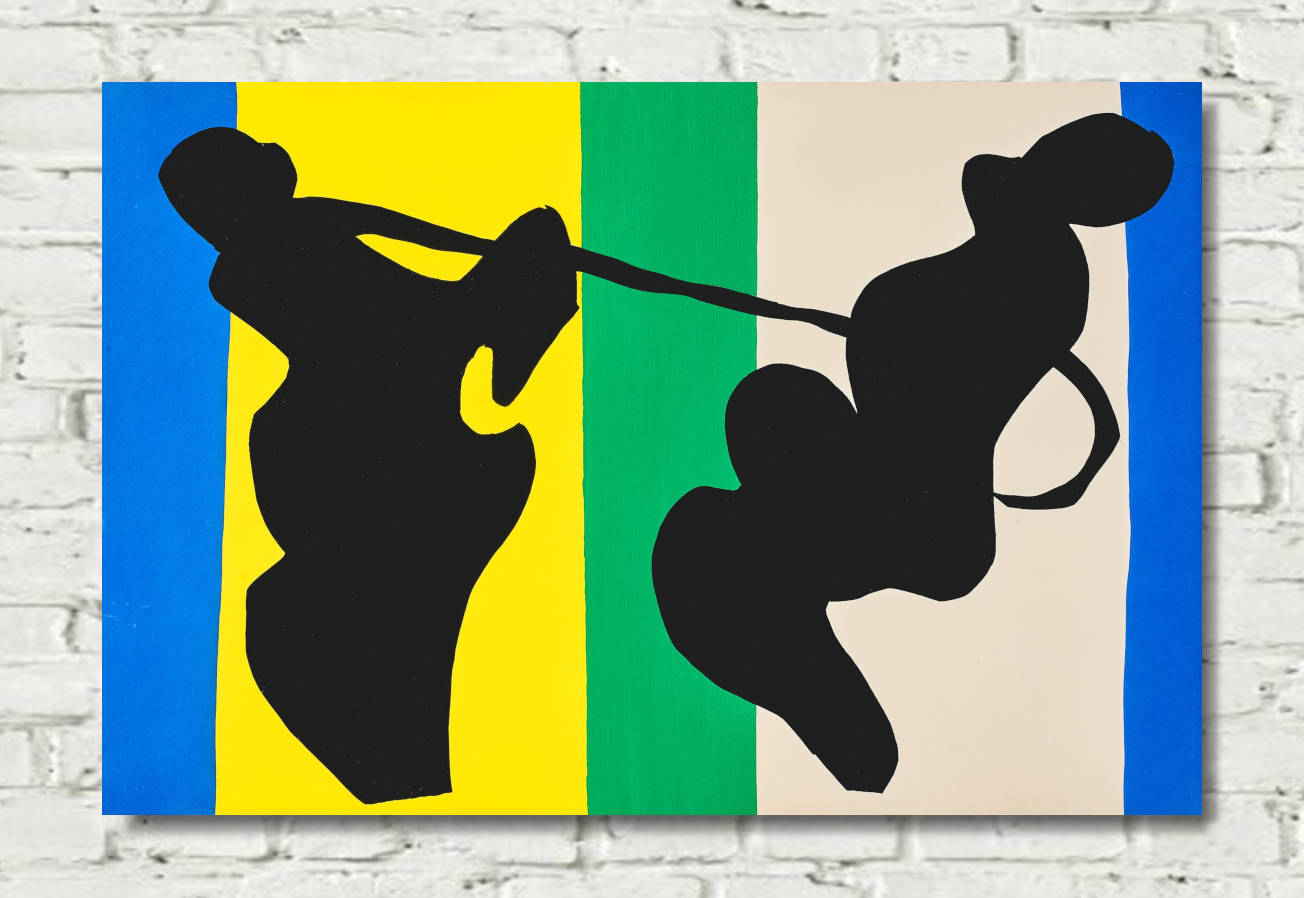
Abstract art gave artists the freedom to make colour itself one of the principal subjects of a painting.
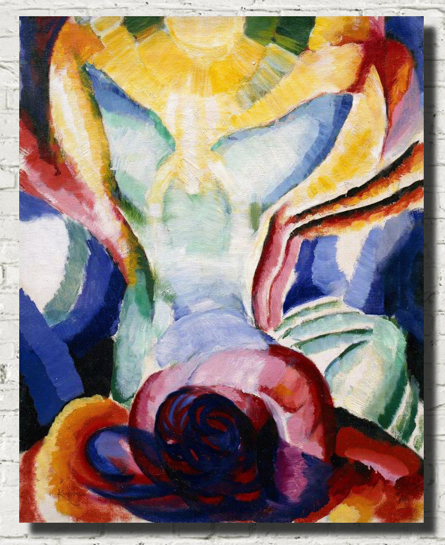
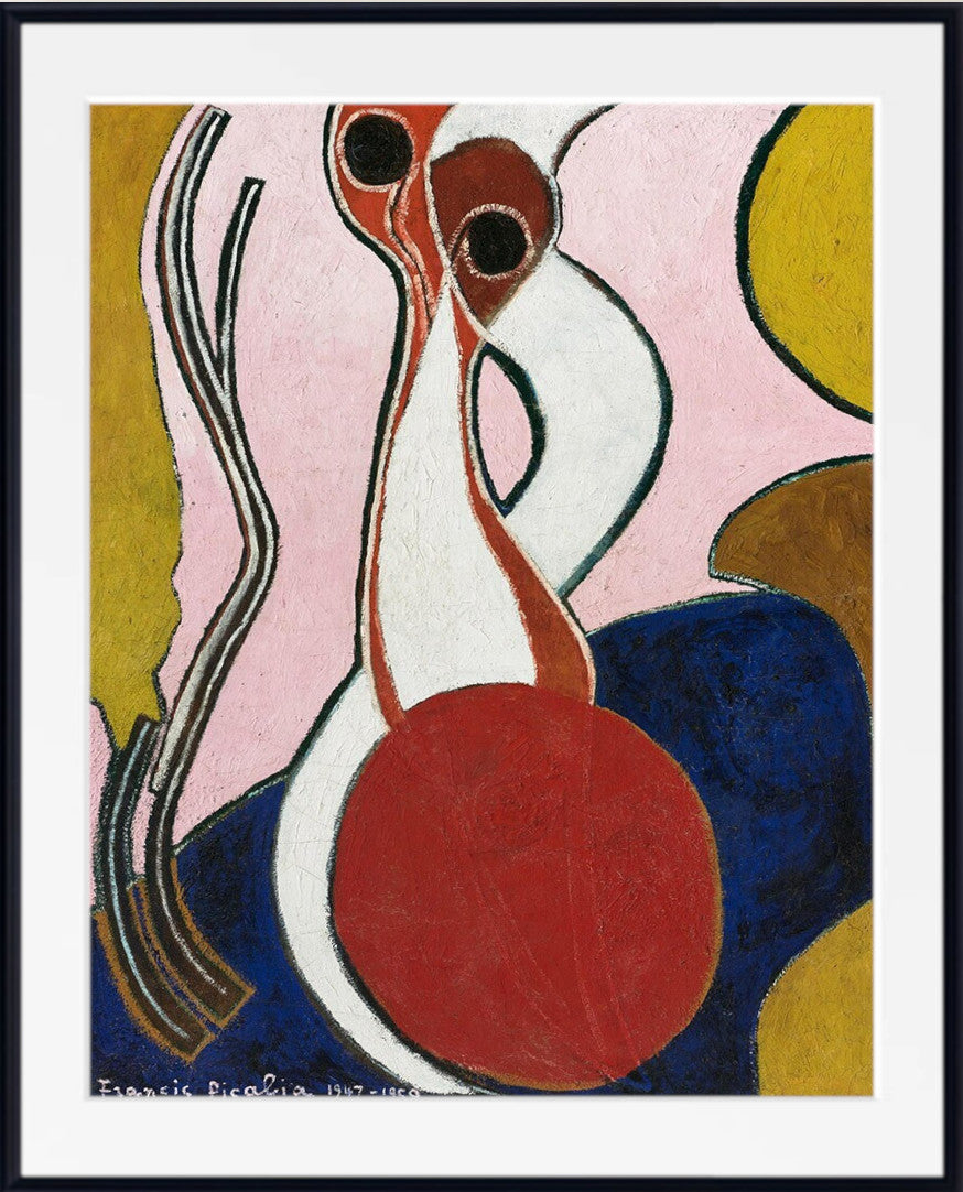
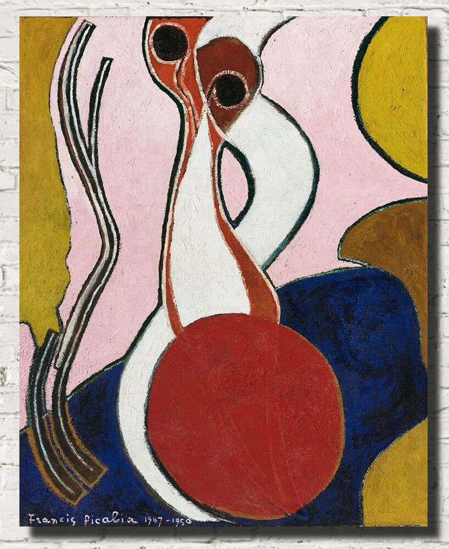
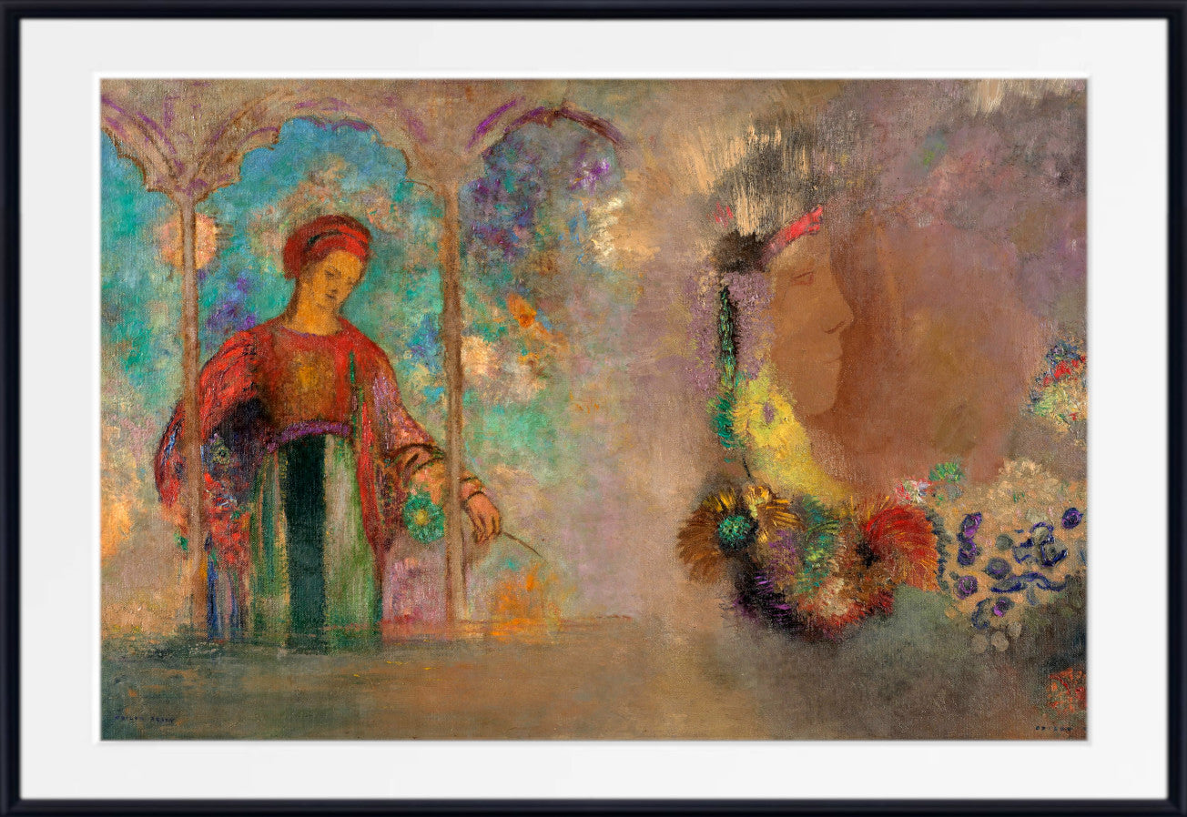
Rather than using red simply to describe a flower, blue to represent water or green to depict foliage, abstract artists could allow colours to act independently. A vivid red might create energy, a field of blue could suggest depth, and contrasting yellow, purple, green and orange shapes could establish rhythm and movement across the composition.
This liberation of colour was one of the great transformations of modern art. Artists no longer needed to reproduce the visible world faithfully. They could use line, shape, texture, geometry and colour to create works that communicate through visual relationships rather than conventional narrative.
Colourful abstract prints are especially versatile in interiors because a single artwork may contain many different hues. This allows the picture to connect with furniture, cushions, rugs, curtains, painted walls and decorative accessories throughout a room.
Wassily Kandinsky and the Emotional Power of Colour
Wassily Kandinsky is one of the central figures in the history of abstract art.
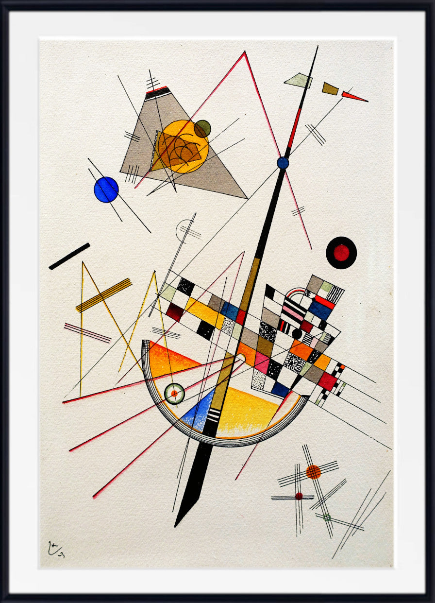
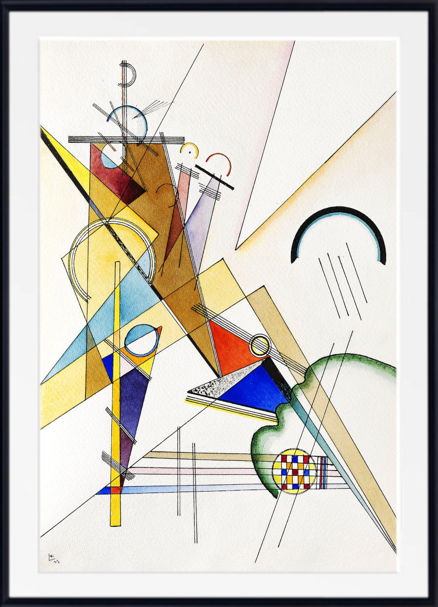
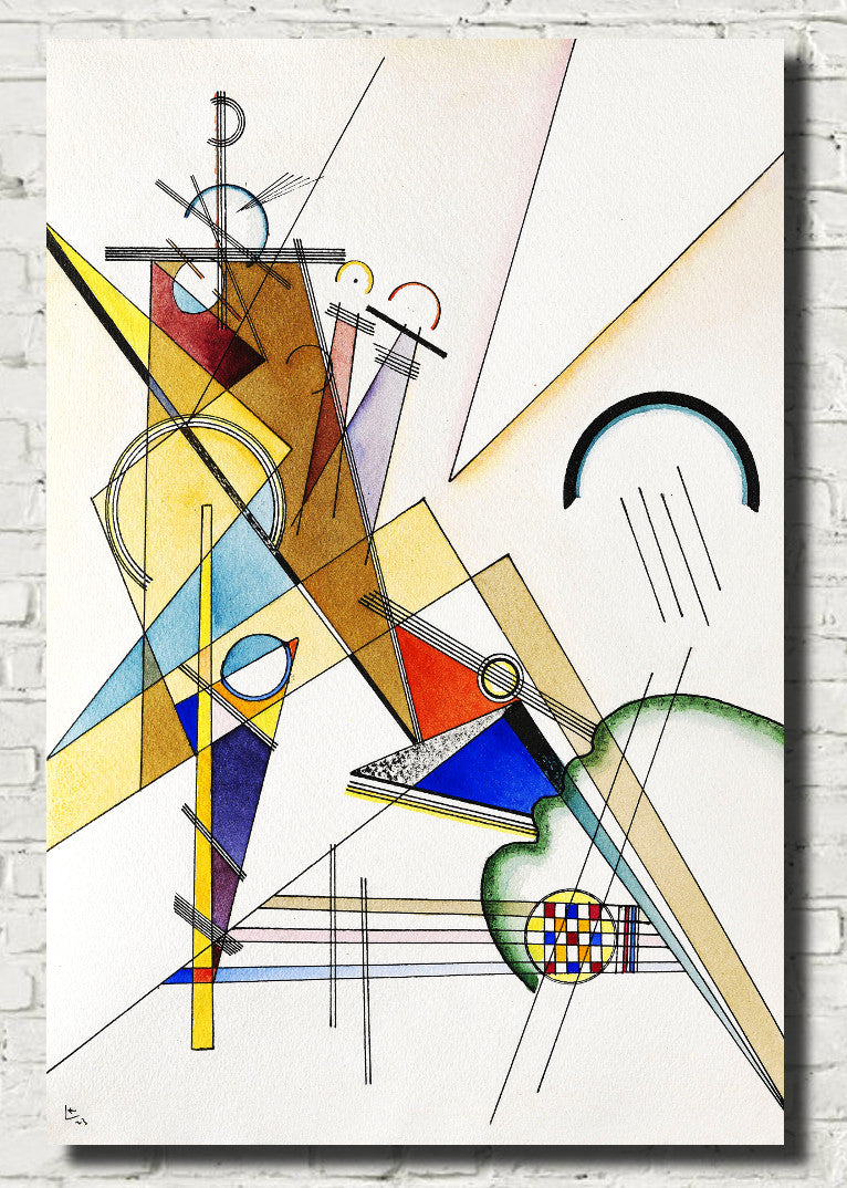
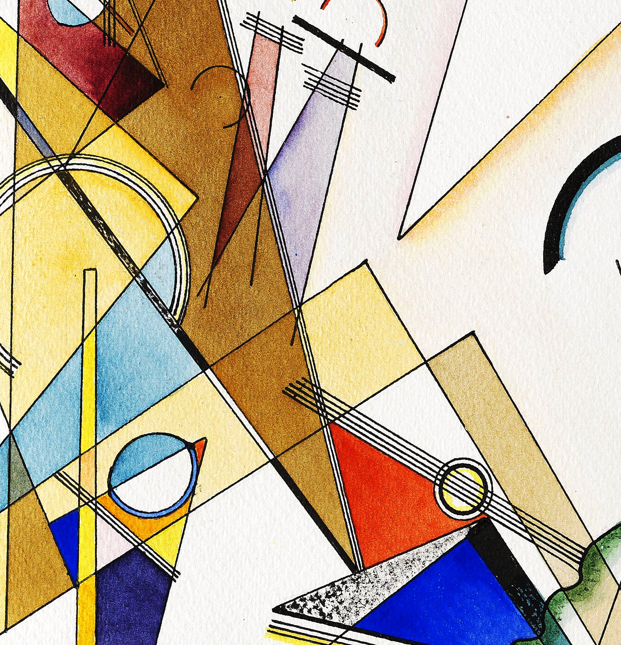
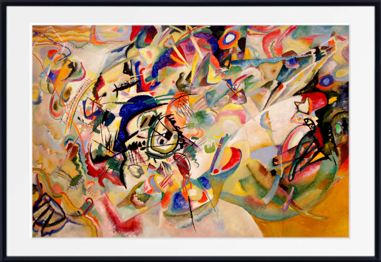
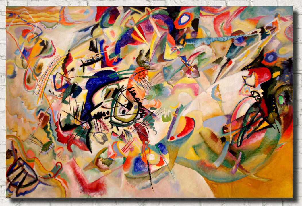
He believed that colours and forms could create emotional responses in ways comparable to music, and many of his most celebrated compositions combine brilliant colour with circles, lines, geometric forms and energetic movement.
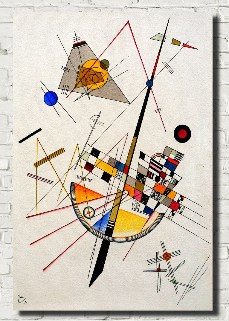
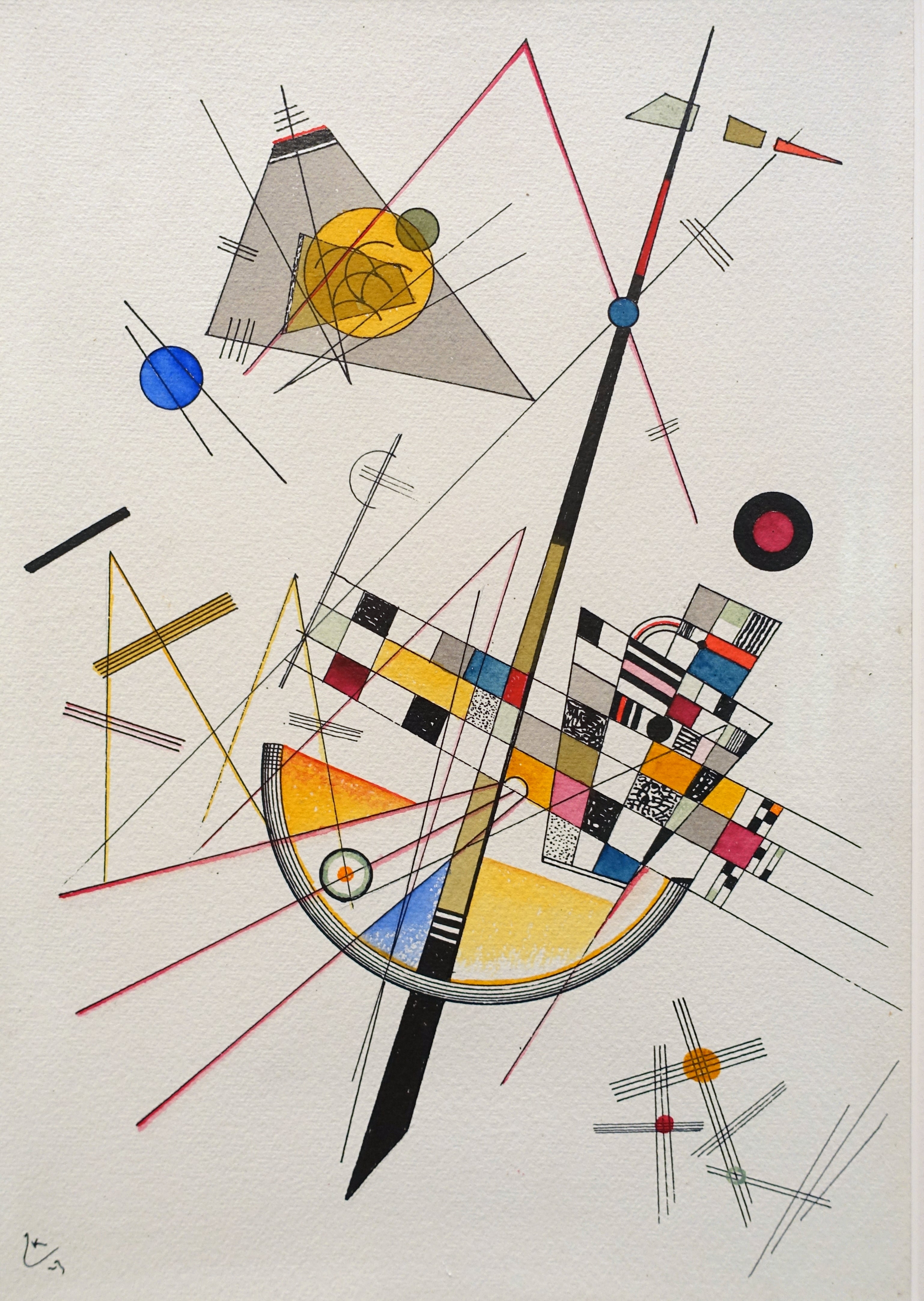
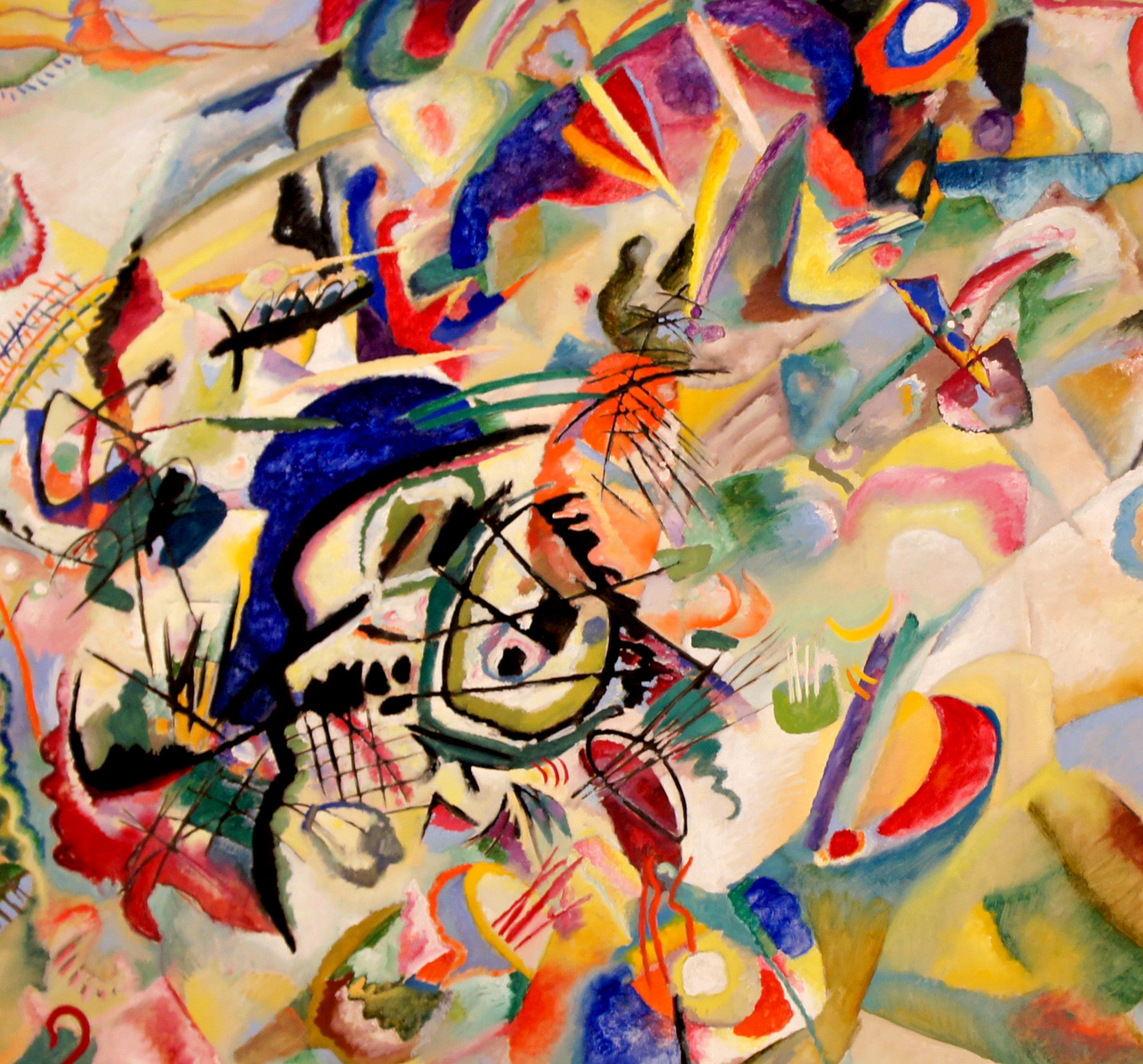
Kandinsky's colourful abstract works can feel musical, spontaneous and carefully organised at the same time. Red, blue, yellow, black, green and violet interact across the picture surface, creating tension, balance and rhythm without depending on a recognisable subject.
Colourful Kandinsky prints are especially effective as statement pieces in living rooms, dining rooms, offices and creative spaces.
Paul Klee: Playful Colour, Symbols and Imagination
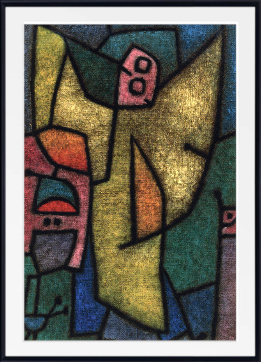
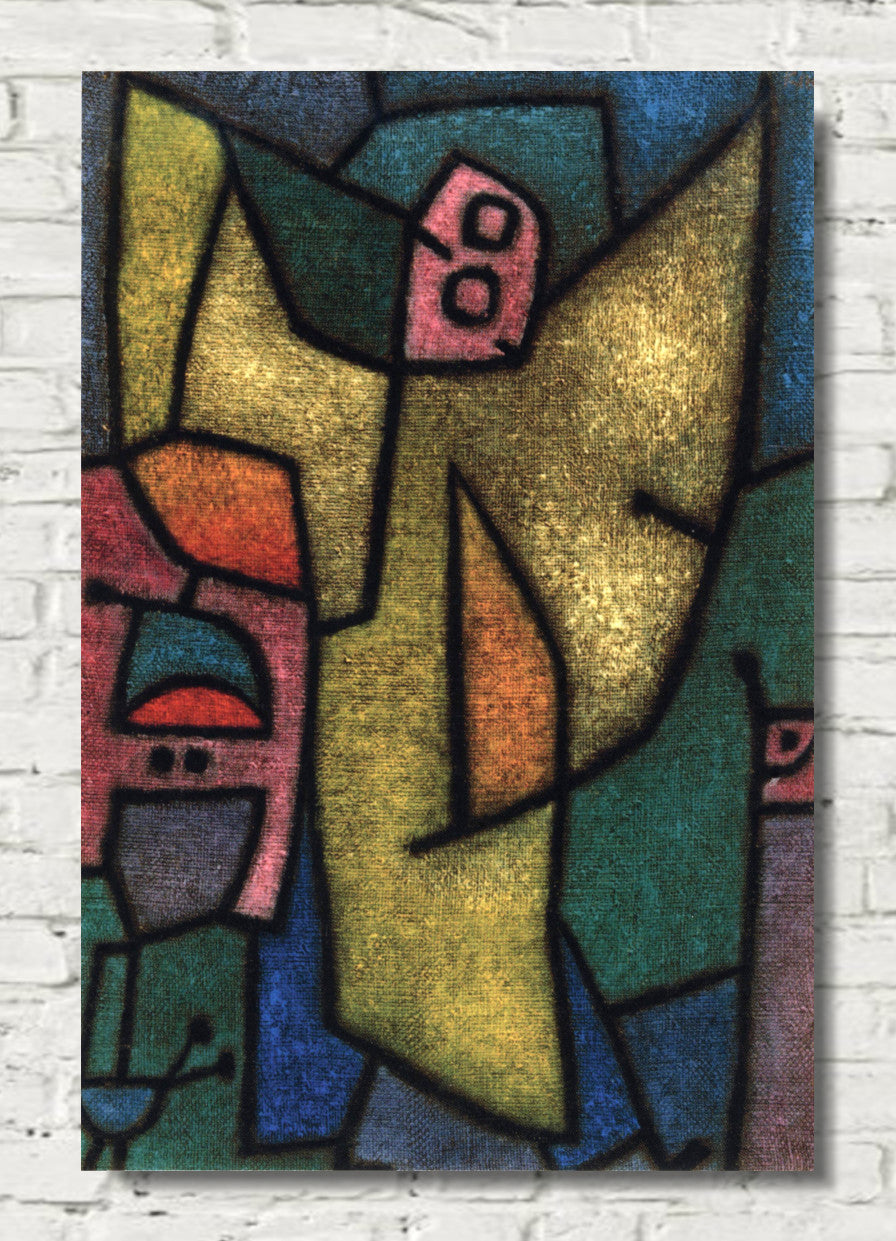
Paul Klee developed one of the most distinctive visual languages in twentieth-century art.
His paintings combine abstraction, drawing, symbols, geometry and subtle colour relationships, moving easily between playful invention and poetic mystery.
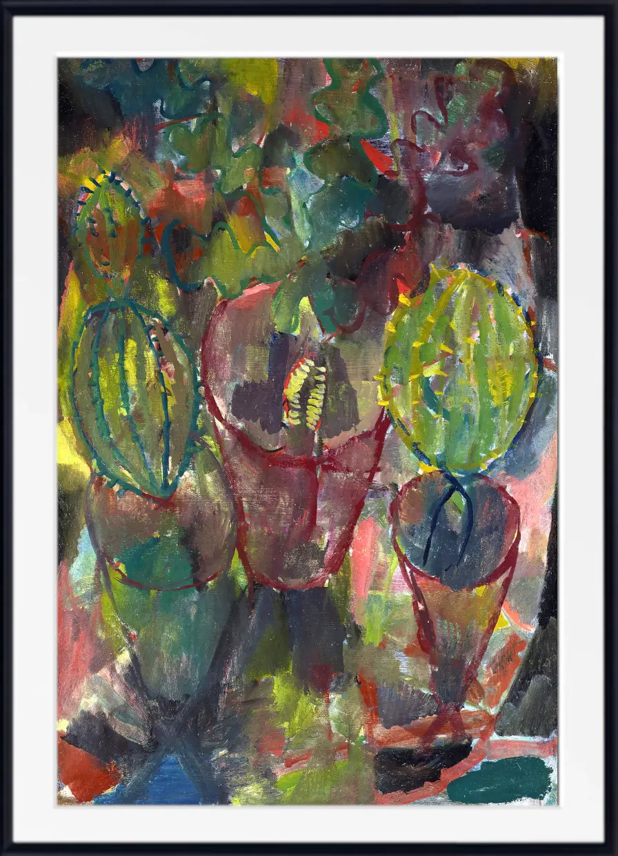
Some Klee works use delicate washes and restrained colour, while others are built from vivid grids, geometric shapes and contrasting tones. Reds, oranges, blues, greens and yellows can appear side by side in carefully balanced arrangements that suggest landscapes, music, architecture or imagined worlds without describing them literally.
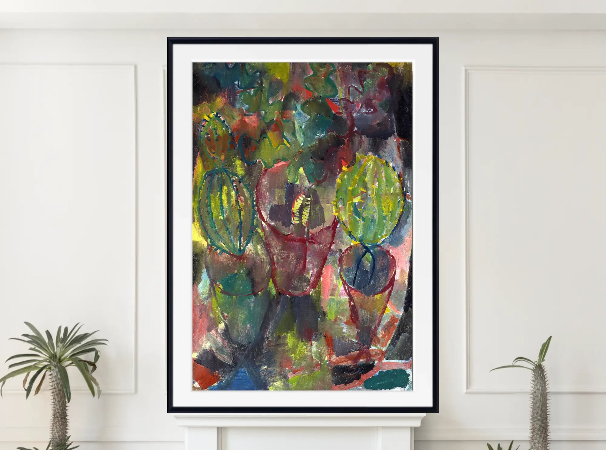
Paul Klee prints are a particularly good choice for bedrooms, studies, reading areas and creative interiors because they can introduce colour without necessarily dominating the room.
Robert Delaunay and Rhythmic Colour
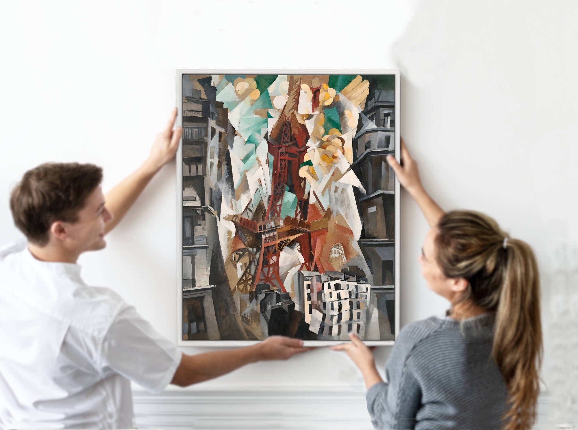
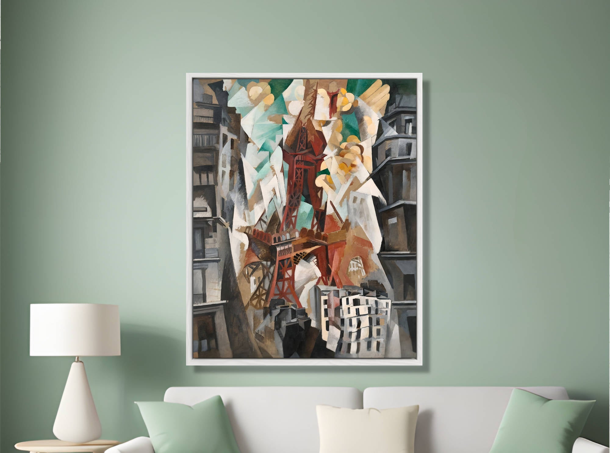
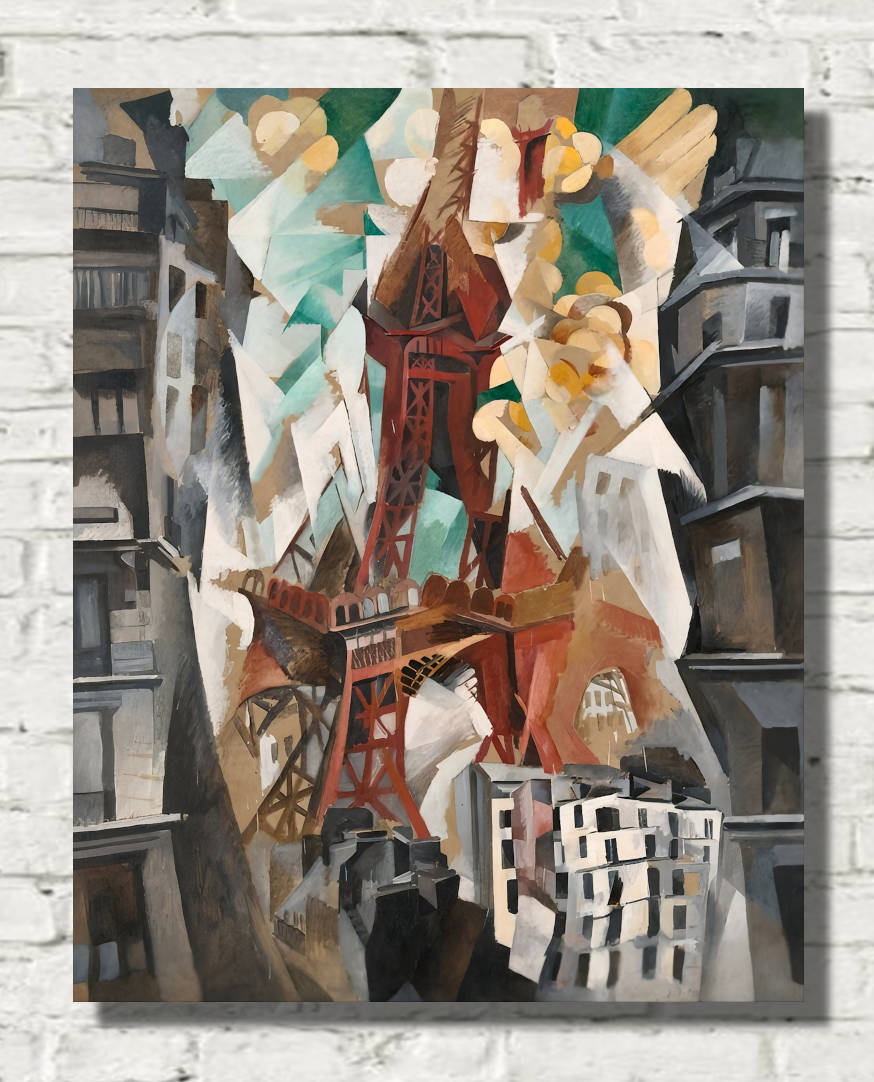
Robert Delaunay made colour central to his artistic practice.
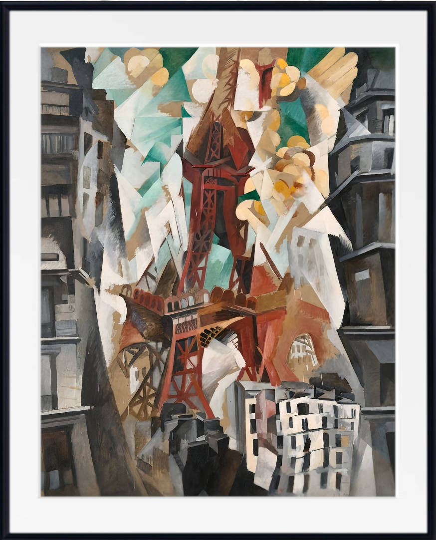
His abstract compositions often use circles, arcs, repeated forms and vivid contrasts to create a sense of movement and optical energy.
Rather than treating colour as decoration applied to a finished composition, Delaunay allowed relationships between colours to generate the structure of the artwork itself.
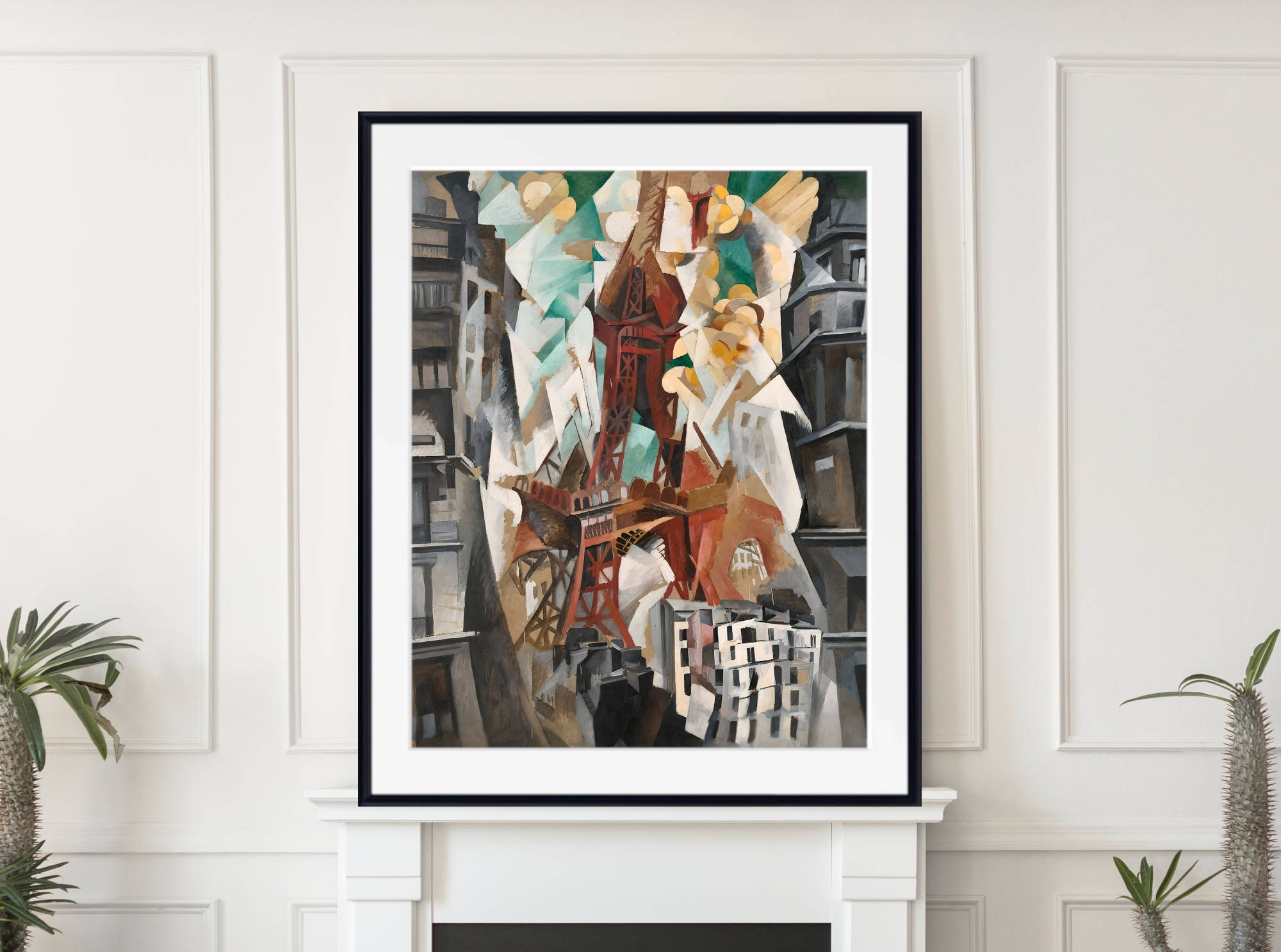
His colourful abstract prints are particularly effective in contemporary rooms where strong colour and geometric form can create a confident focal point. They also work well in creative offices, dining spaces and modern living rooms.
Hilma af Klint: Colour, Geometry and Spiritual Abstraction
Hilma af Klint created visionary abstract paintings built from circles, spirals, geometric forms, botanical motifs and symbolic colour.
Pink, blue, yellow, orange, green and violet appear throughout her compositions, sometimes in gentle pastel relationships and elsewhere in stronger contrasts.
Her art can feel monumental and mysterious while retaining a remarkable decorative clarity.
Hilma af Klint prints are especially suited to interiors where you want colour combined with balance and contemplative visual interest. Softer works can complement bedrooms and reading spaces, while larger geometric compositions can create a striking feature wall.
František Kupka and the Movement of Colour
František Kupka was another pioneer of abstraction who explored colour, rhythm and movement.
His works range from carefully structured geometric compositions to fluid arrangements of curving forms and vivid colour.
Kupka was fascinated by the way colour could create its own visual energy. His paintings often move beyond any clearly identifiable subject, using bands, circles and overlapping forms to generate movement across the surface.
His colourful abstract works are particularly well suited to contemporary interiors, where their combination of modernist history and strong visual impact can make them effective statement pieces.
How to Choose Colourful Abstract Art for Your Home
Start by deciding how much visual impact you want the artwork to create.
A large, strongly coloured abstract print can become the dominant focal point of a room, while a smaller or more softly coloured composition can introduce interest without overwhelming the space.
Look closely at the colours already present in your interior. You do not need to match every shade exactly. Instead, choose an artwork containing one or two colours that echo existing furnishings, together with contrasting tones that add freshness and energy.
A multicoloured abstract print can be particularly useful in a neutral room because it introduces several colours at once. White, cream, beige and grey walls provide a quiet background against which brighter artwork can stand out clearly.
Colourful Abstract Prints for Living Rooms
The living room is one of the best places for colourful abstract wall art because it often contains the largest uninterrupted walls and the widest range of furnishings and decorative colours.
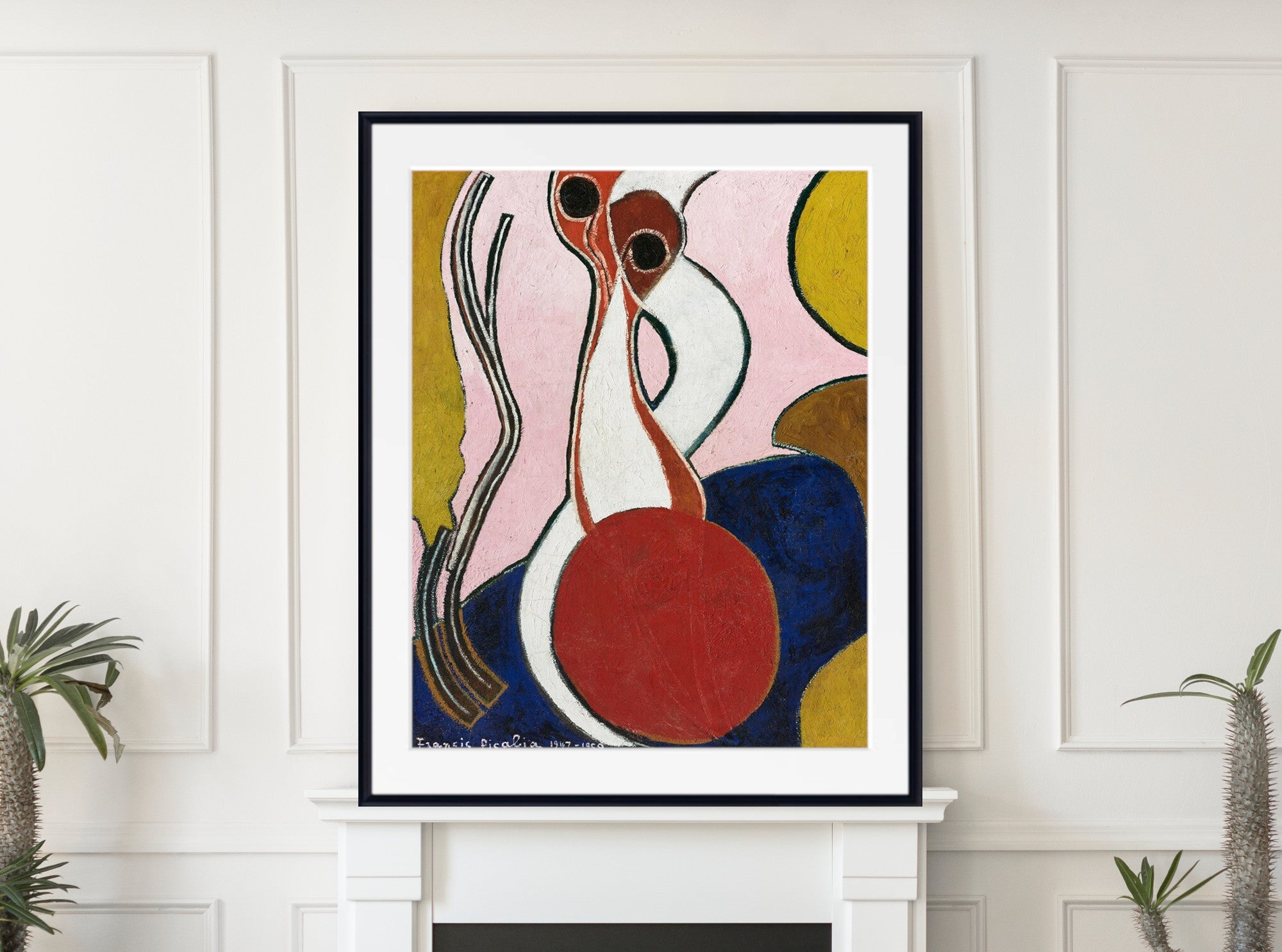
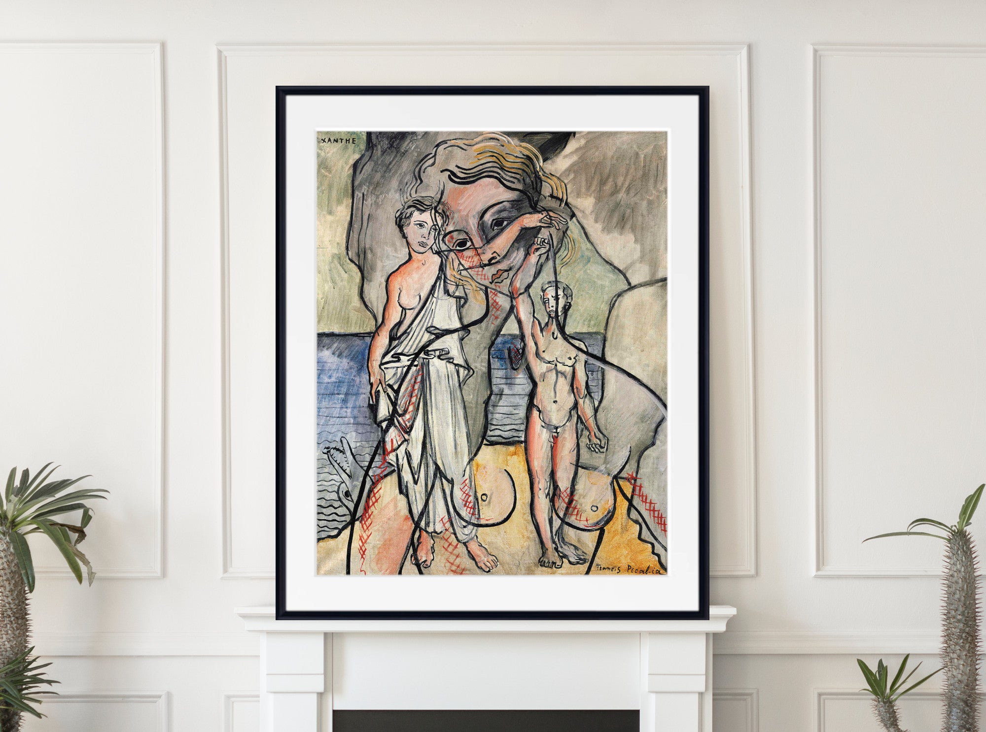
A large colourful abstract print above a sofa can anchor the whole room.
Kandinsky and Delaunay prints can create strong energy and movement, while Klee and Hilma af Klint offer compositions that may feel softer, more poetic or contemplative.
The right choice depends on whether you want the artwork to energise the room or add quieter layers of colour.
Colourful Abstract Prints for Bedrooms
Colourful abstract art can work beautifully in bedrooms, although the character of the composition matters.
Softer pastels, balanced geometric forms and less visually crowded works can add colour while maintaining a restful atmosphere.
Hilma af Klint and Paul Klee are particularly good starting points for bedrooms because many of their works combine colour with balance, rhythm and areas of visual breathing space.
If you prefer stronger colour, use one large artwork as the main decorative feature and keep surrounding textiles and wall colours comparatively simple.
Colourful Abstract Wall Art for Dining Rooms and Offices
Dining rooms can accommodate stronger colour particularly well. A vivid abstract print can create warmth, conversation and visual energy, especially when displayed above a sideboard or on the main wall facing the dining table.
Offices and creative workspaces also suit colourful abstract art. Geometric forms, bright contrasts and rhythmic compositions can give a workspace personality without introducing a literal subject that demands constant attention.
For professional interiors, structured works by Kandinsky, Delaunay, Klee or Kupka can combine historical importance with strong visual appeal.
Bold, Bright and Multicoloured Abstract Art
Some abstract artworks are dominated by one or two strong colours, while others bring together almost the entire spectrum.
These works can feel joyful, energetic and optimistic, but colourful does not necessarily mean chaotic. Many artists use careful geometry, repeated patterns or controlled relationships between colours to create balance.
For a broader selection of vibrant artwork across landscapes, portraits, Impressionism, Fauvism, still life and other subjects, explore our Colourful Wall Art collection.
Geometric Colourful Abstract Prints
Geometric abstraction uses circles, squares, rectangles, lines, arcs and other constructed forms to organise colour.
These works can feel precise and architectural or lively and rhythmic depending on the artist.
Robert Delaunay used circular forms and colour contrasts to suggest movement, while Piet Mondrian reduced composition to carefully balanced lines, spaces and primary colours. Kandinsky combined geometry with freer forms, creating works that often appear to move across the picture surface.
For more artwork centred on structure, geometry and constructed form, explore our Geometric Abstract Prints.
What Colours Work with Colourful Abstract Art?
Colourful abstract art is surprisingly easy to style because the artwork itself often contains several possible starting points.
White and off-white walls allow vivid colours to stand out clearly, while beige and warm neutrals soften brighter compositions.
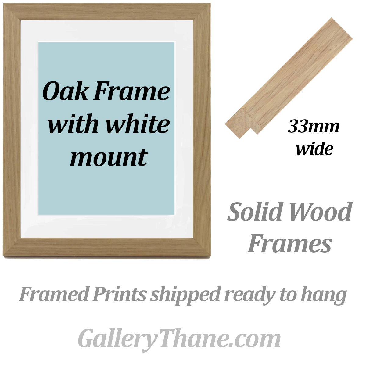
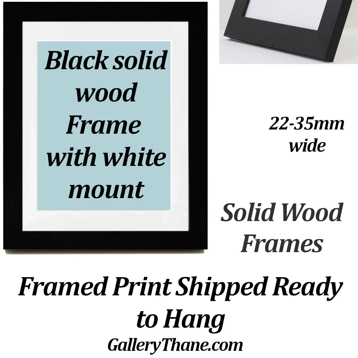
Grey can create a contemporary backdrop, while black frames add structure and definition. Natural wood introduces warmth and works particularly well with colourful modern art because it balances vivid colour with organic texture.
You can also select one secondary colour from the artwork and repeat it elsewhere in the room through cushions, ceramics, rugs or smaller decorative details.
Choosing the Right Size Colourful Abstract Print
Large colourful abstract prints work especially well above sofas, beds, fireplaces and sideboards, where they can establish the main visual focus of the room.
Medium-sized prints are useful above consoles, desks and smaller furniture, while groups of two or three abstract works can create a coordinated display.
Smaller prints are ideal for gallery walls, particularly when combined around a shared colour palette, artist or artistic movement.
Fine Art Prints, Framed Prints and Canvas Panels
GalleryThane colourful abstract artwork is available across a range of formats and sizes.
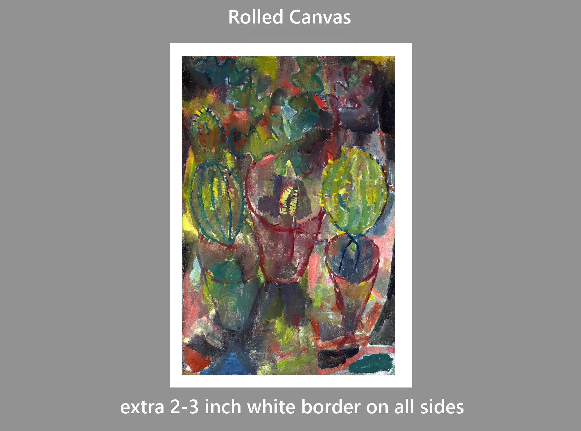
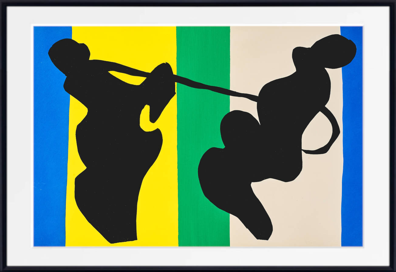
Choose an unframed fine art paper print if you want the freedom to select your own frame, a framed print for a complete gallery-style presentation, or a canvas panel for a clean, ready-to-hang finish.
Our prints, frames and canvas panels are handmade in our Nottinghamshire workshop using carefully selected fine art papers, UV-stabilised pigment inks and quality framing materials.
Explore Related Abstract Art
Continue exploring abstract art by colour:
Blue Abstract Prints
Green Abstract Prints
Beige Abstract Prints
Pink Abstract Prints
Black Abstract Prints
For a broader selection, browse Abstract Art Prints.
Frequently Asked Questions
What is colourful abstract art?
Colourful abstract art uses combinations of colour, shape, line, texture, geometry and gesture without necessarily representing the visible world realistically. Some works are highly geometric and structured, while others are loose, expressive and spontaneous.
Which artists are famous for colourful abstract art?
Major artists associated with colourful abstraction include Wassily Kandinsky, Paul Klee, Robert Delaunay, Hilma af Klint and František Kupka. Each developed a distinctive approach to colour, form and visual rhythm.
What colours go with colourful abstract prints?
Colourful abstract prints work particularly well with white, cream, beige, grey, black and natural wood. You can also choose one or two colours from the artwork and repeat them elsewhere in the room through cushions, rugs or accessories.
Are colourful abstract prints suitable for living rooms?
Yes. Colourful abstract art is especially effective in living rooms because it can create a strong focal point above a sofa, fireplace or sideboard. Large multicoloured works are particularly useful in neutral interiors that need additional energy and personality.
Can colourful abstract art work in a bedroom?
Yes. For bedrooms, choose compositions with balanced forms, softer colours or generous areas of visual space. Paul Klee and Hilma af Klint are especially useful starting points for colourful artwork with a calmer atmosphere.
What is the difference between colourful abstract art and colourful wall art?
Colourful abstract art focuses specifically on non-representational or partly abstract compositions using colour, line, shape and form. Colourful wall art is a broader category that can also include landscapes, portraits, floral paintings, seascapes, still lifes and figurative art.
Should I choose a framed colourful abstract print or a canvas panel?
Choose a framed print for a structured, gallery-style presentation that clearly defines the artwork. Choose a canvas panel for a cleaner, frameless appearance that can work especially well with larger modern abstract compositions.
What size colourful abstract print should I choose?
Large prints work well above sofas, beds and sideboards, while medium-sized works suit smaller walls and furniture. Groups of smaller abstract prints can be combined into gallery walls, particularly when they share a related colour palette or artistic style.