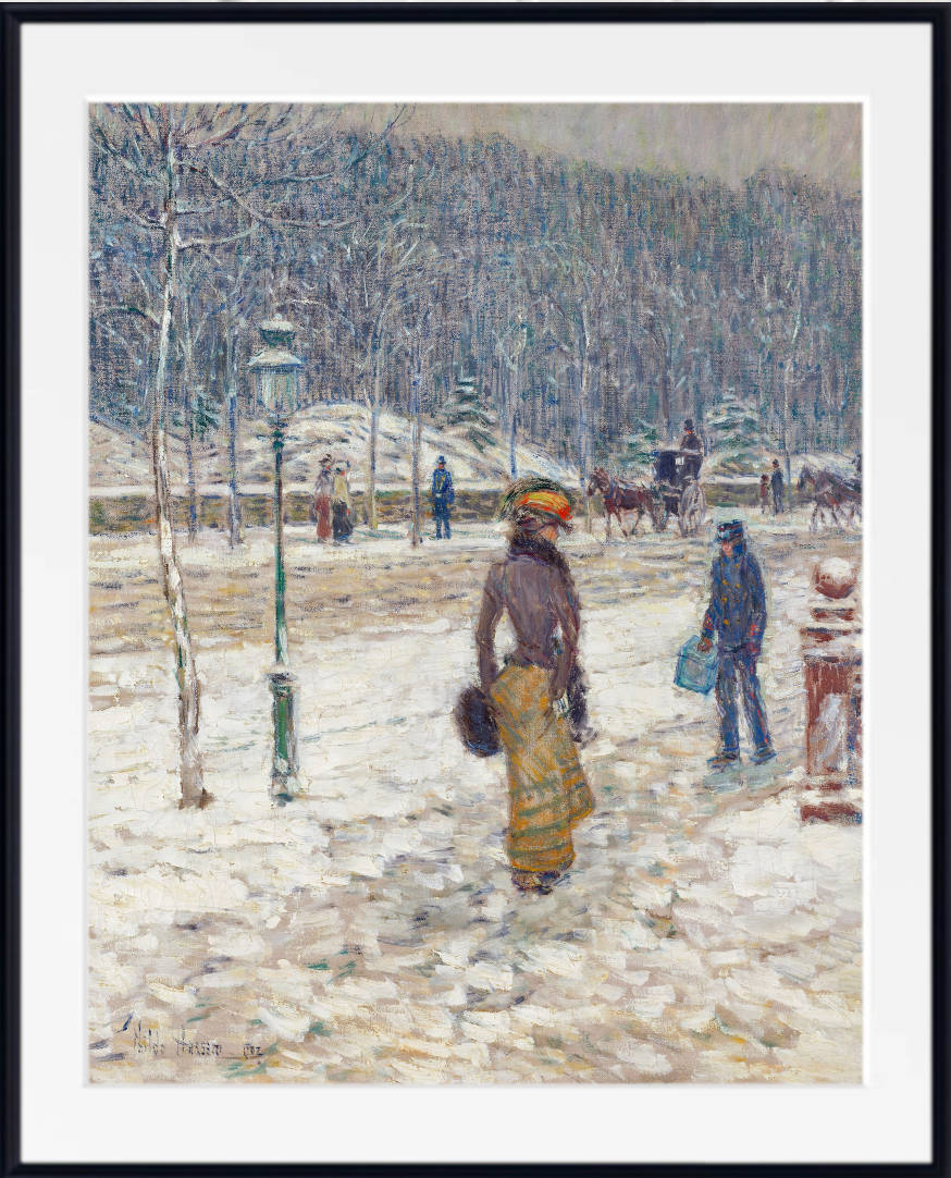
Office wall art can transform a functional workspace into a room with character, focus and a clear sense of purpose. The right artwork adds visual interest without creating unnecessary distraction, reflects the work or interests of the person using the room, and creates a more considered background for meetings and video calls.
Professional office art does not have to mean anonymous corporate decoration or generic motivational slogans. Abstract compositions, architectural paintings, maps, patent illustrations, botanical studies, Japanese prints, city views and atmospheric landscapes can all create a workspace that feels intelligent, personal and professionally arranged.
This guide explains how to choose wall art for a home office, private study or professional workspace, including suitable subjects, colours, sizes, arrangements and frames. For a ready-curated selection, explore the Office Wall Art Prints collection.

What Makes Office Wall Art Effective?
There is no single artistic style that belongs in every office. A writer, architect, engineer, designer and financial adviser may each want something different from the walls surrounding their workspace. The most successful office wall decor usually balances four considerations: visual energy, professional context, personal relevance and the proportions of the room.
Visual interest without constant distraction
Some artworks are quiet and spacious, while others are colourful, complex and energetic. Neither approach is automatically better. The appropriate level of visual activity depends on the work being carried out and the atmosphere you want to create.
A geometric abstract may bring energy to a creative studio. A misty landscape, historic map or restrained architectural interior may feel more comfortable in a room used for reading, analysis or concentrated writing. The aim is not to eliminate visual interest, but to choose art that rewards attention without demanding it throughout the working day.
A connection with the person or organisation
Office art becomes more memorable when it has a reason to be there. A city map may represent the place where a company began. A patent illustration may relate to a technical profession. A coastal painting might recall a familiar location, while an abstract work may reflect a preference for colour, rhythm or modern design.
This type of personal or professional connection generally creates a more convincing interior than artwork selected simply because it is labelled as office decor.
Suitability for the people who use the room
Artwork in a private home office can be highly individual. Art in a reception area, consulting room or client-facing office usually needs to work for a wider audience. Consider how the image may be understood by visitors as well as how it appeals to you.
Strong, unusual or challenging imagery can be excellent in the right setting, but quieter abstracts, maps, landscapes, botanical studies and architectural subjects are generally more adaptable where many different people will see them.
Scale in relation to furniture
Even a well-chosen print can look ineffective when it is much too small for the desk, shelving or seating beneath it. Measure the available wall and consider the artwork in relation to the furniture rather than treating the wall as an isolated rectangle.
Choose Office Art According to How You Work
Before choosing a subject or colour, think about the type of work carried out in the room. This provides a more useful starting point than following a temporary decorating trend.
Concentrated and Analytical Work
Geometric abstraction, maps, monochrome architecture, technical illustrations and quiet landscapes can add structure without making the room feel crowded.
Creative Work
Colourful abstracts, modern cityscapes, Japanese prints and exhibition posters can bring movement and visual energy to design studios and creative offices.
Reading and Writing
Landscapes, historic maps, poetry prints, botanical plates and quiet interiors create an atmosphere suited to research, study and sustained reading.
Technical Work
Patent drawings, engineering subjects, transport plans, architecture and scientific imagery can connect the display directly with a specialist profession.
These are starting points rather than fixed rules. A calm landscape can work in a design studio, while an energetic abstract may be exactly what a writer wants to see above a desk. The strongest choice is one that feels appropriate to both the room and the person using it.
The Best Office Wall Art Subjects
The GalleryThane office collection combines fine art with maps, modernism, technical imagery, architecture and natural-history illustration. The following subjects are particularly well suited to home offices, studies and professional rooms.

1. Abstract and Geometric Office Art
Abstract art is one of the most adaptable choices for a contemporary office. It can introduce colour, movement and structure without imposing a literal story on the room. Abstract prints work particularly well with simple furniture, modern lighting, clean architectural lines and uncluttered shelving.
Geometric compositions create a sense of order through circles, grids, lines and repeated forms. More expressive abstractions introduce greater movement through irregular shapes and changing colour. A restrained abstract may sit quietly beside a desk, while a larger and more colourful composition can become the principal feature of a creative workspace.
Hilma af Klint’s paintings unite geometry, organic forms and symbolic colour. Works from series such as The Ten Largest and The Swan can create a distinctive focal point without relying on a conventional subject. Wassily Kandinsky offers a more animated visual language of lines, floating shapes and rhythmic contrasts.
Explore the Abstract Art Prints collection, Hilma af Klint prints and Wassily Kandinsky prints.

2. Architecture and Cityscape Prints
Architecture and city views bring a sense of place, scale and human activity to an office. They can look professional without becoming impersonal, especially when the chosen city has a connection with the business, profession or person using the room.
Historic streets and civic buildings suit traditional offices and studies. Bridges, industrial architecture and modern skylines create a stronger graphic effect. Night scenes and atmospheric city paintings can give a room depth without introducing overly bright colour.
American modernists provide particularly effective office subjects. John Marin interpreted New York through angled buildings, shifting perspectives and energetic line. Charles Demuth’s Precisionist paintings reduce architecture and industry into controlled planes, verticals and geometric forms.
Architectural subjects also work well as coordinated displays. A pair of city views can balance a wide desk, while three related buildings or bridges can form a structured horizontal arrangement.
Browse the full Architecture & Cityscape Prints collection for historic streets, architectural landmarks, interiors and city views.
Browse Architecture and Cityscape Art Prints and City Skyline Prints.

3. Vintage Maps and Place-Based Prints
Maps are especially well suited to offices because they combine graphic structure with geographical, historical and personal meaning. A map may represent a company’s headquarters, an international market, a favourite city, a significant journey or the place where someone studied or grew up.
Antique world maps bring fine engraved detail and warm neutral colour to traditional interiors. Historic city maps suit studies, libraries and professional rooms, while modern street maps create a cleaner and more contemporary appearance.
Transport maps and seaport charts are natural choices for businesses connected with travel, logistics, engineering, property or international trade. A detailed map can also become a conversation piece in a meeting room or reception area.
Map scale is important. Fine cartographic detail is most rewarding when the print is large enough to inspect. A substantial world map can work as a single statement piece, while smaller city and transport maps can be arranged as a coordinated series.
Explore Vintage Map Prints and the City Street Map collection.

4. Patent Drawings and Technical Illustrations
Patent drawings offer an intelligent alternative to conventional office posters. Their line work, labels and mechanical detail make them especially appropriate for engineering, science, medicine, architecture, manufacturing and technology-related spaces.
The subject can be matched to the work carried out in the room. Aviation diagrams suit pilots and aerospace businesses; cameras make relevant studio art for photographers; engines and machinery complement engineering offices; medical instruments can work in clinical or research settings.
A single patent print provides an understated feature on a narrow wall. A matching set of three or six creates a stronger display above a long desk, meeting table or bank of storage units. Identical frames and even spacing reinforce the precise character of the technical drawings.
Browse the extensive Patent Prints and Illustrations collection.

5. Landscapes, Rivers and Distant Views
Landscape art introduces visual depth into a room. Roads, rivers, coastlines and distant horizons appear to extend beyond the wall, making them particularly useful in compact home offices or workspaces with limited exterior views.
The atmosphere of a landscape matters as much as its subject. Mist, snow, quiet water and open skies create a restrained effect. Mountain scenery, vivid sunsets and turbulent seas provide greater drama and work best where the wall can support a stronger focal point.
Horizontal landscapes are natural choices above wide desks and low storage units. Portrait-format woodland scenes or tall trees can make better use of narrow walls between bookcases or beside windows.
Explore Landscape and Scenery Fine Art Prints for countryside, mountains, rivers, coastlines, Impressionist paintings and Japanese landscapes.

6. Monet’s London and Atmospheric City Art
Claude Monet’s views of London provide a softer alternative to sharply defined architectural prints. In his paintings of Waterloo Bridge, the Houses of Parliament and the Thames, buildings and river traffic emerge through mist, smoke and changing light.
These works combine recognisable architecture with atmospheric colour, making them especially effective in sophisticated offices and private studies. Blue-grey, mauve, violet and muted gold tones complement pale walls, charcoal furniture, dark wood and simple black frames.
One London painting can form a quiet focal point. A pair showing the same bridge under different conditions creates a thoughtful comparison, while several Thames views can become a tonal office gallery wall.
Browse Claude Monet London Prints and the Waterloo Bridge collection.

7. Botanical Prints and Natural-History Art
Botanical illustrations bring organic forms into rooms dominated by screens, straight-edged furniture and storage systems. Leaves, branches, ferns and grasses soften the visual character of an office while retaining the clarity and structure of scientific illustration.
Vintage fern plates are particularly adaptable. Their branching forms are decorative without becoming overly floral, and a matching series can create a calm, orderly display.
One large botanical print works well in a small home office. Four or six related plant studies can form a regular grid in a larger room. Natural oak frames produce a softer effect, while slim black frames emphasise the graphic and scientific qualities of the illustrations.
Browse Botanical Prints and Green Wall Art.
8. Japanese Prints for Calm, Graphic Interiors
Japanese woodblock prints combine clear silhouettes, carefully controlled space and strong relationships between line and colour. They can add detail and atmosphere to an office without making the wall appear cluttered.
Landscapes by Hokusai and Hiroshige offer roads, bridges, rivers, mountains, weather and changing seasons. Later shin-hanga prints often combine traditional subjects with deep colour and atmospheric light. Bird-and-flower prints provide an alternative for offices where botanical or natural-history subjects are appropriate.
Snow scenes, rain, Mount Fuji and quiet streets tend to be especially versatile. Stronger subjects such as waves or dramatic weather can serve as statement pieces in creative rooms.
Explore the Japanese Art Prints collection for landscapes, nature studies, exhibition posters and historic woodblock designs.

9. Scandinavian Interiors and Quiet Rooms
Paintings of restrained interiors can create a thoughtful atmosphere in a study or professional office. Artists such as Wilhelm Hammershøi, Carl Holsøe and Peter Ilsted depicted rooms, windows, doors and solitary figures using muted colour and carefully arranged light.
These works are particularly suited to minimalist offices, consulting rooms and traditional studies decorated with grey, cream, beige, charcoal and natural timber. Their architectural structure also allows them to sit comfortably beside shelving and simple furniture.
Browse the Scandinavian Artists collection for Nordic interiors, landscapes and understated figurative art.
10. Poetry, Typography and Exhibition Posters
Text-based art can work well in an office when the wording has lasting personal or literary significance. Poetry prints, historic typographic designs and museum-style exhibition posters generally have more character than generic instructions to work harder or achieve more.
A complete poem may suit a reading room or private study. A bold exhibition poster can introduce colour and cultural interest to a creative office. Several related posters can also form a more informal display when united by artist, exhibition or colour.
Choose text that remains meaningful beyond the first reading and make sure it can be read comfortably from the intended viewing distance.
Browse Typography Prints and Exhibition Posters.

Office Wall Art Ideas by Profession and Interest
Profession does not have to determine personal taste, but it can provide a useful theme when you want the artwork to feel connected with the work carried out in the room.
Engineering and Technology
Patent drawings, engines, aviation, industrial architecture, geometric abstraction and transport maps can reflect technical interests without resembling workplace signage.
Architecture and Property
Cityscapes, buildings, bridges, historic street maps, architectural interiors and Precisionist paintings create direct connections with the built environment.
Law, Finance and Consultancy
Restrained abstracts, maps, city views, Scandinavian interiors and atmospheric landscapes offer a professional appearance without feeling anonymous.
Healthcare and Wellbeing
Landscapes, water, botanical studies, gardens and quiet Japanese prints can create a softer visual setting for treatment and consultation rooms.
Education and Research
Historic maps, scientific illustration, poetry, architecture and landscape art provide subjects that can support curiosity and close looking.
Design and Creative Work
Colourful abstraction, Japanese printmaking, modern cityscapes and exhibition posters can bring rhythm and energy to studios and creative offices.
Travel and International Business
World maps, transport plans, seaport charts and city views create a natural theme for travel, logistics and internationally focused organisations.
Writing and Publishing
Poetry prints, atmospheric landscapes, quiet interiors, historic maps and art connected with literary cities can create a reflective working environment.
These groupings should be treated as inspiration rather than rules. The most convincing office art is usually chosen because it genuinely interests the people who use the room.
Choosing Office Wall Art by Colour
Colour helps connect artwork with office furniture, walls, flooring and lighting. It can also determine whether the display becomes a quiet part of the room or its principal focal point.
Blue office wall art
Blue is highly versatile in professional interiors. It can appear cool and architectural in city scenes, atmospheric in Monet’s London paintings, graphic in Japanese prints or expressive in modern abstraction.
Navy and deep blue work well with white walls, dark timber and brass. Pale blue and blue-grey suit lighter offices with oak, grey or neutral furniture. Browse Blue Wall Art.
Green office wall art
Green can enter an office through botanical studies, forests, landscapes, Japanese prints or abstract compositions. It combines naturally with wood, stone, cream, black and warm neutral finishes.
Botanical green creates a more organic effect, while deep green landscapes and abstract prints can give the wall greater visual weight. Browse Green Wall Art.
Grey and monochrome office art
Grey artwork suits modern, industrial and minimalist workspaces. Architectural subjects, quiet interiors, misty landscapes and technical illustrations can introduce depth without adding a strong new colour.
Pale grey keeps a room light, while charcoal and black create stronger contrast. Browse Grey Wall Art and Black Wall Art.
Beige and warm neutral office art
Beige, sand, cream and sepia tones suit offices with oak desks, natural textiles, leather seating and traditional furniture. Vintage maps, historic architecture, interiors and softly coloured landscapes can all support a warm neutral scheme.
Browse Beige Wall Art.
Colourful office art
Strong colour can energise a simple room and provide a clear focal point. Kandinsky, Hilma af Klint, Robert Delaunay, Paul Klee and colourful Japanese prints are all possible starting points.
Where the artwork contains many colours, repeat one or two of them elsewhere in the room through a chair, book, lamp or small accessory. This helps the print feel connected with the interior rather than isolated from it.
Where to Hang Office Wall Art
The best location depends on whether the artwork is intended to be seen while working, encountered when entering the room or used as a background for meetings and video calls.
Above the desk
Art above a desk becomes part of the main visual composition of the room. It may be visible to visitors and on camera, but the person seated at the desk will not usually look directly at it while working.
A single landscape-format print, a balanced pair or a horizontal row of three often works well. Leave enough space between the desktop and the bottom of the frame to prevent the arrangement feeling compressed.
Opposite the desk
A print placed opposite the desk is seen throughout the working day. Landscapes, maps, botanical studies and complex abstracts can all work well here because they reward repeated viewing.
Avoid choosing a very small image for a large uninterrupted wall. One substantial print or a well-proportioned group will usually appear more intentional.
Behind the desk
Artwork behind a desk becomes part of the room’s public face. This is especially important where clients visit or video meetings are frequent. Use a clear arrangement with enough scale to remain legible from across the room and through a camera.
Between shelves
Narrow portrait prints, botanical plates and technical drawings can make use of vertical spaces between shelving units. Keep sufficient empty space around the frame so it does not appear squeezed between furniture.
Above office seating
A wide artwork or coordinated series can connect a sofa, bench or pair of chairs with the rest of the office. This is often an appropriate location for atmospheric landscapes, cityscapes and maps.
On narrow or awkward walls
A tall portrait-format print, a vertical pair or a compact stack of three can turn an awkward strip of wall into a deliberate feature. Avoid forcing a wide landscape into a narrow space simply because it matches the room’s colour.
How Large Should Office Wall Art Be?
There is no universal office art size, but the artwork should relate visibly to the furniture and wall around it. These proportions provide useful starting points.
| Location | Useful Starting Point | Suitable Arrangement |
|---|---|---|
| Above a desk | Approximately 60–75% of the desk width | One large print, a pair or a horizontal trio |
| Large uninterrupted wall | Large enough to remain substantial from the doorway | Statement print, four-print grid or gallery wall |
| Narrow wall | Leave visible wall space on both sides | Portrait print or vertical pair |
| Above office seating | Approximately two-thirds of the furniture width | Wide print, pair or coordinated set |
| Video-call background | Large enough for shapes to remain visible on camera | One print or a simple symmetrical group |
Before ordering, mark the proposed outer dimensions on the wall with low-tack tape or paper templates. This makes it easier to judge scale from the desk, doorway and camera position.
One Large Print, a Pair or an Office Gallery Wall?
One statement print
A single large artwork creates the clearest visual focus and is often the easiest arrangement to maintain in a professional room. It works particularly well for a substantial abstract, world map, cityscape or panoramic landscape.
A symmetrical pair
Two prints provide balance above a desk, cabinet or pair of chairs. Choose works with a clear relationship through artist, subject, palette or format. Matching frames and equal spacing create a formal appearance.
A horizontal trio
Three related prints suit long walls and wide desks. Patent drawings, city views, maps and botanical plates are particularly effective because the repeated format creates visual order.
A regular grid
A four- or six-print grid provides a structured gallery effect. It is a strong choice for technical illustrations, plant studies or artwork from a coherent series. Maintain identical frame dimensions and consistent spacing.
A mixed office gallery wall
A mixed gallery wall feels more personal and informal. It can combine subjects such as maps, city views, abstract art and botanical prints, but it still needs a unifying element.
Use one repeated colour, matching frames, a restricted palette or a clear theme to prevent the arrangement becoming visually fragmented. Place the largest artwork first and build the remaining composition around it.
For more layout guidance, read Gallery Wall Art Ideas.
Office Wall Art for Video-Call Backgrounds
Artwork behind a desk now has two audiences: people entering the room and people seeing it through a camera. A display that looks balanced in person may appear very different once cropped into a video-call frame.
Choose readable shapes
Artwork with a clear overall composition generally works better on camera than an extremely detailed print viewed from several metres away. A bold abstract, recognisable cityscape, large map or simple landscape will usually remain legible at reduced screen size.
Check the camera crop
Position the camera at its normal height and examine exactly which part of the wall is visible. Avoid placing the main focal point directly behind the speaker’s head or allowing a frame edge to appear to emerge from the head or shoulders.
Keep the arrangement intentional
One large print, a balanced pair or a small regular grid normally creates a cleaner professional background than many unrelated small images. The camera may exaggerate uneven spacing that is less noticeable in the room.
Control reflections
Glass may reflect windows, desk lamps and ceiling lights. Adjust the angle of nearby lighting or choose a position away from direct glare. Canvas panels and suitable non-reflective glazing can also be considered where reflections are a persistent problem.
Test before hanging
Use paper templates or temporarily position the framed art before making final fixings. Check the composition both in person and through the software normally used for meetings.
Home Office Art and Client-Facing Office Art
A private home office and a professional reception room serve different audiences, even when both are used for serious work.
Home office wall art
A home office provides more freedom to reflect personal taste. Art can refer to favourite artists, places, hobbies, books or professional interests. Strong colour and unusual subjects can work well when the room is primarily used by one person.
Home offices are often smaller, so the display should not overwhelm the furniture. One carefully scaled print may have more impact than several undersized pieces distributed around the room.
Private studies and libraries
Studies and reading rooms suit detailed subjects that reward close inspection: maps, architectural prints, botanical plates, poetry and quiet interiors. Warm wood frames and muted colour can complement bookshelves and traditional furniture.
Consulting and treatment rooms
In spaces used for conversation, healthcare or wellbeing, select images that are interesting without being confrontational. Landscapes, gardens, botanical subjects and quiet Japanese prints are adaptable choices.
Reception areas and meeting rooms
These rooms often need artwork with sufficient scale to work from a distance. A substantial map, cityscape, abstract painting or coordinated series can create identity without making the space feel cluttered.
Creative studios
Design, media and creative workplaces can support stronger colour, more varied frames and less formal arrangements. Abstract modernism, Japanese prints and exhibition posters are particularly effective where the surrounding furnishings are simple.
Frames, Mounts and Print Formats for Offices
Presentation influences whether office art feels formal, contemporary, traditional or informal. The same image can appear very different in a slim black frame, natural oak frame or canvas format.
Black frames
Black frames suit abstract art, architecture, cityscapes, maps, technical drawings and Japanese prints. They create a clear edge and work especially well with black furniture, metal shelving and modern lighting.
Oak and natural wood frames
Natural wood complements botanical studies, landscapes, Japanese nature prints and Scandinavian interiors. It can soften a highly functional office and connect the artwork with timber desks or shelving.
White and pale grey frames
Pale frames create a lighter, less dominant outline. They suit soft abstracts, botanical art and offices with white or very pale walls, particularly where dark frames would create too much contrast.
Mounted framed prints
A white mount separates the image from its surroundings and can give a print a more formal gallery appearance. Mounts are especially effective for maps, technical drawings, botanical plates and smaller works displayed in a grid.
Canvas panels
Canvas panels remove the visual boundary of a traditional frame and can work well for large abstracts, landscapes and atmospheric paintings. They are useful where a clean, ready-to-hang format is preferred.
Matching or mixed frames?
Matching frames create order and are the safest choice for professional offices, regular grids and technical-print sets. Mixed frames can work in a personal home office or creative studio, but should share some visual relationship through colour, material or width.
Common Office Wall Art Mistakes
Choosing artwork that is too small
A small print floating above a wide desk often looks accidental. Increase the artwork size or combine several coordinated prints to create an arrangement with sufficient visual weight.
Hanging artwork too high
Office art should relate to the furniture and the people using the room. When hung too high, it becomes visually disconnected from the desk, seating or storage beneath it.
Using too many unrelated subjects
A map, floral painting, patent drawing, portrait and abstract can coexist, but the arrangement needs a common element. Repeat a colour, frame finish or theme to give the display coherence.
Filling every available wall
Empty space is part of the composition. Leaving some walls clear allows the principal artwork to have greater impact and prevents the office feeling visually crowded.
Relying on generic motivational slogans
Text can be meaningful, but familiar corporate phrases quickly lose their impact. A personally significant poem, map, artwork or technical image often gives a workspace more enduring character.
Ignoring the video-call view
Always check how artwork behind a desk appears through the camera. The crop, reflections and apparent position of the frames can differ considerably from the view inside the room.
Choosing detailed art for a distant location
Fine maps and technical illustrations need to be large enough or close enough to appreciate. Where the artwork is seen mainly from a doorway, choose a composition with strong overall shapes.
Selecting controversial imagery for shared rooms
Highly personal, explicit or confrontational subjects may be appropriate in a private office but less suitable in a room used by clients, patients, colleagues or visitors.
Create an Office That Reflects Your Work
The strongest office wall art is not simply decoration added after the furniture has been arranged. It contributes to the identity of the room and establishes how the space feels when someone enters it.
Begin with the work carried out there. Consider whether the room needs visual calm, energy, structure or a stronger connection with a profession, place or personal interest. Then choose a subject, palette and arrangement that suit both the wall and the furniture around it.
A geometric abstract can sharpen a modern workspace. A historic map can add intellectual and personal interest. Patent drawings can connect directly with a technical profession, while landscapes, botanical prints and Japanese art can soften a room filled with screens and straight lines.
Whether you choose one substantial print, a symmetrical pair or a carefully planned gallery wall, allow enough scale and space for the artwork to feel intentional.
Frequently Asked Questions
What kind of wall art is best for an office?
Suitable office wall art includes abstract compositions, architecture, maps, patent drawings, landscapes, botanical studies, Japanese prints and restrained typography. The best choice depends on the work carried out in the room, the available wall space and whether clients or visitors will see it.
What should I hang above an office desk?
A single landscape-format print, a symmetrical pair or a horizontal row of three prints usually works well above a desk. Aim for a total arrangement approximately 60–75% of the desk width as a starting point.
Is abstract art suitable for a professional office?
Yes. Abstract art is highly adaptable because it can introduce colour and structure without relying on a literal subject. Restrained geometric art suits formal offices, while more colourful compositions can work well in creative and contemporary spaces.
What colours work well for office wall art?
Blue, green, grey, black and warm neutral tones are versatile choices. Stronger colours can create an effective focal point in a simple room. Consider the wall colour, desk, flooring and lighting rather than choosing artwork colour in isolation.
Are maps suitable for office decor?
Maps are excellent office art because they combine graphic structure with geographical and historical interest. They can also represent a business location, home city, international market or personally significant place.
What office artwork looks good behind a desk on video calls?
Choose artwork with clear shapes that remain readable at reduced screen size. One large print, a balanced pair or a simple regular grid usually creates a cleaner background than many unrelated small frames.
Are botanical prints appropriate for an office?
Yes. Ferns, leaves, branches and scientific plant illustrations introduce organic forms while retaining visual structure. They work well in home offices, consulting rooms, healthcare spaces and offices with natural wood or neutral decor.
Should office art have matching frames?
Matching frames create a formal and ordered appearance, making them especially suitable for professional offices, technical-print sets and regular grids. Mixed frames can work in creative or personal offices when they share a common colour or material.
How do I create an office gallery wall?
Begin with the largest artwork, then arrange smaller pieces around it. Create unity through a repeated frame colour, limited palette, common subject or related group of artists. Test the complete layout on the floor or with paper templates before hanging.
What art works in a small home office?
One well-scaled print often works better than many small pieces. Landscapes with distant horizons, maps, botanical studies and restrained abstract art can add depth and character without making a compact room feel crowded.
Are framed prints or canvas panels better for offices?
Framed prints provide a formal, finished appearance and suit maps, architecture, botanical plates and technical drawings. Canvas panels offer a cleaner frameless effect and work particularly well for larger abstracts, landscapes and atmospheric paintings.