




Henri Matisse Print, The Dessert - Harmony in Red
Couldn't load pickup availability
BUY WITH CONFIDENCE
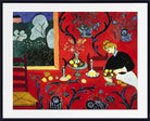
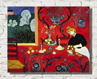
The Dessert – Harmony in Red (1908) by Henri Matisse, also known as The Red Room (Harmony in Red) and La Desserte: Harmonie rouge, is one of the defining masterpieces of modern colour. A woman arranges fruit on a table while an intense field of red spreads almost seamlessly across both tablecloth and wall. Flowing blue arabesques curl through the red surface, fruit and vessels punctuate the table with yellow, orange and white, and an open window reveals an unexpectedly cool green garden beyond.
This Henri Matisse Harmony in Red print demonstrates how the revolutionary colour freedom of Fauvism developed into Matisse's mature decorative style. Conventional perspective is deliberately weakened as wall and table merge into a single red field, while pattern, colour and line become as important as the figures and objects they describe. Available as a fine art print, framed print or canvas panel, Harmony in Red is an exceptional choice for admirers of Matisse, colourful modern art, decorative interiors and landmark twentieth-century painting.
The Dessert – Harmony in Red: A Masterpiece of Modern Colour
Few paintings demonstrate Henri Matisse's understanding of colour as dramatically as Harmony in Red.
The composition represents a relatively ordinary domestic activity.
A woman stands beside a dining table arranging fruit and other objects. A chair occupies the right side of the room, while an open window looks towards trees and flowering plants outside.
Yet Matisse transforms this everyday interior almost completely.
The most striking feature is the vast expanse of saturated red covering both the wall and the tablecloth.
Only a faint edge and the placement of objects tell us where the horizontal table ends and the vertical wall begins.
Instead of using perspective to separate these surfaces, Matisse deliberately joins them through colour.
The entire room becomes a single decorative field.
A Room Almost Entirely Red
The red is not merely a background colour.
It is the fundamental structure of the painting.
Across much of the canvas, the same intense red seems to flow uninterrupted from wall to table.
This has a radical effect on space.
In conventional interior painting, a table projects towards the viewer while the wall stands vertically behind it. Perspective, shadows and changes of tone make those planes clearly distinguishable.
Matisse suppresses many of those signals.
Wall and table are united by the same colour and by the same flowing blue decoration.
The viewer knows intellectually that they occupy different planes, yet visually they repeatedly merge.
This tension between recognisable space and decorative flatness is central to the painting's importance.
The Blue Arabesque
Across the red field runs an elaborate pattern of dark blue arabesques.
Leaves, curling stems and floral forms sweep across both wall and tablecloth.
The pattern refuses to respect the conventional boundary between furniture and architecture.
A blue curve beginning on the table can appear visually related to another form continuing across the wall.
This creates a continuous rhythm throughout the composition.
For Matisse, the arabesque was much more than ornament.
Flowing lines allowed him to connect otherwise separate areas of a painting and guide the viewer's eye across the surface.
In Harmony in Red, this principle reaches extraordinary clarity.
The arabesque effectively binds the room together.
Where Does the Table End and the Wall Begin?
Matisse deliberately makes this question difficult to answer.
The front edge of the table remains visible, helping us understand its basic position.
Fruit, vessels and other objects also establish a horizontal surface.
But the dominant red and blue pattern largely eliminates the distinction between the tablecloth and wallpaper.
The result challenges one of the oldest conventions of Western painting.
Since the Renaissance, artists had often treated a painting as though it were a window through which the viewer looked into convincing three-dimensional space.
Matisse reminds us that a painting is also a flat surface covered with colour.
Harmony in Red allows both interpretations to exist simultaneously.
It represents a room while continually asserting the physical flatness of the canvas.
The Woman Arranging the Table
A female figure bends slightly over the table at the right of the composition.
She is engaged in the domestic activity from which the painting's alternative title, The Dessert, derives.
Her presence is essential because she preserves a sense of lived human space within an increasingly abstract decorative environment.
Matisse does not develop her as an individual portrait.
Her face is simplified and her clothing is treated in broad areas of colour.
Nevertheless, her body establishes scale and confirms that the red field represents a room rather than a completely abstract pattern.
She therefore acts as an intermediary between representation and decoration.
The painting can become extraordinarily flat without losing its connection to everyday life.
Fruit, Vessels and the Still Life
Across the tabletop are objects associated with a traditional still life.
Fruit, bowls, bottles and vessels introduce compact shapes and contrasting colours into the dominant red field.
Yellow and orange fruit becomes exceptionally vivid against the red and blue surroundings.
White ceramics create lighter accents.
These objects also help the viewer understand the orientation of the table.
Without them, the red surface might become almost completely ambiguous.
Yet Matisse does not model the objects with the detailed shadows and tonal gradations expected from traditional still-life painting.
They remain simplified and integrated within the overall decorative rhythm.
The Window into the Green Garden
The window at the upper left is one of the most important elements in the painting.
Inside the room, intense red dominates almost everything.
Through the window, the palette changes dramatically.
Green foliage, flowering plants and cooler outdoor colours create a visual escape from the surrounding red.
The contrast is both chromatic and spatial.
The red interior is comparatively flat, while the garden introduces a suggestion of greater depth.
The eye seems able to travel through the window and out into another world.
At the same time, the curving forms of trees and plants outside echo the decorative arabesques inside.
Interior and exterior are therefore different but still connected.
Red and Green: A Powerful Colour Contrast
The relationship between the red interior and green garden is particularly important.
Red and green are complementary colours.
Placed beside one another, each appears more intense.
Matisse exploits that relationship brilliantly.
The saturated red room makes the green garden appear exceptionally fresh and luminous.
The green window, in turn, intensifies the enormous red field around it.
This is an excellent example of Matisse's approach to colour.
He was less interested in whether an individual colour was objectively accurate than in how it behaved in relation to every other colour within the composition.
Harmony comes from relationships.
From Harmony in Blue to Harmony in Red
The famous red surface was not Matisse's first solution for the painting.
The composition passed through an earlier predominantly blue state and was known during its development as Harmony in Blue.
Matisse was dissatisfied with the decorative balance of the earlier version and substantially repainted the canvas.
The change to red transformed the entire character of the work.
Blue had produced a cooler, more restrained environment.
Red turned the room into an overwhelming field of colour.
This history is especially revealing because it demonstrates that Matisse did not regard colour as something determined automatically by the objects before him.
The same basic composition could become fundamentally different according to the chromatic relationships he selected.
Colour was structural.
Sergei Shchukin and the Commission
Harmony in Red is closely connected with the great Russian collector Sergei Ivanovich Shchukin.
Shchukin was one of the most adventurous collectors of modern French painting before the First World War.
His Moscow mansion contained important works by Monet, Gauguin, Picasso and other leading artists, but his relationship with Matisse became especially significant.
Between 1906 and 1914, Shchukin acquired a remarkable group of Matisse paintings.
Harmony in Red was intended as a large decorative panel for his dining room.
That intended setting helps explain the monumental scale of the canvas and the importance Matisse placed on decoration.
The work was not conceived merely as a small easel painting to be viewed in isolation.
It was designed to transform an architectural interior through colour.
A Monumental Decorative Panel
The original measures approximately 180 × 220 cm.
At that scale, the field of red would have an enormous physical presence.
Matisse himself thought increasingly in terms of decorative panels during this period.
The word “decorative” should not be understood as dismissive.
For Matisse, decoration offered an alternative to the traditional hierarchy that placed illusionistic easel painting above textiles, ceramics, pattern and interior design.
He wanted a painting to work with the architecture around it and create a complete visual environment.
Harmony in Red represents one of his most successful early achievements of that ambition.
Beyond Fauvism
Harmony in Red is often associated with Fauvism because its brilliant colour would have been impossible without the Fauvist breakthrough.
However, the painting dates from 1908, when Matisse was already moving beyond the movement's most concentrated historical phase.
The radical Fauvist experiments at Collioure in 1905 had liberated colour from naturalistic description.
By 1907 and 1908, Matisse was applying that freedom to a different problem.
Rather than concentrating primarily on explosive colour contrasts, he increasingly sought large unified areas of colour, simplified form and decorative rhythm.
MoMA accordingly places Harmony in Red within the beginning of Matisse's great Art and Decoration period rather than within the core Fauvist years.
The painting is therefore best understood as one of the great works showing what Fauvism made possible.
From Fauvist Colour to Decorative Harmony
The distinction is important.
In many classic Fauvist landscapes, individual colours collide energetically across the surface.
In Harmony in Red, Matisse moves towards greater unity.
One enormous colour dominates.
Instead of breaking the canvas into numerous competing patches, the red creates a continuous environment within which the blue arabesque operates.
The effect is simultaneously simpler and more radical.
Matisse had discovered through Fauvism that colour did not need to imitate nature.
He now discovered that a single colour could organise almost an entire painting.
Harmony in Red and Blue Still Life
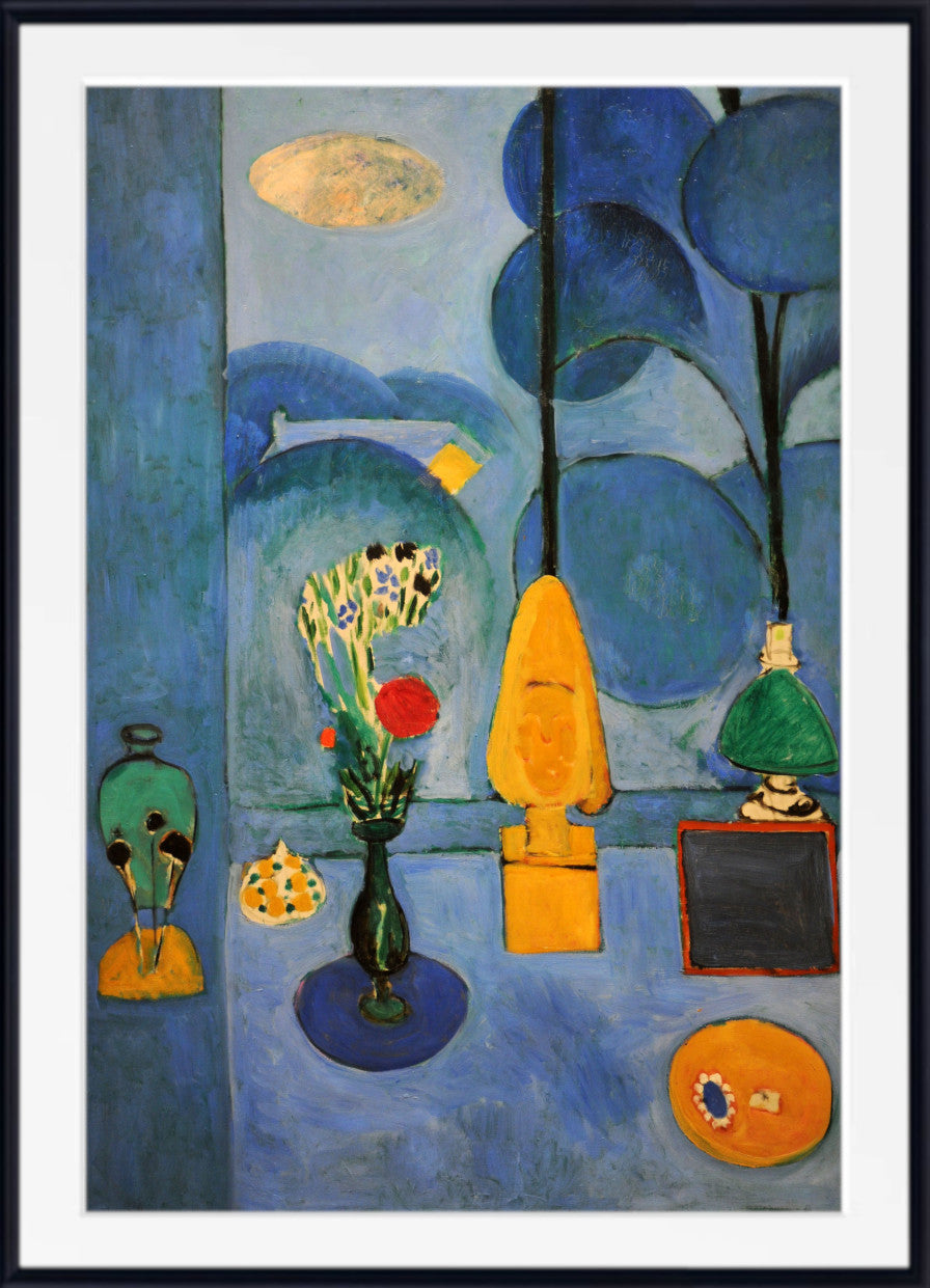
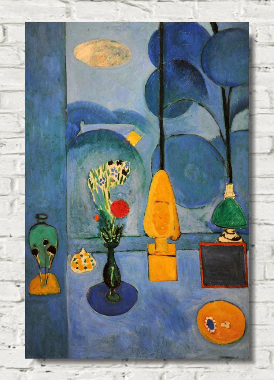
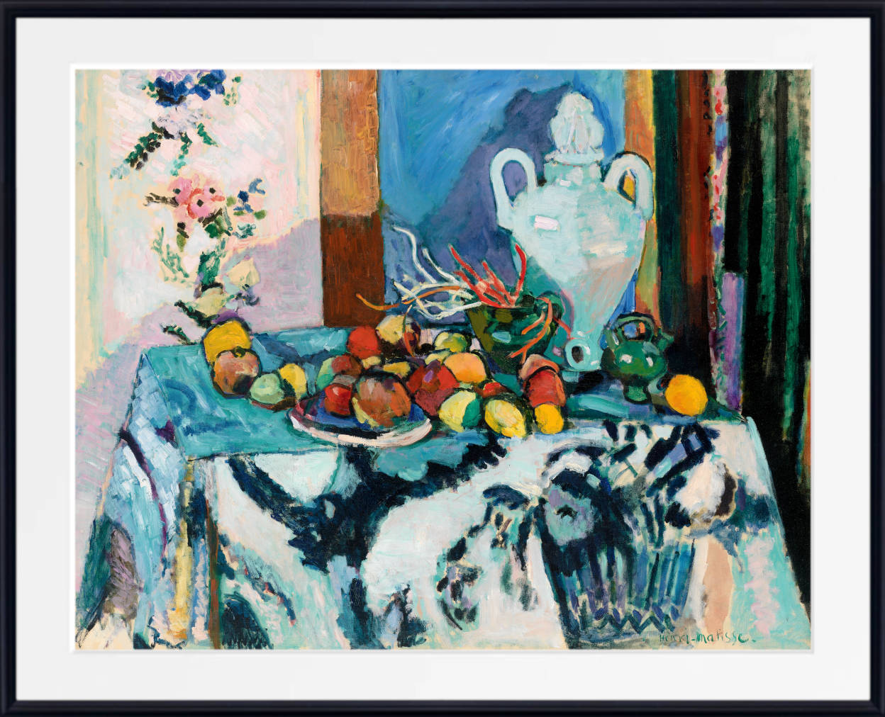
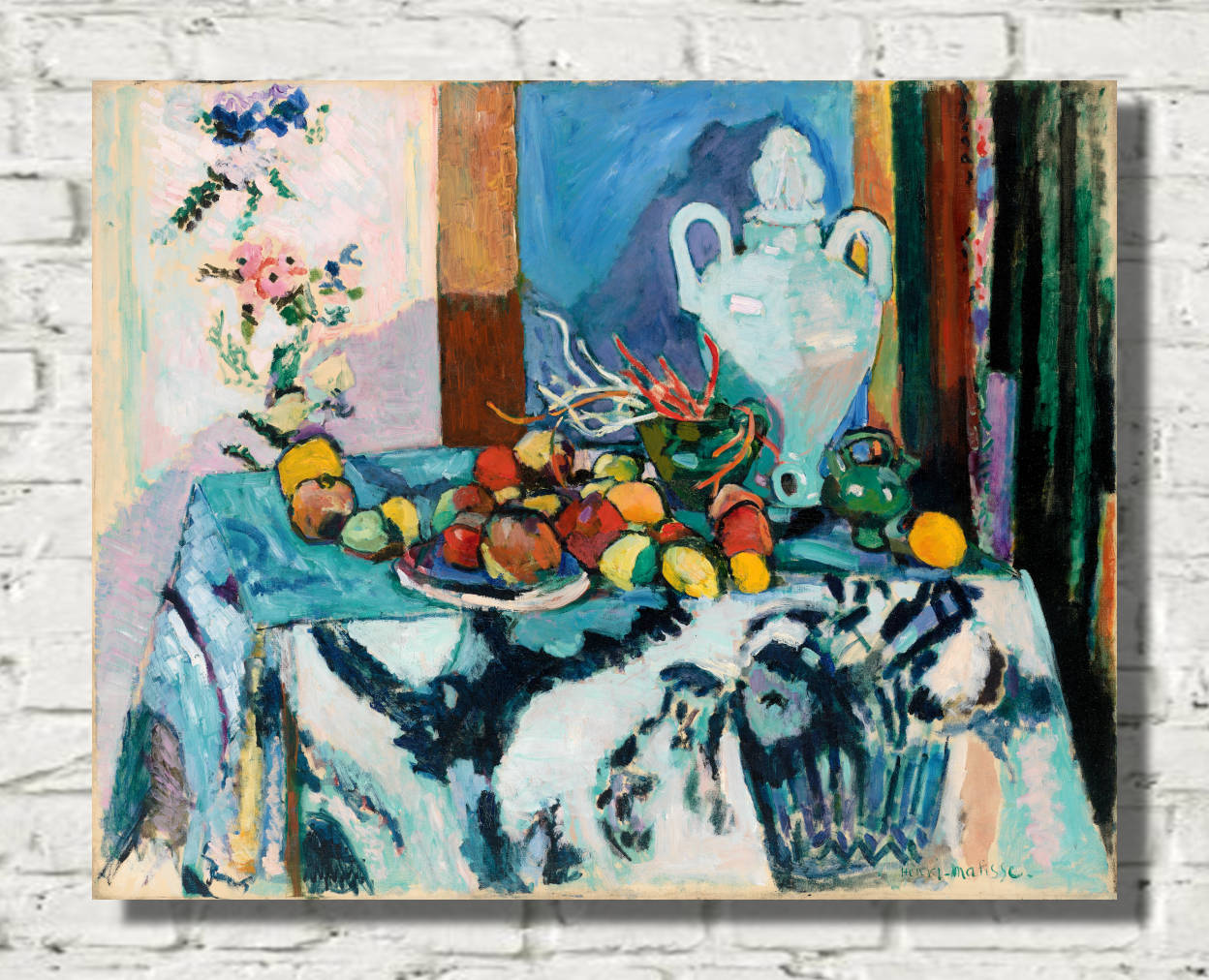
Harmony in Red has an especially revealing relationship with Matisse's earlier Blue Still Life (Nature morte bleue) of 1907.
Both paintings contain fruit, vessels, patterned textiles and domestic interiors.
In Blue Still Life, the tabletop and background remain relatively distinguishable.
There is tension between decorative pattern and conventional depth, but the room can still be read spatially with comparative ease.
In Harmony in Red, Matisse takes the experiment much further.
Table and wall are engulfed by a continuous red field and an almost uninterrupted blue pattern.
The development between these works demonstrates how rapidly his thinking was changing.
Within approximately a year, decorative pattern had moved from being an important component of the room to becoming its dominant organising principle.
Harmony in Red and Peonies
The same development can be traced from Peonies of 1907.
In that painting, the bouquet and tabletop remain physically substantial while the wall behind them begins to dissolve into free areas of colour.
Harmony in Red represents the logical next step.
The wall no longer merely becomes abstracted.
Its colour and pattern spread across the table itself.
The division between object, furniture and architecture becomes increasingly uncertain.
Matisse was therefore developing a consistent line of investigation across several paintings rather than arriving suddenly at the red room.
The Influence of Paul Cézanne
Paul Cézanne remained an important point of reference for Matisse.
Cézanne's still lifes had demonstrated that conventional perspective could be adjusted or disrupted in order to create a stronger composition.
Tables tilt, objects are sometimes seen from slightly different viewpoints and spatial relationships can remain intentionally unstable.
Matisse inherited that freedom.
Yet his solution in Harmony in Red is very different.
Where Cézanne usually sought greater structural solidity, Matisse increasingly used colour and pattern to dissolve conventional depth.
The painting therefore carries forward Cézanne's challenge to Renaissance perspective while transforming it through a completely different visual language.
Matisse's Earlier Dinner Table
The subject also had a much earlier history within Matisse's career.
In the 1890s he had painted The Dinner Table, a considerably more naturalistic domestic interior.
The earlier painting demonstrates his ability to model objects, furniture and figures within convincing conventional space.
Comparing that work with Harmony in Red reveals the magnitude of Matisse's development.
The basic subject remains familiar: a woman, dining table, fruit and domestic objects.
But almost every assumption about how those things should be represented has changed.
Naturalistic modelling has been reduced.
Perspective has been weakened.
Pattern has expanded.
Colour has become dominant.
The comparison demonstrates that Matisse's apparent simplicity was the result of deliberate artistic evolution rather than any inability to paint conventionally.
Pattern as Structure
The blue pattern performs many of the functions that perspective traditionally performed.
It connects different areas, establishes rhythm and helps organise the movement of the eye.
A curve on the table leads towards another curve on the wall.
Leaves echo the vegetation outside the window.
The woman's curved body participates in the same flowing structure.
The painting consequently possesses strong order despite the disappearance of conventional spatial boundaries.
This is one reason the title Harmony in Red is so appropriate.
The composition depends upon balance rather than realistic description.
The Importance of Decorative Art to Matisse
Matisse's growing interest in decoration was fundamental to his mature art.
Textiles, rugs, screens, ceramics and patterned surfaces repeatedly entered his paintings.
These objects taught him that colour and pattern could create complete visual environments without relying upon traditional perspective.
In Harmony in Red, the distinction between fine art and decoration becomes particularly unstable.
The painting resembles a huge tapestry while remaining unmistakably a painting.
The decorative surface does not reduce its seriousness.
On the contrary, decoration becomes the means through which Matisse questions centuries of European pictorial convention.
The Red Room and Matisse's Later Interiors
The importance of Harmony in Red becomes even clearer when viewed in relation to Matisse's later interiors.
Red would return dramatically in The Red Studio of 1911, where another interior is almost completely saturated by a single colour.
Patterned rooms, windows opening onto gardens, textiles and ambiguous perspective remained recurring themes throughout his career.
During the Nice period from the late 1910s onwards, Matisse repeatedly filled interiors with rugs, screens, decorative furniture and patterned walls.
Harmony in Red therefore establishes many ideas that continued to occupy him for decades.
Why Harmony in Red Matters
The Dessert – Harmony in Red brings together many of the ideas that made Matisse one of the most influential artists of the twentieth century:
- a monumental field of saturated red
- dark blue arabesques flowing across table and wall
- conventional perspective deliberately weakened
- table and wall visually merged into one decorative surface
- fruit and vessels simplified into powerful colour accents
- a female figure integrated into the decorative environment
- a green garden providing a complementary contrast with the red interior
- pattern used as an organising structure rather than secondary ornament
- Fauvist colour developed into a mature decorative language
- the entire canvas conceived as a unified visual harmony
The painting therefore represents a major turning point.
It is one of the works in which Matisse moved decisively beyond the brief historical movement of Fauvism and established the visual principles that would shape the next phase of his career.
Henri Matisse's Decorative Painting Style
By 1908, Matisse had already undergone an extraordinary artistic transformation.
His early work had incorporated naturalism, Impressionism, Post-Impressionism and Neo-Impressionist colour theory.
The summer of 1905 at Collioure with André Derain helped establish the liberated colour associated with Fauvism.
Fauvism taught Matisse that colour did not need to obey the visible world.
His subsequent development asked what could be done with that freedom.
Increasingly, the answer involved simplification, large areas of saturated pigment, expressive line and decorative pattern.
Harmony in Red is among the first great masterpieces of this mature direction.
About Henri Matisse
Henri Matisse (1869–1954) was a French painter, draughtsman, sculptor and printmaker and one of the defining artists of twentieth-century modernism.
Born at Le Cateau-Cambrésis in northern France, Matisse initially trained in law before discovering painting during a period of illness.
His early artistic development incorporated academic painting, Impressionism, Post-Impressionism, Paul Cézanne and Neo-Impressionist colour theory.
During the summer of 1905, his experiments with André Derain at Collioure helped establish Fauvism and transformed the role of colour in modern painting.
Matisse subsequently moved beyond Fauvism while retaining its fundamental freedom.
Figures, still lifes, interiors, patterned textiles and Mediterranean landscapes became recurring subjects within an increasingly distinctive visual language based on colour, line, simplification and decorative harmony.
His long career included painting, sculpture, printmaking, book design and, during his later years, his celebrated paper cut-outs.
Few twentieth-century artists exerted greater influence on the development of modern colour.
The Original The Dessert – Harmony in Red
The original The Red Room (Harmony in Red), also widely known as The Dessert – Harmony in Red and La Desserte: Harmonie rouge, dates from 1908.
Matisse created the monumental work in oil on canvas.
It measures approximately 180 × 220 cm.
The painting was associated from its creation with the Russian collector Sergei Ivanovich Shchukin, one of Matisse's most important early patrons.
It was intended as a decorative work for the dining room of Shchukin's Moscow mansion.
During its development, the composition passed through an earlier predominantly blue state associated with the title Harmony in Blue. Matisse subsequently transformed it by covering most of the interior with the saturated red that gives the finished painting its extraordinary visual unity.
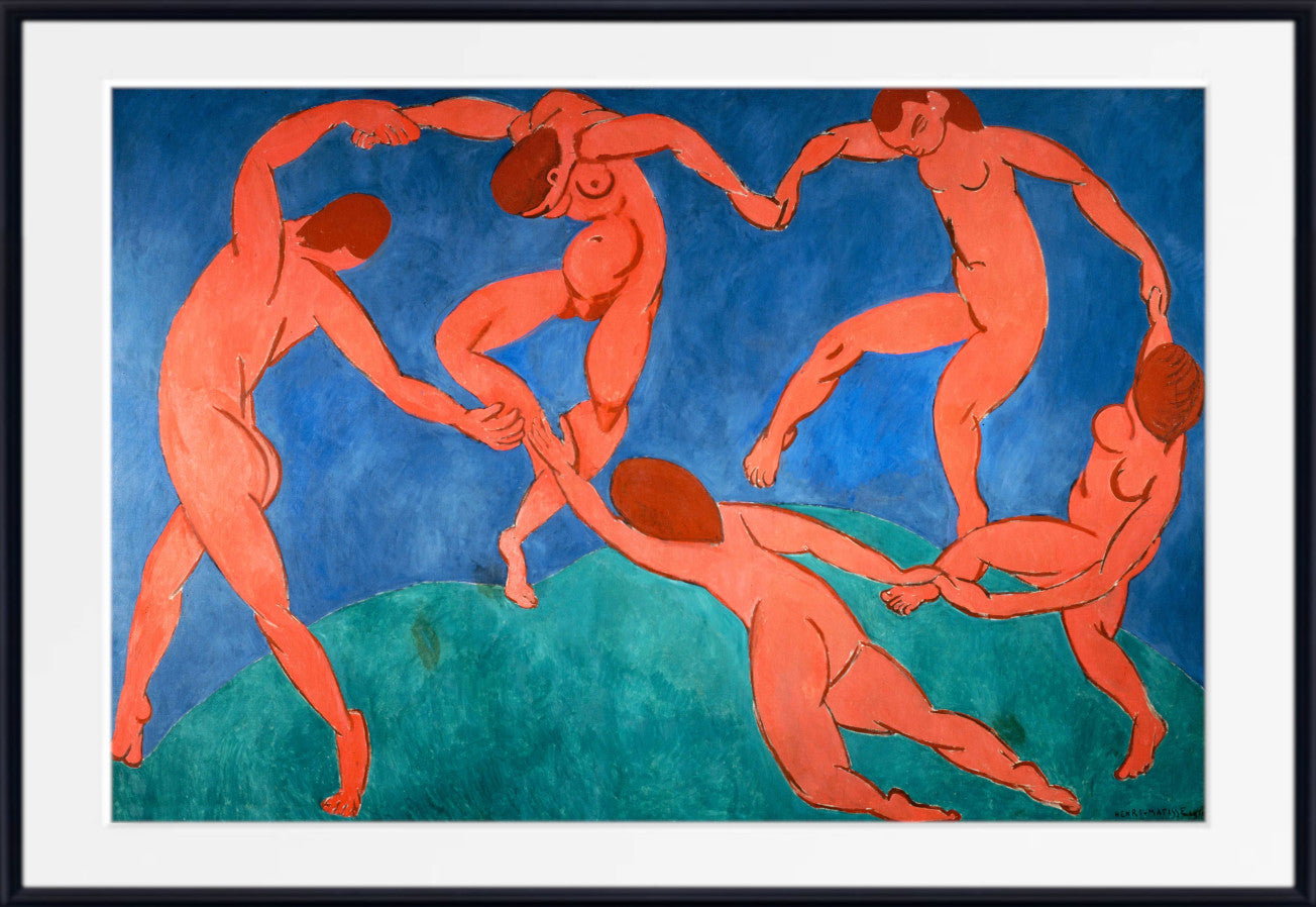
Shchukin went on to assemble one of the world's most important collections of Matisse's work and later commissioned the monumental decorative panels Dance and Music.
Following the Russian Revolution, Shchukin's collection was nationalised.
The painting subsequently entered the Russian state museum collections and is now held by the State Hermitage Museum in St Petersburg.
The Hermitage records the work as The Red Room (Harmony in Red), dated 1908, oil on canvas, measuring 180 × 220 cm.
A Henri Matisse Harmony in Red Print for Your Interior
A Henri Matisse Harmony in Red print creates an immediate focal point because of the extraordinary dominance of saturated red across the composition.
The colour is balanced by deep blue arabesques, green landscape, yellow and orange fruit and lighter vessels, giving the work a much more varied palette than its title initially suggests.
The painting can work particularly effectively against white, cream, putty, pale grey and other neutral walls, where the red remains visually dominant.
Natural timber furniture provides a warmer complement, while restrained Scandinavian-inspired interiors allow the complex pattern and colour to become the principal decorative feature of the room.
Its broad horizontal proportions make it particularly suitable for display above sofas, sideboards, beds and long console tables.
The still-life and dining-room subject also makes it especially appropriate for dining rooms and sophisticated kitchen spaces.
It can work equally well in living rooms, bedrooms, hallways and home offices, particularly within contemporary, Scandinavian-inspired, mid-century and eclectic interiors.
For admirers of Matisse, however, the painting has importance far beyond interior decoration. It represents the moment when the freedom of Fauvist colour developed into one of the most radical and influential decorative languages in modern art.
Frequently Asked Questions
When did Henri Matisse paint Harmony in Red?
Matisse created The Red Room (Harmony in Red) in 1908.
What is the full title of Harmony in Red?
The painting is known by several closely related titles, including The Red Room (Harmony in Red), The Dessert – Harmony in Red and the French La Desserte: Harmonie rouge.
What does Harmony in Red depict?
The painting depicts a woman arranging a dining table containing fruit and vessels. The red wall and red tablecloth carry the same flowing blue pattern, while an open window reveals a green garden beyond.
Is Harmony in Red a Fauvist painting?
The painting developed directly from Matisse's Fauvist liberation of colour, but its 1908 date places it more accurately at the beginning of his post-Fauvist decorative period. It demonstrates how Matisse transformed the discoveries of Fauvism into a broader artistic language based on flat colour, pattern and decorative harmony.
Why is almost the entire room red?
Matisse uses the continuous red field to unite table and wall and weaken conventional perspective. Red becomes the fundamental structural element of the composition rather than merely the colour of an individual surface.
Was Harmony in Red originally blue?
Yes. The composition passed through an earlier predominantly blue state associated with the title Harmony in Blue before Matisse established the final red version.
Why did Matisse change the painting from blue to red?
Matisse continually adjusted colour according to the balance of the entire composition. The transformation to red created a much stronger decorative unity and altered the relationships between every other colour in the painting.
What are the blue patterns in Harmony in Red?
The dark blue decoration consists of flowing floral and vegetal arabesques. The pattern spreads across both wall and tablecloth, helping the two surfaces merge visually.
Why does the table look flat?
Matisse deliberately weakens conventional perspective by covering the tablecloth and wall with the same red colour and blue pattern. Objects on the table provide enough information to suggest depth, but the dominant decorative surface continually flattens the space.
What is visible through the window?
The window reveals a green garden with trees and flowering plants. Its cool green palette provides a powerful complementary contrast with the saturated red interior.
Who was Sergei Shchukin?
Sergei Shchukin was a pioneering Russian collector of modern French art and one of Matisse's most important early patrons. He assembled a major group of Matisse paintings for his Moscow home and later commissioned the monumental panels Dance and Music.
Was Harmony in Red made for Shchukin?
Yes. The monumental painting was intended as a decorative panel for the dining room of Sergei Shchukin's Moscow mansion.
What medium did Henri Matisse use?
The original Harmony in Red was painted in oil on canvas.
What size is the original Harmony in Red?
The State Hermitage Museum records the painting as measuring approximately 180 × 220 cm.
Where is the original Harmony in Red?
The original is held by the State Hermitage Museum in St Petersburg.
How does Harmony in Red relate to Blue Still Life?
Both paintings explore patterned textiles, fruit, vessels and domestic space. In Blue Still Life of 1907, table and background remain more clearly separated. In Harmony in Red, Matisse pushes much further by merging table and wall through one continuous field of red and blue pattern.
Why is Harmony in Red important?
The painting marks a major transition in Matisse's art. It takes the liberated colour of Fauvism and develops it into the flatter, pattern-based decorative language that became fundamental to his mature work.
Is Harmony in Red available as a framed Henri Matisse print?
Yes. GalleryThane offers The Dessert – Harmony in Red in a choice of sizes and formats, including fine art paper prints, framed prints and canvas options.
Where would a Henri Matisse Harmony in Red print work well?
Its bold horizontal format and red-and-blue palette make it particularly effective in living rooms, dining rooms, bedrooms, hallways and home offices. It works especially well in contemporary, Scandinavian-inspired, mid-century and eclectic interiors.
All orders for unframed fine art prints and original paintings are dispatched within 2 working days of receipt of payment.
Orders for custom framed prints are dispatched within 4 working days.
All orders are fully tracked from dispatch to delivery at your home or business.
All print and original painting orders are fully insured against loss or damage in transit. We refund or replace any damaged or lost orders.
Buy with confidence - read what our satisfied customers have to say - Reviews
Fine art papers are printed without any additional white border Please let us know at the time of ordering if you would like a small additional white border.
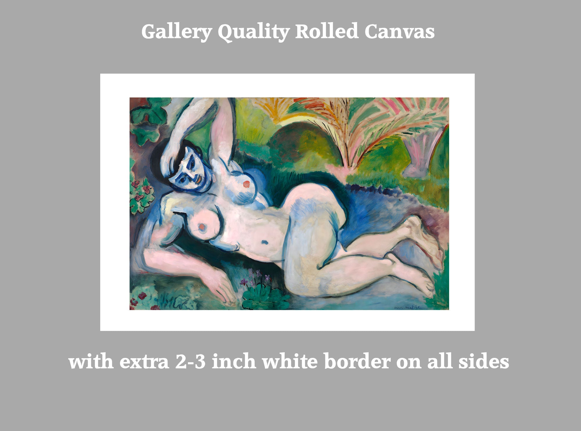
Rolled canvas options have an additional white border of approximately 2.5 inches (7cm) on all 4 sides to aid stretching.
Ready to hang canvas panels are stretched on 1.5 inch deep solid pine frames from sustainable forestry sources. The image is mirrored on all 4 sides to give an aesthetically pleasing finish.
Why not have us gift wrap your order and attach a personalised message to the recipient. Available for all orders. Each order is hand wrapped in high quality gift wrap with meatllic ribbon and bow. Your personalised message is printed on a card which is included with your order.
Have your hand wrapped gift delivered directly to the recipient.
Full tracking and insurance included with every order.
Please note design may vary depending upon availability
Just purchase the gift wrap option HERE
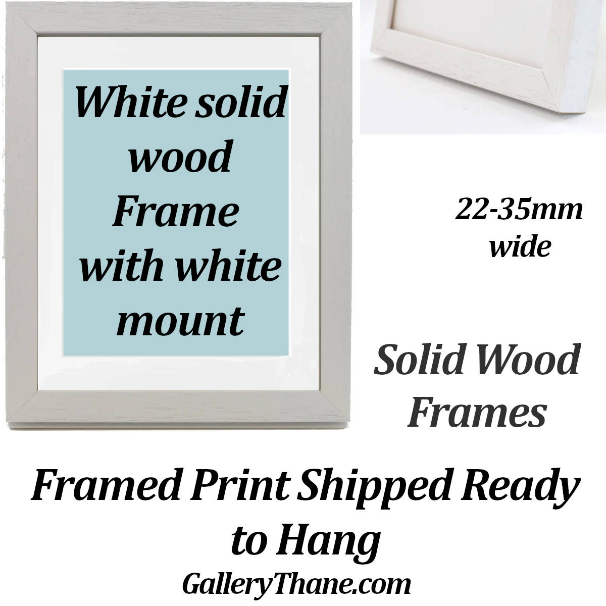
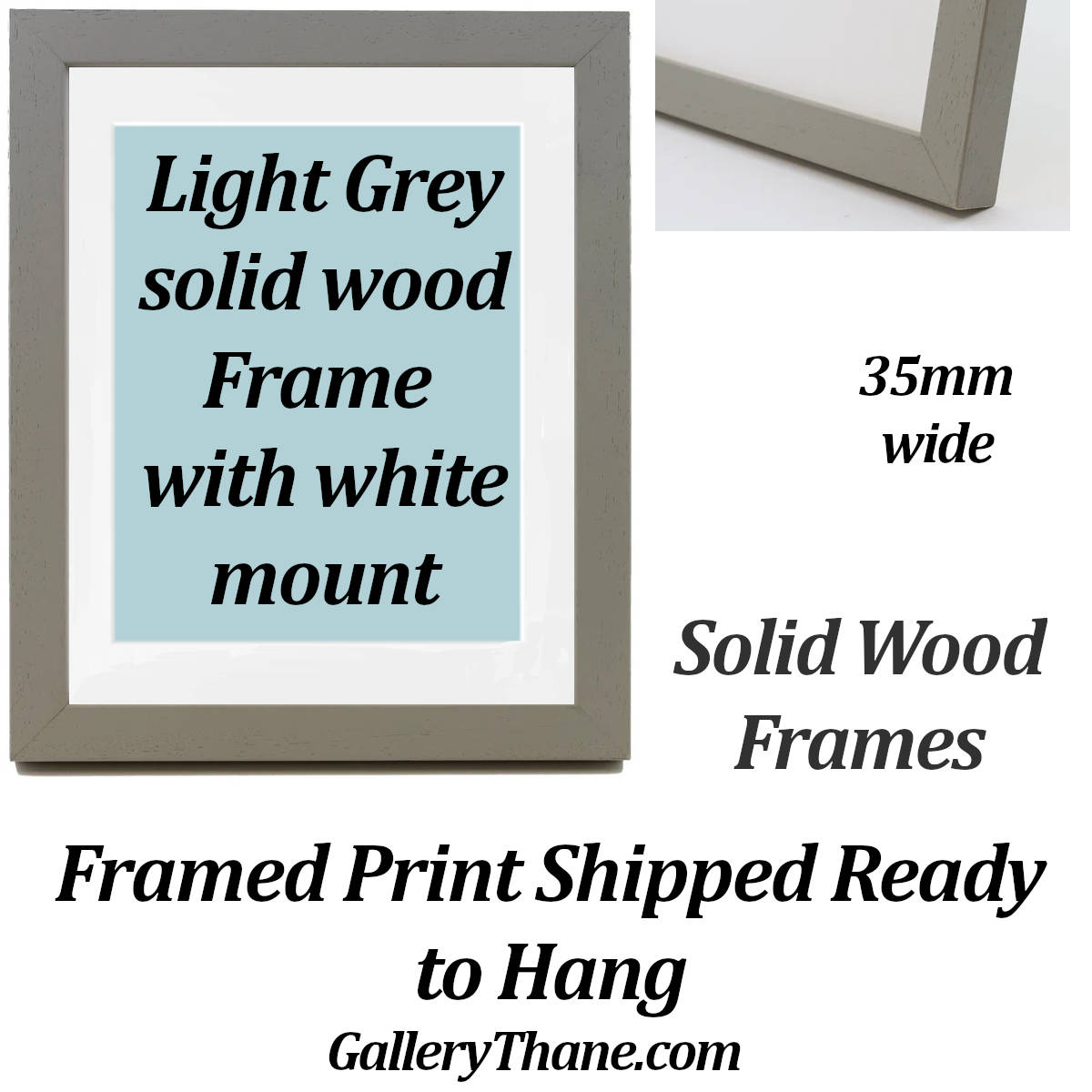
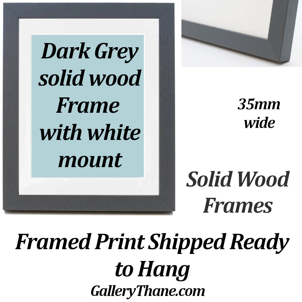
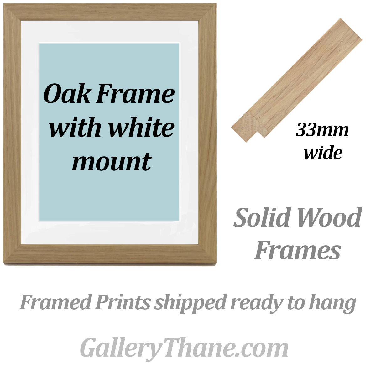
We have a wide range of frames in standard sizes and we also make custom size frames.
To order a framed print:
1. select the print size you would like along with the print materials (matte paper, fine art paper).
2. Add your print choice to the basket.
3. Choose from our range of frames
4. Select the same size as the print you have added to your basket. If the frame size you want is not listed please contact us
5. Choose from the mount or no-mount option
6. Add your frame choice to the basket
7. Proceed to checkout.
Why Choose GalleryThane?
- Printed and framed in-house
- Free UK delivery
- Free EU and USA delivery on orders over £200
- Tracking and insurance included in every order
- Fast 1-3 day dispatch
- Gift wrapping service available
- Gallery quality materials
- Sustainable, eco-friendly packaging
- Great customer support
Explore related collections

What makes our Prints and Canvas Panels so special

Latest Giclee Printing Technology
We have invested in the latest wide format print technology to produce museum quality giclee prints utilising the highest quality pigment inks to give outstanding colour reproduction.

Museum Quality Archival Fine Art Papers
We print on the finest quality fine art papers with textured, smooth and lustre finishes for prints which last a lifetime.
From aceo miniatures to 40x80 inch large format, every print has our lifetime quality guaranteee.

Solid Wood Frames, Cotton Canvas
All of the wood for our canvas panels and frames is responsibly sourced from manages forests. Our cotton canvas is completely seedless for the highest quality reproduction possible.

Have Your Gift Wrapped


Choose a Custom Frame
Popular Collections


EU Representative
Manufacturer
LucasAbstract t/a GalleryThane
15 Campion Way, Bingham NG13 8TR UK
sales@gallerythane.com
EU Authorised Representative
Westwood Sourcing
Fellenoordstraat 52, Unit 2.38
4811 TJ Breda, Netherlands
info@westwoodsourcing.com