

A successful gallery wall should read as one complete composition rather than a collection of unrelated frames. The most reliable approach is to decide the overall width and height first, centre the complete group at an appropriate viewing level, and keep the spaces between neighbouring frames consistent.
This guide explains how high to hang a gallery wall, how much space to leave between frames, how to calculate the dimensions of the finished arrangement, and how to plan layouts for three, five, six, seven or nine artworks. It also covers gallery walls above sofas, beds and console tables, along staircases, in narrow hallways and on picture ledges.
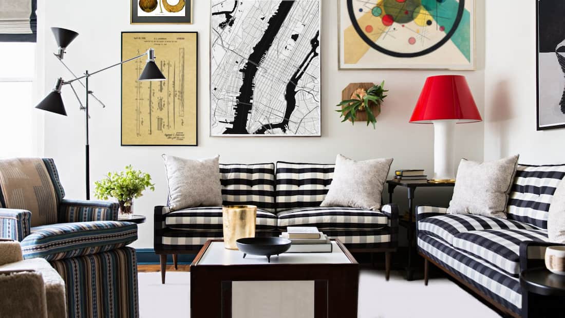
Quick Guide to Gallery Wall Height and Spacing
These measurements are useful starting points rather than rigid rules. Frame sizes, furniture, ceiling height and the way a room is used can all justify small adjustments.
| Question | Practical starting point |
|---|---|
| How high should the group hang on a blank wall? | Place the visual centre of the complete arrangement roughly 145–152 cm from the floor. |
| How much space should be left between frames? | Usually 5–8 cm. Use about 4–5 cm for small frames and 8–10 cm for larger frames. |
| How high above a sofa, bed or console? | Leave approximately 15–25 cm between the furniture and the bottom of the arrangement. |
| How wide should the gallery wall be above furniture? | Aim for the complete group to occupy roughly 60–75% of the furniture width. |
| Should every frame be centred separately? | No. Treat every frame as part of one larger rectangular or organic composition. |
| Where should installation begin? | Start with the central or largest anchor artwork, then work outwards. |
Measure the Wall and Furniture First
Do not begin by choosing individual nail positions. Begin by defining the maximum area that the gallery wall can occupy.
- Measure the usable wall width and height. Exclude door openings, switches, radiators, wall lights and architectural details.
- Measure any furniture beneath the display. A sofa, headboard, console or sideboard will usually determine the centre and maximum width.
- Mark the proposed outer boundary. Use low-tack masking tape to create a temporary rectangle on the wall.
- Check the view from the doorway and main seating position. A layout that works close up may appear too small or too high from across the room.
- Confirm that the frames fit within the boundary with all gaps included.
For a gallery wall above furniture, use the furniture rather than the entire wall as the main reference. An arrangement centred on the wall but not on the sofa or console below it will usually appear unbalanced.
How High Should a Gallery Wall Hang?
On a Blank Wall
On an open wall, position the visual centre of the complete gallery wall at approximately eye level. A centre point around 145–152 cm from the floor is a practical starting range for most rooms.
The important word is complete. Do not hang every frame so that its individual centre sits at the same height. First determine the outside height of the whole arrangement, then place the centre of that complete group at the chosen eye-level line.
In a Seated Room
In a dining room, living room or reading area where the artwork is mainly viewed while seated, the arrangement can be positioned slightly lower. Test the layout from the chairs or sofa before fixing it permanently.
In a Room with High Ceilings
High ceilings do not automatically mean that artwork should be hung higher. Keep the main viewing area comfortable, then use a taller arrangement, a second row or larger artworks to occupy more of the wall above it.
How to Calculate the Hanging Point
For a single frame or the central anchor frame, use this practical calculation:
Measure the wire while pulling it upwards as it will sit when hung. Flexible wire can rise several centimetres under tension, so measuring it while loose can place the frame lower than intended.
How Much Space Should You Leave Between Gallery Wall Frames?
For most domestic gallery walls, a gap of approximately 5–8 cm between neighbouring frames creates a clear relationship without making the arrangement feel cramped.
- Small prints and photographs: around 4–5 cm.
- Medium framed prints: around 5–8 cm.
- Large or heavily mounted frames: around 8–10 cm.
- Dense salon-style walls: gaps can be tighter, but should still look deliberate and remain safe to install.
- Formal grids: keep both horizontal and vertical gaps identical.
Measure from the outside edge of one frame to the outside edge of the next. Mount width and the empty space inside the frame do not count as the gap between artworks.
Should Every Gap Be Exactly the Same?
A strict grid should use equal gaps. A looser salon layout can vary slightly, but repeated spacing should still be visible. For example, most gaps might remain close to 6 cm while one awkward junction narrows to 5 cm. Large unexplained variations make the display look accidental.
Spacing Different Frame Sizes
When large and small frames are mixed, keep the edge-to-edge distance broadly consistent. Do not increase a gap simply because one of the frames is small. The frames should still appear to belong to the same composition.
How to Calculate the Finished Size of a Gallery Wall
Always include the spaces between frames when calculating the complete width and height.
Example: three frames measuring 30 cm wide with two 6 cm gaps will create a total arrangement width of 102 cm:
30 + 30 + 30 + 6 + 6 = 102 cm
Use the same method vertically. In an irregular arrangement, calculate the widest row and the tallest column, then check the overall outside boundary with paper templates or masking tape.
How Wide Should the Gallery Wall Be?
Above a sofa, bed, sideboard or console, a complete arrangement measuring roughly 60–75% of the furniture width will usually appear connected and substantial without becoming top-heavy.
On a blank wall, scale the arrangement to the usable wall rather than to the entire room. Leave enough empty wall around the group for the outer shape to remain visible.
Choose the Right Gallery Wall Layout
The best layout depends on the wall shape, the number and proportions of the artworks, and whether you want the room to feel formal or collected.
The Pair
Two equal frames create calm symmetry. Ideal above bedside tables, a small console or a narrow wall.
The Triptych or Row
Three aligned frames create rhythm across a sofa, bed, desk or sideboard.
The Grid
Equal frames and equal gaps create a formal, architectural arrangement for modern or ordered interiors.
The Anchor Layout
One dominant artwork is surrounded by smaller pieces. This is flexible and easy to expand.
The Salon Wall
Mixed sizes and orientations create a layered, collected effect while remaining within a controlled outer boundary.
The Picture Ledge
Frames rest on a shelf and can overlap slightly, making the display easy to rearrange without adding new holes.
Formal Versus Organic Layouts
Choose a grid, straight row or symmetrical pair when the room has strong architectural lines, matching furniture or a restrained decorative scheme. Choose an anchor or salon layout when the collection includes mixed sizes, varied frame finishes or artworks gathered over time.
Organic does not mean random. Keep at least one organising principle: a repeated gap, shared colour palette, matching frame finish, common subject or clear outside boundary.
Gallery Wall Layouts for Three Prints
Three artworks are easy to balance and suit walls that are too wide for a pair but do not need a large multi-frame display.
Three in a Horizontal Row
Use equal-sized frames, align the top and bottom edges, and keep both gaps identical. This arrangement is particularly effective above a sofa, bed, desk or sideboard.
One Large Print with Two Smaller Prints
Place the large work on one side and stack the two smaller works on the other. The combined height of the smaller pair, including the gap, should relate closely to the height of the larger frame.
Three in a Vertical Stack
A vertical arrangement suits narrow walls, alcoves, landings and spaces between windows or doors. Align the centres and keep the vertical gaps consistent.
A Relaxed Triangle
Place one artwork above two lower artworks, or two above one. This can work over compact furniture, but the group should still have a clear centre and controlled outer shape.
Gallery Wall Layouts for Five Prints
Five prints create enough variety for an expressive display without becoming difficult to plan.
One Central Anchor with Four Surrounding Frames
Start with the largest or most visually important work. Place two frames to either side or distribute the smaller works around its corners. This is one of the easiest layouts to expand later.
Two Frames Above and Three Below
This creates a broad arrangement for a sofa or sideboard. Keep the outside edges balanced and make sure the centre of the upper row relates to the centre of the lower row.
Three Frames Above and Two Below
This can feel slightly lighter at the bottom and works well when the lower pair are larger or visually stronger.
Cross-Shaped Layout
Use one central frame with one above, one below and one on each side. This format is useful for square wall areas and can be formal or playful depending on the frame sizes.
Gallery Wall Layouts for Six, Seven or Nine Prints
Six Prints: A 2 × 3 or 3 × 2 Grid
A six-frame grid is one of the most reliable large layouts. Use two rows of three for a wide wall above furniture, or three rows of two for a narrower vertical space. Equal frame sizes create the cleanest effect.
Six Prints: Mixed Anchor Layout
Use one or two larger works as anchors, then arrange smaller portrait, landscape and square frames around them. Keep the outer boundary compact so the group does not fragment.
Seven Prints: One Centre with Six Around It
A central frame surrounded by six complementary works creates a clear focal point. It suits mixed collections and can be widened or raised according to the wall shape.
Nine Prints: A 3 × 3 Grid
Nine equal frames form a strong square display. This works particularly well for botanical studies, photographs, related abstract works or a single artist series.
Nine Prints: Structured Salon Layout
Combine one large central work with eight varied pieces while keeping the outside edges within an approximate square or rectangle. Repeat colours and frame finishes to prevent the larger group from becoming visually noisy.
How to Hang a Gallery Wall Above Furniture
When artwork hangs above furniture, the two should read as one vertical composition. The furniture determines the centre and usually provides the most useful scale reference.
Above a Sofa
- Centre the complete arrangement over the sofa rather than over the wall.
- Aim for the gallery wall to occupy approximately 60–75% of the sofa width.
- Leave roughly 15–25 cm between the sofa back and the lowest frame.
- Use a horizontal row, broad grid or low salon layout rather than a tall narrow group.
Above a Console or Sideboard
A console supports both symmetrical and mixed arrangements. Leave enough space for lamps, vases or other objects without allowing them to obscure important parts of the artwork. A wide frame or pair can anchor the display, with smaller works extending to either side.
Above a Bed
Bedroom gallery walls generally benefit from calmer spacing, fewer tiny frames and a clearly defined outer rectangle. Keep the group centred over the bed or headboard and leave approximately 15–25 cm above the headboard.
For bed widths, safe placement and layouts for one print, pairs and triptychs, read Art Above the Bed: Sizes, Placement and Small Bedroom Ideas.

How to Arrange a Gallery Wall Along a Staircase
A staircase gallery wall should follow the direction of travel while keeping the artworks at a comfortable viewing height.
- Identify the line created by the stair nosings or handrail.
- Create a second imaginary line above it for the visual centres of the frames.
- Keep the centre of each frame at a broadly consistent distance from the stair line.
- Begin with the largest or most important work near the middle of the staircase.
- Extend the arrangement upwards and downwards while maintaining repeated gaps.
Do not align every frame by its bottom edge. Because the floor level changes, this can create a rigid horizontal row that fights against the angle of the staircase.
Portrait prints and narrow botanical studies are especially useful on stair walls because they fit changing wall heights without projecting too far into the route. Explore the Hallway and Stairway Wall Art collection for suitable formats.
How to Make Different Artworks Look Cohesive
A gallery wall does not require identical art or identical frames. It does need visible relationships between the pieces.
Use One Repeating Element
- the same black, white or natural-wood frame;
- a repeated mount colour;
- a shared palette such as blue, green, neutral or monochrome;
- one subject, artist, movement or period;
- repeated portrait, landscape or square proportions;
- one consistent spacing measurement.
Mixing Frame Colours
Limit the number of finishes and repeat each one more than once. For example, a combination of black and natural wood will look intentional when both finishes appear throughout the arrangement rather than in isolated corners.
Mixing Art Styles
Abstract art, landscapes, portraits, botanical studies and photographs can share a wall when colour, frame style or scale creates continuity. Begin with one anchor artwork, then choose each additional piece because it connects through at least one visible characteristic.

Browse Abstract Art Prints or Botanical Prints for subjects that work particularly well in pairs, grids and larger gallery arrangements.
Gallery Wall Ideas by Room
Living Room Gallery Walls
Living rooms can accommodate the widest range of layouts. Above a sofa, use a broad arrangement with one strong anchor or a grid of four, six or nine frames. On a blank feature wall, a larger salon arrangement can combine different sizes and subjects.
Choose from the Living Room Wall Art collection, or use a focused theme such as Impressionist landscapes, Japanese prints, botanical art or abstract compositions.
Bedroom Gallery Walls
Keep the arrangement calm through restrained colour, matching frames and regular spacing. A pair, triptych or compact grid usually feels more restful above a bed than a very dense salon wall. A larger mixed gallery can work well above a chest of drawers or on a side wall.
Explore Bedroom Wall Art for soft landscapes, florals, Japanese prints, abstract works and quieter figure studies.
Hallway and Entrance Gallery Walls
Hallways reward artworks that can be appreciated at close range. Use a row of portrait prints along a corridor, a compact arrangement above a console or a vertical group on a narrow entrance wall.
Kitchen and Dining-Room Gallery Walls
Botanical art, still lifes, food illustrations, café scenes and vintage patents can create a clear theme. A grid works well above a dining sideboard, while a smaller mixed group can enliven an informal kitchen wall.

Home-Office Gallery Walls
Use a tidy grid for a focused, architectural effect, or combine maps, typography, abstract art and favourite artists for a more personal workspace. Keep frames clear of monitor sightlines and leave working space around shelves and task lighting.
Children’s-Room Gallery Walls
Illustrations, animals, maps and colourful art can create a playful display. Position the arrangement so it can be enjoyed at the child’s viewing height, use secure fixings suitable for the wall and frame weight, and avoid unstable ledges or heavy frames where they could be reached or disturbed.

How to Plan a Gallery Wall with Paper Templates
Paper templates are the safest way to test a layout before drilling holes.
- Place every framed artwork face down on kraft paper or spare wrapping paper.
- Trace around the outside of each frame and cut out the shapes.
- Write the artwork title or number on each template.
- Measure the exact hanging point on the back of each frame.
- Transfer that point to the corresponding paper template.
- Tape the paper shapes to the wall using low-tack masking tape.
- Check the overall height, spacing and relationship with nearby furniture.
- View the arrangement from the doorway and from the main seating position.
- Adjust the templates until the group looks balanced.
- Install the central or largest artwork first, then work outwards.
Planning on the Floor
When wall access is difficult, mark a rectangle on the floor matching the usable wall area. Arrange the frames inside it, photograph the layout from directly above and record every gap before installation.
Using a Picture Ledge
A picture ledge allows framed prints to overlap and makes seasonal changes simple. Begin with the largest frame slightly off-centre, then layer smaller portrait and landscape works in front. Keep the shelf securely installed and do not overload it beyond its rated capacity.

Choose Safe Fixings
Match every fixing to the wall construction and the full weight of the framed artwork. Plasterboard, masonry, lath-and-plaster and timber walls require different methods. Heavy frames, valuable artworks and installations above beds or seating should use secure fixings and may justify professional installation.
Common Gallery Wall Mistakes to Avoid
Hanging the Complete Group Too High
The centre of the composition should relate to normal viewing height. Large areas of empty wall below the frames often indicate that the arrangement needs to move down.
Choosing Frames That Are Too Small for the Wall
A cluster of tiny frames can appear lost above a wide sofa or on a large blank wall. Increase the overall dimensions, add a larger anchor work or use fewer but larger pieces.
Forgetting to Include the Gaps
Five frames may appear to fit when measured individually, but the four spaces between them can add substantial width. Calculate the complete group before ordering or installing anything.
Using Inconsistent Spacing
Uneven gaps are more noticeable than small differences in frame size. Choose one spacing measurement and repeat it throughout the arrangement.
Centring the Art on the Wall Instead of the Furniture
Above a sofa, bed or sideboard, the furniture should normally determine the centre. Otherwise, the two elements can look disconnected.
Adding Too Many Unrelated Small Pieces
A varied collection still needs an anchor, repeated colours or a common frame treatment. Remove pieces that do not contribute to the overall rhythm.
Ignoring the Outer Shape
Step back and look at the silhouette of the entire group. Even an informal salon wall should have a clear visual boundary rather than isolated frames drifting away from the main arrangement.
Installing Before Testing
Paper templates reveal scale and alignment problems without creating unnecessary holes. Use them whenever the arrangement contains more than two frames.
Frequently Asked Questions
How much space should be between pictures in a gallery wall?
A gap of approximately 5–8 cm works for most medium-sized framed prints. Use around 4–5 cm for small frames and 8–10 cm for larger frames. Consistency is more important than the exact number.
How high should the centre of a gallery wall be?
On a blank wall, place the visual centre of the complete arrangement roughly 145–152 cm from the floor. In rooms where the art is mainly viewed while seated, the group can be positioned slightly lower.
How high should a gallery wall hang above a sofa?
Leave approximately 15–25 cm between the top of the sofa and the lowest frame. The arrangement should feel connected to the sofa rather than floating high above it.
How wide should a gallery wall be above a sofa?
Aim for the complete group to occupy roughly 60–75% of the sofa width. Include every frame and every gap when calculating the total width.
Do all gallery wall frames need to match?
No. Matching frames create a formal look, but mixed frames can be equally successful. Limit the finishes, repeat each finish and use shared colours, subjects or spacing to create cohesion.
Should I start a gallery wall from the middle?
Usually, yes. Install the central or largest anchor artwork first, then work outwards. For a strict grid, establish the centre lines and complete outside dimensions before hanging the first frame.
What is the best layout for three pictures?
Three equal frames in a horizontal row are the simplest option. Other effective layouts include a vertical stack, one large frame beside two smaller stacked frames, or a compact triangular arrangement.
What is the best layout for five pictures?
Use one central anchor with four surrounding frames, two frames above three, three above two, or a cross-shaped arrangement. Keep the complete group visually centred and maintain repeated gaps.
Can I mix portrait and landscape prints?
Yes. Mixed orientations add movement and help fill irregular wall shapes. Use a central anchor, consistent gaps and a controlled outside boundary to prevent the layout from looking scattered.
Are odd numbers better for a gallery wall?
Odd numbers can feel relaxed and naturally asymmetrical, while even numbers suit formal rows and grids. Neither is inherently better; the wall shape and desired mood should determine the choice.
How do I arrange a gallery wall on stairs?
Follow the angle of the staircase with an imaginary line through the centres of the frames. Keep the artwork at a broadly consistent distance above the stair line or handrail and work outwards from a central anchor.
How can I plan a gallery wall without making holes?
Trace every frame onto paper, mark its hanging point and tape the templates to the wall. Adjust the arrangement until the height, spacing and overall size look balanced.
Explore Curated Gallery Wall Ideas
Begin with a favourite artist, subject or colour palette, then apply the height and spacing principles above to the complete group.